
Rob Beekmans recently reviewed the new eG Enterprise v6 in his outstanding blog vThoughts of IT – we would like to share his post with you:
Okay for who is unfamiliar with eG Innovations a quick introduction, eG innovations is focused on a intelligent performance management solution. Their solution offers an end-to-end monitoring solution for virtual, cloud and physical environments. Their layered structure gives a fast and clear view on what is going on.
New look
So let’s take a look at the new look of eG Innovations. I know they have been working hard on this for a while and I was pleasantly surprised when they showed it to me.
Let’s just jump in straight away and show you the new main interface. You will see this dashboard when you log on.
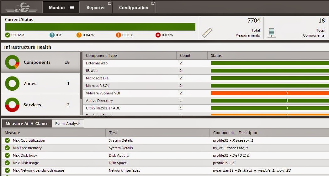
It’s a fresh and clear dashboard for me, much better than the old one. At the top of the dashboard you see the different health status of your environment. The big difference is that the infrastructure screen and the status screens have been converted. The focus of the screen is much better now, in the old version there was to much going on. First thing you see it the status bar.
The status bar shows how much percentage of the total environment is healthy and will show per severity the percentage. It’s a good start to see the overall health, it shouldn’t be to far from 95-99% to often I think otherwise you’re in trouble.
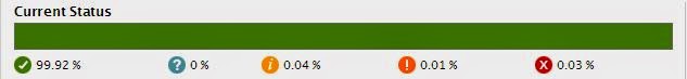
The old infrastructure overview got a overhaul as well. the components, zones and services are shown in a clear manner showing also the issues with the components at the same time.
In the old version many things were text lines you had to click on and here it’s more like a modern graphical interface, well done I have to say.
One last thing about the top bars, the right bar will give a quick overview of what you are monitoring, the number of measurements and components. If the number of measurements is very low something is wrong with your configuration.
Service topology
Let’s take a look at Service topology.
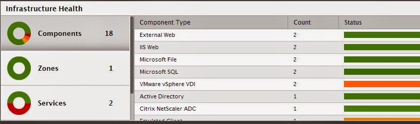
Clicking on Service in the main screen will show the services you have configured in the main screen.
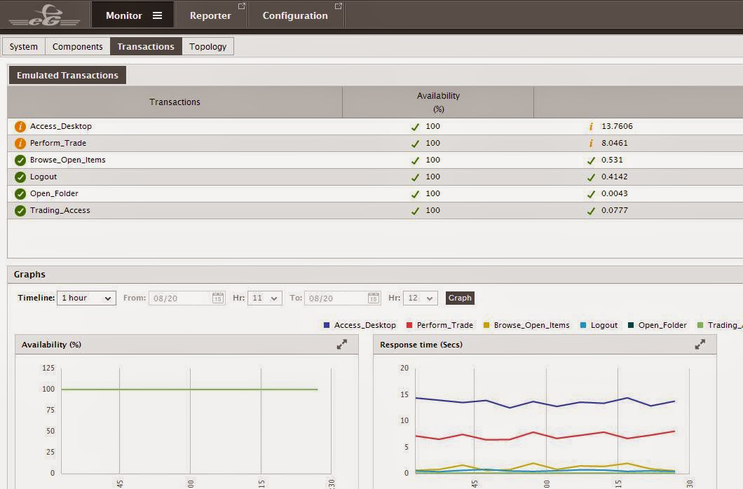
Here we have two services configured, a website and pnc_trading. Let’s take a look at pnc_trading.
Clicking on pnc_trading we will see how this service is configured. The service is built up from a number of actions, accessing the desktop, performing trade and so on. In this screen you will see the response time of an action and a graph with the historical response times as well as availability.
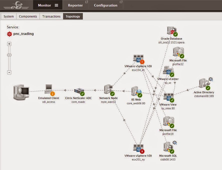
When we click on Topology we will see the relation between the components, building this map allows you to set the relationship between components. A relationship can be that one component connects to the other or that one uses the other. The map gives a good overview of all components and by clicking on them you are taken right to that components.
Layering
Layering was one of the major features of eG Innovations in my opinion, I liked the way the layers represented the issues in severity. The new layers are totally different from the old ones, the function is the same but it looks way better. The main difference now is that when you open up a layer, you open up a layer.
When you click on a layer it will open up and show the measurements of that layer. it really opens up and shows the measurements below.
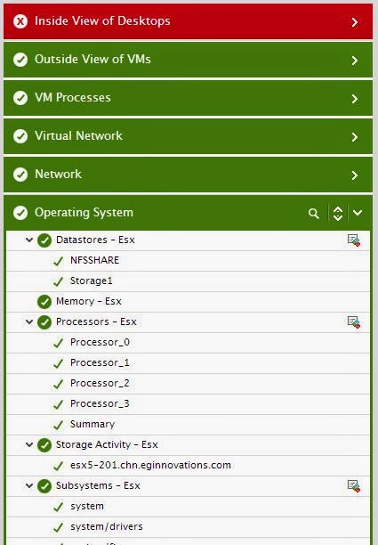
Clicking on a measurement will give the details and metrics in the main screen. This a major difference with the old version for there the measurements showed in the main screen and the metrics in the lower part. I think this is more logical and much as we see in other software.
It’s simple, it’s clean and it’s easy to understand…and it looks powerful.
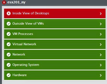
I opened the red one for that’s where the issue is.
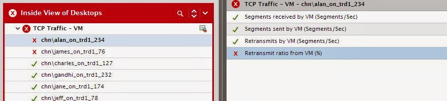
It’s the inside view of a Desktop, rather than the outside view of the desktop it will show what the desktop is thinking is happening…. like us thinking we get real results when searching on Google, the desktop like us is presented a view of the resources and that might be totally different than the real resources outside the desktop.
The Re-transmit ratio from this vm is having issues it says, clicking on the error will pop-up a screen that will show you what is happening there. TCP transmission percentage is high, that’s a clear message to send you off on a hunt for to fix this.
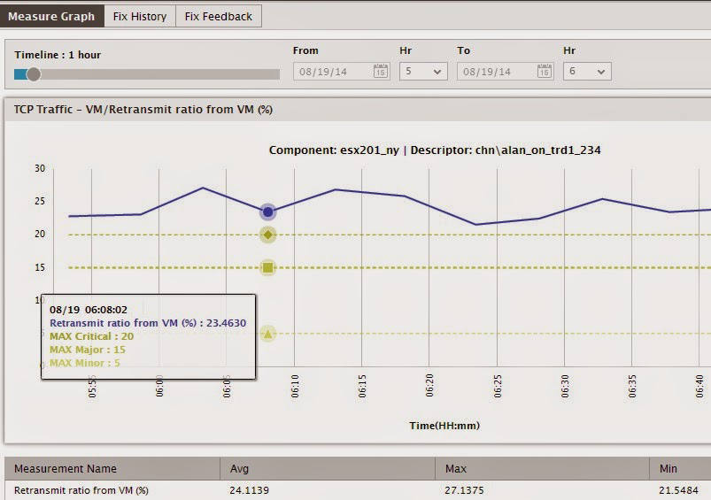
Sure the first thing to do is check out how long this has been going on. Clicking on the graph shows this along with minor, major and critical lines. Functionality is still the same, looks have improved a lot as has the browse-ability of the screen, it’s more logical now.
There are so many dashboard you can take a week of holiday to go through all of them, this is just one and it gives you an idea of what is possible. Again it’s clear, readable and has a modern look.
Dashboard
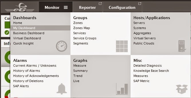
I spoke about the dashboard already in the beginning but sure now you are thinking I don’t want that default dashboard I want to add my own measurements there and see the weather and news. From the menu you can choose many option and one of them is to create a custom dashboard. The same menu as we saw with monitoring is also available with reporting or configuration. When you click on the three strips you get a menu with all options available, simpler than that is impossible.
So when we click the My dashboard option we see an empty screen and we have to option to add our measurements. It’s called Add Widgets and from the widget screen you have several options.
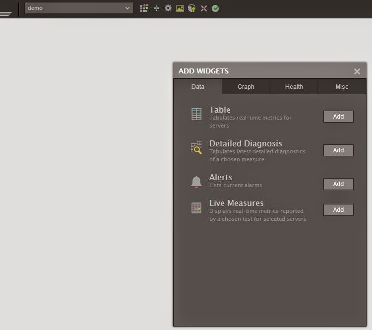
You can add tables, alerts or live measurements.
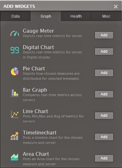
You can any kind of graph, when you select the graph you will be presented with a component selection and a measurement selection for it needs to know what you want to see there. The last TAB there is to add news feeds or weather feeds, most times not needed unless you are in a business were you operate outside.
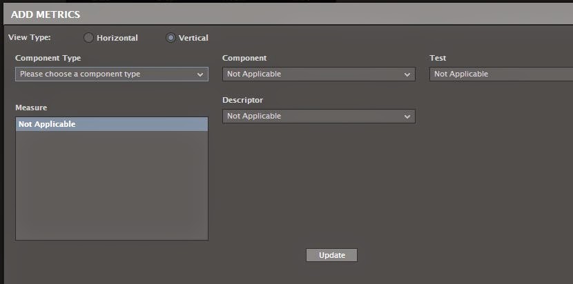
Once you selected any widget you will need to specify what you want to display, so select the components, test and measurement. After you’ve done this you can move, re-size the widget and add it to the dashboard.
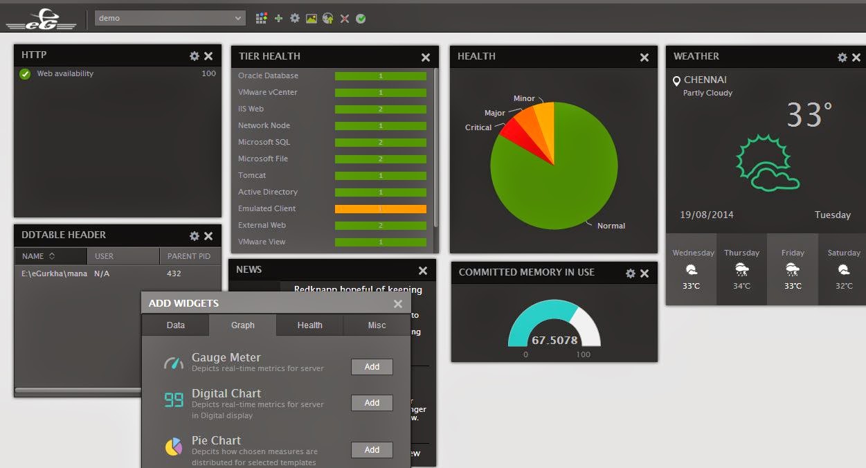
And there it is, my one-two-three click dashboard with various widgets on it. Adding the widgets is not a lot of work, the work is in the thinking before you add things. You need to determine what you want to monitor and show on the big screen in the office.
Reports
Okay so now we had the main screen, layers and the dashboard, let’s finish off with the reports.
The report function in the old version was hard to work with, all options where there but as so much was possible you felt like in the forest. With this redesign you feel like you got to the end of the maze, it’s clear and understandable.
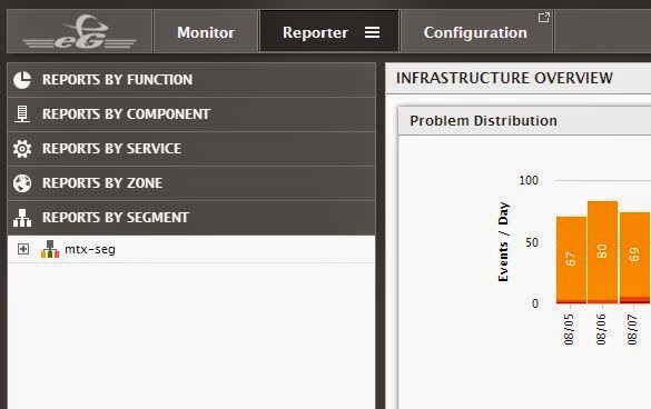
When going to Reports you will see this menu structure that is as clear as it can get. Opening one of them shows the items below, in the main screen you will see a nice list of all options available.
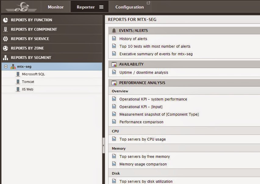
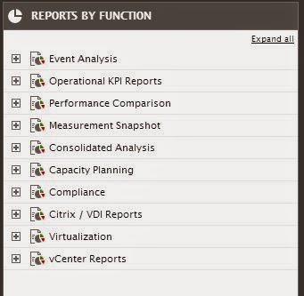
Okay one last screenshot (so many that are interesting). Opening the reports by function shows many different reports. When you click on of the open the different reports are displayed, you can click them and in the main screen they will show the report.
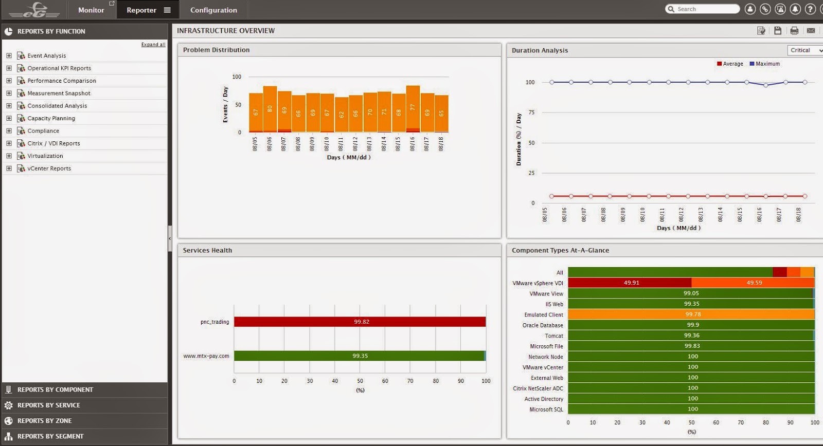
Okay one more, a full view of the report screen with reports opened.. if this isn’t easy I don’t know that is. Compared to the old version this is such an improvement, it’s simply amazing.
What haven’t I covered?
Well there is so much more, there is creating a topology, there is the admin mode, there is adding and modifying agents and so much more. My intention was to show you in a quick way what the new version looked like and I think you have a good understanding now.
If you are interested and I can’t think why not call them for a demo or when you are in the Netherlands call PQR, we are a partner and can show you the demo, implement it, making sure you have end to end monitoring.
New features
Of course eG Innovations hasn’t been busy working on a new look only, they have added functionality as well. This blog is about the new look but I don’t want to withhold you those new features, so here they are;
- Support for monitoring Citrix XenMobile
- Support for monitoring Sharefile
- More in-depth monitoring for enterprise applications (SAP in particular)
Conclusion
I think version 6 is a huge step forward for eG Innovations. They handled monitoring very well already and now they have an enterprise ready console that really is so much cleaner and easier to navigate in. I have to work with it when we implement it at customers and this will help me because the customer will learn faster to handle the console.
eG Enterprise is an Observability solution for Modern IT. Monitor digital workspaces,
web applications, SaaS services, cloud and containers from a single pane of glass.


