Overview
The Overview dashboard of a Microsoft SQL application provides an all-round view of the health of the Microsoft SQL application being monitored, and helps administrators pinpoint the problem areas. Using this dashboard therefore, you can determine the following quickly and easily:
- Has the application encountered any issue currently? If so, what is the issue and how critical is it?
- How problem-prone has the application been during the last 24 hours? Which application layer has been badly hit?
- Has the administrative staff been able to resolve all past issues? On an average, how long do the administrative personnel take to resolve an issue?
- Are all the key performance parameters of the application operating normally?
- What is the Application configuration of the Microsoft SQL application?
- How many SQL Processes are running?
- What is the Database Usage? What is the Data space and how much Unused space is available in the Microsoft SQL application with respect to each Database?
- How effective is the Database Transaction? What is the Transaction rate of each Database? Are the transactions for each Database behaving normally or is there any abnormal transactional behavior that has been reported during a particular time period?
The contents of the Overview Dashboard have been elaborated on hereunder:
-
The Current Application Alerts section of Figure 1 reveals the number and type of issues currently affecting the performance of the Microsoft SQL application that is being monitored. To know more about the current issues, click on any cell against Distribution that represents the problem priority of interest to you; the details of the current problems of that priority will then appear as depicted by Figure 1.
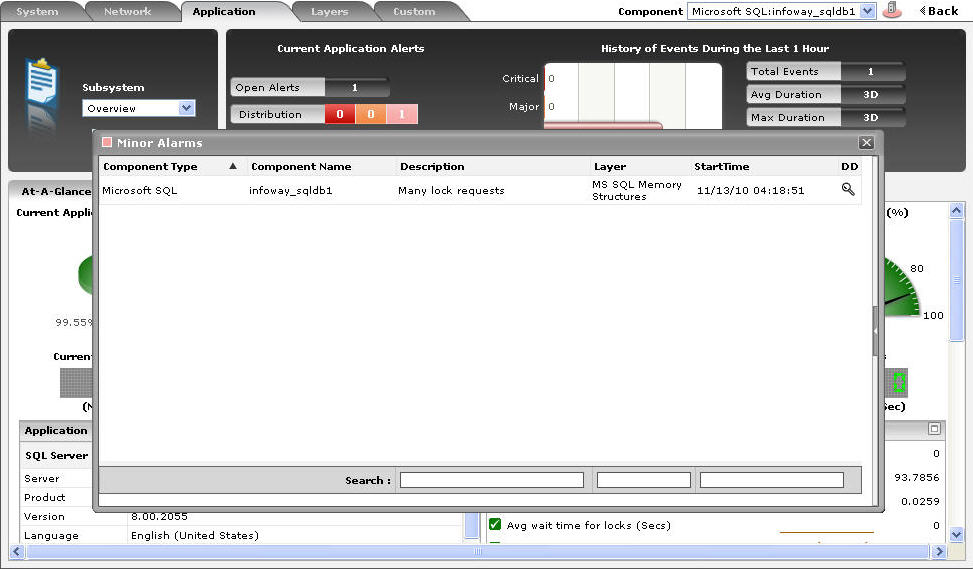
Figure 1 : Viewing the current application alerts of a particular priority
- If the pop-up window of Figure 1 reveals too many problems, you can use the Search text boxes that have been provided at the end of the Description, Layer, and StartTime columns to run quick searches on the contents of these columns, so that the alarm of your interest can be easily located. For instance, to find the alarm with a specific description, you can provide the whole/part of the alarm description in the text box at the end of the Description column in Figure 1; this will result in the automatic display of all the alarms with descriptions that contain the specified search string.
-
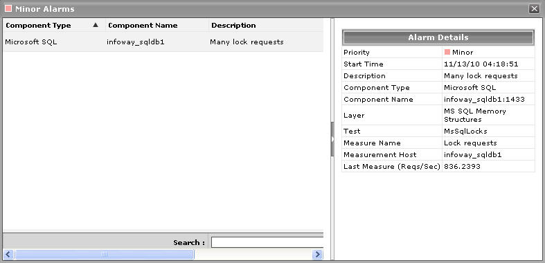
To zoom into the exact layer, test, and measure that reported any of the listed problems, click on a particular alarm in the Alarms window of Figure 1. Doing so will introduce an Alarm Details section into the Alarms window (see Figure 2), which provides the complete information related to the problem clicked on. These details include the Site affected by the problem for which the alarm was raised, the test that reported the problem, and the last measure that was reported will be reported in the Last Measures.
-
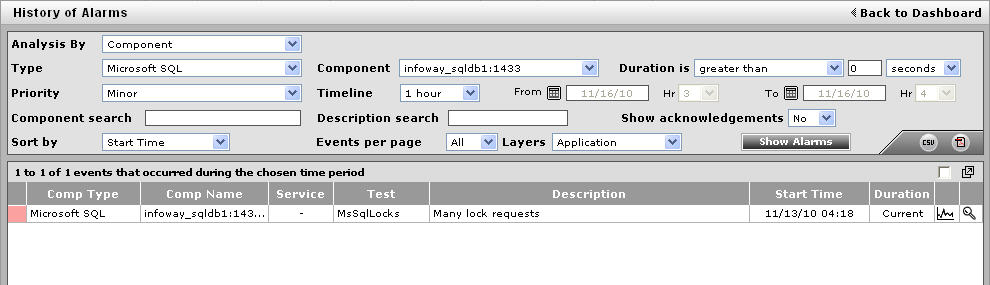
While the list of current issues faced by the application serves as a good indicator of the current state of the application, to know how healthy/otherwise the application has been over time, a look at the problem history of the application is essential. Therefore, the dashboard provides the History of Events section; this section presents a bar chart, where every bar indicates the number of problems of a particular severity, which was experienced by the Microsoft SQL application during the last 1 hour (by default). Clicking on a bar here will lead you to Figure 3 which provides a detailed history of problems of that priority. Alongside the bar chart, you will also find a table displaying the average and maximum duration for problem resolution; this table helps you determine the efficiency of your administrative staff.
-
If required, you can override the default time period of 1 hour of the event history, by following the steps below:
- Click the
 button at the top of the dashboard to invoke the Dashboard Settings window.
 - Select the Event History option from the Default timeline for list.
- Set a different default timeline by selecting an option from the Timeline list.
- Finally, click the Update button.
- Click the
- Back in the dashboard, you will find that the History of Events section is followed by an At-A-Glance section; this section, using pie charts, digital displays and gauge charts, reveals, at a single glance, the current status of some of the critical metrics and key components of the Microsoft SQL application. For instance, the Current Application Health pie chart indicates the current health of the application by representing the number of application-related metrics that are in various states. Clicking on a slice here will take you to Figure 3 that provides a detailed problem history.
-
The dial and digital graphs that follow provide you with quick updates on the status of a pre-configured set of resource usage-related metrics pertaining to the Microsoft SQL application. If required, you can configure the dial graphs to display the threshold values of the corresponding measures along with their actual values, so that deviations can be easily detected. For this purpose, do the following:
- Click the button at the top of the dashboard to invoke the Dashboard Settings window.
- Set the Show Thresholds flag in the window to Yes.
-
Finally, click the Update button.
You can customize the At-A-Glance tab page further by overriding the default measure list for which dial/digital graphs are being displayed in that tab. To achieve this, do the following:
- Click on the icon at the top of the Application Dashboard. In the Dashboard Settings window that appears, select Application from the Module list, and Overview from the Sub-System list.
- To add measures for the dial graph, pick the Dial Graph option from the Add/Delete Measures for list. Upon selection of the Dial Graph option, the pre-configured measures for the dial graph will appear in the Existing Value(s) list. Similarly, to add a measure to the digital display, pick the Digital Graph option from the Add/Delete Measures for list. In this case, the Existing Value(s) list box will display all those measures for which digital displays pre-exist.
-
Next, select the Test that reports the said measure, pick the measure of interest from the Measures list, provide a Display name for the measure, and click the Add button to add the chosen measure to the Existing Value(s) list. Note that while configuring measures for a dial graph the ‘Measures’ list will display only those measures that report percentage values.
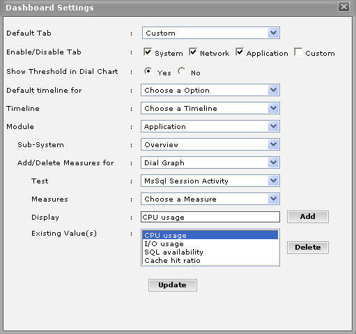
Figure 4 : Configuring measures for the dial graph
- If you want to delete one/more measures from the dial/digital graphs, then, as soon as you choose the Dial Graph or Digital Graph option from the Add/Delete Measures for list, pick any of the displayed measures from the Existing Value(s) list, and click the Delete button.
- Finally, click the Update button to register the changes.
Note:
Only users with Admin or Supermonitor privileges can enable/disable the system, network, and application dashboards, or can customize the contents of such dashboards using the Dashboard Settings window. Therefore, whenever a user without Admin or Supermonitor privileges logs into the monitoring console, the
button will not appear. -
Clicking on a dial/digital graph will lead you to the layer model page of the Microsoft SQL application; this page will display the exact layer-test combination that reports the measure represented by the dial/digital graph.
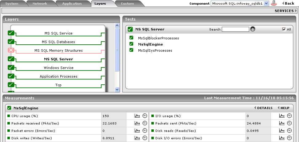
Figure 5 : The page that appears when the dial/digital graph in the Overview dashboard of the Microsoft SQL Application is clicked
- Click the
-
If your eG license enables the Configuration Management capability, then, an Application Configuration section will appear here (as shown in Figure 1) providing the basic configuration of the application. You can configure the type of configuration data that is to be displayed in this section by following the steps below:
- Click on the icon at the top of the Application Dashboard. In the Dashboard Settings window that appears, select Application from the Module list, and Overview from the Sub-System list.
- To add more configuration information to this section, first, pick the Application Configuration option from the Add/Delete Measures for list. Upon selection of this option, all the configuration measures that pre-exist in the Configuration Management section will appear in the Existing Value(s) list.
- Next, select the config Test that reports the said measure, pick the measure of interest from the Measures list, provide a Display name for the measure, and click the Add button to add the chosen measure to the Existing Value(s) list.
- If you want to delete one/more measures from this section, then, as soon as you choose the Application Configuration option from the Add/Delete Measures for list, pick any of the displayed measures from the Existing Value(s) list, and click the Delete button.
- Finally, click the Update button to register the changes.
- Click on the
-
Next to this section, you will find a pre-configured list of Key Performance Indicators of the Microsoft SQL application. Besides indicating the current state of and current values reported by a default set of resource usage metrics, this section also reveals ‘miniature’ graphs of each measure, so that you can instantly study how that measure has behaved during the last 1 hour (by default) and thus determine whether the change in state of the measure was triggered by a sudden dip in performance or a consistent one. Clicking on a measure here will lead you to Figure 6, which displays the layer and test that reports the measure.
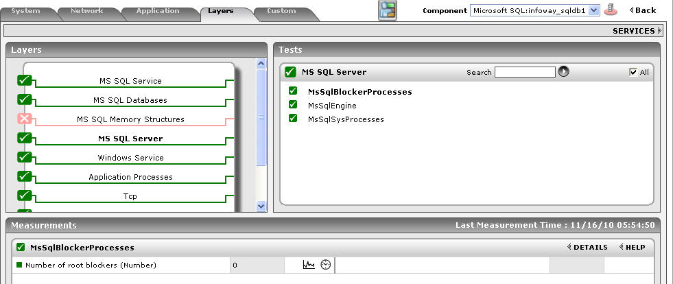
Figure 6 : Clicking on a Key Performance Indicator
You can, if required, override the default measure list in the Key Performance Indicators section by adding more critical measures to the list or by removing one/more existing ones from the list. For this, do the following:
- Click on the icon at the top of the Application Dashboard. In the Dashboard Settings window that appears, select Application from the Module list, and Overview from the Sub-System list.
- To add more metrics to the Key Performance Indicators section, first, pick the Performance Indicator option from the Add/Delete Measures for list. Upon selection of this option, all the measures that pre-exist in the Key Performance Indicators section will appear in the Existing Value(s) list.
- Next, select the Test that reports the said measure, pick the measure of interest from the Measures list, provide a Display name for the measure, and click the Add button to add the chosen measure to the Existing Value(s) list.
- If you want to delete one/more measures from this section, then, as soon as you choose the Key Performance Indicators option from the Add/Delete Measures for list, pick any of the displayed measures from the Existing Value(s) list, and click the Delete button.
- Finally, click the Update button to register the changes.
- Click on the
-
Clicking on a ‘miniature’ graph that corresponds to a key performance indicator will enlarge the graph (see Figure 7), so that you can view and analyze the measure behavior more clearly, and can also alter the Timeline and dimension (3d/ 2d) of the graph, if need be.
-
This way, the first few sections of the At-A-Glance tab page help understand what issues are currently affecting the application health, and when they actually originated. To diagnose the root-cause of these issues however, you would have to take help from the remaining sections of the At-A-Glance tab page. For instance, the Key Performance Indicators section may indicate a sudden/steady increase in the Log cache hit ratio of the Microsoft SQL application. However, to determine whether the rise in the Log cache hit ratio was a result of one/more high SQL processes executing on the Microsoft SQL application or a couple of resource-intensive SQL applications, you need to focus on the SQL Process - Summary section. This SQL Process - Summary section for starters reveals the number of Processes that are in varying states of activity. With the help of this section therefore, you can quickly figure out whether there are currently any:
- Processes that are being processed in the background;
- Processes that are being blocked by other processes;
- Processes that are not utilized at present by the Microsoft SQL application;
- Processes that are currently running for the target Microsoft SQL application, etc.
Say, you notice that too many processes are currently running in a BACKGROUND state. Immediately, you might want to know whether this is a sudden occurrence, or has that problem occurred over a course of time. To enable you to determine this, every process that is displayed in the SQL Process - Summary section is accompanied by a ‘miniature’ graph, which tracks the changes in the corresponding process during the last 1 hour (by default). To enlarge the graph, click on it; this will invoke Figure 8. The enlarged graph allows you to change the Timeline for analysis, and also the graph dimension.
- The Database Usage Summary section reveals how well the databases are being managed by the target Microsoft SQL application. For every database, this section reveals the space that is utilized by the data files, the space that is used for indexing the data, and the space that is currently unused in the database. From this information, you can infer which database is utilizing the maximum amount of allocated resources. By default, the Database list provided by this section is sorted in the alphabetical order of the names of the databases. If need be, you can change the sort order so that the databases are arranged in, say, the descending order of values displayed in the Data Space column - this column displays the space that is utilized by the data files. To achieve this, simply click on the column heading Data Space. Doing so tags the Data Space label with a down arrow icon - this icon indicates that the Database Usage Summary table is currently sorted in the descending order of the space used by the data files. To change the sort order to ‘ascending’, all you need to do is just click again on the Data Space label or the down arrow icon. Similarly, you can sort the table based on any column available in it.
- The Database Transaction Summary section, on the other hand, provides the transaction details of each of the databases that are currently available in the Microsoft SQL application. By default, the database list provided by this section is sorted in the alphabetical order of the process names. If need be, you can change the sort order so that the databases are arranged in, say, the descending order of values displayed in the Active transactions column - this column displays the number of active transactions made by each database that is available in the Microsoft SQL application. To achieve this, simply click on the column heading – Active transactions. Doing so tags the Active transactions label with a down arrow icon - this icon indicates that the database list is currently sorted in the descending order of the active transaction count. To change the sort order to ‘ascending’, all you need to do is just click again on the Active transactions label or the down arrow icon. Similarly, you can sort the process list based on any column available in the Database Transaction Summary section.
-
While the At-A-Glance tab page reveals the current state of the databases and the overall resource usage of the Microsoft SQL application, to perform additional diagnosis on problem conditions highlighted by the At-A-Glance tab page and to accurately pinpoint their root-cause, you need to switch to the Details tab page (see Figure 9) by clicking on it. For instance, the At-A-Glance tab page may indicate the number of processes that are currently blocked, but to know which process has been blocked for the longest time, you will have to use the Details tab page.

Figure 9 : The Details tab page of the Microsoft SQL Application Overview Dashboard
-
The Details tab page comprises of a default set of comparison bar graphs using which you can accurately determine the following:
- The size of the databases.
- The Log size of the databases.
- How many Active transactions are made on each database?
- What is the SQL Cache hit ratio of each database?
If required, you can configure the Details tab page to include comparison graphs for more measures, or can even remove one/more existing graphs by removing the corresponding measures. To achieve this, do the following:
- Click on the icon at the top of the Application Dashboard. In the Dashboard Settings window that appears, select Application from the Module list, and Overview from the Sub-System list.
- To add measures for comparison graphs, first, pick the Comparison Graph option from the Add/Delete Measures for list. Upon selection of this option, the pre-configured measures for comparison graphs will appear in the Existing Value(s) list.
-
Next, select the Test that reports the said measure, pick the measure of interest from the Measures list, provide a Display name for the measure, and click the Add button to add the chosen measure to the Existing Value(s) list.
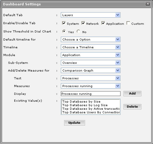
Figure 10 : Configuring measures for the dial graph
- If you want to delete one/more measures for which comparison graphs pre-exist in the details tab page, then, as soon as you choose the Comparison Graph option from the Add/Delete Measures for list, pick any of the displayed measures from the Existing Value(s) list, and click the Delete button.
- Finally, click the Update button to register the changes.
Note:
Only users with Admin or Supermonitor privileges can enable/disable the system, network, and application dashboards, or can customize the contents of such dashboards using the Dashboard Settings window. Therefore, whenever a user without Admin or Supermonitor privileges logs into the monitoring console, the
button will not appear. -
By default, the comparison bar graphs list the top-10 databases only. To view the complete list of databases, simply click on the corresponding graph in Figure 9. This enlarges the graph as depicted by Figure 11.
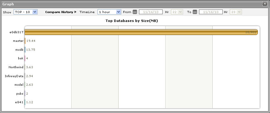
Figure 11 : The expanded top-n graph in the Details tab page of the Microsoft SQL Application Overview Dashboard
- Though the enlarged graph lists all the databases in this case by default, you can customize the enlarged graph to display the details of only a few of the larger/smaller databases by picking a top-n or last-n option from the Show list in Figure 11.
- Another default aspect of the enlarged graph is that it pertains to the current period only. Sometimes however, you might want to know what occurred during a point of time in the past; for instance, while trying to understand the reason behind a sudden increase or decrease in the size of the database usage on a particular day last week, you might want to first determine the database whose size has abnormally increased / decreased on the same day. To figure this out, the enlarged graph allows you to compare the historical performance of the databases. For this purpose, click on the Compare History link in Figure 11 and select the TimeLine of your choice.
-
Where detailed diagnosis is applicable, you can quickly view the detailed measures that correspond to a comparison graph by clicking on the
 icon at the right, top corner of the enlarged graph. This will invoke Figure 12, using which you can arrive at the root-cause of a problem.
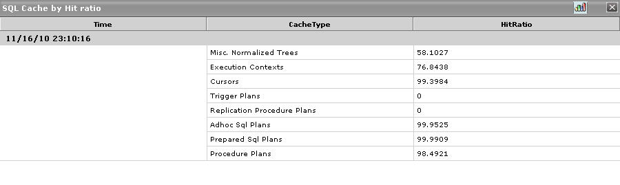
Figure 12 : The detailed diagnosis that appears when the DD icon in the enlarged comparison bar graph is clicked
-
For detailed time-of-day / trend analysis of the historical performance of a Microsoft SQL application, use the History tab page. By default, this tab page (see Figure 13) provides time-of-day graphs of critical measures extracted from the target Microsoft SQL application, using which you can understand how performance has varied during the default period of 24 hours. In the event of a problem, these graphs will help you determine whether the problem occurred suddenly or grew with time. To alter the timeline of all the graphs simultaneously, click on the Timeline link at the right, top corner of the History tab page of Figure 13.
You can even override the default timeline (of 24 hours) of the measure graphs, by following the steps below:
- Click on the icon at the top of the Application Dashboard.
- In the Dashboard Settings window that appears, select History Graph from the Default Timeline for list.
- Then, choose a Timeline for the graph.
- Finally, click the Update button.
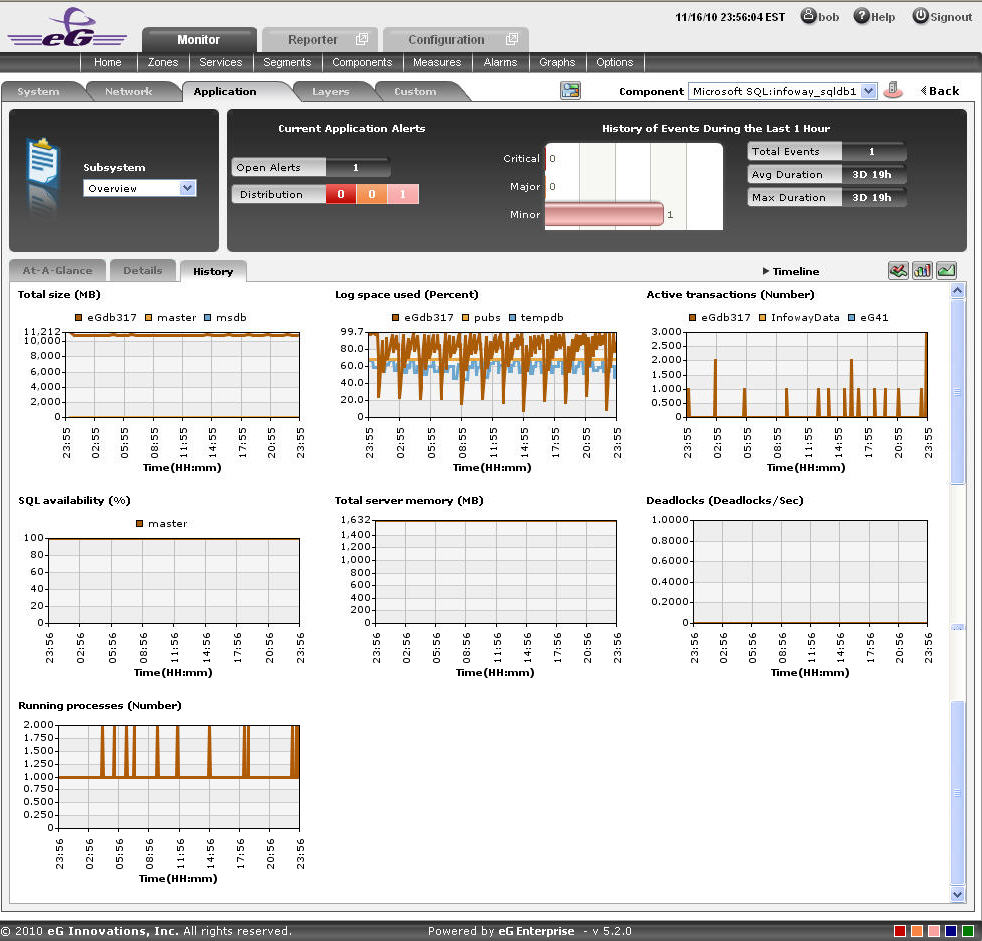
Figure 13 : Time-of-day measure graphs displayed in the History tab page of the Application Overview Dashboard
- Click on the
-
You can click on any of the graphs to enlarge it, and can change the Timeline of that graph in the enlarged mode as shown in Figure 14.
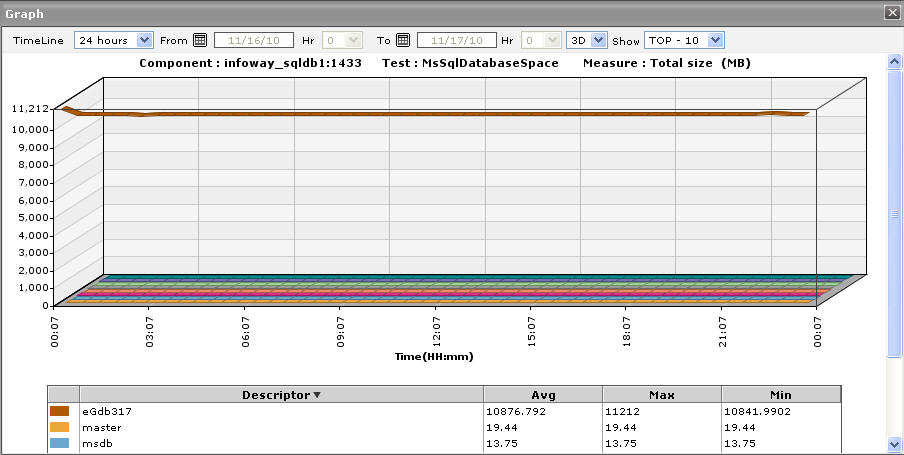
Figure 14 : An enlarged measure graph of a Microsoft SQL Application
- In case of tests that support descriptors, the enlarged graph will, by default, plot the values for the top-10 descriptors alone. To configure the graph to plot the values of more or less number of descriptors, select a different top-n / last-n option from the Show list in Figure 14.
-
If you want to quickly perform service level audits on the Microsoft SQL application, then summary graphs may be more appropriate than the default measure graphs. For instance, a summary graph might come in handy if you want to determine the variation of Total size of a database with respect to the percentage of time during the last 24 hours. Using such a graph, you can determine whether the database size has been constant or varied, and if not, how frequently the application faltered in this regard. To invoke such summary graphs, click on the
 icon at the right, top corner of the History tab page. Figure 15 will then appear.
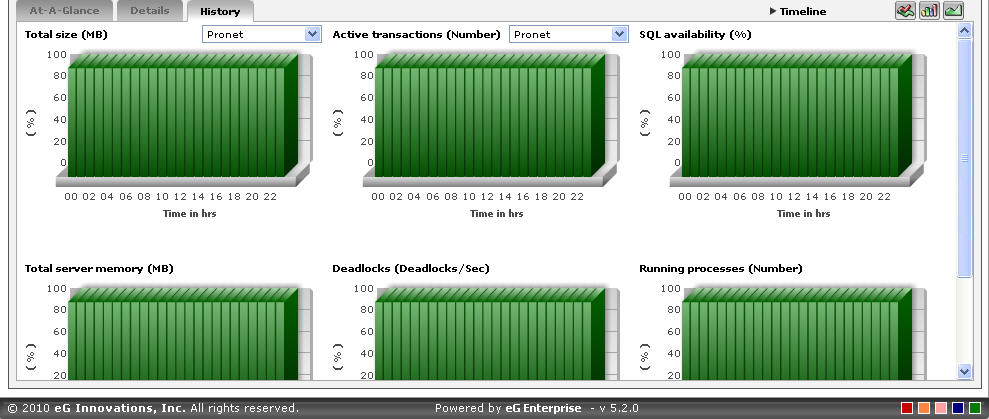
Figure 15 : Summary graphs displayed in the History tab page of the Application Overview Dashboard
-
You can alter the timeline of all the summary graphs at one shot by clicking the Timeline link at the right, top corner of the History tab page of Figure 13. You can even alter the default timeline (of 24 hours) for these graphs, by following the steps given below:
- Click on the icon at the top of the Application Dashboard.
- In the Dashboard Settings window that appears, select Summary Graph from the Default Timeline for list.
- Then, choose a Timeline for the graph.
- Finally, click the Update button.
- Click on the
-
To change the timeline of a particular graph, click on it; this will enlarge the graph as depicted by Figure 16. In the enlarged mode, you can alter the Timeline of the graph. Also, though the graph plots hourly summary values by default, you can pick a different Duration for the graph in the enlarged mode, so that daily/monthly performance summaries can be analyzed.
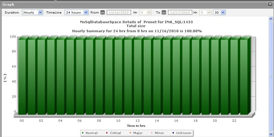
Figure 16 : An enlarged summary graph of the Microsoft SQL Application
-
To perform effective analysis of the past trends in performance, and to accurately predict future measure behavior, click on the
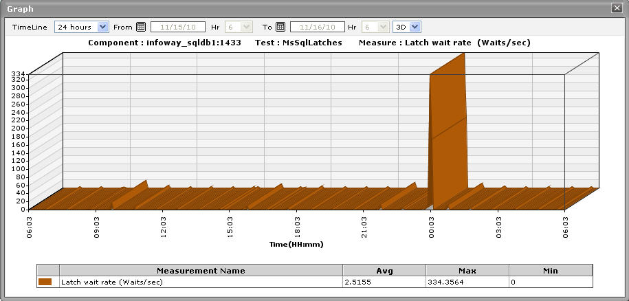
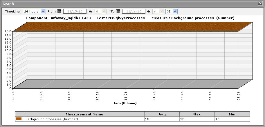
 icon at the right, top corner of the History tab page. These trend graphs as shown in Figure 17 typically show how well and how badly a measure has performed every hour during the last 24 hours (by default). For instance, the Total size trend graph of each database of a Microsoft SQL application will help you figure out the total size of the database that was available in the application every hour during the last 24 hours. If the gap between the minimum and maximum values is marginal, you can conclude that the size of the database has been more or less constant during the designated period;this implies that the size of the database has neither increased nor decreased steeply during the said timeline. On the other hand, a wide gap between the maximum and minimum values is indicative of an erratic change in the size of the database, and may necessitate further investigation.
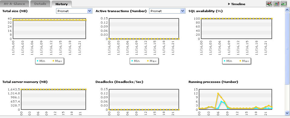
Figure 17 : Trend graphs displayed in the History tab page of the Application Overview Dashboard
-
To analyze trends over a broader time scale, click on the Timeline link at the right, top corner of the History tab page, and edit the Timeline of the trend graphs. Clicking on any of the miniature graphs in this tab page will enlarge that graph, so that you can view the plotted data more clearly and even change its Timeline.
To override the default timeline (of 24 hours) of the trend graphs, do the following:
- Click on the icon at the top of the Application Dashboard.
- In the Dashboard Settings window that appears, select Trend Graph from the Default Timeline for list.
- Then, choose a Timeline for the graph.
- Finally, click the Update button.
- Click on the
- Besides the timeline, you can even change the Duration of the trend graph in the enlarged mode. By default, Hourly trends are plotted in the trend graph. By picking a different option from the Duration list, you can ensure that Daily or Monthly trends are plotted in the graph instead.
-
Also, by default, the trend graph only plots the minimum and maximum values registered by a measure. Accordingly, the Graph type is set to Min/Max in the enlarged mode. If need be, you can change the Graph type to Avg (see Figure 18), so that the average trend values of a measure are plotted for the given Timeline. For instance, if an average trend graph is plotted for the Total size measure, then the resulting graph will enable administrators to ascertain whether the size of a particular database has been constant during a specified timeline.
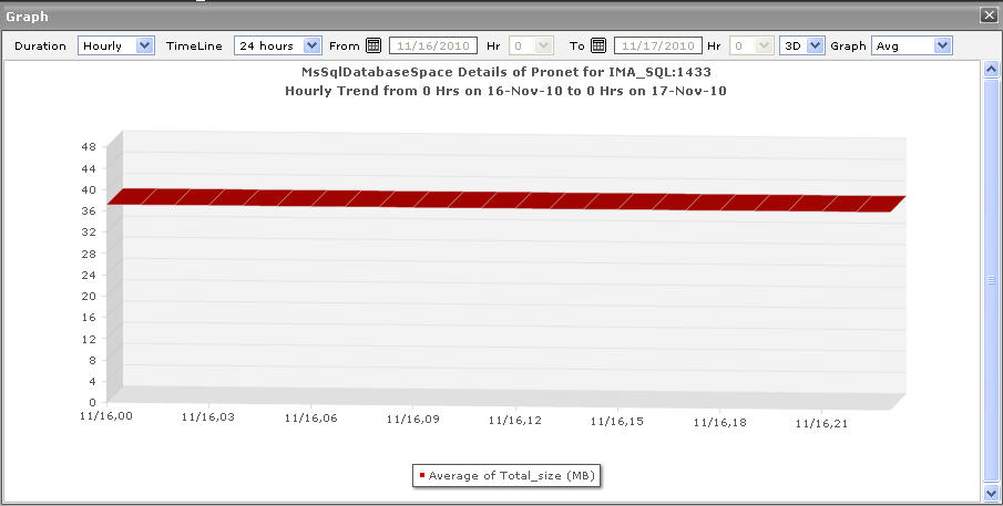
Figure 18 : Viewing a trend graph that plots average values of a measure for a database available in the Microsoft SQL application
-
Likewise, you can also choose Sum as the Graph type to view a trend graph that plots the sum of the values of a chosen measure for a specified timeline. For instance, if you plot a ‘sum of trends’ graph for the measure that reports the Total size of a database available in the Microsoft SQL application, then, the resulting graph will enable you to analyze, on an hourly/daily/monthly basis (depending upon the Duration chosen), whether there was any change in the size of the database.
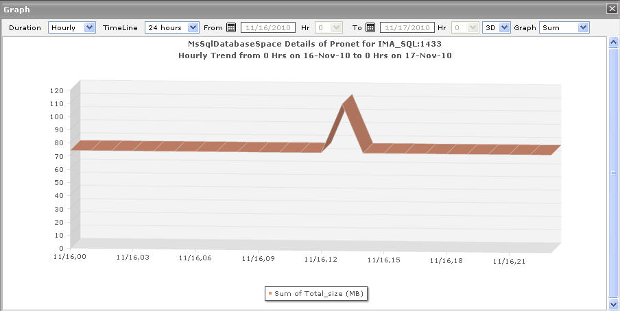
Figure 19 : A trend graph plotting sum of trends for a database available in the Microsoft SQL application
Note:
In case of descriptor-based tests, the Summary and Trend graphs displayed in the History tab page typically plot the values for a single descriptor alone. To view the graph for another descriptor, pick a descriptor from the drop-down list made available above the corresponding summary/trend graph.
- At any point in time, you can switch to the measure graphs by clicking on the
 button.
 -
Typically, the History tab page displays measure, summary, and trend graphs for a default set of measures. If you want to add graphs for more measures to this tab page or remove one/more measures for which graphs pre-exist in this tab page, then, do the following:
Note:
Only users with Admin or Supermonitor privileges can enable/disable the system, network, and application dashboards, or can customize the contents of such dashboards using the Dashboard Settings window. Therefore, whenever a user without Admin or Supermonitor privileges logs into the monitoring console, the
button will not appear.