Adding a widget
To add a new widget to the User Experience dashboard, the user must first click on the  icon. Figure 1 will then appear.
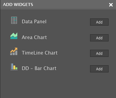
Figure 1 : Adding a widget to the User Experience dashboard
The User Experience Dashboard supports four type of widgets, namely:
- The Data widget: When included in the dashboard, this will display the current state and value of a selected measure, with a link to detailed metrics (if available).
- The Area Chart widget: When included in the dashboard, this will display a historical area chart indicating the trends in the behavior of a chosen measure over a given timeline. This chart is easy to read and helps in rapidly detecting abnormal performance trends.
- The TimeLine Chart widget: This widget will display a line graph of a chosen measure over a given timeline. Using this graph, time-of-day variations in measure values can be observed closely and sporadic/consistent aberrations in performance can be quickly identified.
- The dd – Bar Chart widget: This widget will graphically represent the detailed diagnostics of a chosen measure. This way, administrators can quickly compare performance across various parameters and can accurately isolate the root-cause of performance degradations.
To add a Data widget, do the following:
-
Click the Add button in Figure 1. Figure 2 will then appear.
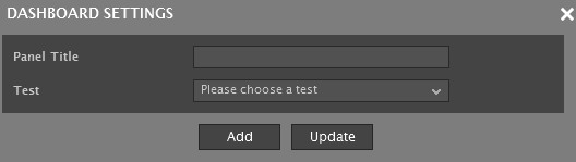
Figure 2 : Th pop up window that appears when the Add button against the Data Widget is clicked
-
In Figure 3, specify the Panel Title.
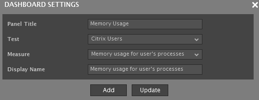
- Next, select the Test that reports the measure to be displayed in the Data widget.
- Pick the Measure.
- Provide a Display Name for the measure.
- Click Add to add the measure to the Data widget. Similarly, multiple measures can be added to the same Data widget.
- Once you are done adding, click the Update button to apply the configuration changes to the dashboard.
-
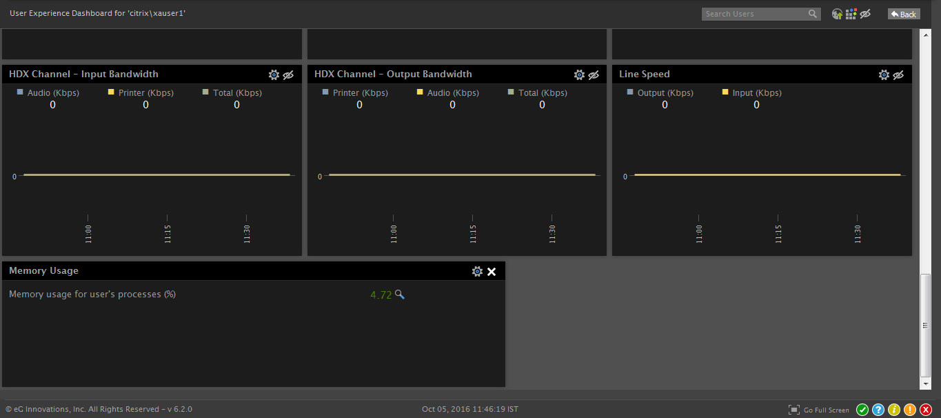
Figure 4 displays a Data widget that has been added to the dashboard.
- To add an Area Chart, do the following:
- Click the Add button against the Area widget in Figure 1.
-
In Figure 5 that appears, specify the Panel Title (see Figure 5).
- Next, select a Timeline for the Area chart.
- Then, pick a Color Palette for the Area chart by clicking the
 icon.
icon. - Then, select the Test that reports the measure for which the Area chart is to be generated.
- Pick the Measure for the chart.
- Provide a Display Name for the measure.
- Click Add to add the widget and Update to apply the configuration changes to the dashboard.
-
Figure 6 displays a Data widget that has been added to the dashboard.
- To add a TimeLine Chart, do the following:
- Click the Add button against the TimeLine Chart widget in Figure 1.
-
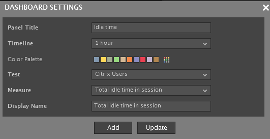
Then, specify the Panel Title (see Figure 7).
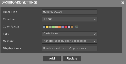
- Next, select a Timeline for the graph.
- Then, pick a Color Palette for the Area chart by clicking the button.
- Then, select the Test that reports the measure for which the Line graph is to be generated.
- Pick the Measure to be plotted in the graph.
- Provide a Display Name for the measure.
- Click Add to add the widget and Update to apply the configuration changes to the dashboard.
-
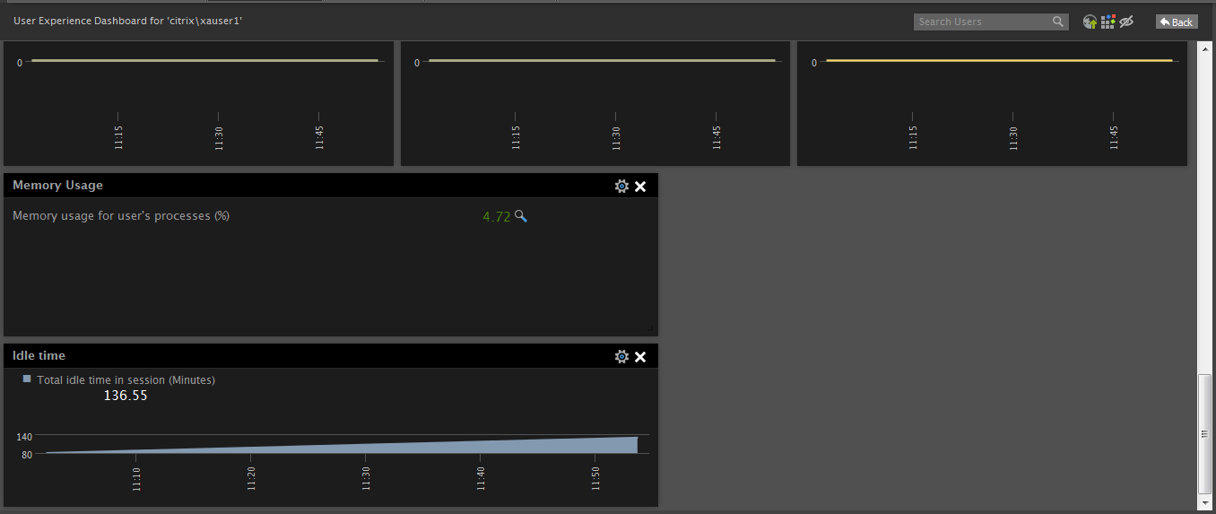
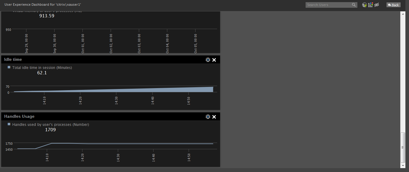
Figure 8 displays a TimeLine Chart widget that has been added to the dashboard.
To add a DD – Bar Chart widget, do the following:
- Click the Add button against the DD – Bar Chart widget in Figure 1. Figure 9 will then appear.
-
Then, specify the Panel Title (see Figure 9).
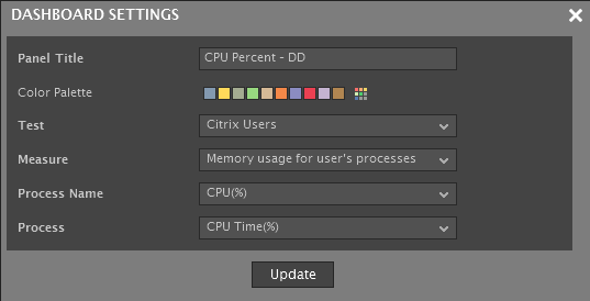
- Pick a Color Palette for the bar chart by clicking the icon.
- Then, select the Test that reports the detailed metrics for which the bar chart is to be generated.
- Pick the Measure.
- From Process Name and Process lists, select the DD columns that report the values to be used as the X and Y axis of the bar graph.
- Click Update to apply the configuration changes to the dashboard.
-
Figure 10 displays a Line widget that has been added to the dashboard.
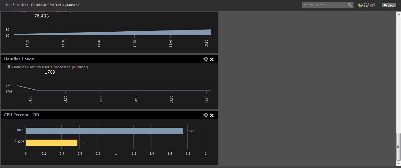
Figure 10 : A User Experience Dashboard with a DD – Bar Chart widget
Note:
The position of any widget (default/custom) can be changed in the dashboard using a simple 'click-and-drag' routine.