Overview
The Overview dashboard of a Citrix Virtual Apps application provides an all-round view of the health of the Citrix Virtual Apps application that is being monitored, and helps the administrators to pinpoint the problematic areas. Hence using this dashboard, you can determine the following queries in a quick and easy way.
- Has the application encountered any issue currently? If so, what is the issue and how critical is it?
- How problem-prone has the application been during the last 24 hours? Which application layer has been badly hit?
- Has the administrative staff been able to resolve all past issues? On an average, how long do the administrative personnel take to resolve an issue?
- Are all the key performance parameters of the application operating normally?
- Is the Citrix Virtual Apps application utilizing CPU optimally or is the current CPU usage very high? Did the CPU usage increase suddenly or gradually - i.e., over a period of time?
- How many active sessions are available? What are those sessions?
- Are there any disconnected sessions? If so, when was it disconnected? What was the problem behind the disconnected session?
- How many application processes have been running? What is the CPU utilization of each of those applications? Is there any abnormal increase in CPU utilization over a period of time?
- How many users are active in the current time period? How many files are available for that particular user?
The contents of the Overview Dashboard have been elaborated on hereunder:
-
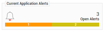
The Current Application Alerts section of Figure 1 reveals the number and type of issues currently affecting the performance of the Citrix Virtual Apps application that is being monitored. To know more about the issues at hand, click on any cell against Distribution that represents the problem priority of interest to you; the details of the current problems of that priority will then appear as depicted by Figure 1.
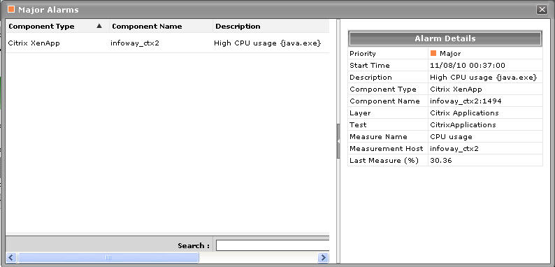
- If the pop-up window of Figure 1 reveals too many problems, you can use the Search text boxes that have been provided at the end of the Description, Layer, and StartTime columns to run quick searches on the contents of these columns, so that the alarm of your interest can be easily located. For instance, to find the alarm with a specific description, you can provide the whole/part of the alarm description in the text box at the end of the Description column; this will result in the automatic display of all the alarms with descriptions that contain the specified search string.
-
To zoom into the exact layer, test, and measure that reported any of the listed problems, click on any of the alarms in the Alarms window of Figure 1. Doing so will introduce an Alarm Details section into the Alarms window (see Figure 2), which provides the complete information related to the problem clicked on These details include the Site affected by the problem for which the alarm was raised, the test that reported the problem, and the percent usage indicating the Last Measure.
-
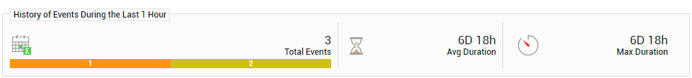
While the list of current issues faced by the application serves as a good indicator of the current state of the application, to know how healthy/otherwise the application has been over the time, a look at the problem history of the application is essential. Therefore, the dashboard provides the History of Events section; this section presents a bar chart, where every bar indicates the total number of problems along with their corresponding severity, which was experienced by the Citrix Virtual Apps application during the last 1 hour (by default). Alongside the bar chart, you will also find a table displaying the average and maximum duration for problem resolution; this table helps you determine the efficiency of your administrative staff.
- In the dashboard, you will find that the History of Events section is followed by an At-A-Glance section. This section reveals the current status of some critical metrics and key components of the Citrix Virtual Apps application at a single glance, using pie charts, digital displays and gauge charts. For instance, the Current Application Health pie chart indicates the current health of the application by representing the number of application-related metrics that are in various states. Clicking on a slice here will take you to Figure 3 that provides a detailed problem history.
-
The dial and digital graphs that follow will provide you with quick updates on the status of a pre-configured set of resource usage-related metrics pertaining to the Citrix Virtual Apps application. If required, you can configure the dial graphs to display the threshold values of the corresponding measures along with their actual values, so that deviations can be easily detected. For this purpose, do the following:
- Click the
 button at the top of the dashboard to invoke the Dashboard Settings window.
 - Set the Show Thresholds flag in the window to Yes.
- Finally, click the Update button.
- Click the
-
You can customize the At-A-Glance tab page further by overriding the default measure list for which dial/digital graphs are being displayed in that tab. To achieve this, do the following:
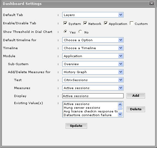
- Click on the icon at the top of the Application Dashboard. In the Dashboard Settings window that appears, select Application from the Module list, and Overview from the Sub-System list.
- To add measures for the dial graph, pick the Dial Graph option from the Add/Delete Measures for list. Upon selection of the Dial Graph option, the pre-configured measures for the dial graph will appear in the Existing Value(s) list. Similarly, to add a measure to the digital display, pick the Digital Graph option from the Add/Delete Measures for list. In this case, the Existing Value(s) list box will display all those measures for which digital displays pre-exist.
-
Next, select the Test that reports the said measure, pick the measure of interest from the Measures list, provide a Display name for the measure, and click the Add button to add the chosen measure to the Existing Value(s) list. Note that while configuring measures for a dial graph the 'Measures' list will display only those measures that report percentage values.
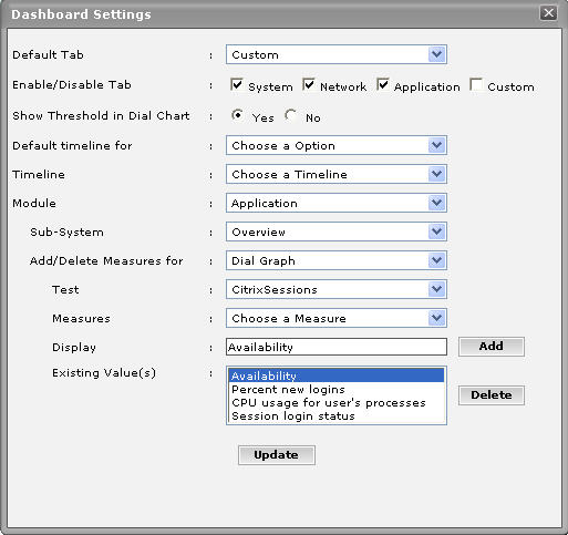
Figure 4 : Configuring measures for the dial graph
- If you want to delete one/more measures from the dial/digital graphs, then, as soon as you choose the Dial Graph or Digital Graph option from the Add/Delete Measures for list, pick any of the displayed measures from the Existing Value(s) list, and click the Delete button.
-
Finally, click the Update button to register the changes.
Note:
Only users with Admin or Supermonitor privileges can enable/disable the system, network, and application dashboards, or can customize the contents of such dashboards using the Dashboard Settings window. Therefore, whenever a user without Admin or Supermonitor privileges logs into the monitoring console, the
button will not appear.
- Click on the
-
Clicking on a dial/digital graph will lead you to the layer model page of the Citrix Virtual Apps Application; this page will display the exact layer-test combination that reports the measure represented by the dial/digital graph.
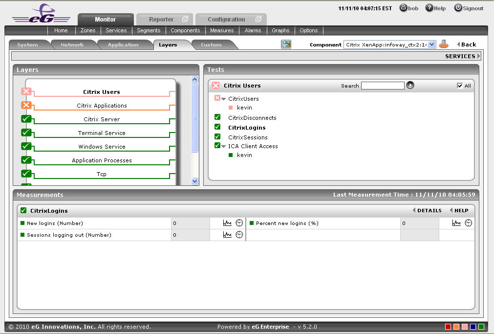
Figure 5 : The page that appears when the dial/digital graph in the Overview dashboard of the Citrix Virtual Apps Application is clicked
-
If your eG license enables the Configuration Management capability, then, an Application Configuration section will appear here providing the basic configuration of the application. You can configure the type of configuration data that is to be displayed in this section by following the steps below:
- Click on the icon at the top of the Application Dashboard. In the Dashboard Settings window that appears, select Application from the Module list, and Overview from the Sub-System list.
- To add more configuration information to this section, first, pick the Application Configuration option from the Add/Delete Measures for list. Upon selection of this option, all the configuration measures that pre-exist in the Configuration Management section will appear in the Existing Value(s) list.
- Next, select the config Test that reports the said measure, pick the measure of interest from the Measures list, provide a Display name for the measure, and click the Add button to add the chosen measure to the Existing Value(s) list.
- If you want to delete one/more measures from this section, then, as soon as you choose the Application Configuration option from the Add/Delete Measures for list, pick any of the displayed measures from the Existing Value(s) list, and click the Delete button.
- Finally, click the Update button to register the changes.
- Click on the
-
Next to this section, you will find a pre-configured list of Key Performance Indicators of the Citrix Virtual Apps application. Besides indicating the current state of and current value reported by a default collection of critical metrics, this section also reveals ‘miniature’ graphs of each metric, so that you can instantly study how that measure has behaved during the last 1 hour (by default) and thus determine whether the change in state of the measure was triggered by a sudden dip in performance or a consistent one. Clicking on a measure here will lead you to Figure 6, which displays the layer and test that reports the measure.

-
You can, if required, override the default measure list in the Key Performance Indicators section by adding more critical measures to the list or by removing one/more existing ones from the list. For this, do the following:
- Click on the icon at the top of the Application Dashboard. In the Dashboard Settings window that appears, select Application from the Module list, and Overview from the Sub-System list.
- To add more metrics to the Key Performance Indicators section, first, pick the Performance Indicator option from the Add/Delete Measures for list. Upon selection of this option, all the measures that pre-exist in the Key Performance Indicators section will appear in the Existing Value(s) list.
- Next, select the Test that reports the said measure, pick the measure of interest from the Measures list, provide a Display name for the measure, and click the Add button to add the chosen measure to the Existing Value(s) list.
- If you want to delete one/more measures from this section, then, as soon as you choose the Key Performance Indicators option from the Add/Delete Measures for list, pick any of the displayed measures from the Existing Value(s) list, and click the Delete button.
- Finally, click the Update button to register the changes.
- Click on the
-
Clicking on a ‘miniature’ graph that corresponds to a key performance indicator will enlarge the graph, so that you can view and analyze the measure behaviour more clearly, and can also alter the Timeline and dimension (3d/ 2d) of the graph, if need be.
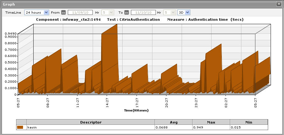
Figure 7 : Enlarging the Key Performance Indicator graph
-
This way, the first few sections of the At-A-Glance tab page helps you to understand the issues that are currently affecting the application health, and when they actually originated. However, to diagnose the root-cause of these issues, you would have to take help from the remaining sections of the At-A-Glance tab page. For instance, the Key Performance Indicators section may reveal a slowdown in the Citrix server. But, to determine whether this slowdown is owing to too many instances of an application executing on the server, or due to excessive resource usage by one/more applications/OS-level processes on the server, you need to focus on the Virtual Apps Application - Summary section and the Application Process - Summary section in the dashboard. The Virtual Apps Application - Summary section lists the applications that are currently executing on the Virtual Apps server, and for each application, reveals:
- The percent CPU utilization of that application;
- The percentage of memory that is utilized by that application;
- The number of instances of that application that are currently operational
- This section turns your attention to the most resource-hungry applications on the Citrix Virtual Apps server.
-
The Virtual Apps Sessions section provides you with a quick overview of the current session activity on the Citrix Virtual Apps server. Session overloads, idle sessions that are unnecessarily consuming resources, and hung server sessions causing slowdowns can be instantly detected using this section. Each measure displayed here is associated with a miniature graph. By clicking on the graph, you can view an enlarged graph of that particular session-related measure for a default period of 24 hours, and infer whether any abnormal activity has taken place during the default timeline. This default timeline can be altered according to the user’s desire.
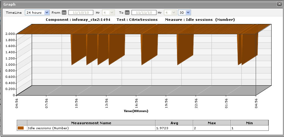
Figure 8 : Idle sessions graph that is enlarged from the Virtual Apps Sessions.
-
The Application Process - Summary section, on the other hand, traces the percent CPU usage and percent memory usage of each of the Citrix Virtual Apps processes that are currently executing on the target host, and thus leads you to the resource-intensive processes. By default, the process list provided by this section is sorted in the alphabetical order of the process names. If need be, you can change the sort order so that the processes are arranged in, say, the descending order of values displayed in the Instances column - this column displays the number of instances of each process that is in execution currently. To achieve this, simply click on the column heading - Instances. Doing so tags the Instances label with a down arrow icon - this icon indicates that the process list is currently sorted in the descending order of the instance count. To change the sort order to ‘ascending’, all you need to do is just click again on the Instances label or the down arrow icon. Similarly, you can sort the process list based on any column available in the Application Process - Summary section.
-
While the At-A-Glance tab page reveals the current state of the Citrix Virtual Apps application and the overall resource usage of the application, to perform additional diagnosis on problem conditions highlighted by the At-A-Glance tab page and to accurately pinpoint their root-cause, you need to switch to the Details tab page by clicking on it. For instance, the At-A-Glance tab page may that the CPU usage of an application is very high, but to know which user is utilizing that application, you will have to use the Details tab page.
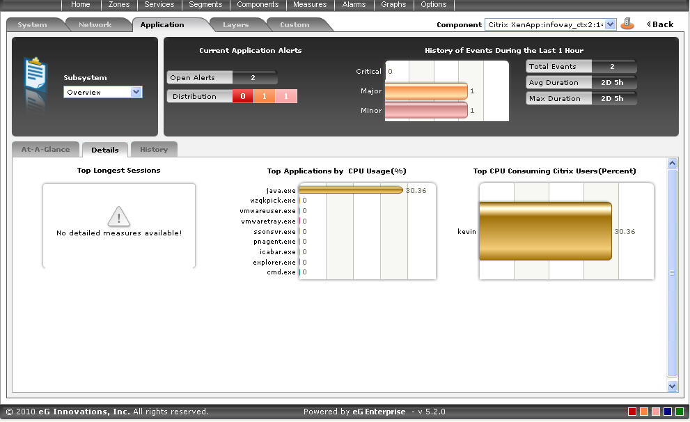
Figure 9 : The Details tab page of the Application Overview Dashboard
-
The Details tab page comprises of a default set of comparison bar graphs using which you can accurately determine the following:
- What are the longest sessions on the Citrix server?
- What are the resource-intensive applications on the Citrix server?
- Which user is utilizing the maximum CPU resources on the server?
-
If required, you can configure the Details tab page to include comparison graphs for more measures, or can even remove one/more existing graphs by removing the corresponding measures. To achieve this, do the following:
- Click on the icon at the top of the Application Dashboard. In the Dashboard Settings window that appears, select Application from the Module list, and Overview from the Sub-System list.
- To add measures for comparison graphs, first, pick the Comparison Graph option from the Add/Delete Measures for list. Upon selection of this option, the pre-configured measures for comparison graphs will appear in the Existing Value(s) list.
-
Next, select the Test that reports the said measure, pick the measure of interest from the Measures list, provide a Display name for the measure, and click the Add button to add the chosen measure to the Existing Value(s) list.
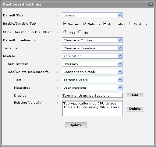
Figure 10 : Configuring measures for the dial graph
- If you want to delete one/more measures for which comparison graphs pre-exist in the details tab page, then, as soon as you choose the Comparison Graph option from the Add/Delete Measures for list, pick any of the displayed measures from the Existing Value(s) list, and click the Delete button.
- Finally, click the Update button to register the changes.
Note:
Only users with Admin or Supermonitor privileges can enable/disable the system, network, and application dashboards, or can customize the contents of such dashboards using the Dashboard Settings window. Therefore, whenever a user without Admin or Supermonitor privileges logs into the monitoring console, the
button will not appear. - Click on the
-
By default, the comparison bar graphs list the top-10 applications and users only. To view the complete list of applications and users, simply click on the corresponding graph in Figure 9. This enlarges the graph as depicted by Figure 11.
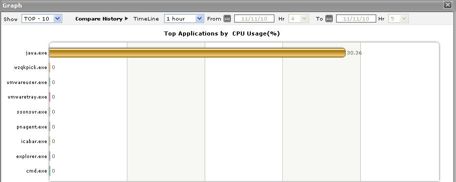
Figure 11 : The expanded top-n graph in the Details tab page of the Application Overview Dashboard
- Though the enlarged graph lists all the applications or users (as the case may be) by default, you can customize the enlarged graph to display the details of only a few of the best/worst-performing users and applications by picking a top-n or last-n option from the Show list in Figure 11.
- Another default aspect of the enlarged graph is that it pertains to the current period only. Sometimes however, you might want to know what occurred during a point of time in the past; for instance, while trying to understand the reason behind a sudden spike in CPU usage on a particular day last week, you might want to first determine which application is guilty of abnormal CPU consumption on the same day. To figure this out, the enlarged graph allows you to compare the historical performance of applications or users. For this purpose, click on the Compare History link in Figure 1.12 and select the TimeLine of your choice.
- For detailed time-of-day / trend analysis of the historical performance of a Citrix Virtual Apps application, use the History tab page. By default, this tab page (see Figure 12) provides time-of-day graphs of critical measures extracted from the target Citrix Virtual Apps application, using which you can understand how performance has varied during the default period of 24 hours. In the event of a problem, these graphs will help you determine whether the problem occurred suddenly or grew with time. To alter the timeline of all the graphs simultaneously, click on the Timeline link at the right, top corner of the History tab page of Figure 12.
-
You can even override the default timeline (of 24 hours) of the measure graphs, by following the steps below:
- Click on the icon at the top of the Application Dashboard.
- In the Dashboard Settings window that appears, select History Graph from the Default Timeline for list.
- Then, choose a Timeline for the graph.
- Finally, click the Update button.
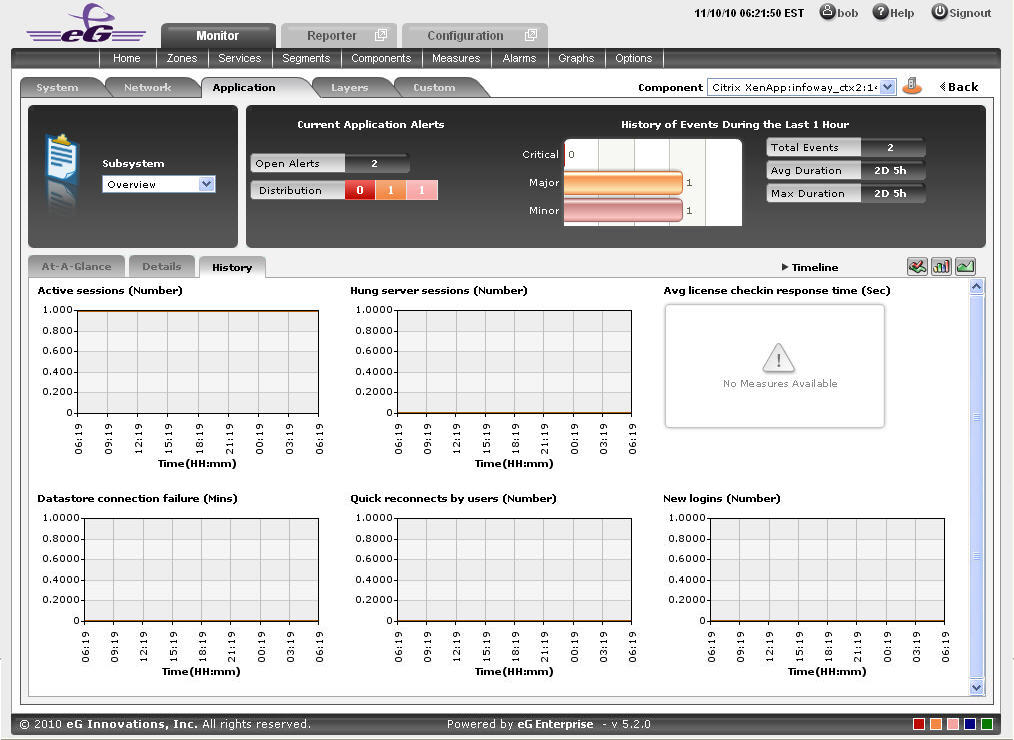
Figure 12 : Time-of-day measure graphs displayed in the History tab page of the Application Overview Dashboard
- Click on the
-
You can click on any of the graphs to enlarge it, and can change the Timeline of that graph in the enlarged mode.
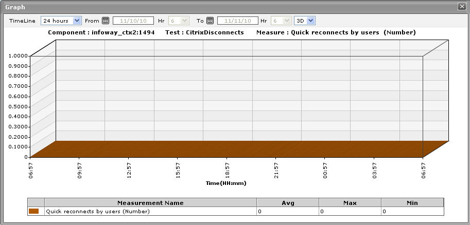
Figure 13 : An enlarged measure graph of a Citrix Virtual Apps Application
- In case of tests that support descriptors, the enlarged graph will, by default, plot the values for the Top-10 descriptors alone. To configure the graph to plot the values of more or less number of descriptors, select a different top-n / last-n option from the Show list in .
-
If you want to quickly perform service level audits on the Citrix Virtual Apps server, then summary graphs may be more appropriate than the default measure graphs. For instance, a summary graph might come in handy if you want to determine the percentage of time during the last 24 hours the Citrix Virtual Apps server was available. Using such a graph, you can determine whether the availability levels guaranteed by the Citrix Virtual Apps server were met or not, and if not, how frequently did the server falter in this regard. To invoke such summary graphs, click on the
 icon at the right, top corner of the History tab page. Figure 14 will then appear.
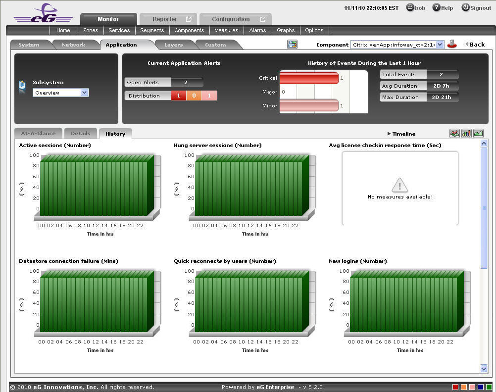
Figure 14 : Summary graphs displayed in the History tab page of the Application Overview Dashboard
-
You can alter the timeline of all the summary graphs at one shot by clicking the Timeline link at the right, top corner of the History tab page of Figure 14. You can even alter the default timeline (of 24 hours) for these graphs, by following the steps given below:
- Click on the icon at the top of the Application Dashboard.
- In the Dashboard Settings window that appears, select Summary Graph from the Default Timeline for list.
- Then, choose a Timeline for the graph.
- Finally, click the Update button.
- Click on the
-
To change the timeline of a particular graph, click on it; this will enlarge the graph as depicted by Figure 15. In the enlarged mode, you can alter the Timeline of the graph. Also, though the graph plots hourly summary values by default, you can pick a different Duration for the graph in the enlarged mode, so that daily/monthly performance summaries can be analyzed.
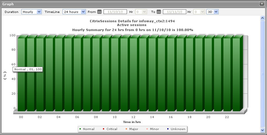
Figure 15 : An enlarged summary graph of the Citrix Virtual Apps Application
-
To perform effective analysis of the past trends in performance, and to accurately predict future measure behavior, click on the
 icon at the right, top corner of the History tab page. These trend graphs typically show how well and how badly a measure has performed every hour during the last 24 hours (by default). For instance, the Active Sessions trend graph will point you to when (during the last 24 hours) the number of active sessions to the Citrix server had peaked, and when it was very low. If the gap between the minimum and maximum values is marginal, you can conclude that the number of active sessions has been more or less constant during the designated period;this implies that the active session has neither increased nor decreased steeply during the said timeline. On the other hand, a wide gap between the maximum and minimum values is indicative erratic session load on the server, and may necessitate further investigation. By carefully studying the trend graph, you can even determine the points of time at which the session has behaved abnormally during the stated timeline, and this knowledge can greatly aid further diagnosis.
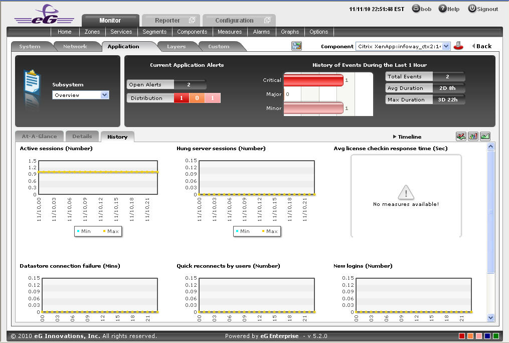
Figure 16 : Trend graphs displayed in the History tab page of the Application Overview Dashboard
- To analyze trends over a broader time scale, click on the Timeline link at the right, top corner of the History tab page, and edit the Timeline of the trend graphs. Clicking on any of the miniature graphs in this tab page will enlarge that graph, so that you can view the plotted data more clearly and even change its Timeline.
-
To override the default timeline (of 24 hours) of the trend graphs, do the following:
- Click on the icon at the top of the Application Dashboard.
- In the Dashboard Settings window that appears, select Trend Graph from the Default Timeline for list.
- Then, choose a Timeline for the graph.
- Finally, click the Update button.
- Click on the
- Besides the timeline, you can even change the Duration of the trend graph in the enlarged mode. By default, Hourly trends are plotted in the trend graph. By picking a different option from the Duration list, you can ensure that Daily or Monthly trends are plotted in the graph instead.
-
Also, by default, the trend graph only plots the minimum and maximum values registered by a measure. Accordingly, the Graph type is set to Min/Max in the enlarged mode. If need be, you can change the Graph type to Avg, so that the average trend values of a measure are plotted for the given Timeline. For instance, if an average trend graph is plotted for the Active Sessions measure, then the resulting graph will enable administrators to ascertain how many sessions, on an average, were active on the Citrix server during a specified timeline; such a graph can help you assess how session load has changed during a given timeline.
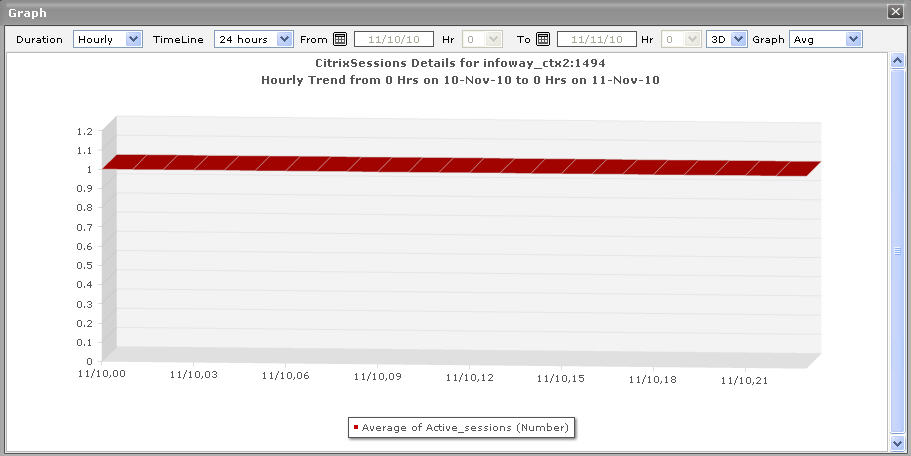
Figure 17 : Viewing a trend graph that plots average values of a measure for a Citrix Virtual Apps application
-
Likewise, you can also choose Sum as the Graph type to view a trend graph that plots the sum of the values of a chosen measure for a specified timeline. For instance, if you plot a 'sum of trends' graph for the measure that reports the number of active sessions of the application, then, the resulting graph will enable you to analyze, on an hourly/daily/monthly basis (depending upon the Duration chosen), how the level of session activity on the Citrix server has varied.
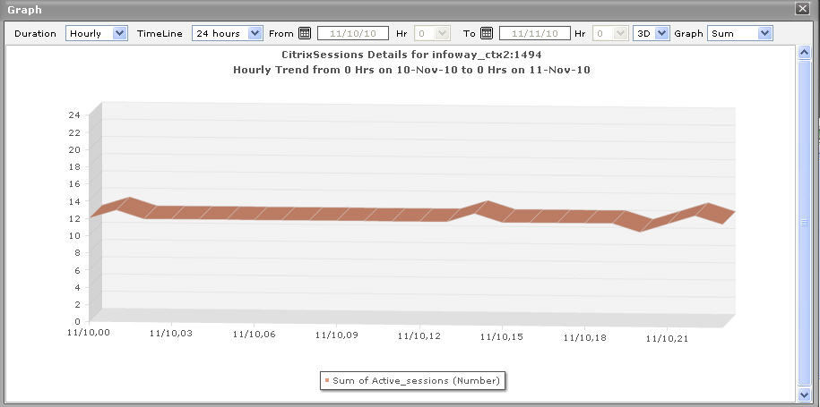
Figure 18 : A trend graph plotting sum of trends for a Citrix Virtual Apps application
Note:
In case of descriptor-based tests, the Summary and Trend graphs displayed in the History tab page typically plot the values for a single descriptor alone. To view the graph for another descriptor, pick a descriptor from the drop-down list made available above the corresponding summary/trend graph.
- At any point in time, you can switch to the measure graphs by clicking on the
 button.
 -
Typically, the History tab page displays measure, summary, and trend graphs for a default set of measures. If you want to add graphs for more measures to this tab page or remove one/more measures for which graphs pre-exist in this tab page, then, do the following:
- Click the button at the top of the dashboard.
-
The Dashboard Settings window then appears. From the Module list of Figure 19, pick Application, choose Overview as the Sub-System, and then, select History Graph from the Add/Delete Measures for list.
- The measures for which graphs pre-exist in the History tab page will be automatically displayed in the Existing Value(s) list. To delete a measure, and in effect, its corresponding graph as well, select the measure from the Existing Value(s) list, click the Delete button, and then click the Update button.
- To add a new graph, first, pick the Test that reports the measure for which a graph is to be generated.
- Next, select the Measure of interest.
- Provide a Display name for the measure. Then, click the Add button to add the measure to the Existing Values(s) list. Finally, click the Update button.
- This will add a new measure, summary, and trend graph for the chosen measure, to the History tab page.
Note:
Only users with Admin or Supermonitor privileges can enable/disable the system, network, and application dashboards, or can customize the contents of such dashboards using the Dashboard Settings window. Therefore, whenever a user without Admin or Supermonitor privileges logs into the monitoring console, the
button will not appear. - Click the
CitrixServer
To periodically assess the availability of a Citrix server, quickly measure the load-handling capacity of the server, and promptly detect aberrations in the internal operations of the server, select the CitrixServer option from the Subsystem list.
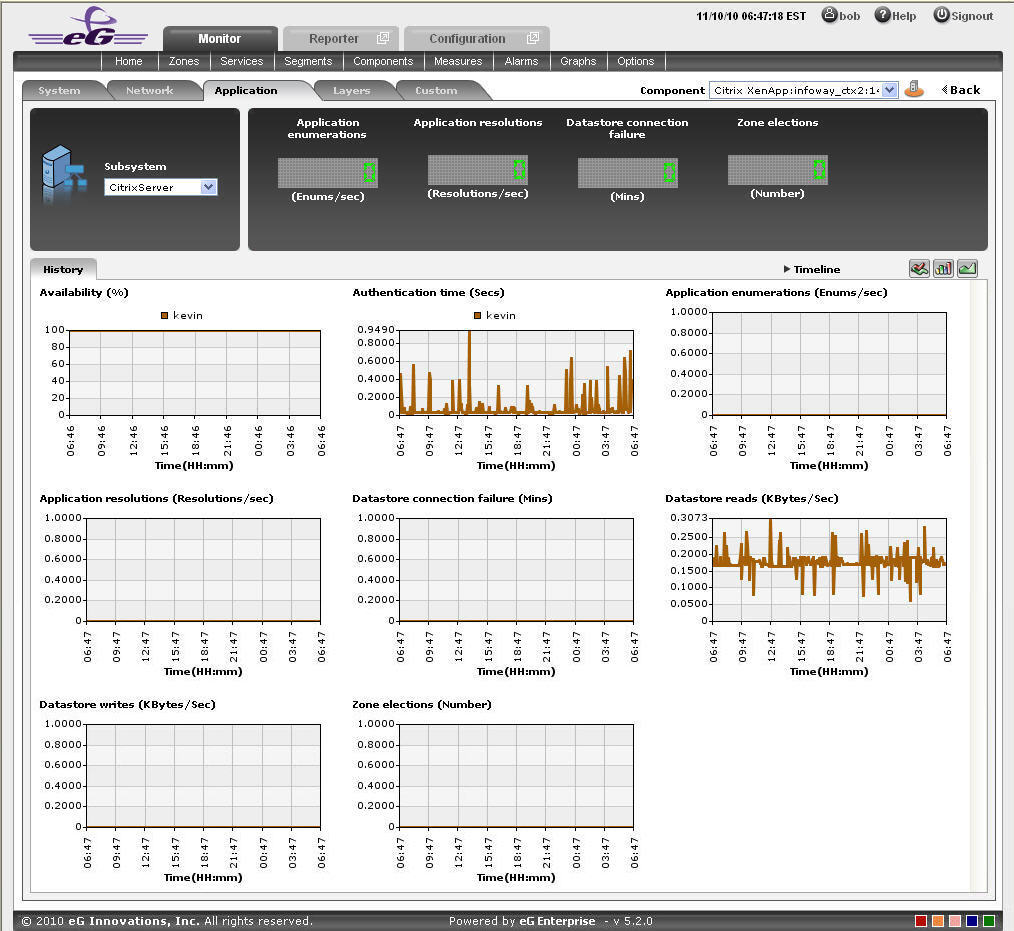
Figure 20 : The CitrixServer Subsystem
The contents of the CitrixServer subsystem that then appears (see Figure 20) are as follows:
- The dashboard begins with digital displays that report the current values of pre-configured metrics; typically, critical server-related metrics can be configured for display here. Using these displays, you can quickly visualize the overall health of the server.
- The History tab page that follows the Digital display section offers measure graphs of pre-configured metrics, which help analyze the performance of the Citrix server over time. By quickly cross-correlating and time-correlating across these metrics, you can rapidly identify the root-cause of many performance issues.
-
By default, these historical graphs track the time-of-day variations in the performance of the Citrix server during the last 24 hours. You can override this default timeline by following the steps discussed below:
- Click on the icon at the top of the Application Dashboard.
- In the Dashboard Settings window that appears, select History Graph from the Default Timeline for list.
- Then, choose a Timeline for the graph.
- Finally, click the Update button.
- Click on the
-
To change the timeline of all the measure graphs at one shot, just click on the Timeline link at the right, top corner of the History tab page. To alter the timeline for a single graph, just click on that graph - this will enlarge the graph. You can change the Timeline of the graph in the enlarged mode.
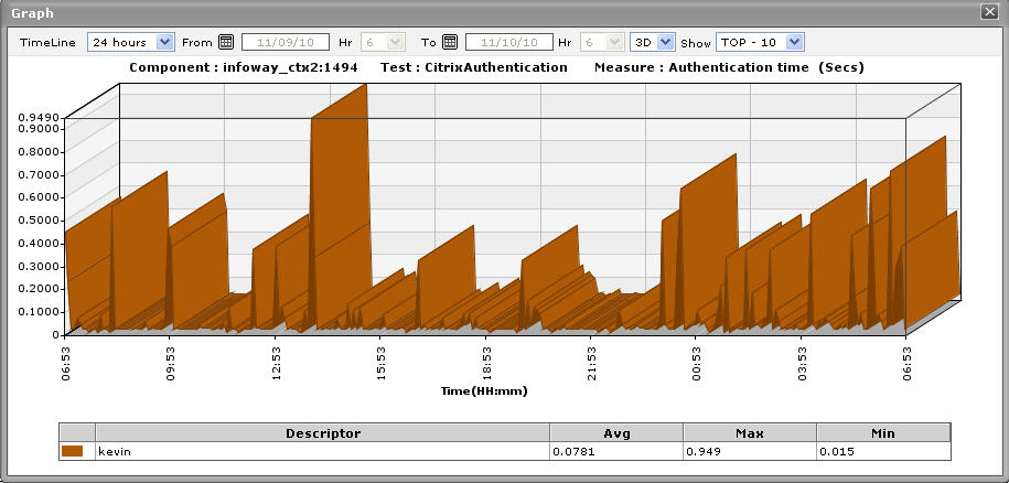
Figure 21 : An enlarged measure graph in the History tab page of the CitrixServer dashboard
- In case of graphs that plot values for multiple descriptors, you can also change the number of descriptors for which the graph should plot values. By default, the enlarged graph reveals the variations in the performance of the top-10 descriptors. If need be, you can pick a different top-n or last-n option from the Show list in the enlarged graph.
- Instead of these measure graphs, you can, if required, view summary graphs of the server-related measures in the History tab page. For this, click on the icon at the right, top corner of the History tab page. Summary graphs help you figure out the percentage of time during the last 24 hours (by default) the quality of service delivered by the Citrix Virtual Apps server was compromised. While monitoring mission-critical applications that are governed by rigid service level agreements, summary graphs will help you determine whether the guaranteed availability of the server was met or not, and if not, how often was the server not available.
-
You can override the default timeline (of 24 hours) of the summary graphs by following the steps discussed below:
- Click on the icon at the top of the Application Dashboard.
- In the Dashboard Settings window that appears, select Summary Graph from the Default Timeline for list.
- Then, choose a Timeline for the graph.
-
Finally, click the Update button.
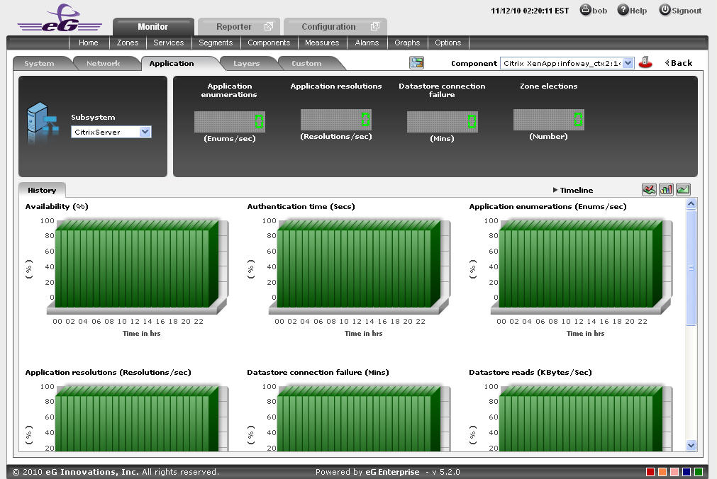
Figure 22 : Summary graphs displayed in the History tab page of the CitrixServer Dashboard
- Click on the
- Here again, you can change the Timeline of all the summary graphs by clicking on the Timeline link in , or click on a graph, enlarge it, and change its Timeline in the enlarged mode. Also, though the graph plots hourly summary values by default, you can pick a different Duration for the graph in the enlarged mode, so that daily/monthly performance summaries can be analyzed.
-
You can click on the
icon at the right, top corner of the History tab page to view trend graphs of the metrics. By default, these trend graphs plot the maximum and minimum health state values for every hour of the last 24 hours (by default). The default timeline of 24 hours can be overridden by following the steps discussed below:- Click on the icon at the top of the Application Dashboard.
- In the Dashboard Settings window that appears, select Trend Graph from the Default Timeline for list.
- Then, choose a Timeline for the graph.
- Finally, click the Update button.
- Click on the
-
Using these trend graphs, you can understand the variations in the overall health of the Citrix Virtual Apps server during the last 24 hours (by default), deduce the future health trends, and accordingly recommend changes to the application.
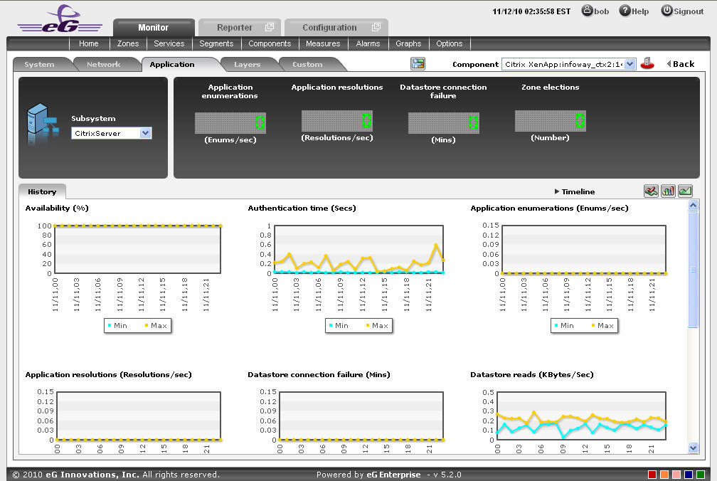
Figure 23 : Trend graphs displayed in the History tab page of the CitrixServer Dashboard
- Here again, you can change the Timeline of all the trend graphs by clicking on the Timeline link in , or click on a graph, enlarge it, and change its Timeline in the enlarged mode. Also, though the graph plots hourly trend values by default, you can pick a different Duration for the graph in the enlarged mode, so that daily/monthly performance trends can be analyzed. IThe timeline of this graph can be altered at runtime by
- Also, by default, the trend graph only plots the minimum and maximum values registered by a measure. Accordingly, the Graph type is set to Min/Max in the enlarged mode. If need be, you can change the Graph type to Avg, so that the average trend values of a measure are plotted for the given Timeline. Such a graph will enable you to assess whether the memory resources were utilized effectively or not, over time.
-
Likewise, you can also choose Sum as the Graph type to view a trend graph that plots the sum of the values of a chosen measure for a specified timeline. For instance, a 'sum of trends' Availability will enable you to analyze, on an hourly/daily/monthly basis (depending upon the Duration chosen), whether the server was available during the specified timeline.
Note:
In case of descriptor-based tests, the Summary and Trend graphs displayed in the History tab page typically plot the values for a single descriptor alone. To view the graph for another descriptor, pick a descriptor from the drop-down list made available above the corresponding summary/trend graph.
- At any point in time, you can switch to the measure graphs by clicking on the button.
-
Typically, the History tab page displays measure, summary, and trend graphs for a default set of measures. If you want to add graphs for more measures to this tab page or remove one/more measures for which graphs pre-exist in this tab page, then, do the following:
- Click the button at the top of the dashboard.
- The Dashboard Settings window then appears. From the Module list of Figure 19, pick Application, choose CitrixServer as the Sub-System, and then, select History Graph from the Add/Delete Measures for list.
- The measures for which graphs pre-exist in the History tab page will be automatically displayed in the Existing Value(s) list. To delete a measure, and in effect, its corresponding graph as well, select the measure from the Existing Value(s) list, click the Delete button, and then click the Update button.
- To add a new graph, first, pick the Test that reports the measure for which a graph is to be generated.
- Next, select the Measure of interest.
- Provide a Display name for the measure. Then, click the Add button to add the measure to the Existing Values(s) list. Finally, click the Update button.
-
This will add a new measure, summary, and trend graph for the chosen measure to the History tab page.
Note:
Only users with Admin or Supermonitor privileges can enable/disable the system, network, and application dashboards, or can customize the contents of such dashboards using the Dashboard Settings window. Therefore, whenever a user without Admin or Supermonitor privileges logs into the monitoring console, the
button will not appear.
- Click the
CitrixSessions
If you require an integrated dashboard for analyzing the present/past performance and problem information pertaining to the sessions that are executed on the Citrix Virtual Apps application, select the CitrixSessions option from the Subsystem list. This option helps you to efficiently and accurately diagnose the root-cause of the session-related abnormalities. Using this single, central dashboard, you can ascertain the following quickly and easily:
- Are all the sessions active on this particular application?
- How long has a particular session been in an idle state? What is the exact time period of the idle session?
- Are there any disconnected sessions?
- Has the application been unavailable during a particular session?
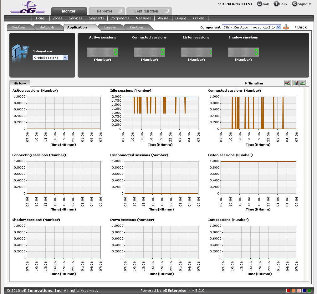
Figure 24 : The CitrixSessions Dashboard
The contents of this dashboard are discussed hereunder:
-
The Digital display section, displays the session activity in numbers. For instance the number of active session will be displayed in this section which can be viewed at a single glance. Clicking on a Digital display will lead you to Figure 24, which displays the layer and test that reports the measure.
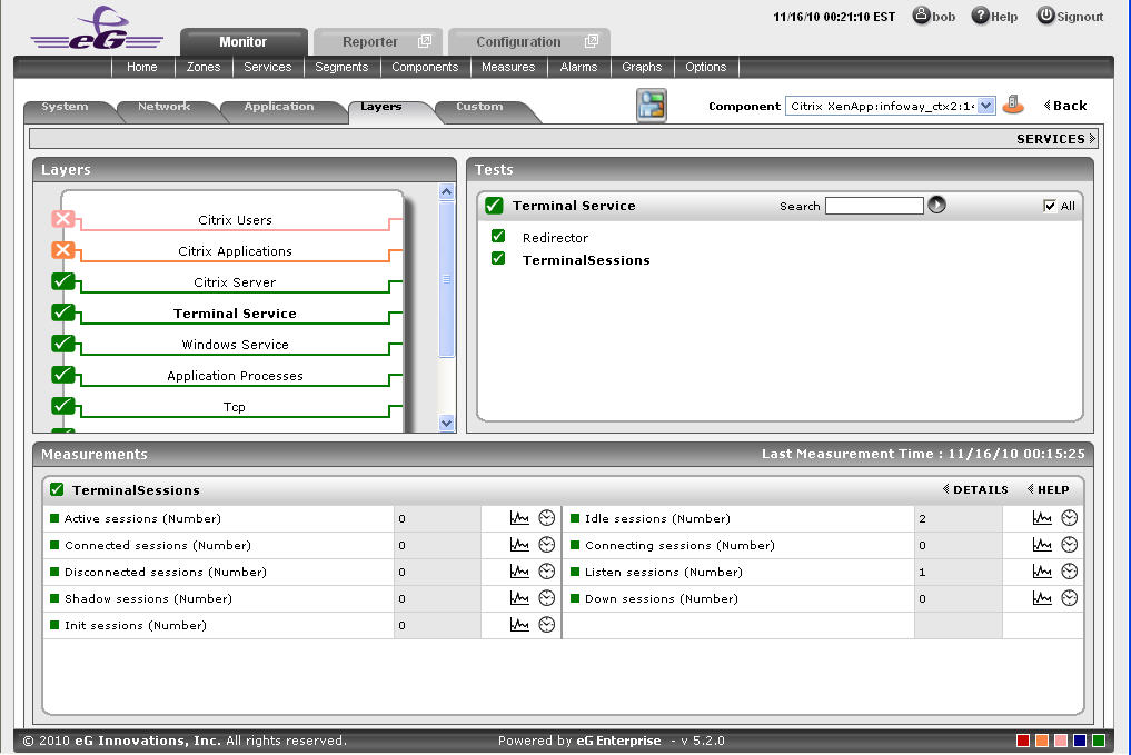
Figure 25 : Clicking on a digital display in the CitrixSessions dashboard
-
For historically analyzing the session activity of the Citrix Virtual Apps application, click on the History tab page. This tab page displays time-of-day graphs for all the thread-related measures for default duration of 24 hours. You can override this default timeline (of 24 hours) by following the steps below:
- Click on the icon at the top of the Application Dashboard.
- In the Dashboard Settings window that appears, select History Graph from the Default Timeline for list.
- Then, choose a Timeline for the graph.
- Finally, click the Update button.
- Click on the
-
Say, you suddenly notice that the session state has been idle for a while; in such a case, you can use these measure graphs to figure out when during the last 24 hours the session has been idle. If required, you can even look beyond the last 24 hours - i.e., you can find out whether the anomaly originated much earlier. For this, you just need to click on the graph of interest to you. This will enlarge the graph; in the enlarged mode, you can alter the graph Timeline, so that the performance of that measure can be analyzed over a broader time window. In this mode, you can even change the graph dimension from 3d to 2d, or vice-versa.
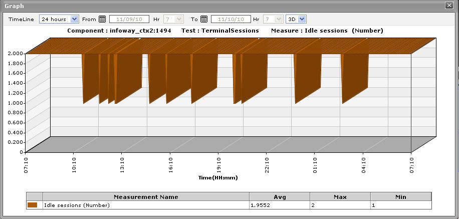
Figure 26 : An enlarged measure graph in the History tab page of the Citrix Session dashboard
- To view summary graphs on Idle sessions state instead of the default measure graphs, just click on the icon at the right, top corner of the History tab page. Figure 27 will then appear. The summary graphs of Figure 27 reveal the percentage of time during the last 24 hours (by default) the Citrix Virtual Apps application has been idle. These graphs will therefore be useful to figure out the type of issues (whether critical/major/minor) the application was experiencing. These graphs also help to determine whether the assured service levels were delivered or not.
-
The default duration (of 24 hours) of the summary graphs can be overridden by following the procedure discussed below:
- Click on the icon at the top of the Application Dashboard.
- In the Dashboard Settings window that appears, select Summary Graph from the Default Timeline for list.
- Then, choose a Timeline for the graph.
- Finally, click the Update button.
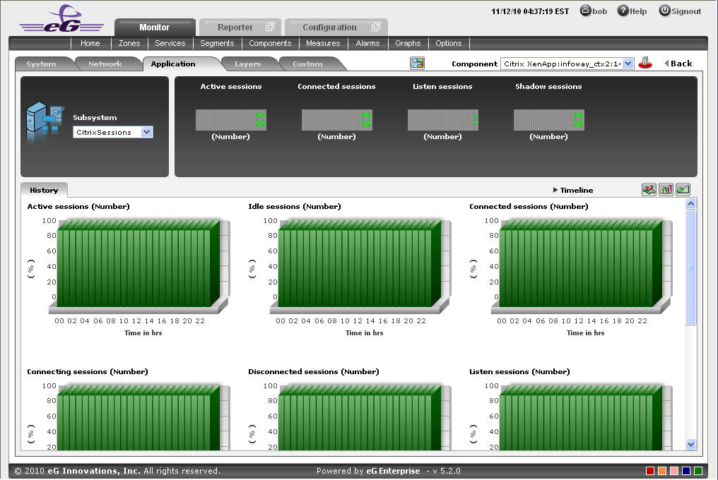
Figure 27 : Summary graphs displayed in the History tab page of the CitrixSessions Dashboard
- Click on the
- Use the Timeline link at the right, top corner of the tab page to change the timeline of all the summary graphs at one shot. For altering the timeline of a single graph, click on it; this will enlarge the graph. In the enlarged mode, you can change the Timeline of the summary graph and modify the dimension (3D/2D) of the graph. Also, by default, hourly summaries are plotted in the summary graph; you can configure these graphs to plot daily/monthly summaries instead by picking the relevant option from the Duration list in the enlarged mode.
- If you want to view the past trends of various sessions, click on the icon at the right, top corner of the History tab page. Figure 28 will then appear. Using the trend graphs displayed in Figure 28, you can better assess the current sessions of your application and can accordingly plan its future availability. By default, these trend graphs plot the maximum and minimum values registered by every session related measure during every hour for the last 24 hours. From this data, you can clearly figure out when during the last 24 hours the application performance has peaked and when it has been below-normal.
-
The default duration (of 24 hours) of the trend graphs can be overridden by following the procedure discussed below:
- Click on the icon at the top of the Application Dashboard.
- In the Dashboard Settings window that appears, select Trend Graph from the Default Timeline for list.
- Then, choose a Timeline for the graph.
- Finally, click the Update button.
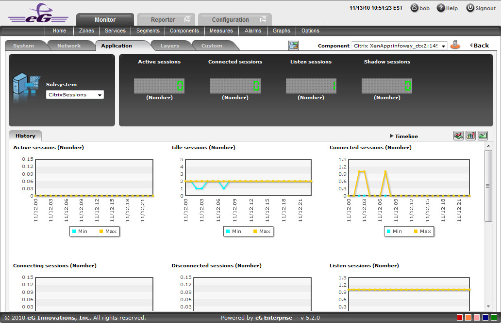
Figure 28 : Trend graphs displayed in the History tab page of the CitrixSessions Dashboard
- Click on the
-
Use the Timeline link at the right, top corner of the tab page to change the timeline of all the trend graphs at one shot. For altering the timeline of a single graph, click on it; this will enlarge the graph. In the enlarged mode, you can change the Timeline of the trend graph and modify the dimension (3D/2D) of the graph. Also, by default, hourly trends are plotted in the trend graph; you can configure these graphs to plot daily/monthly trend values instead by picking the relevant option from the Duration list in the enlarged mode. Moreover, by default, the trend graphs plot only the minimum and maximum values registered by a measure during the specified timeline - this graph will enable you to isolate those times at which performance of that measure had peaked and the times it had fared poorly. For instance, using the default trend graph for the Idle sessions measure, you can clearly identify when too many sessions were idle and when the number of Idle sessions were minimum. If need be, you can select the Avg option from the Graph type list in the enlarged mode to make sure that the trend graph plots the average trend values for the specified timeline - in the case of the above example, such a graph will help you understand how the number of Idle sessions has varied during the set timeline. Alternatively, you can select the Sum option from the Graph type list to have the trend graph plot the sum of trends for the specified timeline.
Note:
In case of descriptor-based tests, the Summary and Trend graphs displayed in the History tab page typically plot the values for a single descriptor alone. To view the graph for another descriptor, pick a descriptor from the drop-down list made available above the corresponding summary/trend graph.
- At any point in time, you can switch to the measure graphs by clicking on the button.
-
Typically, the History tab page displays measure, summary, and trend graphs for a default set of measures. If you want to add graphs for more measures to this tab page or remove one/more measures for which graphs pre-exist in this tab page, then, do the following:
- Click the button at the top of the dashboard.
- The Dashboard Settings window then appears. From the Module list of Figure 19, pick Application, choose CitrixSessions as the Sub-System, and then, select History Graph from the Add/Delete Measures for list.
- The measures for which graphs pre-exist in the History tab page will be automatically displayed in the Existing Value(s) list. To delete a measure, and in effect, its corresponding graph as well, select the measure from the Existing Value(s) list, click the Delete button, and then click the Update button.
- To add a new graph, first, pick the Test that reports the measure for which a graph is to be generated.
- Next, select the Measure of interest.
- Provide a Display name for the measure. Then, click the Add button to add the measure to the Existing Values(s) list. Finally, click the Update button.
-
This will add a new measure, summary, and trend graph for the chosen measure to the History tab page.
Note:
Only users with Admin or Supermonitor privileges can enable/disable the system, network, and application dashboards, or can customize the contents of such dashboards using the Dashboard Settings window. Therefore, whenever a user without Admin or Supermonitor privileges logs into the monitoring console, the
button will not appear.
- Click the
CitrixApplications
Select the CitrixApplications option from the Subsystem list to know how efficiently the applications are used by the Citrix Virtual Apps. Upon selection of this Subsystem Figure 29 will appear.
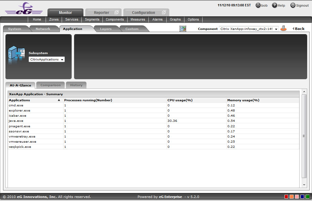
Figure 29 : The CitrixApplications Dashboard
The contents of this dashboard are as follows:
- The At-A-Glance tab page (see ) contains a Virtual Apps Application-Summary section which provides an insight view of the Applications that are available for the Citrix Virtual Apps. The Applications can either be sorted in alphabetical order or can be sorted according to their current health status such as Processes running, CPU Usage and Memory usage.
-
As shown in , the Comparison tab page that follows the At-A-Glance tab page provides a series of top-10 charts, using which you can quickly isolate those Applications that are leading the lot in the following default performance areas: Instances, amount of CPU used, amount of memory used. This default list of performance areas (i.e., measures) for top-n chart generation can be overridden by following the steps discussed below:
- Click on the icon at the top of the Application Dashboard. In the Dashboard Settings window that appears, select Application from the Module list, and CitrixApplications from the Sub-System list.
- To add new measures for which top-n graphs are to be displayed in the Comparison tab page, first, pick the Comparison Graph option from the Add/Delete Measures for list. Upon selection of this option, the pre-configured measures for comparison graphs will appear in the Existing Value(s) list.
- Next, select the Test that reports the said measure, pick the measure of interest from the Measures list, provide a Display name for the measure, and click the Add button to add the chosen measure to the Existing Value(s) list.
- If you want to delete one/more measures for which comparison graphs pre-exist in the Comparison tab page, then, as soon as you choose the Comparison Graph option from the Add/Delete Measures for list, pick any of the displayed measures from the Existing Value(s) list, and click the Delete button.
- Finally, click the Update button to register the changes.
Note:
Only users with Admin or Supermonitor privileges can enable/disable the system, network, and application dashboards, or can customize the contents of such dashboards using the Dashboard Settings window. Therefore, whenever a user without Admin or Supermonitor privileges logs into the monitoring console, the
button will not appear. 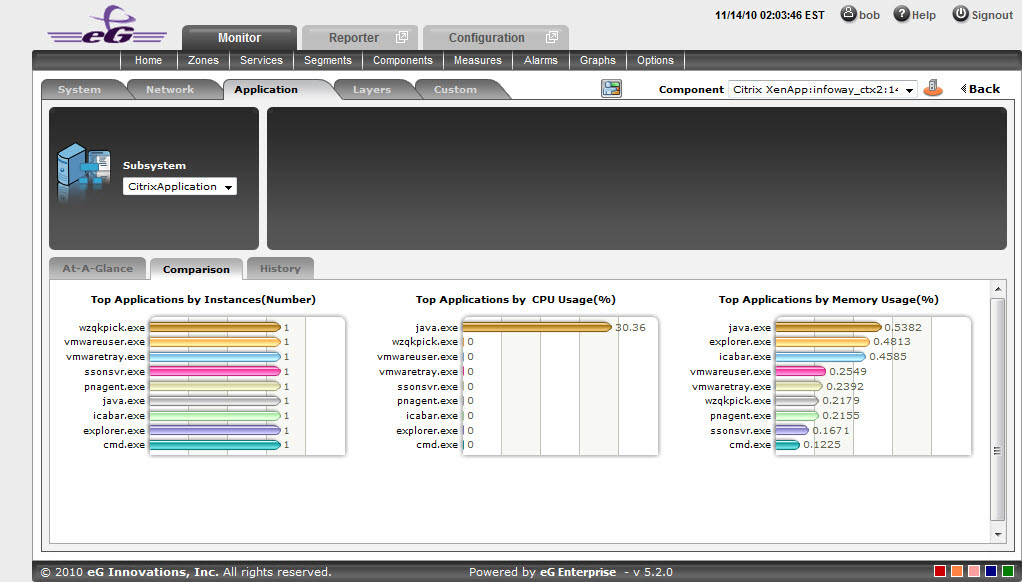
Figure 30 : The Comparison tab page of a CitrixApplication dashboard
- Click on the
- If an application slowdown can be attributed to the lack of adequate CPU or Memory resources, then these top-10 bar charts can aid you in swiftly nailing the exact application that could be serving as the source of this CPU or memory contention.
- Typically, these bar charts depict the current usage data. Sometimes however, you might want to detect which Application was over-utilizing any resource at some point of time in the past. In such a case, you will have to click on the corresponding graph in the Comparison tab page to enlarge it. In the enlarged mode, you can click on the Compare History link, so that you can alter the graph Timeline, and view which application was being fully utilized during the specified timeline.
-
The History tab page in Figure 31 below, by default, provides a series of measure graphs that reveal how the Application has been performing over the default duration of the last 24 hours. The CPU and Memory utilization as well as the number of Processes that are running currently can be identified. The default duration of 24 hours can be overridden using the procedure discussed below:
- Click on the icon at the top of the Application Dashboard.
- In the Dashboard Settings window that appears, select History Graph from the Default Timeline for list.
- Then, choose a Timeline for the graph.
- Finally, click the Update button.
Note:
Only users with Admin or Supermonitor privileges can enable/disable the system, network, and application dashboards, or can customize the contents of such dashboards using the Dashboard Settings window. Therefore, whenever a user without Admin or Supermonitor privileges logs into the monitoring console, the
button will not appear. 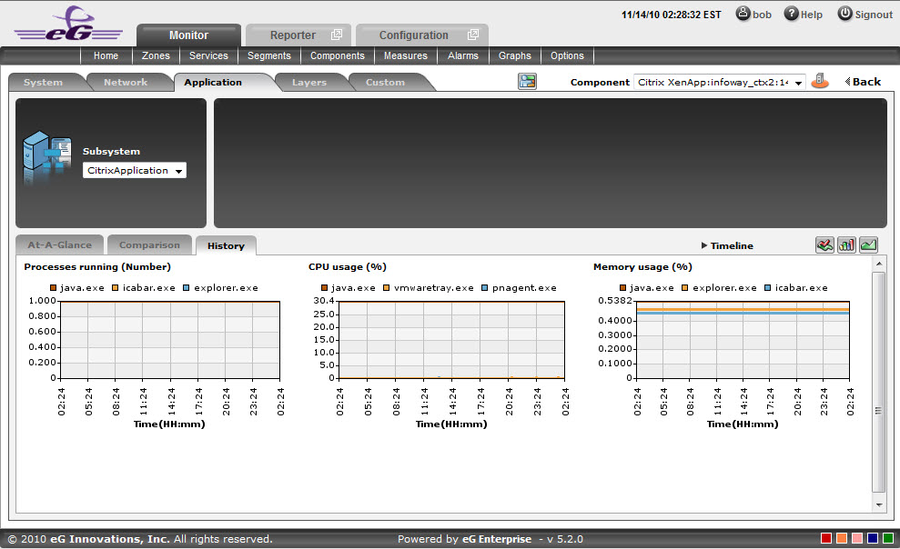
Figure 31 : The History tab page of CitrixApplication dashboard
- Click on the
-
If need be, you can even alter the timeline of all these measure graphs so that you can analyze performance across days and weeks; for this, simply click the Timeline link at the right, top corner of the History tab page and change the timeline for the graphs using the calendar that pops out. To change the timeline of a single graph alone, simply click on that graph to enlarge it, and then modify the Timeline of the graph in the enlarged mode. In the enlarged mode, you can even change the dimension of the measure graph (3d / 2d). Figure 32 shows an enlarged measure graph.
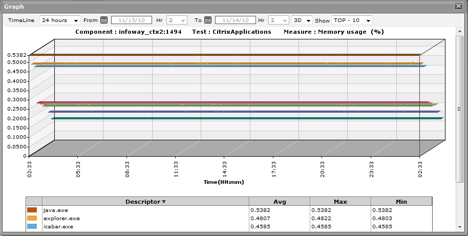
Figure 32 : An enlarged measure graph in the History tab page of the CitrixApplications dashboard
- To determine the service level achievements / slippages of the Citrix Application, you need to view summary graphs of the measures and not the default measure graphs. For this, just click on the icon at the right, top corner of the History tab page.
- Besides revealing the efficiency of your administrative staff in recognizing bottlenecks and mitigating them, these summary graphs also indicate whether the CitrixApplication has been able to maintain the assured performance levels during the default duration of 24 hours.
-
To override this default duration, follow the steps below:
- Click on the icon at the top of the Application Dashboard.
- In the Dashboard Settings window that appears, select Summary Graph from the Default Timeline for list.
- Then, choose a Timeline for the graph.
- Finally, click the Update button.
- Click on the
- In case of the summary graphs too, you can change the Timeline of all graphs by clicking on the Timeline link at the right, top corner of the History tab page. To alter the timeline of a single graph, here again, you will have to click on that graph, enlarge it, and modify the timeline. Also, by default, hourly summaries are plotted in the summary graph; you can configure these graphs to plot daily/monthly summaries instead by picking the relevant option from the Duration list in the enlarged mode.
- To analyze past trends in the loading/unloading of classes, click on the icon at the right, top corner of the History tab page.
- These trend graphs, by default, plot the minimum and maximum values that every measure registered during each hour of the last 24 hours (by default). Using such graphs, you can accurately point to the time during which the performance of the Application was at peak, and the times at which there was a lull. By carefully observing these past trends, you can effectively analyze the performance of the application, predict future performances accordingly, and suggest measures to enhance the efficiency. Here again, you can change the timeline of all graphs using the Timeline link in Figure 35, or just a particular graph by clicking on it and enlarging it.
-
For changing the default duration (of 24 hours) of the trend graphs, do the following:
- Click on the icon at the top of the Application Dashboard.
- In the Dashboard Settings window that appears, select Trend Graph from the Default Timeline for list.
- Then, choose a Timeline for the graph.
- Finally, click the Update button.
- Click on the
-
In addition, when a trend graph is enlarged, it is not just the Timeline that you can modify. The Duration of the graph can also be altered. By default, trend graphs reveal only the hourly trends in performance. By picking the relevant option from the Duration list, you can ensure that the trend graph in question plots daily/monthly trend values instead. Also, in the enlarged mode, the Graph type can also be modified. Since the default Graph type is Min/Max, the trend graph, by default, reveals the minimum and maximum values registered by a measure. If need be, you can select the Avg or Sum option from the Graph type list to plot average trend values of a measure or sum of trends (as the case may be) in the graph.
Note:
In case of descriptor-based tests, the Summary and Trend graphs displayed in the History tab page typically plot the values for a single descriptor alone. To view the graph for another descriptor, pick a descriptor from the drop-down list made available above the corresponding summary/trend graph.
- At any point in time, you can switch to the measure graphs by clicking on the button.
-
Typically, the History tab page displays measure, summary, and trend graphs for a default set of measures. If you want to add graphs for more measures to this tab page or remove one/more measures for which graphs pre-exist in this tab page, then, do the following:
- Click the button at the top of the dashboard.
- The Dashboard Settings window then appears. From the Module list of Figure 19, pick Application, choose CitrixApplicaations as the Sub-System, and then, select History Graph from the Add/Delete Measures for list.
- The measures for which graphs pre-exist in the History tab page will be automatically displayed in the Existing Value(s) list. To delete a measure, and in effect, its corresponding graph as well, select the measure from the Existing Value(s) list, click the Delete button, and then click the Update button.
- To add a new graph, first, pick the Test that reports the measure for which a graph is to be generated.
- Next, select the Measure of interest.
- Provide a Display name for the measure. Then, click the Add button to add the measure to the Existing Values(s) list. Finally, click the Update button.
- This will add a new measure, summary, and trend graph for the chosen measure to the History tab page.
Note:
Only users with Admin or Supermonitor privileges can enable/disable the system, network, and application dashboards, or can customize the contents of such dashboards using the Dashboard Settings window. Therefore, whenever a user without Admin or Supermonitor privileges logs into the monitoring console, the
button will not appear. - Click the
CitrixUsers
Select the CitrixUsers option from the Subsystem list to know how many Users are currently accessing the Citrix Virtual Apps application. Upon selection of this Subsystem Figure 33 will appear.
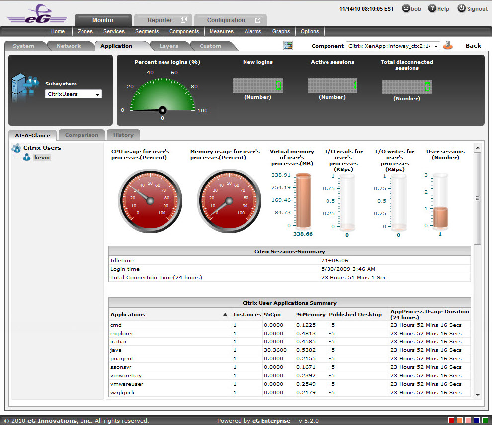
Figure 33 : The CitrixUsers Dashboard
The contents of this dashboard are as follows:
- A dial chart for Percent new logins and digital displays for various user sessions provide an insight view of the user login information at a single glance Clicking on a dial chart / digital display will lead you to the corresponding layer and test that reports the measure.
- The At-A-Glance tab page (see Figure 33) contains a Citrix Users left panel which lists out the number of users who are currently active for this session. A context-sensitive right panel provides an insight view of the user information that is available for the Citrix Virtual Apps. The user’s processes information can be viewed at a single glance with the help of dial charts and cylindrical charts.
- The Citrix Sessions – Summary (see Figure 33) in the right panel indicates the user session information such as Login time, Idle Time and Total Connected Time, at a single glance.
-
The Citrix User Application Summary (see Figure 33) lists the number of Applications that are currently used by the user. The applications can be sorted either in alphabetical order or in accordance with the application specific information that is available next to each application name.
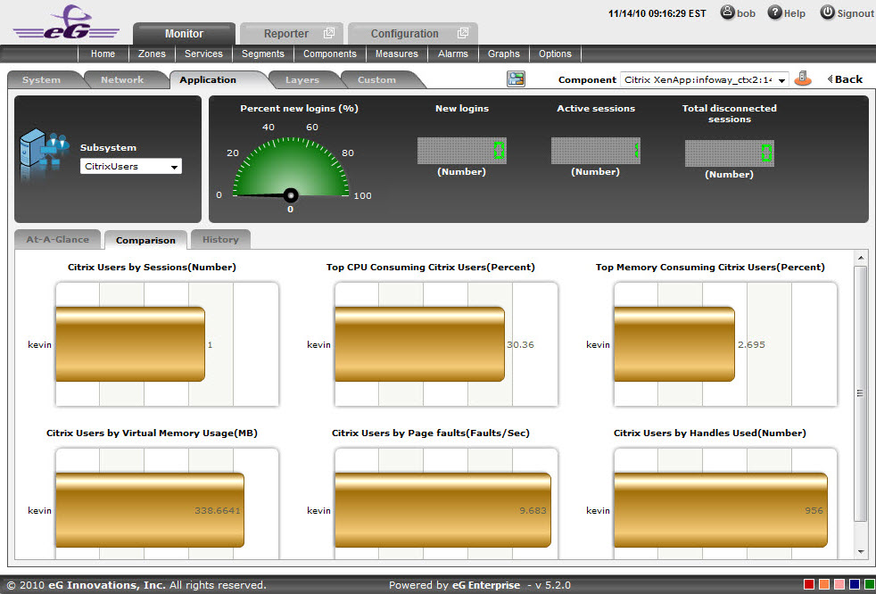
Figure 34 : The Comparison tab page of CitrixUsers dashboard
-
As shown in Figure 34, the Comparison tab page that follows the At-A-Glance tab page provides a series of top-10 charts, using which you can quickly isolate the Users who are currently active for this session. These graphs provide an insight view of various session related activities that are performed for each user login. This default list of performance areas (i.e., measures) for top-n chart generation can be overridden by following the steps discussed below:
- Click on the icon at the top of the Application Dashboard. In the Dashboard Settings window that appears, select Application from the Module list, and CitrixUsers from the Sub-System list.
- To add new measures for which top-n graphs are to be displayed in the Comparison tab page, first, pick the Comparison Graph option from the Add/Delete Measures for list. Upon selection of this option, the pre-configured measures for comparison graphs will appear in the Existing Value(s) list.
- Next, select the Test that reports the said measure, pick the measure of interest from the Measures list, provide a Display name for the measure, and click the Add button to add the chosen measure to the Existing Value(s) list.
- If you want to delete one/more measures for which comparison graphs pre-exist in the Comparison tab page, then, as soon as you choose the Comparison Graph option from the Add/Delete Measures for list, pick any of the displayed measures from the Existing Value(s) list, and click the Delete button.
-
Finally, click the Update button to register the changes.
Note:
Only users with Admin or Supermonitor privileges can enable/disable the system, network, and application dashboards, or can customize the contents of such dashboards using the Dashboard Settings window. Therefore, whenever a user without Admin or Supermonitor privileges logs into the monitoring console, the
button will not appear.
- Click on the
- If an application slowdown can be attributed to the lack of adequate resources, then these top-10 bar charts can aid you in swiftly nailing the exact resource location that could be serving as the source of this resource contention.
- Typically, these bar charts depict the current usage data. Sometimes however, you might want to detect which Application was over-utilizing the resources at some point of time in the past. In such a case, you will have to click on the corresponding graph in the Comparison tab page to enlarge it. In the enlarged mode, you can click on the Compare History link, so that you can alter the graph Timeline, and view which user was the leading memory consumer during the specified timeline.
-
The History tab page below, by default, provides a series of measure graphs that reveal how the Application has been performing over the default duration of the last 24 hours. The CPU and Memory utilization as well as the number of Processes that are running currently can be identified. The default duration of 24 hours can be overridden using the procedure discussed below:
- Click on the icon at the top of the Application Dashboard.
- In the Dashboard Settings window that appears, select History Graph from the Default Timeline for list.
- Then, choose a Timeline for the graph.
- Finally, click the Update button.
Note:
Only users with Admin or Supermonitor privileges can enable/disable the system, network, and application dashboards, or can customize the contents of such dashboards using the Dashboard Settings window. Therefore, whenever a user without Admin or Supermonitor privileges logs into the monitoring console, the
button will not appear. 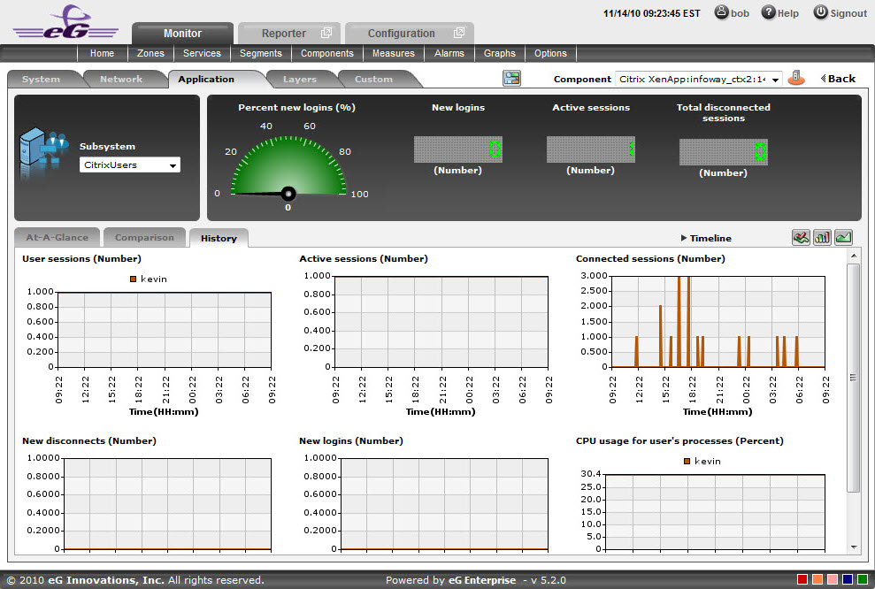
- Click on the
-
If need be, you can even alter the timeline of all these measure graphs so that you can analyze performance across days and weeks; for this, simply click the Timeline link at the right, top corner of the History tab page and change the timeline for the graphs using the calendar that pops out. To change the timeline of a single graph alone, simply click on that graph to enlarge it, and then modify the Timeline of the graph in the enlarged mode. In the enlarged mode, you can even change the dimension of the measure graph (3d / 2d).
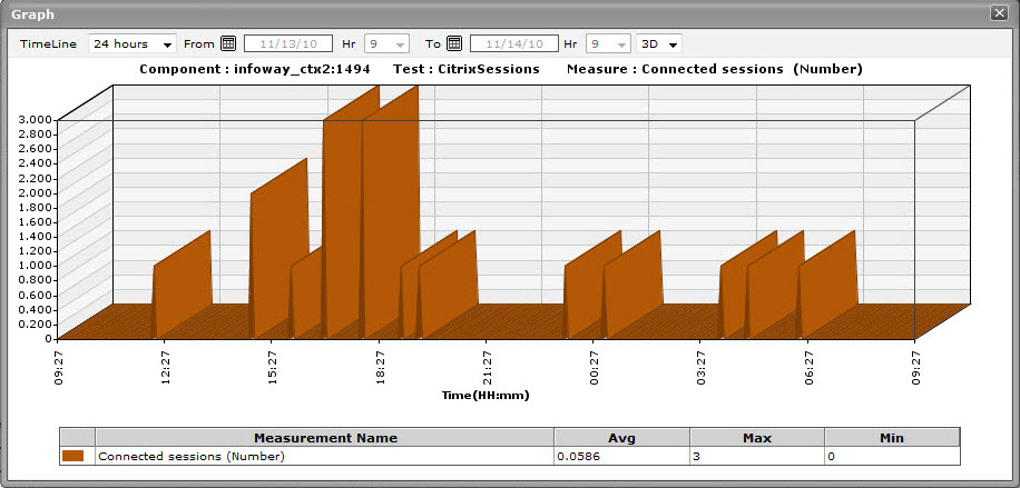
Figure 36 : An enlarged measure graph in the History tab page of the CitrixUsers dashboard
- To determine the service level achievements / slippages of the CitrixUsers, you need to view summary graphs of the measures and not the default measure graphs. For this, just click on the icon at the right, top corner of the History tab page.
- Besides revealing the efficiency of your administrative staff in recognizing bottlenecks and mitigating them, these summary graphs also indicate whether the CitrixUsers are able to acquire the assured performance levels during the default duration of 24 hours.
-
To override this default duration, follow the steps below:
- Click on the icon at the top of the Application Dashboard.
- In the Dashboard Settings window that appears, select Summary Graph from the Default Timeline for list.
- Then, choose a Timeline for the graph.
- Finally, click the Update button.
- Click on the
- In case of the summary graphs too, you can change the Timeline of all graphs by clicking on the Timeline link at the right, top corner of the History tab page. To alter the timeline of a single graph, here again, you will have to click on that graph, enlarge it, and modify the timeline. Also, by default, hourly summaries are plotted in the summary graph; you can configure these graphs to plot daily/monthly summaries instead by picking the relevant option from the Duration list in the enlarged mode.
- To analyze past trends in the loading/unloading of classes, click on the icon at the right, top corner of the History tab page.
- These trend graphs, by default, plot the minimum and maximum values that every measure registered during each hour of the last 24 hours (by default). Using such graphs, you can accurately point to the time windows in which the performance of the Application was at peak, and the times at which there was a lull. By carefully observing these past trends, you can effectively analyze the performance of the application, predict future performances accordingly, and suggest measures to enhance the efficiency. Here again, you can change the timeline of all graphs using the Timeline link in Figure 35, or just a particular graph by clicking on it and enlarging it.
-
For changing the default duration (of 24 hours) of the trend graphs, do the following:
- Click on the icon at the top of the Application Dashboard.
- In the Dashboard Settings window that appears, select Trend Graph from the Default Timeline for list.
- Then, choose a Timeline for the graph.
- Finally, click the Update button.
Note:
In case of descriptor-based tests, the Summary and Trend graphs displayed in the History tab page typically plot the values for a single descriptor alone. To view the graph for another descriptor, pick a descriptor from the drop-down list made available above the corresponding summary/trend graph.
- Click on the
- At any point in time, you can switch to the measure graphs by clicking on the button.
-
Typically, the History tab page displays measure, summary, and trend graphs for a default set of measures. If you want to add graphs for more measures to this tab page or remove one/more measures for which graphs pre-exist in this tab page, then, do the following:
- Click the button at the top of the dashboard.
- The Dashboard Settings window then appears. From the Module list of Figure 19, pick Application, choose CitrixUsers as the Sub-System, and then, select History Graph from the Add/Delete Measures for list.
- The measures for which graphs pre-exist in the History tab page will be automatically displayed in the Existing Value(s) list. To delete a measure, and in effect, its corresponding graph as well, select the measure from the Existing Value(s) list, click the Delete button, and then click the Update button.
- To add a new graph, first, pick the Test that reports the measure for which a graph is to be generated.
- Next, select the Measure of interest.
- Provide a Display name for the measure. Then, click the Add button to add the measure to the Existing Values(s) list. Finally, click the Update button.
- This will add a new measure, summary, and trend graph for the chosen measure to the History tab page.
- Click the
TerminalServices
To investigate issues relating to the terminal services of the Citrix Virtual Apps application, select TerminalServices as the Subsystem. Figure 37 will then appear.
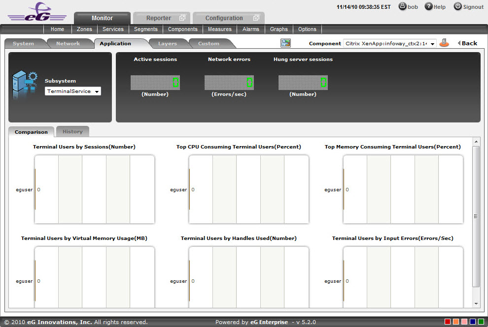
Figure 37 : The TerminalServices Dashboard
The contents of the TerminalServices dashboard are as follows:
-
The digital graphs section indicates the number of Active sessions, Network errors and Hung server sessions at a single glance. Clicking on a digital graph will lead you to the layer model page of the Citrix Virtual Apps Application; this page will display the exact layer-test combination (see Figure 38) that reports the measure represented by the digital graph.
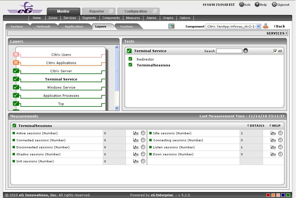
Figure 38 : The page that appears when the digital graph in the TerminalServices dashboard of the Citrix Virtual Apps Application is clicked
-
The Comparison tab page (see ) provides a series of graphs for the Terminal Users activity. These graphs provide an insight view of various session related activities that are performed for each Terminal User. This default list of performance areas (i.e., measures) for top-n chart generation can be overridden by following the steps discussed below:
- Click on the icon at the top of the Application Dashboard. In the Dashboard Settings window that appears, select Application from the Module list, and TerminalServices from the Sub-System list.
- To add new measures for which top-n graphs are to be displayed in the Comparison tab page, first, pick the Comparison Graph option from the Add/Delete Measures for list. Upon selection of this option, the pre-configured measures for comparison graphs will appear in the Existing Value(s) list.
- Next, select the Test that reports the said measure, pick the measure of interest from the Measures list, provide a Display name for the measure, and click the Add button to add the chosen measure to the Existing Value(s) list.
- If you want to delete one/more measures for which comparison graphs pre-exist in the Comparison tab page, then, as soon as you choose the Comparison Graph option from the Add/Delete Measures for list, pick any of the displayed measures from the Existing Value(s) list, and click the Delete button.
-
Finally, click the Update button to register the changes.
Note:
Only users with Admin or Supermonitor privileges can enable/disable the system, network, and application dashboards, or can customize the contents of such dashboards using the Dashboard Settings window. Therefore, whenever a user without Admin or Supermonitor privileges logs into the monitoring console, the
button will not appear.
- Click on the
- If an application slowdown can be attributed to the lack of adequate resources, then these top-10 bar charts can aid you in swiftly nailing the exact resource location that could be serving as the source of this resource contention.
- Typically, these bar charts depict the current usage data. Sometimes however, you might want to detect which Application was over-utilizing the resources at some point of time in the past. In such a case, you will have to click on the corresponding graph in the Comparison tab page to enlarge it. In the enlarged mode, you can click on the Compare History link, so that you can alter the graph Timeline, and view which memory pool was the leading memory consumer during the specified timeline.
-
The History tab page depicted below, by default, displays time-of-day graphs revealing the user’s processes statistics for a default period of 24 hours. If the eG agent reports about a particular session which is down, these graphs will help determine when exactly in the last 24 hours the anomaly has occurred. This default duration of 24 hours can be overridden using the following steps:
- Click on the icon at the top of the Application Dashboard.
- In the Dashboard Settings window that appears, select History Graph from the Default Timeline for list.
- Then, choose a Timeline for the graph.
-
Finally, click the Update button.
Note:
Only users with Admin or Supermonitor privileges can enable/disable the system, network, and application dashboards, or can customize the contents of such dashboards using the Dashboard Settings window. Therefore, whenever a user without Admin or Supermonitor privileges logs into the monitoring console, the
button will not appear. 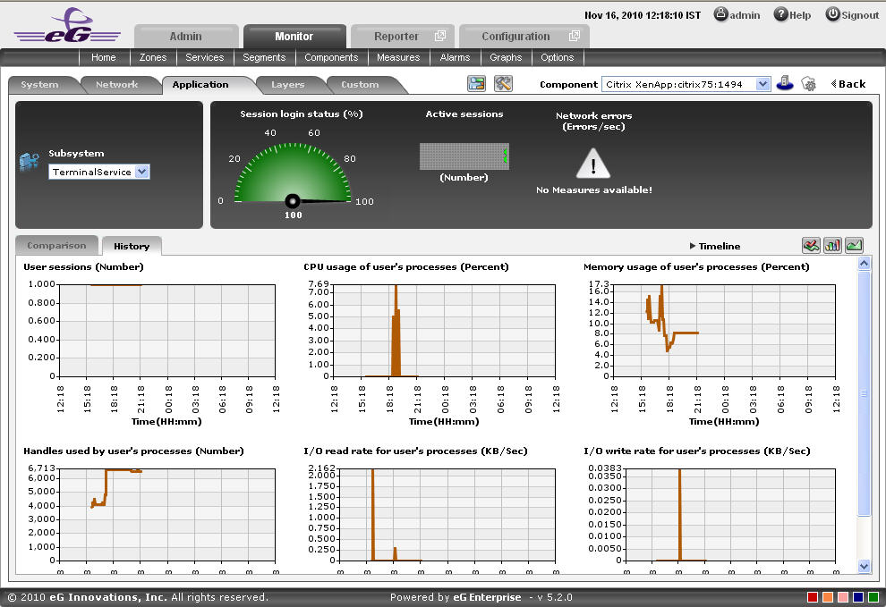
Figure 39 : The History tab page of a TerminalServices dashboard
- Click on the
-
A careful study of this graph over time periods longer than 24 hours, can reveal intermittent breaks (if any) in various measures of the user’s processes. To ensure that all graphs plot values for longer time periods, click on the Timeline link at the right, top corner of the History tab page, and then change the timeline using the calendar that pops out. To modify the timeline for a particular graph alone, click on the graph to enlarge it, and alter the timeline in the enlarged mode. Besides the timeline, you can even change the graph dimension (3d / 2d) in the enlarged mode. Figure 1.41 shows an enlarged graph of a measure that is represented in the History tab page.
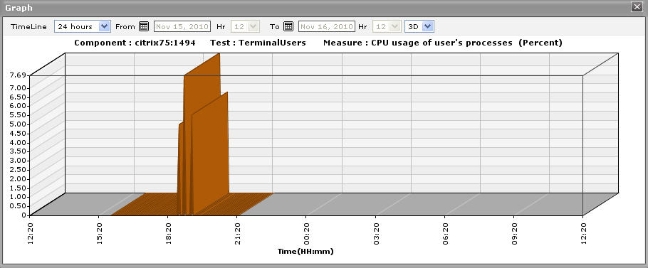
Figure 40 : The enlarged graph of a measure in the TerminalServices dashboard
- Sometimes, you might have to periodically determine the percentage of time for which certain critical Citrix Virtual Apps applications have been running, so that you know whether/not the application has been able to maintain the desired service levels. To run such checks, summary graphs of the user’s processes measures are useful. To view summary graphs in the History tab page, click on the icon at the right, top corner of the History tab page.
-
These summary graphs reveal the percentage of time during the last 24 hours (by default) the Citrix Virtual Apps has experienced issues related to the terminal service. To override this default timeline, do the following:
- Click on the icon at the top of the Application Dashboard.
- In the Dashboard Settings window that appears, select Summary Graph from the Default Timeline for list.
- Then, choose a Timeline for the graph.
- Finally, click the Update button.
- Click on the
- To perform the summary analysis over a broader time window, click on the Timeline link at the right, top corner of the History tab page and change the timeline; this will alter the timeline for all the graphs. To change the timeline of a particular graph alone, click on the graph to enlarge it, and then alter its timeline. Also, by default, hourly summaries are plotted in the summary graph; you can configure these graphs to plot daily/monthly summaries instead by picking the relevant option from the Duration list in the enlarged mode. Here again, the graph dimension (3d / 2d) can be altered.
- Similarly, you can analyze the TerminalServices trends by viewing trend graphs in the History tab page. For this, click on the icon at the right, top corner of the tab page.
-
These trend graphs, by default, plot the minimum and maximum values registered by every uptime-related measure during every hour for the last 24 hours. Using these graphs, you can ascertain when during the last 24 hours uptime was very high, and when it was low. The default duration of 24 hours can be overridden using the procedure discussed below:
- Click on the icon at the top of the Application Dashboard.
- In the Dashboard Settings window that appears, select Summary Graph from the Default Timeline for list.
- Then, choose a Timeline for the graph.
- Finally, click the Update button.
- Click on the
-
To perform trend analysis over a longer time span, click on the Timeline link at the right, top corner of the History tab page and change the timeline; this will alter the timeline for all the graphs. To change the timeline of a particular graph alone, click on the graph to enlarge it, and then alter its timeline. In addition to the timeline, the graph dimension (3d / 2d), the graph Duration, and the Graph type can also be changed in the enlarged mode. By default, the graph Duration is Hourly, indicating that trend graphs plot hourly trend values by default. To ensure that these graphs plot the daily/monthly trend values instead, select the relevant option from the Duration list. Similarly, as already mentioned, trend graphs plot only the minimum and maximum values registered by a measure during the specified timeline. Accordingly, the Graph type is set to Min/Max by default in the enlarged mode. If you want the trend graph to plot the average trend values instead, set the Graph type to Avg. On the other hand, to configure the trend graph to plot the sum of trends set the Graph type to Sum.
Note:
In case of descriptor-based tests, the Summary and Trend graphs displayed in the History tab page typically plot the values for a single descriptor alone. To view the graph for another descriptor, pick a descriptor from the drop-down list made available above the corresponding summary/trend graph.
- At any point in time, you can switch to the measure graphs by clicking on the button.
-
Typically, the History tab page displays measure, summary, and trend graphs for a default set of measures. If you want to add graphs for more measures to this tab page or remove one/more measures for which graphs pre-exist in this tab page, then, do the following:
- Click the button at the top of the dashboard.
- The Dashboard Settings window then appears. From the Module list of Figure 1.20, pick Application, choose TerminalServices as the Sub-System, and then, select History Graph from the Add/Delete Measures for list.
- The measures for which graphs pre-exist in the History tab page will be automatically displayed in the Existing Value(s) list. To delete a measure, and in effect, its corresponding graph as well, select the measure from the Existing Value(s) list, click the Delete button, and then click the Update button.
- To add a new graph, first, pick the Test that reports the measure for which a graph is to be generated.
- Next, select the Measure of interest.
- Provide a Display name for the measure. Then, click the Add button to add the measure to the Existing Values(s) list. Finally, click the Update button.
-
This will add a new measure, summary, and trend graph for the chosen measure to the History tab page.
Note:
Only users with Admin or Supermonitor privileges can enable/disable the system, network, and application dashboards, or can customize the contents of such dashboards using the Dashboard Settings window. Therefore, whenever a user without Admin or Supermonitor privileges logs into the monitoring console, the
button will not appear.
- Click the