Exchange Online Dashboard
The eG Enterprise monitoring console offers a dedicated Exchange Online Dashboard, out-of-the-box. Using the different web pages of this dashboard, you can at-a-glance:
- Receive an overview of the performance of the Exchange Online service, and isolate bottlenecks in mail sending/receiving;
- Analyze the user activity on the Exchange Online service, and identify inactive and never-logged-in users;
- Isolate the geography from which most users are coming:
- Study the incoming and outgoing mail traffic, and promptly detect abnormal email activity, message delivery failures, and potential slowness in delivery;
- Pinpoint domains, senders, and receivers that are seeing unusually high email traffic;
- Be promptly alerted to spam and malware in inbound and outbound emails;
- Review operations performed by non-owners, assess their activity levels, and spot abnormal levels of activity;
The dashboard also embeds smart drill-downs, which enable you to go from problem symptom to source within a click!
To access the dashboard, click on the Monitor tile and select Microsoft Office 365 from the Dashboards menu. Then, move your mouse pointer over the Exchange Online icon in the left panel of the page that appears, and click on the Overview option.
To view this dashboard for a particular tenant, choose that tenant from the Tenant list box at the right, top corner.
The sections that follow will discuss each page of the Exchange Online dashboard in detail.
Overview
To access the Overview page, move your mouse pointer over the Exchange Online icon in the left panel, and click on the Overview option within.
The Overview page of the dashboard provides a bird's eye view of the availability, health, and efficiency of the mail sending/receiving activity of the Exchange Online service (see Figure 1).
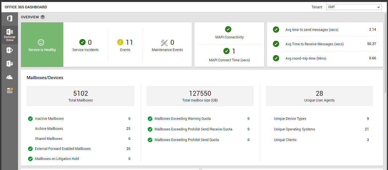
Figure 1 : The OVERVIEW page of the Exchange Online dashboard
First up, the Overview page indicates the current health state of the Exchange Online email service using intuitive text, colors, and imagery. If the service is found to be in a degraded state currently, then check the Service Incidents count displayed alongside to see if it reports a non-zero value. Unplanned service incidents are a common cause for poor service health. This means that if one/more Service Incidents have been reported by this page, then the degraded service state can be attributed to these incidents. Click on the Service Incidents count to know more about them.
The Events counter alerts you to problem events that eG Enterprise may have captured on the Exchange Online service. To zoom into these events, click on the Events count. The All Events page (see Figure 2) will then open, where you can view the complete details of all eG alarms related to the Exchange Online service.
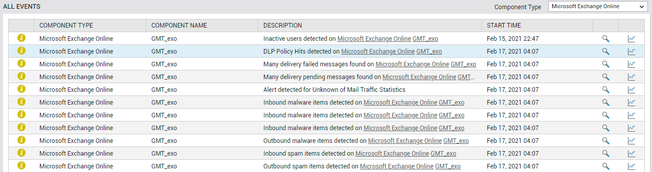
Figure 2 : The ALL EVENTS dashboard that appears when the Events counter in the Exchange Online dashboard is clicked
If maintenance is currently in progress, then the Maintenance Events measure will indicate the same. Planned maintenance is regular Microsoft-initiated service updates to the infrastructure and software applications.
Additionally, the Overview page also alerts you if MAPI connectivity to any mailbox is lost or is very slow. If MAPI access is not enabled for a user's mailbox, or if MAPI connectivity to that mailbox is lost, the corresponding user will not be able to access the mailbox. As a result, the user will not be able to send/receive mails. Such an anomaly, if not resolved quickly, can adversely impact user productivity! This is why, if the MAPI Connectivity indicator (see Figure 1) in this page reports a problem, you need to quickly figure out which mailbox is inaccessible via MAPI, and why. For that, click on the MAPI Connectivity indicator in this page. This will point you to the exact mailbox that has suffered a connectivity loss (see Figure 3).

Figure 3 : Detailed diagnostics revealing the MAPI connectivity status of each mailbox
Also, if the break in connectivity was caused by an error that occurred on the mailbox, the details of the error will also be provided to you, to enable easy troubleshooting (not shown in Figure 3).
Like an unavailable MAPI connection, a sluggish MAPI connection can also be the reason for a less than satisfactory user experience with Exchange Online. The MAPI Connect Time measure proactively alerts you to this slowness (see Figure 1).
At configured intervals, eG Enterprise emulates a user sending/receiving a configured number of emails (default: 1) over Exchange Online. The Overview page displays the results of the last emulation, thus warning you of probable bottlenecks in (if any) sending and/or receiving mails over Exchange Online. The Avg round-trip time counter (see Figure 1) reveals if there is any slowness in the mail send/receive activity. If some lethargy is observed in this activity, then compare the values of the Avg time to send messages and Avg time to receive messages measures to isolate where the bottleneck lies - in mail transmission? or in mail reception? You can also click on the Avg round-trip time measure to view a Avg Round-trip Time measure graph (see Figure 4). This graph helps you track variations to the round-trip time over the last 2 days, so you can determine whether the slowness that was observed during the last simulation was sudden or consistent.
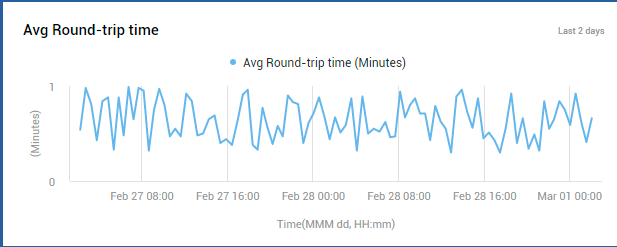
Figure 4 : A measure graph that tracks time-of-day variations to Avg Round-trip time
The Mailboxes/Devices section (see Figure 1) that appears next in the Overview page helps analyze mailbox usage, so you can quickly detect over- and under-utilization of mailboxes. Using this section, you can instantly figure out how many of the Total Mailboxes configured on Exchange Online are:
- Inactive Mailboxes: Mailboxes created for retaining the mailbox content of former employees of an organization;
- Archive Mailboxes: Mailboxes to which mail items from primary mailboxes are moved for easy online access;
- Shared Mailboxes: Mailboxes that are shared by a group of people, so they can monitor and send email from a common account;
- External Forward Enabled Mailboxes: Mailboxes configured with rules to automatically forward messages to external senders; its important for administrators to closely monitor the mail traffic to/from such mailboxes. This is because, external forwarders are commonly used by hackers and bad actors to exfiltrate data from an organization.
- Mailboxes on Litigation Hold: Mailboxes that are placed on hold to preserve all mailbox content, including deleted items and original versions of modified items.
To know which mailboxes are of each of the types discussed above, click on the corresponding mailbox types in the Overview page (see Figure 5).
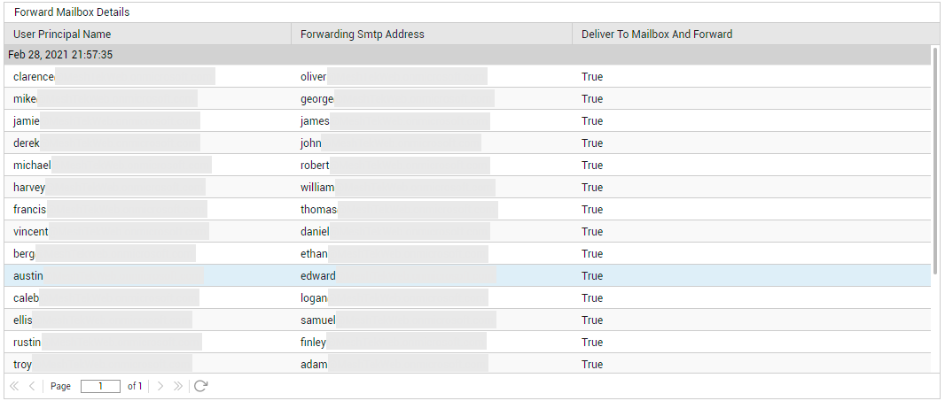
Figure 5 : Detailed diagnostics revealing the ExternalForward ENabled
By tracking changes to the Total mailbox size counter (see Figure 1) displayed in the Overview page, you can figure out if mailboxes are growing abnormally in size. This can happen if one/more mailboxes have or are about to exceed the size limit (quota) set for them. To determine if such mailboxes are the reason for the abnormal growth in mailbox size, check to see if the Mailboxes Exceeding Warning Quota, Mailboxes Exceeding Prohibit Send/Receive Quota, and/or the Mailboxes Exceeding Prohibit Send Quota measures (see Figure 1) displayed in this page report non-zero values. If one/more of these measures do report non-zero values, then you can conclude that such 'heavy' mailboxes exist, and are probably causing mailbox size to grow. To identify these 'heavy' mailboxes, click on the corresponding measures in this page. For instance, you can click on the Mailboxes Exceeding Warning Quota measure in this page to know which mailboxes are of a size that is greater than the warning quota/limit set.
With many organizations these days encouraging their employees to work from home using any device of their choice, it has become super-imperative for administrators to track which mobile devices, operating systems, and clients are accessing Exchange Online and syncing with the mailboxes hosted on it. This information is critical, as they help administrators understand the type of devices/OS'/clients that frequently interact with Exchange Online, so that they can accordingly define access policies, DLP policies, and anti-malware protection policies to protect the mailboxes and data hosted online. The Overview page provides this important information to administrators! For starters, the Unique User Agents count (see Figure 1) displayed here reveals how many distinct mobile devices are accessing Exchange Online. To zoom into these devices, click on the Unique User Agents count. Figure 6 will then appear revealing the different type of user agents and the type of devices of each type.
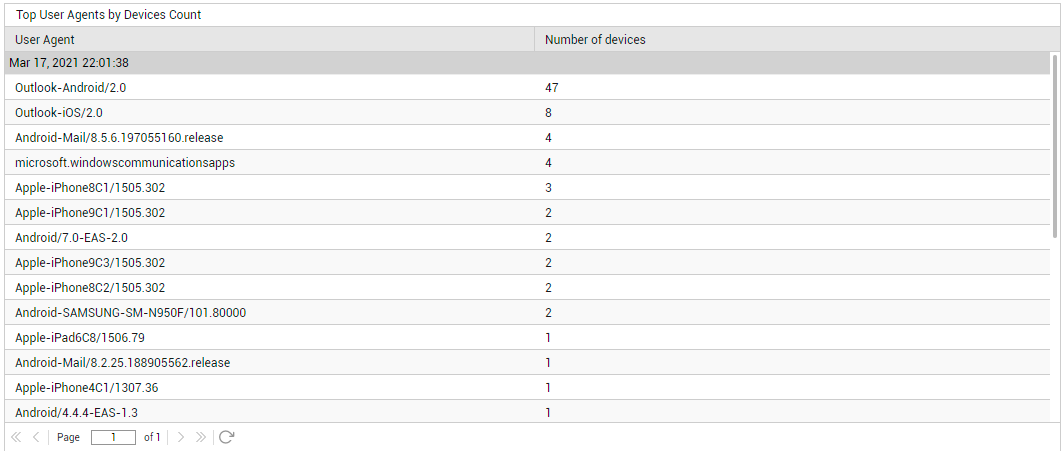
Figure 6 : Detailed diagnosis revealing the different types of user agents and the count of devices of that type
Similarly, use the Unique Device Types measure to determine the number of device types that are accessing Exchange Online. To know what these device types are, click on the Unique Device Types measure (see Figure 7).
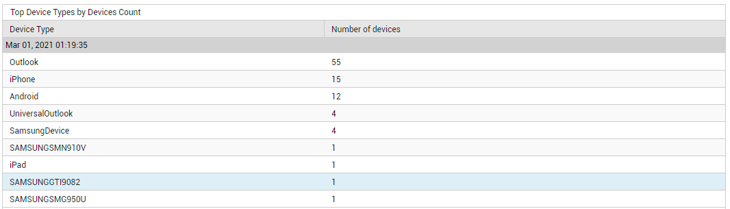
Figure 7 : Detailed diagnosis revealing the device types and the count of devices of each type
Likewise, click on the Unique Clients count to know which client applications are accessing the email service (see Figure 8), and click on the Unique Operating Systems count to know which operating systems users are connecting from (see Figure 9).
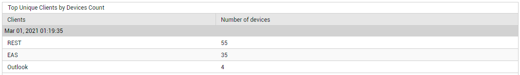
Figure 8 : Detailed diagnosis revealing the top unique clients in terms of the count of devices using them
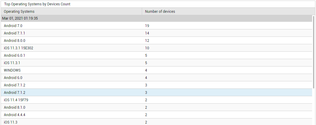
Figure 9 : Detailed diagnosis revealing the top operating systems in terms of the number of devices using them
Next, you will find a Recipients by Type distribution pie chart (see Figure 10).
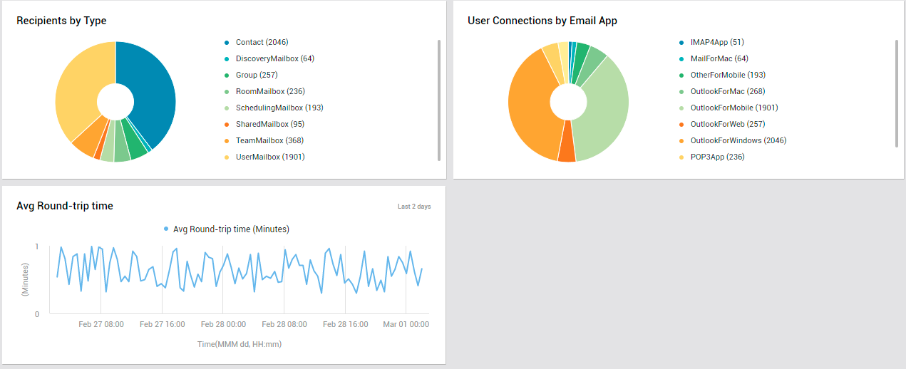
Figure 10 : The OVERVIEW page displaying distribution pie charts and a measure graph
A recipient is any mail-enabled object to which Exchange Online can deliver or route messages. Exchange includes several explicit recipient types - for eg., Contact, SharedMailbox, UserMailbox etc. In the event of a spike in email traffic, you can use the Recipients by Type pie (in Figure 10) to instantly identify where most of the messages are going - to mail contacts? to distribution groups? to mailboxes on Exchange Online? if so, then which mailboxes? - are they shared mailboxes? team mailboxes? user mailboxes?
While the Recipients by Type section helps identify the popular recipient types, the User Connections by Email App quickly leads you to the email clients (eg., Outlook for Web, Mail for Mac OS) that are the most popular amidst users (see Figure 10). Moreover, if there is a sudden yet significant spurt in user connections to Exchange Online, you can use this pie chart to identify the email app/client that the maximum number of users are connecting to, thereby contributing to the connection overload.
Users
To access the USERS page, move your mouse pointer over the Exchange Online icon in the left panel, and click on the Users option within.
The Users page focuses on the users of the Exchange Online service. A quick look at the dashboard will reveal how actively Exchange Online has been used, what type of permissions have been granted to the users, and where these users are from.
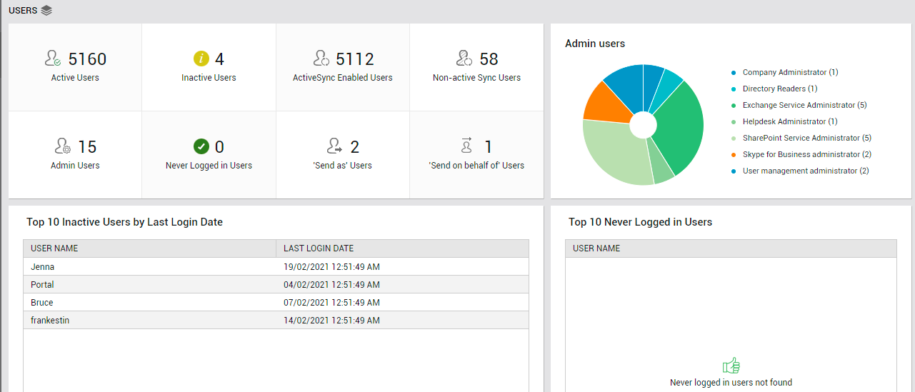
Figure 11 : The USERS page of the Exchange Online dashboard
The Active Users count displayed in this page (see Figure 11) is a good indicator of the current user load on Exchange Online. Track this measure over time to proactively detect overload conditions. If there are users who have subscribed to the service but have not used it in a long time, then the Inactive Users count (in Figure 11) reveals how many such users exist. Similarly, there may be users who have not logged in to Exchange Online even once since their account was created. Inactive users and the 'never logged in' users unnecessarily consume resources and licenses. To optimize resource and license usage, its best that such users are identified and removed quickly. To know who are the inactive users, click on the Inactive Users count (see Figure 12).
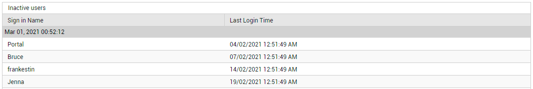
Figure 12 : Detailed diagnosis revealing the inactive users
Likewise, to know which users have never logged in till now, click on the Never Logged in Users count in this page.
Next, you will find an Admin users pie chart (see Figure 11). This chart reveals how users have been distributed across different administrative roles. Typically, Microsoft 365 or Office 365 subscription comes with a set of admin roles that you can assign to users in your organization. Example: Help desk administrator, Exchange service administrator, SharePoint Service Administrator etc. Each admin role maps to common business functions and gives people in your organization permissions to do specific tasks. With the help of the Admin users pie, you can find out what are the different admin roles that have been assigned to users across the Exchange Online environment. Also, you can accurately identify the exact role that has been assigned to a maximum number of users.
If multiple Inactive Users exist, you can use the Top 10 Inactive Users by Last Login Date table (see Figure 11) to know who those inactive users are and when they logged into Exchange Online last. This will point you to those users who have not logged in for the longest time. Similarly, if there are users who have never logged into Exchange Online, the Top 10 Never Logged in Users table will list such users (see Figure 11). You can mark the inactive and 'never logged in' user accounts for deletion, so as to conserve resources and licenses.
Finally, you will find the Users by Location pie chart (see Figure 13).
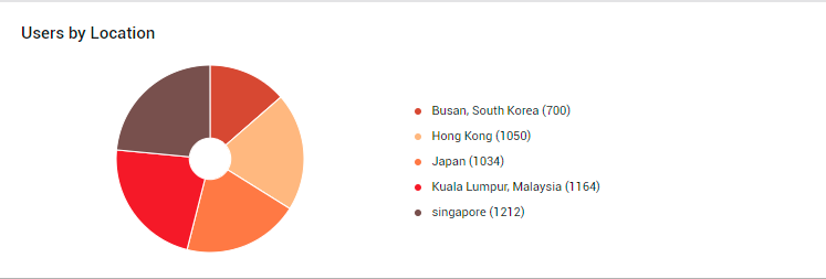
Figure 13 : The Users by Location pie chart
A quick look at this pie chart will help you understand where your users are coming from - i.e., from which locations are users accessing the Exchange Online service. A closer look will point you to those geographies from which the maximum number of users are coming. This means that the email service is most popular in such geographies, and any dip in service quality will significantly impact such users first. On the flip side, the pie chart also points you to locations where the email service is favored the least. You may want to investigate the reasons for the same and eliminate it, so as to improve overall service usage.
Mail Traffic
To access the MAIL TRAFFIC page, move your mouse pointer over the Exchange Online icon in the left panel, and click on the Mail Traffic option within.
Use the Mail Traffic page to analyze mail traffic handled by Exchange Online, and rapidly detect bottlenecks in mail delivery.
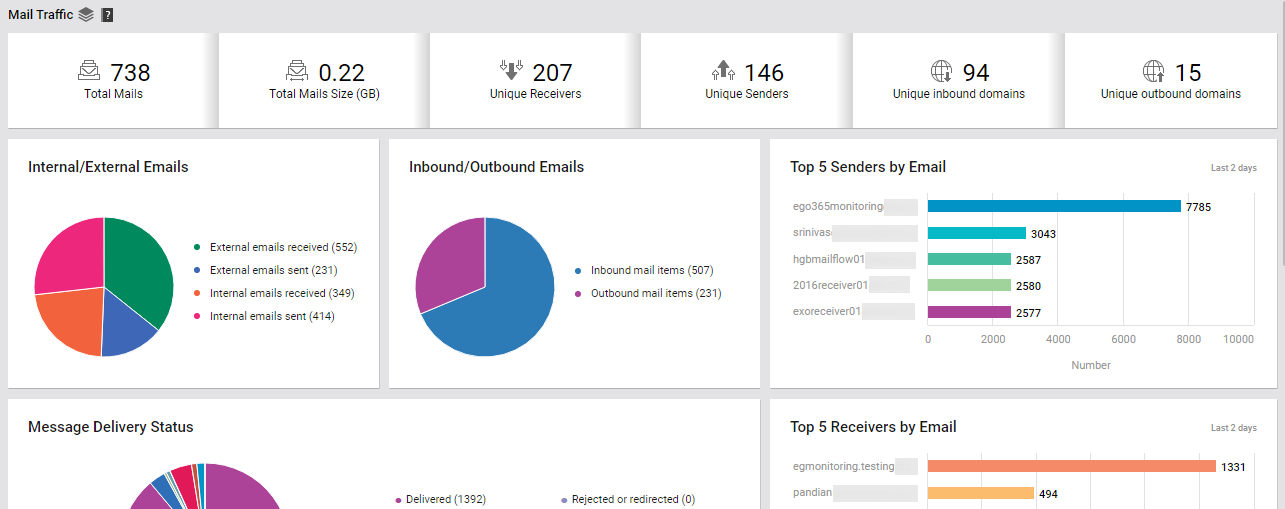
Figure 14 : The MAIL TRAFFIC page of the Exchange Online dashboard
This page begins by providing you with a summary of the mail traffic. Here, you can view the Total mails count across all the mailboxes that have been configured on Exchange Online for the chosen tenant, and the Total mails size. Track variations to these two counters over time, so that you can quickly detect any sudden and significant increase in the count and size of mails.
To know how many distinct senders and receivers have been configured for the monitored tenant account, use the Unique Senders and Unique Receivers counters displayed here (see Figure 14).
Similarly, from Figure 14, you can know how many distinct domains are sending emails to the domains configured for the target tenant (Unique Outbound Domains), and how many are receiving emails from the tenant's domains (Unique Inbound Domains). Click on the Inbound Domains count to know which are the inbound domains, how many mails each domain received, and the total size of the inbound mails.
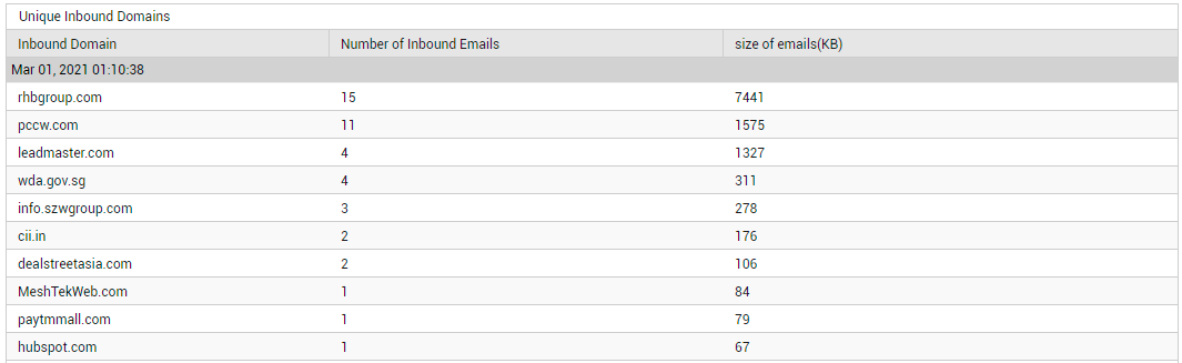
Figure 15 : Detailed diagnosis revealing details related to the unique inbound domains
Likewise, you can click on the Oubound Domains count to know which are the outbound domains, how many mails each domain sent, and the total size of the outbound mails.
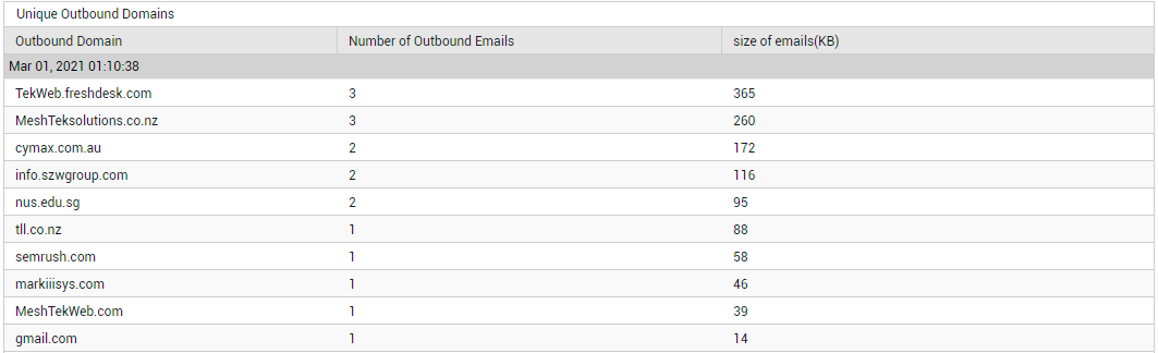
Figure 16 : Detailed diagnosis revealing details related to the unique outbound domains
Using these detailed diagnostics, you can quickly identify those domains that are seeing a lot of mail traffic. If this level of activity is unexpected, you may want to investigate further.
Typically, mails received from and/or sent to domains 'external' to the target tenant's domains are classified as 'external mails'. On the other hand, email communication between senders and receivers within the target tenant's domains are classified as 'internal mails'. If a steep and unexpected increase is observed in the Total mails count and/or Total mails size displayed in this page, you may want to know what type of mail traffic is causing it - internal mail traffic? or external mail traffic? Using the Internal/External Mails distribution pie chart (see Figure 14), you can quickly and accurately find the answer to this question! This pie reveals the following:
- How many external mails are being sent (External emails sent) and received (External emails received) by the monitored tenant?
- How many internal mails are being sent (Internal emails sent) and received (Internal emails received) by the monitored tenant?
With the help of the numbers reported, you can easily tell what type of email traffic is causing the abnormal email activity - transmission/reception of internal mails? or transmission/reception of external mails? You can even drill down to the specific senders and receivers who are responsible for this abnormality by clicking on specific slices of the pie chart or on the corresponding legend. For instance, clicking on the slice representing 'External emails received' (or on its corresponding legend entry), will lead you to those 'external senders' who have sent the maximum number of emails to the receivers in the tenant's domains.
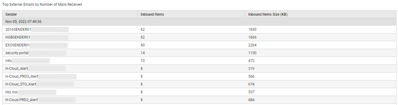
Figure 17 : Detailed diagnosis revealing who sent the maximum number of inbound mails
You can easily sort this 'external senders list' on the basis of mail size, so that you can quickly identify the 'external senders' who sent the 'heaviest' mails, thus causing abnormal growth in overall mail size.
Sometimes, you may need an overview of the incoming and outgoing mail traffic of the target tenant, regardless of the type of mails ('internal' or 'external') that are trafficked. Use the Inbound/Outbound Emails pie chart (in Figure 14) for this purpose! This pie chart depicts the number of mails flowing into the target tenant's domains (Inbound mail items) and flowing out of them (Outbound mail items). In the event of a sudden and significant surge in the Total mails count, you can use this pie chart to quickly figure out what is causing the rise - incoming mails? or outgoing mails? If Incoming mail items are found to be the reason for the spike in mail traffic, then click on the slice representing Inbound mail items (or the corresponding legend entry), to accurately identify who is sending the maximum number of mails.
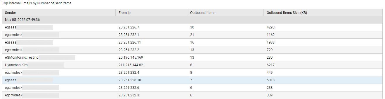
Figure 18 : Detailed diagnosis revealing who sent the maximum number of inbound mail items
Likewise, if the spike in mail traffic is caused by Outbound mail items, then click on the slice representing Outbound mail items (or on the corresponding legend entry) to accurately pinpoint the receiver of the maximum number of mails (see Figure 19).
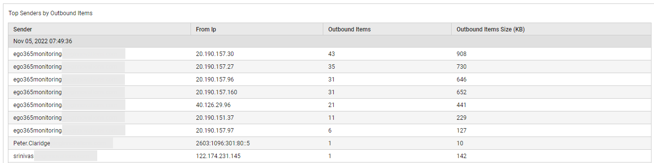
Figure 19 : Detailed diagnosis revealing who sent the maximum number of outgoing mails
You can also sort these 'sender' and 'receiver' lists on the basis of the mail size. If there is abnormal growth in Total mails size, then the lists so sorted will point you to the exact sender or receiver (as the case may be) who has contributed to this growth by trafficking 'heavy' mails.
The Mail Traffic page also saves you the time and trouble of drilling-down from the Inbound/Outbound Emails pie chart to view the sender and receiver of the maximum number of mails! In fact, you only need to glance at the Top 5 Senders by Email bar graph (see Figure 14) and the Top 5 Receivers by Email bar graph (see Figure 20) to glean the same information!
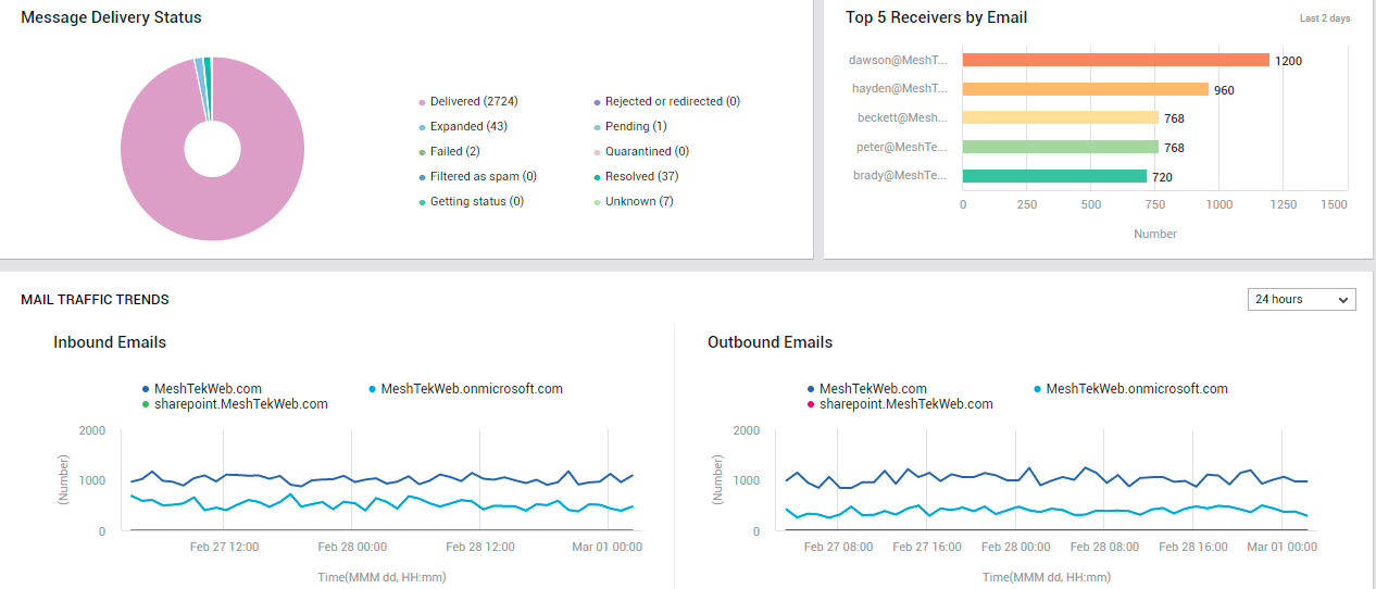
Figure 20 : The MAIL TRAFFIC page reporting mail delivery status, top 5 receivers of emails, and mail traffic trends
Besides sudden/steady spikes in mail traffic, frequent failures / consistent slowness in the delivery of emails can also seriously degrade user experience with Exchange Online. To capture such failures/delays instantly, use the Mail Delivery Status donut chart (see Figure 20). The slices of this chart represent the number of emails in different delivery states. One look at this chart would suffice to figure out:
- Are there any delivery failures?
- Were any mails rejected or redirected?
- Have any mails been quarantined?
- Are too many mails pending delivery?
To know which mails failed delivery, click on the slice representing Failed mails (or the corresponding legend entry). The sender and receiver of the failed emails, the subject of the emails, and the IP from which the mails were sent will then be displayed, so as to ease troubleshooting (see Figure 21).
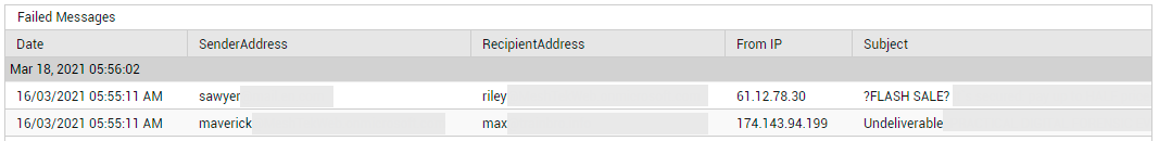
Figure 21 : Detailed diagnosis revealing which messages failed
Similarly, you can click on the slice representing Pending mails (or the corresponding legend entry) to view the details of emails that are still to be delivered (see Figure 22). If mails have been in the Pending state for too long, it could indicate a processing bottleneck.
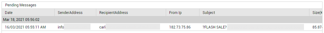
Figure 22 : Detailed diagnosis revealing pending messages
Likewise, click on the slice representing Rejected or Redirected mails (or the corresponding legend entry) to view the details of emails that are have been rejected or redirected. Using this information, you can figure out if your message flow rules need to be tweaked.
The Inbound/Outbound Emails pie chart (see Figure 14) provides a real-time view of incoming and outgoing email traffic across all domains configured for the monitored tenant. However, if you want to analyze past trends in incoming and outgoing mail traffic per domain, you can use the measure graphs in the MAIL TRAFFIC TRENDS section (see Figure 20). By default, the Incoming Emails and the Outgoing Emailsgraphs available in this section, plot time-of-day variations in email traffic over the last 24 hours. You can choose a different timeline for these graphs by selecting a different option from the list box available at the right top corner of this section.
By default, using the Incoming Emails graph, you can study the incoming mail traffic to each domain during the last 24 hours. In the process, you can quickly figure out when, during the last 2 days, an unusually high number of emails flowed into the Exchange Online ecosystem, and which domain received this mail inflow.
Similarly, by default, using the Outgoing Emails graph, you can study the outgoing mail traffic of each domain during the last 24 hours. In the process, you can quickly figure out when, during the last 2 days, an unusually high number of emails flowed out of the Exchange Online ecosystem, and which domain was responsible for this.
Domains seeing abnormal incoming and/or outgoing mail activity at a given point in time, should be monitored closely for possible abuse/malicious attacks.
Mail Protection
Are the tenant's mails well protected against spam and malware? The Mail Protection page answers this question!
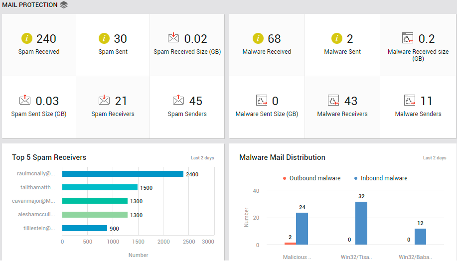
Figure 23 : The MAIL PROTECTION page of the Exchange Online Dashboard
To access the mail traffic page, move your mouse pointer over the Exchange Online icon in the left panel, and click on the Mail Traffic option within.
The page (see Figure 23) begins by providing you with a quick summary of spam mails received and sent. The number of Spam Sent and Spam Received can be determined. While the Spam Received Size indicates the total size of all spam mails received by the tenant, Spam Sent Size indicates the total size of spam mails sent. These metrics will give you a fair idea of the level of spamming that is happening. If these numbers are high, its certainly a cause for concern. You will then want to know who is sending the most spams and who is receiving them. The Spam Senders and Spam Receivers count reveal how many email accounts send and receive spams, respectively. To know who the 'busiest' spam senders are in terms of the number of spam mails they send, click on the Spam Senders count.
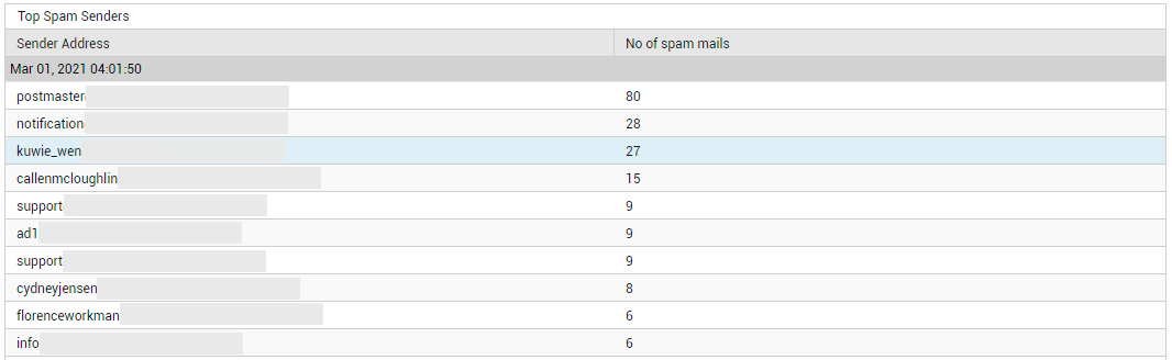
Figure 24 : Detailed diagnosis revealing the senders of the maximum number of spam mails
If you are looking to save a 'mouse-click', then, instead of clicking on Spam Senders, take a look at the Top-5 Spam Senders bar graph in this page (see Figure 25). This will point you to the sender of the largest number of spam mails.
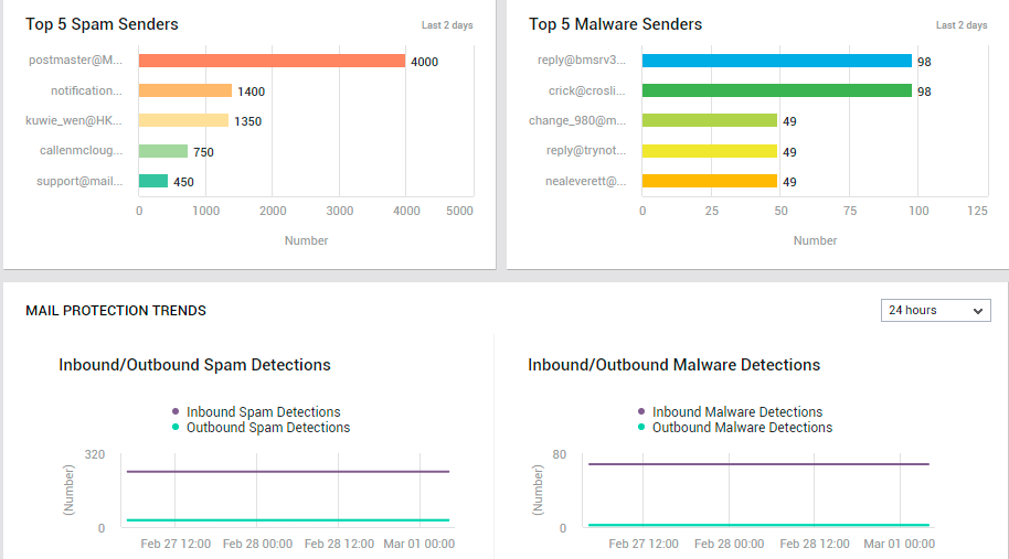
Figure 25 : The MAIL TRAFFIC page displaying top spam senders, malware senders, and mail protection trends
Likewise, you can click on the Spam Receivers count in Figure 23 to know who is receiving the maximum number of spam mails (see Figure 26).
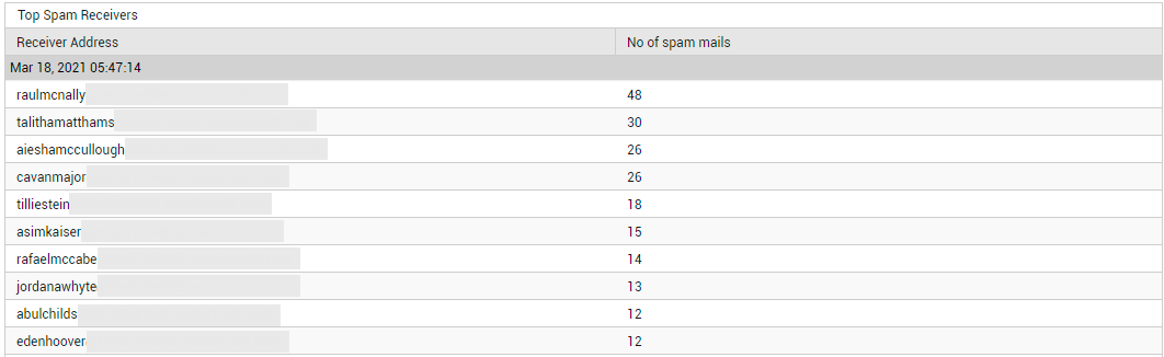
Figure 26 : Detailed diagnosis revealing the top spam receivers
Alternatively, you can avoid the drill down by taking a look at the Top-5 Spam Receivers bar graph instead (see Figure 23). This will point you to the recipient of the largest number of spam mails.
If the collective size of the spam mails is very high, you will want to know who sent these large-sized mails and who received them. Click on the Spam Received count in Figure 23 to know the recipients of large-sized inbound spam mails and who sent them (see Figure 27).
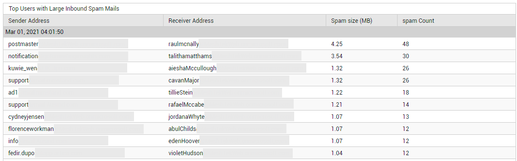
Figure 27 : Detailed diagnosis revealing the top users with large inbound spam mails
Click on the Spam Sent count in Figure 23 to identify the senders of large-sized outbound spam mails, and who received them (see Figure 28). By pulling up the senders for questioning, and by educating the receivers on how they can protect their accounts from spam, you can help minimize the impact of this menace.
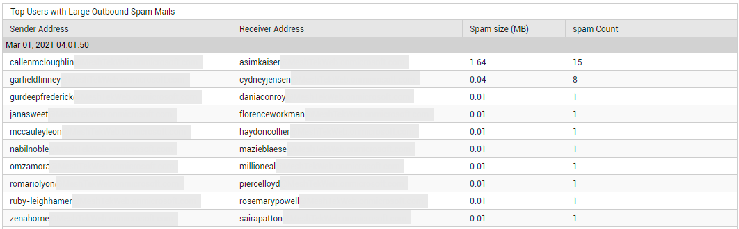
Figure 28 : Detailed diagnosis revealing the top users with large outbound spam mails
Next, the page provides a summary of the malware sent and received. To know how many malware mails are in circulation in the email system of the tenant, look up the Malware Received and Malware Sent metrics displayed in this page (see Figure 23). To determine the size of the malware mails sent and received, take a look at the values reported by the Malware Sent Size and Malware Received Size measures (see Figure 23). If many malware mails are in circulation, and the collective size of these mails is also very high, it means that you have enough reason to worry! In such a case, you will want to know who is sending and receiving large-sized malware mails. To identify the senders of such large-sized malware mails, who received them, and the files that were infected, click on the Malware Sent count (see Figure 29).
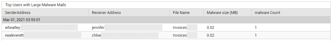
Figure 29 : Detailed diagnosis revealing the senders of large-sized malware mails and who received them
To identify the receivers of large malware mails, who sent them, and the files that were infected, click on the Malware Received count (see Figure 30).
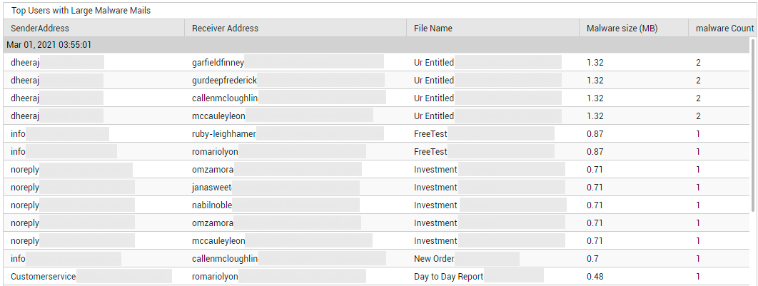
Figure 30 : Detailed diagnosis revealing the receivers of large-sized malware mails and who sent them
Additionally, the total number of Malware Receivers and Malware Senders is also revealed by this page (see Figure 23). To zoom into the senders of large-sized mails, regardless of who they sent them to, click on the Malware Senders count (see Figure 31).
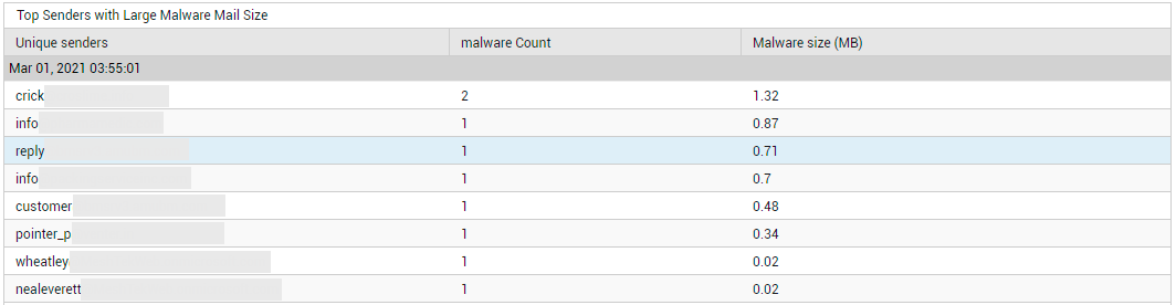
Figure 31 : Detailed diagnosis pinpointing the top malware senders in terms of the size of mails sent
Similarly, to know who received the 'heaviest' malware mails, regardless of where they came from, click on the Malware Receivers count in Figure 23. Figure 32 will then appear.
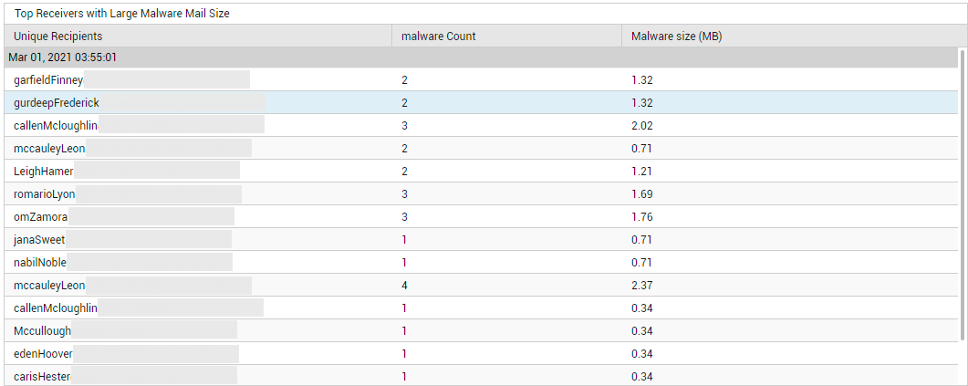
Figure 32 : Detailed diagnosis pinpointing the top receivers of malware mails in terms of the size of the mails received
With the help of the detailed metrics on senders, receivers, and infected files, you can identify the email accounts that are vulnerable to such attacks, while also gaining a better understanding of how the malware typically operates. This will provide you with inputs for improving your malware tracking and prevention systems.
Where the number of malware mails received is far more worrisome than the size of the mails, you will want to know who sent the maximum number of such mails to the target tenant's domain. For this, take a look at the Top 5 Malware Senders bar graph in Figure 25. This graph will lead you to that email account from which the highest number of malware mails were received. This will point you to those email accounts that need to be closely monitored for malware.
Its as important to focus on the 'malware' itself as it is on who sent/received it. This is what is achieved by the Malware Mail Distribution graph (see Figure 25). This graph reveals how many malware of a certain type is detected in outbound and inbound mails. This way, you can identify which malware was detected mostly in incoming mails, and which ones were prevalent in outgoing mails. With this information, you will know what type of malware to look for in inbound and outbound mails.
Use the MAIL PROTECTION TRENDS section in this page (see Figure 33) to study past trends in the detection of spams, malware, and DLP (data loss prevention). By default, the measure graphs in this section plot the count of intrusions detected over the last 24 hours. You can change the timeline for these graphs by selecting a different time period from the list box that you will find at the right, top corner of this section.
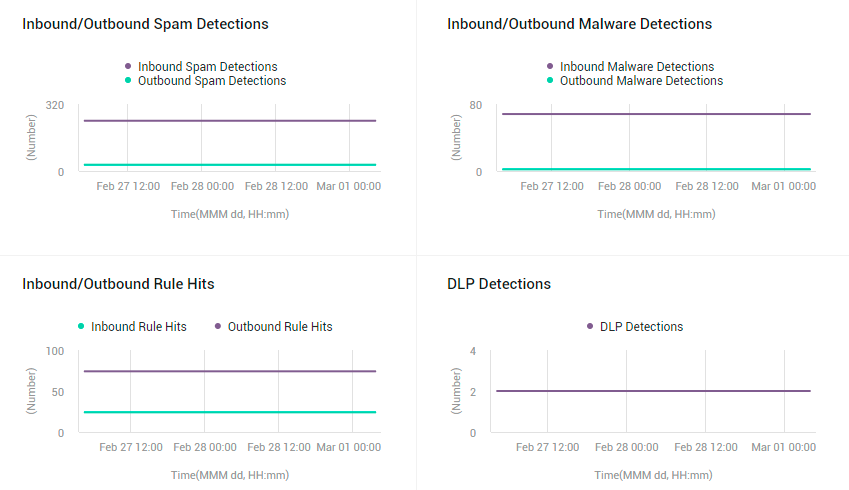
Figure 33 : The MAIL PROTECTION page revealing the MAIL PROTECTION TRENDS section
The Inbound/Outbound Spam Detections graph (see Figure 33) plots the number of spam mails detected in incoming and outgoing mail traffic during the last 24 hours (by default). From this graph, you will be able to accurately tell when, during the last 24 hours, the highest number of spam mails were sent and received. If a significant leap in spam mails was observed at a particular point in time, the reasons for the same should be diagnosed.
The Inbound/Outbound Malware Detections graph (see Figure 33) plots the number of malware mails detected in incoming and outgoing mail traffic, during the last 24 hours (by default). From this graph, you will be able to accurately tell when in the last 24 hours, the highest number of malware mails were sent and received. If a significant leap in malware mails was observed at a particular point in time, the reasons for the same should be diagnosed.
The next graph in this section studies trends on rule hits (see Figure 33). You can use mail flow rules (also known as transport rules) to identify and take action on messages that flow through your Office 365 organization. Mail flow rules are similar to the Inbox rules that are available in Outlook and Outlook on the web. The main difference is mail flow rules take action on messages while they're in transit, and not after the message is delivered to the mailbox. Mail flow rules contain a richer set of conditions, exceptions, and actions, which provides you with the flexibility to implement many types of messaging policies. The Inbound/Outbound Rule Hits graph (see Figure 33) plots the number of incoming and outgoing mails on which mail flow rules were applied and corresponding action was taken, during the last 24 hours (by default). From this graph, you will be able to accurately tell when the highest number of rule hits occurred.
To study trends in DLP (Data Loss Preventions) detections in the last 24 hours, use the DLP Detections graph (see Figure 33). To comply with business standards and industry regulations, organizations need to protect sensitive information and prevent its inadvertent disclosure. Examples of sensitive information that you might want to prevent from leaking outside your organization include financial data or personally identifiable information (PII) such as credit card numbers, social security numbers, or health records. With a data loss prevention (DLP) policy in the Office 365 Security & Compliance Center, you can identify, monitor, and automatically protect sensitive information across Office 365. You can use a rule to meet a specific protection requirement, and then use a DLP policy to group together common protection requirements, such as all of the rules needed to comply with a specific regulation. The DLP Detectionsgraph plots the number of emails that complied with one/more DLP rules, during the last 24 hours (by default). This will give you an idea about how many mails bearing sensitive information is trafficked during a day. The graph also pinpoints exactly when during the last 24 hours, the maximum number of protection-worthy emails were sent/received. If this number is significantly higher than what was observed across the entire day, you may want to investigate further.
Non Owner Activities
There are two types of Microsoft 365 non-owners: administrators and delegated users. Delegated users are those who are assigned permissions to a mailbox owned by another user. For instance, a member of an Office 365 Group who has been granted Send as or Send on behalf permissions can send email as the group, or on behalf of the group. Users with such permissions can be categorized as Delegated Users. Administrators are responsible for the maintenance of Exchange Online, which includes managing the mailboxes of delegated users. This means that not every non-owner mailbox access in Microsoft 365 indicates a security breach; a non-owner mailbox access may just be the admin accessing the delegated user's mailbox for any given maintenance task. That's why it's essential to validate whether non-owner mailbox access events are in line with the business context to accurately identify anomalies. By shedding light on non-owner mailbox accesses, the NoN Owner Activities page (see Figure 34) turns your attention to real administrator activities, and those performed by delegated users such as users with 'send as' and 'send on behalf of' permissions.
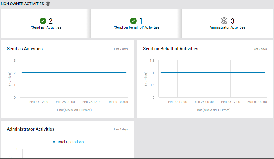
Figure 34 : The NON OWNER ACTIVITIES page of the Exchange Online dashboard
To access the Non Owner activities page, move your mouse pointer over the Exchange Online icon in the left panel, and click on the Non Owner Activities option within.
First up, this page alerts you if any 'Send As', 'Send on behalf of', or Administrator activities occur. To know what these activities are, who performed them, and whether/not they were successful, click on the corresponding measure in this page. For instance, if you click on the Send As Activities counter in Figure 34, Figure 35 will appear revealing who performed the activity, when, and what is the status of the activity.
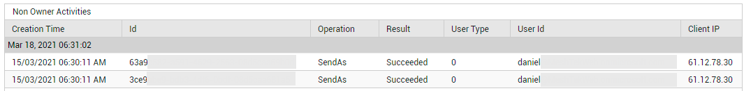
Figure 35 : Detailed diagnosis revealing who performed Send As activities, when, and from which client
The graphs that follow the real-time metrics (see Figure 36) take you back in time (default: past 2 days), and enable you to identify the time-windows where non-owner activities - i.e., activities of Send As, Send on behalf of, and Administrator users - were at their peak (see Figure 36). If these 'highs' were not expected during the indicated timelines, you may want to investigate the activities further to understand if there was any security breach.
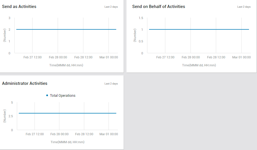
Figure 36 : The NON OWNER ACTIVITIES page displaying measure graphs on send as, send on behalf of, and administrator activities