SQLServer
If you want to assess how efficiently the SQL server manages the databases available on it, and thus promptly detect the server related discrepancies, select the SQLServer option from the Subsystem list.
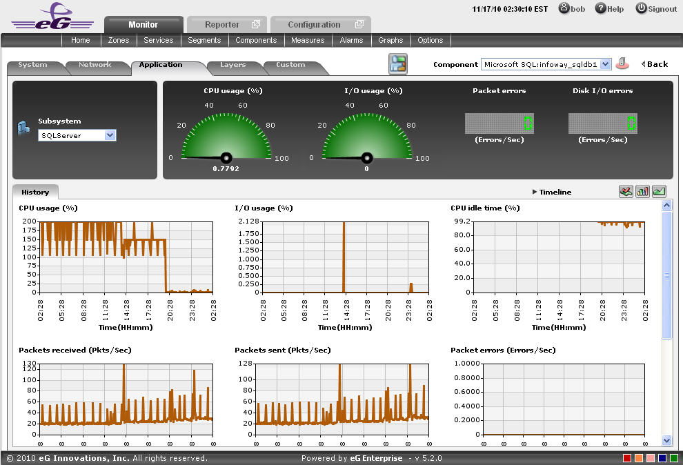
Figure 1 : The SQLServer Dashboard
The contents of the SQLServer dashboard that then appears (see Figure 1) are as follows:
- The dashboard begins with a dial and digital graphs section, which enables you to visually track the changes that are happening in the measures related to the SQL server of the MS SQL application. For instance, the CPU usage of the SQL server can be viewed at a single glance. Clicking on a dial/digital graph will lead you to the layer model page of the MS SQL Application; this page will display the exact layer-test combination that reports the measure represented by the dial/digital graph.
- The History tab page displays measure graphs that depict how the server related measures such as CPU usage has been varying over time. In the event of any retaliation in the measures, this time-bound analysis will help you to easily differentiate between a sudden spike in the CPU usage and a consistent rise in the same.
-
By default, these historical graphs track the time-of-day variations in memory usage during the last 24 hours. You can override this default timeline by following the steps discussed below:
- Click on the
 icon at the top of the Application Dashboard.
 - In the Dashboard Settings window that appears, select History Graph from the Default Timeline for list.
- Then, choose a Timeline for the graph.
- Finally, click the Update button.
- Click on the
-
To change the timeline of all the measure graphs at one shot, just click on the Timeline link at the right, top corner of the History tab page. To alter the timeline for a single graph, just click on that graph - this will enlarge the graph. You can change the Timeline of the graph in the enlarged mode.
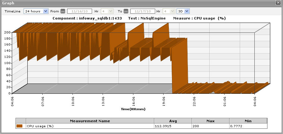
Figure 2 : An enlarged measure graph in the History tab page of the SQLServer dashboard
- Instead of these measure graphs, you can, if required, view summary graphs of the memory-related measures in the History tab page. For this, click on the
 icon at the right, top corner of the History tab page. Summary graphs help you figure out the percentage of time during the last 24 hours (by default) the MS SQL application was hogged by the server-related issues. While monitoring mission-critical applications that are governed by rigid service level agreements, summary graphs will help you determine whether the guaranteed CPU usage levels were fulfilled or not, and if not, how often did the usage levels slip.
 -
You can override the default timeline (of 24 hours) of the summary graphs by following the steps discussed below:
- Click on the icon at the top of the Application Dashboard.
- In the Dashboard Settings window that appears, select Summary Graph from the Default Timeline for list.
- Then, choose a Timeline for the graph.
- Finally, click the Update button.
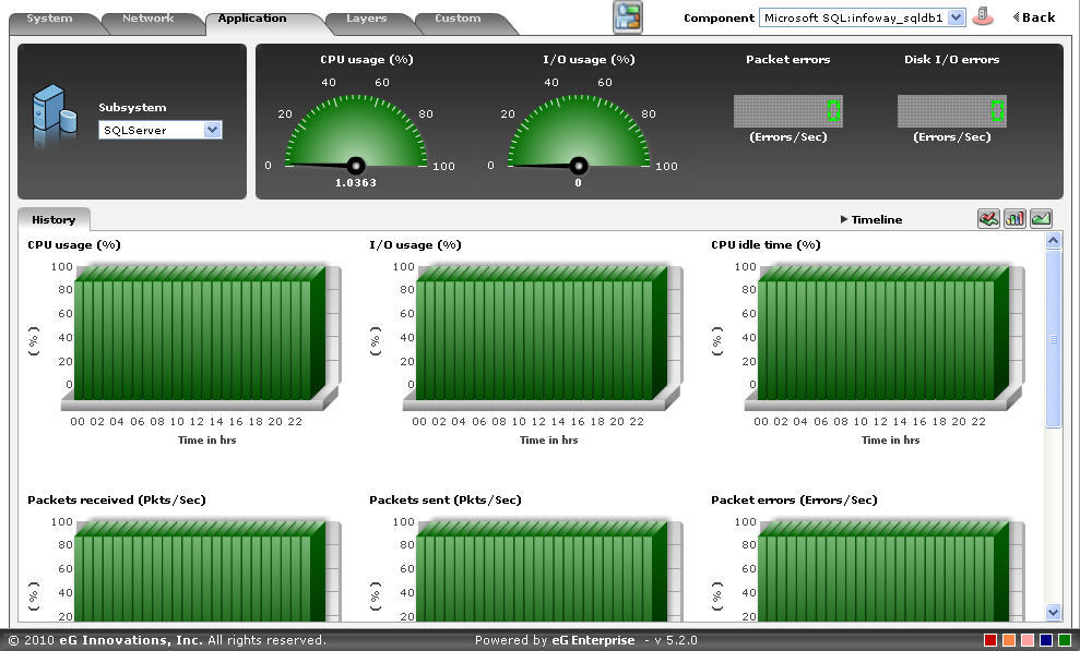
Figure 3 : Summary graphs displayed in the History tab page of the SQLServer Dashboard
- Click on the
- Here again, you can change the Timeline of all the summary graphs by clicking on the Timeline link in Figure 3, or click on a graph, enlarge it, and change its Timeline in the enlarged mode. Also, though the graph plots hourly summary values by default, you can pick a different Duration for the graph in the enlarged mode, so that daily/monthly performance summaries can be analyzed.
-
You can click on the
 icon at the right, top corner of the History tab page to view trend graphs of the memory usage-related measures. By default, these trend graphs plot the maximum and minimum memory usage values for every hour of the last 24 hours (by default). The default timeline of 24 hours can be overridden by following the steps discussed below:
- Click on the icon at the top of the Application Dashboard.
- In the Dashboard Settings window that appears, select Trend Graph from the Default Timeline for list.
- Then, choose a Timeline for the graph.
- Finally, click the Update button.
Using these trend graphs, you can understand the variations in the CPU usage of the SQL server during the last 24 hours (by default), deduce the future usage trends, and accordingly recommend changes to the server size.
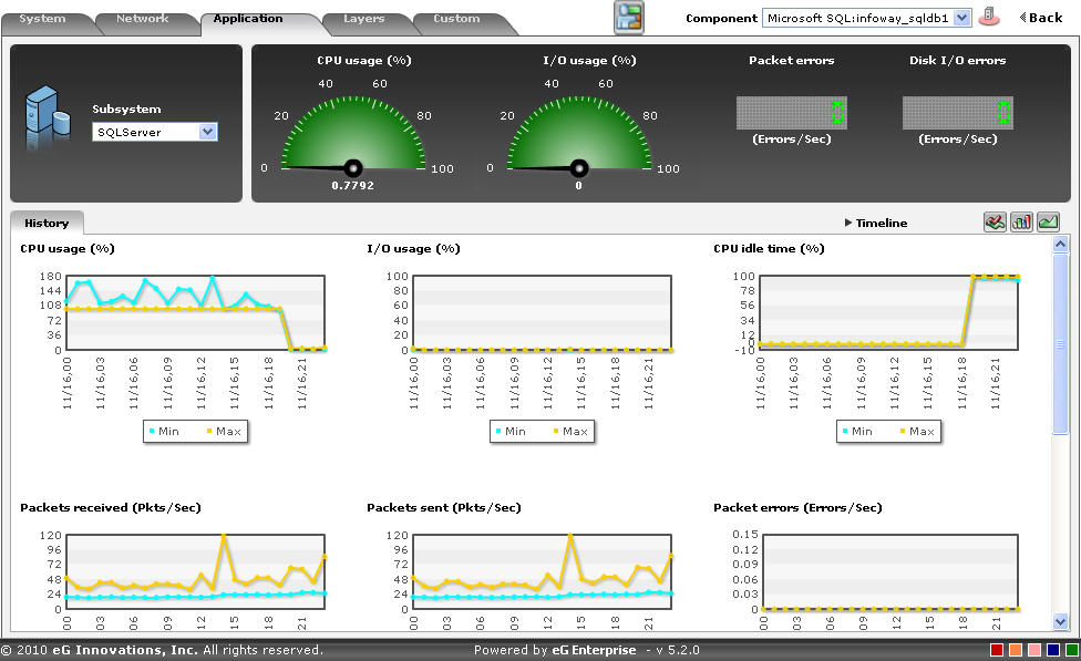
Figure 4 : Trend graphs displayed in the History tab page of the SQLServer Dashboard
- Click on the
- Here again, you can change the Timeline of all the trend graphs by clicking on the Timeline link in Figure 4, or click on a graph, enlarge it, and change its Timeline in the enlarged mode. Also, though the graph plots hourly trend values by default, you can pick a different Duration for the graph in the enlarged mode, so that daily/monthly performance trends can be analyzed.
- Also, by default, the trend graph only plots the minimum and maximum values registered by a measure. Accordingly, the Graph type is set to Min/Max in the enlarged mode. If need be, you can change the Graph type to Avg, so that the average trend values of a measure are plotted for the given Timeline. Such a graph will enable you to assess whether the memory resources were utilized effectively or not, over time.
-
Likewise, you can also choose Sum as the Graph type to view a trend graph that plots the sum of the values of a chosen measure for a specified timeline. For instance, a ‘sum of trends’ CPU usage will enable you to analyze, on an hourly/daily/monthly basis (depending upon the Duration chosen), how the CPU usage of a server has varied during the specified timeline.
Note:
In case of descriptor-based tests, the Summary and Trend graphs displayed in the History tab page typically plot the values for a single descriptor alone. To view the graph for another descriptor, pick a descriptor from the drop-down list made available above the corresponding summary/trend graph.
- At any point in time, you can switch to the measure graphs by clicking on the
 button.
 -
Typically, the History tab page displays measure, summary, and trend graphs for a default set of measures. If you want to add graphs for more measures to this tab page or remove one/more measures for which graphs pre-exist in this tab page, then, do the following:
- Click the button at the top of the dashboard.
- The Dashboard Settings window then appears. From the Module list of , pick Application, choose SQL Server as the Sub-System, and then, select History Graph from the Add/Delete Measures for list.
- The measures for which graphs pre-exist in the History tab page will be automatically displayed in the Existing Value(s) list. To delete a measure, and in effect, its corresponding graph as well, select the measure from the Existing Value(s) list, click the Delete button, and then click the Update button.
- To add a new graph, first, pick the Test that reports the measure for which a graph is to be generated.
- Next, select the Measure of interest.
- Provide a Display name for the measure. Then, click the Add button to add the measure to the Existing Values(s) list. Finally, click the Update button.
- This will add a new measure, summary, and trend graph for the chosen measure to the History tab page.
Note:
Only users with Admin or Supermonitor privileges can enable/disable the system, network, and application dashboards, or can customize the contents of such dashboards using the Dashboard Settings window. Therefore, whenever a user without Admin or Supermonitor privileges logs into the monitoring console, the
button will not appear. - Click the