OneDrive Dashboard
The OneDrive Dashboard is the one-stop-shop for overseeing the health, usage, and performance of OneDrive sites. Using the different web pages offered by this dashboard, you can at-a-glance find answers to the following questions:
- Is the OneDrive service healthy? If not, is it because of unplanned service incidents, or planned maintenance events?
- Is the OneDrive service responding well to web requests?
- Are any OneDrive sites inactive? If so, which sites are these?
- Is any OneDrive site unavailable?
- Are sites using the storage space allocated optimally? If not, which sites are about to exhaust their allocated storage space?
- Are there orphaned sites? If so, which sites are they?
- Did any file operation fail? Which one is it?
- Which file operation took an unreasonably long time to complete? Was this operational slowness sudden or consistent?
- Has any sudden/inexplicable spike been noticed in the count of any file operation in recent times? If so, which operation experienced such a spike?
- Which OneDrive users are inactive currently?
- Which site is experiencing a high level of activity currently?
- Which personal site is using up storage space excessively?
- Which users are performing the maximum number of file operations?
- Which file operation is being performed by the maximum number of unique users?
- Which client IP performed the maximum number of operations?
- Which file operation is performed the maximum number of times?
To access the dashboard, click on the Monitor tile and select Microsoft Office 365 from the Dashboards menu. Then, move your mouse pointer over the OneDrive icon in the left panel of the page that appears, and click the Overview option within.
To view this dashboard for a particular tenant, choose that tenant from the Tenant list box at the right, top corner.
Overview
The Overview page provides an overview of the health of the OneDrive service and sites configured on it (see Figure 1).
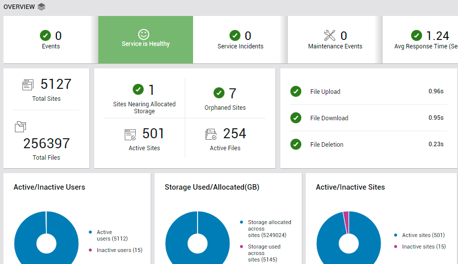
Figure 1 : The OVERVIEW page of the OneDrive dashboard
To access the Overview page, move your mouse pointer over theOneDrive icon in the left panel, and click on the Overview option within.
Problem Events related to OneDrive are also revealed by this page. Click on Events to know what those events are and when they occurred.
The service health indicator in Figure 1 indicates how healthy the OneDrive service is currently, using conventional color codes and visual representations. If the service is in a degraded state, then you can tell if service incidents are impacting service health by checking the value of the Service Incidents measure displayed in Figure 1. If this display reports a non-zero value, then it means that one/more unplanned service incidents have occurred, and are probably the reason for the degraded service state.
Use the Maintenance Events display here to know whether planned maintenance events have occurred.
Are OneDrive sites responding well to HTTP/S requests? The Avg Response Time counter displayed in Figure 1 answers this question! This measure reports an aggregate of response time across all sites configured on OneDrive. If a majority of the sites are poorly responsive, then this aggregate will reflect the aberration.
Determine the number of OneDrive sites that have been configured for the chosen tenant, and the total number of files stored across all sites, using the Total Sites and Total Files measures in Figure 1. Clicking on either of these measures will lead you to Figure 2 that lists the top sites in terms of the number of files stored. This will point you to the most used / hugely popular sites.
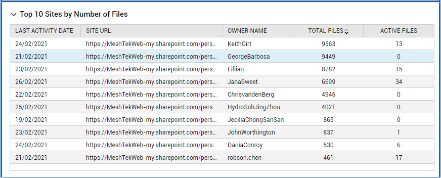
Figure 2 : The table listing the top sites in terms of file count that appears when the Total Files measure is clicked
By default, each OneDrive for Business site is allocated 1 TB of storage space for its use. Some sites however may be more actively used or may contain more files than the rest; such sites may hence utilize more storage. If a site does not have enough storage space free, users cannot store any more files on the site; nor can they work on the files that pre-exist. This is why, it is important to be notified if a site is over-utilizing or is rapidly exhausting its allocated storage space. The Sites Nearing Allocated Storage measure in Figure 1 does just that. This measure reports the number of sites that are about to use up all its allocated storage space. If this measure reports a non-zero value, it implies that one/more sites may potentially encounter a storage space crunch very soon.
Orphaned sites are those sites that are deleted from the authentication provider (such as removed from Active users page in the Microsoft 365 admin center when user leaves the organization), and still continue to exist in OneDrive for Business! These sites should be identified and cleaned up (if exists) to avoid security risks to sensitive data. The Orphaned Sites measure displayed in the Overview page (see Figure 1) reveals if such potential security threats exist. To know which are the orphaned sites, click on this measure.
To gauge the workload on OneDrive in real-time, use the Active Sites and Active Files measures in Figure 1. These measures report the number of OneDrive sites that are actively used to store files, and the number of files across sites that are actively accessed/worked on. Clicking on either of these measures will point you to the sites where the maximum number of files are stored (see Figure 2).
Users of a OneDrive site can upload files to the site, download them, and even delete them. However, if these file operations take too long to complete, user experience with OneDrive will suffer. The File Upload, File Download, and File Deletion measures report the time taken to perform each of these operations, and thus alerts you to probable latencies in such operations. You can click on any of these measures to study the variations in the status of and time taken by that corresponding operation over the last 2 days (see Figure 3, Figure 4, and Figure 5).
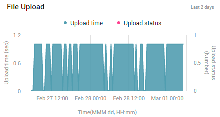
Figure 3 : The graph that you will be lead to once you click on the File upload measure in the OVERVIEW page
Figure 4 : The graph that you will be lead to when you click on the File download measure in the OVERVIEW page
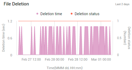
Figure 5 : The graph that you will be lead to when you click on the File deletion measure in the OVERVIEW page
With the help of these graphs, you can quickly figure out if any operation had failed frequently/sporadically during the last 2 days, and if so, when. You can also determine whether any file operation has been consistently slow during the given period. This can hint at persistent processing issues on the sites.
The Active/Inactive Users donut chart (see Figure 1) indicates how many users are actively using the sites, and how many are not. Click on the slice representing Active Users (or on the corresponding legend entry) to know which users are most active in terms of the number of file operations they performed (see Figure 6).
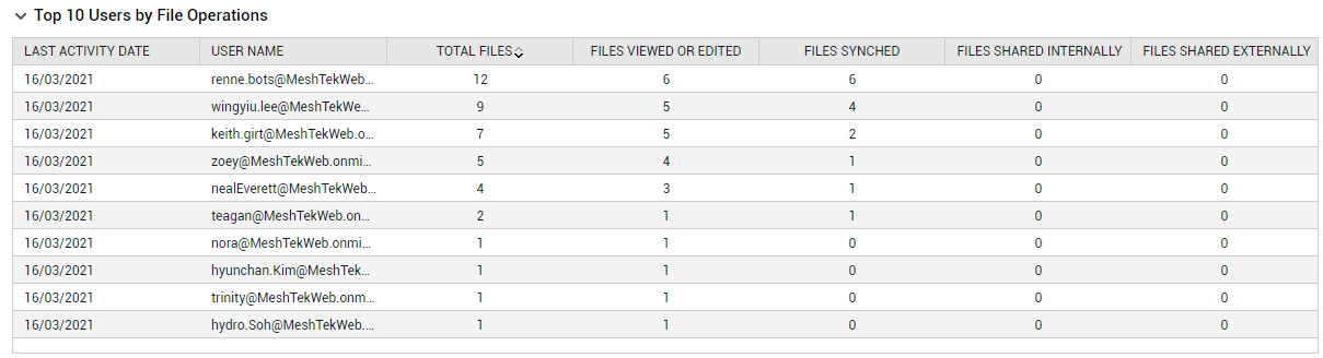
Figure 6 : The table revealing the top users in terms of number of file operations they performed, which appears when the Active Users slice in the Active/Inactive Users donut chart is clicked
Click on the slice representing Inactive Users (or on the corresponding legend entry) to know who the inactive users are.
The Storage Used/Allocated donut chart in Figure 1 indicates the amount of storage allocated to sites and the storage space currently utilized across sites. A quick look at this chart will reveal whether the allocated storage space is about to be exhausted. Click on the slice representing Storage allocated across sites (or on the corresponding legend entry) to know how much storage has been allocated to each site. This will point you to sites that have been sized with the maximum storage space. Click on the slice representing Storage used across sites (or on the corresponding legend entry) to know how much storage space each site has utilized till now. This will reveal those sites that are over-utilizing their storage space allocation, and may soon run out of free space. Such sites may potentially be rendered unusable, if more space is not allocated to them or files are not cleared to free up space on them.
Use the Active/Inactive Sites donut chart in Figure 1 to know how many sites are been actively used to store files and how many are not. If inactive sites are large in number, you may want to investigate the reasons for the low level of activity on the sites. You can begin by clicking on the slice representing Inactive sites (or on the corresponding legend entry), and identifying which sites are currently inactive.
The Site Connectivity bar graph in the OVERVIEW page (see Figure 7) reports the time taken to connect to every OneDrive site. Sites with connectivity issues are thus revealed.
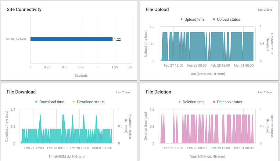
Figure 7 : The OVERVIEW page reporting site connectivity and measure graphs on file operations
Scroll down further to view the Top 10 Sites by Active Number of Files table (see Figure 8), using which you can quickly identify those sites where the maximum number of files are actively used.
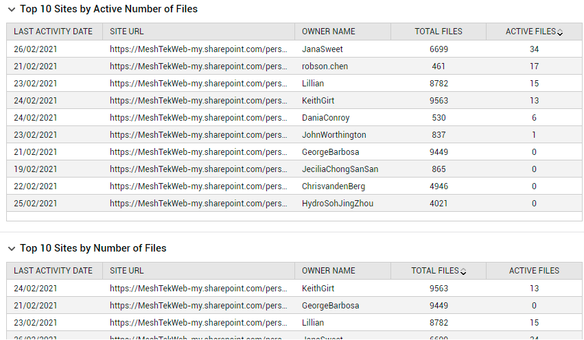
Figure 8 : The OVERVIEW page displaying the top site in terms of the total number of files and number of active files
The owners of these sites are also revealed. Users of these sites would want to maintain the high level of activity at all times; therefore, you need to make sure that the user experience with these sites remain above-par at any given point in time.
The Top 10 Sites by Number of Files table points (see Figure 8) you to those sites where the maximum number of files are stored. You may want to check if such sites are sized with adequate storage space, so it can continue to store many files.
The Top 10 Users by File Operations table (see Figure 9) points you to users who have performed the maximum number of file operations across sites. A look at the table will also reveal which operation was repeatedly performed by the user. If these numbers seem 'suspect' to you, you may want to investigate further.
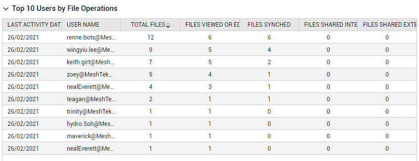
Figure 9 : The table listing top users in terms of number of file operations performed
Usage
The Usage page (see Figure 10) holds a mirror to the different types of operations that are performed on OneDrive sites, helps you isolate abnormal activity levels, and points you to the exact sites, users, and clients that are responsible for the abnormality.
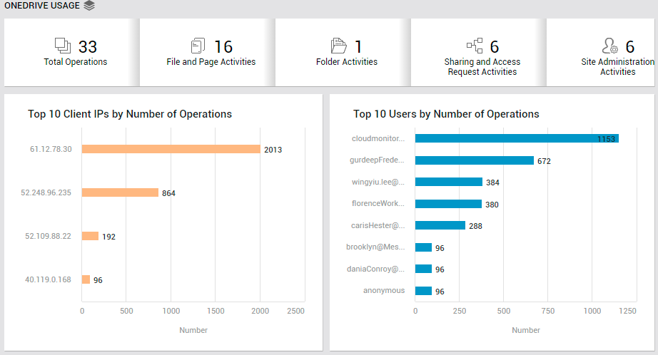
To access the usage page, move your mouse pointer over the OneDrive icon in the left panel, and click on the Usage option within.
The Total Activities counter displayed in this page (see Figure 10) reports the total number of activities performed, and serves as a good indicator of the current operational load on OneDrive sites. If this number is abnormally high, then take a look at the File and Page Activities count, Folder Activities count, Sharing and Access Request Activities count, Site Administration Activities count, and the Synchronization Activities count displayed alongside. A quick look at the count of these activities will point you to the exact activity that caused the overall activity level to increase abnormally.
You can click on the Total Activities counter. This will lead you to a series of measure graphs, each focusing on a different operation that is performed on files, folders, or sites (see Figure 11). With the help of these graphs, you can observe changes in the number of activities (of each type) performed during the last 2 days. In the process, you can ascertain whether the unusual increase that you see in Total Activities is owing to a sudden surge in a specific activity's levels or is the climax of a consistent increase in that activity.
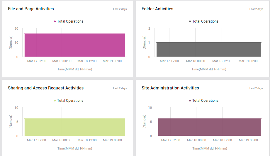
Figure 11 : The measure graphs that you will jump to in the USAGE page, if any of the file operation counters is clicked
To study how many operations of a particular type was performed over the past 2 days, click on the number of operations of that type reported in real-time. For instance, if you click on the File and Page Activities count in Figure 10, you will be lead to the File and Page Activities measure graph you see at the top of Figure 11. This way, you can focus on the variations in the count of a single operation.
Sometimes, in the event of an unexpected spike in total activity levels, you may want to know which users and clients, across operation types, are contributing to the abnormal operational load. For this, all you need to do is take a quick look at the Top 10 Client IPs by Number of Operations and the Top 10 Users by Number of Operations bar graphs (see Figure 10). These bar graphs will point you to the exact client IP addresses and users that are responsible for the high levels of activity.
Next, let us focus on the Unique Users by Activity graph (see Figure 12).
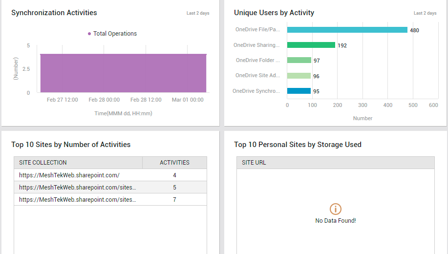
Figure 12 : The USAGE page displaying top users and sites in terms of number of activities, and top personal sites in terms of storage usage
This graph will reveal the type of activity that has been performed by the maximum number and the least number of distinct users. The most and least popular activities can thus be identified. It will also point you to those activities with abnormal usage - i.e., activities that are performed by an unexpected number of users. You may want to investigate such activities to determine if there has been a security breach. For that, click on the bar representing the 'suspicious' activity type in the bar graph. Figure 13 will then appear. This will tell you which users have performed what activities of that type. From this, you can confirm if the right users have performed the right activities.
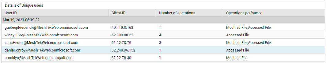
Figure 13 : Detailed diagnosis revealing which user performed what activities and from which IP address
The most active sites, in terms of the number of activities performed on them, are revealed by the Top Sites by Number of Activities table (see Figure 12). Sites experiencing dubious / questionable activity levels are also revealed in the process.
Use the Top 10 Personal Sites by Storage Used table (see Figure 12) to know how each personal site is using the allocated storage space. Sites that are about to run out of storage space can be quickly identified in the process.