CPU
You can also use the System dashboard to instantly identify CPU bottlenecks and the processes responsible for the same. For this, select the CPU option from the Subsystem list. Figure 1 will then appear.
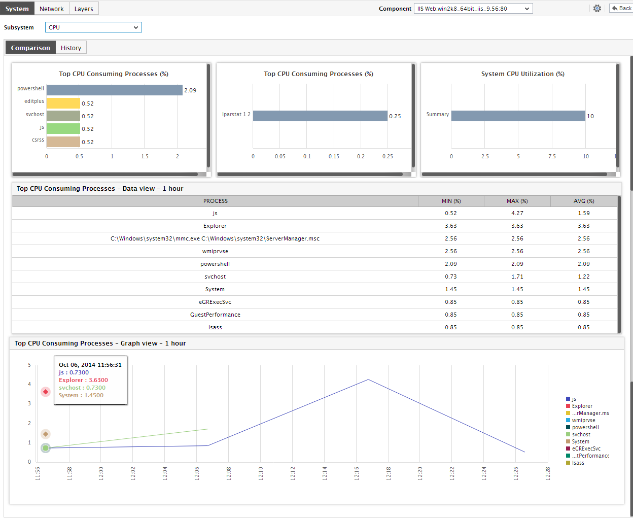
Figure 1 : The System Dashboard for the CPU subsystem
- The first section of the dashboard helps determine whether/not the host is currently facing any CPU-related issues - dial charts and digital number displays provided by this section enables administrators to figure out whether or not all the key CPU health indicators are currently operating well-within their thresholds limit. The dial charts do not indicate the threshold settings for measures by default.
-
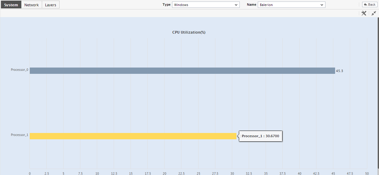
Let us now return to the cpu dashboard. If you click on a dial chart or a digital graph in the cpu dashboard, Figure 2 will appear displaying the exact measure that is represented by the dial/digital chart, and the layer and test to which that measure is mapped.
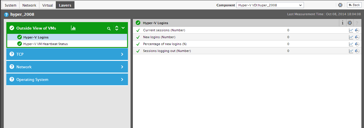
Figure 2 : Clicking on a dial chart/digital chart to view the corresponding layer model, test, and measure
- Below the dial and digital charts, you will find the Comparison tab page, which provides a default set of bar charts comparing the current CPU usage of the processors supported by the host and the processes executing on the host. Using these default bar graphs, you can accurately identify those processors that are excessively utilizing the CPU resources of the host, and those processes that are responsible for this CPU erosion.
-
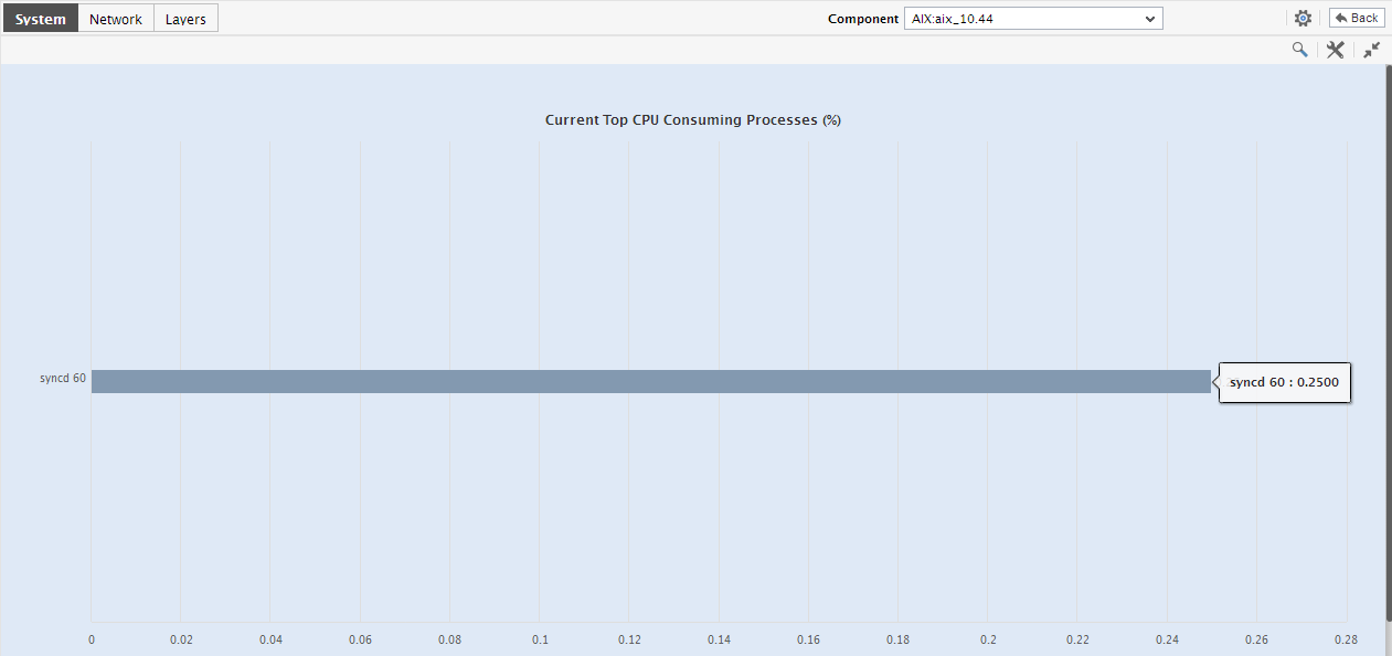
Clicking on any of the bar charts in the Comparison tab page will expand the chart; for instance, to clearly view the top CPU consuming processes on the host, you can enlarge the Top CPU Consuming Processes bar chart as depicted by Figure 3 below.
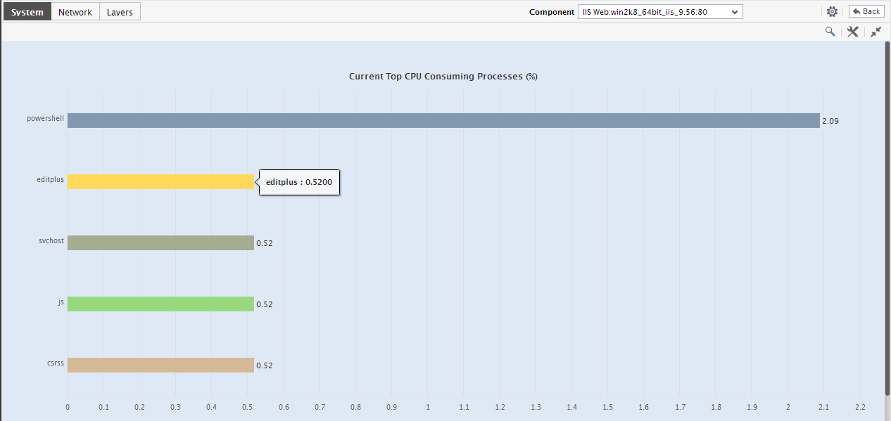
Figure 3 : Expanding a Top-N bar chart in the Comparison tab page of the CPU subsystem dashboard
- By default, the enlarged bar graph in Figure 4 displays top-10 the processes currently executing on the host and the percentage CPU utilized by each. If need be, you can customize the enlarged bar graph, so that it displays only a few processes - say, only the top-5 processes in terms of CPU usage. For this, simply select the top-5 option from the Show list in Figure 5.
-
Moreover, besides the current CPU usage, you can also compare the historical CPU usage of processes by clicking on the Compare History link in Figure 6. Doing so will allow you to alter the Timeline of the bar graph, and enable you to zero-in on that process that was devouring the CPU resources on the host during a particular time period in the past.
-
You can also click on the
 icon in Figure 4 to invoke the detailed diagnosis page. Since this page provides the process id of the top CPU consumers on the host, it enables you to easily locate the CPU-intensive processes and initiate remedial measures.
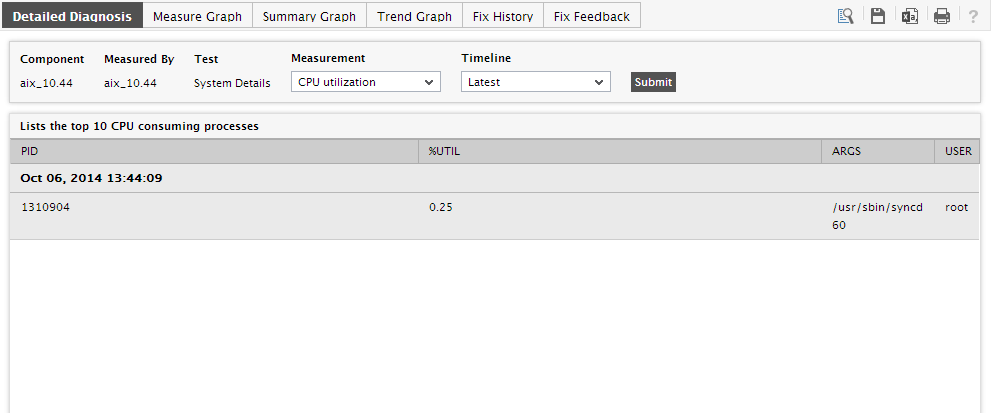
Figure 5 : The detailed diagnosis of the top CPU-consuming processes
- In addition to these bar charts, this tab page also provides you with a CPU Usage Summary by Top Processes table. While the charts focus on current CPU usage by default, the table reveals the top CPU consumers on the host during the last 1 hour (by default). Besides, the table also indicates how high and how low the CPU usage of each process has scaled during the same hour. This way, you can understand whether the high CPU usage of a process was just a sudden spike or a consistent phenomenon.
-
Besides the above, the tab page also embeds a CPU Usage History by Top Processes chart. This chart graphically compares the CPU usage of the processes that were executing on the host during the last 1 hour (by default), and enables the quick and easy identification of the process that is the top CPU consumer. Clicking on this chart enlarges it enabling you to perform the comparative analysis more effectively.
- You can alter the Timeline of the comparison, change its dimension, and even invoke the detailed diagnosis page (see Figure 8) to determine the Process ID of the leading CPU consumer.
-
To shift your focus from current performance to historical performance, click on the History tab page. Figure 9 will then appear.
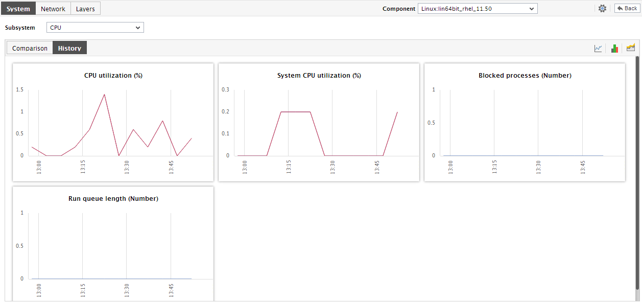
Figure 7 : The History tab page of the CPU dashboard
- By default, the History tab page displays time-of-day measure graphs revealing how the host has been using the CPU resources of the host over the last 24 hours. Using these graphs, you can effortlessly figure out when exactly a CPU contention (if any) crept into the host. If required, you can click on the Timeline link in Figure 10 to go further back in time and analyze the CPU usage.
-
Back in the dashboard, you can enlarge a graph in the History tab page by clicking on that graph.
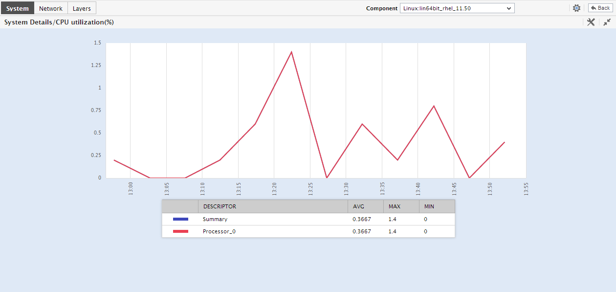
- Here again, you can modify the graph Timeline, or change its dimension from 3d to 2d. In case of graphs that plot values for multiple descriptors, you can selectively compare the CPU usage of a few descriptors alone by selecting a top-n or last-n option from the Show list.
-
By clicking on the
 icon in the History tab page you can convert the measure graphs into summary graphs; these summary graphs, by default, reveal the percentage of time in the last 24 hours during which the CPU usage of the host has remained optimal. Besides indicating whether the overall CPU usage of the host has been within the acceptable limits, it also indicates how often during a day these usage levels have been compromised. You can click on a summary graph to enlarge it; furthermore, you can change the Timeline of the graph in the enlarged mode.
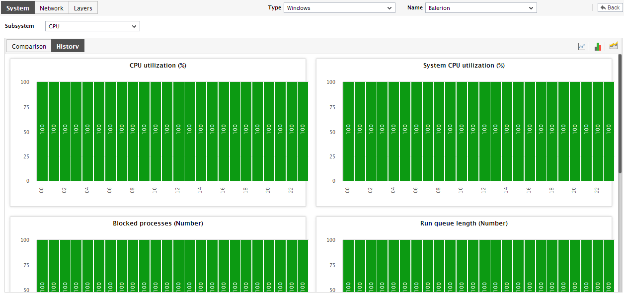
Figure 9 : Summary graphs on CPU usage displayed in the History tab page of the CPU dashboard
- You can even expand the summary graph by clicking on it, and then alter its Timeline.
-
Similarly, you can click on the
 icon in the History tab page to view trend graphs revealing the maximum and minimum CPU used by the host during the last 24 hours (by default). This enables you to better analyze the past trends in CPU usage, and foresee the future trends.
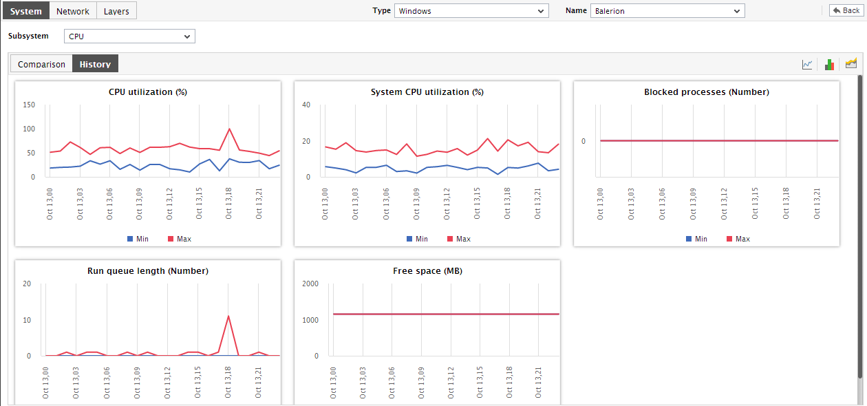
Figure 10 : The Trend graphs on CPU usage displayed in the History tab page of the CPU dashboard
-
You can even expand the trend graph by clicking on it, and then alter its Timeline. By default, the trend graph plots the minimum and maximum values of a measure during the given timeline. In the enlarged mode, you can change the Graph type so that the average values or sum of trend values are plotted in the trend graphs instead.
Note:
In case of descriptor-based tests, the Summary and Trend graphs displayed in the History tab page typically plot the values for a single descriptor alone. To view the graph for another descriptor, pick a descriptor from the drop-down list made available above the corresponding summary/trend graph.
- At any point in time, you can switch to the measure graphs by clicking on the
 button.