Configurable Widgets of My Dashboard
If you wish to compare the values of metrics for a wide range of components or if you wish to compare the detailed diagnosis of various measures or if you wish to view the list of alarms for a chosen measure, then you can use the widgets from the Configurable Widgets tab.
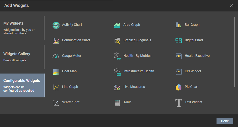
Figure 1 : The Configurable Widgets list
The forthcoming sections will explain in detail about each widget available in this tab.
-
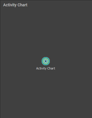
Activity Chart
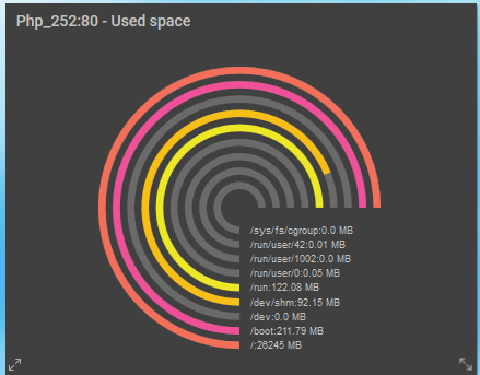
To compare the performance of measures across servers/descriptors in a single graph, you can use the Activity Chart. For example, you can plot the graph for the Used Space measure of the Disk Space test across descriptors of a chosen server and identify the descriptors that are over-utilized. To add an Activity Chart to your dashboard, click the Activity Chart option that appears in the right panel when you click the Configurable Widgets tab in Figure 1. Figure 2 will then appear.
Once the Activity Chart widget is appended to the dashboard, click on the
 icon. Figure 3 will then appear.
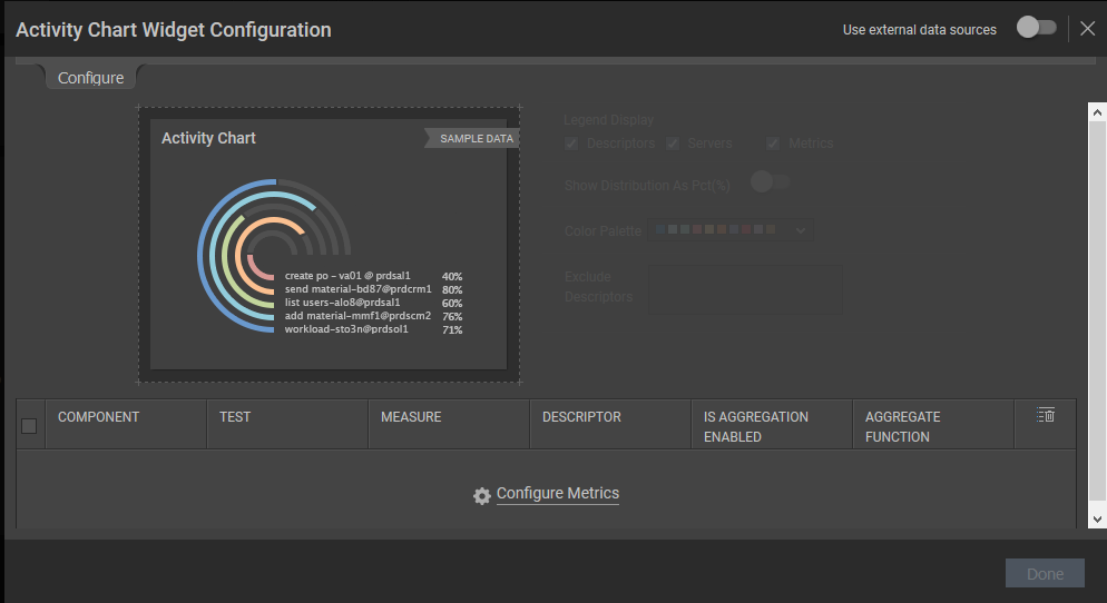
Figure 3 : Configuring the Activity Chart widget
To configure the metrics for the Activity Chart, click the Configure Metrics link in Figure 3. Figure 4 will then appear.
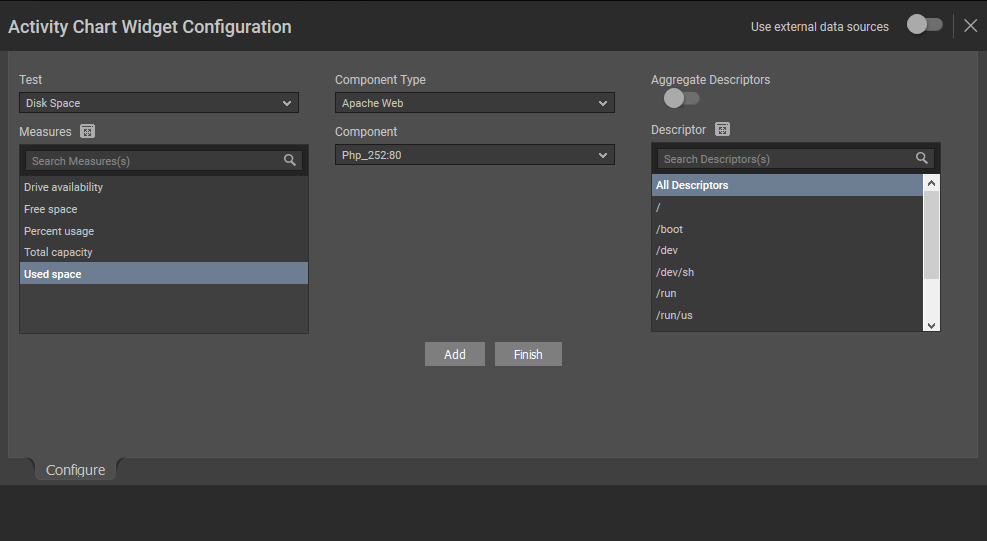
Figure 4 : Choosing the test/measure/descriptors for a chosen component
In Figure 4, specify the following:
- Select a Test, Component Type, Component and Measures for which you wish to configure the Activity Chart. If the Component list consists of too many components, then viewing all the components and selecting the ones you need for configuring the widget could require endless scrolling. To avoid this, you can click the
 icon next to the Component list. The COMPONENTS pop up window will then appear using which you can view almost all the components in a single interface and Select the ones that you wish to view in the Activity Chart widget. You can even search for a component of your choice using the Search Component(s) field in the Components list. Once you have selected the Component, the descriptors of the chosen component will be displayed in the Descriptor section. Select the descriptor of your choice from this list. If the Descriptor list consists of too many descriptors, then viewing all the descriptors and selecting the ones you need for configuring the widget could require endless scrolling. To avoid this, you can click the icon next to the Descriptor list. The DESCRIPTOR pop up window will then appear using which you can view almost all the descriptors in a single interface and Select the ones that you wish to view in the Activity Chart. You can even search for a descriptor of your choice using the Search Descriptor(s) field in the Descriptor list.
 - If descriptors exist for a chosen component, an Aggregate Descriptors slider will appear as shown in Figure 4. By default, this slider is turned off. If this slider is turned on, then an Aggregate Function drop down list will appear with the functions using which you can aggregate the chosen measures and display the same in the Activity Chart.
-
Clicking the Add button will display the selections that you have made in the section below the sample activity chart (see Figure 5).
Note:
You are allowed to provide the name of your choice for the components, measures and the individual descriptor that you have chosen. To do so, just double-click on the component/measure/descriptor for which you wish to provide a name of your choice and enter a new name.
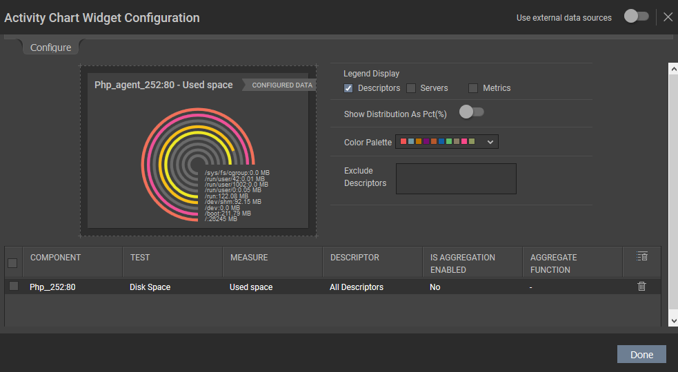
Figure 5 : Listing your selection and choosing the default configuration
- If you wish to delete a selection, then you can do so clicking the
 icon. If you wish to delete multiple selections at a single shot, then select the check box against the selections and click the
  icon.
icon. - By default, the Servers, Measures and Descriptors options are checked against the Legend Display field. If you do not wish to view descriptor-wise measure values, then you can uncheck the Descriptors option against the Legend Display field. If you do not wish to view the measure-wise values, then you can uncheck the Metrics option against this field.
-
You can even choose the colors of your own to plot the graph from the Color Palette list.
Note:
You can even define your own set of colors in the [GRAPH_PALETTES] section of the <eG_INSTALL_DIR>\manager\config\eg_customdashboard.ini file.
- By default, this chart will be represented for the actual values of the chosen measure across descriptors. Therefore, the Show Distribution As Pct(%) slider will be turned off. If you wish to represent this graph in terms of percentage, turn on this slider.
- If you wish to exclude certain descriptors of a test, then you can do so by providing a comma-separated list of descriptors in the Exclude Descriptors list. You can even specify a pattern of descriptors to be excluded in this list box.
- If you wish to drill down from the generated graph/chart to a particular dashboard or a web page available in eG Enterprise, then, you can do so by providing the URL of the dashboard /web page in the Drill Down URL text box. For example, you can specify to navigate to the User Experience Dashboard upon clicking a legend in the generated graph/chart.
-
Clicking the Done button will display the Activity chart for the chosen measures as shown in Figure 6.
- Select a Test, Component Type, Component and Measures for which you wish to configure the Activity Chart. If the Component list consists of too many components, then viewing all the components and selecting the ones you need for configuring the widget could require endless scrolling. To avoid this, you can click the
-
Area Graph
To view the area-wise distribution of metrics in a single graph, you can use the Area Chart. For example, if you wish to plot a chart for the Incoming traffic and Outgoing traffic of the Windows Network Traffic test and identify how well the network traffic is utilized over a time period, then you can plot an Area Chart. To add an Area Chart to your dashboard, click the Area Graph option that appears in the right panel when you click the Configurable Widgets tab in . Figure 7 will then appear.
Figure 7 : The Area Chart widget
Once the Area Chart widget is appended to the dashboard, click on the
 icon. Figure 8 will then appear.
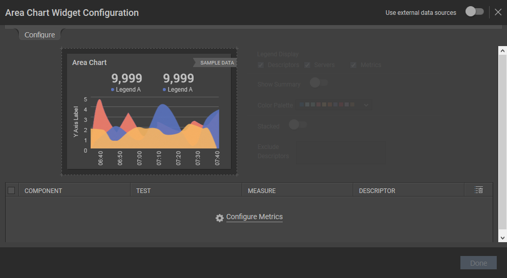
Figure 8 : The Area Chart Widget Configuration
To configure the metrics for the Area Chart, click the Configure Metrics link in Figure 8. Figure 9 will then appear.
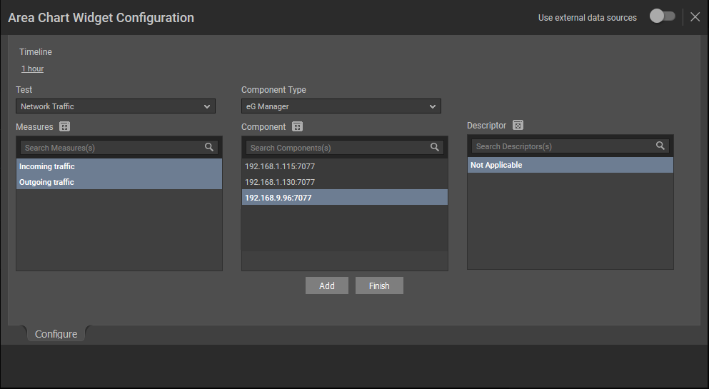
Figure 9 : Configuring the metrics for Area Chart
In Figure 9, specify the following:
- Select a Test, Component Type, Component and Measures for which you wish to configure the Area Chart. If the Component list consists of too many components, then viewing all the components and selecting the ones you need for configuring the widget could require endless scrolling. To avoid this, you can click the icon next to the Component list. The COMPONENTS pop up window will then appear using which you can view almost all the components in a single interface and Select the ones that you wish to view in the Area Chart widget. You can even search for a component of your choice using the Search Component(s) field in the Components list. Once you have selected the Component, the descriptors of the chosen component will be displayed in the Descriptor section. Select the descriptor of your choice from this list. If the Descriptor list consists of too many descriptors, then viewing all the descriptors and selecting the ones you need for configuring the widget could require endless scrolling. To avoid this, you can click the icon next to the Descriptor list. The DESCRIPTOR pop up window will then appear using which you can view almost all the descriptors in a single interface and Select the ones that you wish to view in the Area Chart. You can even search for a descriptor of your choice using the Search Descriptor(s) field in the Descriptor list.
- Pick a Timeline for which the Area Chart should be configured. If you wish to specify the time for which the Area Chart should be configured, then you can do so using the From and To fields.
Clicking the Add button will display the selections that you have made in the section below the sample area chart (see Figure 10).
Note:
You are allowed to provide the name of your choice for the components, measures and the individual descriptor that you have chosen. To do so, just double-click on the component/measure/descriptor for which you wish to provide a name of your choice and enter a new name.
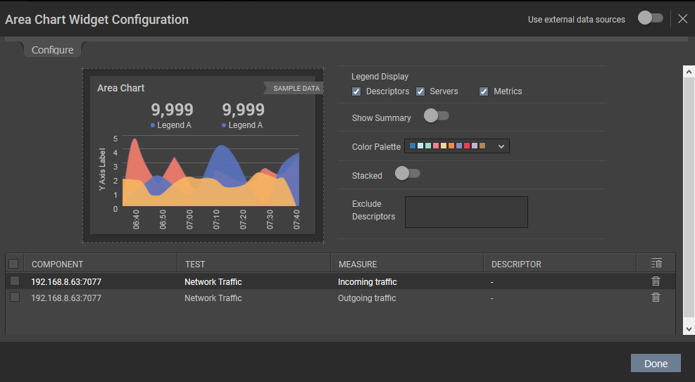
Figure 10 : Listing your selection and choosing the default configuration
- If you wish to delete a selection, then you can do so clicking the icon. If you wish to delete multiple selections at a single shot, then select the check box against the selections and click the icon.
- By default, the Servers, Measures and Descriptors options are checked against the Legend Display field. If you do not wish to view descriptor-wise measure values, then you can uncheck the Descriptors option against the Legend Display field. If you do not wish to view the measure-wise values, then you can uncheck the Metrics option against this field.
-
You can even choose the colors of your own to plot the graph from the Color Palette list.
Note:
You can even define your own set of colors in the [GRAPH_PALETTES] section of the <eG_INSTALL_DIR>\manager\config\eg_customdashboard.ini file.
- If you wish to exclude certain descriptors of a test, then you can do so by providing a comma-separated list of descriptors in the Exclude Descriptors list. You can even specify a pattern of descriptors to be excluded in this list box.
- Clicking the Done button will display the Area chart for the chosen measures as shown in Figure 11.
-
By default, the area chart will be displayed with an overlap of one metric over the other i.e., the measure with the maximum value will be plotted first and the rest of the measures will be plotted within the area of the measure with the maximum value.
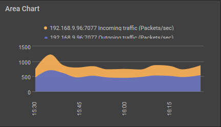
Figure 11 : The Area Chart widget that is configured based on your selection
-
If you wish to view the exact area distribution of measures without overlap, you can slide the Stacked slider to the right in Figure 10. For example, if you wish to view the area-wise distribution of the Incoming Traffic and Outgoing Traffic metrics of the Windows Network Traffic test using the Area Chart, then upon adding those metrics, the Area Chart will appear as shown in Figure 12 with the minimum value being plotted in the graph first and the value higher than the minimum value plotted over the minimum value. Note that only the metrics with the same measurement unit should be added if the Stacked slider is turned on.
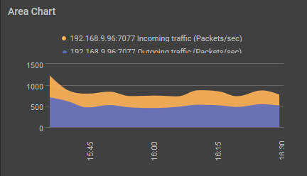
Figure 12 : The Area Chart when the Stack Area Chart check box is checked
If you wish to change the colors used in the Area Chart, simply click the
 icon and choose the color palette of your interest.
- Select a Test, Component Type, Component and Measures for which you wish to configure the Area Chart. If the Component list consists of too many components, then viewing all the components and selecting the ones you need for configuring the widget could require endless scrolling. To avoid this, you can click the
-
Bar Graph
If you want to compare the values of the configured measure-descriptor combinations during the last measurement period, you can use the Bar Graph widget. To append a bar graph to your dashboard, click the Bar Graph option that appears in the right panel when the Configurable Widgets tab is clicked (see ). Figure 13 will then appear in your dashboard.
Figure 13 : The Bar Graph widget
You may add the measures and components by clicking the Configure Metrics link in Figure 14 that appears when you click the
 icon in the Bar Graph widget. A bar graph can be generated for closely related measures so that you can accurately diagnose the root-cause of performance problems in an infrastructure. For instance, a bar graph comparing the CPU usage of a virtual host, the relative CPU usage of the VMs, and the actual CPU usage of the VMs, will lead you to the root-cause of a CPU contention experienced by a VM.
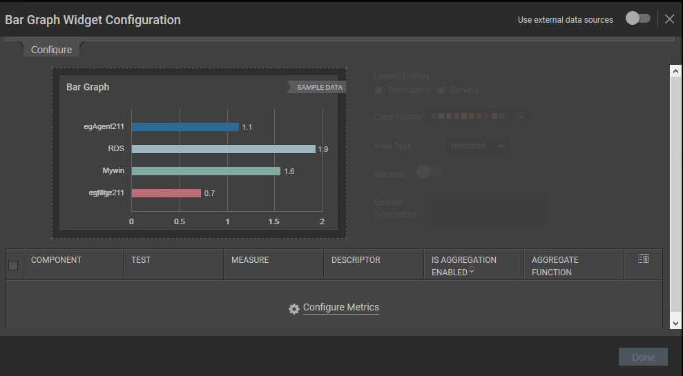
Figure 14 : Clicking the Configure Metrics
Once you click the Configure Metrics link in Figure 14, Figure 15 will appear where you will be required to choose the Test, Measures, Component Type and Components of your choice.
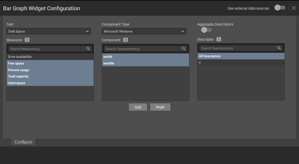
Figure 15 : Configuring the test, measures and components for generating the bar graph
In Figure 15, specify the following:
- Select a Test, Component Type, Component and Measures for which you wish to configure the Area Chart. If the Component list consists of too many components, then viewing all the components and selecting the ones you need for configuring the widget could require endless scrolling. To avoid this, you can click the icon next to the Component list. The COMPONENTS pop up window will then appear using which you can view almost all the components in a single interface and Select the ones that you wish to view in the Bar Graph widget. You can even search for a component of your choice using the Search Component(s) field in the Components list. Once you have selected the Component, the descriptors of the chosen component will be displayed in the Descriptor section. Select the descriptor of your choice from this list. If the Descriptor list consists of too many descriptors, then viewing all the descriptors and selecting the ones you need for configuring the widget could require endless scrolling. To avoid this, you can click the icon next to the Descriptor list. The DESCRIPTOR pop up window will then appear using which you can view almost all the descriptors in a single interface and Select the ones that you wish to view in the Bar Graph. You can even search for a descriptor of your choice using the Search Descriptor(s) field in the Descriptor list.
Clicking the Add button will display the selections that you have made in the section below the sample bar graph (see Figure 16).
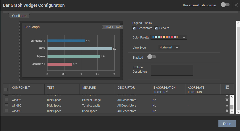
Figure 16 : Listing the selection and choosing the default options
- By default, the Servers and Descriptors options are checked against the Legend Display field. If you do not wish to view descriptor-wise measure values, then you can uncheck the Descriptors option against the Legend Display field.
-
You can even choose the colors of your own to plot the graph from the Color Palette list.
Note:
You can even define your own set of colors in the [GRAPH_PALETTES] section of the <eG_INSTALL_DIR>\manager\config\eg_customdashboard.ini file.
-
If you wish to exclude certain descriptors of a test, then you can do so by providing a comma-separated list of descriptors in the Exclude Descriptors list. You can even specify a pattern of descriptors to be excluded in this list box.
Note:
-
You are allowed to provide the name of your choice for the components, measures and the individual descriptor that you have chosen. To do so, just double-click on the component/measure/descriptor for which you wish to provide a name of your choice and enter a new name.
- If you wish to delete a selection, then you can do so clicking the icon. If you wish to delete multiple selections at a single shot, then select the check box against the selections and click the icon.
-
Clicking the Done button will display the Bar chart for the chosen measures as shown in Figure 11.
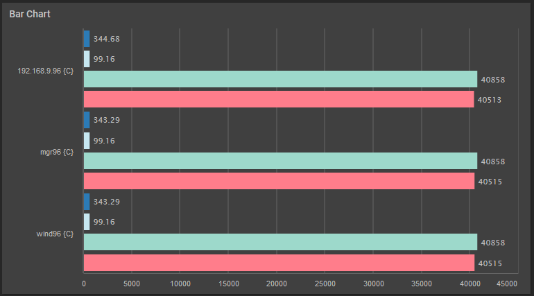
Figure 17 : The Bar Chart widget that is configured based on your selection
-
If you have chosen Vertical option from the View Type list, then, the Bar chart will be displayed as shown in Figure 18.
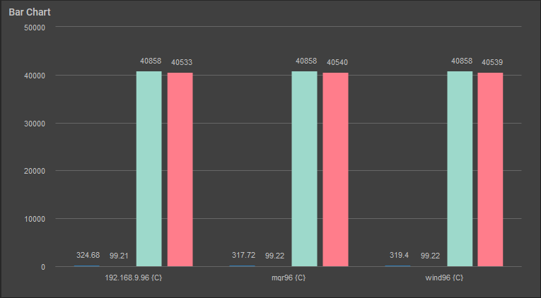
Figure 18 : The bar graph that appears when Vertical option is chosen for viewing
To view a bar graph for measures on which aggregation is enabled, you can use the stacked slider. For generating such a bar graph, turn on the Stacked slider in Figure 16. Figure 19 will then appear.
Figure 19 : Generating a bar graph by turning on the Stacked slider
If such a bar graph is generated for closely related measures, it will enable you to accurately diagnose the root-cause of performance problems in an infrastructure.
If you wish to change the colors used in the bar graph, simply click the
icon and choose the color palette of your interest. - Select a Test, Component Type, Component and Measures for which you wish to configure the Area Chart. If the Component list consists of too many components, then viewing all the components and selecting the ones you need for configuring the widget could require endless scrolling. To avoid this, you can click the
-
Combination Chart
If you wish to view a graphical representation of a set of metrics with different measurement units, then you can use the Combination Chart widget. This Combination Chart combines the Line Chart, Bar Graph and Area Charts and provides you with a single graph. To add a Combination Chart to your dashboard, click the Combination Chart option that appears in the right panel when the Configurable Widgets tab is clicked in . Figure 20 will then appear.
Figure 20 : The Combination Chart widget
Once the Combination Chart widget is appended to the dashboard, click on the
 icon. Figure 21 will then appear.
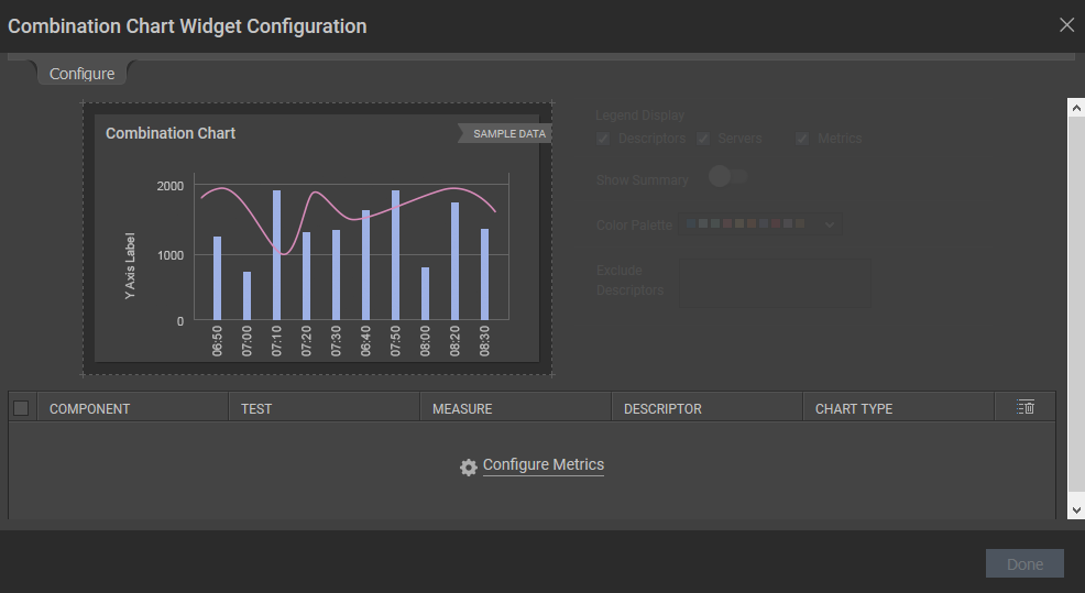
Figure 21 : Configuring the Combination Chart
To configure the metrics for generating a Combination Chart, click the Configure Metrics link in Figure 21. Figure 22 will then appear.
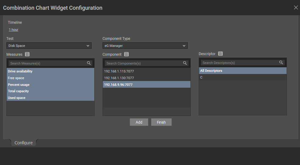
Figure 22 : Selecting the tests and measures for generating the Combination chart
In Figure 22, specify the following:
- Select a Test, Component Type, Component and Measure for which you wish to configure the Combination Chart. If the Component list consists of too many components, then viewing all the components and selecting the ones you need for configuring the widget could require endless scrolling. To avoid this, you can click the icon next to the Component list. The COMPONENTs pop up window will then appear using which you can view almost all the components in a single interface and Select the ones that you wish to view in the Combination Chart widget. You can even search for a component of your choice using the Search Component(s) field in the Component list. Once you have selected the Component, the descriptors of the chosen component will be displayed in the Descriptor section. Select the descriptor of your choice from this list. If the Descriptor list consists of too many descriptors, then viewing all the descriptors and selecting the ones you need for configuring the widget could require endless scrolling. To avoid this, you can click the icon next to the Descriptor list. The DESCRIPTOR pop up window will then appear using which you can view almost all the descriptors in a single interface and Select the ones that you wish to view in the Combination Chart. You can even search for a descriptor of your choice using the Search Descriptor(s) field in the Descriptor list.
- Pick a Timeline for which the Combination Chart should be configured. If you wish to specify the time for which the Combination Chart should be configured, then you can do so using the From and To fields.
-
Clicking the Add button will add you selection to the chart and clicking the Finish display the selections that you made as shown in Figure 23.
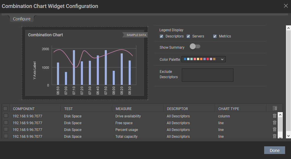
Figure 23 : Displaying the selections for generating the Combination Chart
In Figure 23, you can either alter the following default specifications or generate the chart by clicking the Done button.
- By default, the Servers, Descriptors and Metrics option is checked against the Legend Display field. If you do not wish to view descriptor-wise measure values, then you can uncheck the Descriptors option against the Legend Display field. If you do not wish to view the measure-wise values, then you can uncheck the Measures option against this field.
- If you wish to exclude certain descriptors of a test, then you can do so by providing a comma-separated list of descriptors in the Exclude Descriptors list.
-
You can even choose the colors of your own to plot the graph from the Color Palette list.
Note:
You can even define your own set of colors in the [GRAPH_PALETTES] section of the <eG_INSTALL_DIR>\manager\config\eg_customdashboard.ini file.
- If you wish to view the value of the chosen measure during the last measurement period, then turn on the slider against the Show Summary.
- By default, in environments where hundreds of descriptors are discovered for a test, obtaining all the values of those descriptors for the chosen timeline in the widget may cause overhead to the eG manager. To avoid this, administrators can choose to plot the widget for the top most/botttom most values reported by the descriptors. For this purpose, administrators should turn on the slider against the Show TopN option.
- As soon as the Show TopN slider is turned on, the Priority list appears. By default, Top 10 has been chosen from the Priority list indicating that the top 10 values of the chosen measure for the chosen descriptors will be displayed in the generated widget.
-
You are allowed to provide the name of your choice for the components, measures and the individual descriptor that you have chosen. To do so, just double-click on the component/measure/descriptor for which you wish to provide a name of your choice and enter a new name.
- By default, the graph will be plotted as a line chart and therefore all your selections will be listed with the Chart Type column indicating line as the default graph type. If you wish to view certain metrics of your selection as a bar graph or an area chart, then simply double clicking the line option under the Chart Type column against the chosen measure will invoke a drop down list. From this list, select column or Area according to your wish.
- If you wish to delete a selection, then you can do so clicking the icon. If you wish to delete multiple selections at a single shot, then select the check box against the selections and click the icon.
-
Clicking the Done button will display the Combination chart for the chosen measures as shown in Figure 24.
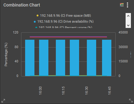
Figure 24 : The Combination Chart that is displayed based on the metrics of your choice
-
If the metrics of your choice are with different measurement units, then each type of graph will have a separate Y axis for your reference (see Figure 25). If you plot the Used space, Total capacity, Free Space metrics of the Disk Space test and the Incoming Traffic of the Network Traffic test, then the graph will be plotted with 3 different Y axis. The Y axis for the Total Capacity measure will be in represented in MB, the Y axis of the Percent usage measure will be represented in Percent and the Y axis of the Incoming traffic will be represented in Packets/sec.
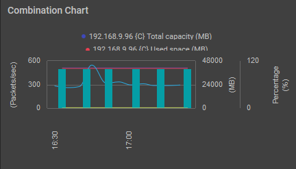
Figure 25 : The Combination Chart when different chart types are chosen
-
If you have turned on the slider of the Show Summary option, then the value of the measure during the last measurement period will be displayed as shown in Figure 26.
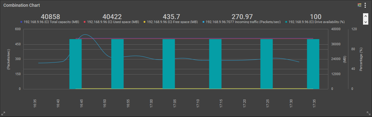
Figure 26 : Viewing the value of the chosen measures during the last measurement period
- Select a Test, Component Type, Component and Measure for which you wish to configure the Combination Chart. If the Component list consists of too many components, then viewing all the components and selecting the ones you need for configuring the widget could require endless scrolling. To avoid this, you can click the
-
Detailed Diagnosis
If you wish to periodically monitor the detailed diagnosis of a particular measure in your environment, then you can use the Detailed Diagnosis widget. Clicking the Add button against the Detailed Diagnosis option that appears in the right panel when the Configurable Widgets tab is clicked (see ) will append the Detailed Diagnosis widget to the dashboard (see Figure 27).
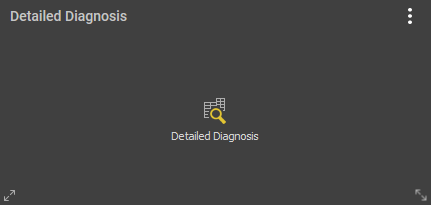
Figure 27 : The Detailed Diagnosis widget
Now, clicking the
 icon in the widget will lead you to Figure 28.
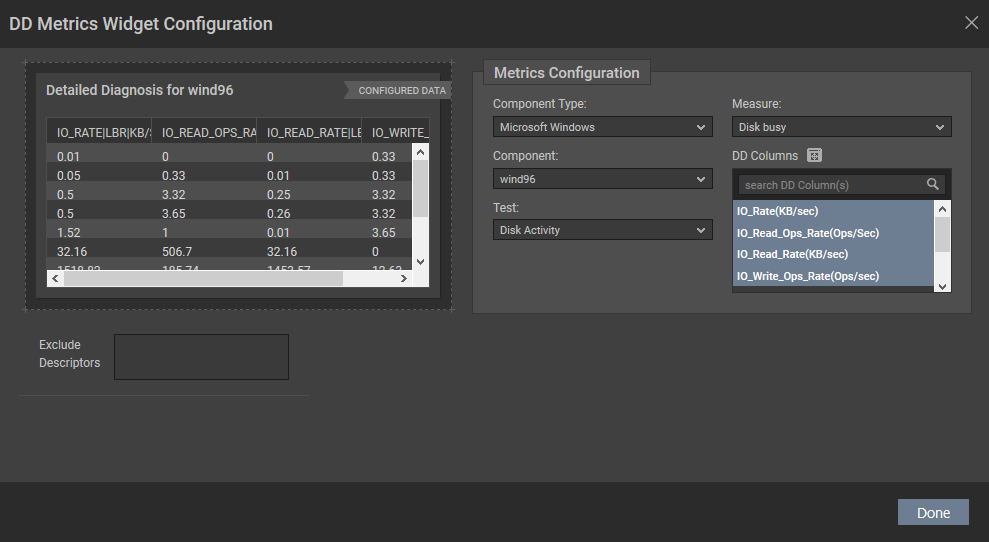
Figure 28 : Configuring the Detailed Diagnosis widget
Select the Component Type,Component, Test and Measure for which you wish to view the detailed diagnosis in Figure 28. The DD Columns will then be populated with the attributes that are available for the chosen measure. You can either select all the attributes or select the ones that are of interest to you. Clicking the Done button in Figure 28 will list your selection in the Detailed Diagnosis widget as shown in Figure 29.
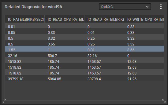
Figure 29 : The Detailed Diagnosis widget designed based on your choice
Note:
The detailed diagnosis of a single measure can alone be viewed in the Detailed Diagnosis widget. If you wish to view the detailed diagnosis for multiple measures, then you need to include multiple Detailed Diagnosis widgets in your dashboard.
-
Digital Chart
The Digital Chart helps administrators to track the fluctuations of a chosen measure over a period of time. To configure a Digital Chart, just click the Digital Chart option that appears in the right panel when the Configurable Widgets tab is clicked (see). The Digital Chart will now be appended to the dashboard as shown in Figure 30.
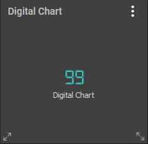
Figure 30 : The Digital Chart widget
To configure the measure of your choice, just click the
 icon in the widget which leads you to Figure 31.
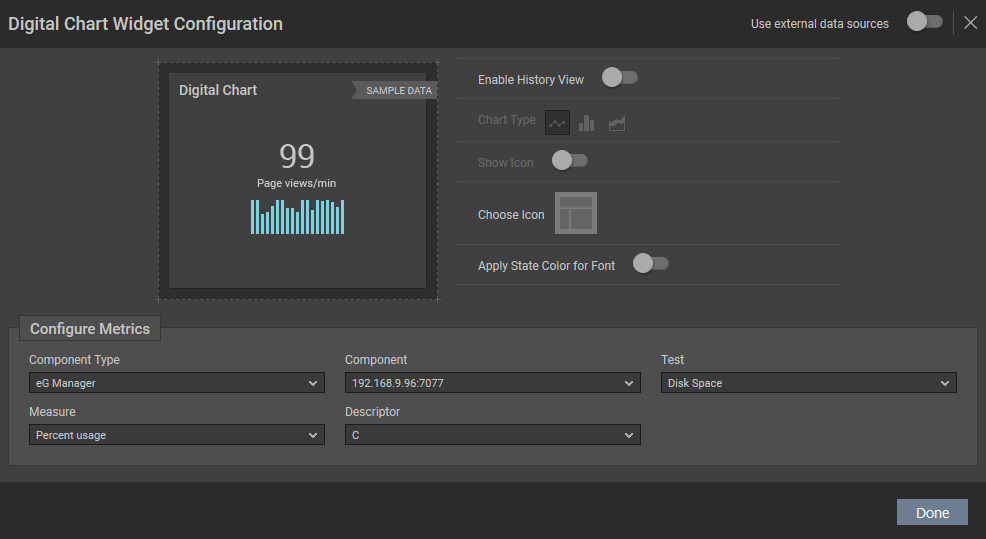
Figure 31 : Configuring the Digital Chart widget
Selecting a Component Type, Component, Test, Measure and Descriptor in Figure 31 and clicking the Update button will display the Digital Chart for the chosen measure as shown in Figure 32.
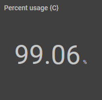
Figure 32 : The Digital Chart widget that is configured as per your selection
If you wish to view the historical view of the measure for which you have configured the digital chart, then you can turn on the Enable History View slider. Once you have turned the slider on, the Chart Type, Show Icon and Choose Icon options will be enabled.
If you want to view the history graph of the chosen measure, then select the turn on the Enable History View slider and click the
 icon. If you want to view a bar graph relating to the performance of the chosen measure, then you can click the
  icon. Similarly to view an area chart of the chosen measure over a time period, you can choose the
  icon.
icon. You can even choose a relevant icon of your choice for display in the digital chart. For this, click the
 icon against the Choose Icon option in Figure 31. Figure 33 then appears.
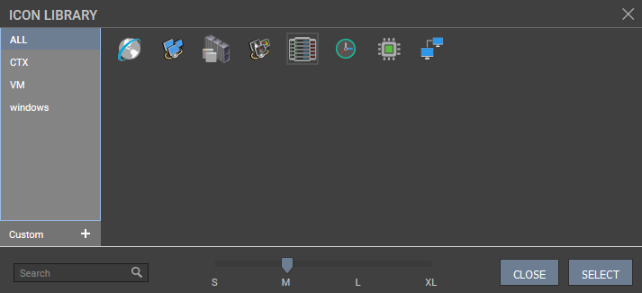
Figure 33 : Choosing the icon for display in the generated digital chart
Select the icon of your choice from Figure 33 and click the SELECT button. If you do not wish to choose the icon from the icon offered, then you can click the Custom option in Figure 33 to upload your own image. Figure 34 appears when you click the Custom option in Figure 33.
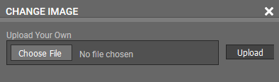
Figure 34 : Uploading your own icon
Click the Choose File option to Upload the image of your choice. You can even choose the size of the image to be displayed in the digital chart. By default, the slider is positioned in the L option indicating that a larger icon will be displayed in the digital chart. You can even search for the icon of your choice using the Search text box.
You can even choose to view the state of the measure by merely turning on the Apply State Color for Font slider. Figure 35 appears displaying the Digital chart as per your selection.
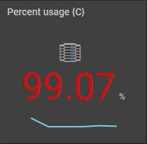
Figure 35 : The Digital Chart that appears with the state color, chosen icon and line graph
-
Gauge Meter
Often administrators may want to keep track on certain mission critical metrics round the clock. To view such real-time metrics, you can use the Gauge Meter widget. To add a Gauge Meter widget to the dashboard, just click the Gauge Meter option in the right panel that appears when the Configurable Widgets tab is clicked (see ). The Gauge Meter widget will then be appended to the dashboard as shown in Figure 36.
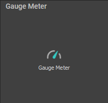
Figure 36 : The Gauge Meter widget
Clicking the
 icon in the widget will lead you to Figure 37 using which you can configure the metrics for the widget.
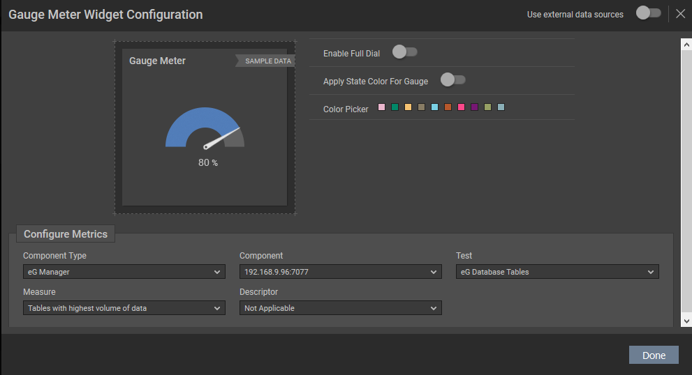
Figure 37 : Configuring the Gauge Meter
Selecting a Component Type, Component, Test, Measure and Descriptor in Figure 37 and clicking the Done button will display the Gauge Meter for the chosen measure (see Figure 38).
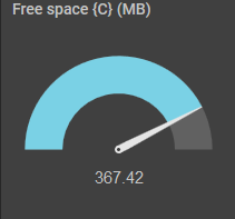
Figure 38 : The Gauge Meter widget that is configured as per your choice
Using this Gauge Meter widget you can figure out the maximum value of the measure and the current value of the metric in real time. This widget also helps you to figure out the load/utilization of the chosen measure in real time.
You can even choose the color of the half dial using the colors available against the Color Picker option.
If you wish to enable a full dial for the Gauge Meter widget, then turn on the Enable Full Dial slider. This will ensure that a full dial is displayed in the widget instead of the default half dial.
By default, the Gauge Meter widget will not display the state of the measure. However, if you wish to view the state of the chosen measure, then you can turn on the Apply State Color For Gauge slider. This will ensure that the color of the dial is changed according to the state of the chosen measure. Figure 39 displays a full dial with the state of the measure.
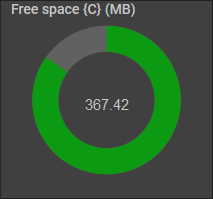
Figure 39 : The Gauge Meter widget displaying the full dial and the state of the measure
Note:
If the measurement unit of the measure plotted in the Gauge Meter is Percent, then the maximum value of the Gauge Meter is 100. If the measure has a measurement unit other than Percent, then the maximum value is picked by analyzing the values reported by the measure over a time period. If you wish to change this time period, then you can do so by editing the GaugeMaxTimeline parameter available in the [DASHBOARD_SETTINGS] section of the <EG_INSTALL_DIR>\manager\config\eg_customdashboard.ini file. By default, the GaugeMaxTimeline parameter is set to 24 hours.
By default, the Gauge Meter is plotted using the default HighCharts plugin. If you wish to use a different plugin, then you can do so by setting the EnableHighChartsforGauge flag available in the [DASHBOARD_SETTINGS] section of the <EG_INSTALL_DIR>\manager\config\eg_customdashboard.ini file to false.
-
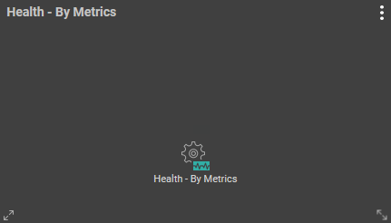
Health - By Metrics
If you wish to view the health of a group of key metrics associated with the components of your interest in the dashboard, then use the Health - By Metrics widget. To add a Health - By metrics widget to the dashboard, just click the Health - By Metrics option in the right panel that appears when the Configurable Widgets tab is clicked (see ). The Health - By Metrics widget will then be appended to the dashboard.
Once the Health - By Metrics widget is appended to the dashboard, click on the
 icon. Figure 41 will then appear.
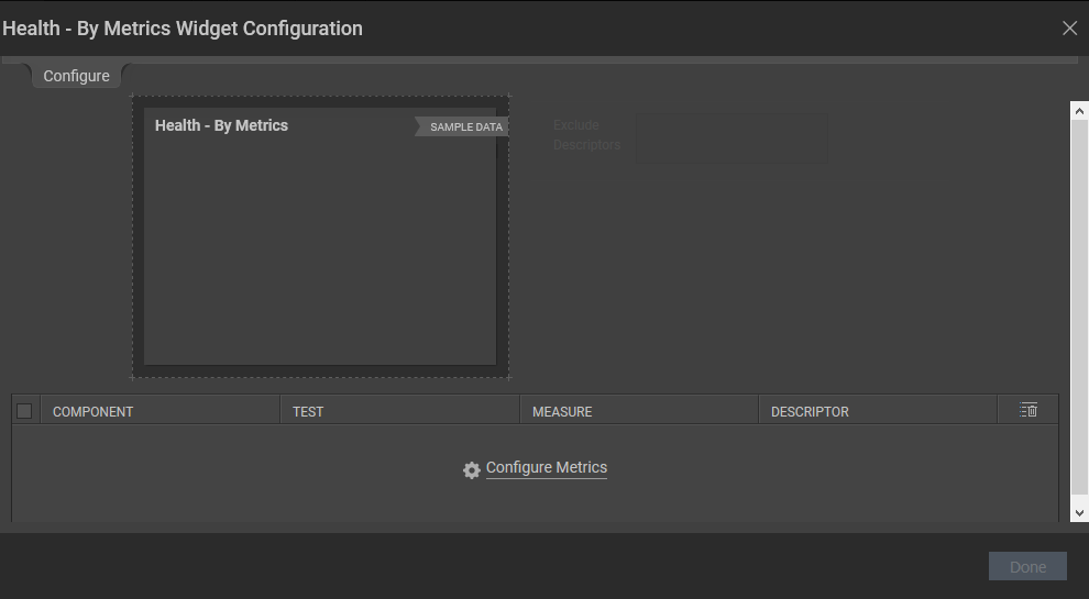
Figure 41 : Health Widget Configuration window
Clicking the Configure Metrics link in Figure 41 will invoke Figure 42.
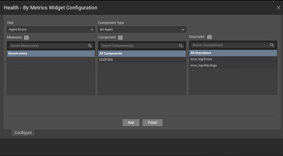
Figure 42 : Adding the metrics of a component type
Configure the metrics in Figure 42 as specified below:
- Select a Component Type and Component for which you wish to configure the Health widget.
- Once the Component is chosen, the Test list in the Pick Key Metrics section will be populated with the tests pertaining to the chosen component. Once you choose the test, the measures of that test will be populated in the Measure list. Select the measure(s) of your interest from this list.
- Select the Descriptor and click the Add button. By default, All Descriptors option will be chosen from the Descriptor list.
-
Clicking the Add button will display your selection as shown in Figure 43.
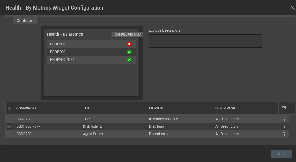
Figure 43 : Displaying your selection
Note:
You are allowed to provide the name of your choice for the components, measures and the individual descriptor that you have chosen. To do so, just double-click the component/measure/descriptor for which you wish to provide a name of your choice and enter a new name.
- If you wish to delete a selection, then you can do so clicking the icon. If you wish to delete multiple selections at a single shot, then select the check box against the selections and click the icon.
- If you wish to exclude certain descriptors, then you can do so by providing a comma-separated list of descriptors in the Exclude Descriptors list. You can even specify a pattern of descriptors to be excluded in this list box.
-
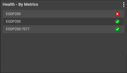
Clicking the Done button will display the chosen components and their current state in the Health - By Metrics widget as shown in Figure 44.
-
Clicking the state of the component will lead you to Figure 45 that contains the KPI and Problem Analytics tab.
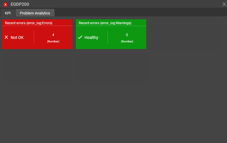
Figure 45 : The KPI indicators of a chosen component
In the KPI tab, the measures configured by you will be displayed along with its current state and the value reported during the current measure period. If no alerts are raised for the chosen measure, then the measure is reported as Healthy. If alerts are generated for the component pertaining to the chosen measure, then, apart from the measures configured, the problematic measures are also listed along with their state and value in the KPI tab. If you do not wish to view the problematic measures in the KPI tab apart from the measures that you have configured and also wish to view the state of the server as that of the state of the measure that you have configured, then you should set the ShowHealthbasedonKPI flag in the eg_customdashboard.ini file in the <eG_INSTALL_DIR>\manager\config folder to Yes.
The Problem Analytics tab as shown in Figure 46 provides an overall summary of alerts generated for the chosen Component. The alarm description will also be listed in this tab for further analysis.
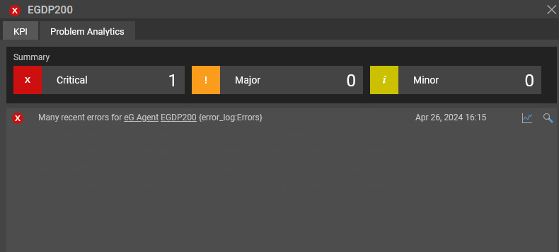
Figure 46 : The Problem Analytics tab displaying the alerts generated for the chosen component
Clicking on the alarm description will lead you to the problematic test/measure combination in the layer model of the particular component.
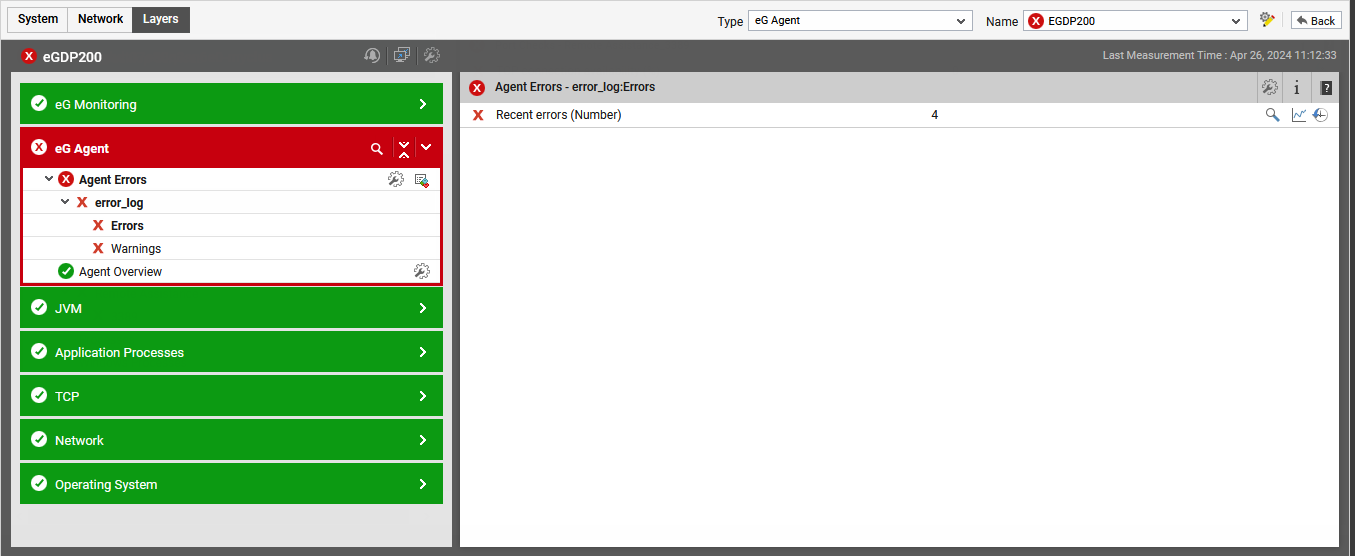
Figure 47 : The layer model that appears upon clicking an alarm description in the Problem Analytics tab
Note:
- The Problem Analytics tab will not appear if all the measures configured are healthy.
- The KPI tab displays only the problematic measures in the highest order of severity. For example, if a component consists of a measure with a major alert and a measure with a minor alert, then the KPI tab displays the measure with the major alert apart from the measures of your interest. The Problem Analytics tab on the other hand, will list all the alarms for the chosen component irrespective of the criticality.
-
Heat Map
If you wish to view the distribution of metrics possessing the same measurement unit, then you can use the Heat Map chart. To add a Heat Map widget to the dashboard, just click the Heat Map option in the right panel that appears when the Configurable Widgets tab is clicked (see ).
Figure 48 : The Heat Map Chart widget
Once the Heat Map chart widget is appended to the dashboard, click on the
 icon. Figure 49 will then appear.
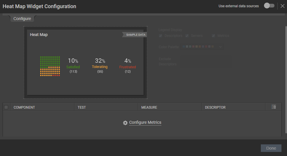
Figure 49 : The page leading users to configure metrics
Clicking the Configure Metrics will lead you to Figure 50 where you will be allowed to configure the measures of your choice to plot the Heat Map widget.
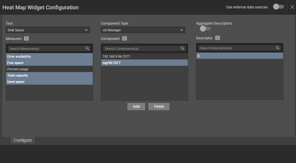
Figure 50 : Configuring the Heat Map chart
Specify the following in Figure 50:
- Select a Test, Component Type, Component and Measure for which you wish to configure the Heat Map chart. If the Component list consists of too many components, then viewing all the components and selecting the ones you need for configuring the widget could require endless scrolling. To avoid this, you can click the icon next to the Component list. The COMPONENT pop up window will then appear using which you can view almost all the components in a single interface and Select the ones that you wish to view in the Heat Map chart widget. You can even search for a component of your choice using the Search Component(s) field in the Component list. Once you have selected the Component, the descriptors of the chosen component will be displayed in the Descriptor section. Select the descriptor of your choice from this list. If the Descriptor list consists of too many descriptors, then viewing all the components and selecting the ones you need for configuring the widget could require endless scrolling. To avoid this, you can click the icon next to the Descriptor list. The DESCRIPTOR pop up window will then appear using which you can view almost all the descriptors in a single interface and Select the ones that you wish to view in the Heat Map chart. You can even search for a descriptor of your choice using the Search Descriptors(s) field in the Descriptor list.
- If descriptors exist for a chosen component, an Aggregate Descriptors flag will appear as shown in Figure 76. By default, this flag is set to No. If this flag is set to Yes, then an Aggregate Function drop down list will appear with the functions using which you can aggregate the chosen measures and display the same in the Heat Map chart.
- By default, all the options are checked against the Legend Display field. This implies that by default, the generated heat map will include the name of the server, descriptor and measure. If you do not wish to view descriptor-wise measure values in the heat map chart, then you can uncheck the Descriptors option against the Legend Display field. If you do not wish to view the measure-wise values in the heat map chart, then you can uncheck the Metrics option against this field.
-
Clicking the Add button in Figure 50 will display the selections that you have made in Figure 51.
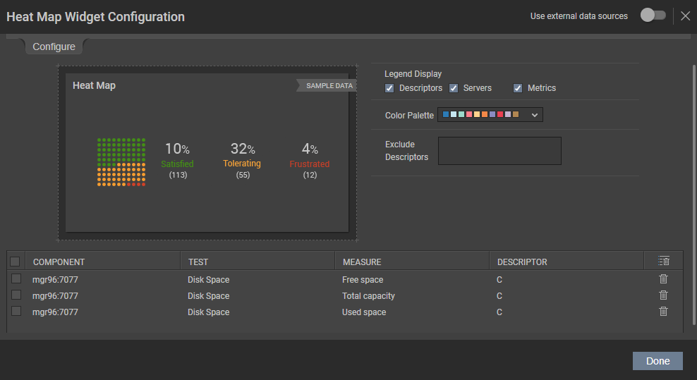
Figure 51 : Displaying your selection for Heat Map chart
You are allowed to provide the name of your choice for the components, measures and the individual descriptor that you have chosen. To do so, just double-click on the component/measure/descriptor for which you wish to provide a name of your choice and enter a new name.
- If you wish to delete a selection, then you can do so clicking the icon. If you wish to delete multiple selections at a single shot, then select the check box against the selections and click the icon.
-
Clicking the Done button will display the Heat Map chart for the chosen measures as shown in Figure 52. By default, the overall representation of the Heat Map chart will be in percentage values, irrespective of the measurement unit of the chosen measures.
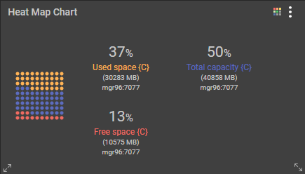
Figure 52 : The Heat Map Chart that is configured based on the metrics of your choice
Note:
- The distribution of the Heat Map Chart will be relevant only for measures with the same measurement unit.
- If you configure more than 5 measures, the Heat Map Chart may not be evenly distributed.
- Unlike other graphs, when you expand the Heat Map Chart widget, the actual Heat Map Chart cannot be expanded to fit the widget.
- Select a Test, Component Type, Component and Measure for which you wish to configure the Heat Map chart. If the Component list consists of too many components, then viewing all the components and selecting the ones you need for configuring the widget could require endless scrolling. To avoid this, you can click the
-
Line Graph
By analyzing the Minimum, Maximum and Average values of a chosen measure over a chosen time period, you can deduce past performance trends, predict future trends, and accordingly draw capacity plans for the future. To deduce such trends, you can use the Line chart widget. Clicking the Line Graphoption in the right panel that appears when the Configurable Widgets tab is clicked in will append the Line Graph to the dashboard as shown in Figure 53.
Figure 53 : The Line Chart widget
To add the measures for which you wish to view the line chart, click on the
 icon in Figure 53. Figure 54 will then appear.
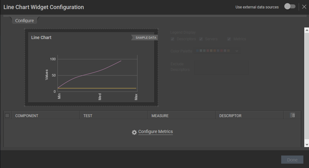
Figure 54 : The wizard that appears to configure the Line Graph
Clicking the Configure Metrics link in Figure 54 will lead you to Figure 55.
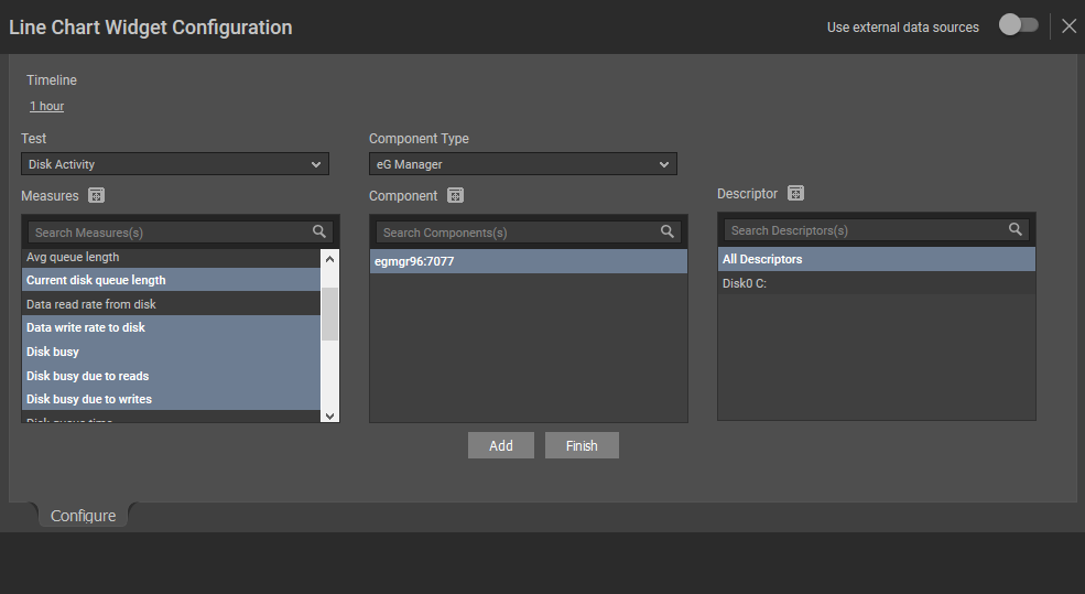
Figure 55 : Configuring the Line Graph widget
Let us now discuss on how to configure metrics using Figure 55:
- Pick a Timeline for which the Line Chart should be configured. If you wish to specify the time for which the Line Chart should be configured, then you can do so using the From and To fields.
- Select a Test, Component Type, Component and Measure for which you wish to configure the Line Chart. If the Component list consists of too many components, then viewing all the components and selecting the ones you need for configuring the widget could require endless scrolling. To avoid this, you can click the icon next to the Component list. The COMPONENTS pop up window will then appear using which you can view almost all the components in a single interface and Select the ones that you wish to view in the Line Chart widget. You can even search for a component of your choice using the Search Component(s) field in the Component list. Once you have selected the Component, the descriptors of the chosen component will be displayed in the Descriptor section. Select the descriptor of your choice from this list. If the Descriptor list consists of too many descriptors, then viewing all the descriptors and selecting the ones you need for configuring the widget could require endless scrolling. To avoid this, you can click the icon next to the Descriptor list. The DESCRIPTOR pop up window will then appear using which you can view almost all the descriptors in a single interface and Select the ones that you wish to view in the Line Chart. You can even search for a descriptor of your choice using the Search Descriptor(s) field in the Descriptor list.
-
Once you have chosen the required measures and the component, click the Add button. When you click the Finish button, your selection will be listed as shown in Figure 56.
Note:
You are allowed to provide the name of your choice for the components, measures and the individual descriptor that you have chosen. To do so, just double-click on the component/measure/descriptor for which you wish to provide a name of your choice and enter a new name.
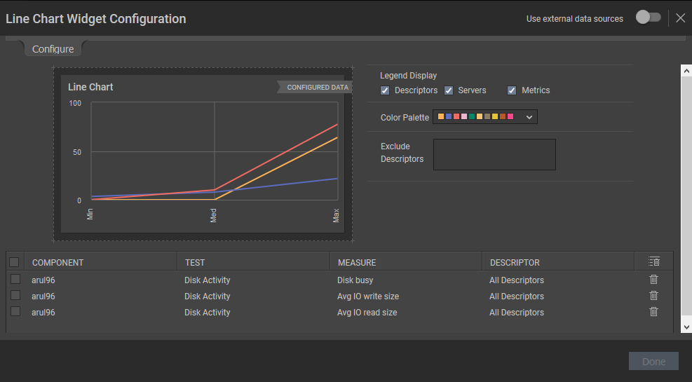
Figure 56 : The components, test and measures you have chosen
- By default, all the options are checked against the Legend Display field. If you do not wish to view descriptor-wise measure values, then you can uncheck the Descriptors option against the Legend Display field. If you do not wish to view the measure-wise values then you can uncheck the Metrics option against this field.
- If you wish to exclude certain descriptors of a test, then you can do so by providing a comma-separated list of descriptors in the Exclude Descriptors list.
- If you wish to delete a selection, then you can do so clicking the icon. If you wish to delete multiple selections at a single shot, then select the check box against the selections and click the icon.
- If you wish to change the colors used in the line chart, simply click the icon and choose the color palette of your interest. You can even define your own set of colors in the [GRAPH_PALETTES] section of the <eG_INSTALL_DIR>\manager\config\eg_customdashboard.ini file.
-
Clicking the Done button will display the Line Chart for the chosen measures as shown in Figure 57.
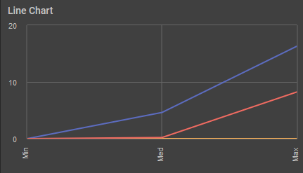
Figure 57 : The Line Chart widget that is configured based on your selection
-
Live Measures
If you wish to monitor the real time metrics reported by certain measures, then you can use the Live Measures widget. Clicking the Live Measures option in the right panel that appears when the Configurable Widgets tab is clicked in will append the Live Measures widget to your dashboard (see Figure 58).
Figure 58 : The Live Measures widget
Clicking the
 icon in the widget will lead you to Figure 59 where you will be required to configure the measure of your choice.
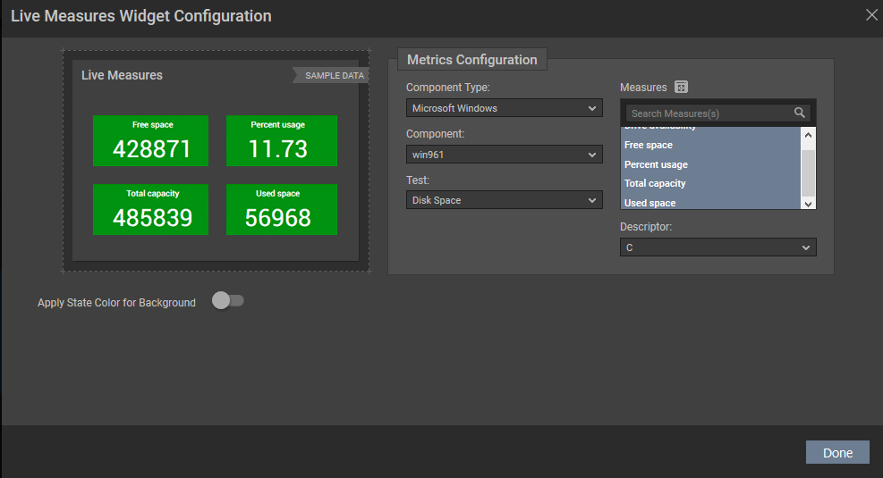
Figure 59 : Configuring the metrics to be displayed in the Live Measures widget
Select the Component Type, Component, Test, Descriptor and Measure for which you wish to view the real time metrics in the Live Measures widget and click the Done button in Figure 59. Figure 60 will then appear.
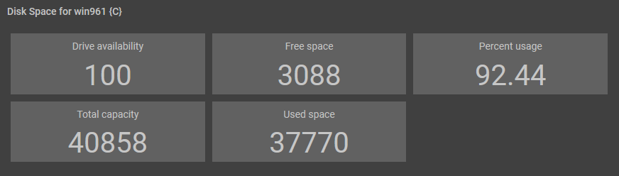
Figure 60 : The Live Measures widget that is designed as per your choice
If you wish to view the current state of each measure, then, you can enable the Apply State Color for Background slider. By doing so, each measure tile in Figure 60 will be displayed with the current state color in the background. as shown in Figure 61.
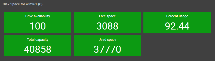
Figure 61 : The Live Measures widget with current state of the measures
Note:
The Live Measures widget can be configured to view the measures of a single Test alone. If you wish to configure Live Measures for multiple tests, then you may need to configure a Live Measures widget for each chosen Test.
-
Pie Chart
To view the distribution of metrics for a chosen component based on a pre-defined template, you can use the Pie Chart widget. Clicking the Pie Chart option in the right panel that appears when the Configurable Widgets tab is clicked will append the Pie Chart widget to the dashboard as shown in Figure 62.
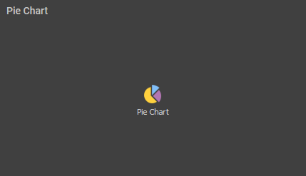
Figure 62 : The Pie Chart widget
Clicking the
 icon will invoke Figure 63.
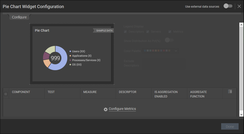
Figure 63 : Configuring the Pie Chart widget
To configure the pie chart, click the Configure Metrics link. Figure 64 will then appear.
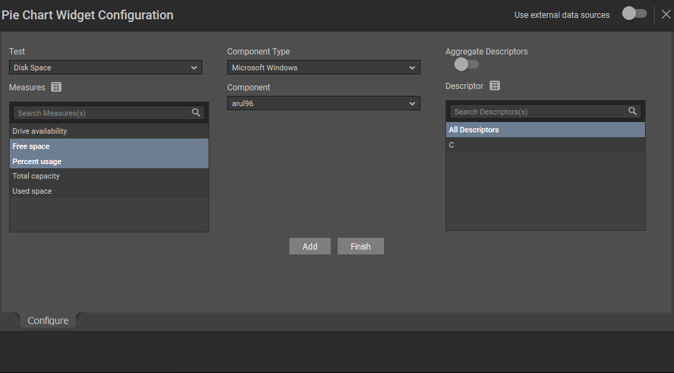
Figure 64 : Adding the metrics for the Pie Chart widget
Select a Test, Component Type, Component, Measures and Descriptor of your choice from Figure 64 and click the Add button to view the distribution of metrics in the Pie Chart widget (see Figure 65).
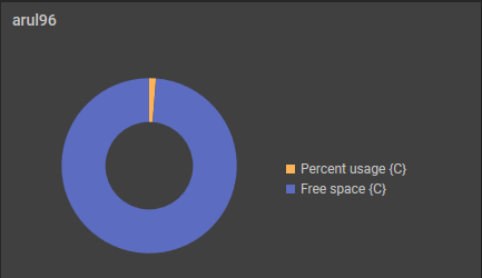
Figure 65 : The Pie Chart metrics displaying the distribution of metrics
Note:
For a pie chart to be plotted effectively, the measurement units of all the measures should be the same.
-
Scatter Plot
To historically analyze the values of two closely related metrics and plot their historical values in a single graph, you can use the scatter plot widget. Clicking the Scatter Plot option in the right panel that appears when the Configurable Widgets tab is clicked will append the Scatter Plot widget in Figure 66.
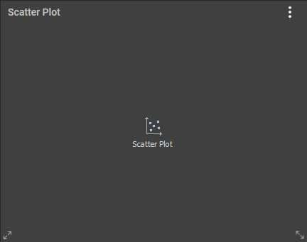
Figure 66 : The Scatter Plot widget
Clicking on the
 icon in this widget will invoke Figure 67 using which you can configure the metrics that are to be displayed in this widget.
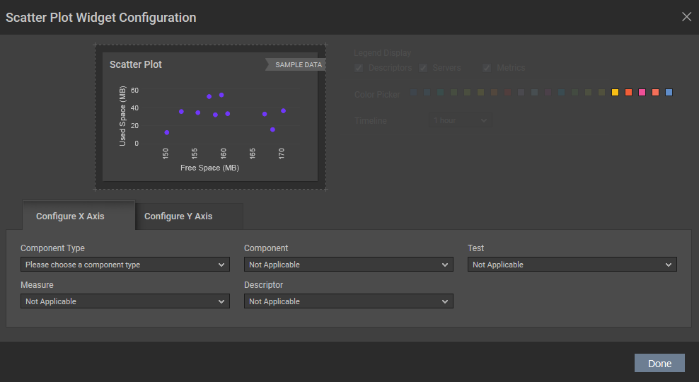
Figure 67 : The configuration page of the Scatter Plot widget
In Figure 67, specify the following:
By default, the Configure X Axis tab will be displayed. Here, select the Component Type, Component, Test, Measure and Descriptor for which you wish to plot the graph.
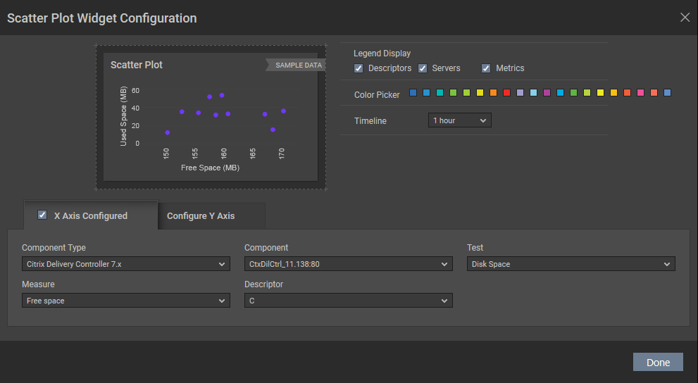
Figure 68 : Configuring the X Axis
Similarly, select the Component Type, Component, Test, Measure and Descriptor for the Y axis from the Configure Y Axis tab (see Figure 69).
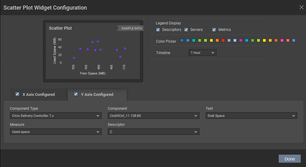
Figure 69 : Configuring the Y Axis
By default, all options are checked against the Legend Display field in Figure 69. If you do not wish to view descriptor-wise measure values, then you can uncheck the Descriptors option against the Display field. Similarly, if you do not wish to view the measures, then, you can uncheck the Metrics option.
Select the color to plot the graph from the Color Picker palette.
Choose a Timeline for which you wish to plot the graph. By default, the timeline is 1 hour.
Clicking the Done button will invoke Figure 70.
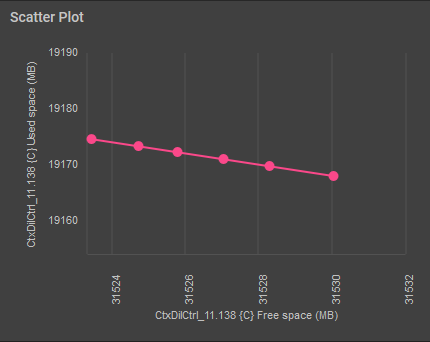
Figure 70 : The Free Space Vs Used Space measure plotted for the Scatter Plot widget
-
Table
If you want to compare the values of metrics collected from a wide array of components in a tabular column, then, you can use the Table widget. Clicking on the Table widget option in the right panel that appears when the Configurable Widgets tab is clicked in will append the Table widget in Figure 71.
Clicking on the
 icon in this widget will invoke Figure 72 using which you can configure the metrics that are to be displayed in this widget.
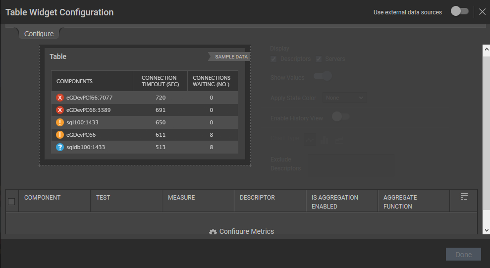
Figure 72 : Configuring metrics that are to be shown in the Table widget
Clicking the Configure Metrics link will invoke Figure 73 where you will be allowed to configured the metrics for displaying in the Table widget.
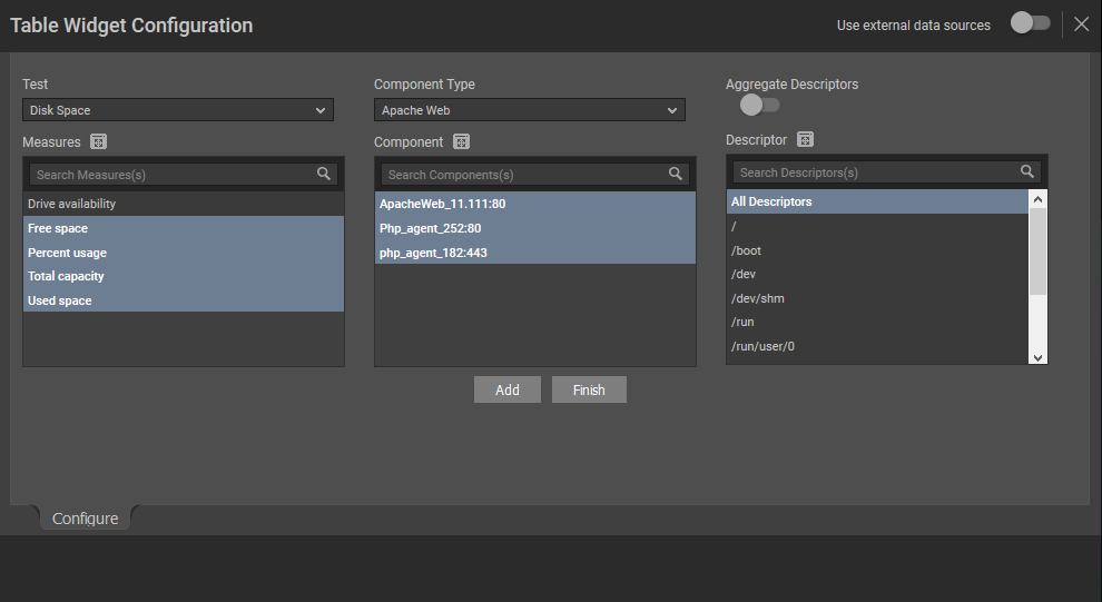
Figure 73 : Configuring the metrics for the Table widget
Let us now discuss on how to configure metrics in the Table widget using Figure 73:
-
Select a Test, Component Type, Component and Measures for which you wish to configure the Table widget. Once you have chosen the Component, the descriptors of the chosen component will be displayed in the Descriptor section. Select the descriptor of your choice from this list. If the Components list consists of too many components, then viewing all the components and selecting the ones you need for configuring the widget could require endless scrolling. To avoid this, you can click the
icon next to the Component list. Figure 74 will then appear using which you can view almost all the components in a single interface and Select the ones that you wish to view in the Table widget. 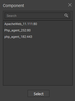
Figure 74 : The COMPONENTS pop up window
Note:
You are allowed to provide the name of your choice for the components, measures and the individual descriptor that you have chosen. To do so, just double-click on the component/measure/descriptor for which you wish to provide a name of your choice and enter a new name.
- You can even search for a component of your search using the Search Components(s) field in the Components list.
-
If the Descriptor list consists of too many descriptors, then viewing all the descriptors and selecting the ones you need for configuring the widget could require endless scrolling. To avoid this, you can click the
icon next to the Descriptor list. Figure 75 will then appear using which you can view almost all the descriptors in a single interface and Select the ones that you wish to view in the Table widget. 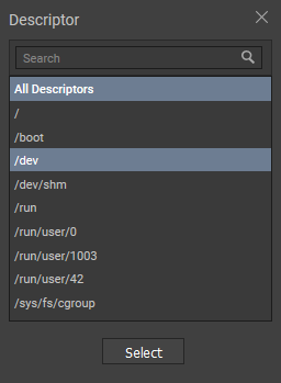
- You can even search for a descriptor of your search using the Search Descriptor(s) field in the Descriptor list.
-
If descriptors exist for a chosen component, an Aggregate Descriptors slider will appear as shown in Figure 76. By default, this slider is turned off. If this slider is turned on, then an Aggregate Function drop down list will appear with the functions using which you can aggregate the chosen measures and display the same in the Table widget.
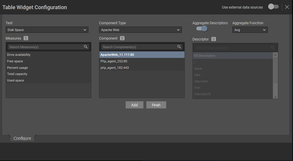
Figure 76 : The Aggregate Descriptors flag that appears when a descriptor is chosen
-
Once you have chosen your selection, click the Add button and then the Finish button. Figure 77 will then appear where you will be allowed to alter the default selections of the widget.
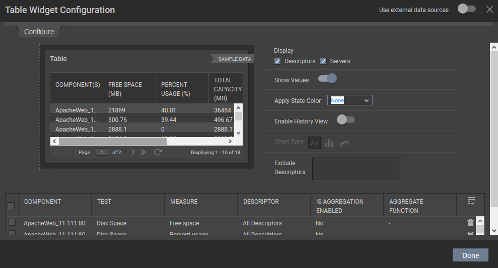
- By default, the Servers and Descriptors options are checked against the Display field in Figure 77. If you do not wish to view descriptor-wise measure values, then you can uncheck the Descriptors option against the Display field.
- By default, the Show Values flag (see Figure 77) is set to Yes indicating that the real time values of the chosen measures are displayed in the Table widget. If this flag is set to No, then the state of the chosen measure during the last measurement period for each chosen component is displayed as against the real time values.
- If you wish to view the state of each measure displayed in the Table widget, then choose Background or Font from the Apply State Color list. If you choose Background, then the background of the measure value will be displayed with the state of the measure. If you choose Font from this list, then the measure value by itself will be displayed in the current state. By default, None is chosen from this list.
- If you wish to historically analyze the measures of the table widget over a period of time, then , turn on the Enable History View slider. By default, this slider is turned off.
- The Chart Type option will be enabled only when the Enable History View slider is turned on. By default, the graph will be plotted as a line chart against the measure in the Table widget and therefore
 icon is chosen against the Chart Type list as default. If you wish to view the historical analysis of the measures as a bar graph, then, select
  option from this list. Similarly, you can choose
  icon to view the historical analysis of the measures as an area graph.
 - If you wish to exclude certain descriptors of a test, then you can do so by providing a comma-separated list of descriptors in the Exclude Descriptors list.
- You can even edit the Component, Measure and Descriptor columns in the Selection Details section to provide a name of your choice.
- If you wish to delete a selection, then you can do so clicking the icon. If you wish to delete multiple selections at a single shot, then select the check box against the selections and click the icon.
-
Clicking the Done button in Figure 77 will populate the Table widget with the values of the chosen measures in a tabular format as shown in Figure 78.
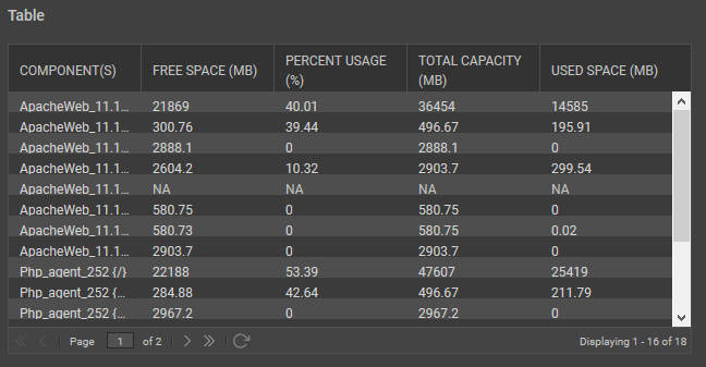
Figure 78 : The Table widget that is designed as per your choice
-
If Background option is chosen from the Apply State Color list, then the Table widget will appear as shown in Figure 79.
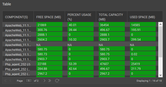
Figure 79 : The Table widget that is designed as per your choice
-
If you have turned on the Enable History View slider, then the Table widget will appear as shown in Figure 80.
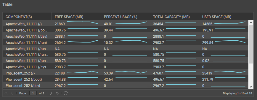
Figure 80 : The Table widget when the Enable History View slider is turned on
-
-
Timeline Graph
To historically analyze the performance of the chosen measure, you can include a Timeline Graph in your dashboard. Clicking the Timeline Graph option in the right panel that appears when the Configurable Widgets tab is clicked will append the Timeline Chart widget in the dashboard. A sample widget is shown in Figure 81.
Figure 81 : The Timeline Chart widget
To add the measures for which you wish to view the timeline chart, click on the
 icon. Figure 82 will then appear.
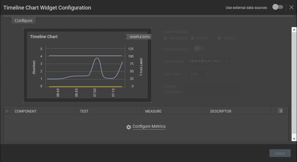
Figure 82 : Configuring the Timeline Chart
Clicking the Configure Metrics link will lead you to Figure 83 where you will be allowed to configure the test, component, component type and measure for generating the Timeline chart.
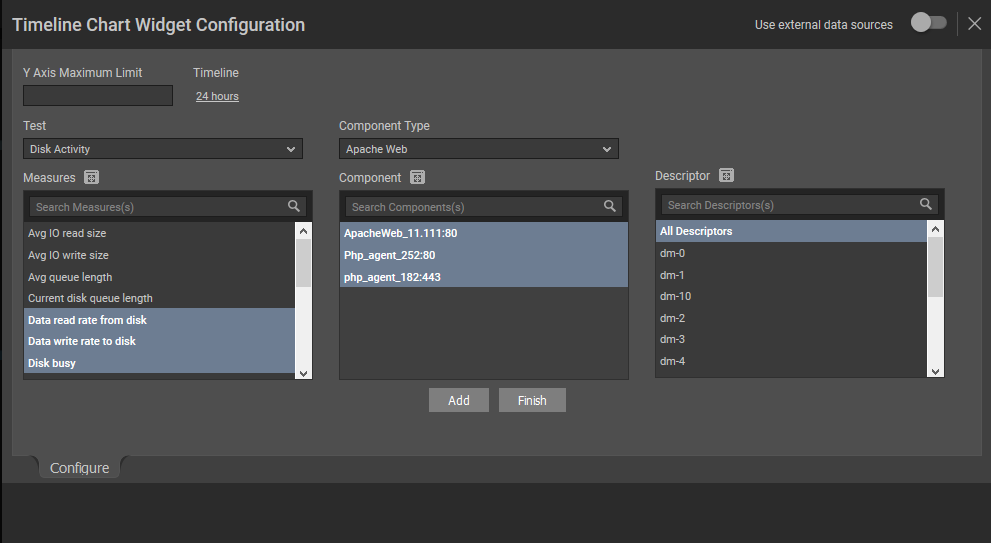
Figure 83 : Configuring the metrics for the Timeline Chart
In Figure 83, do the following:
- Pick a Timeline for which the Timeline Chart should be configured. If you wish to specify the time for which the Timeline Chart should be configured, then you can do so using the From and To fields. By default, the timeline is 1 hour.
-
Select a Test, Component Type, Component and Measure for which you wish to configure the Timeline Chart widget. If the Components list consists of too many components, then viewing all the components and selecting the ones you need for configuring the widget could require endless scrolling. To avoid this, you can click the
icon next to the Components list. The COMPONENTS pop up window will then appear using which you can view almost all the components in a single interface and Select the ones that you wish to view in the Timeline Chart widget. You can even search for a component of your choice using the Search Component(s) field in the Component list. Once you have selected the Component, the descriptors of the chosen component will be displayed in the Descriptor section. Select the descriptor of your choice from this list. If the Descriptor list consists of too many descriptors, then viewing all the descriptors and selecting the ones you need for configuring the widget could require endless scrolling. To avoid this, you can click the icon next to the Descriptor list. The DESCRIPTOR pop up window will then appear using which you can view almost all the descriptors in a single interface and Select the ones that you wish to view in the Timeline Chart. You can even search for a descriptor of your choice using the Search Descriptor(s) field in the Descriptor list. -
Once you have chosen the Component, Component Type, Test, Measures and Descriptors, click the Add button and then the Finish button. The selections that you have made will appear as shown in Figure 84.
Note:
You are allowed to provide the name of your choice for the components, measures and the individual descriptor that you have chosen. To do so, just double-click on the component/measure/descriptor for which you wish to provide a name of your choice and enter a new name.
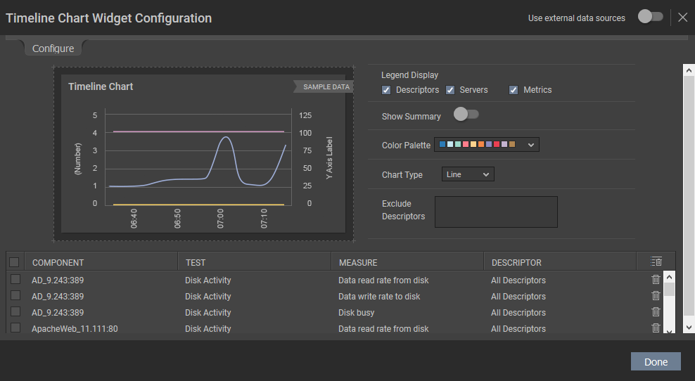
Figure 84 : Choosing the other parameters for the Timeline Chart
- If you wish to delete a selection, then you can do so by clicking the icon. If you wish to delete multiple selections at a single shot, then select the check box against the selections and click the icon.
- By default, all the options are checked against the Legend Display field. If you do not wish to view descriptor-wise measure values, then you can uncheck the Descriptors option against the Legend Display field. If you do not wish to view the measure-wise values, then you can uncheck the Metrics option against this field.
- If you wish to view the value of the chosen measure during the last measurement period, then turn on the slider against the Show Summary.
- By default, the graph will be plotted as a line chart and therefore Line option is chosen from the Chart Type list as default. If you wish to view the Timeline chart as a bar graph, then, select Column option from this list.
- If you wish to change the colors used in the Timeline Chart, simply click the icon and choose the color palette of your interest. You can even define your own set of colors in the [GRAPH_PALETTES] section of the <eG_INSTALL_DIR>\manager\config\eg_customdashboard.ini file.
-
If you wish to exclude certain descriptors of a test, then you can do so by providing a comma-separated list of descriptors in the Exclude Descriptors list.
-
Clicking the Done button in Figure 84 will display the Timeline Chart for the chosen measures as shown in Figure 85.
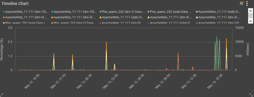
Figure 85 : The Timeline Chart widget configured based on the measures of your choice
The Timeline Chart that appears as a bar graph when the Column option is chosen from the Chart Type list (see Figure 86).
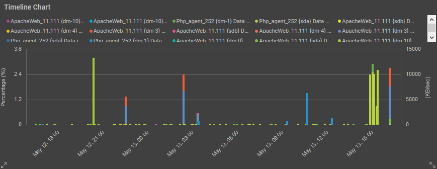
Figure 86 : The Timeline Chart widget configured as a bar graph
-
TopN Analysis
To analyze the top values of measures over a period of time, you can use the TopN Analysis widget. Clicking on the TopN Analysis widget option in the right panel that appears when the Configurable Widgets tab is clicked in will append the TopN Analysis widget to the dashboard as shown in Figure 87.
Figure 87 : The TopN Analysis widget
To add the measures for which you wish to view the TopN Analysis widget, click on the
 icon. Figure 88 will then appear.
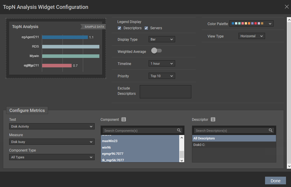
Figure 88 : Configuring the TopN Analysis widget
In the Configure Metrics section of Figure 88, specify the following:
- Select a Test, Component Type, Component and Measure for which you wish to configure the TopN Analysis widget. If the Components list consists of too many components, then viewing all the components and selecting the ones you need for configuring the widget could require endless scrolling. To avoid this, you can click the icon next to the Components list. The COMPONENTS pop up window will then appear using which you can view almost all the components in a single interface and Select the ones that you wish to view in the TopN Analysis widget. You can even search for a component of your choice using the Search Components(s) field in the Component list. Once you have selected the Component, the descriptors of the chosen component will be displayed in the Descriptor section. Select the descriptor of your choice from this list. If the Descriptor list consists of too many descriptors, then viewing all the descriptors and selecting the ones you need for configuring the widget could require endless scrolling. To avoid this, you can click the icon next to the Descriptor list. The DESCRIPTOR pop up window will then appear using which you can view almost all the descriptors in a single interface and Select the ones that you wish to view in the TopN Analysis widget. You can even search for a descriptor of your choice using the Search Descriptor(s) field in the Descriptor list.
- Once you choose the measure, you will be allowed to alter the options that were grayed out initially.
- By default, all the options are checked against the Legend Display field. If you do not wish to view descriptor-wise measure values, then you can uncheck the Descriptors option against the Legend Display field. If you do not wish to view the server-wise values, then you can uncheck the Servers option against this field.
- By default, Bar option is chosen from the Display Type list. This implies that the TopN Analysis widget will be plotted as a bar graph. If you wish to plot the widget in a table format, then choose Table option from this list.
- If you have chosen Bar option from the Display Type list, then an additional Color palette list will appear using which you can choose the color palette of your interest. You can even define your own set of colors in the [GRAPH_PALETTES] section of the <eG_INSTALL_DIR>\manager\config\eg_customdashboard.ini file.
- If you have chosen Bar option from the Display Type list, then an additional View Type list will appear. By default Horizontal is chosen from this list.
- Pick a Timeline for which the TopN Analysis widget should be configured. By default, the timeline is 1 hour.
- By default, Top 10 has been chosen from the Priority list indicating that the top 10 values of the chosen measure for the chosen descriptors will be displayed in the widget.
-
Using the Weighted Average flag, you can indicate how the Avg value is to be computed for a chosen measure. The status of the Weighted Average flag is relevant only if the Test chosen is a descriptor-based test, and the descriptors are dynamic in nature. For example, the Net flows test auto-discovers the net flows that are currently active on a Cisco router. For each net flow (i.e., source IP - destination IP pair) so discovered, the test reports a variety of statistics. Unlike descriptors such as disk partitions or processors that rarely change, the net flows are dynamic descriptors, which may change often; in other words, a net flow that is active on the network now, may not communicate at all during the next measurement period. The Net flows test will neither report metrics for the inactive descriptors nor display it in the eG monitoring console. This is why, net flows are considered ‘dynamic descriptors’.
-
By default, the Avg value of the chosen measure is compared across all selected descriptors. Since the Weighted Average flag is set to No by default, this Avg is computed as the ratio of the sum total of the measure values reported by a descriptor during the given timeline and the total number of times the test ran during the same timeline. In case of dynamic descriptors however, the Avg values so computed may not reveal the ‘true picture of performance’. This is because, the test may not discover or report metrics for dynamic descriptors throughout a given timeline. For example, take the case of the Net flows test. Say, the test auto-discovered two net flows - namely, ‘A’ and ‘B’ - during its first measurement period; both net flows registered a Data in Flow of 3 MB and 8 MB respectively. Assume that the second time the Net flows test ran, it captured 5 MB of data in net flow ‘A’. Net flow ‘B’ however was inactive during the second measurement period, and hence, was not discovered at all. If the Weighted Average flag is set to No by default, then, the TOP-N report will plot the Avg value of 4 MB (3+5=8/2=4) for net flow ‘A’ and 4 MB (8/2=4) again for net flow ‘B’. If you notice, unlike net flow ‘A’, where 8 MB of data was transacted over a period of time, in case of net flow ‘B’, 8 MB of data was transacted at one shot! Logically therefore, net flow ‘B’ has to be ranked above net flow ‘A’ in terms of data in flow. However, since the default Avg value computation does not clearly bring out this difference, both net flow ‘A’ and ‘B’ are treated at par! This is why, in case of dynamic descriptors, you may want to set the Weighted Average flag to Yes. In this case, the eG Enterprise system expresses Avg as the ratio of the sum total of the measure values reported by a descriptor during a given timeline and the ‘total number of times that descriptor was active’ during the same timeline. This implies that if the Weighted Average flag is set to Yes in the net flow example above, the Avg value for net flow ‘A’ will continue to be 4 (3+5=8/2=4), but the same for net flow ‘B’ will be 8 MB (8/1=8). In the TopN Analysis widget report therefore, net flow ‘B’ will be placed above net flow ‘A’, thereby accurately pointing you to the top communicators over the network.
By default, when the Show TopN flag to Yes, the Avg value of the chosen measure is compared across all selected descriptors. Since the Weighted Average slider is turned off by default, this Avg is computed as the ratio of the sum total of the measure values reported by a descriptor during the given timeline and the total number of times the test ran during the same timeline. In case of dynamic descriptors however, the Avg values so computed may not reveal the ‘true picture of performance’. This is because, the test may not discover or report metrics for dynamic descriptors throughout a given timeline. For example, take the case of the Net flows test. Say, the test auto-discovered two net flows - namely, ‘A’ and ‘B’ - during its first measurement period; both net flows registered a Data in Flow of 3 MB and 8 MB respectively. Assume that the second time the Net flows test ran, it captured 5 MB of data in net flow ‘A’. Net flow ‘B’ however was inactive during the second measurement period, and hence, was not discovered at all. If the Weighted Average flag is set to No by default, then, the TOP-N report will plot the Avg value of 4 MB (3+5=8/2=4) for net flow ‘A’ and 4 MB (8/2=4) again for net flow ‘B’. If you notice, unlike net flow ‘A’, where 8 MB of data was transacted over a period of time, in case of net flow ‘B’, 8 MB of data was transacted at one shot! Logically therefore, net flow ‘B’ has to be ranked above net flow ‘A’ in terms of data in flow. However, since the default Avg value computation does not clearly bring out this difference, both net flow ‘A’ and ‘B’ are treated at par! This is why, in case of dynamic descriptors, you may want to set the Weighted Average flag to Yes. In this case, the eG Enterprise system expresses Avg as the ratio of the sum total of the measure values reported by a descriptor during a given timeline and the ‘total number of times that descriptor was active’ during the same timeline. This implies that if the Weighted Average flag is set to Yes in the net flow example above, the Avg value for net flow ‘A’ will continue to be 4 (3+5=8/2=4), but the same for net flow ‘B’ will be 8 MB (8/1=8). In the Table widget report therefore, net flow ‘B’ will be placed above net flow ‘A’, thereby accurately pointing you to the top communicators over the network.
- Select a Test, Component Type, Component and Measure for which you wish to configure the TopN Analysis widget. If the Components list consists of too many components, then viewing all the components and selecting the ones you need for configuring the widget could require endless scrolling. To avoid this, you can click the
- If you wish to exclude certain descriptors of a test, then you can do so by providing a comma-separated list of descriptors in the Exclude Descriptors list.
-
Clicking the Done button in Figure 82 will display the TopN Analysis widget for the chosen measure as shown in Figure 85.
-
Topology
To view a service or segment topology in your environment, you can use the Topology widget. Clicking the Topology option in the right panel that appears when the Configurable Widgets tab is clicked will append the Topology widget to the dashboard as shown in Figure 92.
Figure 92 : The Topology widget
Clicking the
 icon will lead you to Figure 93.
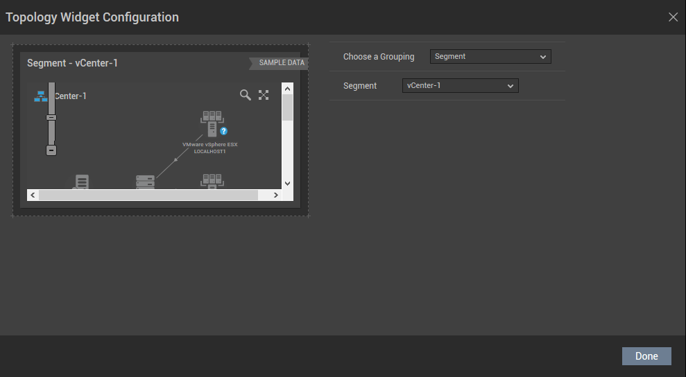
Figure 93 : Configuring the Topology widget
In Figure 93, specify the following:
- By default, the Topology widget offers you the flexibility to view either the service or segment topologies configured in the target environment. For this, you can choose either Service or Segment from the Choose a Grouping list.
- Select the name of the service or segment topology that you wish to view from the Group Name list.
Figure 94 shows a segment topology configured in the target environment.
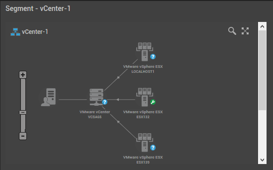
Figure 94 : The segment topology configured in the target environment
-
Trend Graph
To historically analyze the trend of the measures over a period of time, you can use the Trend Graph widget. Clicking the Trend Graph option in the right panel that appears when the Configurable Widgets tab is clicked will append the Trend Graph widget to the dashboard as shown in Figure 95.
Figure 95 : The Trend graph widget
Clicking the
 icon will lead you to Figure 96 where you will be required to configure the widget.
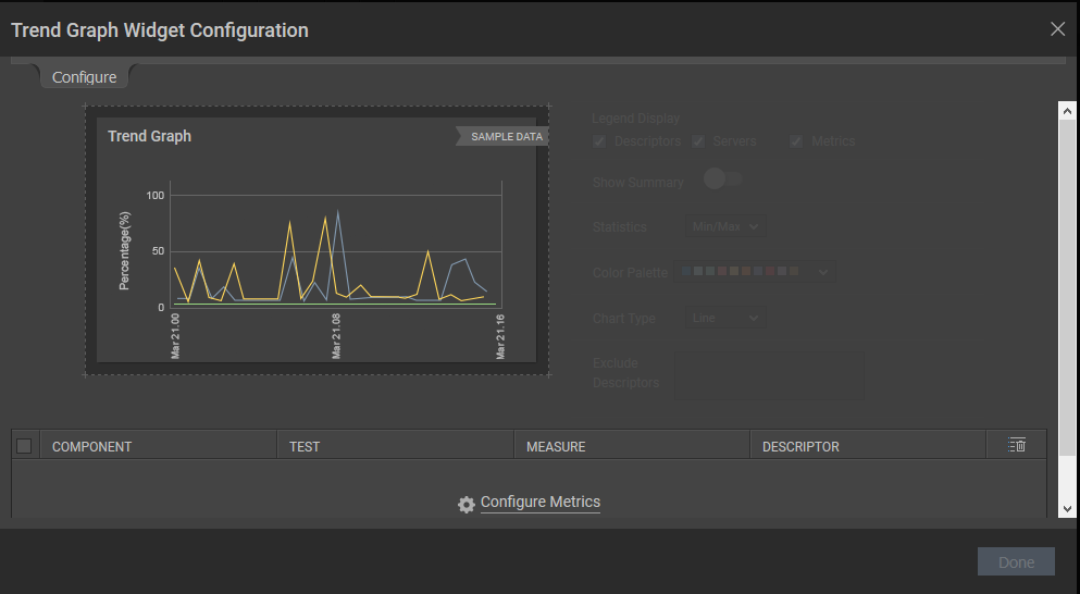
Figure 96 : The Trend graph widget configuration page
In Figure 96, click the Configure Metrics link to configure the metrics for the widget. Figure 97 will then appear.
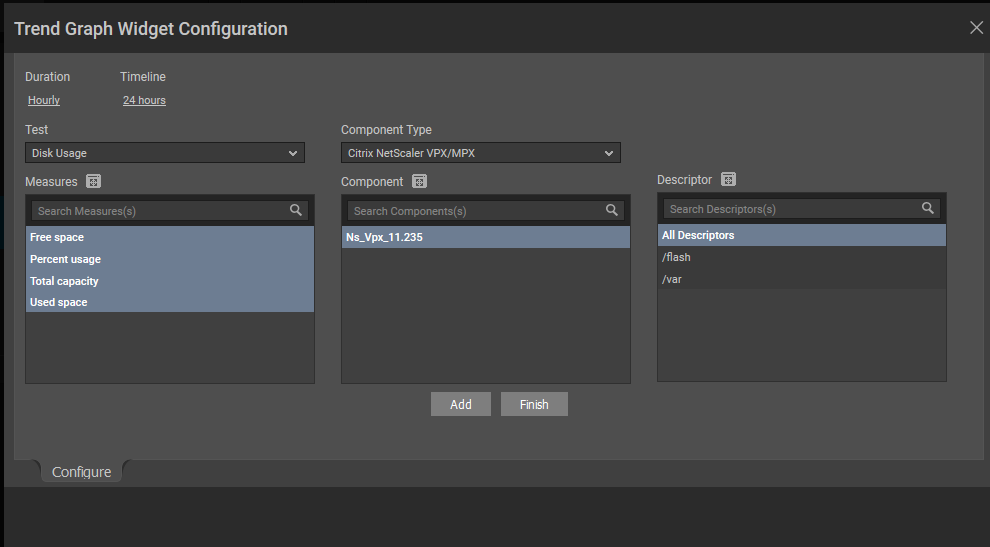
Figure 97 : Configuring the measures for the trend graph widget
In Figure 97, specify the following:
- Specify the Duration for which you wish to configure the widget. By default, Hourly is chosen from this list.
- Pick a Timeline for which the Trend Graph should be configured. By default, the timeline is 24 hours. Note that the Timeline will change based on the selection that you have made for the Duration option.
- Select a Test, Component Type, Component and Measure for which you wish to configure the Trend Graph widget. If the Components list consists of too many components, then viewing all the components and selecting the ones you need for configuring the widget could require endless scrolling. To avoid this, you can click the icon next to the Components list. The COMPONENTS pop up window will then appear using which you can view almost all the components in a single interface and Select the ones that you wish to view in the Trend Graph widget. You can even search for a component of your choice using the Search Components(s) field in the Component list. Once you have selected the Component, the descriptors of the chosen component will be displayed in the Descriptor section. Select the descriptor of your choice from this list. If the Descriptor list consists of too many descriptors, then viewing all the descriptors and selecting the ones you need for configuring the widget could require endless scrolling. To avoid this, you can click the icon next to the Descriptor list. The DESCRIPTOR pop up window will then appear using which you can view almost all the descriptors in a single interface and Select the ones that you wish to view in the Trend Graph widget. You can even search for a descriptor of your choice using the Search Descriptor(s) field in the Descriptor list.
- Once you choose the measures and descriptors, click the Add button and then the Finish button.
-
Figure 98 will then appear listing your selection.
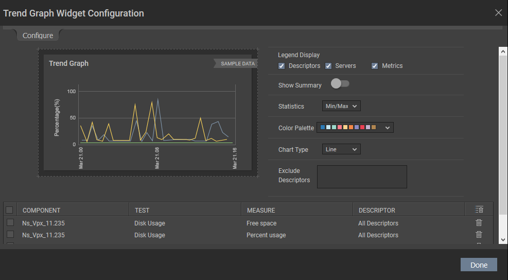
Figure 98 : Configuring the additional parameters for the Trend graph widget
In Figure 98, specify the following:
- By default, all the options are checked against the Legend Display field. If you do not wish to view descriptor-wise measure values, then you can uncheck the Descriptors option against the Legend Display field. If you do not wish to view the server-wise values, then you can uncheck the Servers option against this field.
- If you wish to view the current value of the chosen measure in the widget, then, turn on the Show Summary slider. By default, this slider is turned off.
- If you wish to plot the trend graph widget with the minimum/maximum values of the chosen measures, then choose Min/Max option from the Statistics list. You can even plot the trend graph widget for average values and the sum value of the chosen measures.
- You can choose the color palette of your interest from the Color Palette list to plot the graph. You can even define your own set of colors in the [GRAPH_PALETTES] section of the <eG_INSTALL_DIR>\manager\config\eg_customdashboard.ini file.
- If you wish to plot the trend graph as a line, then choose Line option from the Chart Type list. You are even allowed to plot the graph as vertical bars. For this, choose Column option from the Chart Type list.
- If you wish to exclude certain descriptors of a test, then you can do so by providing a comma-separated list of descriptors in the Exclude Descriptors list.
Clicking the Done button will display the Trend Graph as per your selection as shown in Figure 99.
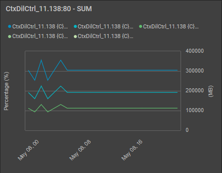
Figure 99 : The Trend graph widget configured with the default line chart option
If you have chosen Bar option from the Chart Type list of Figure 98 and turned on the Show Summary slider, then the Trend graph will appear as shown in Figure 100.
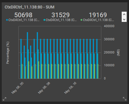
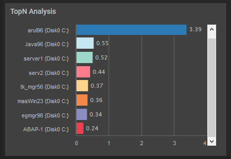
Figure 89 : The TopN Analysis widget
If you have turned on the Weighted Average slider and chosen Vertical option from the View Type list, then the TopN Analysis widget will appear as shown in Figure 90.
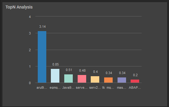
Figure 90 : A vertical TopN Analysis widget
If you have chosen Table option from the Display Type list, then the TopN Analysis widget will appear as shown in Figure 91.
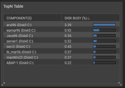
Figure 91 : The TopN Analysis widget in a table format