Disk
To take a closer look at how a host uses the disk space available to it, and to promptly detect probable usage excesses, select the Disk option from the Subsystem list. Figure 1 will then appear.
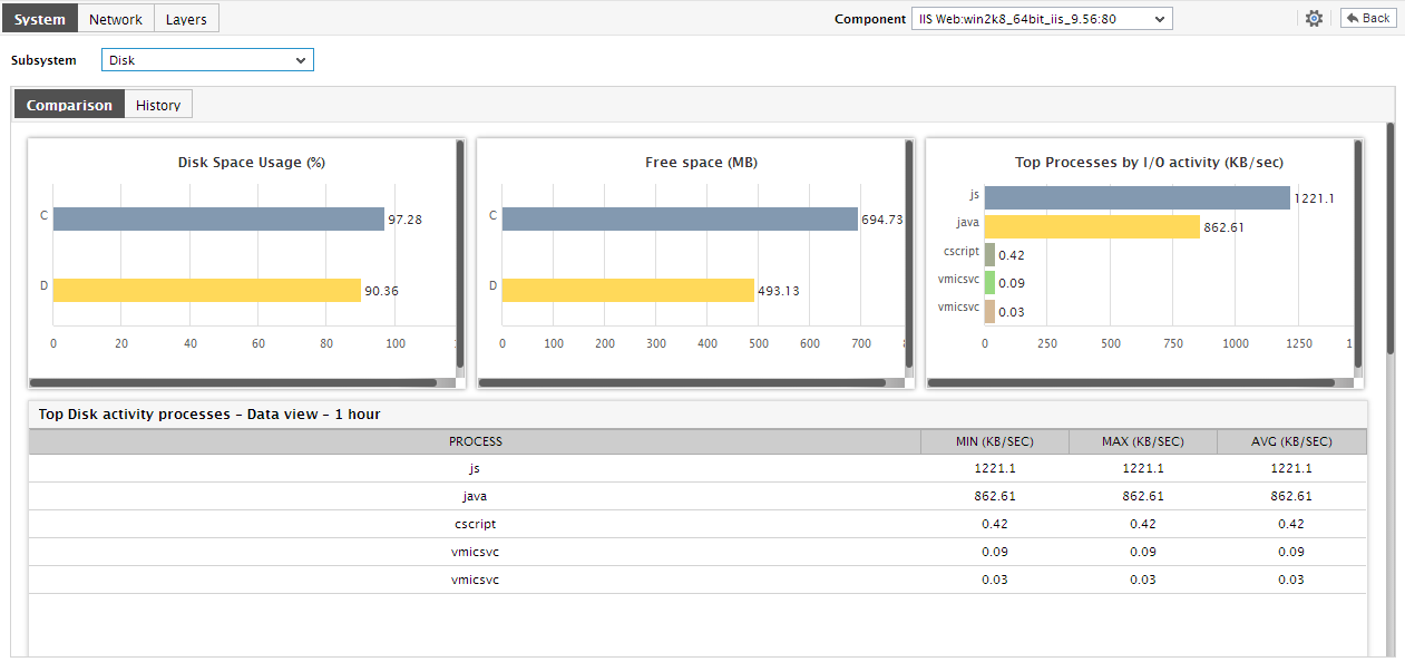
Figure 1 : The dashboard of the Disk Subsystem
This dashboard provides the following:
- A quick look at the pie charts displayed in the Disk Usage Summary section, can provide you with a clear idea of how well each disk partition on the host is being used currently; the partition that is currently running out of space can be swiftly identified from this section.
- In addition to the above, the Comparison tab page of Figure 1 provides a default collection of bar charts. These default charts not only enable you to compare space usage across disk partitions, but also help you evaluate the level of activity on each disk. This way, you can accurately isolate those disks that are currently experiencing a space crunch and also those that are very busy processing requests. If these bar charts reveal that a particular disk is currently experiencing high I/O activity, you can use the Top Processes by I/O activity bar chart to zero-in on the process on the host that is responsible for generating this I/O.
-
To view a bar chart in the Comparison tab page more clearly, click on it; this enlarges the chart as depicted by Figure 2 below.
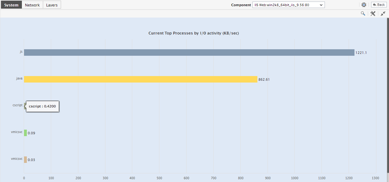
Figure 2 : The expanded bar chart comparing the disk I/O activity generated by processes on the host
- By default, the comparison bar charts compare the current disk usage or I/O. If need be, you can alter the timeline of a bar chart, so as to compare the status of disks at some point of time in the past. This enables you to investigate past problems better.
-
If your expanded bar chart appears cluttered owing to a large number of disk partitions/processes, you can easily filter out the ‘not-very-important’ disk partitions / processes from the chart. Besides enhancing the readability of your bar charts, this enables you to focus on selected descriptors alone. For instance, in the bar chart, you can choose to view only the top-5 processes on the basis of the level of disk I/O activity. To achieve this, simply select the top-5 option from the Show list (see Figure 3).
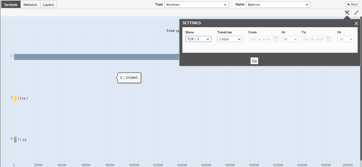
Figure 3 : Configuring the expanded bar chart to display the top-5 processes with the highest I/O activity
- Besides, to view more details about the I/O-intensive processes on the host, you can simply invoke the detailed diagnosis page from the enlarged Top Processes by I/O activity bar chart.
-
After analyzing current disk performance thoroughly, if you want to engage in an in-depth analysis of the historical disk usage metrics, switch to the History tab page by clicking on it.
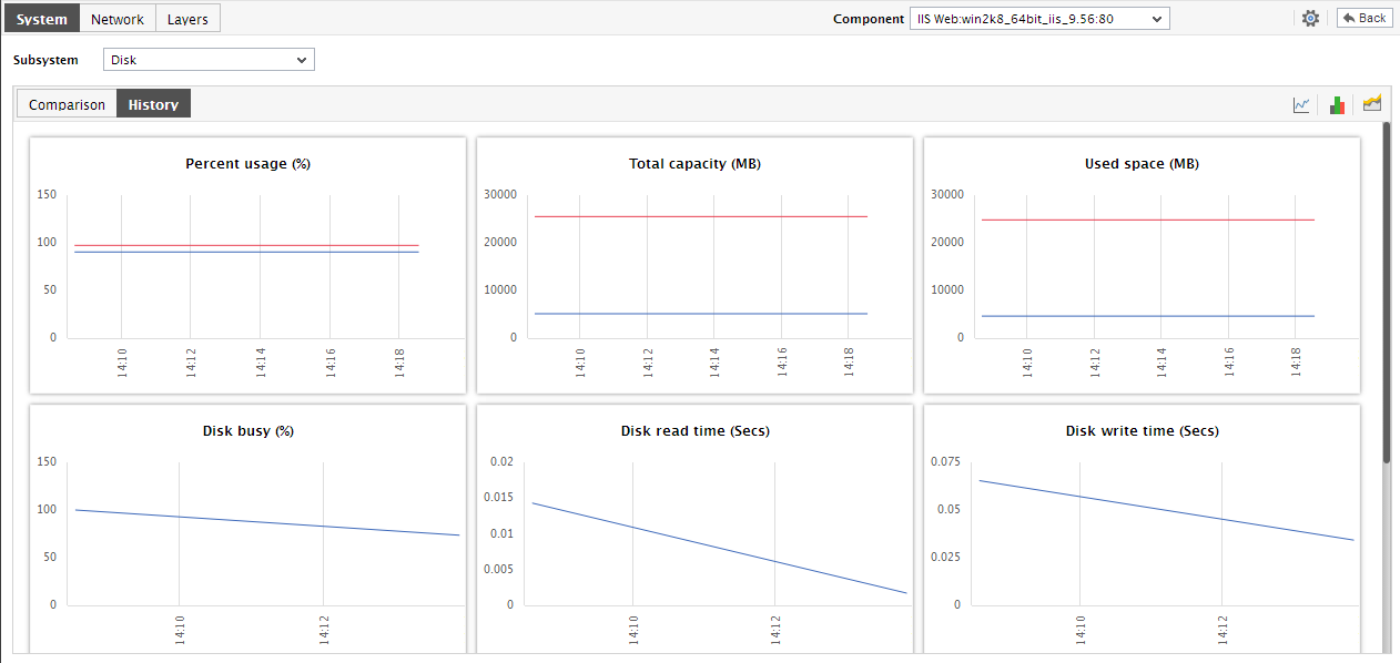
- By default, the History tab page provides measure graphs revealing the time-of-day variations in disk usage and disk I/O during the last 24 hours (by default). By carefully studying these measure graphs, you can accurately identify which disk experienced excessive usage / high I/O at what time during the last hour.
-
Like the bar charts, these measure graphs also enlarge when clicked (see Figure 4).
Figure 5 : An enlarged measure graph in the History tab page of the Disk Dashboard
- Here again, the graph Timeline can be altered. Moreover, you can reduce the number of disk partitions for which usage values are plotted in a single graph, by picking a top-n or last-n option from the Show list.
-
To assess the overall health of the disk partitions and to perform efficient service level audits on disk usage, you can convert the measure graphs into summary graphs, on-the-fly. For this purpose, click on the
 icon at the right, top corner of Figure 5. will then appear displaying summary graphs for a pre-configured list of measures.
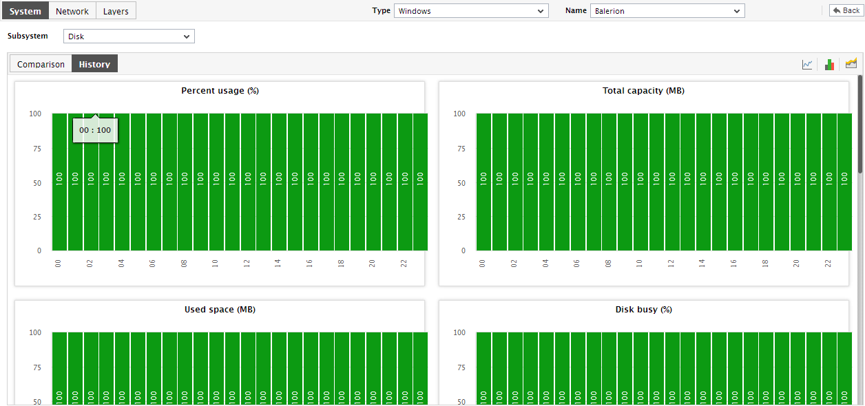
Figure 6 : Summary graphs of disk usage
- You can even expand the summary graph by clicking on it, and then alter its Timeline and its dimension (2d / 3d).
- Similarly, to analyze past trends in disk usage and accordingly plan the future disk capacity of the host, you can view the historical trend graphs in the History tab page, instead of the measure/summary graphs. For this, click on the
 icon.
icon. -
You can even expand the trend graph by clicking on it, and then alter its Timeline. By default, the trend graph plots the minimum and maximum values of a measure during the given timeline. In the enlarged mode, you can view the Graph type so that the average values or sum of trend values are plotted in the trend graphs instead.
Note:
In case of descriptor-based tests, the Summary and Trend graphs displayed in the History tab page typically plot the values for a single descriptor alone. To view the graph for another descriptor, pick a descriptor from the drop-down list made available above the corresponding summary/trend graph.
- At any point in time, you can switch to the measure graphs by clicking on the
 button.