Graphs
So far in this document we have illustrated eG Enterprise’s capability to lead the supermonitor to the root cause of the problems in his/her infrastructure. In more complex scenarios than the one depicted, manual analysis may become necessary.
eG Enterprise includes a variety of graphing capabilities for manual diagnosis. eG Enterprise supports the following graph types:
- Measure
- Summary
- Trend
Figure 1 shows the measurement graph that is obtained via the Measure option under the graphs menu. This graph shows the instantaneous values of the measures reported by the agents for the TcpTest for a web server. A measure graph is used by the supermonitor to plot the instantaneous value of any of the measurements made by eG Enterprise with time of day. The measure graph is accessed via the Measure option under GRAPHS in the menu across the top of this page. Follow the steps given below to plot a measure graph.
- The service for which the graph is to be plotted is first selected from the Service list box. This step is optional. If no specific service is chosen, the Component list box is populated with all the components being currently managed by the eG manager. Alternatively, if a specific service is chosen, the Component list only includes components that are related to the service under consideration.
- Next, a specific component associated with this service can be selected from the Component list box. If there are too many components in the list to choose from, you can narrow your search further by using the Search text box. Specify the whole/part of the component name/type to search for in this text box, and click the right-arrow button next to it. The Component list will then be populated with all component names and/or component types that embed the specified search string (see Figure 1). Select the component of your choice from this list.
- All the layers that map to the selected component will be available in the Layer list box and the supermonitor can choose any layer.
- The tests corresponding to the layer under consideration form the options of the Test list box. The required test can be chosen from this box.
- If the test is executed by multiple Measurement Hosts, then you can select a particular Msmt Host for graph generation.
- The measurements reported by this test appear in the Measurements list box, one or more of which can be picked.
- To override the default timeline, click on the
 icon. The settings page appears, the period for which the variations of the selected measurements have to be analyzed can be specified using the Timeline list. You can either provide a fixed time line such as 1 hour, 2 days, etc., or select the Any option from the list to provide a From and To date/time for graph generation.
 -
The Graph button can be utilized to view the graph. The Data button will enable the supermonitor to view the table of data corresponding to the graph as in Figure 1. The user can print the graph using the Print button. Similarly, the graph data can also be saved as a PNG image using the save button in Figure 1.
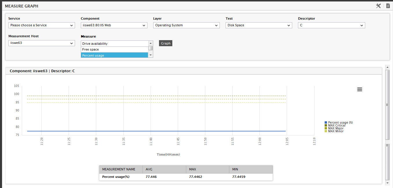
Figure 1 : eG Enterprise’s measurement graph
In Figure 1, the blue line denotes the actual variations in the measurement values. The lines in various shades of gold and green, indicate the different levels of thresholds (high, medium, and low) that have been assigned to the measure. An alarm is raised when the actual measurement crosses any of the multiple threshold values that have been set. The alarm priority though, will differ according to the nature of the threshold that was violated. For example if a MIN CRITICAL or MAX CRITICAL threshold value is violated, then a critical priority alarm will be generated by the eG Enterprise system.
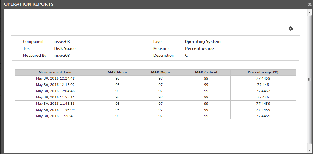
Figure 2 : Measurements depicting the variation of Percentage usage with time of day
Figure 3 depicts a summary graph that gives an overall picture of the percentage of time the measurements pertaining to a component were in a normal, critical, major, minor, or unknown state, over a period of time. The steps involved in plotting this graph are the same as that of a measure graph except for minor changes. Unlike the measurement graph, this graph pertains to a single measurement alone. The measurements reported by this test appear in the Measurements list box, one of which can be picked. The supermonitor can also opt to view the hourly, daily or monthly variations of measures in the case of summary graphs by selecting an appropriate option from the Duration list box. Like the measure graph, the summary graph can also be printed or saved.
In the graph, red indicates a critical state, orange indicates the existence of a major problem, yellow indicates the existence of a minor problem, green denotes normalcy, and blue implies that the state is unknown.
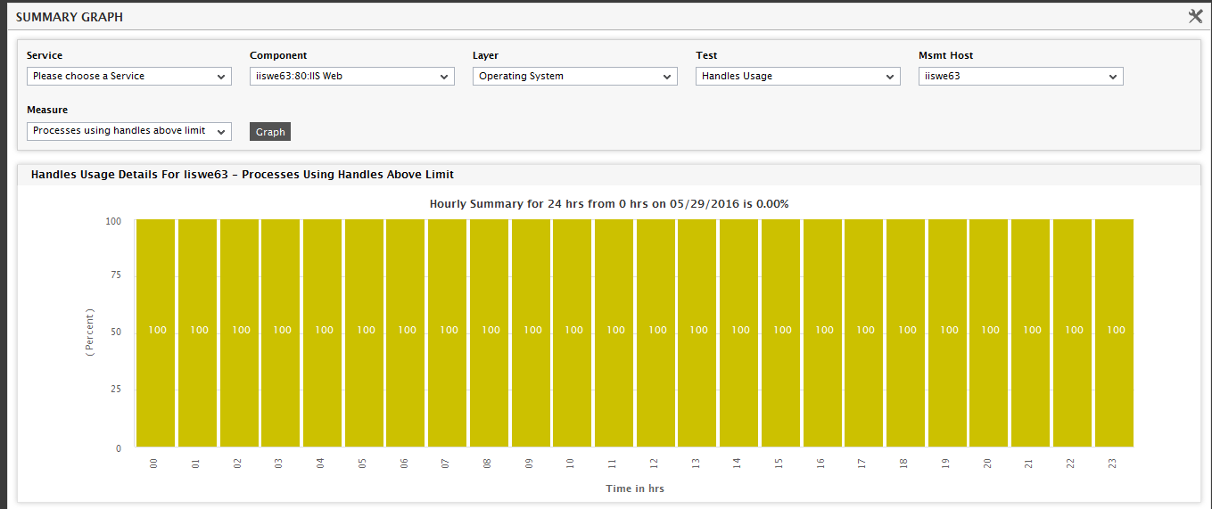
Figure 3 : Summary graph showing the percentage of normal, critical, major, minor, and unknown measurements
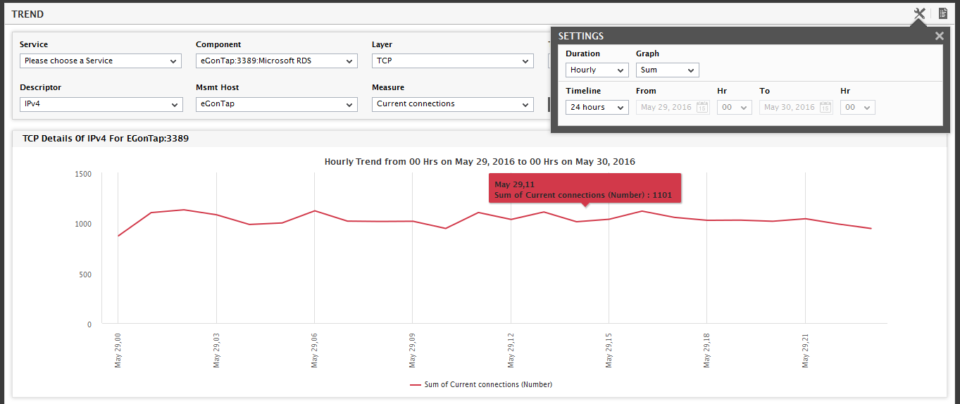
Since Internet traffic is very bursty, using the measurement graphs over a long time window (greater than a week) to view trends in the measurements can be very difficult. To make it easier to analyze trends, eG Enterprise monitors and stores trend data on an hourly, daily, and monthly basis. The eG user interface allows the trend data to be plotted on a web browser. Figure 4 depicts a trend graph; by default, a trend graph takes the minimum and the maximum value of measurements over a period of time into consideration. Accordingly, the Graph list displays Min/Max by default. Alternatively, you can even generate a trend graph where the average values of a chosen measure are plotted over a period of time. To achieve this, simply select the Average option from the Graph list in Figure 5. For instance, you can plot a trend graph that depicts how many TCP connections on an average were established with a critical Terminal server, every day during a couple of weeks (see Figure 5); besides indicating the normal load on the Terminal server, such a graph also enables you to understand whether the Terminal server has been adequately tuned to handle higher loads, and thereby helps you make effective sizing recommendations for the future. Likewise, you can also choose Sum as the Graph type to view a trend graph that plots the sum of the values of a chosen measure for a specified timeline. For example, a Sum graph of TCP connections to a Terminal server (see Figure 6) serves as an accurate indicator of how busy the Terminal server was during a given period.
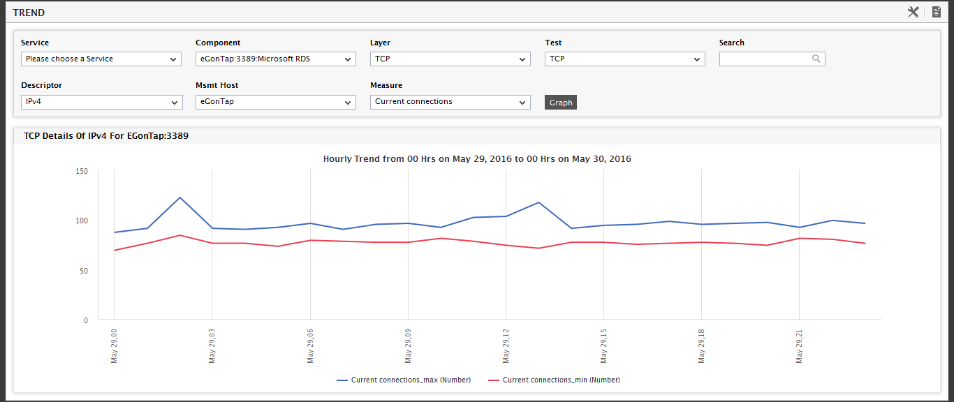
Figure 4 : A Min/Max Trend Graph
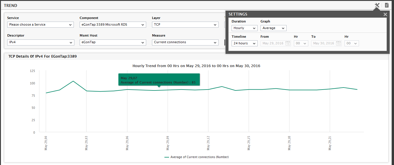
Figure 5 : An Average Trend Graph
Note:
The capability of the eG manager to compute the Sum and Average of metrics is governed by the Compute average/sum of metrics while trending flag in the MANAGER SETTINGS page in the eG administrative interface. By default, this flag is set to Yes indicating that eG Enterprise computes and stores the average and sum values of every performance metric in the database, by default. If, for some reason, you want to disable this capability, just set this flag to No, and Update the changes.
Note:
By default, the Sum trend graphs are generated for all measures. You can, if you so need, enable this capability for specific measures by following the steps given below:
- Edit the eg_ui.ini file in the <EG_INSTALL_DIR>\manager\config directory.
- Set the TrendSumForAllMeasures flag in the [misc_args] section of the file to false (default is true).
- Save the eg_ui.ini file.
- Next, edit the eg_tables.ini file in the <EG_INSTALL_DIR>\manager\config directory.
-
In the [measure_total] section of the file, provide an entry for the measure for which Sum trend graphs need to be generated, in the following format:
<TestName>:<MeasureName>=<DisplayName>
For example, to generate a Sum trend graph for the measure Current_connections reported by TcpTest, your specification would be:
TcpTest:Current_connections=Current TCP Connections
- Finally, save the eg_tables.ini file.
Note:
By default, the graphs in the monitor interface plot values averaged over every 20 seconds of the specified timeline. For instance, to plot the values of a measure gathered over an hour, by default, 180 data points will be plotted in the graph, one for every 20 seconds of data. If the default time scale remains as 20 seconds, then, longer timelines will result in a large number of data points been plotted on the graph; this, in turn, provides administrators with deeper insights into measure behavior. However, sometimes, administrators might require less granular information on the graph, so that they are able to read and analyze the graphs better. To facilitate this, eG Enterprise permits administrators to specify a custom time scale for graphs in the Timescale Monitor text box in the monitor settings page of the eG administrative interface.