JVM Classes
Select the jvm Classes option from the Subsystem list to know how efficiently the class loader used by the Java application is and has been loading/unloading classes onto memory. Upon selection, will appear.
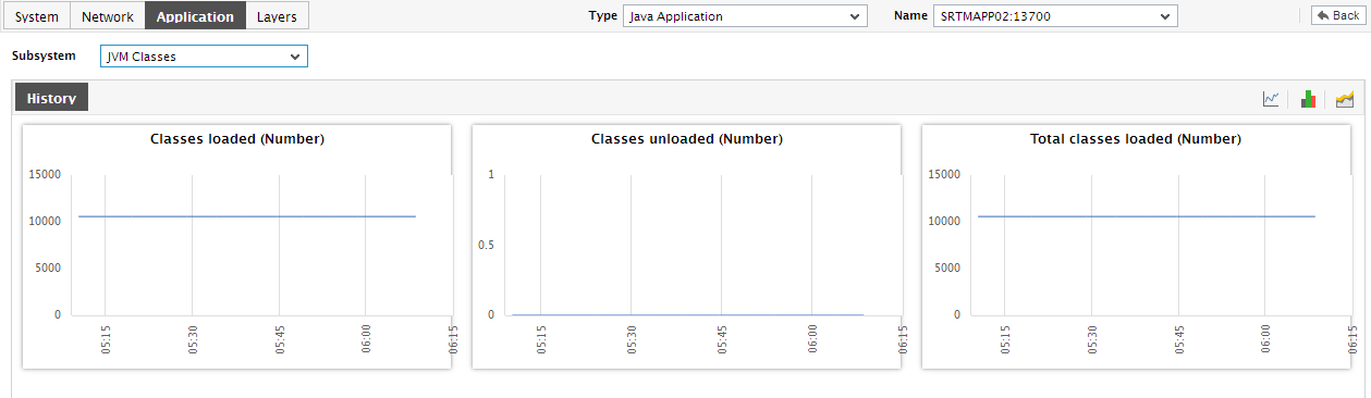
Figure 1 : The JVM Classes Dashboard
The contents of this dashboard are as follows:
- The jvm Classes section indicates the current health of the class loader by providing a pie chart that graphically depicts the number of classes currently loaded and unloaded by the application.
- The History tab page below, by default, provides a series of measure graphs that reveal how the class loader has been performing over the default duration of the last 24 hours. If the number of classes loaded/unloaded dramatically decreases, it could indicate that the class loader is experiencing issues with loading/unloading. In such a case, a look at these measure graphs will help you figure out when exactly the bottleneck surfaced - did it happen suddenly or is it a condition that has become worse with time?
-
If need be, you can even alter the timeline of all these measure graphs so that you can analyze performance across days and weeks; for this, simply click the Timeline link at the right, top corner of the History tab page and change the timeline for the graphs using the calendar that pops out. To change the timeline of a single graph alone, simply click on that graph to enlarge it, and then modify the Timeline of the graph in the enlarged mode.
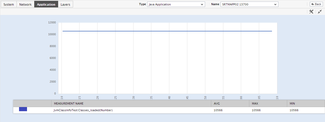
Figure 2 : An enlarged measure graph in the History tab page of the JVM Classes dashboard
-
To determine the service level achievements / slippages of the class loader, you need to view summary graphs of the measures and not the default measure graphs. For this, just click on the
 icon at the right, top corner of the History tab page. Figure 2 then appears.
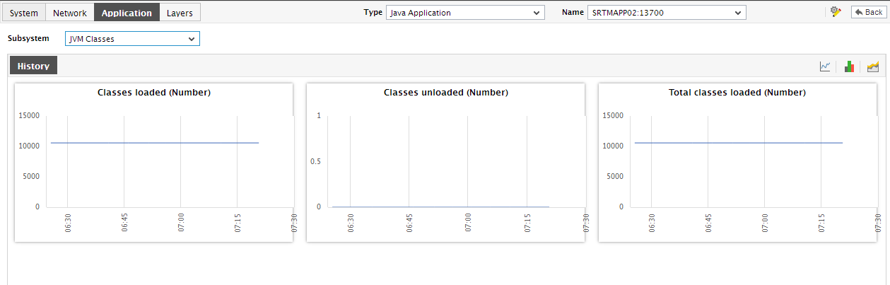
Figure 3 : Summary graphs displayed in the JVM Classes Dashboard
The summary graphs displayed in Figure 3 reveal the percentage of time the Java application experienced problems in loading/unloading classes on to the memory. Besides revealing the efficiency of your administrative staff in recognizing bottlenecks and mitigating them, these summary graphs also indicate whether the class loader has been able to maintain the assured performance levels during the default duration of 24 hours.
- In case of the summary graphs too, you can change the Timeline of all graphs by clicking on the Timeline link at the right, top corner of the History tab page. To alter the timeline of a single graph, here again, you will have to click on that graph, enlarge it, and modify the timeline. Also, by default, hourly summaries are plotted in the summary graph; you can configure these graphs to plot daily/monthly summaries instead by picking the relevant option from the Duration list in the enlarged mode.
-
To analyze past trends in the loading/unloading of classes, click on the
 icon at the right, top corner of the History tab page. Figure 4 will then appear.
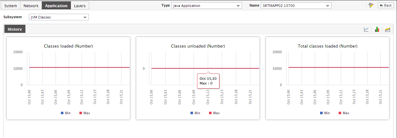
Figure 4 : Trend graphs displayed in the JVM Classes Dashboard
- These trend graphs, by default, plot the minimum and maximum values that every measure registered during each hour of the last 24 hours (by default). Using such graphs, you can accurately point to the time windows in which the class loader was actively loading/unloading classes, and the times at which there was a lull. By carefully observing these past trends, you can effectively gauge the workload that the application has been imposing on the class loader, predict future workloads accordingly, and suggest measures to enhance the efficiency of the loader
-
In addition, when a trend graph is enlarged, it is not just the Timeline that you can modify. The Duration of the graph can also be altered. By default, trend graphs reveal only the hourly trends in performance. By picking the relevant option from the Duration list, you can ensure that the trend graph in question plots daily/monthly trend values instead. Also, in the enlarged mode, the Graph type can also be modified. Since the default Graph type is Min/Max, the trend graph, by default, reveals the minimum and maximum values registered by a measure. If need be, you can select the Avg or Sum option from the Graph type list to plot average trend values of a measure or sum of trends (as the case may be) in the graph.
Note:
In case of descriptor-based tests, the Summary and Trend graphs displayed in the History tab page typically plot the values for a single descriptor alone. To view the graph for another descriptor, pick a descriptor from the drop-down list made available above the corresponding summary/trend graph.
- At any point in time, you can switch to the measure graphs by clicking on the
 button.