JVM Memory
If you want to assess how efficiently the JVM uses the memory resources available to it, and thus promptly detect memory-intensive pools, select the jvm Memory option from the Subsystem list.
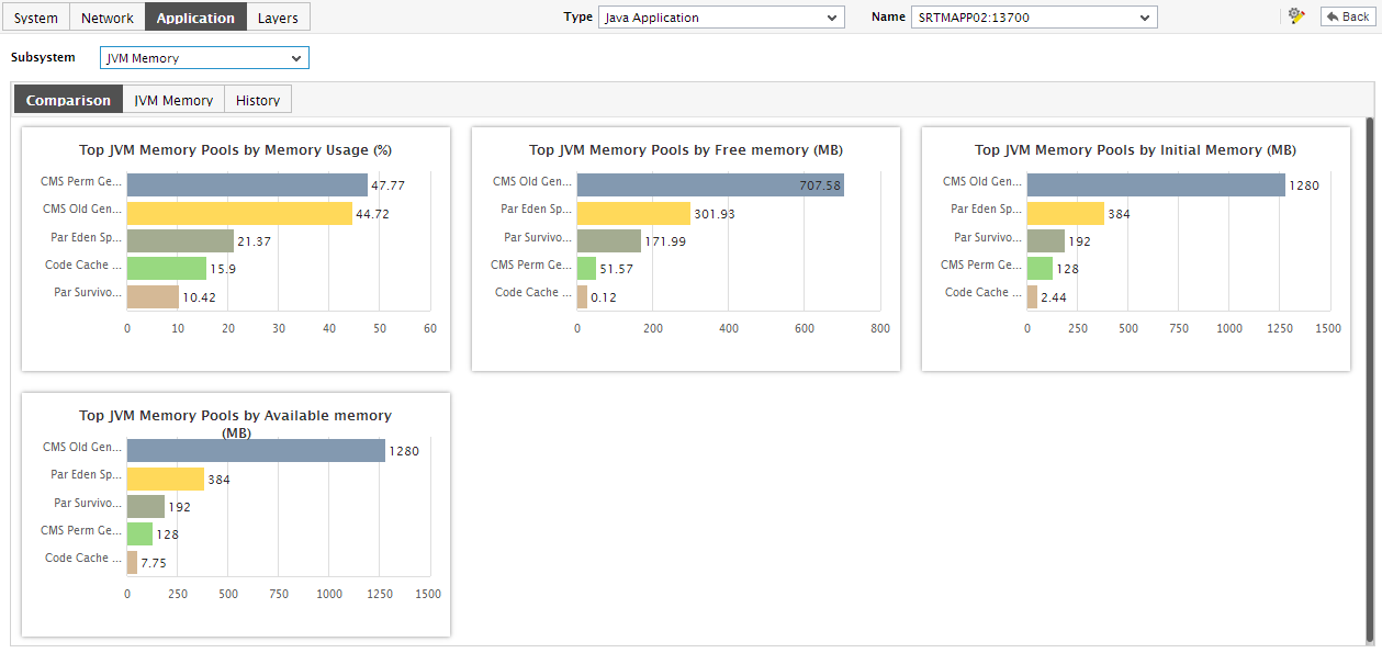
Figure 1 : The JVM Memory Dashboard
The contents of the jvm Memory dashboard that then appears (see Figure 1) are as follows:
- The dashboard begins with a jvm Memory Usage - Summary section, which enables you to visually track the percentage of memory used by each of the memory pools on the JVM. Pools that are currently running short of memory resources can be instantly identified using the usage chart provided by this section.
- The Comparison tab page that follows the jvm Memory Usage - Summary section, provides a series of top-10 charts, using which you can quickly isolate those memory pools that are leading the lot in the following default performance areas: overall memory consumption, amount of free memory, committed/available memory, and initial memory.
- If an application slowdown can be attributed to the lack of adequate memory resources, then these top-10 bar charts can aid you in swiftly nailing the exact memory pool that could be serving as the source of this memory contention.
-
Typically, these bar charts depict the current usage data. Sometimes however, you might want to detect which memory pool was over-utilizing memory at some point of time in the past. In such a case, you will have to click on the corresponding graph in the Comparison tab page to enlarge it. In the enlarged mode, you can click on the Compare History link, so that you can alter the graph Timeline, and view which memory pool was the leading memory consumer during the specified timeline.
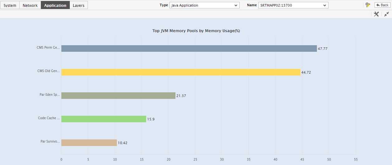
Figure 2 : The enlarged memory usage graph
- Also, though the enlarged graph displays the top-10 memory pools on the JVM by default, you can choose to view a more or a less number of memory pools by picking a top-n or last-n option from the Show list in the enlarged graph.
-
In contrast to the Comparison tab page, which, by default, reports the current memory usage levels of individual memory pools, the History tab page displays measure graphs that depict how each memory pool has been using the JVM memory over time. In the event of a memory contention, this time-bound analysis will help you easily differentiate between a sudden spike in memory usage and a consistent rise in the same.
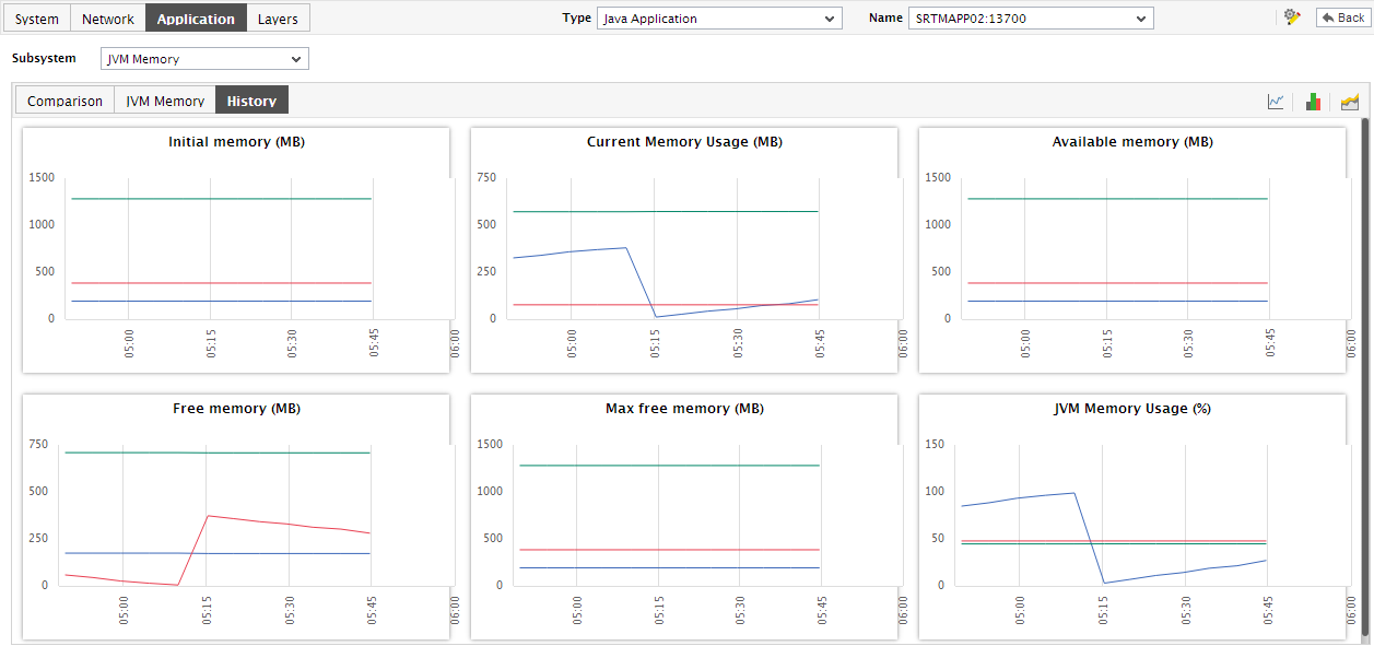
Figure 3 : The History tab page of the JVM Memory Dashboard
-
To alter the timeline for a single graph, just click on that graph - this will enlarge the graph. You can change the Timeline of the graph in the enlarged mode.
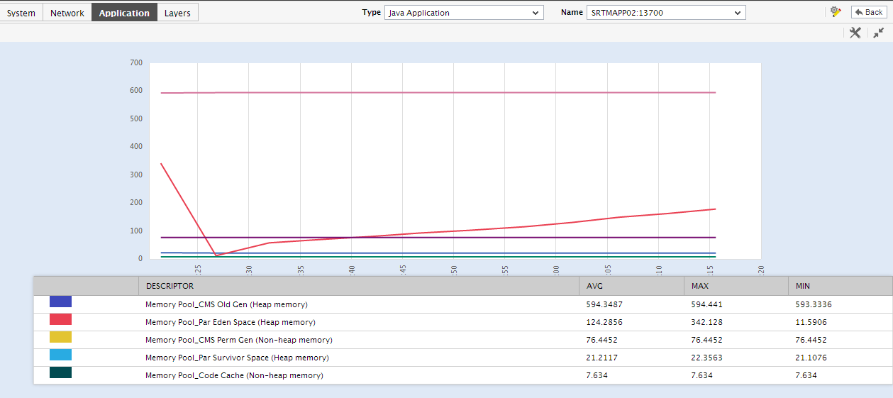
Figure 4 : An enlarged measure graph in the Comparison tab page of the JVM Memory dashboard
- Besides changing the timeline, you can also change the number of best/worst performers whose performance results are to be plotted in the graph. By default, the enlarged graph reveals the variations in the performance of the top-10 memory pools. If need be, you can pick a different top-n or last-n option from the Show list in the enlarged graph.
-
Instead of these measure graphs, you can, if required, view summary graphs of the memory-related measures in the History tab page. For this, click on the
 icon at the right, top corner of the History tab page. Summary graphs help you figure out the percentage of time during the last 24 hours (by default) the Java application was hogged by memory-related issues. While monitoring mission-critical applications that are governed by rigid service level agreements, summary graphs will help you determine whether the guaranteed memory usage levels were fulfilled or not, and if not, how often did the usage levels slip.
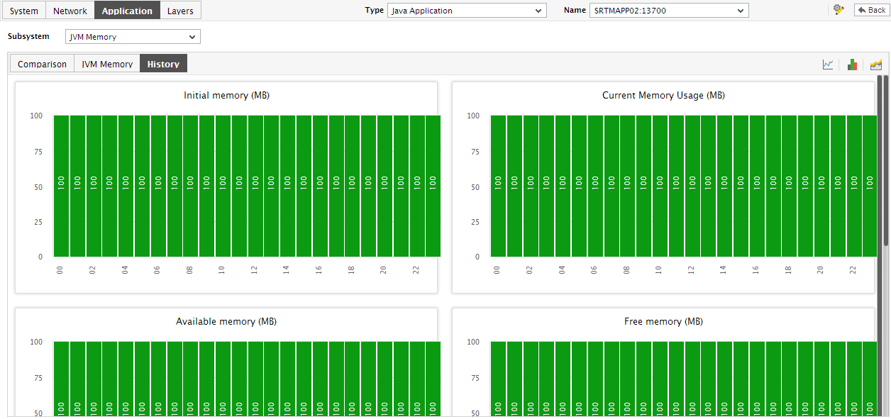
Figure 5 : Summary graphs displayed in the History tab page of the JVM Memory Dashboard
- Here again, you can change the Timeline of all the summary graphs by clicking on the Timeline link in Figure 6, or click on a graph, enlarge it, and change its Timeline in the enlarged mode. Also, though the graph plots hourly summary values by default, you can pick a different Duration for the graph in the enlarged mode, so that daily/monthly performance summaries can be analyzed.
- You can click on the
 icon at the right, top corner of the History tab page to view trend graphs of the memory usage-related measures. By default, these trend graphs plot the maximum and minimum memory usage values for every hour of the last 24 hours (by default).
 -
Using these trend graphs, you can understand the variations in the memory usage of each pool during the last 24 hours (by default), deduce the future usage trends, and accordingly recommend changes to the memory pool size.
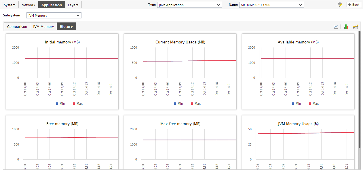
Figure 6 : Trend graphs displayed in the History tab page of the JVM Memory Dashboard
- Click on a graph, enlarge it, and change its Timeline in the enlarged mode. Also, though the graph plots hourly trend values by default, you can pick a different Duration for the graph in the enlarged mode, so that daily/monthly performance trends can be analyzed.
-
Also, by default, the trend graph only plots the minimum and maximum values registered by a measure. Accordingly, the Graph type is set to Min/Max in the enlarged mode. If need be, you can view the Graph type of the measure for the given Timeline. Such a graph will enable you to assess whether the memory resources were utilized effectively or not, over time.
Note:
In case of descriptor-based tests, the Summary and Trend graphs displayed in the History tab page typically plot the values for a single descriptor alone. To view the graph for another descriptor, pick a descriptor from the drop-down list made available above the corresponding summary/trend graph.
- At any point in time, you can switch to the measure graphs by clicking on the
 button.
 - Typically, the History tab page displays measure, summary, and trend graphs for a default set of measures.