JVM Thread
If you require an integrated dashboard for analyzing the present/past performance and problem information pertaining to the threads executing on the JVM, so that you can efficiently and accurately diagnose the root-cause of the thread-related abnormalies, select the jvm Thread option from the Subsystem list. Using this single, central dashboard, you can ascertain the following quickly and easily:
- Are any threads currently executing on the JVM? Which of these threads are consuming CPU excessively and why? Has the CPU consumption of the thread been high always or is this a sudden occurrence?
- Are any threads blocked currently? Have they been blocked for too long a time? Why did it happen?
- Are any threads in a deadlock? If so, what caused the deadlock?
- Have any threads been waiting for too long a time for other threads to release an object? If so, how long, and what caused the waiting?
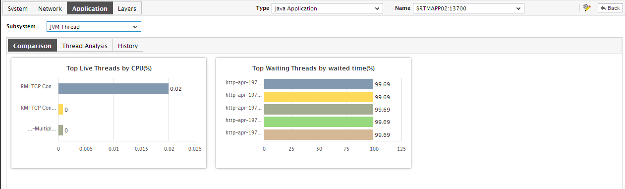
Figure 1 : The JVM Thread Dashboard
The contents of this dashboard are discussed hereunder:
- The Thread Analysis section, by default, displays the stack trace of each of the threads that are currently running on the JVM. Accordingly, the default selection in the Analysis By list is Runnable threads. To view the stack trace of those threads that are in a different state (say, Blocked, Waiting, Timed waiting, etc.), you will have to pick a different option from the Analysis By list.
-
A stack trace (also called stack backtrace or stack traceback) is a report of the active stack frames instantiated by the execution of a program. It is commonly used to determine what threads are currently active in the JVM, and which threads are in each of the different states - i.e., alive, blocked, waiting, timed waiting, etc.
Typically, when a Java application begins exhibiting erratic resource usage patterns, it often takes administrators hours, even days to figure out what is causing this anomaly - could it be owing to one/more resource-intensive threads being executed by the application? If so, what is causing the thread to erode resources? Is it an inefficient piece of code? In which case, which line of code could be the most likely cause for the spike in resource usage? To be able to answer these questions accurately, administrators need to know the complete list of threads that the application executes, view the stack trace of each thread, analyze each stack trace in a top-down manner, and trace where the problem originated.
The jvm thread dashboard simplifies this seemingly laborious procedure by not only alerting administrators instantly to excessive resource usage by a thread, but also by providing the administrator with quick and easy access to the stack trace information of that thread; with the help of stack trace, administrators can effortlessly drill down to the exact line of code that requires optimization.
- Regardless of the Analysis By option chosen, the thread list in the Thread Analysis section is sorted in the descending order of the percentage CPU time of the threads. We can thus conclude that the first thread for which stack trace is provided in this section is the top consumer of CPU. In the event of abnormally high CPU usage by this thread, you can use the stack trace to determine which line of code executed by this thread was causing the CPU usage to soar.
-
You will have to scroll down the Thread Analysis section to view the stack trace of the other threads. Alternatively, you can click on the
 icon next to the Analysis By list to invoke the Thread Analysis window (see Figure 2) using which you can quickly review the stack trace of each of the top CPU consumers.
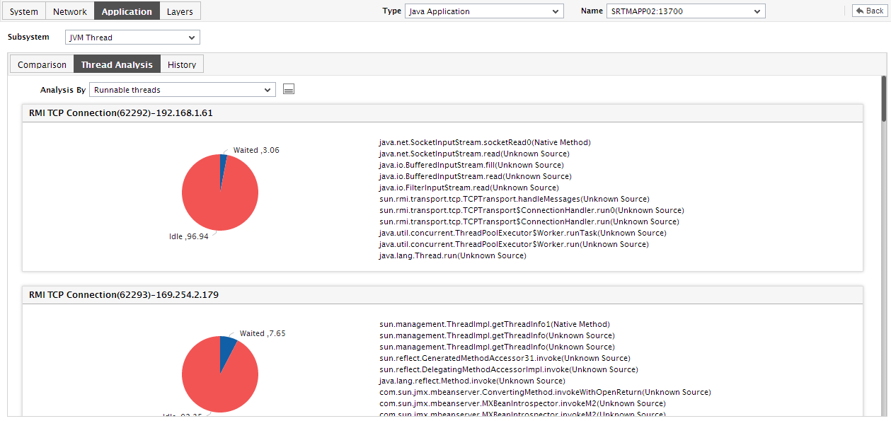
- Below the Thread Analysis section is the Comparison tab page that displays a series of top-10 charts. These charts, by default, aid the quick and accurate identification of the thread that is currently consuming the maximum CPU, the thread that has been blocked for the longest time, and the thread that has been in waiting for the longest time. You can override this default setting by including comparison graphs for more measures in the Comparison tab page, or by removing one/more existing graphs from this tab page.
-
To view a comparison graph more clearly, click on it; this enlarges the comparison graph as depicted by Figure 3.
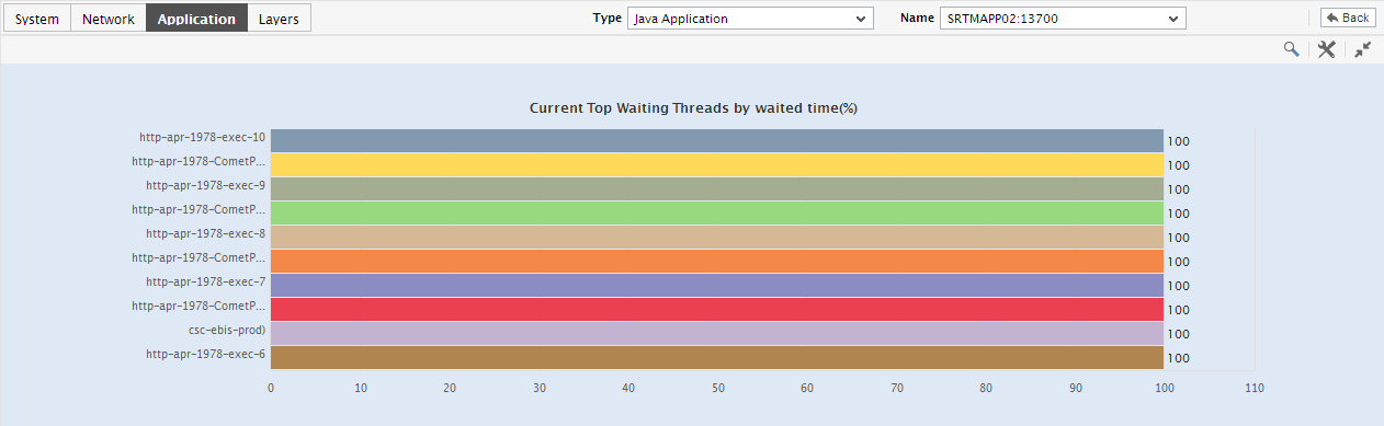
Figure 3 : An enlarged top-n bar graph in the JVM Thread dashboard of the Java Application
- In the enlarged mode, you can pick a different top-n or last-n option from the Show list to focus on a more or a less number of JVM threads. Also, to perform a post-mortem on issues that occurred in the past and to zero-in on threads that may have contributed to this past problem, click on the Compare History link in Figure 4 and provide a Timeline for this comparison. A comparison bar graph indicating the top-10 (by default) threads in a specific performance area during the specified timeline, will then appear.
-
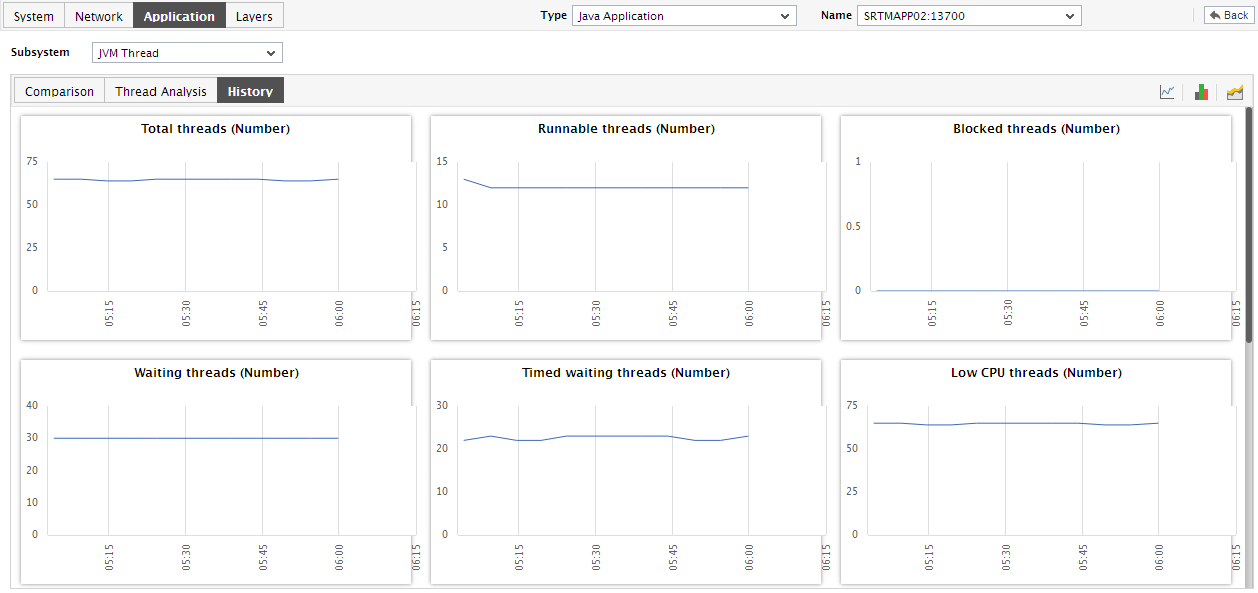
For historically analyzing the state of the JVM threads, click on the History tab page. This tab page displays time-of-day graphs for all the thread-related measures for a default duration of 24 hours.
-
Say, you suddenly notice that the number of blocked threads has increased; in such a case, you can use these measure graphs to figure out when during the last 24 hours the block occurred. If required, you can even look beyond the last 24 hours - i.e., you can find out whether the anomaly originated much earlier. For this, you just need to click on the graph of interest to you. This will enlarge the graph; in the enlarged mode, you can alter the graph Timeline, so that the performance of that measure can be analyzed over a broader time window.
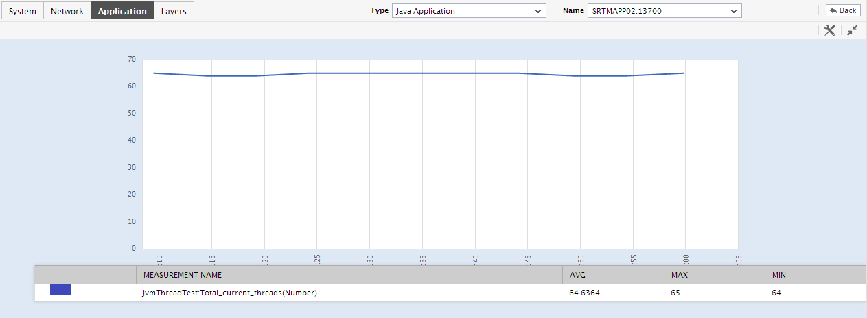
Figure 5 : An enlarged measure graph in the History tab page of the JVM Thread dashboard
-
To view summary graphs on thread state instead of the default measure graphs, just click on the
 icon at the right, top corner of the History tab page. Figure 5 will then appear. The summary graphs of Figure 6 reveal the percentage of time during the last 24 hours (by default) the Java application has been affected by thread-related issues, and the type of issues (whether critical/major/minor) the application was experiencing. These graphs help determine whether the assured service levels were delivered or not. For instance, if the Java application assures its users of zero deadlock situations, then the summary graph will reveal whether the Java application did encounter any deadlock situation, and if so for how long - this way, while performing service level audits on the application, the auditor can understand whether the application delivered on its promise or has slipped. If service level slippages are detected, then the summary graphs will also reveal the extent of the slip - i.e., the percentage of time for which the desired service levels were not delivered.
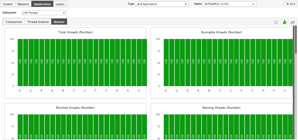
Figure 6 : Summary graphs displayed in the History tab page of the JVM Thread Dashboard
- Use the Timeline link at the right, top corner of the tab page to change the timeline of all the summary graphs at one shot. For altering the timeline of a single graph, click on it; this will enlarge the graph. In the enlarged mode, you can change the Timeline of the summary graph and modify the dimension (3D/2D) of the graph. Also, by default, hourly summaries are plotted in the summary graph; you can configure these graphs to plot daily/monthly summaries instead by picking the relevant option from the Duration list in the enlarged mode.
-
If you want to view the past trends in thread performance, click on the
 icon at the right, top corner of the History tab page. Figure 7 will then appear. Using the trend graphs displayed inFigure 7, you can better assess the current capacity of your application and can accordingly plan its future capacity. By default, these trend graphs plot the maximum and minimum values registered by every thread-related measure during every hour of the last 24 hours. From this data, you can clearly figure out when during the last 24 hours the application performance has peaked and when it has been below-normal.
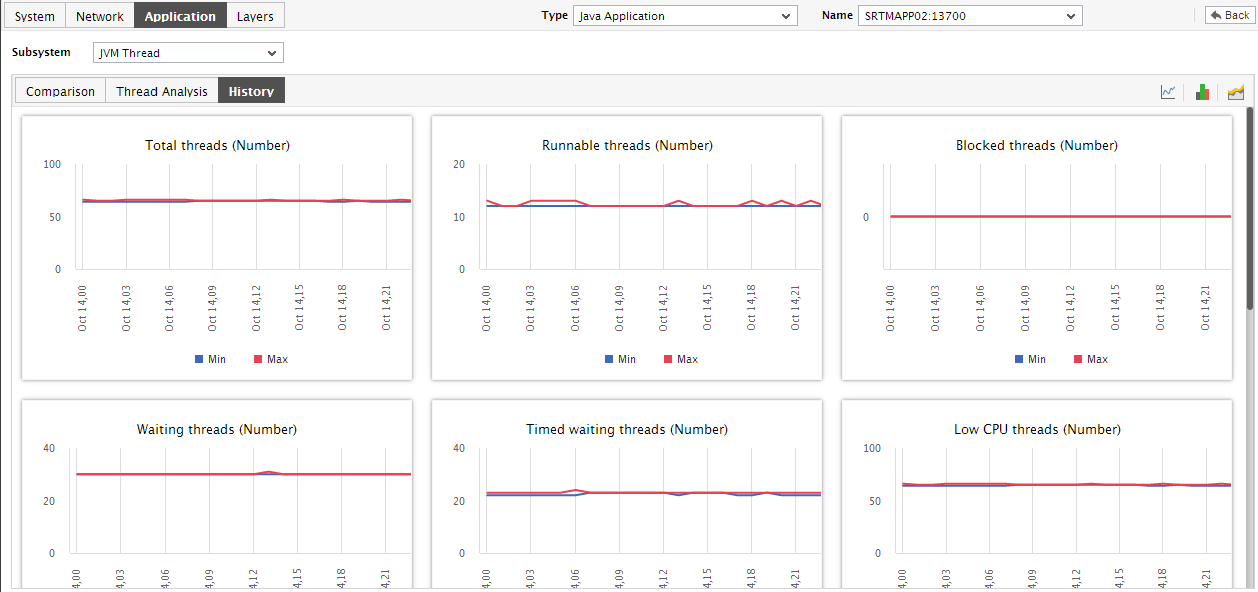
Figure 7 : Trend graphs displayed in the History tab page of the JVM Thread Dashboard
-
Use the Timeline link at the right, top corner of the tab page to change the timeline of all the trend graphs at one shot. For altering the timeline of a single graph, click on it; this will enlarge the graph. In the enlarged mode, you can change the Timeline of the trend graph and modify the dimension (3D/2D) of the graph. Also, by default, hourly trends are plotted in the trend graph; you can configure these graphs to plot daily/monthly trend values instead by picking the relevant option from the Duration list in the enlarged mode. Moreover, by default, the trend graphs plot only the minimum and maximum values registered by a measure during the specified timeline - this graph will enable you to isolate those times at which performance of that measure had peaked and the times it had fared poorly. For instance, using the default trend graph for the Blocked threads measure, you can clearly identify when too many threads were blocked and when blocked threads were minimum. If need be, you can view the Avg option from the Graph type list in the enlarged mode to make sure that the trend graph plots the average trend values for the specified timeline - in the case of the above example, such a graph will help you understand how the blocked threads count has varied during the set timeline. Alternatively, you can select the Sum option from the Graph type list to have the trend graph plot the sum of trends for the specified timeline.
Note:
In case of descriptor-based tests, the Summary and Trend graphs displayed in the History tab page typically plot the values for a single descriptor alone. To view the graph for another descriptor, pick a descriptor from the drop-down list made available above the corresponding summary/trend graph.
- At any point in time, you can switch to the measure graphs by clicking on the
 button.