JVM Uptime
To investigate issues with availability and uptime of the JVM, select jvm Uptime as the Subsystem. Figure 1 will then appear.
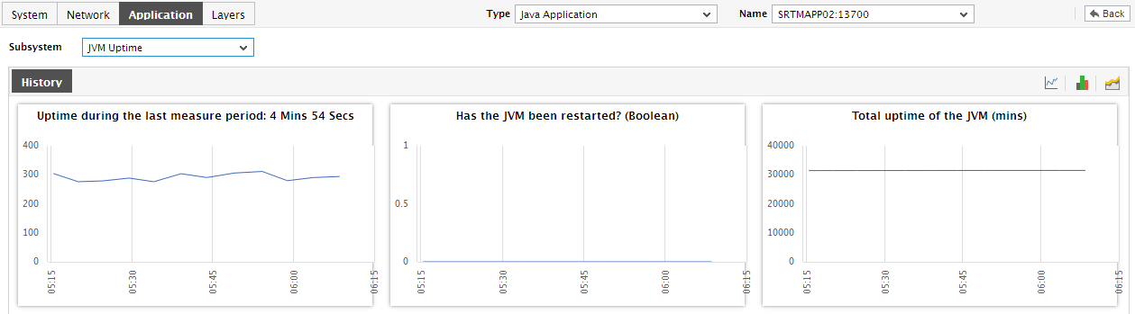
Figure 1 : The JVM Uptime Dashboard
The contents of the uptime dashboard are as follows:
- From the jvm Uptime section, you can determine the total duration for which the JVM has been up and running since its startup. If the JVM was started two days ago, but the uptime indicated by this section spans only a day, it is a clear indication that the JVM was unavailable for a while in-between; a possible reason for this could be a scheduled/unscheduled reboot of the Java application.
- A careful study of this graph over time periods longer than 24 hours, can reveal intermittent breaks (if any) in JVM availability and failure of scheduled JVM reboots (if any). To ensure that all graphs plot values for longer time periods, click on the Timeline link at the right, top corner of the History tab page, and then change the timeline using the calendar that pops out. To modify the timeline for a particular graph alone, click on the graph to enlarge it, and alter the timeline in the enlarged mode. Besides the timeline, you can even change the graph dimension (3d / 2d) in the enlarged mode.
-
Sometimes, you might have to periodically determine the percentage of time for which certain critical Java applications have been up and running, so that you know whether/not the application has been able to maintain the desired uptime levels. To run such uptime checks, summary graphs of the uptime measures are useful. To view summary graphs in the History tab page, click on the
 icon at the right, top corner of the History tab page. Figure 2 will then appear.
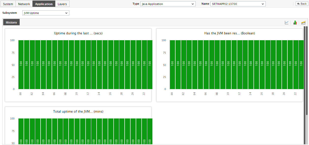
Figure 2 : Summary graphs displayed in the JVM Uptime Dashboard
- To perform the summary analysis over a broader time window, click on the Timeline link at the right, top corner of the History tab page and change the timeline; this will alter the timeline for all the graphs. To change the timeline of a particular graph alone, click on the graph to enlarge it, and then alter its timeline. Also, by default, hourly summaries are plotted in the summary graph; you can configure these graphs to plot daily/monthly summaries instead by picking the relevant option from the Duration list in the enlarged mode.
-
Similarly, you can analyze uptime trends by viewing trend graphs in the History tab page. For this, click on the
 icon at the right, top corner of the tab page. Figure 2 will then appear.
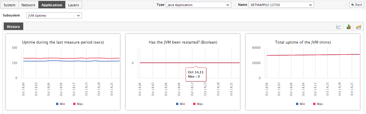
Figure 3 : Trend graphs displayed in the JVM Uptime Dashboard
- These trend graphs, by default, plot the minimum and maximum values registered by every uptime-related measure during every hour for the last 24 hours. Using these graphs, you can ascertain when during the last 24 hours uptime was very high, and when it was low.
-
To change the timeline of a particular graph, click on the graph to enlarge it, and then alter its timeline. The Graph type can be viewed in the enlarged mode. By default, the graph Duration is Hourly, indicating that trend graphs plot hourly trend values by default. To ensure that these graphs plot the daily/monthly trend values instead, select the relevant option from the Duration list. Similarly, as already mentioned, trend graphs plot only the minimum and maximum values registered by a measure during the specified timeline. Accordingly, the Graph type is set to Min/Max by default in the enlarged mode. If you want the trend graph to plot the average trend values instead, set the Graph type to Avg. On the other hand, to configure the trend graph to plot the sum of trends set the Graph type to Sum.
Note:
In case of descriptor-based tests, the Summary and Trend graphs displayed in the History tab page typically plot the values for a single descriptor alone. To view the graph for another descriptor, pick a descriptor from the drop-down list made available above the corresponding summary/trend graph.
- At any point in time, you can switch to the measure graphs by clicking on the
 button.