Memory
Apart from CPU and disk usage, you can pick the Memory option from the Subsystem list to determine how the system has been using its memory resources. Figure 1 will then appear.
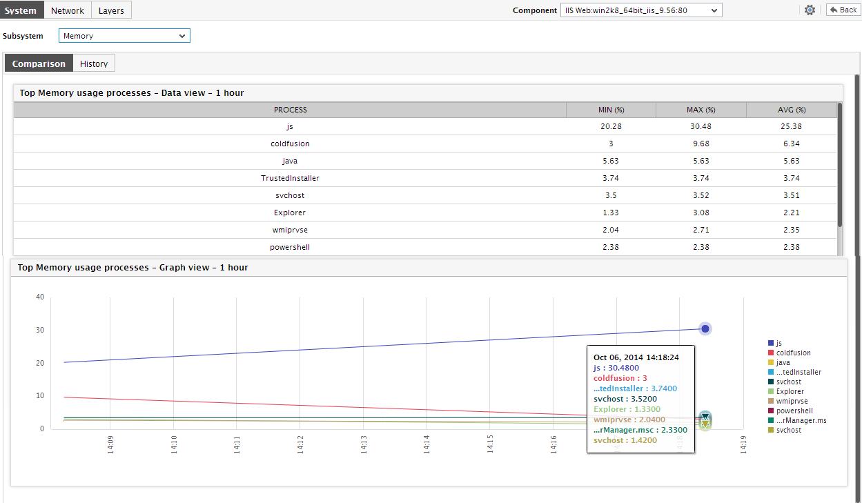
Figure 1 : The System Dashboard for the Memory subsystem
-
Since the dial charts and digital number displays in Figure 2 report the current state of a default set of memory usage-related metrics, continuous review of these metrics can provide you with a heads-up on any usage irregularities that may have surfaced recently.
-
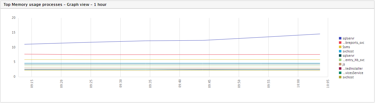
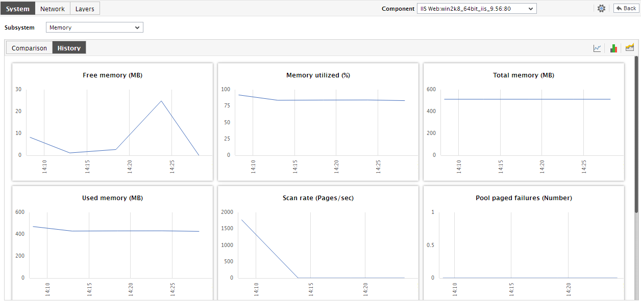
While a comparative analysis of current/1-hour performance can reveal a memory contention that occurred recently, deeper historical analysis is necessary for deducing usage trends and problem patterns. To perform this historical analysis, use the History tab page. This tab page displays a number of graphs, plotted for a default period of 24 hours, that reveal the time-of-day variations in the memory usage of the host.
-
Instead of changing the default timeline, you can change the timeline of the measure graphs on-the-fly too by clicking on the Timeline link in Figure 3, and can even enlarge a graph by simply clicking on it. The enlarged graph will appear as depicted by .
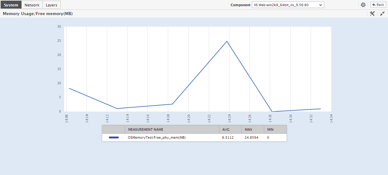
Figure 4 : An enlarged Memory usage measure graph
- Here again, you can modify the Timeline of the graph.
-
If required, you can configure the History tab page to display Summary graphs instead of the measure graphs. To achieve this, click on the
 icon at the right, top corner of the History tab page of Figure 5. Figure 6 will then appear revealing summary graphs for the critical memory usage measures. From these graphs, you can easily determine the percentage of time (during the last day by default) the system has experienced memory-related issues. Besides indicating how memory-efficient the system was during the default period, these graphs also enable you to gauge the efficiency of the administrative staff in resolving issues that might have surfaced.
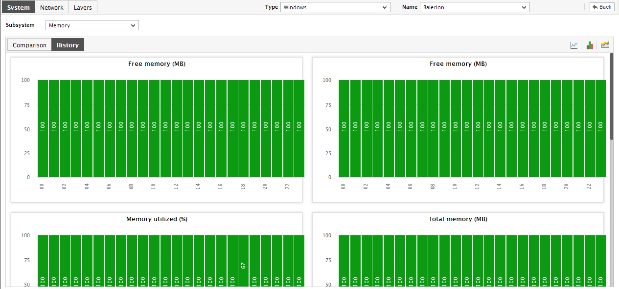
Figure 5 : The History tab page displaying Summary graphs on memory usage
- You can even expand the summary graph by clicking on it, and then alter its Timeline and its dimension (2d / 3d).
-
Similarly, with a mere click of a button, you can have the History tab page display trend graphs instead of summary/measure graphs. For this, just click on the
 icon at the right, top corner of Figure 5.
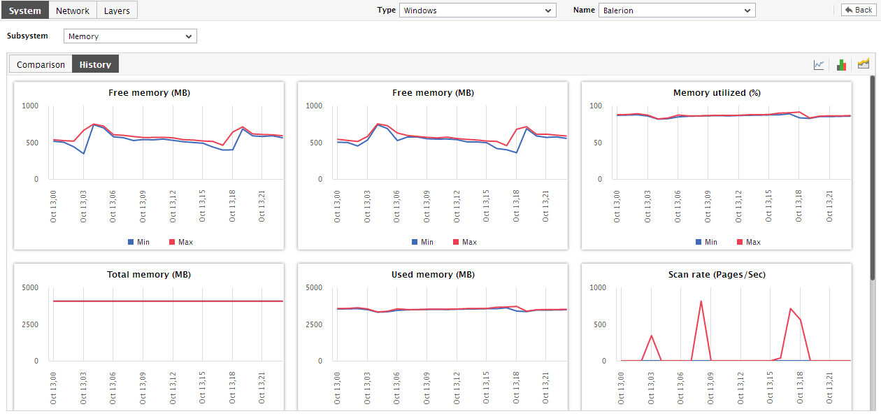
Figure 6 : The History tab page displaying trend graphs on memory usage
-
You can even expand the trend graph by clicking on it, and then alter its Timeline. By default, the trend graph plots the minimum and maximum values of a measure during the given timeline. In the enlarged mode, you can change the Graph type so that the average values or sum of trend values are plotted in the trend graphs instead.
Note:
In case of descriptor-based tests, the Summary and Trend graphs displayed in the History tab page typically plot the values for a single descriptor alone. To view the graph for another descriptor, pick a descriptor from the drop-down list made available above the corresponding summary/trend graph.
- At any point in time, you can switch to the measure graphs by clicking on the
 button.