Network
If you want to strictly focus on the current and past issues related to the availability of the network connection to the device/server, and network latencies / packet losses experienced by the device/server, pick the Network option from the Subsystem list. Figure 1 will then appear.
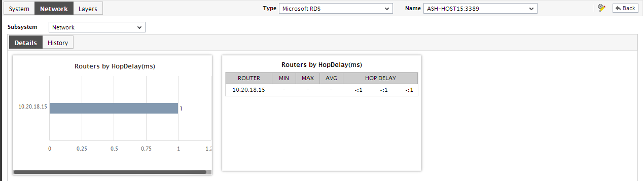
Figure 1 : The dashboard of the Network subsystem
For a network device, this dashboard reveals the following:
- With the help of the digital displays available in Figure 1, which report the current network latency values for the device, you can proactively determine network-level slowdowns (if any). While digital displays are available for a default set of measures, you can configure additional digital displays or remove any of the existing displays by following the steps discussed below:
- Below the digital graphs is the Details tab page. If the target network device experiences a high network latency, then, using the Routers by Hop Delay bar graph and table available in the Details tab page, you can view the hop-by-hop connectivity and delay, zero-in” on the exact hop at which the delay has occurred, probe into the root-cause of the delay, and resolve the issue, so as to optimize network performance. You can expand the bar graph by clicking on it.
-
The History tab page, on the other hand, displays measure graphs by default, which indicate the time-of-day variations in the availability and overall network health of the device during the last 24 hours. You can click on a graph to enlarge it and view it clearly. You can even click on Timeline to modify the graph timeline, and thus analyze network performance over a longer time period.
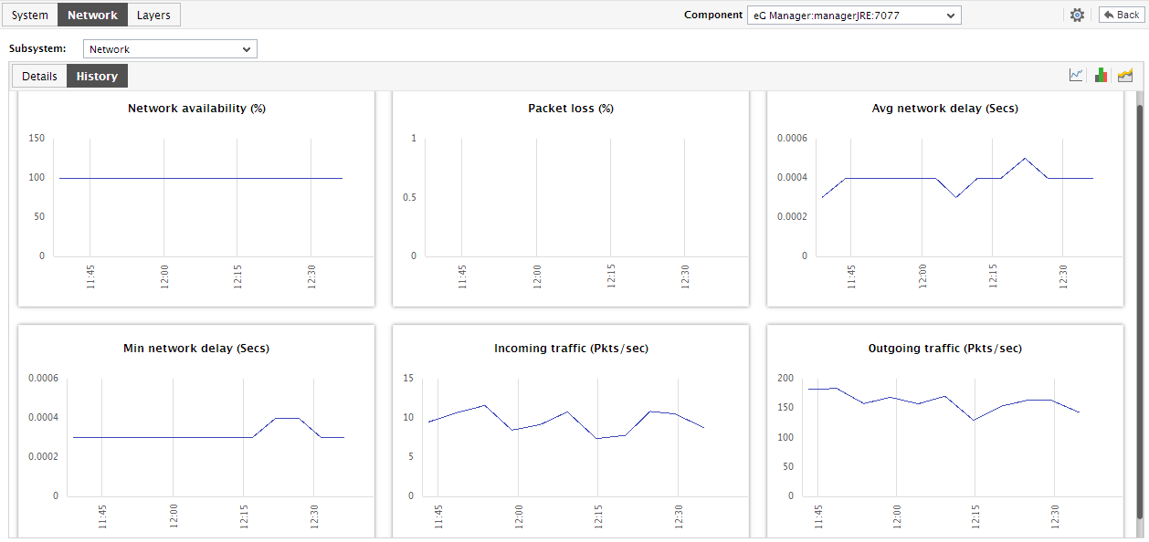
Figure 2 : History tab page displaying measure graphs in the dashboard of the Network sub-system
-
To view the percentage of time during the last 24 hours for which the network performance was affected by issues, click on the
 icon at the right, top corner of Figure 2.
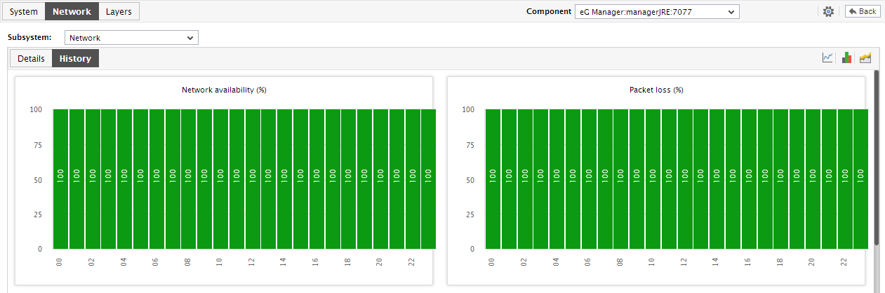
Figure 3 : The Summary graphs in the dashboard of the Network subsystem
- Using the graphs in Figure 2, you can effectively perform service level audits and detect when and what type of network issues caused the agreed-upon service levels to be compromised.
-
Similarly, click on the
 icon at the right, top corner of the History tab page in Figure 2 to view and analyze the past trends in network performance. By default, the trend graphs will pertain to the last 24 hours.
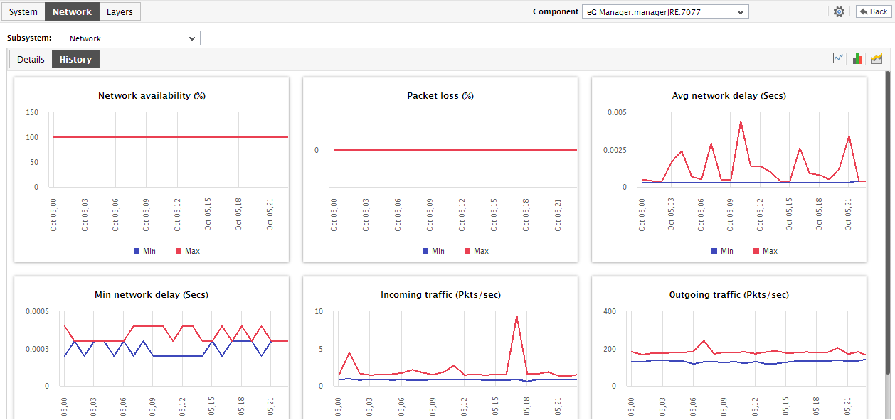
Figure 4 : The Trend graphs in the dashboard of the Network subsystem
- Using these trend graphs, you can determine when network performance peaked and when it hit rock bottom - this way, you can easily infer how network performance has varied during the last 24 hours, and thus receive a heads-up on potential network anomalies.
- To change the timeline of a single graph, click on the graph to enlarge it.
- Also, an enlarged summary/trend graph allows you to alter the graph Duration - i.e., view the daily or weekly summary/trend information, instead of the default hourly data in the graphs.
-
Also, by default, the trend graphs in the History tab page plot the minimum and maximum values of a measure during the given timeline. In enlarged trend graphs, you can change the Graph type so that the average values or sum of trend values are plotted in the trend graphs instead.
Note:
In case of descriptor-based tests, the Summary and Trend graphs displayed in the History tab page typically plot the values for a single descriptor alone. To view the graph for another descriptor, pick a descriptor from the drop-down list made available above the corresponding summary/trend graph.
- At any point in time, you can switch to the measure graphs by clicking on the
 button.
As stated earlier, the Network Subsystem Dashboard of a network device provides measure graphs that track the availability of the device over the network, network latencies, and packet loss experienced by the device during communication. For a server/application however, the same Network Subsystem Dashboard will additionally display the following:
- Measure graphs tracking the incoming and outgoing traffic of the target server during the last 24 hours (by default); using these graphs, you can determine when during the last 24 hours the network activity to and from the server was very high.
- A bar graph depicting the network delay experienced at every hop; using this bar graph, you can accurately isolate the hop at which maximum network latency has occurred.
- A table depicting the hop-by-hop delay.