Overview
By default, the Overview option is chosen from the Subsystem list of Figure 1. As the name suggests, the Overview dashboard provides an all-round view of the network health of a target application/device.
Figure 1 depicts the Overview Dashboard for a network device.
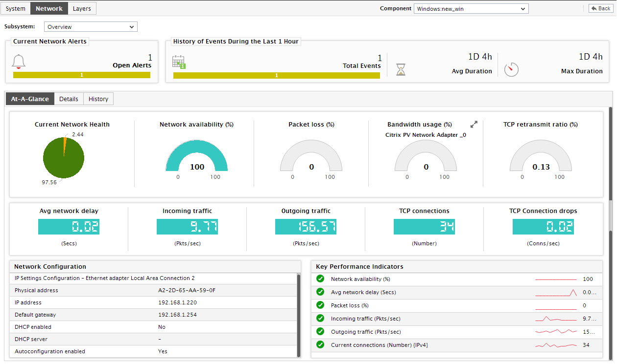
Figure 1 : The Network Dashboard of a network device
For a monitored host, the Overview dashboard reveals the following:
- Using the Current Network Alerts section of Figure 1, you can instantly understand how many problems of what severity are currently affecting the health of the Network layer of the device. Clicking on a non-zero number here will open Figure 1, which will list the network-related alarms of the priority clicked on.
- To determine the quality of the network links leading to the network device during the last 1 hour, view the History of Events section; this section displays a bar graph that provides a quick look at the number and priority of network problems faced by the target application during the last 1 hour. In addition, the average and maximum duration for which these issues remained open will also be available in this secton; this enables you to assess the efficiency of your administrative staff.
-
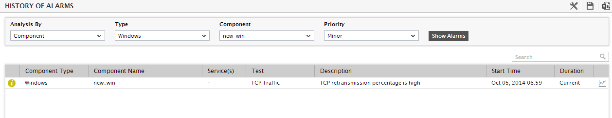
For more details about the historical problems, click on any of the bars in the bar graph. The history of alarms page of Figure 2 will then appear, listing all the network-related events that were captured by the eG agent on the target network device, during the last 24 hours (by default). This information enables you to understand what type of problems were faced by the target device during the default timeline, and how long each problem remained.
- For a network device, this tab page reveals, at a single glance, the current network health, network latencies (if any), and the status of the network interfaces supported by the device. Besides enabling you to accurately detect sudden changes in the state of the device, this section also helps you nail the root-cause of this state change; moreover, you can even identify network interfaces that are performing poorly, with the help of this section.
- You can use the Current Network Status section in the At-A-Glance tab page to know how problem-prone your network is; the pie chart here indicates the percentage of current network-related measures that are in varying states of activity. Clicking on a slice in this pie chart will once again lead you to the Event History page.
-
This will be followed by dial charts and digital displays that will update you with the status of a pre-configured list of metrics; these metrics reveal the following:
- Whether the network device is currently available over the network or not;
- Has the device experienced any loss of data packets? If so, to what extent?
- How long has the device been up? Was the device rebooted anytime after it was started?
- Was there any delay in connecting to the device? How significant is the delay? - in the event of a high network latency, you can use the Routers by HopDelay table to figure out where - i.e., at which hop - the maximum delay occurred.
- What is the maximum rate at which data is currently transmitted and received by the network interfaces supported by the device?
- What is the maximum speed at which the network interfaces currently operate?
Note:
If you have configured one/more measures of a descriptor-based test to be displayed as a dial chart, then, in real-time, the descriptor that is in an abnormal state or is currently reporting the maximum value for that measure will be represented in the dial chart. You can view the dial charts pertaining to the other descriptors, by clicking on the More button that appears alongside a dial chart in the dashboard.
-
Clicking on a dial chart/digital display in the dashboard will lead you to the layer model page that will reveal the exact layer and test that reports the measure represented by the dial chart/digital display.
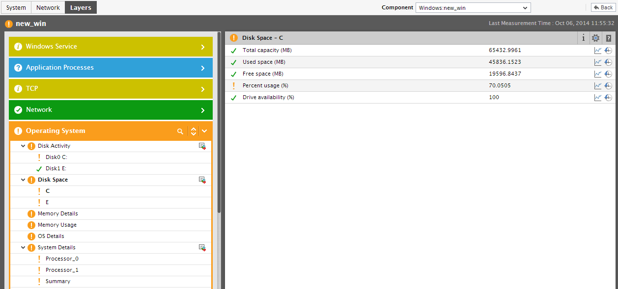
Figure 3 : The page that appears when a dial/digital chart in the Network Overview Dashboard is clicked
-
If users are experiencing delays while connecting to the component via the network, then you can use the Routers by Hop Delay (ms) section to nail the root-cause of such a network latency. This section details the hop-by-hop connectivity and delay, and thus help isolate the exact hop at which a network delay occurred.
Note:
If you have configured more than two dial charts for the Network Overview dashboard using the Dashboard Settings window, then the Routers by Hop delay (ms) section will not appear in the At-A-Glance tab page.
- The Network Configuration section displays the current network configuration, and enables you to ascertain whether a change in configuration could have contributed to the network problems at hand.
-
By closely monitoring the status of these metrics, you can be instantly updated with critical network issues. Clicking on a measure listed in the Key Performance Indicators section will lead you to the Layer Model tab page of the application (see Figure 3), which reveals the exact layer and test that reported the measure.
Figure 4 : Clicking on a key performance indicator in the Network Overview Dashboard
-
This way, from a single console, you can receive rapid, real-time updates on the overall network status of your network devices, and instantly identify the root-cause of such network-related anomalies. In order to zoom into the performance of network interfaces in particular, switch to the Details tab page by clicking on it. Figure 5 will then appear.
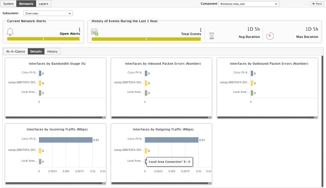
Figure 5 : The Details tab page of the Network Dashboard of a network device
-
The Details tab page provides a default set of bar charts, each of which lists the top-10 network interfaces in a particular performance arena. Using these default bar charts, you can instantly figure out the following:
- Which network interface is currently available?
- Which network interface is operating with the maximum speed?
- Which network interface is utilizing the maximum bandwidth?
- The incoming and outgoing traffic to which network interface is very high currently?
- In addition to the default/user-configured bar graphs, the Details tab page includes a Routers by HopDelay bar chart that graphically depicts the hop-by-hop delay, so that you can easily identify the hop at which significant delay has occurred.
-
By default, all the bar charts in the Details tab page pertain to the current period. However, sometimes, you might want to go back in time, so as to investigate a past problem and identify its source. For this purpose, click on the corresponding bar chart in the Details tab page. Doing so will invoke Figure 5.
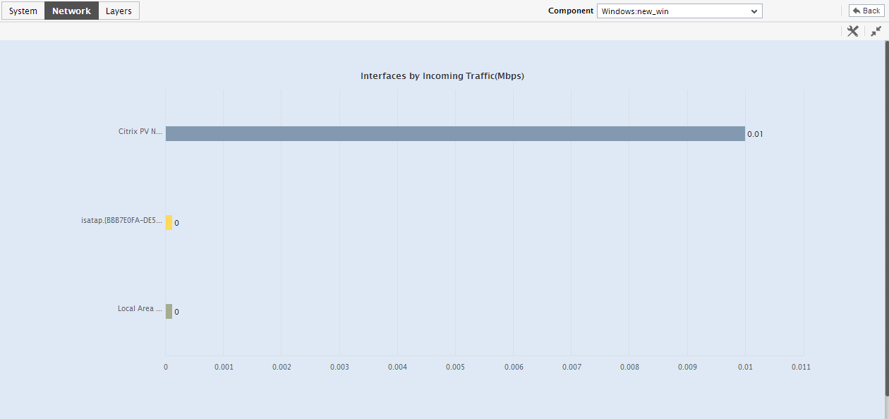
Figure 6 : The enlarged top-10 bar chart in the Details tab page of a Network Dashboard
- The enlarged bar chart, by default, lists all the network interfaces that are supported by the target server/network device. To view the performance of a specific set of interfaces alone, select a top-n or last-n option from the Show list in the settings option.
-
Though the Details tab page enables you to focus on both the current and past performance of network interfaces, to proactively detect any type of potential anomaly, the past performance of the network in its entirety needs to be analyzed. For this purpose, switch to the History tab page by clicking on it.
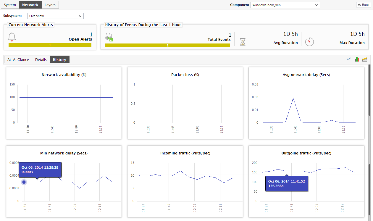
Figure 7 : The History tab page of the Network dashboard of a network device
-
Figure 7 that appears reveals measure graphs for a pre-configured set of performance metrics; these graphs, which are typically plotted for a default period of 24 hours, indicate the following:
- Were there any breaks in the availability of the network connection to the device during the last 24 hours?
- Were any data packets lost in transit during the last 24 hours?
- Was any significant delay detected in connecting to the device during the last 24 hours?
- How was the data traffic to and from the device during the last 24 hours?
- Were any TCP connections dropped by the target during the default timeline?
- How busy was the target, in terms of TCP connections, during the default time period?
You can click on the graph to expand it and view its contents clearly.
-
If need be, you can view Summary graphs in the History tab page to figure out the percentage of time (during the last day by default) the device experienced network-related issues. To achieve this, click on the
 icon at the right, top corner of Figure 7. Figure 8 will then appear displaying summary graphs plotted for a default period of 24 hours.
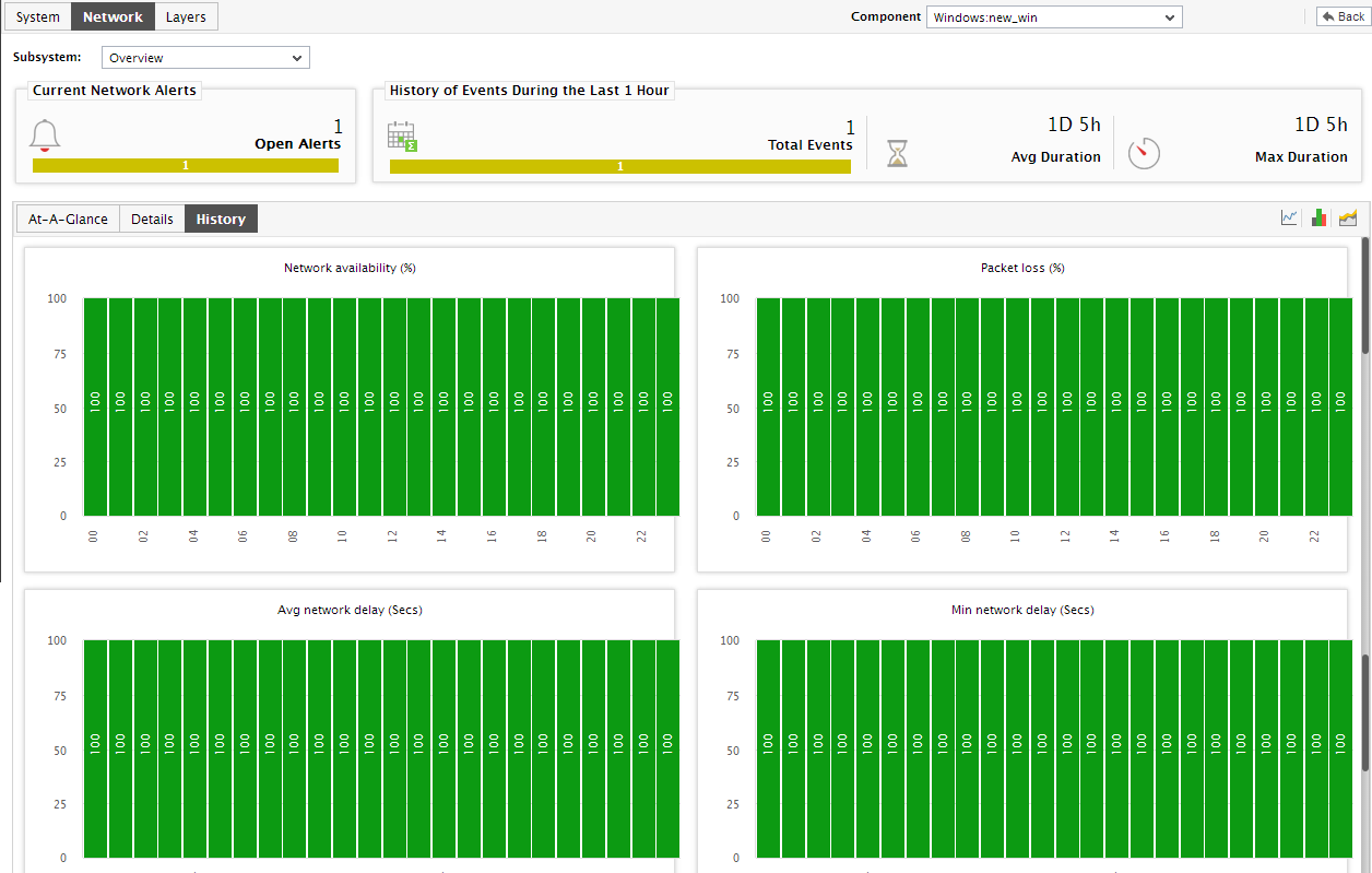
Figure 8 : The History tab page displaying summary graphs on network performance
-
Similarly, you can choose to analyze the past trends in network performance using the History tab page, instead of time-of-day variations or performance summaries, by clicking on the
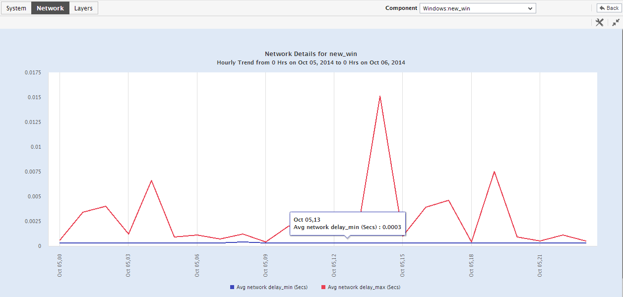
 icon at the right, top corner of Figure 8. This will invoke Figure 9, which will reveal trend graphs that capture the minimum and maximum values that pre-configured measures registered during the default period of 24 hours.
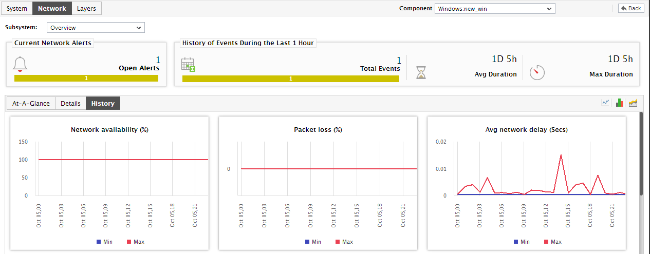
Figure 9 : The History tab page displaying trend graphs on network performance
-
You can even expand the trend graph by clicking on it (see Figure 10).
-
In the enlarged mode, you can even alter the Timeline of trend graphs. By default, the trend graph plots the minimum and maximum values of a measure during the given timeline. In the enlarged mode, you can change the Graph type so that the average values or sum of trend values are plotted in the trend graphs instead.
Note:
In case of descriptor-based tests, the Summary and Trend graphs displayed in the History tab page typically plot the values for a single descriptor alone. To view the graph for another descriptor, pick a descriptor from the drop-down list made available above the corresponding summary/trend graph.
- At any point in time, you can switch to the measure graphs by clicking on the
 button.