Pre-built Widgets of My Dashboard
eG Enterprise offers a range of pre-built widgets that are ready to use when included in the My Dashboard.
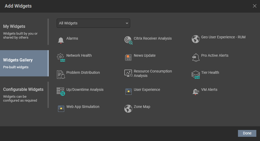
Figure 1 : The list of pre-built widgets
Let us discuss each of these widget in detail in the forthcoming sections.
-
Alarms
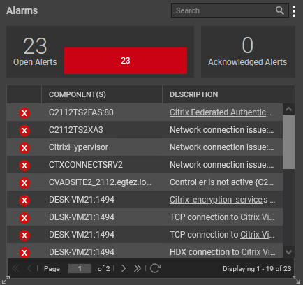
To view the list of currently open problems in your environment, you can use the Alarms widget. To include an Alarms widget in the dashboard, click on the Alarms widget that appears in the right panel when you click the Widgets Gallery option (see Figure 1). The Alarms widget will then be appended to the dashboard with the alarms that are currently open in your environment as shown in Figure 2.
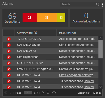
Figure 2 : The Alarms widget that shows the current alarms in your environment
The first section of Figure 2 lists the overall count of Open Alerts and the count of alerts raised for each severity (Critical/Major/Minor). You can even view the count of alarms that were acknowledged in the target environment from the Acknowledged Alerts section.
In the next section, every alarm generated for a component is listed in detail. Clicking on an individual alarm will lead you to the layer model of the particular component for which the alarm was raised. If you do not wish to get a detailed list of alarms and instead wish to view the count of alarms generated for each component based on the severity, then you need to set the AlertDistributionByServer flag in the <EG_INSTALL_DIR>\manager\config\eg_customdashboard.ini file to yes. By default, this flag is set to No.
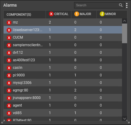
Figure 3 : The Alerts widget that shows the alarms based on severity for each component
Clicking on the alarm count under the CRITICAL, MAJOR and MINOR columns in Figure 3 will lead you to Figure 4 which will show you the description of the alarm, start time of the alarm and the detailed diagnosis of the measure that caused the alarm.
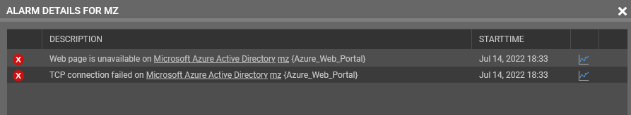
Figure 4 : The alarm description for a chosen component and severity
You can even search for a component of you choice by partially typing the name of the component in the Search text box (see Figure 3).
Clicking the vertical dots besides the Search text box reveals a drop down list with a few additional settings relevant to the Alarms widget as shown in Figure 5.
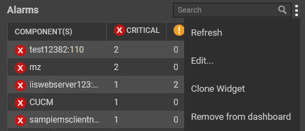
Figure 5 : Additional settings
Using the options displayed in the drop down list of Figure 5, you can do the following:
-
Refresh the Alarms widget by clicking the Refresh option.
-
To edit the alarms widget, click the Edit... option. Figure 6 will then appear.
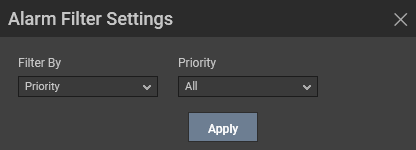
Figure 6 : The Alarm Filter Settings pop up window
-
By default, the Priority option will be chosen from the Filter By list indicating that you can choose to view the alarms based on their severity in the Alarms widget. Further, you can filter the alarms based on the severity from the Priority list. By default, All option will be chosen from this list. Clicking the Apply button will filter the alarms based on your selection. Figure 7 displays an Alarm widget that was filtered based on the Critical alerts raised in the target environment.
-
You can even filter the alerts based on the Component Type, Zone, Service and Segment in your environment using the Filter By option displayed in Figure 6.
-
-
To clone the Alarms widget, click the Clone widget option in Figure 5. Figure 8 will then appear.
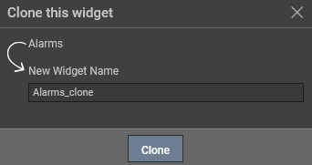
Figure 8 : Cloning the Alarms widget
By default, the Alarms_clone option will be displayed in the New Widget Name text box. You can specify the name of the your choice in this text box and click the Clone option.
-
To delete this widget from the dashboard, click the Remove from Dashboard option. Figure 9 then appears.
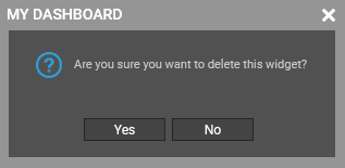
Figure 9 : Removing the widget from the dashboard
Clicking the Yes button in Figure 9 will enable you to delete the widget from the dashboard.
-
-
Network Health
If you wish to view the percentage of components that are currently available over the network in your infrastructure in the dashboard and those that are not available, then use the Network Health widget. The Network Health widget will appear once you click the Network Health option that appears in the right panel when you click the Widgets Gallery (see Figure 10).
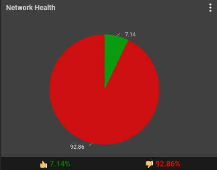
Figure 10 : The Network Health widget
The pie chart will then appear with the distribution of the components that are available over the network and those that are not available over the network.
Clicking the vertical dots in Figure 10 reveals a drop down list with a few additional settings relevant to the Network Health widget as shown in Figure 11.
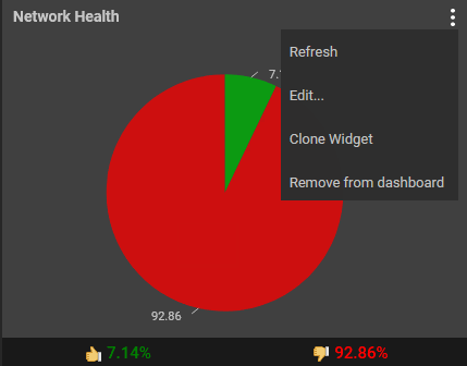
Figure 11 : Additional Settings for Network Health widget
Using the options displayed in the drop down list of Figure 11, you can do the following:
-
Refresh the Network Health widget by clicking the Refresh option.
-
To edit the Network Health widget, click the Edit... option. Figure 12 will then appear.
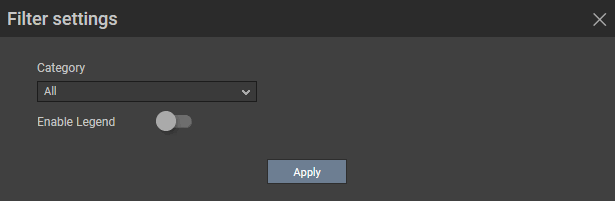
Figure 12 : The Filter settings pop up window for Network Health widget
-
To view the list of components that are online/offline, turn on the Enable legend slider in Figure 12. Figure 13 then appears. By default, the list of components will be displayed based on the highest value plotted in the pie chart. For example, if the pie chart displays 92.86% as the components that are unavailable over the network, then, the Distribution-Offline section will display the list of components that are offline.
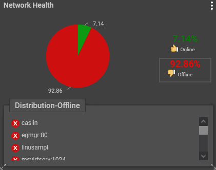
Figure 13 : Viewing the distribution of components that are offline
-
Clicking on a component in Figure 13 will lead you to the layer model of the chosen component where you can view all the network related details of the chosen component.
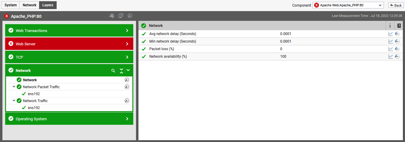
Figure 14 : The layer model page that appears upon clicking a component in the Network Health widget
-
By default, All option is chosen from the Category list of Figure 12. This implies that you can view the distribution of all the components that are available/unavailable over the network. If you wish to view the distribution of the components belonging to a Zone/Service/Segment or the components in your target environment, you can do so by choosing the appropriate option from the Category list shown in Figure 15.
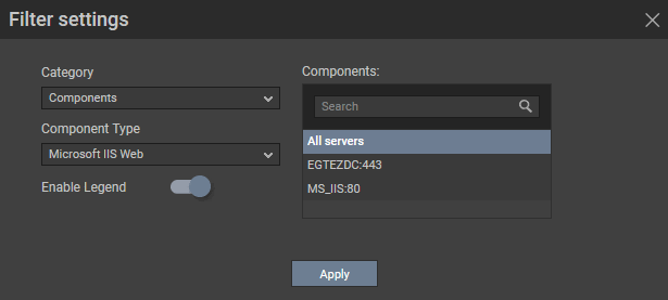
Figure 15 : Filtering the components based on the Component Type
-
For example, if you had chosen Components from the Category list, then you are required to choose the Component Type. Based on the chosen Component Type, the Components list box will be auto populated with the list of components belonging to that component type. By default, All servers option will be chosen from Figure 15 indicating that the availability/unavailability of only those chosen components over the network will be plotted in the Network health widget.
Clicking the Apply button in Figure 15 will reveal Figure 16 which displays the availability over the network for the chosen components alone.
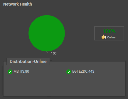
Figure 16 : The widget displayed for components of chosen Component Type
-
-
To clone the Network Health widget, click the Clone Widget option in Figure 11. Figure 17 will then appear.
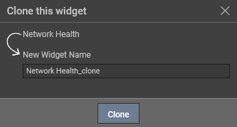
Figure 17 : Cloning the Network Health widget
By default, the Network Health_clone option will be displayed in the New Widget Name text box. You can specify the name of the your choice in this text box and click the Clone option.
-
To delete this widget from the dashboard, click the Remove from Dashboard option.
-
-
News Update
If you wish to view the latest trending news in your dashboard, click on the News Update option in the right panel that appears upon clicking the Widgets Gallery (see Figure 1). The News widget will then appear as shown in Figure 18 listing the top trending news in India under various categories.
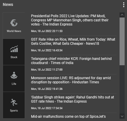
Figure 18 : The News widget that appears in the dashboard
Clicking the vertical dots in Figure 18 reveals a drop down list with a few additional settings relevant to the News Update widget as shown in Figure 19.
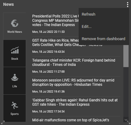
Figure 19 : Additional Settings for the News Update widget
Using the options displayed in the drop down list of Figure 19, you can do the following:
-
Refresh the News Update widget by clicking the Refresh option.
-
To edit the News Update widget, click the Edit... option. Figure 20 will then appear.
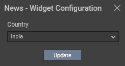
Figure 20 : Choosing the Country for which you wish to view the News
By default, India will be chosen from the Country list. If you wish to view the current news in the country of your choice, then, you can choose the Country from Figure 20 and click the Update button.
-
To delete this widget from the dashboard, click the Remove from Dashboard option.
Note:
The News widget can be added only once in a dashboard.
-
-
Pro Active Alerts
If you wish to analyze how proactive your environment is with respect to the alerts raised in your environment, you can use the Pro Active Alerts widget. This widget will appear once you click the Pro Active Alerts option that appears in the right panel when you click the Widgets Gallery (see Figure 21).
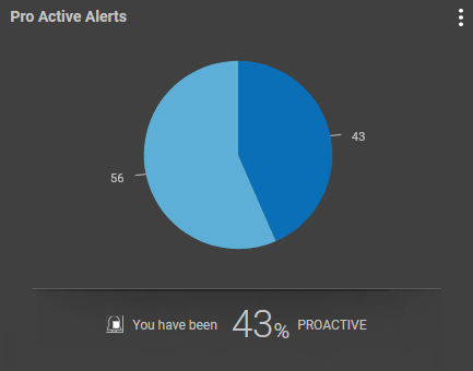
Figure 21 : The Pro Active Alerts widget
This widget displays a pie chart with the percentage of critical alerts raised in the target environment and the percentage of alerts on which state transition was detected by eG Enterprise during the last day.
Clicking the vertical dots in Figure 21 reveals a drop down list with a few additional settings relevant to the Pro Active Alerts widget as shown in Figure 22.
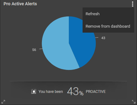
Figure 22 : Additional Settings for the Pro Active Alerts widget
Using the options displayed in the drop down list of Figure 22, you can do the following:
-
Refresh the Pro Active Alerts widget by clicking the Refresh option.
-
To delete this widget from the dashboard, click the Remove from Dashboard option.
Note:
- Proactive % is calculated based on the number of alerts that moved to a higher state i.e., a minor alert transit to a major alert and a major alert transit to a critical alert from the total alerts.
- If there is no transition to higher state and alerts are closed in the state that were originally reported, the Proactive % will be 100%.
- The Pro Active Alerts widget can be added only once in a dashboard.
-
-
Problem Distribution
To view the distribution of problems that occurred over a chosen time period, identify the count of problems that are currently open and figure out the maximum time duration for which a problem has remained open, you can use the Problem Distribution widget. Using this widget, you an analyze when exactly during the past week, maximum number of problems were noticed in the target environment. To add this widget to your dashboard, click on the Problem Distribution option in the right panel that appears upon clicking the Widgets Gallery (see Figure 1).
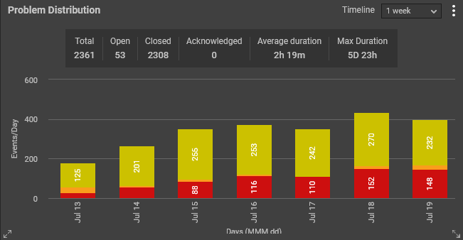
Figure 23 : The Problem Distribution widget that appears in the dashboard
The Problem Distribution widget will then appear as shown in Figure 23. By default, this widget consists of two sections - a KPI section and a bar graph displaying the distribution of problems (based on the severity) that occurred during the chosen Timeline. The default Timeline is 1 week. This is why, 1 week is chosen from the Timeline list.
The KPI section reveals the total count of problems noticed in the target environment during the past 1 week. By merely looking at this section, administrators can figure out the count of problems that were closed/are open during the chosen timeline. This section also provides insights into the number of problems that were acknowledged during the chosen timeline. Administrators can also figure out the average problem duration and the maximum duration for which a problem was open from this section. By closely analyzing this section, administrators can figure out how well their environment has fared in the past 1 week and also take stock on the count of problems that need to be closed.
The bar graph offers you a day-wise distribution of the Critical, Major and Minor problems encountered by the target environment during the past 1 week. By analyzing this graph, administrators can figure out the exact day on which maximum number of critical/major/minor alerts were raised in the target environment.
Clicking the vertical dots in Figure 23 reveals a drop down list with a few additional settings relevant to the Pro Active Alerts widget as shown in Figure 24.
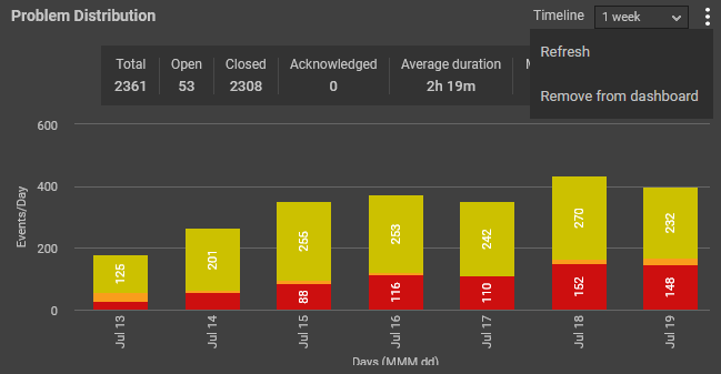
Figure 24 : Additional Settings in the Problem Distribution widget
Using the options displayed in the drop down list of Figure 24, you can do the following:
-
Refresh the Problem Distribution widget by clicking the Refresh option.
-
To delete this widget from the dashboard, click the Remove from Dashboard option.
Note:
The Problem Distribution widget can be added only once in a dashboard.
-
-
Tier Health
In order to view the number of components of each component type and the status in which the components are in your infrastructure, you can use the Tier Health widget. Once you click the Tier Health option in the right panel that appears when the Widgets Gallery (see Figure 1) is clicked, the Tier Health widget will appear in your dashboard displaying all the component types in your infrastructure (see Figure 25).
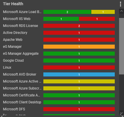
Figure 25 : The Tier Health widget
Against each component type, a bar graph will appear listing the number of components in Critical, Major, Minor, Normal, and/or Unknown states. Clicking on a section of the bar graph will lead you to the page (see Figure 26) where you will be able to view the dashboard overview of the components that are currently in the chosen state.
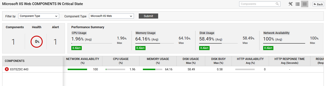
Figure 26 : The COMPONENTS page that appears when a bar is clicked from the Tier Health widget
Clicking the vertical dots in Figure 25 reveals a drop down list with a few additional settings relevant to the Tier Health widget as shown in Figure 27.
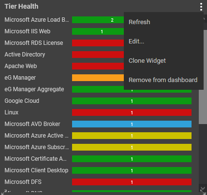
Figure 27 : Additional Settings for Tier Health widget
Using the options displayed in the drop down list of Figure 27, you can do the following:
-
Refresh the Tier Health widget by clicking the Refresh option.
-
To edit the Tier Health widget, click the Edit... option. Figure 28 will then appear.
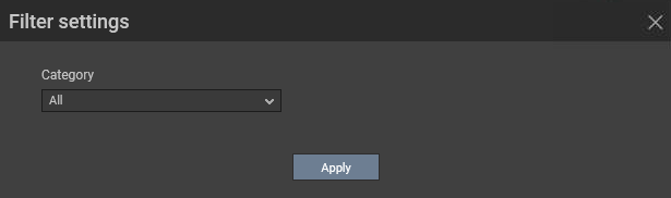
Figure 28 : The Filter settings pop up window for Tier Health widget
-
By default, All option is chosen from the Category list of Figure 28. This implies that the bar graph if this widget displays the count of components in each state for each component type. If you wish to view the Tier health of the components belonging to a Zone/Service/Segment or the components in your target environment, you can do so by choosing the appropriate option from the Category list shown in Figure 29.
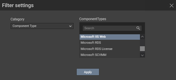
Figure 29 : Filtering the components based on the Component Type
-
For example, if you had chosen Component Type from the Category list, then you are required to choose one/more component types from the Component Types list. You can even search for the Component Types of your choice using the Search text box.
Clicking the Apply button in Figure 29 will reveal Figure 30 which displays the health of the components for the chosen component type.
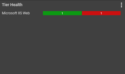
Figure 30 : The widget displayed for the chosen Component Type
-
-
To clone the Tier Health widget, click the Clone Widget option in Figure 27. Figure 31 will then appear.
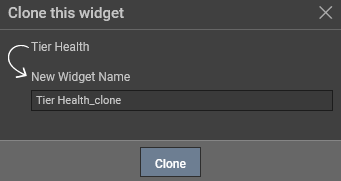
Figure 31 : Cloning the Tier Health widget
By default, the Tier Health_clone option will be displayed in the New Widget Name text box. You can specify the name of the your choice in this text box and click the Clone option.
-
To delete this widget from the dashboard, click the Remove from Dashboard option.
-
-
User Experience
To figure out how satisfied the user experience was on a web site in terms of Apdex score, you can use the User Experience widget. Click on the User Experience option in the right panel that appears upon clicking the Widgets Gallery. The User Experience widget will then appear as shown in Figure 32.
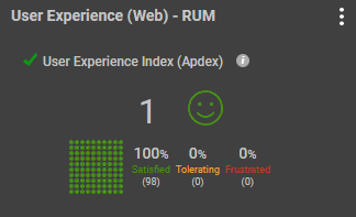
Figure 32 : The User Experience widget
By default, the Apdex score of the chosen web site/web application is displayed in Figure 32. Additionally, a heat map chart displays the distribution of user's page views in terms of satisfied page views, tolerating page views and frustrating page views.
Clicking the vertical dots in Figure 32 reveals a drop down list with a few additional settings relevant to the User Experience widget as shown in Figure 33.
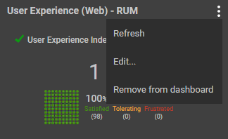
Figure 33 : Additional Settings for User Experience widget
Using the options displayed in the drop down list of Figure 33, you can do the following:
-
Refresh the User Experience widget by clicking the Refresh option.
-
To edit the User Experience widget, click the Edit... option. Figure 34 will then appear.
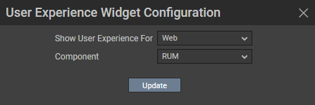
Figure 34 : The configuration pop up window
-
By default, this widget is configured to view the user experience of a web site/web application on a web browser. To this effect, the Web option is displayed by default against the Show User Experience For list. If you wish to measure the user experience of a web site/web application from a browser on a mobile device, then pick the Mobile option.
-
As soon as you pick the Mobile option, you will be prompted to pick the operating system of the mobile device from the OS list. By default, All option is chosen from this list.
-
If more than one Real User Monitor components are monitored in the target environment, then, the Component list will be populated with all the Real User Monitor components. You can pick the component that is managed to measure the user experience of the web site/web application of your choice from this list.
-
-
To delete this widget from the dashboard, click the Remove from Dashboard option.
-
-
Geo User Experience - RUM / User Experience - Citrix
To figure out the experience of users across different geographic locations, you can use the Geo User Experience - RUM widget. Click on the Geo User Experience - RUM option in the right panel that appears upon clicking the Widgets Gallery. The Geo User Experience - RUM widget will then appear as shown in Figure 35.
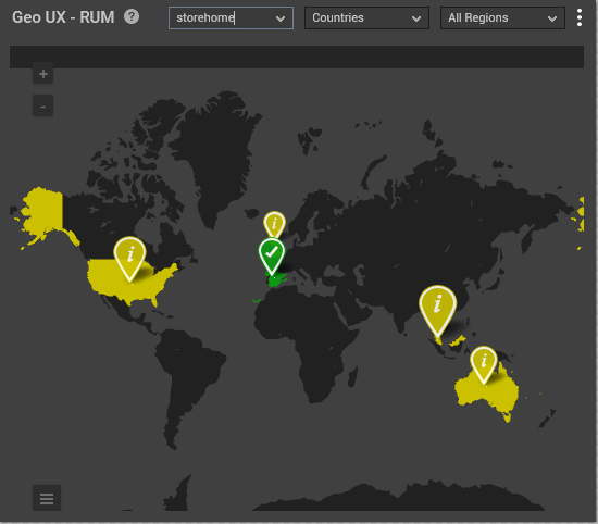
Figure 35 : The Geo User Experience - RUM widget
By default, all the Real User Monitor components managed in the target environment will be listed in alphabetical order in the list box adjacent to the Geo UX - RUM label. You can choose the component of your choice from this list box.
Clicking on a location pin will reveal the user experience to a web site/web application based on the number of page views, average page load time and percentage of errors encountered (see Figure 36).
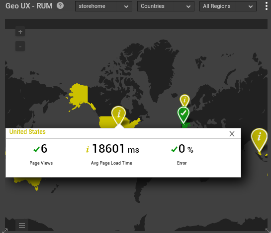
Figure 36 : Clicking on a location to view the user experience
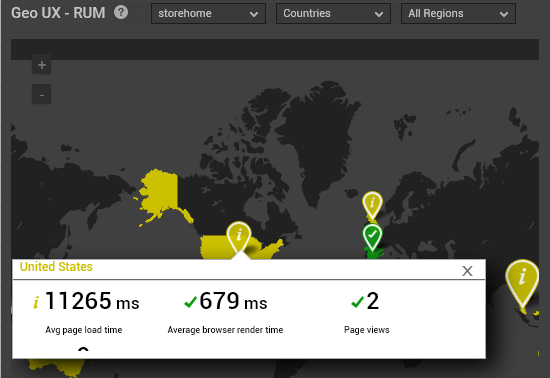
For the chosen component, this widget will display the experience of users based on different countries/regions. If you wish to view the experience of users accessing a web site/web application from a specific country, then choose a country from the Countries list box (see Figure 35). The All Regions list box will then be populated with all the regions associated with the chosen country.
Once you choose a region, the widget will be automatically zoomed to the chosen region as shown in Figure 37. Clicking on the location pin will help you view the experience of users in that particular region.
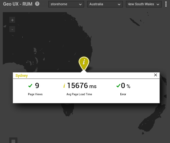
Figure 37 : Drilling down to a Country/Region
By closely viewing the metrics reported in this widget for each geographic location, administrators can figure out the real reason behind poor user experience.
Clicking the vertical dots in Figure 35 reveals a drop down list with a few additional settings relevant to the Geo User Experience - RUM widget as shown in Figure 38.
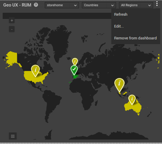
Figure 38 : Additional Settings for Geo User Experience - RUM widget
Using the options displayed in the drop down list of Figure 38, you can do the following:
-
Refresh the Geo User Experience - RUM widget by clicking the Refresh option.
-
To edit the Geo User Experience - RUM widget, click the Edit... option. Figure 39 will then appear.
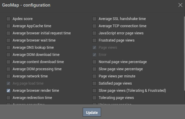
Figure 39 : Configuring additional metrics for display in the widget
By default, the Avg page load time, Page views and Error measures will be chosen by default (see Figure 39). If you wish to choose additional measures, then, select the measure by checking the check box preceding the measure and click the Update button. Figure 40 displays the additional measure that was configured for display in this widget.
-
To delete this widget from the dashboard, click the Remove from Dashboard option.
-
-
Up/Downtime Analysis
Use the Up/Downtime Analysis widget to effectively assess server/device
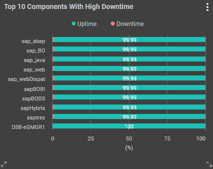
Figure 41 : The Up/Downtime Analysis widget
By default, the top-10 servers/devices with highest downtime will be displayed in the widget.
Clicking the vertical dots in Figure 41 reveals a drop down list with a few additional settings relevant to the Up/Downtime Analysis widget as shown in Figure 42.
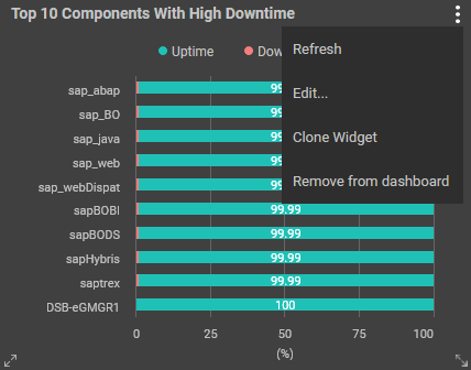
Figure 42 : Additional Settings for Up/Downtime Analysis widget
Using the options displayed in the drop down list of Figure 42, you can do the following:
-
Refresh the Up/Downtime Analysis widget by clicking the Refresh option.
-
To edit the Up/Downtime Analysis widget, click the Edit... option. Figure 43 will then appear. Figure 44 will then appear.
Figure 43 : Settings to configure the widget
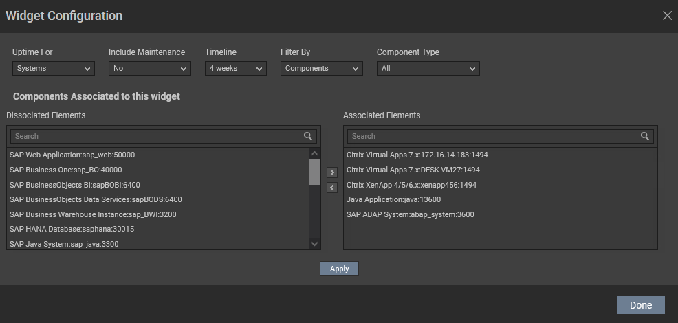
Figure 44 : Settings to configure the widget
To configure the widget, you can do the following:
By default, Systems will be chosen from the Uptime for list indicating that the widget is by default configured to display the downtime of the top-10 systems in the target environment. If you wish to configure the widget to display the downtime of top-10 network devices,
By default, the Uptime/Downtime Analysis widget ignores all reboots that occur when a 'maintenance policy configuration' is active on a component - in other words, such reboots are by default excluded from the count of reboots displayed by the widget. This default behavior is governed by the Include Maintenance flag, which is set to No by default. You can however, optionally configure the widget to include reboots that occur during maintenance periods in its count of reboots. For this, set the Include Maintenance flag to Yes.
Select a Timeline for the widget. By default, 1 day will be chosen from this list.
By default, the Components option is chosen from the
By default, All option is chosen from the Component Type list indicating that all the components will be considered to be displayed in the widget based on their downtime. If you wish to pick only a few components of a component type, then you can pick the appropriate component type from this list.
The Associated Elements text box in the Components Associated to this widget section is by default populated with all the components managed in the target environment. If you wish to exclude one or more component, then, select the component from this list and click the < button. This will move your selection to the Dissociated Elements list. Clicking the Apply button will apply the changes to the widget. You can even search for the components of your choice using the Search text box.
Once you have made the changes clicking the Done button will reveal the widget with the selections chosen by you (see Figure 45).
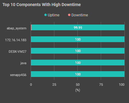
Figure 45 : The Up/Downtime Analysis widget with components of your interest
-
To clone the Up/Downtime Analysis widget, click the Clone Widget option in Figure 41. Figure 46 will then appear.
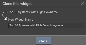
Figure 46 : Cloning the Up/Downtime Analysis widget
Specify the name of the your choice in the New Widget Name text box and click the Clone option.
- To delete this widget from the dashboard, click the Remove from Dashboard option.
-
-
Citrix Receiver Analysis
Use this widget to identify the versions of Citrix Receivers that are in use in your Citrix environment and figure out the count of users logged into each version of Citrix Receiver. To include the Citrix Receiver Analysis widget in the dashboard, click on the Citrix Receiver Analysis widget that appears in the right panel when you click the Widgets Gallery option (see Figure 1). The Citrix Receiver Analysis widget will then be appended to the dashboard as shown in Figure 47.
Note:
This widget is disabled by default. To enable this widget, set the ShowCitrixReceiverAnalysisWidget flag under the [DASHBOARD_SETTINGS] section of the eg_customdashboard.ini file available in the <eG_INSTALL_DIR>/manager/config location to Yes.
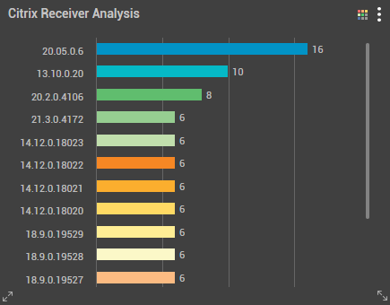
Figure 47 : The Citrix Receiver Analysis widget
To plot the bar graph with the color palette of your choice, you can click the icon. For this, you need to click the
 icon and pick the color palette from the list that appears (see Figure 48).
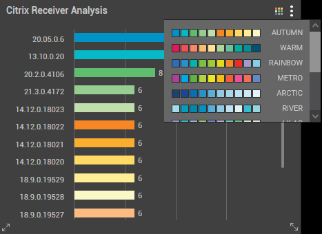
Figure 48 : Picking the color palette
Clicking the vertical dots in Figure 47 reveals a drop down list with a few additional settings relevant to the Citrix Receiver Analysis widget as shown in Figure 49.
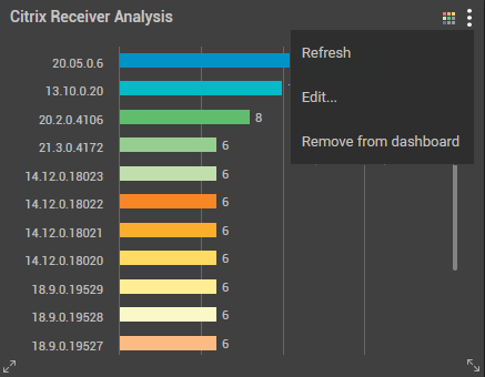
Figure 49 : Additional Settings for Citrix Receiver Analysis widget
Using the options displayed in the drop down list of Figure 49, you can do the following:
-
Refresh the Citrix Receiver Analysis widget by clicking the Refresh option.
-
To edit the Citrix Receiver Analysis widget, click the Edit... option. Figure 50 will then appear.
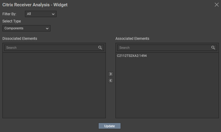
Figure 50 : Filtering the users based on the OS type
By default, this widget will display the count of users logged into the Citrix environment using different versions of Citrix Receiver. If you wish to filter the count of users based on the operating system type that was used to log into the Citrix environment using different versions of Citrix Receiver, then, you can do so by picking an operating system from the Filter By option.
By default, the Components option is chosen from the Select Type list indicating that the widget will be plotted for all the versions of the Citrix Receiver and the users logged into the Citrix environment using those versions of Citrix Receiver. However, if you wish to view the count of users logged into the Citrix environment using one/more versions of Citrix Receiver, then, you can pick the Citrix Receiver option from this list.
By default, the Associated Elements list will list all the Citrix Virtual Apps 7.x components managed in the target environment. If you do not wish to consider analyzing the count of users logging into one/more Citrix Virtual Apps server using Citrix Receiver, then, you can disassociate those servers by choosing them from the Associated Elements list and move your selection to the Dissociated Elements list using the < button. You can even search for the server of your choice from the Associated Elements and Dissociated Elements list using the Search text box. If you had chosen Citrix Receiver option from the Select Type list, then, all the versions of Citrix Receiver will be populated in the Associated Elements list.
Clicking the Update button will reveal the Citrix Receiver Analysis widget that displays the count of users logged in using different versions of Citrix Receiver for the chosen operating system type (see Figure 51).
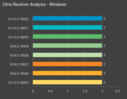
Figure 51 : The Citrix Receiver Analysis widget for the chosen OS type
-
To delete this widget from the dashboard, click the Remove from Dashboard option.
-
-
Resource Consumption Analysis
To analyze the physical resource consumption of the servers in the target environment and identify the process that is responsible for hogging the resources, you can use the Resource Consumption Analysis widget.
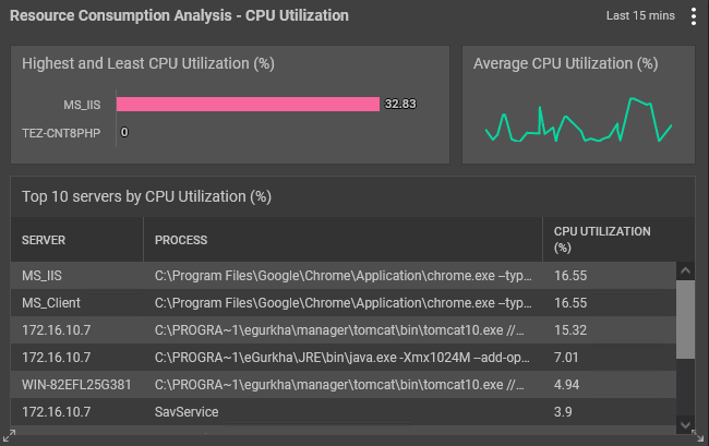
Figure 52 : The Resource Consumption Analysis widget
By default, this widget comprises of three sections:
-
A bar graph displaying the highest and least percentage of CPU utilized by the servers in the target environment.
-
A line graph displaying the average CPU utilization percentage of the servers during the last 15 minutes and
-
A table displaying the top 10 processes of the servers that are hogging the CPU resources during the last 15 minutes.
Clicking the vertical dots in Figure 52 reveals a drop down list with a few additional settings relevant to the Resource Consumption Analysis widget as shown in Figure 53.
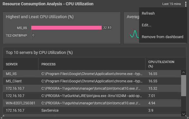
Figure 53 : Additional Settings for Resource Consumption Analysis widget
Using the options displayed in the drop down list of Figure 53, you can do the following:
-
Refresh the Resource Consumption Analysis widget by clicking the Refresh option.
-
To edit the Resource Consumption Analysis widget, click the Edit... option. Figure 54 will then appear.
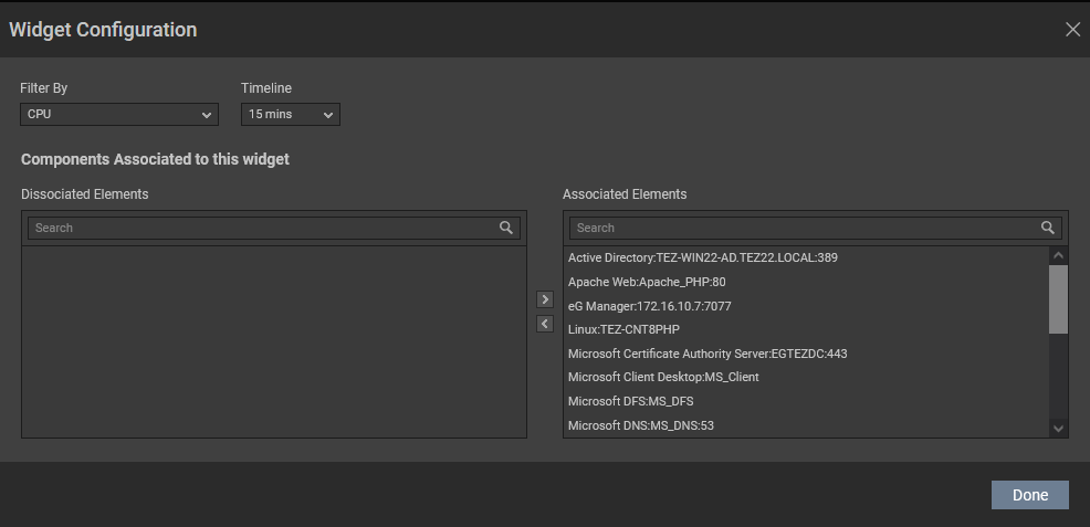
Figure 54 : The configuration pop up window
-
By default, this widget is configured to analyze the CPU utilization of the servers in the target environment. Therefore, CPU option is chosen by default from the Filter by list. If you wish to view the disk/memory utilization of the servers in the target environment, then you can pick Disk or Memory option from this list.
By default, this widget is plotted for analyzing the resource consumption of the servers in the target environment in the last 15 minutes. Therefore, 15 mins is chosen from the Timeline list. If you wish to increase the timeline to analyze the resource consumption of the servers in the target environment, then, you can do so using the Timeline list.
-
This widget by default, displays the resource consumption of all the servers in the target environment. If you do not wish to consider analyzing the resource consumption of a select few servers, then you can disassociate those servers by choosing them from the Associated Elements list (displayed in the Components Associated to this widget of Figure 54) and move your selection to the Dissociated Elements list using the < button. You can even search for the server of your choice from the Associated Elements and Dissociated Elements list using the Search text box.
-
Clicking the Done button will display the resource consumption analysis of only the chosen servers (see Figure 55).
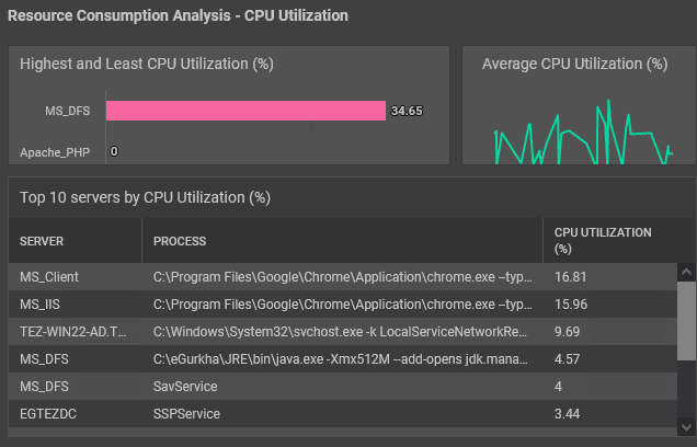
Figure 55 : The Resource Consumption Analysis widget for the chosen servers
-
-
To delete this widget from the dashboard, click the Remove from Dashboard option.
-
-
VM Alerts
If you wish to monitor the real time alerts generated for each virtual machine (VM) or virtual desktop available in a hypervisor, then you can use the VM Alerts widget. The VM Alerts widget will appear once you click the VM Alerts option that appears in the right panel when you click the Widgets Gallery (see Figure 56).
Note that this widget will appear in the Widgets Gallery only when you create a One Click Dashboard.
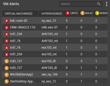
Figure 56 : The VM Alerts widget
By default, this widget displays the count of alerts raised based on the severity (Critical/Major/Minor) for each virtual machine/virtual desktop in the target environment.
Clicking on a number in any of the CRITICAL, MAJOR or MINOR columns against a virtual machine/virtual desktop will lead you to Figure 57 where you will be able to view all the alerts raised for the chosen virtual machine/virtual desktop.
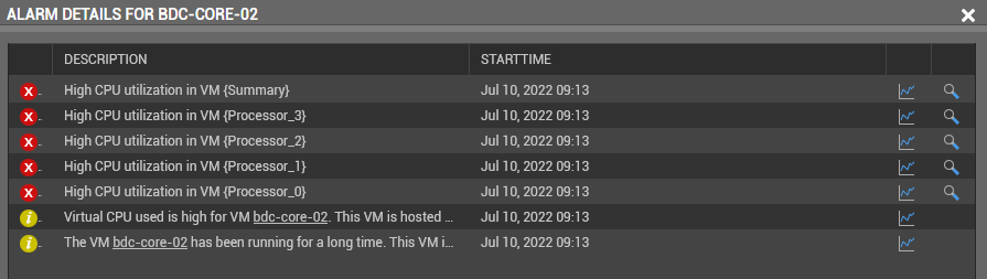
Figure 57 : Viewing the alerts pertaining to the chosen virtual machine/virtual desktop
Clicking on an alert in Figure 57 will lead you to the layer model of the component (see Figure 58) where you can precisely identify the reason for the alert.
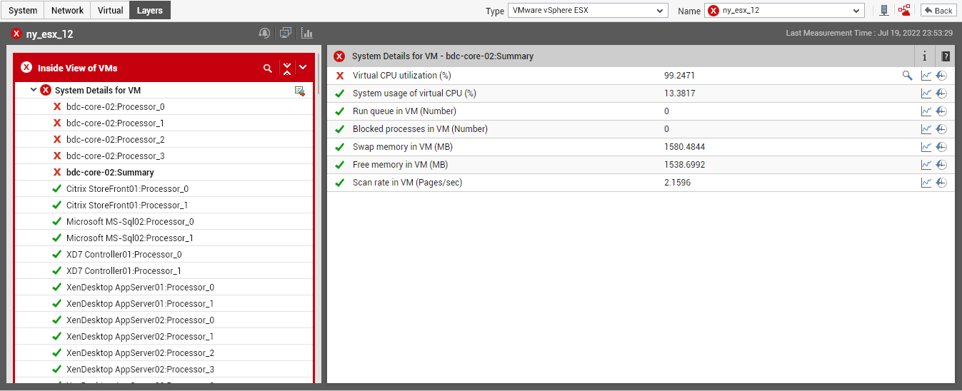
Figure 58 : The layer model that appears when an alert is clicked
To search for the virtual machine/virtual desktop of your choice, you can use the Search text box (see Figure 56).
Clicking the vertical dots in Figure 56 reveals a drop down list with a few additional settings relevant to the VM Alerts widget as shown in Figure 59.
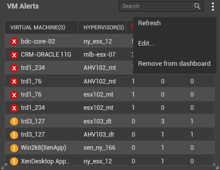
Figure 59 : Additional Settings for VM Alerts widgets
Using the options displayed in the drop down list of Figure 59, you can do the following:
-
Refresh the VM Alerts widget by clicking the Refresh option.
-
To edit the VM Alerts widget, click the Edit... option. Figure 60 will then appear.
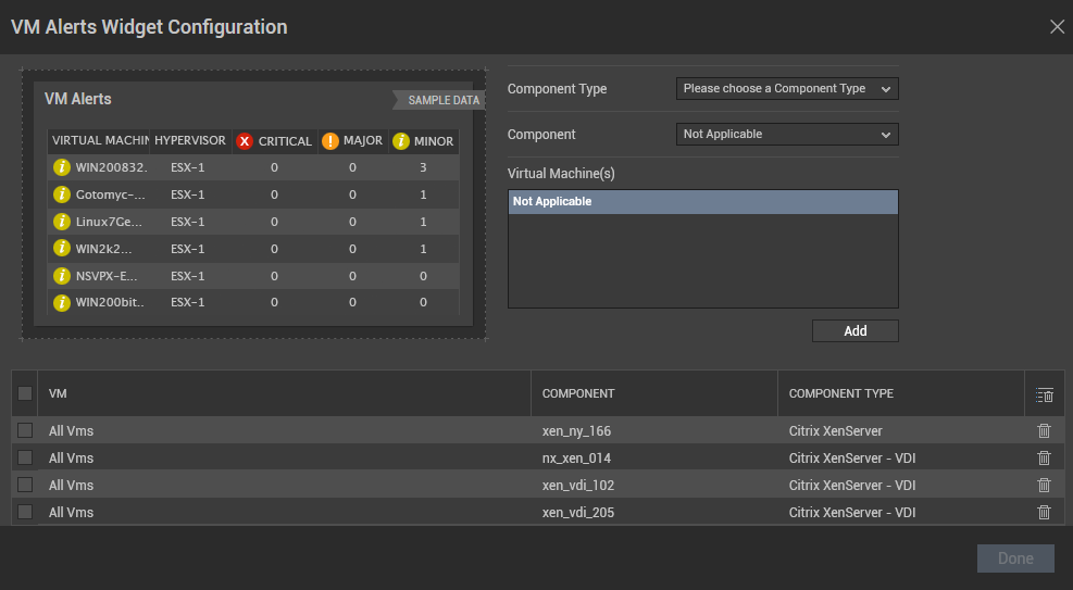
Figure 60 : The VM Alerts widget configuration window
By default, all the virtual machines/virtual desktops pertaining to the components in the target virtual environment is pre-configured and displayed as shown in Figure 60.
If you wish to view the VM Alerts widget only for a select few virtual machines/virtual desktops in your environment, then, you need to first delete the All Vms selection. If you wish to delete all the pre-configured selection, the select the check box preceding the VM column and click the
 icon.
icon. If you wish to delete only the virtual machines/virtual desktops of a chosen component or a component type, then, you can check the check box preceding the All Vms option against the component/component type of your choice and click the
 icon.
icon.Once you have deleted all the pre-configured selection, you can choose the Component Type.
The Component list will then be populated with all the components pertaining to the chosen Component Type.
Once the Component is chosen, the virtual machines/virtual desktops pertaining to the chosen component will be populated in the Virtual Machine(s) list box.
By default, All VMs option will be selected in the Virtual Machine(s) list box. However, you can choose one/more virtual machines of your choice and click the Add button.
Your selection will be displayed in the section below as shown in Figure 61.
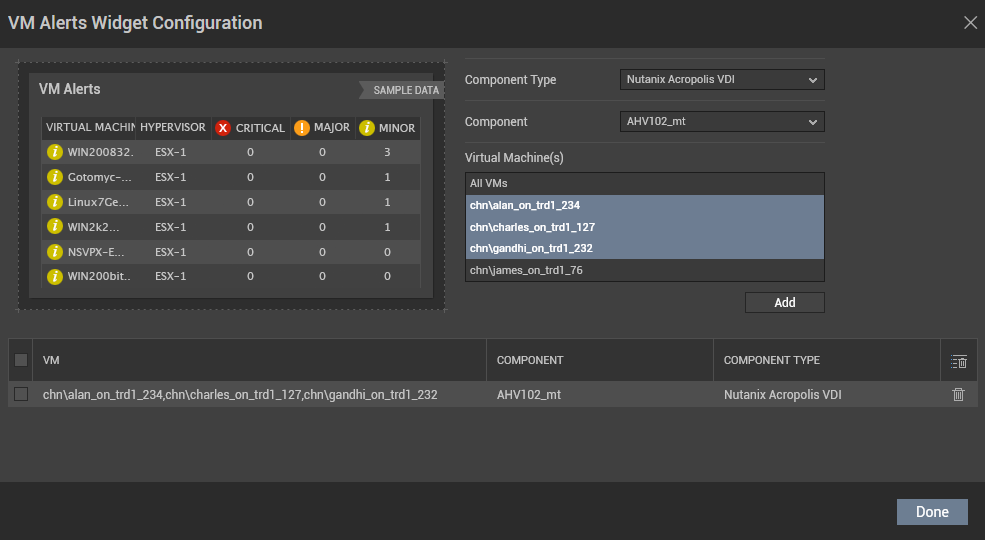
Figure 61 : Choosing the Virtual Machines for displaying in the widget
Clicking the Done button in Figure 61 will reveal the VM Alerts widget for only those virtual machines that you have selected (see Figure 62).
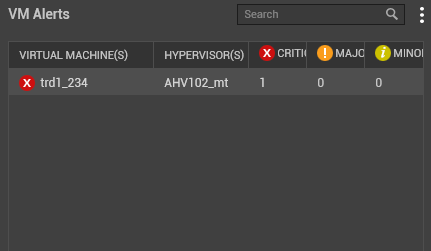
Figure 62 : The VM Alerts widget for the chosen virtual machines
-
To clone the VM Alerts widget, click the Clone Widget option in Figure 59. Figure 63 will then appear.
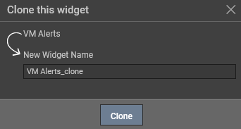
Figure 63 : Cloning the VM Alerts widget
By default, the VM Alerts_clone option will be displayed in the New Widget Name text box. You can specify the name of the your choice in this text box and click the Clone option.
-
To delete this widget from the dashboard, click the Remove from Dashboard option.
-
-
Web App Simulation
Use the Web App Simulation widget to view the transaction flow process of a simulation recorded by the Web App Simulator. The Web App Simulation widget will appear once you click the Web App Simulation option that appears in the right panel when you click the Widgets Gallery (see Figure 64).
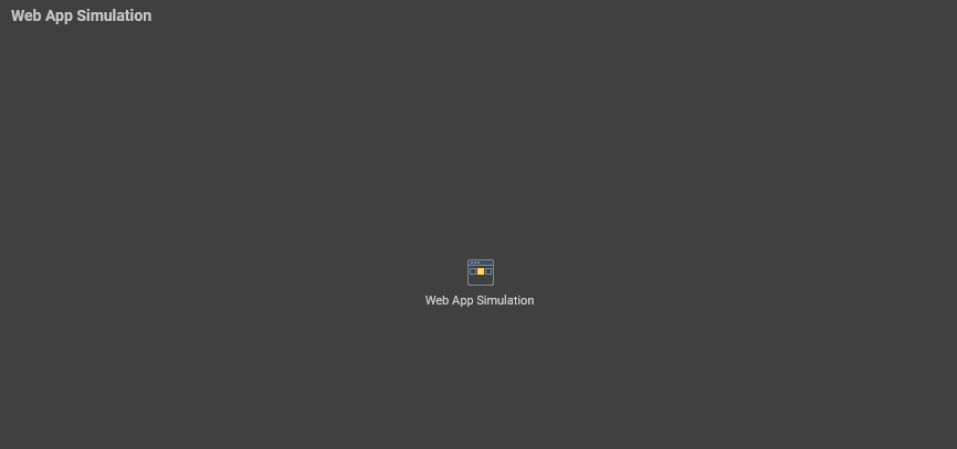
Figure 64 : An empty Web App Simulation widget
Clicking the
 icon in Figure 64 will reveal Figure 65.
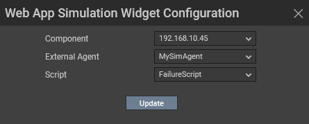
Figure 65 : Configuring the Web App Simulation widget
In Figure 65, first, pick the Component for which you wish to view the transaction flow process of a simulation.
The External Agent associated with the chosen Component will now be automatically populated.
Next, the scripts that were recorded for simulation for the chosen Component will be listed in the Script list box. Pick a script of your choice from this list.
Clicking the Update button in Figure 65 will reveal the transaction flow process of the chosen script as shown in Figure 66.
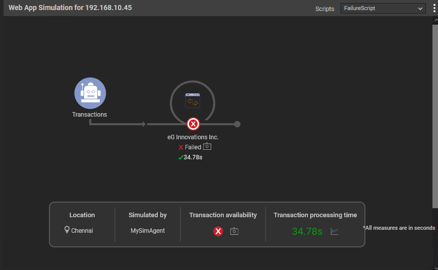
Figure 66 : The Web App Simulation widget revealing a failed transaction
If the transaction failed at any step, then clicking on the
 icon will reveal the failure screenshot (see Figure 67) that will help you analyze the reason on why the transaction failed.
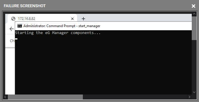
Figure 67 : A failure screenshot
Figure 68 displays a script that executed successfully.
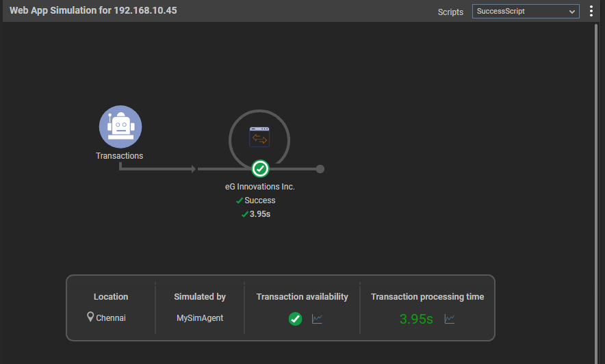
Figure 68 : A successful simulation
Clicking the vertical dots in Figure 66 reveals a drop down list with a few additional settings relevant to the Web App Simulation widget as shown in Figure 69.
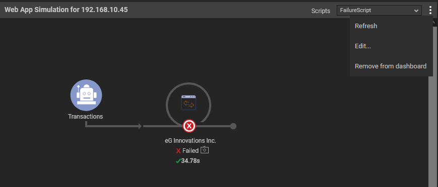
Figure 69 : Additional Settings of the Web App Simulation widget
Using the options displayed in the drop down list of Figure 69, you can do the following:
-
Refresh the Web App Simulation widget by clicking the Refresh option.
-
To edit the Web App Simulation widget, click the Edit... option. Figure 65 will then appear where you can configure the widget based on your preferences.
-
To delete this widget from the dashboard, click the Remove from Dashboard option.
-
-
Zone Map
Typically, zones are associated with different geographies. While monitoring large infrastructures therefore, eG Enterprise allows you to drill down to view the exact geographic area where a zone operates, and instantly evaluate the performance of different zones spread across different locations worldwide. If you wish to evaluate the performance of different zones spread across different locations worldwide, then you can use the Zone Map widget. The Zone Map widget will appear once you click the Zone Map option that appears in the right panel when you click the Widgets Gallery (see Figure 70).
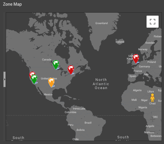
Figure 70 : The Zone Map widget
Clicking on a zone pin in Figure 70 will reveal the alerts that were raised for the components associated with the zone (see Figure 71).
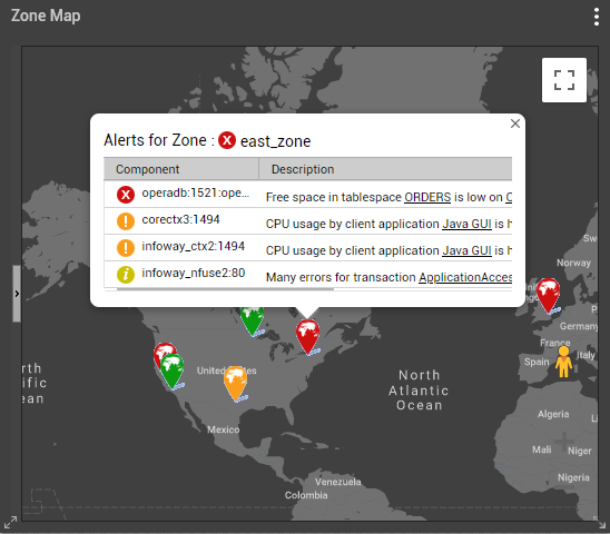
Figure 71 : Alerts raised for the components associated with a zone
Further drilling down an alert will lead you to the layer model of the component (see Figure 72) where you can precisely identify the reason for the alert.
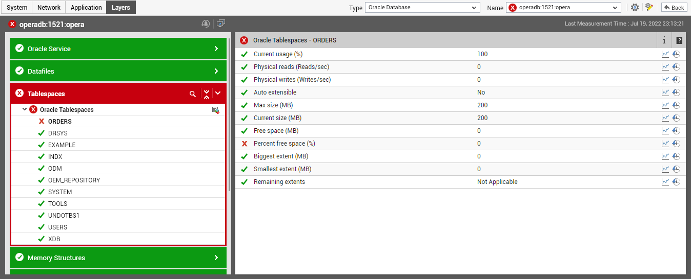
Figure 72 : The layer model that appears when an alert is clicked
To view this widget in full screen mode, click the
 icon in Figure 70. Figure 73 will then appear.
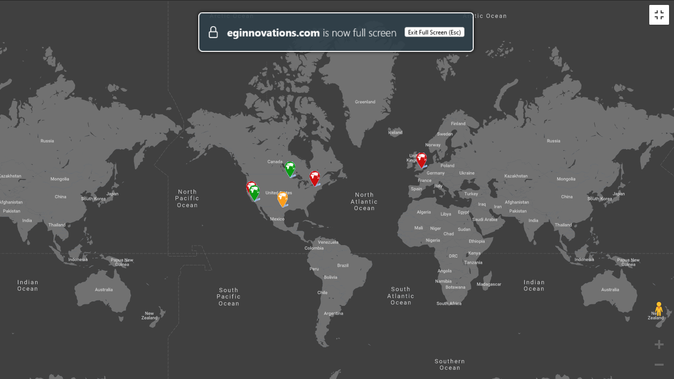
Figure 73 : The Zone Map widget in Full Screen Mode
To exit Full Screen mode, click the
 icon in Figure 73 or simply click the ESC button in your keyboard.
 Clicking the vertical dots in Figure 70 reveals a drop down list with a few additional settings relevant to the Zone Map widget as shown in Figure 74.
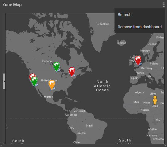
Figure 74 : Additional Settings for Zone Map
Using the options displayed in the drop down list of Figure 74, you can do the following:
-
Refresh the Zone Map widget by clicking the Refresh option.
-
To delete this widget from the dashboard, click the Remove from Dashboard option.
-