TCP
To zoom into the health of the TCP connections to and from a server, select Tcp from the Subsystem list. Doing so invokes Figure 1.
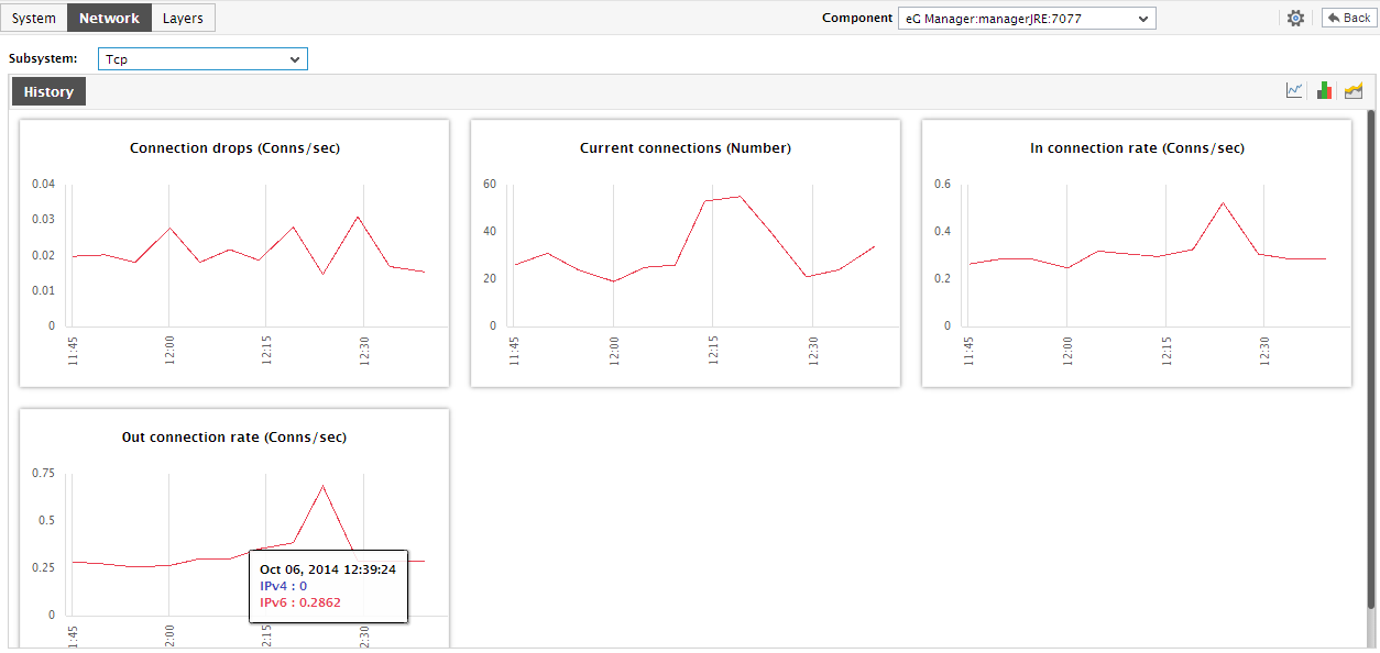
Figure 1 : The Dashboard of the Tcp Subsystem
For shifting from the present to the past and analyzing past TCP performance, use the History tab page inFigure 2. By default, this tab page displays measure graphs revealing the time-of-day variations in current TCP connections, dropped TCP connections, and incoming and outgoing TCP connections, during the last 24 hours (by default). Using these graphs, you can quickly figure out the following:
- When during the last 24 hours was the TCP load on the target host unusually high? When was the load uncharacteristically low?
- Is there any increase in the number of TCP connections that were dropped? Is this increase sudden or consistent? If the TCP connection drops have increased steadily during the last 24 hours, when did this pattern begin?
Clicking on a graph in Figure 1 will lead you to the enlarged graph as shown in Figure 2.
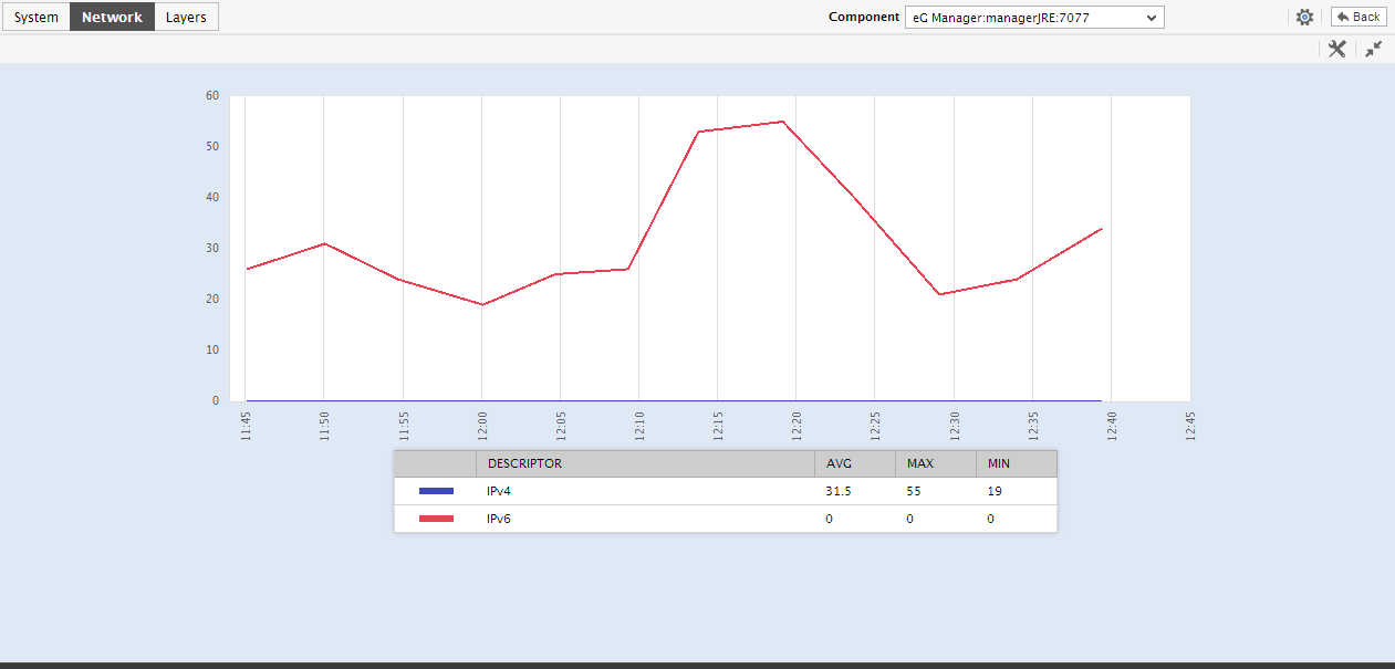
Figure 2 : The enlarged graph that appears when a graph is clicked
If you want to perform service level audits on the TCP connection handling ability of a target host, then, you can configure the History tab page to display summary graphs of the TCP-related metrics, instead of the default measure graphs. For this, just click on the  icon at the right, top corner of the History tab page. Figure 3 will then appear.

Figure 3 : Summary graphs in the dashboard of the Tcp Subsystem
The summary graphs denote the percentage of time (during the last 24 hours) for which each TCP-related measure had been in an abnormal state. This way, problem-prone performance metrics can be isolated and the reasons for their poor performance can be investigated.
Similarly, to study the past trends in TCP-related statistics and predict the future behavior of the target host, you can have the History tab page display trend graphs of the TCP-related metrics. For this, click on the  icon. Figure 4 will then appear.
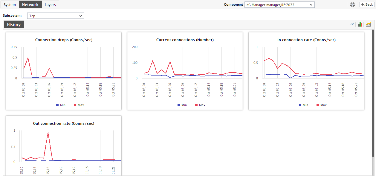
Figure 4 : Trend graphs displayed in the dashboard of the Tcp Subsystem
Using the trend graphs, you can figure out when (during the last 24 hours) the overall TCP activity and connection drops had peaked on the target host and when it was abnormally low
You can change the Timeline of the measure/summary/trend graphs on-the-fly by clicking on the settings option on the enlarged graph.
Also, an enlarged summary/trend graph allows you to alter the graph Duration - i.e., view the daily or monthly summary/trend information, instead of the default hourly data in the graphs.
Moreover, by default, the trend graphs in the History tab page plot the minimum and maximum values of a measure during the given timeline. In enlarged trend graphs, you can change the Graph type so that the average values or sum of trend values are plotted in the trend graphs instead.
Note:
In case of descriptor-based tests, the Summary and Trend graphs displayed in the History tab page typically plot the values for a single descriptor alone. To view the graph for another descriptor, pick a descriptor from the drop-down list made available above the corresponding summary/trend graph.
At any point in time, you can switch to the measure graphs by clicking on the  button.