Uptime
To view the uptime details of the system, you can select the Uptime option from the Subsystem list. Figure 1 then appears.
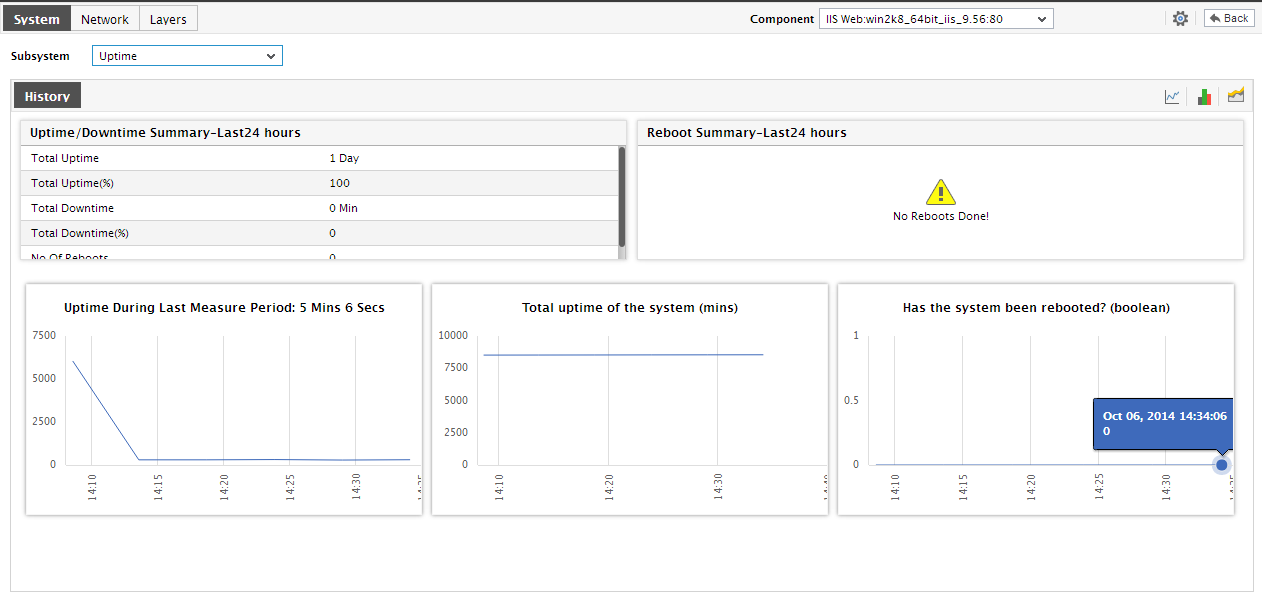
Figure 1 : The System Uptime Dashboard
This dashboard reveals the following:
- The first section of the dashboard reveals the total time for which the system has been up and running since it was last rebooted. The Uptime/DownTime Summary section provides a quick summary of the availability of the system during the last 24 hours (by default) - the details include: the total duration for which the system has been up and running in the last 24 hours, the percentage uptime, the total duration (in the last 24 hours) for which the system was down, the percentage of downtime, and number of reboots during the last 24 hours. Using these details, you can determine whether the agreed uptime levels for the system were met or not, and if not, how much is the system falling short of its desired performance levels.
- You can also infer whether the system experienced any reboots during the last 24 hours (by default). To know more about each reboot, refer to the Reboot Summary section. For every reboot that occurred in the last 24 hours (by default), this section reveals when the system was shutdown, when the reboot occurred, and how long did the system remain down until it was rebooted. This clearly indicates the frequency of the reboots, and helps determine whether such reboots were scheduled or unexpected.
- This will be followed by a default set of graphs indicating how long during the last 24 hours (by default) the system has been up, and whether the reboots scheduled for the system have occurred during the last hour or not.
-
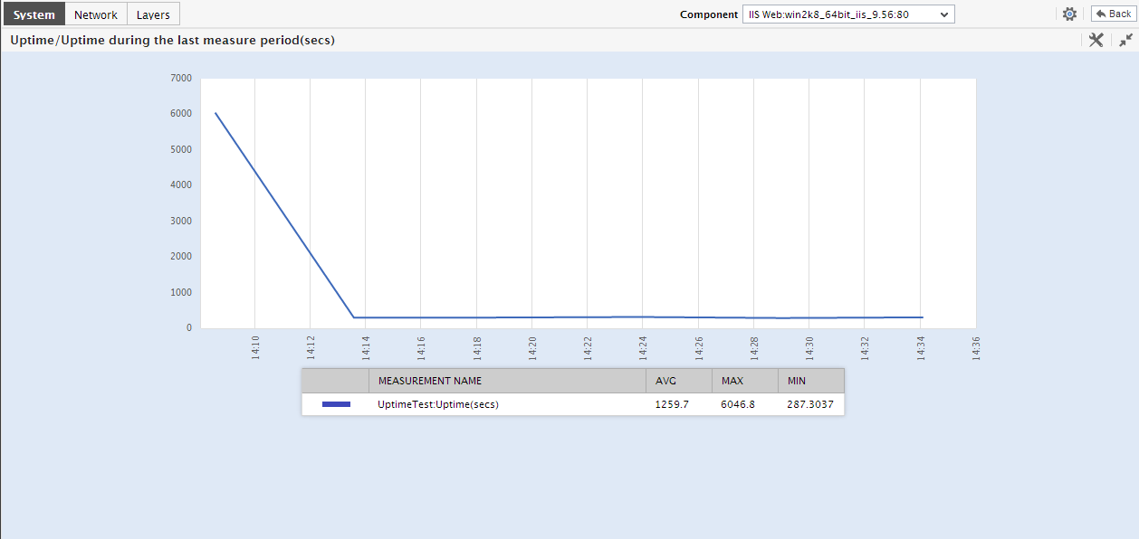
To view the measure graphs clearly, click on a graph of interest to you to enlarge it (see Figure 2); you can alter the Timeline in the enlarged graph. Using these graphs, breaks in the availability of the system and failure of reboot schedules can be accurately identified and investigated.
-
Click on the
 icon at the right, top corner of the History section to view summary graphs using which you can effectively perform service level audits on a host, based on the duration of their availability. Determine the percentage of time for which the host was operational during the last day (by default), and also be notified of reboots that might have occurred on the host during the default timeline. If required, you can click on the Timeline link to alter the graph timeline.
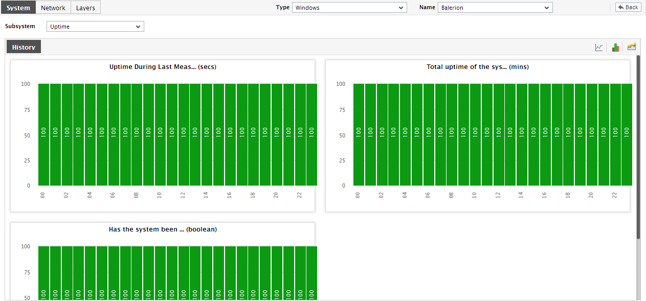
Figure 3 : The Summary graphs in the System Uptime Dashboard
-
Clicking on the
 icon in the History section will display trend graphs on system uptime;these trends reveal when during the last 24 hours (by default) uptime was the lowest, and when reboots failed (see Figure 4). If required, you can click on the graph to expand it and alter its Timeline.
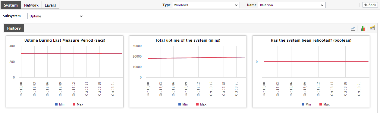
- You can even expand the trend graph by clicking on it, and then alter its Timeline. By default, the trend graph plots the minimum and maximum values of a measure during the given timeline. In the enlarged mode, you can change the Graph type so that the average values or sum of trend values are plotted in the trend graphs instead.
- At any point in time, you can switch to the measure graphs by clicking on the
 button.