NetFlow Dashboard
The NetFlow Dashboard meaningfully groups netflow statistics pertaining to a target NetFlow device and aesthetically presents these statistics using a variety of visual tools - eg., graphs, charts, grids, etc. - with the aim of enabling administrators rapidly spot network bottlenecks and easily and accurately isolate the root-cause of the bottlenecks.
Overview
The Overview tab page of the dashboard, as the name suggests, presents an overview of network health. The left panel of the Overview tab page displays dial charts representing the current health of the network link to the target NetFlow device. A quick look at these charts will tell you whether the device is currently available over the network, and if so, whether it is experiencing any network latency. In the right panel, you will find graphs that depict the level of traffic on and the bandwidth usage of each interface supported by the monitored NetFlow device, during the last hour (by default). With the help of these graphs, you can quickly spot those interfaces that have been consistently handling an abnormally high volume of traffic and those that have been consuming bandwidth excessively.
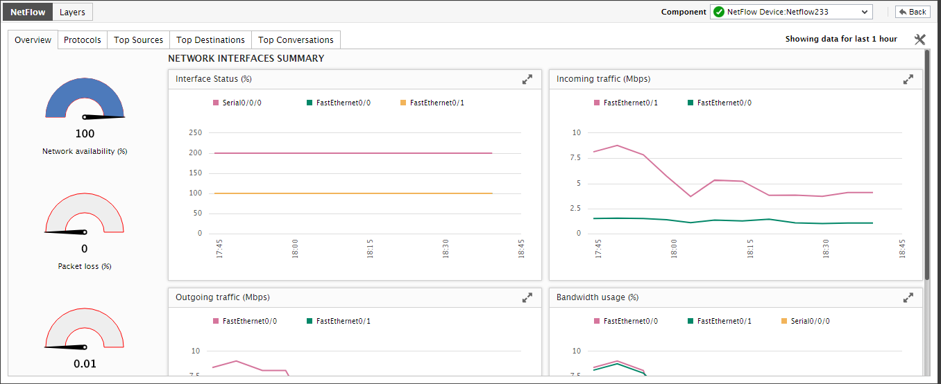
Figure 2 : The Overview tab page
To increase or decrease the timeline of the graphs, click on the  icon at the right, top corner of Figure 2. This will open Figure 3, using which you can change the graph timeline. This way, you can alter the default timeline of all the graphs displayed in the Overview tab page.
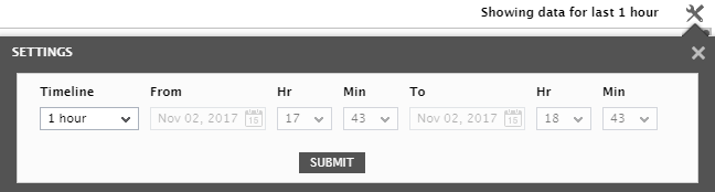
Figure 3 : Changing the timeline of the graphs in the Overview tab page
On the other hand, if you want to change the timeline of a particular graph alone, then you first have to enlarge the graph. For that, click on it.Figure 4 will then appear. Using Figure 4, you can view the graph clearly and can also easily change the timeline of that graph alone.
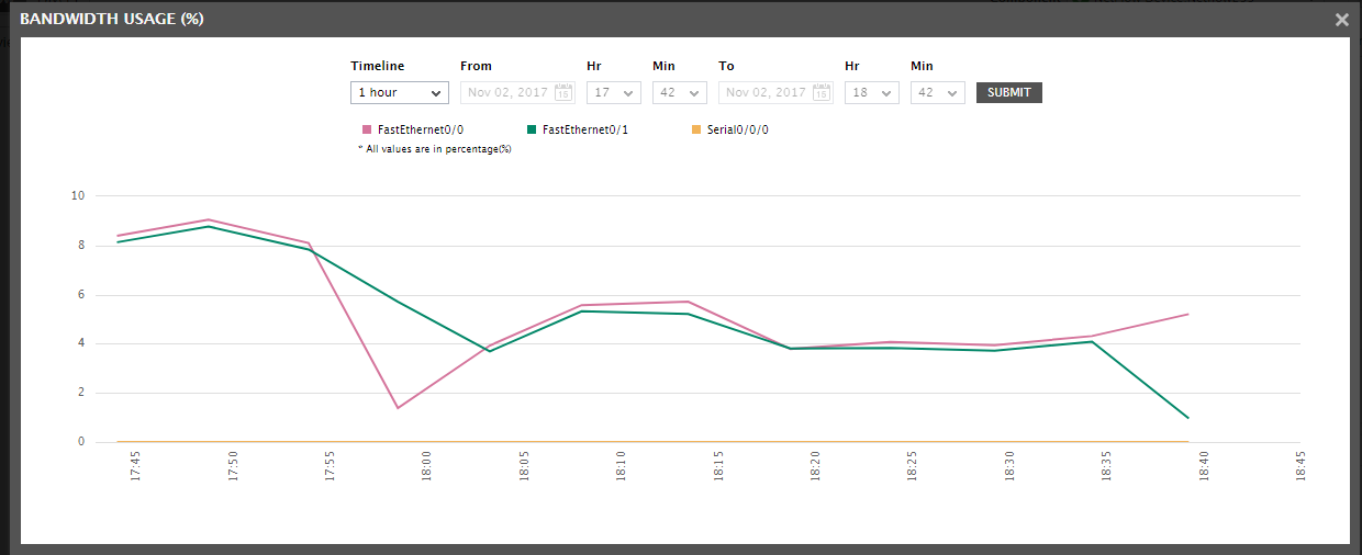
Figure 4 : Viewing the graph in the enlarged mode and changing its timeline
Protocols
Using the distribution charts in the Protocols tab page, you can easily analyze how traffic on each interface was distributed across applications/protocols, during the last hour (by default). If a particular interface is seeing an abnormally high volume of traffic, then a single glance at the distribution chart corresponding to that interface will lead you to the exact application/protocol that is contributing to that abnormality.
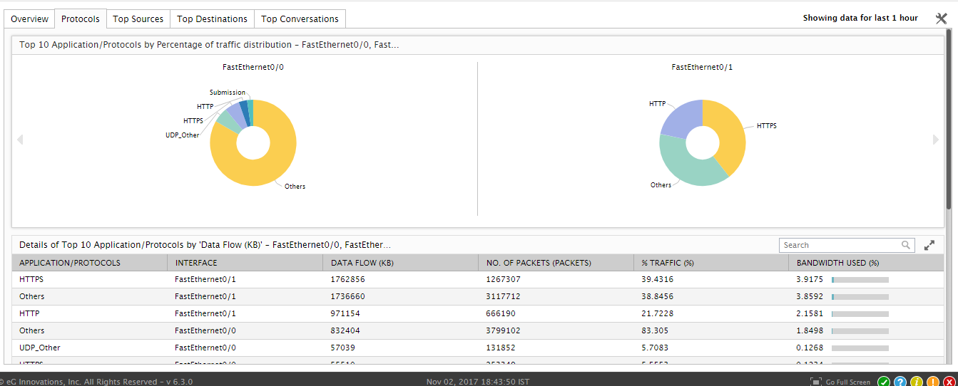
Figure 5 : Viewing traffic distribution charts and top-10 applications/protocols grid in the Protocols tab page
To analyze data flow across interfaces, use the Top 10 Applications/Protocols by Data Flow grid of Figure 5. This grid is by default sorted in the descending order of % Traffic, and hence, pinpoints the application/protocol that is contributing to high traffic volume on the network, regardless of interface. You can also use the Search option here to search for a particular record(s) in the grid. All you need to is type the string you want to search for in the Search text box and click the magnifying glass icon alongside. All records with a value that matches the search string in whole/part will be listed.
Scrolling down the dashboard will reveal the a time-of-day graph that compares bandwidth usage across applications/protocols during the last hour (by default). Using this graph, you can quickly and accurately isolate bandwidth-intensive applications/protocols.
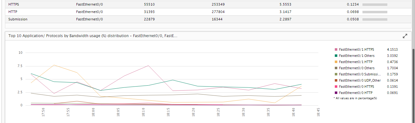
Figure 6 : A graph comparing bandwidth usage across applications/protocols
You can make changes to the default settings governing this tab page by clicking on the icon at the right, top corner of Figure 5. Figure 7 will then appear.
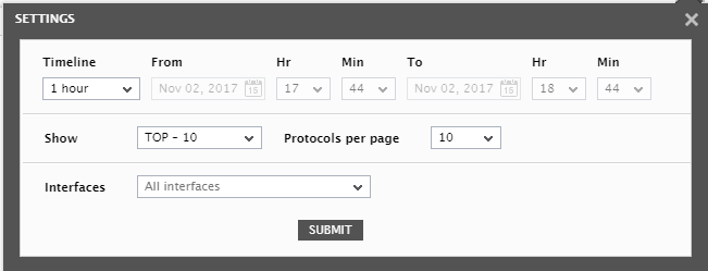
Figure 7 : Overriding default settings of the Protocols tab page
Using Figure 7, you can change the default time line of 1 hour for the distribution charts and graphs in the Protocols tab page. Also, by default, the distribution charts, graphs, and the grid display the top-10 applications/protocols alone in terms of traffic or bandwidth usage (as the case may be). You can increase or decrease this number. Alternatively, you can even choose to show those applications/protocols that consume very less bandwidth or generate very low traffic on the interfaces. For this purpose, pick a different Top-N option or a Last-N option from the Show drop-down in Figure 7.
You can indicate how many protocols you want displayed per page by picking an option from the Protocols per page drop-down.
Moreover, by default, the charts, graphs, and grid in the Protocols tab page represent statistics pertaining to all interfaces. You can instead have them represent performance of a particular interface alone by picking an interface of your choice from the Interfaces drop-down. This will enable you to focus on applications/protocols pertaining to a specific interface.
Once you are done with all changes, click the Submit button in Figure 7 to register the changes.
Top Sources
To identify the top source in terms of data flow at a single glance, use the Top Sources tab page. The traffic distribution charts at the top of this tab page reveal which source imposed the maximum load on each interface during the last 30 minutes (by default). If a particular interface appears to be seeing an abnormally high level of traffic, then, you can use the distribution chart of that interface to accurately isolate the source that is contributing to the interface overload.
If you want to know which source, across interfaces, generated a very high volume of traffic during the same default timeline (30 minutes), use the grid below the distribution charts. This grid is by default sorted in the descending order of % Traffic, and hence, pinpoints the source that is contributing to high traffic volume on the network, regardless of interface.
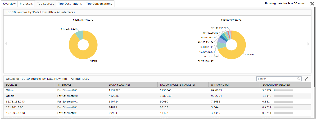
Figure 8 : The Top Sources tab page
You can also use the Search option here to search for a particular record(s) in the grid. All you need to do is type the string you want to search for in the Search text box and click the magnifying glass icon alongside. All records with a value that matches the search string in whole/part will be listed.

Figure 9 : Using the Search option in the Top Sources tab page
You can make changes to the default settings governing this tab page by clicking on the icon at the right, top corner of Figure 9. Figure 10 will then appear.
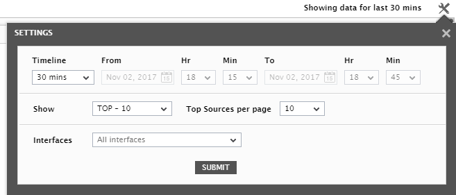
Figure 10 : Overriding default settings of the Top Sources tab page
Using Figure 10, you can change the default time line of 30 minutes for the distribution charts and grid in the Top Sources tab page. Also, by default, the distribution charts and the grid display the top-10 sources alone in terms of traffic. You can increase or decrease this number. Alternatively, you can even choose to show those sources that consume very less bandwidth or generate very low traffic on the interfaces. For this purpose, pick a different Top-N option or a Last-N option from the Show drop-down in Figure 10.
You can indicate how many sources you want displayed per page by picking an option from the Top Sources per page drop-down.
Moreover, by default, the charts and grid in the Top Sources tab page represent statistics pertaining to all interfaces. You can instead have them represent performance of a particular interface alone by picking an interface of your choice from the Interfaces drop-down. This will enable you to focus on top sources pertaining to a specific interface.
Once you are done with all changes, click the Submit button in Figure 10 to register the changes.
Top Destinations
To identify the top destination in terms of data flow at a single glance, use the Top Destinations tab page. The traffic distribution charts at the top of this tab page reveal which destination imposed the maximum load on each interface during the last 30 minutes (by default). If a particular interface appears to be seeing an abnormally high level of traffic, then, you can use the distribution chart of that interface to accurately isolate the destination that is contributing to the interface overload.
If you want to know which destination, across interfaces, generated a very high volume of traffic during the same default timeline (30 minutes), use the grid below the distribution charts. This grid is by default sorted in the descending order of % Traffic, and hence, pinpoints the destination that is contributing to high traffic volume on the network, regardless of interface.
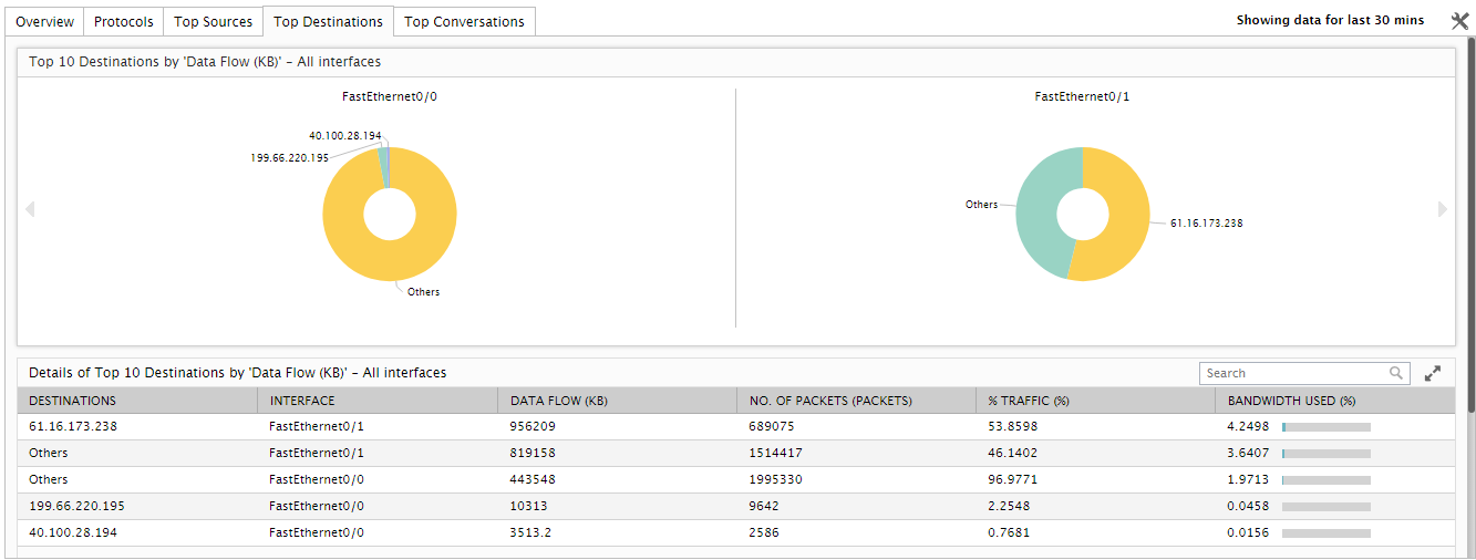
Figure 11 : The Top Destinations tab page
You can also use the Search option here to search for a particular record(s) in the grid. All you need to do is type the string you want to search for in the Search text box and click the magnifying glass icon alongside. All records with a value that matches the search string in whole/part will be listed.
You can make changes to the default settings governing this tab page by clicking on the icon at the right, top corner of Figure 11. Figure 12 will then appear.
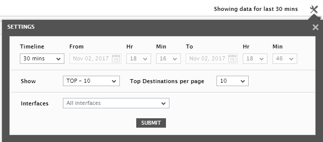
Figure 12 : Overriding default settings of the Top Destinations tab page
Using Figure 12, you can change the default time line of 30 minutes for the distribution charts and grid in the Top Destinations tab page. Also, by default, the distribution charts and the grid display the top-10 destinations alone in terms of traffic. You can increase or decrease this number. Alternatively, you can even choose to show those destinations that consume very less bandwidth or generate very low traffic on the interfaces. For this purpose, pick a different Top-N option or a Last-N option from the Show drop-down in Figure 12.
You can indicate how many sources you want displayed per page by picking an option from the Top Destinations per page drop-down.
Moreover, by default, the charts and grid in the Top Destinations tab page represent statistics pertaining to all interfaces. You can instead have them represent performance of a particular interface alone by picking an interface of your choice from the Interfaces drop-down. This will enable you to focus on top destinations pertaining to a specific interface.
Once you are done with all changes, click the Submit button in Figure 12 to register the changes.
Top Conversations
To identify the top conversations in terms of data flow at a single glance, use the Top Conversations tab page. The traffic distribution charts at the top of this tab page reveal which conversation imposed the maximum load on each interface during the last 30 minutes (by default). If a particular conversation appears to be seeing an abnormally high level of traffic, then, you can use the distribution chart of that interface to accurately isolate the conversation that is contributing to the interface overload.
If you want to know which conversation, across interfaces, generated a very high volume of traffic during the same default timeline (30 minutes), use the grid below the distribution charts. This grid is by default sorted in the descending order of % Traffic, and hence, pinpoints the conversation that is contributing to high traffic volume on the network, regardless of interface.
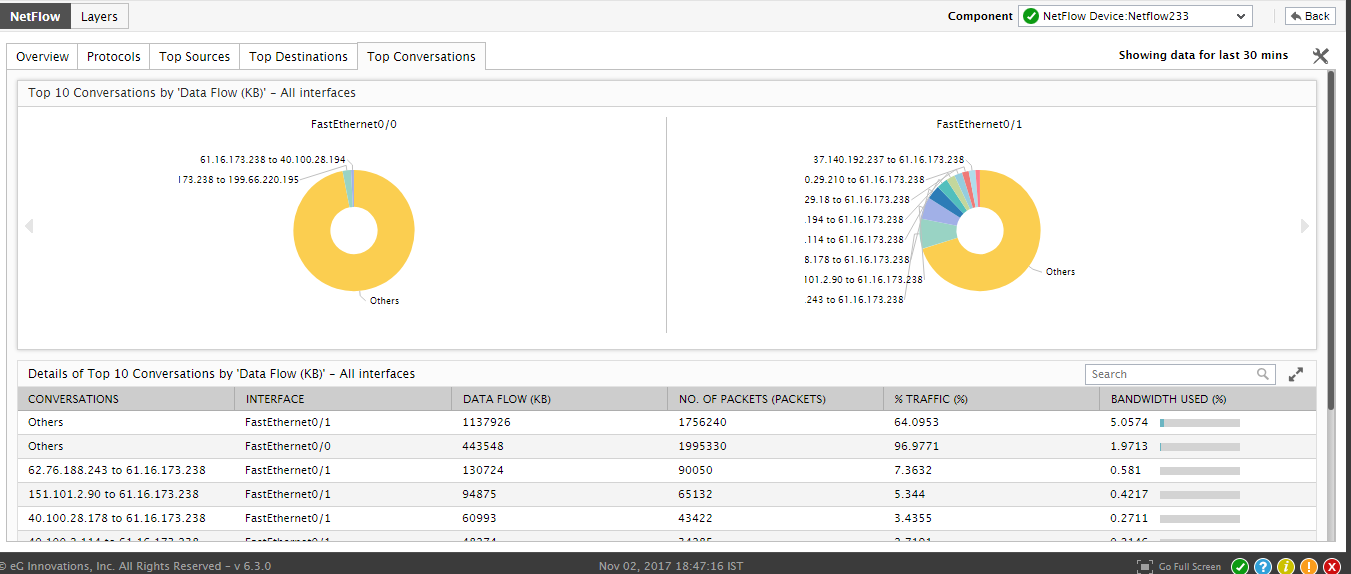
Figure 13 : The Top Conversations tab page
You can also use the Search option here to search for a particular record(s) in the grid. All you need to do is type the string you want to search for in the Search text box and click the magnifying glass icon alongside. All records with a value that matches the search string in whole/part will be listed.
You can make changes to the default settings governing this tab page by clicking on the icon at the right, top corner of Figure 13. Figure 14 will then appear.
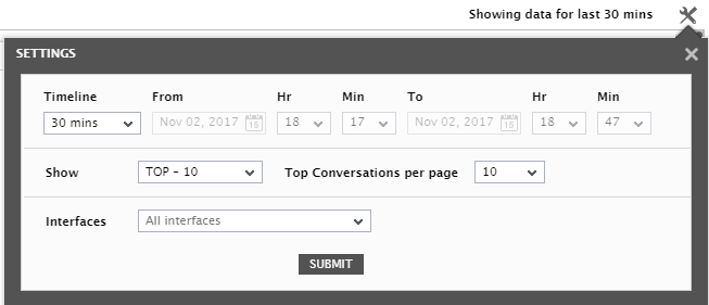
Figure 14 : Overriding default settings of the Top Conversations tab page
Using Figure 14, you can change the default time line of 30 minutes for the distribution charts and grid in the Top Conversations tab page. Also, by default, the distribution charts and the grid display the top-10 conversations alone in terms of traffic. You can increase or decrease this number. Alternatively, you can even choose to show those conversations that consume very less bandwidth or generate very low traffic on the interfaces. For this purpose, pick a different Top-N option or a Last-N option from the Show drop-down in Figure 14.
You can indicate how many sources you want displayed per page by picking an option from the Top Conversations per page drop-down.
Moreover, by default, the charts and grid in the Top Conversations tab page represent statistics pertaining to all interfaces. You can instead have them represent performance of a particular interface alone by picking an interface of your choice from the Interfaces drop-down. This will enable you to focus on top conversations pertaining to a specific interface.
Once you are done with all changes, click the Submit button in Figure 14 to register the changes.