Office 365 Services Dashboard
The eG Enterprise monitoring console offers an Office 365 Services Dashboard, out-of-the-box. Using the different web pages of this dashboard, you can at-a-glance:
- Receive an overview of the performance of the Office 365 environment, and isolate pain points;
- Analyze the health and usage of Office 365 services, pinpoint services that are in an degraded state currently, detect unusual activity on a service, and identify users responsible for such activities;
- Assess license usage across the Office 365 environment, identify licenses that are about to expire shortly, and those that are pending activation/provisioning;
- Audit user activity across the Office 365 environment, spot suspect user logins, and identify user groups that were newly created/modified/deleted.
The dashboard also embeds smart drill-downs, which enable you to go from problem symptom to source within a click!
To access the dashboard, click on the Monitor tile and select Microsoft Office 365 from the Dashboards menu.
To view the Office 365 dashboard of a particular tenant, choose that tenant from the Tenant list box at the right, top corner.
In addition to the global Office 365 dashboard, separate dashboards are also provided for each of the Office 365 services that the chosen tenant subscribes to - i.e., Exchange Online, SharePoint Online, Microsoft Teams, and OneDrive. To know more about each of these service-centric dashboards, refer to the corresponding monitoring guides.
The sections that follow will discuss each page of the Office 365 dashboard in detail.
Overview
To access the Overview page, move your mouse pointer over the Office 365 icon in the left panel, and click on the Overview option within.
The Overview page of the dashboard provides a bird's eye view of the availability, health, processing power, and license usage, across all services the chosen Office 365 tenant subscribes to (see Figure 1).
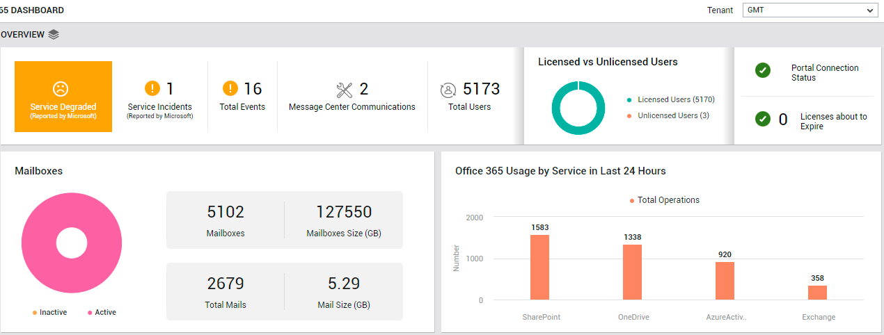
Figure 1 : The OVERVIEW page of the Office 365 Dashboard
If any service is in a degraded state, then the Overview page indicates the same using intuitive text, colors, and imagery. To know which service is under-performing and why, click on the service health indicator. The SERVICE HEALTH page will then open pointing you to the precise service that is experiencing issues (see Figure 2).
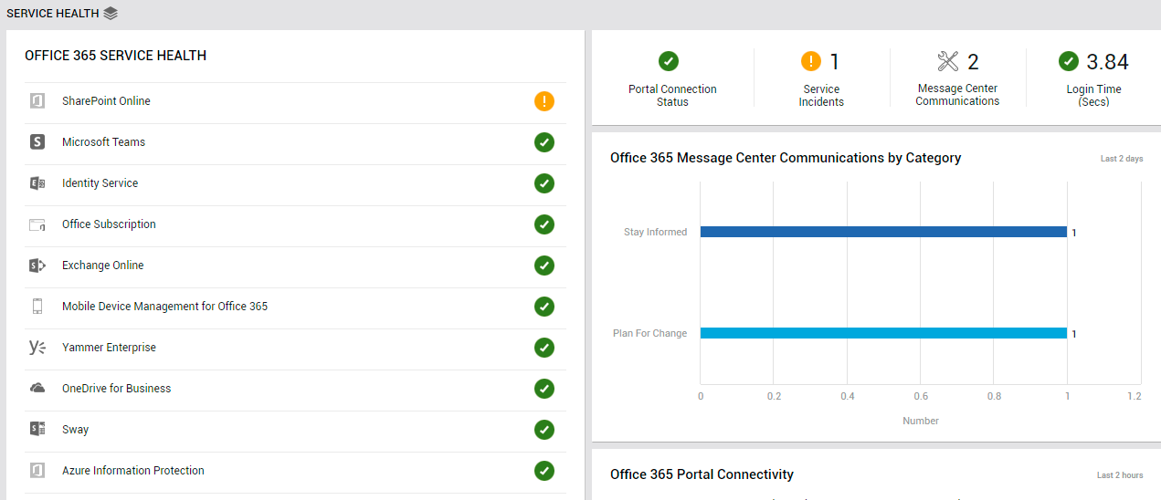
Figure 2 : The SERVICE HEALTH page that appears when the service health indicator in the OVERVIEW page is clicked
Unplanned service incidents can impact service availability and responsiveness. To indicate if such incidents have occurred, the OVERVIEW page reports the count of Service Incidents(see Figure 1). You can zoom into these incidents by clicking on the Service Incidents count. Doing so will lead you to the List of Service Incidents, using which you can figure out what incidents occurred and which services were impacted (see Figure 3).
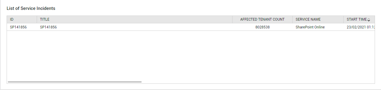
Figure 3 : The List of Service Incidents section that appears when the Service Incidents measure in the OVERVIEW page is clicked
Additionally, the OVERVIEW page turns your attention to communications that may have been published in the Message Center (see Figure 1. Also, the user load on Office 365 can be ascertained using the Total Users count displayed here. If any of these users are unlicensed, then the Licensed vs Unlicensed Users donut chart will reveal the same (see Figure 1). To know who these users are, click on the Unlicensed Users legend entry (or on the slice representing unlicensed users in the donut chart).
The Overview page also alerts you if the Office 365 portal is currently unavailable (see Figure 1). You can even drill down from the Portal Connectivity Status reported by the Overview page to view the Office 365 Portal Connectivity graph in the Service Health page (see Figure 4).
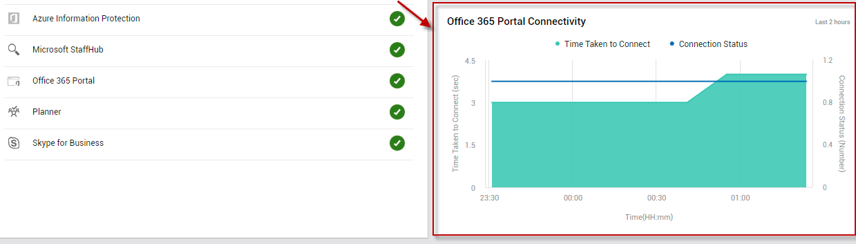
Figure 4 : The Office 365 Portal Connectivity graph that appears when the Portal Connectivity Status measure in the OVERVIEW page is clicked
With the help of this graph, you can look back at the last 2 hours and study how portal connectivity was during that time window. In the process, you can quickly figure out how often during that time period the portal was inaccessible - i.e., connectivity to the portal was lost. Additionally, connection latencies (if any) that may have been experienced by users to the portal during that past timeline are also revealed by this graph. This way, the graph sheds light on connectivity issues that may have occurred in the past, but may have been missed/overlooked by administrators.
The Overview page also indicates if any license is about to expire. To know which licenses are about to expire, click on the Licenses about to Expire measure displayed in this page (see Figure 1). This will invoke the License Usage page, using which administrators can accurately identify the licenses nearing expiry and how soon these licenses will expire (see Figure 5).
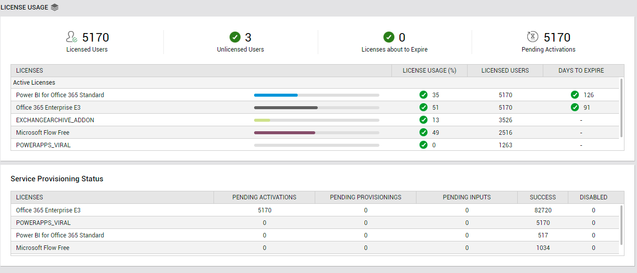
Figure 5 : The LICENSE USAGE page that opens when the Licenses to Expire count in the OVERVIEW page is clicked
With the help of this information, administrators can easily plan license renewals and ensure the uninterrupted use of Office 365 services.
The Mailboxes section (see Figure 1) of the OVERVIEW page offers administrators a quick summary of the count and size of mailboxes on Office 365, and brings inactive mailboxes (if any) to the administrator's notice. If there has been abnormal growth in the size of the mailboxes over time, then the administrator can click on the Mailboxes count or the Mailboxes Size counter displayed in this section to know which users' mailboxes have contributed to this growth (see Figure 6).
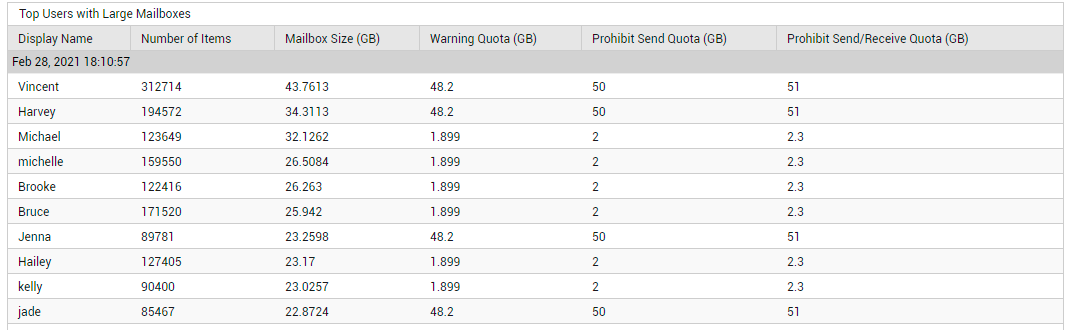
Figure 6 : Detailed diagnostics revealing the top mailboxes in terms of size
If numerous mails clutter a mailbox, the size of that mailbox will increase. Likewise, a few 'heavy' mails can also contribute to the growth in the size of a mailbox. A look at the Total Mails and Mail Size measures ( see Figure 1) reported by the Mailboxes section will point administrators to the probable cause of any abnormal growth in mailbox size. For close scrutiny of the mail activity on Office 365, click on either of the aforesaid measures. The MAIL TRAFFIC page (see Figure 7) of the Exchange Online dashboard will then open, enabling administrators to thoroughly analyze mail traffic.
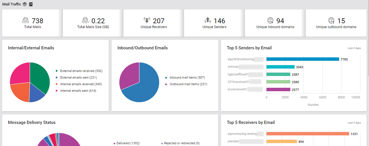
Figure 7 : The MAIL TRAFFIC page that appears when the Total Mails or Mails Size measure in the OVERVIEW page is clicked
Using the Office 365 Usage by Service in Last 24 Hrs section (see Figure 1), administrators can quickly identify the popular / actively-used Office 365 services, based on the count of operations users performed on the services during the last 24 hours. You can click on any bar in the bar graph displayed in this section to view the Service Usage page (see Figure 8), which will provide you with deeper analytics on service usage. Using the Service Usage page, you can instantly identify the user who has used that service the most (during the last 24 hours), and what type of operations he/she performed using the service.
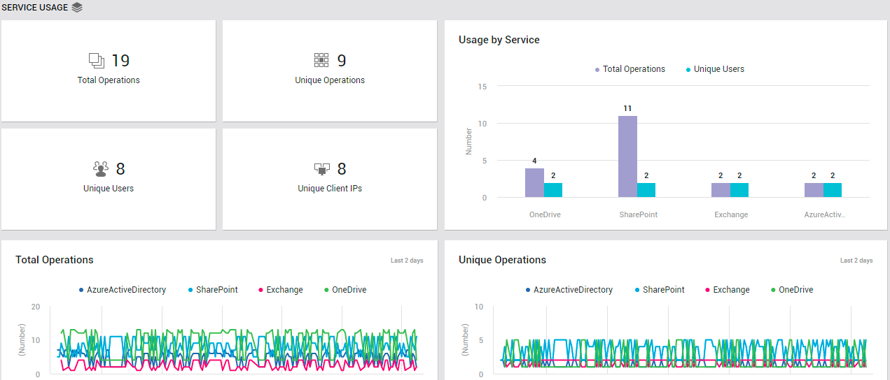
Figure 8 : The SERVICE USAGE page that appears when a bar in the Office 365 Usage by Service in Last 24 Hrs bar graph in the OVERVIEW page is clicked
To analyze the mails flowing into each domain every day during the last 2 days, use the Inbound Emails graph in the Overview page (see Figure 9). With the help of this graph, unusual / suspect mail reception (if any) in recent times can be spotted - i.e., you can quickly figure out if any domain received an unusually large number of emails any time during the last 2 days.
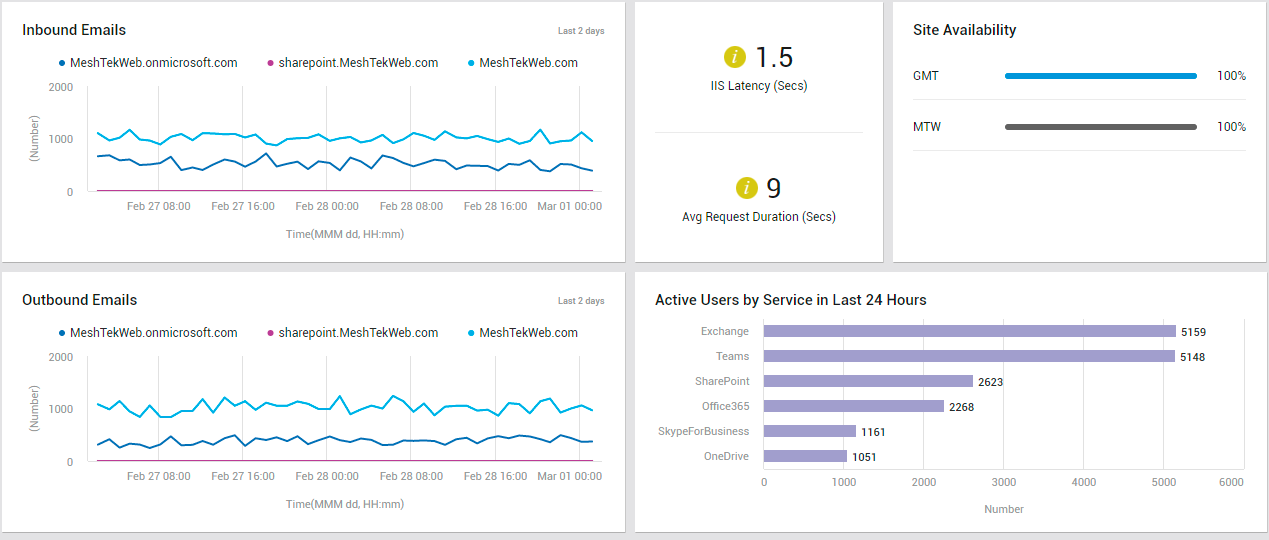
Figure 9 : The OVERVIEW page displaying measure graphs on email activity, reporting site availability and responsiveness, and measuring user activity on services
Likewise, to analyze the mails flowing out of each domain every day during the last 2 days, use the Outbound Emails graph (see Figure 9) in the Overview page . With the help of this graph, unusual / suspect mail transmission (if any) in recent times can be spotted - i.e., you can quickly figure out if any domain sent an unusually large number of emails any time during the last 2 days.
In addition, the Overview page reports the Avg Request Duration (see Figure 9) of SharePoint Online. From this, administrators can figure out if SharePoint Online is servicing requests slowly. If such a processing delay is observed, then the page further reveals if IIS Latency - i.e., poor responsiveness of the IIS web server - is the reason for it.
To check on the availability of SharePoint Online sites and to swoop down on unavailable sites, use the Site Availability section (see Figure 9) of the Overview page.
You can also assess service usage on the basis of the count of users actively using each service. For this, use the Active Users by Service in Last 24 hours bar graph (see Figure 9). One look at this graph will point you to that service that is seeing the maximum user traffic.
Service Health
To access the service health page, move your mouse pointer over the Office 365 icon in the left panel, and click on the Service Health option within.
Use the Service Health page to monitor the health of each service that the monitored tenant subscribes to. From the OFFICE 365 SERVICE HEALTH section of this page, you can rapidly identify the service that is in a poor health state currently (see Figure 10).
Figure 10 : The SERVICE HEALTH page
Clicking on that service will point you to the precise service incident that is affecting the health of that service (see Figure 11).
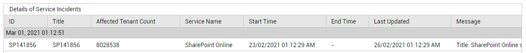
Figure 11 : Detailed diagnosis describing the service incidents that have occurred on a service
To view all service incidents across the Office 365 environment, click on the Service Incidents measure reported by this page. Doing so will lead you to the List of Service Incidents(see Figure 12), using which you can figure out what incidents occurred and which services were impacted.
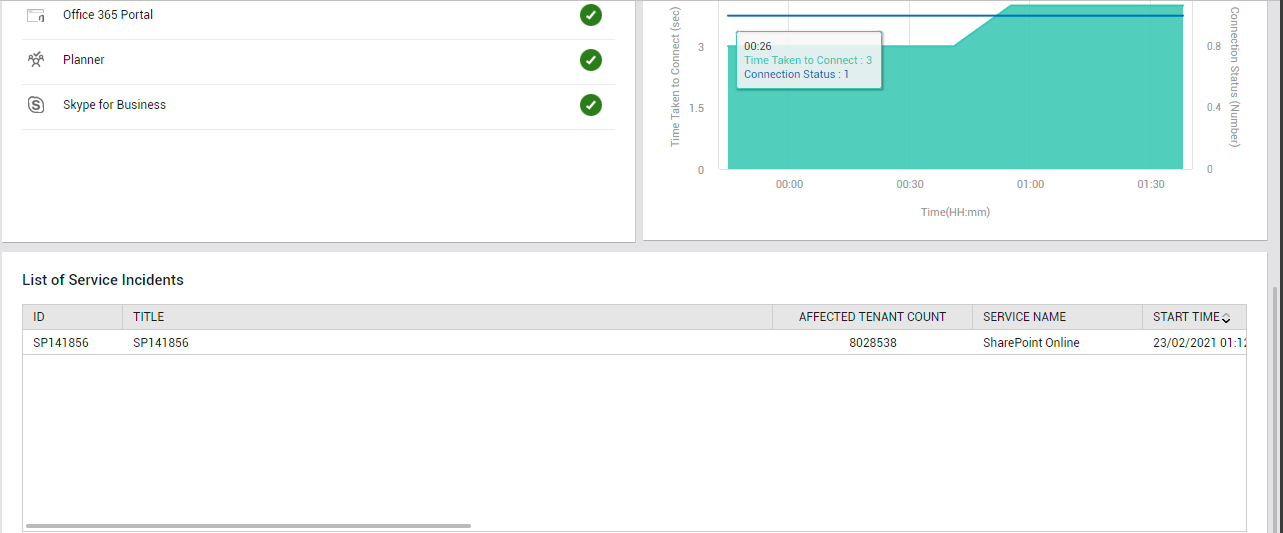
Figure 12 : The List of Service Incidents that appears when the Service Incidents counter in the SERVICE HEALTH page is clicked
The Service Health page also alerts you if the Office 365 portal is currently unavailable (see Figure 10). You can even drill down from the Portal Connectivity Status reported by this page to view the Office 365 Portal Connectivity graph (see Figure 13).
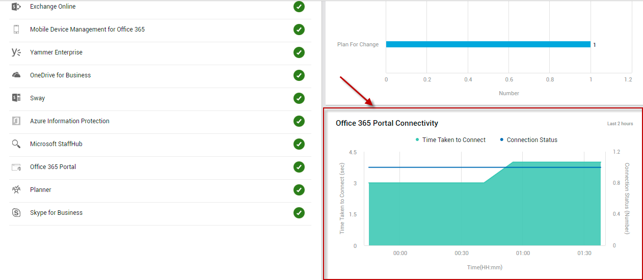
Figure 13 : Clicking on the Portal Connectivity Status measure to focus on the Office 365 Portal Connectivity graph
With the help of this graph, you can look back at the last 2 hours and quickly figure out if the portal had been inaccessible during that time window.
Sometimes, the portal may be available, but it may take forever to connect to the portal! You can instantly detect this anomalous condition using the Login time measure reported by the Service Health page (see Figure 10). If this measure reports an abnormally high value, it implies that a connection latency exists. Clicking on the Login time measure takes you to the Office 365 Portal Connectivity graph once again (see Figure 13). Connection latencies (if any) that may have been experienced by users during the last 2 days are revealed by this graph. This way, the graph sheds light on connectivity issues that may have occurred in the past, but may have been missed/overlooked by administrators.
Additionally, the Service Health page turns your attention to communications that may have been published in the Office 365 Message Center. If one/more messages have been posted in the Message Center, then use the Office 365 Message Center Communications by Category bar graph in the page to know what type of messages have been published (see Figure 10). Clicking on the bar representing a message category/type will provide a description of all the messages of type that have been published to Message Center (see Figure 14). This way, you can receive important updates/announcements without moving an inch!
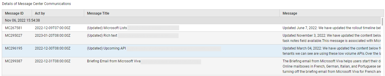
Figure 14 : Detailed diagnostics revealing the messages published to the Message Center
License Usage
To access the license usage page, move your mouse pointer over the Office 365 icon in the left panel, and click on the License Usage option within.
Use the License Usage page of the dashboard to track how licenses are utilized across the Office 365 environment (see Figure 15).
Figure 15 : The LICENSE USAGE page
Clicking on the count of Licensed Users (see Figure 15) will lead you to the LICENSES table (see Figure 16).
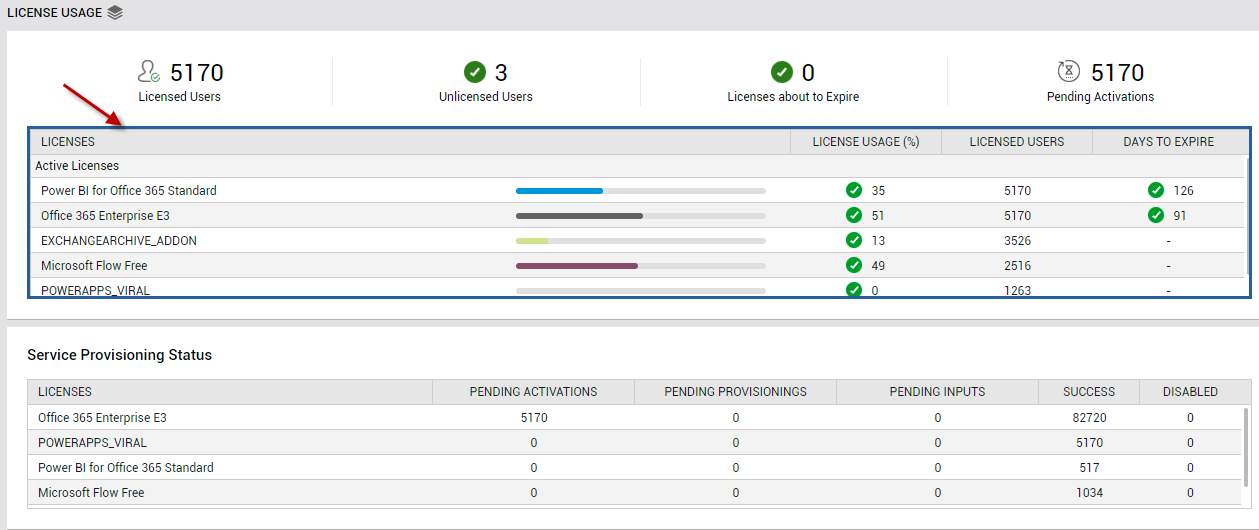
Figure 16 : Clicking on the Licensed Users count in the LICENSE USAGE page to focus on the LICENSES table
This table reveals the following:
- What are the different Office 365 products that the monitored tenant subscribes to?
- To how many users are each of these products licensed?
- Is any product rapidly running out of licenses? If so, which one is it?
- Are any product's licenses nearing expiry? Which product is this, and how soon will this product's licenses expire? - You can even click on the DAYS TO EXPIRE corresponding to a product to identify the precise product SKUs that will be expiring within the said number of days.
With the help of these insights, you can efficiently plan your license purchases/renewals, so it aligns with your future license requirements.
Unlicensed users are those who are registered with Office 365, but who have not subscribed to any product/service. To know who these unlicensed users are, click on the Unlicensed Users count in Figure 15. Figure 17 will then appear.
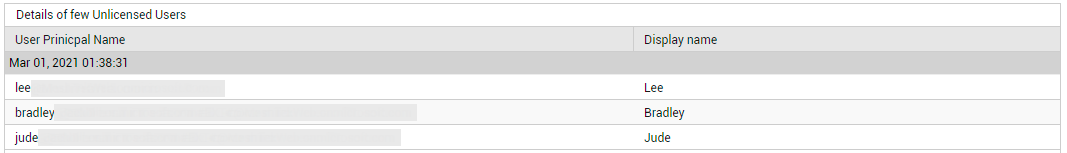
Figure 17 : Detailed diagnostics revealing the unlicensed users
When you subscribe to a product, you actually sign up for a specific set of applications and services . Typically, a service passes through many stages before it is successfully provisioned to a user. Using the Service Provisioning Status section of this page (seeFigure 15), you can easily track the provisioning status of the services associated with each product that the monitored tenant subscribes to. A quick glance at this section will reveal which products have maximum number of services in the pending activation, pending provisioning, pending inputs, or disabled states. You can even click on a service count under a state (eg., PENDING ACTIVATIONS) to know which services are in that state currently (see Figure 18).

Figure 18 : Detailed diagnostics revealing the services that are in a particular provisioning state
Users/Groups
To access the USERS/GROUPS page, move your mouse pointer over the Office 365 icon in the left panel, and click on the Users/Groups option within.
The Users/Groups page provides a macro-view of users and groups who are registered with a monitored tenant, and helps audit access permissions set for users and changes to user/group configurations (see Figure 19).
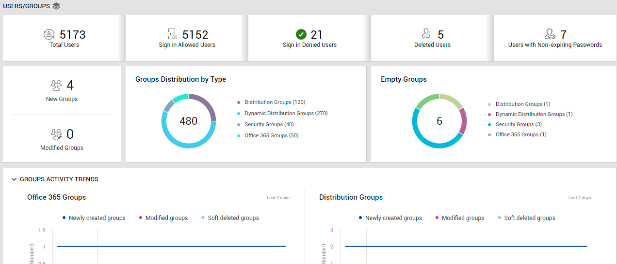
Figure 19 : The USERS/GROUPS page
From the Total Users count displayed in this page, you can determine the total number of users who are registered with the target tenant. However, not all of these users will be allowed to login to Office 365. The Sign in Allowed Users and Sign in Denied Users measures tell you how many of the registered users are allowed to sign in and not allowed to sign in to Office 365. To know which users are denied login rights, click on the Sign in Denied Users count (see Figure 20).
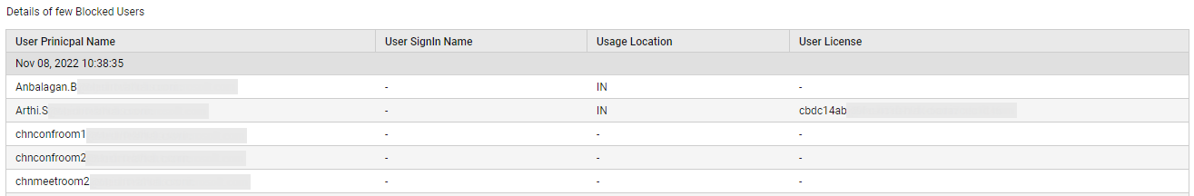
Figure 20 : Detailed diagnosis revealing the list of users who have been denied sign in rights
To help you audit user configuration changes and user privileges at a glance, this page also reports the number of Deleted Users and the count of Users with Non-Expiring Passwords. To know which users have been deleted, click on the Deleted Users count (see Figure 21).
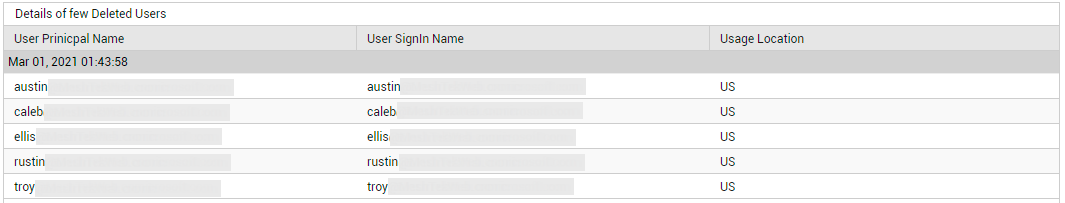
Figure 21 : Detailed diagnosis listing the deleted users
Similarly, to identify the users with non-expiring passwords, click on the Users with Non-Expiring Passwords count (see Figure 22).
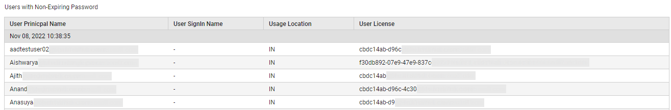
Figure 22 : List of users with non-expiring passwords
The New Groups and Modified Groups measures that this page reports enable you to keep track of additions/changes to group configuration. (see Figure 19)
Typically, any new group that is created should be of one of the following types:
- Distribution Groups: A Distribution Group (DG) is a group that contains two or more people, has an email address and appears in the Global Address List (GAL) for a company. Internal and External users can send emails to the DG and it will go to all members of the DG.
- Dynamic Distribution Groups: A dynamic distribution group is created dynamically when an email is being sent to the particular group based on some pre-defined rules or conditions. When configuring such a group, you need to choose the type of recipients who need to be automatically added as members of the group, and also define the other rules that govern membership. The group will be dynamically created with members who are of the recipient type chosen and who fulfill the defined rules
- Security Groups: A security-enabled distribution group (or security group) is created so that you can assign permissions to a large group of users instead of assigning permissions to individual users one at a time.
- Office 365 Groups: An Office 365 Group is a way to centralize membership for multiple Microsoft products in one place, and apply policies at the project or team level instead of each product. Using Office 365 groups, you can create a shared space to communicate, collaborate, and schedule events with colleagues on a shared task, project, or resource.
With the help of Groups Distribution by Type chart in the Users/Groups page (see Figure 19), you can effortlessly figure out how many groups of each type currently exist. However, some of these groups may be empty - i.e., may not contain any users. Such groups, if large in number, can unnecessarily clutter the Office 365 workspace and make management difficult for administrators. This is why, such groups are best deleted! The Empty Groups chart (see Figure 19) helps figure out how many groups of each type are presently empty. You can click on a segment (in the chart) that corresponds to a group type, or on the group type itself in the legend, to know which groups of that type are empty (see Figure 23); such groups can then be marked for deletion.
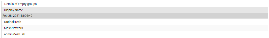
Figure 23 : List of empty groups
To audit the additions and configuration changes made to the different types of groups, use the GROUPS ACTIVITY TRENDS section in this page. Using the graph plotted here for each type of group, you can quickly figure out when in the last 2 days new groups of that type were added, and existing groups of that type were modified/soft-deleted (see Figure 24).
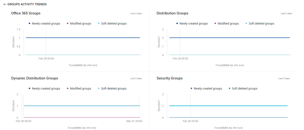
Figure 24 : The GROUP ACTIVITY TRENDS section of the USERS/GROUPS page
If an unusual number of changes have been effected on any type of group during the last 2 days, then the corresponding graph will indicate the same, thus turning the spotlight on configuration changes that are suspicious. To know what these changes are, you can quickly take help from the GROUPS ACTIVITY DETAILS table at the end of this page (see Figure 25).
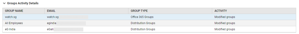
Figure 25 : The GROUPS ACTIVITY DETAILS table in the USERS/GROUPS page
Service Usage
To access the Service usage page, move your mouse pointer over the Office 365 icon in the left panel, and click on the Service Usage option within.
For at-a-glance analysis of the usage of different services, which the monitored tenant subscribes to, use the Service Usage page (see Figure 26).
Figure 26 : The SERVICE USAGE page
The current level of activity across all services can be quickly and accurately gleaned from the Total Operations count displayed in this page (see Figure 26). To know what type of operations were performed, how many times, and on which service, click on the Total Operations count in Figure 26. Figure 27 will then appear.
Figure 27 : The list of operations that were performed, how many times, and on which service
However, note that this count will include redundant operations as well - i.e., operations performed repeatedly. If you want to know how many 'distinct' operations were performed across services, regardless of how many times, then use the Unique Operations count displayed in Figure 26. To figure out what unique operations were performed, click on the Unique Operations count (see Figure 28).
Figure 28 : Detailed diagnosis listing the unique operations that were performed on a chosen service
Besides the count of operations, a few other aspects of service usage are also highlighted in this page. For instance, the Unique Users count indicates how many distinct users are accessing the services (see Figure 26). Click on this count to know which users are accessing each service (see Figure 29) and what operations they perform.
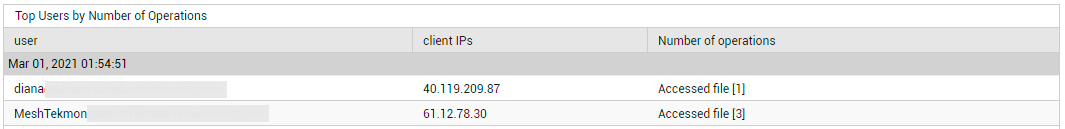
Figure 29 : Detailed diagnosis revealing the users accessing a chosen service and the operations they perform
Similarly, using Unique Client IPs, you can instantly figure out how many unique clients are accessing the various services (see Figure 26). To know which client IP addresses are accessing each service, click on the Unique Client IPs count.
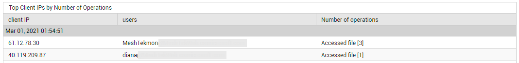
Figure 30 : Detailed diagnosis revealing the client IPs that are accessing a chosen service and the operations performed from each IP.
With that, you now have a high-level summary of service usage, across all services that the chosen tenant subscribes to. However, to be able to tell the actively used services from the least-used/least-popular ones, you need insights into the usage of every service. For such insights, use the Usage by Service bar graph (see Figure 26). From this graph, you can instantly determine how many operations are performed on each service, and how many unique users are accessing every service. One glance at this graph would suffice to identify which services are popular and which are not, in terms of usage.
If you click on the Total Operations bar in the bar graph (or on the Total Operations legend entry), you will be routed to the Total Operations and Unique Operations measure graphs. With the help of these graphs, you can look at how many operations and how many unique operations were performed every 8 hours during the last 2 days. If sudden and significant spikes are noticed in the operations count, it could be a cause for concern, as it hints at 'suspicious' activity. These graphs will not only highlight such anomalies, but will also pinpoint which service was impacted and when.
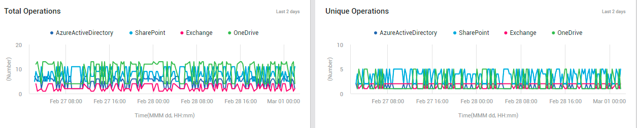
Figure 31 : The Total and Unique Operations measure graphs
Scrolling down this page, you will find the Unique Users and Unique Client IPs measure graphs (see Figure 32).
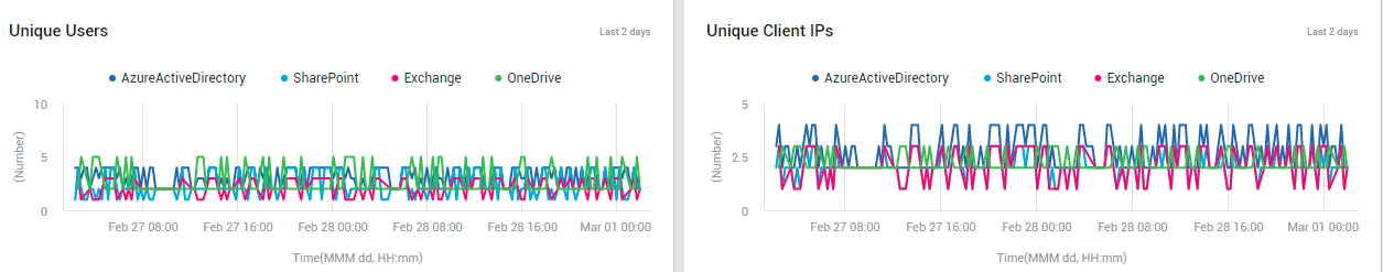
Figure 32 : The Unique Users and Unique Client IPs measure graphs
Like the operational measure graphs, these graphs help you study the variations in the number of unique users and unique clients, which were accessing each service, during the last 2 days. Abnormal user activity on a service can be captured in the process. Additionally, you can figure out when such deviant activities took place.
To know which users performed the most number of operations across all services during the last 24 hours (by default), and to identify the operations that were repeatedly performed by those users, use the Top 10 Users by Number of Activities table. This information points you to the users who are actively using one/more services, and also reveals the most-common purpose for which they use those services.
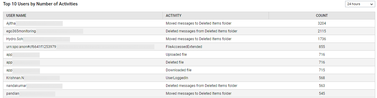
Figure 33 : The Top 10 Users by Number of Activities table
You can change the timeline for which this table is generated by selecting a different timeline from the drop-down list at the right, top corner of the table.
For per-operation insights into service usage, use the Top 10 Frequent Operations bar graph (see Figure 34).
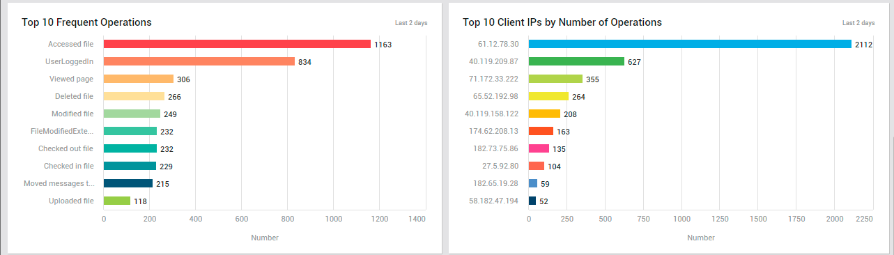
Figure 34 : The Top 10 Frequent Operations and Top 10 Client IPs by Number of Operations graphs in the SERVICE USAGE page
This graph helps you rapidly identify the operation that was most often performed on the services. If critical operations - eg., user logins - are found to be performed more frequently than normal, it could imply a possible hacking attempt. This graph turns your attention to such security snags.
To view a quick summary of operations performed from each client IP address, use the Top 10 Client IPs by Number of Operations bar graph (see Figure 35). This will point you to client IPs from which the maximum number of operations were performed across services. If an abnormal number of operations are found to have been attempted from a single client IP address, you may want to investigate further to figure out if those operations are legitimate or not. Sometimes, these could be hacking attempts or malicious virus attacks in disguise!