Correlation Analysis Report
In order to effectively plan the capacity of their IT environments, administrators have to closely observe how resource consumption / responsiveness / overall performance of a component varies vis-a-vis its load. For instance, administrators might want to check how disk space usage is affected by high disk activity or correlate the response time of a Web server with the connections to that server. The results of this correlation analysis will enable administrators to judge how usage/response time will be affected by the anticipated load and accordingly ascertain the future capacity requirements of their critical servers/systems.
The Correlation Analysis Report enables this correlation analysis. With the help of this report, administrators can pick two closely related measures and plot their historical values in a single graph, with one measure being the X axis and the other being the Y axis. For instance, you can pit disk space usage against free space on the disk in the same graph. To generate this Correlation Analysis Report, do the following:
-
Select the Correlation Analysis option from the Analytical Reports node of the REPORTS BY FUNCTION tree. Figure 1 then appears.
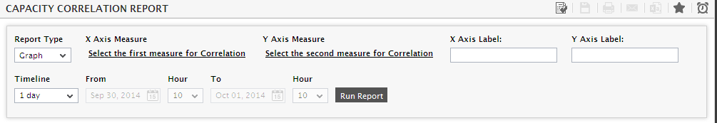
- First, pick a Report Type. Select Graph for a graphical report.
-
Then, to add the first measure to be plotted in the report, click on the Select the first measure for Correlation link in Figure 1. Figure 2 then appears.
-
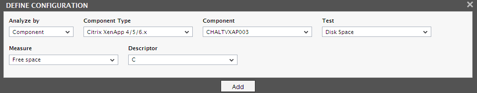
When Figure 2 appears, do the following:
-
In large environments, you might have to choose the component of interest to you from a long list of components. To avoid the drudgery of scrolling an endless component list to locate the component of your choice, you can select a criterion for filtering the component list from the Analyze by drop-down. The options are as follows:
- Component: To select the component from the list of managed components of a particular type, select this option from the Analyze by list. Then, pick a Component Type. This will populate the Component list with all managed components of the chosen type. Select a component from this list.
- Zone: If the component you are looking for is part of a zone/sub-zone, then select this option. You will then have to pick the Zone to which the component belongs. To search even the sub-zones of the chosen zones for the component, set the Include Subzone flag to Yes. All component-types that are part of the selected zone will then appear in the Component Type list. Upon choosing a type, the components of that type that are part of the zone will then appear in the Component list. Pick a component from within.
- Segment: If the component for the correlation is part of a segment, then select this option. Next, pick the Segment to which the component belongs, and then pick a Component Type from the list of component-types that are part of the segment. Once the Component list is populated with those components of the chosen type that are part of the selected segment, pick the component of your choice from within.
- Service: If the component for the correlation is involved in the delivery of a specific service, then select this option. Next, pick the Service with which the component is associated, and then pick a Component Type from the list of component-types that are part of the service topology. Once the Component list is populated with those components of the chosen type that are part of the selected service, pick the component of your choice from within.
- Next, pick the Test and then the Measure to be correlated.
- If the Test selected supports descriptors, then pick the descriptor to be used for the correlation.
- Then, click the Add button.
-
-
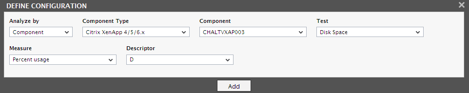
Once back in the Capacity Correlation Report page (see Figure 3), click on the Select the second measure for Correlation link therein to add the second measure for the correlation. The steps for adding a measure for correlation have already been discussed at step 4 above.
-
Once both measures are added, proceed to provide labels for the X and Y axis of the graph, in case of a Graph report. Typically, the first measure you choose will be the X Axis, and the second one will be the Y axis. If no labels are provided, then the measure names will be automatically set as labels for both the axes.
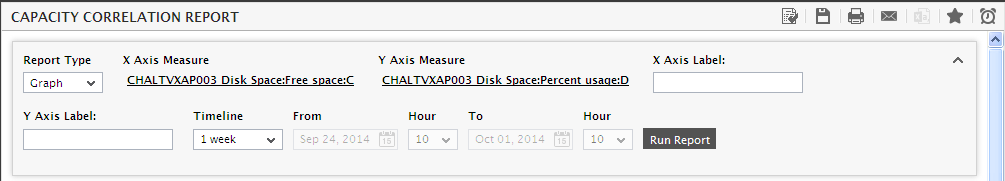
Figure 4 : Generating the Capacity Correlation Report
-
Then, specify the report Timeline.
Note:
For every user registered with the eG Enterprise system, the administrator can indicate the maximum timeline for which that user can generate a report. Once the maximum timeline is set for a user, then, whenever that user logs into eG Reporter and attempts to generate a report, the Timeline list box in the report page will display options according to the maximum timeline setting of that user. For instance, if a user can generate a report for a maximum period of 3 days only, then 3 days will be the highest option displayed in the Timeline list - i.e., 3 days will be the last option in the fixed Timeline list. Similarly, if the user chooses the Any option from the Timeline list and proceeds to provide a start date and end date for report generation using the From and To specifications, eG Enterprise will first check if the user's Timeline specification conforms to his/her maximum timeline setting. If not, report generation will fail. For instance, for a user who is allowed to generate reports spanning over a maximum period of 3 days only, the difference between the From and To dates should never be over 3 days. If it is, then, upon clicking the Run Report button a message box will appear, prompting the user to change the From and To specification.
-
In addition to the settings discussed above, this report comes with a set of default specifications. These settings are hidden by default. If you do not want to disturb these default settings, then you can proceed to generate the report by clicking the Run Report button soon after you pick the criteria for generating the report. However, if you want to view and then alter these settings (if required), click on the
 icon. The default settings will then appear in the MORE OPTIONS drop down window (see Figure 5). The steps below discuss each of these settings and how they can be customized.
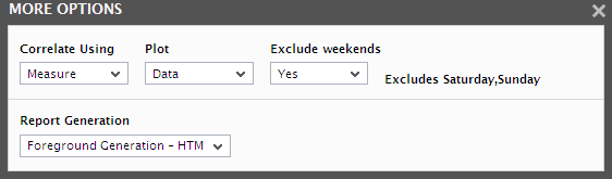
Figure 5 : The default settings for generating a Capacity Correlation report
- Next, indicate the type of data to be plotted in the graph by picking an option from the Correlate Using drop-down. If raw performance metrics are to be correlated, pick the Measure option. If you want to use only the minimum trend values for correlation, then pick the Min Trend option. Likewise, to use the maximum trend values, select the Max Trend option. Else, select the Average option to use the average performance values for correlation. If you choose the Min Trend, Max Trend, or Average options, you will have to select an option from the Trend Data list ton to indicate what type of trend values are to be used for the correlation - whether Hourly or Daily.
- Select an option from the Plot list box to ascertain the graph according to your desire. By default, Data option is displayed in this list box indicating that all the Y axis values obtained for the measure will be plotted against their corresponding X axis values. In large environments, where higher amount of values are generated for months of data, the graph that is generated for correlating the measures becomes tedious with multiple Y axis plottings against the X axis data. With such heavy Y axis plottings, overlapping of data makes it difficult for the administrator to understand the graph. Moreover, the administrator may not be interested to track minute variations in the graph when months of data have to be accessed. In such a case, a more legible graph needs to be generated which would enable the administrator to track the changes that had happened during the chosen time period. For generating such a legible graph, you need to plot a single Y axis value against an X axis value. To plot such a Y axis value, select either the Average/Minimum/Maximum options from the Plot list box. If Average option is selected from this list box, then the average of all the Y axis values corresponding to that X axis value will be determined and plotted in the graph.
- To determine the exact point in the X axis against which the determined Y axis value has to be plotted, you can use the X Axis Grouping Unit list box. By default, the Default Grouping option is displayed in this list box indicating that the X axis values are determined by default. Suppose if you choose 100 from this list box, your X axis starts at 17000, then, the Y axis values that fall in the range of 17000 and 17100 will be determined. Now, the functionality chosen from the Plot list box will be applied on those Y axis values and a single Y axis value will be determined. This Y axis value will be plotted against the median of the X axis value range i.e., this value will be plotted against 17050.
- If the timeline specified for the report needs to exclude the data collected during the Weekends, then set Exclude weekends to Yes. If not, select No.
-
In large environments, reports generated using months of data can take a long time to complete. Administrators now have the option of generating reports on-line or in the background. When a report is scheduled for background generation, administrators can proceed with their other monitoring, diagnosis, and reporting tasks, while the eG manager is processing the report. This saves the administrator valuable time. To schedule background processing of a report, you can either select the Background Save - PDF option or the Background Save - CSV option from the Report Generation list. In this case, a Report Name text box will appear, where you would have to provide the name with which the report is to be saved in the background. To process reports in the foreground, select the Foreground Generation - HTML option from this list.
Note:
- The Report Generation list will appear only if the EnableBackgroundReport flag in the [BACKGROUND_PROCESS] section of the eg_report.ini file (in the {EG_INSTALL_DIR}\manager\config directory) is set to Yes.
- The default selection in the Report Generation list will change according to the Timeline specified for the report. If the Timeline set is greater than or equal to the number of days specified against the MinDurationForReport parameter in the [BACKGROUND_PROCESS] section of the eg_report.ini file, then the default selection in the Report Generation list will be Background Save - PDF. On the other hand, if the Timeline set for the report is lesser than the value of the MinDurationForReport parameter, then the default selection in the Report Generation list will be Foreground. This is because, the MinDurationForReport setting governs when reports are to be processed in the background. By default, this parameter is set to 2 weeks - this indicates that by default, reports with a timeline of 2 weeks and above will be processed in the background.
-
Finally, click the Run Report button. If the Report Type is Graph and Foreground Generation - HTML option is chosen from the Report Generation list, a Capacity Correlation Report depicted by Figure 6 will appear.
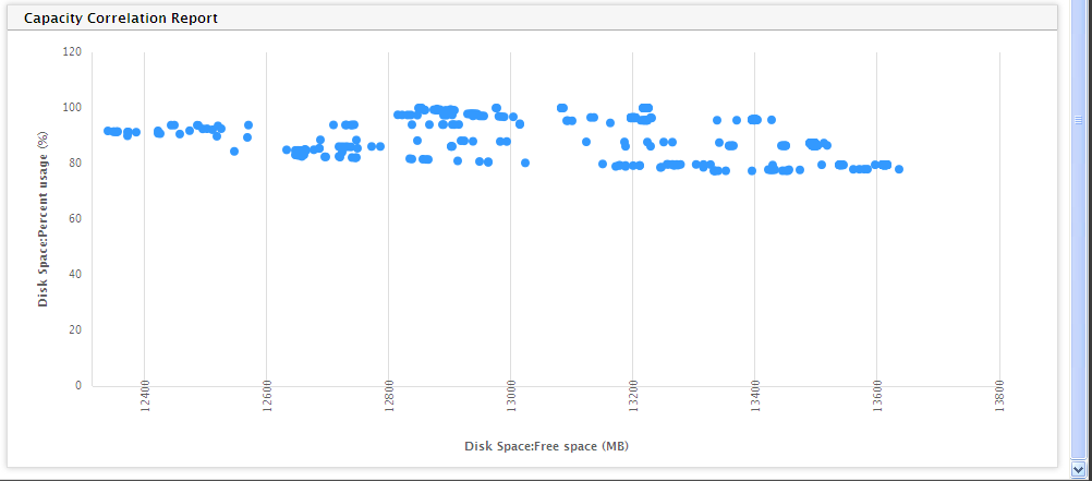
- In the graph of Figure 6, the free space of a disk partition is correlated with the disk space usage of that disk partition. A single glance at the graph would suffice to understand how an increase in the space usage of the disk partition over time has eroded the free space on that disk partition. Using this computation, administrators can determine how much more disk space should be allocated to ensure that there is adequate free space to support higher usage levels.
-
If the Report Type is Graph and the Average option is chosen from the Plot list box along with an X Axis Grouping Unit of 100, a Correlation Report as depicted by Figure 7 will appear. The graph depicted by this report will now be more legible when compared to plotting months of data together. This graph will help administrators to track the minute variations in the measure values without compromising on the legibility of the graph.
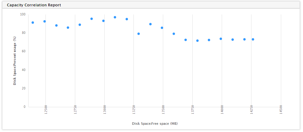
Figure 7 : The Correlation Report when the Average option is chosen from the Plot list box
-
If the Report Type was Data and the Data option is chosen from Plot list box, then clicking the Run Report button will invoke Figure 8, where a tabular comparison of the metrics of the two chosen measures will be available.
-
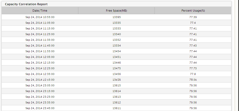
If the Report Type was Data and the Data option is chosen from Plot list box, then clicking the Run Report button will invoke Figure 9, where a tabular comparison of the metrics of the two chosen measures will be available.
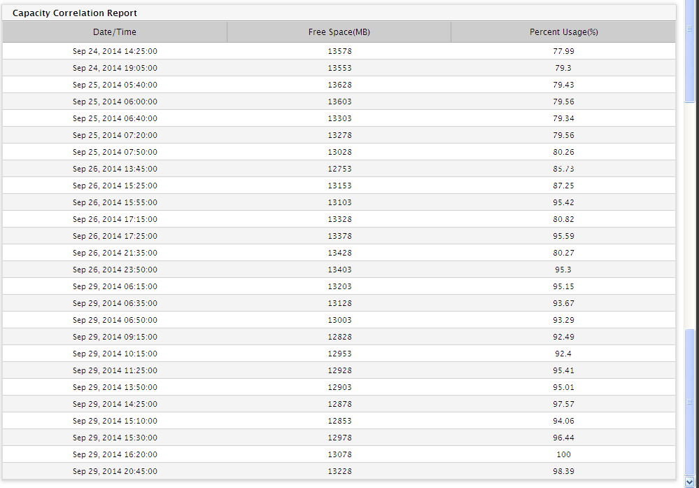
Figure 9 : A Correlation Report of type Data when Average option is selected from the Plot text box
- If the Background Save - PDF option is chosen from the Report Generation list, then clicking on the Run Report button will not generate the report and display it in this page for your benefit. Instead, a message indicating that the report is being processed in the background will appear. This will be accompanied by a link that will lead you to the page that lists all the reports that are being processed in the background, and their current status. If background report generation fails for a report, you can regenerate that report using this page, or can even delete that report if need be. On the other hand, if background processing successfully completes for your report, then, you can view a PDF of the report by clicking on the
 icon in that page.