Microsoft Yammer - User Experience Report
Use this report to historically analyze the operations performed by an emulated user using Microsoft Yammer. By closely analyzing the generated report, administrators can figure out which operation (for e.g., like/post/delete messages, upload files etc) is the key contributor in degrading the user experience on Microsoft Yammer over time.
To generate this report, do the following:
-
Login to eG Reporter.
-
Follow the menu sequence: REPORTS BY FUNCTION -> Domain-specific Reports -> Office 365 Monitoring -> Microsoft Yammer -> User Experience
-
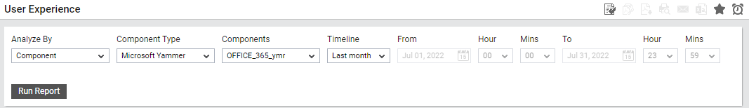
Figure 1 will then appear. Using this report, you can engage in a time-based user experience analysis on a web application that is part of a zone/segment/service. Indicate your choice by picking the one of the following options from the Analyze by list.
- Component:If the Component option is chosen from the Analyze by list, then all components of the chosen Component Type will be listed in the Component list box. From this list box, select the components for which the report is to be generated. If the Component list consists of too many components, then viewing all the components and selecting the ones you need for report generation could require endless scrolling. To avoid this, you can click the
 button next to the Component list. The COMPONENTS pop up window will then appear using which you can view almost all the components in a single interface and select the ones for which the report is to be generated.
 - Zone: If the Zone option is chosen from the Analysis by list, then you would be required to select the Zone for which the report is to be generated. In addition, you will also have to indicate whether the report needs to include even those components that are included in the sub-zones of the chosen zone. If this is the case, you will have to set the Include sub-zones flag to Yes.
- Service: Select this option if the components for which a report is to be generated are involved in the delivery of a business service. Then, select a Service.
- Segment: Choose this option if the virtual hosts to be evaluated are part of a segment. Then, pick a Segment for analysis.
- Component:If the Component option is chosen from the Analyze by list, then all components of the chosen Component Type will be listed in the Component list box. From this list box, select the components for which the report is to be generated. If the Component list consists of too many components, then viewing all the components and selecting the ones you need for report generation could require endless scrolling. To avoid this, you can click the
-
Next, select the Component Type for which the report is to be generated.
-
The Components list will then be populated with the components that belong to the chosen Component Type. Select a component of your choice from this list.
-
Provide a report Timeline. You can either select a fixed timeline such as 1 hour, 2 days, etc., or choose the Any option from the Timeline list, and then provide a From and To date/time for report generation.
Note:
For every user registered with the eG Enterprise system, the administrator can indicate the maximum timeline for which that user can generate a report. Once the maximum timeline is set for a user, then, whenever that user logs into eG Reporter and attempts to generate a report, the Timeline list box in the report page will display options according to the maximum timeline setting of that user. For instance, if a user can generate a report for a maximum period of 3 days only, then 3 days will be the highest option displayed in the Timeline list - i.e., 3 days will be the last option in the fixed Timeline list. Similarly, if the user chooses the Any option from the Timeline list and proceeds to provide a start date and end date for report generation using the From and To specifications, eG Enterprise will first check if the user's Timeline specification conforms to his/her maximum timeline setting. If not, report generation will fail. For instance, for a user who is allowed to generate reports spanning over a maximum period of 3 days only, the difference between the From and To dates should never be over 3 days. If it is, then, upon clicking the Run Report button a message box will appear, prompting the user to change the From and To specification.
-
In addition to the settings discussed above, this report comes with a set of default specifications. These settings are hidden by default. If you do not want to disturb these default settings, then you can proceed to generate the report by clicking the Run Report button soon after you pick a Measure. However, if you want to view and then alter these settings (if required), click on the
 icon. The default settings will then appear in the MORE OPTIONS drop down window (see Figure 2). The steps below discuss each of these settings and how they can be customized.
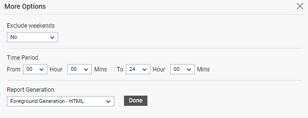
Figure 2 : The default settings for generating the User Experience report
-
If the timeline specified for the report needs to exclude the data collected during the Weekends, then set Exclude weekends to Yes. If not, select No.
Note:
By default, the weekend constitutes Saturday and Sunday. To override this default setting, do the following:
- Edit the eg_report.ini file in the <EG_INSTALL_DIR>\manager\config directory.
- In the [RUM_REPOTRS] section of the file, the EXCLUDE_WEEKEND parameter is set to Saturday, Sunday by default. You can modify this by setting the EXCLUDE_WEEKEND parameter to a comma-separated list of other days of the week - say Friday, Saturday.
- Save the file after making the required changes.
-
Specify the Time Interval for which this report is to be generated. By default, the Time Interval is 1 day. This implies that the experience of each user to the web application is consolidated together and the graph of this report is plotted for each day. If you choose 30 mins from the Time Interval list, then the graph will be plotted for every 30 minutes.
Note:
If you have chosen a Timeline of 1 week and above, it is not advisable to choose 30 mins and 1 hour options from the Time Interval list.
-
From the Chart Type list, specify whether you wish to generate the report as a bar graph or as an area chart. By default, Bar option is chosen from this list indicating that the report will be generated as a bar graph, by default.
-
Next, specify the start time and end time for report generation against the Time period field.
-
In large environments, reports generated using months of data can take a long time to complete. Administrators now have the option of generating reports on-line or in the background. When a report is scheduled for background generation, administrators can proceed with their other monitoring, diagnosis, and reporting tasks, while the eG manager is processing the report. This saves the administrator valuable time. To schedule background processing of a report, select the Background Save - PDF option from the Report Generation list. In this case, a Report Name text box will appear, where you would have to provide the name with which the report is to be saved in the background. To process reports in the foreground, select the Foreground Generation - HTML option from this list.
Note:
- The Report Generation list will appear only if the EnableBackgroundReport flag in the [BACKGROUND_PROCESS] section of the eg_report.ini file (in the [EG_INSTALL_DIR]\manager\config directory) is set to Yes.
- The default selection in the Report Generation list will change according to the Timeline specified for the report. If the Timeline set is greater than or equal to the number of days specified against the MinDurationForReport parameter in the [BACKGROUND_PROCESS] section of the eg_report.ini file, then the default selection in the Report Generation list will be Background. On the other hand, if the Timeline set for the report is lesser than the value of the MinDurationForReport parameter, then the default selection in the Report Generation list will be Foreground. This is because, the MinDurationForReport setting governs when reports are to be processed in the background. By default, this parameter is set to 2 weeks - this indicates that by default, reports with a timeline of 2 weeks and above will be processed in the background.
-
Click the Done button if any changes were made to the More Options drop down window.
-
Finally, click the Run Report button to generate the report.
-
If the Report type is Foreground Generation - HTML, then Figure 3 will appear as soon as you click the Run Report button.
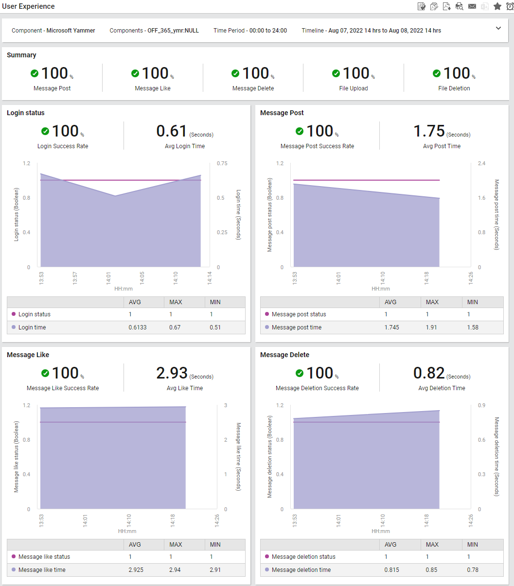
Figure 3 : The generated User Experience report
The generated report (see Figure 3) contains a series of graphs that helps administrators identify when exactly the operations performed by an emulated user failed and what type of operation failed frequently. This would help administrators in troubleshooting issues related to the operations performed by users on Microsoft Yammer! Let us now briefly discuss on how to intepret these graphs:
-
The Summary section (see Figure 3) reveals whether the emulated user was able to succesfully post/like/delete messages and perform file uploads/deletes on Microsoft Yammer over a period of time. By merely looking at this section, administrators can identify the type of operation that had failed frequently in the chosen time period.
-
The Login Status section ( see Figure 3) revelas whether an emulated user was able to login to Microsoft Yammer over a chosen time period. Further the graph revelas the exact date/time on which the emulated user took too long to login to Microsoft Yammer. By closely analyzing the graph, administrators can identify sudden/sporadic failures in the login status of users on Microsoft Yammer. Also administrators can infer if the degradation in user experience is due to a sudden/steep increase in the time taken to connect to Microsoft Yammer over the chosen time period.
-
A series of graphs (see Figure 3) related to a user emulating an operation performed on Microsoft Yammer helps administrators identify which operation (for e.g., liking a message, posting a message or deleting a mssage) failed frequently and which operation took too long to complete over a chosen time period. By comparing these graphs administrators can figure out which type of operation failed frequently during the chosen time period - is it liking a message? or posting a message? or deleting a message?
-
Next, a series of graphs (see Figure 4) related to a user emulating an operation performed on Microsoft Yammer helps administrators identify which operation (for e.g.,file uploads or file deletes) failed frequently and which operation took too long to complete over a chosen time period. By comparing these graphs administrators can figure out which type of operation failed frequently during the chosen time period - is it uploading a file? or deleting a file?
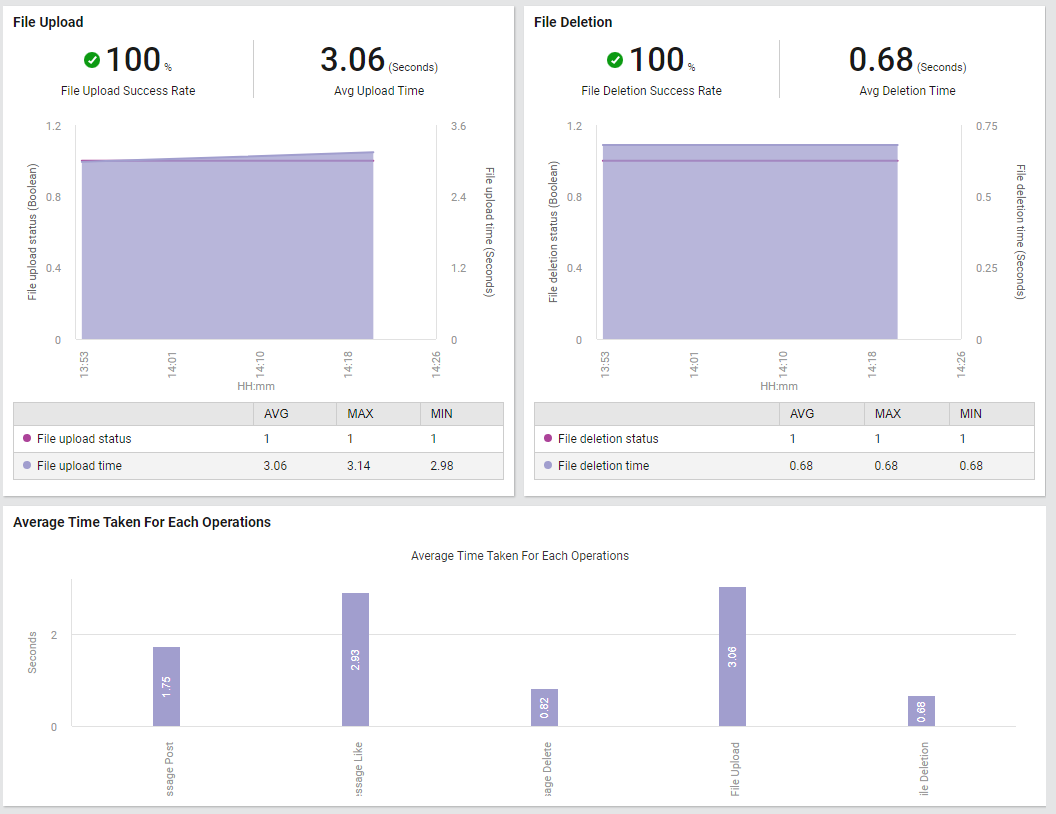
Figure 4 : Graphs displaying the operations performed by a user on Microsoft Yammer
The Average Time Taken For Each Operations section reveals a bar graph which helps administrators identify the maximum time taken by each operation performed by an emulated user. This graph helps administrators which operation took too ling to complete during the chosen time period.
-