Users - ICA Virtual Channel Analytics Report
When multiple users connect to a Citrix XenApp server from remote terminals using the ICA protocol, administrators may often need to figure out which user was consuming the maximum resources and when exactly the resource utilization was at peak. For this purpose, eG Enterprise offers the ICA Virtual Channel Analytics report.
Using this report, administrators can historically analyze the Top N users consuming maximum resources and the time duration for which the resource utilization was high. By analyzing this report, administrators can figure out which users are utilizing the resources abnormally, analyze if they really are in need of those resources and optimize the resources allocated to the users.
To generate this report, do the following:
- Select theICA Virtual Channel Analytics option by following the menu sequence: REPORTS BY FUNCTION -> Domain-specific Reports -> Virtual Applications / Desktops -> Users.
-
Figure 1 will then appear.
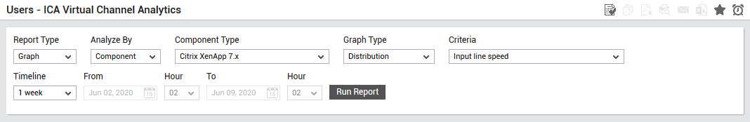
Figure 1 : Specifying the criteria for the Users - ICA Virtual Channel Analytics report
- From Figure 1, choose a Report Type (Graph or Data). The default Report Type is Graph. To closely observe and clearly understand the behavior of a single performance parameter across a zone, you can plot a single measure's data alone in a Graph report (see Figure 1).
-
Then, select a criterion for analysis from the Analyze By list box. Using this report, you can analyze the performance of one/more components, or those that are part of a service or a segment. The options provided by the Analyze By list box are discussed hereunder:
- Component: Select this option to choose the component(s) from across all the managed components in the environment. For instance, for a graphical report on ICA virtual channel analytics of all the managed Citrix XenApp 7.x hosts in the environment, select Component from the Analyze By list, select Citrix XenApp 7.x from the Component Type list. For a Data report, select Component from the Analyze By list, select Citrix XenApp 7.x from the Component Type list, and then select all the virtual hosts listed in the Components list. If the Components list consists of too many components, then viewing all the components and selecting the ones you need for report generation could require endless scrolling. To avoid this, you can click the
 button next to the Components list. The Components pop up window will then appear using which you can view almost all the components in a single interface and Select the ones for which the report is to be generated. You can narrow your search further by using the Search text box. Specify the whole/part of the component name to search for in this text box, and click the
  icon next to it.
 - Service: Select this option if the components for which a report is to be generated are involved in the delivery of a business service. Then, select a Service.
- Segment: Choose this option if the components to be evaluated are part of a segment. Then, pick a Segment for analysis.
- Zone: Pick this option for a report on the performance of virtual components that are included in a zone. Then, choose a Zone. A Zone drop-down list will then appear, from which you would have to select the zone to which the components of interest to you belong. A Sub Zone flag also appears. Indicate whether the components present within the sub-zones of the chosen zone are also to be to be considered for report generation, by setting the Sub Zone flag to Yes.
- Component: Select this option to choose the component(s) from across all the managed components in the environment. For instance, for a graphical report on ICA virtual channel analytics of all the managed Citrix XenApp 7.x hosts in the environment, select Component from the Analyze By list, select Citrix XenApp 7.x from the Component Type list. For a Data report, select Component from the Analyze By list, select Citrix XenApp 7.x from the Component Type list, and then select all the virtual hosts listed in the Components list. If the Components list consists of too many components, then viewing all the components and selecting the ones you need for report generation could require endless scrolling. To avoid this, you can click the
- If the Report Type is Graph, you would have to select an option from the Graph Type list to indicate the graph type to be used for plotting performance data - select the Timeline option, so that the values reported by the chosen Measure are plotted in time-of-day line graphs. By default, the Distribution option is chosen from this list indicating that the report represents performance data in distribution pie charts and bar graphs.
- If the Report Type is chosen as Data, then a User list box will appear. By default, All Users will be chosen from this list indicating that this report will include a detailed report on all the users logged into the server based on the chosen Criteria.
- If the Report Type is chosen as Data, then an additional Show Top list box will appear. By default the TOP - 10 option will be chosen from this list indicating that the report will be generated for the Top 10 users.
-
Then, specify the Timeline for the graph. You can either provide a fixed time line such as 1 hour, 2 days, etc., or select the Any option from the list to provide a From and To date/time for report generation.
Note:
For every user registered with the eG Enterprise system, the administrator can indicate the maximum timeline for which that user can generate a report. Once the maximum timeline is set for a user, then, whenever that user logs into eG Reporter and attempts to generate a report, the Timeline list box in the report page will display options according to the maximum timeline setting of that user. For instance, if a user can generate a report for a maximum period of 3 days only, then 3 days will be the highest option displayed in the Timeline list - i.e., 3 days will be the last option in the fixed Timeline list. Similarly, if the user chooses the Any option from the Timeline list and proceeds to provide a start date and end date for report generation using the From and To specifications, eG Enterprise will first check if the user's Timeline specification conforms to his/her maximum timeline setting. If not, report generation will fail. For instance, for a user who is allowed to generate reports spanning over a maximum period of 3 days only, the difference between the From and To dates should never be over 3 days. If it is, then, upon clicking the Run Report button a message box will appear, prompting the user to change the From and To specification.
-
In addition to the settings discussed above, this report comes with a set of default specifications. These settings are hidden by default. If you do not want to disturb these default settings, then you can proceed to generate the report by clicking the Run Report button soon after you pick one/more components for report generation. However, if you want to view and then alter these settings (if required), click on the
 icon. The default settings will then appear in the MORE OPTIONS drop down window (see Figure 2). The steps below discuss each of these settings and how they can be customized.
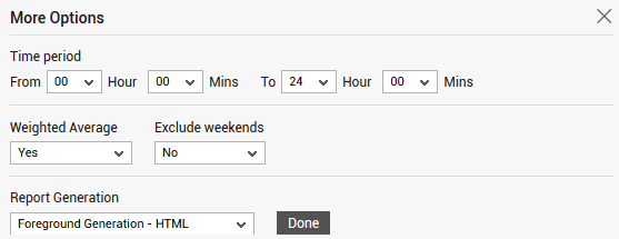
-
If the timeline specified for the report needs to exclude the data collected during the weekends, then set Exclude weekends to Yes. If not, select No.
Note:
By default, the weekend constitutes Saturday and Sunday. To override this default setting, do the following:
- Edit the eg_report.ini file in the <EG_INSTALL_DIR>\manager\config directory.
- In the [EXCLUDE_WEEKEND] section of the file, the Days parameter is set to Saturday,Sunday by default. You can modify this by setting the Days parameter to a comma-separated list of other days of the week - say Friday,Saturday.
- Save the file after making the required changes.
-
Using the Weighted Average flag, you can indicate how the Avg value is to be computed for a chosen measure for the purpose of this report. By default, this report compares the Avg value of the chosen measure across all selected descriptors. Since the Weighted Average flag is set to No by default, this Avg is computed as the ratio of the sum total of the measure values reported by a descriptor during the given timeline and the total number of times the test is executed during the same timeline. In case of dynamic descriptors however, the Avg values so computed may not reveal the ‘true picture of performance’. This is because, the test may not discover or report metrics for dynamic descriptors throughout a given timeline. For example, take the case of the Citrix Users test. Say, two users - namely, ‘A’ and ‘B’ have logged into the Citrix XenApp server. During its first measurement period; the CPU Utilization for a user session is registered as 2% and 8% respectively. Assume that the second time the Citrix Users test ran, it captured 5% as the CPU Utilization of user ‘A’. User ‘B’ however was inactive during the second measurement period, and hence, was not discovered at all. If the Weighted Average flag is set to No by default, then, this report will plot the Avg value of 4% (3+5=8/2=4) for user ‘A’ and 4% (8/2=4) again for user ‘B’. If you notice, unlike user ‘A’, where 8% of CPU was utilized over a period of time, in case of user ‘B’, 8% of CPU was utilized at one shot! Logically therefore, user ‘B’ has to be ranked above user ‘A’ in terms of CPU utilization. However, since the default Avg value computation does not clearly bring out this difference, both user ‘A’ and ‘B’ are treated at par in this report! This is why, in case of dynamic descriptors, you may want to set the Weighted Average flag to Yes. In this case, the eG Enterprise system expresses Avg as the ratio of the sum total of the measure values reported by a descriptor during a given timeline and the ‘total number of times that descriptor was active’ during the same timeline. This implies that if the Weighted Average flag is set to Yes in the example above, the Avg value for user ‘A’ will continue to be 4 (3+5=8/2=4), but the same for user ‘B’ will be 8 MB (8/1=8). In this report therefore, user ‘B’ will be placed above user ‘A’, thereby accurately pointing you to the top user who is consuming maximum CPU resources.
- Then, specify the start time and end time for report generation against the Time period field (see Figure 2).
-
In large environments, reports generated using months of data can take a long time to complete. Administrators now have the option of generating reports on-line or in the background. When a report is scheduled for background generation, administrators can proceed with their other monitoring, diagnosis, and reporting tasks, while the eG manager is processing the report. This saves the administrator valuable time. To schedule background processing of a report, select the Background Save - PDF option from the Report Generation list. In this case, a Report Name text box will appear, where you would have to provide the name with which the report is to be saved in the background. To process reports in the foreground, select the Foreground Generation - HTML option from this list.
Note:
- The Report Generation list will appear only if the EnableBackgroundReport flag in the [BACKGROUND_PROCESS] section of the eg_report.ini file (in the [EG_INSTALL_DIR]\manager\config directory) is set to Yes.
- The default selection in the Report Generation list will change according to the Timeline specified for the report. If the Timeline set is greater than or equal to the number of days specified against the MinDurationForReport parameter in the [BACKGROUND_PROCESS] section of the eg_report.ini file, then the default selection in the Report Generation list will be Background Save - PDF. On the other hand, if the Timeline set for the report is lesser than the value of the MinDurationForReport parameter, then the default selection in the Report Generation list will be Foreground. This is because, the MinDurationForReport setting governs when reports are to be processed in the background. By default, this parameter is set to 2 weeks - this indicates that by default, reports with a timeline of 2 weeks and above will be processed in the background.
- Finally, click the Run Report button to generate the report.
-
If the option chosen from the Graph from Report Type list and Distribution from the Graph Type list and Report Generation list is Foreground Generation - HTML, then, Figure 3 will appear upon clicking on the Run Report button.
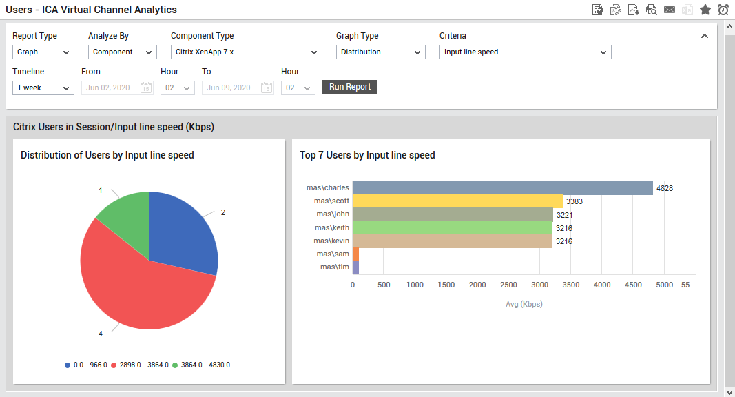
Figure 3 : The generated report when Graph is chosen as Report Type
The two sections of the generated report in Figure 3 are explained in detail as follows:
The distribution pie chart reports the distribution of users based on the chosen criteria. Using this pie chart administrators can figure out the maximum number of users in a particular range. Clicking on a slice of the pie chart will lead you to Figure 4. Here, for the chosen range, the name of each user and the average value of the chosen Criteria (in our example - it is Input Line Speed) will be specified.
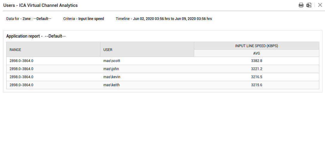
Figure 4 : The report that appears upon clicking a slice of the pie chart
The next section in Figure 3 is a bar graph that reveals the top 10 users based on the chosen Criteria. In our example, the input line speed of top 10 users are displayed in descending order. Clicking on a bar in this section will reveal a graphical report for the chosen User and Criteria combination as shown in Figure 5.
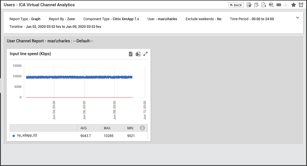
Figure 5 : The generated report when a bar in the bar graph is clicked
-
If the Report Type is Graph, Graph Type is chosen as Timeline and Report Generation list is Foreground Generation - HTML, then, this report will be generated for any of the user from the User list as shown in Figure 6.
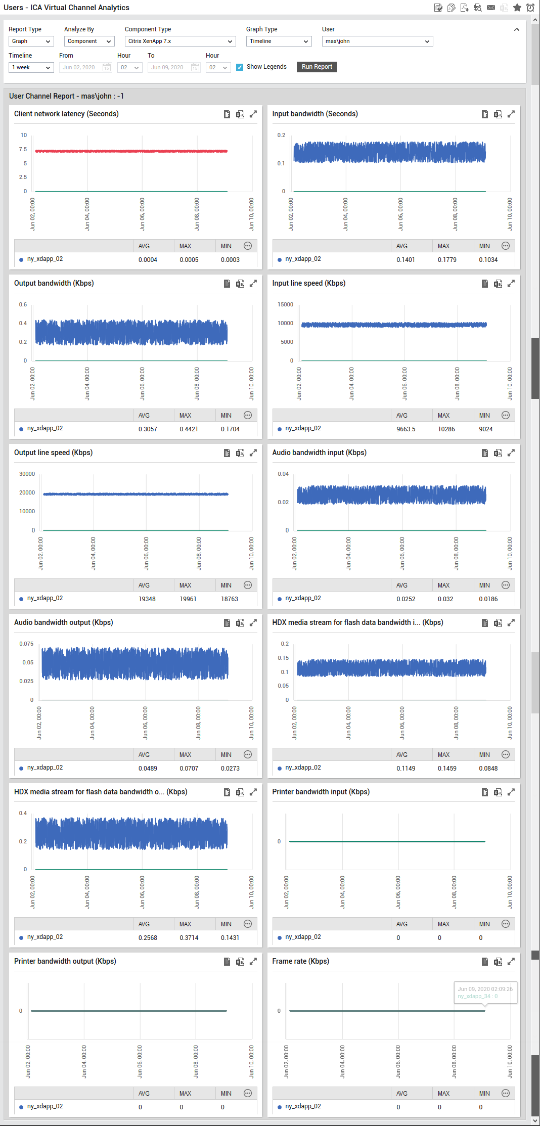
Figure 6 : The generated report for a chosen user when the graph Type is Timeline
The generated report will provide a time of day analysis on all the options provided in the Criteria list box. Using this generated report, for each user, administrators can figure out when exactly the user had used the maximum bandwidth, network latency etc. Using this report, users consuming more bandwidth can be isolated and the reasons for such abnormal consumption can be analyzed.
-
If the Report Type is Data and the Report Generation list is Foreground Generation - HTML, then, this report will be generated for any of the user from the User list as shown in Figure 7.
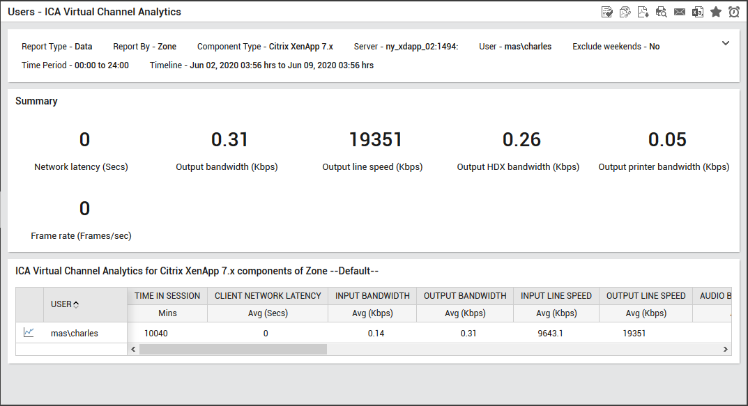
Figure 7 : The generated report if Data option is chosen from the Report Type list
The sections reported in Figure 7 are explained in detail as follows:
- The Summary section reveals the experience of the users by providing an overview on the latencies experienced by the users and the resources utilized by the users while connecting to the server. Using this section, administrators can figure out which type of latency criteria is hindering the user experience of most users.
- The next section provides in depth analysis into the latencies experienced by each user and the resources utilized by each user in detail. Using this section, administrators can figure out the user whose experience is suffering the most on the server. Clicking on the
 icon will lead you back to Figure 6 where you could view a detailed time line report in a graphical format for the chosen user.