Virtualization Manager - Resource Pools Report
As resource-intensive VM resource pools configured on one/more vSphere/ESX servers in a cluster can drain the physical resources of the corresponding virtual hosts, and consequently affect the aggregated resource base of the cluster, it is imperative that you monitor the current and historical performance of the cluster resource pools, so that resource contentions can be captured early and resolved quickly. The Cluster - Resource Pools report enables you to perform just that. Besides helping you identify resource-hungry resource pools in a cluster, this report also enables you to isolate the VM in the pool that is responsible for the abnormal behavior of the pool (if any), and the physical servers on which these VMs operate.
To generate this report, do the following:
- Select the Resource Pools option from the vCenter Reports node of the REPORTS BY FUNCTION tree.
-
Figure 1 will then appear.
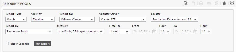
Figure 1 : Providing the specifications of the Cluster - Resource Pools report
- First, pick a Report Type. For a graphical representation of physical server performance, pick the Graph option. To view the metrics related to the resource usage of the physical servers in a cluster in a tabulated form, pick the Data option.
- If the Report Type is Graph, then the View by list will offer 2 options - Timeline and Distribution. While the Timeline option will provide a time-of-day measure graph depicting resource pool performance, the Distribution option will result in distribution pie charts and bar graphs being displayed. The default selection is however Timeline.
- By default, the Report for list will display VMware vCenter as its selection.
- From the vCenter Server list, pick the vCenter server for which the report is to be generated.
- Upon selecting the vCenter Server, the Cluster list will get automatically populated with those clusters that are being managed by the chosen vCenter Server. Pick a cluster for which this report is to be generated.
- Then, pick an option from the Report by list. By default, the Resource Pools option will be chosen here.
- Next, pick a measure for which a graph is to be generated, from the Measure list.
-
Then, specify the Timeline for the graph. You can either provide a fixed time line such as 1 hour, 2 days, etc., or select the Any option from the list to provide a From and To date/time for report generation.
Note:
For every user registered with the eG Enterprise system, the administrator can indicate the maximum timeline for which that user can generate a report. Once the maximum timeline is set for a user, then, whenever that user logs into eG Reporter and attempts to generate a report, the Timeline list box in the report page will display options according to the maximum timeline setting of that user. For instance, if a user can generate a report for a maximum period of 3 days only, then 3 days will be the highest option displayed in the Timeline list - i.e., 3 days will be the last option in the fixed Timeline list. Similarly, if the user chooses the Any option from the Timeline list and proceeds to provide a start date and end date for report generation using the From and To specifications, eG Enterprise will first check if the user's Timeline specification conforms to his/her maximum timeline setting. If not, report generation will fail. For instance, for a user who is allowed to generate reports spanning over a maximum period of 3 days only, the difference between the From and To dates should never be over 3 days. If it is, then, upon clicking the Run Report button a message box will appear, prompting the user to change the From and To specification.
-
In addition to the settings discussed above, this report comes with a set of default specifications. These settings are hidden by default. If you do not want to disturb these default settings, then you can proceed to generate the report by clicking the Run Report button soon after you pick a Measure. However, if you want to view and then alter these settings (if required), click on the
 button. The default settings will then appear in the MORE OPTIONS drop down window (see Figure 2). The steps below discuss each of these settings and how they can be customized.
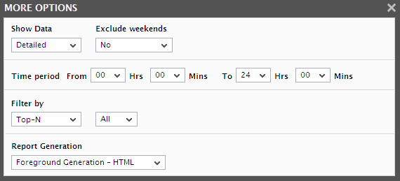
Figure 2 : The default settings for generating the Cluster – Resource Pools report
-
The speed with which a report is generated depends primarily on the report Timeline. While a Timeline that varies between a couple of days to a week enables the eG Enterprise system to quickly retrieve the required data, timelines that span multiple weeks/months could slow-down the data retrieval and report generation process to a considerable extent, owing to the volume of data involved. In order to ensure quick and easy access to reports, eG Enterprise provides you the option of enabling data retrieval from the Trend information in the database, instead of the Detailed test information that is used by default for report generation. The Detailed test information based comprises of multiple measurement records for a test - one or more each for every test execution. Whereas, the Trend information includes only hourly, daily, and monthly summary computations for a test performed on a continuous basis. For instance, during a period of 1 hour, a test that runs every 5 minutes inserts atleast 12 records into the Detailed test information base. On the other hand, the Trend information base would consist of only 1 record for the same 1 hour period. Fewer the number of records, query execution becomes much quicker, and data retrieval faster. To use the trend data for report generation, you will have to select the Trend option from the Show Data field in Figure 2. By default, the Detailed option is selected in Figure 2 indicating that the report data is retrieved from the detailed test information in the database. If need be, you can also ensure that all reports always use the Detailed test tables alone by hiding the Show Data field from the reporter interface. To achieve this, do the following:
- Login to the eG administrative interface as 'admin'.
- Select the Manager option from the Settings tile that appears when the
 button against the Admin tab is clicked.
 -
From the GENERAL SETTINGS page that then appears, if you set the Compute average/sum of metrics while trending flag to No, then the Show Data field will not appear in the reporter interface; this denies users access to the Trend option, and thus ensures that reports are always generated using the Detailed tables.
Note:
- A Trend report will not include the data for the current day since trend data is only computed at the end of the day.
- If the Trend option is chosen, the time period of the report should be greater than 1 day.
-
The usage of Detailed test tables for generating reports, especially those that span weeks, increases the stress on the eG database, thus resulting in undue delays in report generation. In order to ensure that the database is not choked by such voluminous data requests, you can configure eG Enterprise to automatically "force" the use of the Trend option if the Timeline of a report exceeds a pre-configured duration. To specify this time boundary, do the following:
- Edit the eg_report.ini file in the <EG_INSTALL_DIR>\manager\config directory.
- In the [MISC] section of the file, you will find a DetailedTime parameter.
- Specify the duration (in days) beyond which Detailed reports cannot be generated, against the DetailedTime parameter, and save the eg_report.ini file.
- For instance, to make sure that Detailed reports are disallowed for a Timeline of over 2 weeks, set the DetailedTime parameter to 14 and save the file.
- Say, subsequently, you attempt to generate a Detailed report for a FixedTimeline of 3 weeks (which is greater than the 14-day limit set in our example). The instant you select the 3 weeks option from the Fixed list box, the Detailed option gets automatically disabled, and the Trend option gets enabled. Similarly, if you specify an AnyTimeline that runs over 14 days, then, upon clicking the Run Report button to generate the report, a message box appears (see Figure 8) informing you that only the Trend option is permitted.
- To proceed with the Trend report generation, click the ok button in the message box. To terminate Trend report generation, click the Cancel button.
-
If the timeline specified for the report needs to exclude the data collected during the Weekends, then set Exclude weekends to Yes. If not, select No.
Note:
By default, the weekend constitutes Saturday and Sunday. To override this default setting, do the following:
- Edit the eg_report.ini file in the <EG_INSTALL_DIR>\manager\config directory.
- In the [virtual_cluster] section of the file, the exclude_weekend parameter is set to Saturday,Sunday by default. You can modify this by setting the exclude_weekend parameter to a comma-separated list of other days of the week - say Friday,Saturday.
- Save the file after making the required changes.
- Next, indicate the report Timeperiod.
-
You can further filter the resultset of your report picking one of the following options from the Filter by list:
- Top -N - Select this option and pick a number from the drop-down list adjacent to it to ensure that the resulting graph only plots the values of the specified number of top players in the chosen performance arena.
- Range - Pick this option and provide a value range in the From and To text boxes that appear alongside.
- Greaterthan - Pick this option and provide a value in the text box that appears alongside to view the details of only those resource pools which have registered a value greater than the value specified in that box for the chosen Measure.
- Lessthan - Pick this option and provide a value in the text box that appears alongside to view the details of only those resource pools which have registered a value lesser than the value specified in that box for the chosen Measure.
-
In large environments, reports generated using months of data can take a long time to complete. Administrators now have the option of generating reports on-line or in the background. When a report is scheduled for background generation, administrators can proceed with their other monitoring, diagnosis, and reporting tasks, while the eG manager is processing the report. This saves the administrator valuable time. To schedule background processing of a report, you can either select the Background Save - PDF option or the Background Save - CSV option from the Report Generation list. In this case, a Report Name text box will appear, where you would have to provide the name with which the report is to be saved in the background. To process reports in the foreground, select the Foreground Generation - HTML option from this list.
Note:
- The Report Generation list will appear only if the EnableBackgroundReport flag in the [BACKGROUND_PROCESS] section of the eg_report.ini file in the [EG_INSTALL_DIR]\manager\config directory is set to Yes.
- The default selection in the Report Generation list will change according to the Timeline specified for the report. If the Timeline set is greater than or equal to the number of days specified against the MinDurationForReport parameter in the [BACKGROUND_PROCESS] section of the eg_report.ini file, then the default selection in the Report Generation list will be Background Save - PDF. On the other hand, if the Timeline set for the report is lesser than the value of the MinDurationForReport parameter, then the default selection in the Report Generation list will be Foreground. This is because, the MinDurationForReport setting governs when reports are to be processed in the background. By default, this parameter is set to 2 weeks - this indicates that by default, reports with a timeline of 2 weeks and above will be processed in the background.
- Finally, click the Run Report button.
-
If the Report Type is Graph, the View by selection is Timeline, the Report by option is Resource pools, and the option chosen from the Report Generation list is Foreground Generation - HTML, then, clicking the Run Report button will invoke Figure 3.
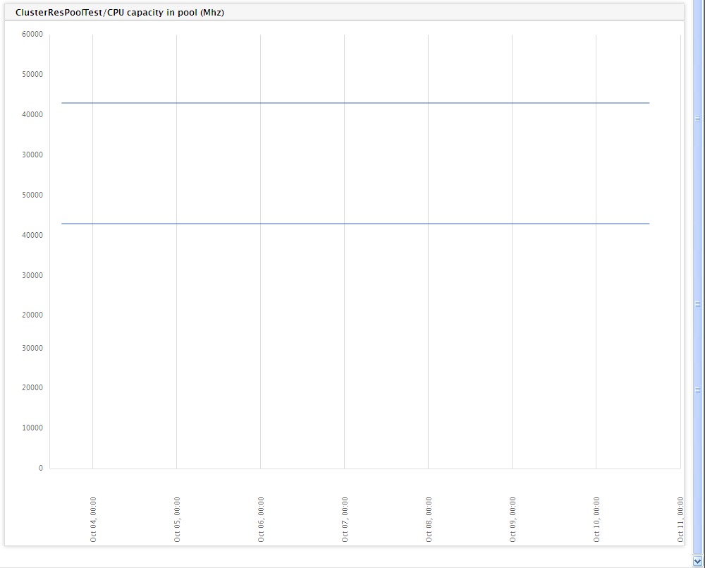
Figure 3 : A Cluster - Resource Pools report if the 'View by' option chosen is 'Timeline' and 'Report by' option is 'Resource pools'
- Figure 3, as you can see, displays a time-of-day graph - this graph compares the behavior of the chosen performance measure a crisis all the resource pools within the selected cluster during the specified timeline. For instance, if CPU usage is the Measure chosen, then this graph will compare the CPU usage of the resource pools in the cluster, thus visually enabling you to identify which resource pool is utilizing CPU excessively.
-
If the Report Type is Graph, the View by selection is Timeline, the Report for option is Physical Servers, and the option chosen from the Report Generation list is Foreground Generation - HTML, then, clicking the Run Report button will invoke Figure 4. The graph displayed in Figure 4 will enable you to quickly compare the chosen performance metric across all the physical servers in the selected cluster so that, resource-intensive servers in the cluster can be isolated.
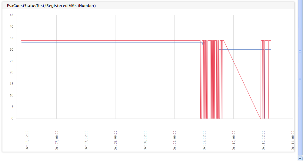
Figure 4 : A Cluster - Resource pools report that appears when the 'View by' option is 'Timeline' and the 'Report by' option is 'Physical servers'
-
If the Report Type is Graph, the View by selection is Timeline, the Report for option is Virtual Machines, and the option chosen from the Report Generation list is Foreground Generation - HTML, then, clicking the Run Report button will invoke Figure 5. The graph displayed in Figure 5 will enable you to quickly compare the values of the chosen performance metric across all the virtual machines in the selected cluster so that, resource-intensive VMs in the cluster can be isolated.
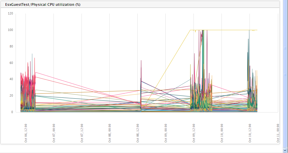
Figure 5 : The Cluster -Resource pools report if the 'View by' selection is 'Timeline' and the 'Report by' selection is 'Virtual machines'
-
Now, if the Report Type is Graph, the View by selection is Distribution, the Report by option is Resource Pools, and the option chosen from the Report Generation list is Foreground Generation - HTML, then, clicking the Run Report button will invoke Figure 6.
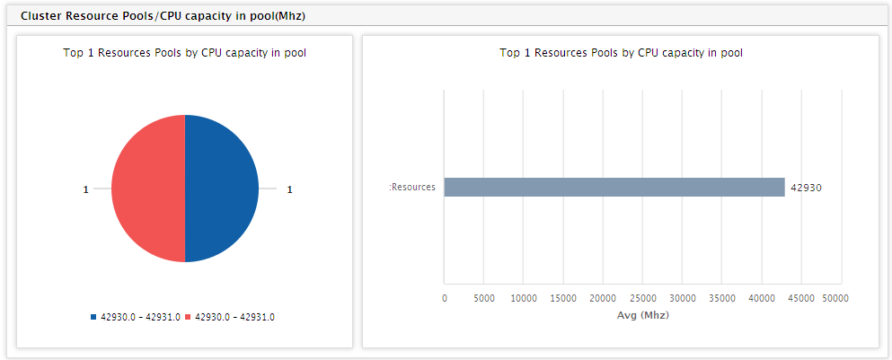
Figure 6 : The Cluster - Resource Pools report where the 'View by' selection is 'Distribution' and the 'Report by' option is 'Resource Pools'
-
Figure 6 comprises of the following:
-
A distribution pie chart that depicts the number of resource pools that are in different distribution ranges. The distribution ranges are obtained by applying the first of the configured functions on the chosen Measure. For instance, assume that Direct VMs in pool is the chosen Measure. Say that you have configured to display the Avg and Max of this measure in a Data report. Typically, both these configured values will appear only in the Data report. In the case of a Graph report however, the first of the two functions - i.e., Avg of Direct VMs in pool - alone is calculated for every resource pool in the chosen Cluster. The resulting pie chart enables administrators to deduce, at a glance, the number of resource pools where the chosen performance metric has fared well and/or badly. Clicking on a particular slice in the pie chart lists the resource pools that fall within the value range represented by that slice (see Figure 7). Against every pool, the actual values for each of the configured functions (both Avg and Max, in our example) will be displayed. A cluster-level Summary of the chosen Measure will also be available.
Note:
By default, the chart type for distribution is a pie chart. However, you can have a bar graph depict the same data instead of a pie chart, by following the steps given below:
- Edit the eg_report.ini file in the <EG_INSTALL_DIR>\manager\config directory.
- Change the value of the chartTypeForDist parameter in the [virtual_CENTER] section of this file from the default Pie, to Bar.
- Save the eg_report.ini file.
By default, the number of value ranges that need to be configured for the distribution chart is 10. To override this default setting, do the following:
- Edit the eg_report.ini file in the <EG_INSTALL_DIR>\manager\config directory.
- Specify a number of your choice against the nofRangeForDist parameter in the [virtual_cluster] section of this file. By default, this parameter will hold the value 10.
-
Save the eg_report.ini file.
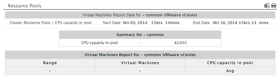
Figure 7 : The physical servers that fall within the usage range clicked on
-
Adjacent to the pie chart, you will find a bar chart that indicates the resource pools that have topped/failed in a selected performance realm (i.e., the Measure) during the specified Timeline. For example, for the Direct VMs in Pool measure, this bar chart reveals the resource pools in the cluster with the maximum direct VMs. Like the pie chart, the values for the bar chart are also calculated by applying the first of the configured functions on the chosen Measure.
Note:
You can configure the colors to be used in the distribution chart and the Top <N> Components bar chart in the zone report, by editing the eg_report.ini file in the <eg_install_dir>\manager\config directory. The [VIRTUAL_cluster] section of the file defines the 20 default colors of the distribution and bar charts:
[VIRTUAL_CLUSTER]
ChartColor=#8399b0,#ffd95a,#a4ac91,#98d980,#d5b996,#f48848,#8b8cc2,
#eb4052,#c4b3d0,#b18651,#ebb7ce,#028768,#f5c372,#887c65,#e4c536,
#b5582c,#f94989,#770d72,#97a067,#89aeb7distColor=#115fa6,#f25454,#60bd68,#b276b2,#81bef7,#a61120,#ffd13e,
#770d72,#887c65,#a4ac91
You override the default color settings of the distribution chart by modifying the color-codes specifying against distColor. For changing the colors used by the Top <N> Components chart, alter the codes listed against the ChartColor parameter.
Note:
The number of components to be displayed in the Top <N> Components bar chart is configurable. To specify the number, select Top-N from the Filter by list in , and pick an option from the adjacent drop-down list.
-
-
On the other hand, if the Report Type is Graph, the View by selection is Distribution, the Report by option is Physical Servers, and the option chosen from the Report Generation list is Foreground Generation - HTML, then, clicking the Run Report button will invoke Figure 8.

Figure 8 : The Cluster - Resource pools report where the 'View by' selection is 'Distribution' and the 'Report by' selection is 'Physical Servers'
-
Figure 8 comprises of the following:
-
A distribution pie chart that depicts the number of physical servers that are in different distribution ranges. The distribution ranges are obtained by applying the first of the configured functions on the chosen Measure. For instance, assume that Registered guests is the chosen Measure. Say that you have configured to display the Avg and Max of this measure in a Data report. Typically, both these configured values will appear only in the Data report. In the case of a Graph report however, the first of the two functions - i.e., Avg of Registered guests - alone is calculated for every physical server in the chosen Cluster. The resulting pie chart enables administrators to deduce, at a glance, the number of physical servers where the chosen performance metric has fared well and/or badly. Clicking on a particular slice in the pie chart lists the physical servers that fall within the value range represented by that slice (see Figure 9). Against every server, the actual values for each of the configured functions (both Avg and Max, in our example) will be displayed. A cluster-level Summary of the chosen Measure will also be available.
By default, the chart type for distribution is a pie chart. However, you can have a bar graph depict the same data instead of a pie chart, by following the steps given below:
- Edit the eg_report.ini file in the <EG_INSTALL_DIR>\manager\config directory.
- Change the value of the chartTypeForDist parameter in the [virtual_CENTER] section of this file from the default Pie, to Bar.
- Save the eg_report.ini file.
By default, the number of value ranges that need to be configured for the distribution chart is 10. To override this default setting, do the following:
- Edit the eg_report.ini file in the <EG_INSTALL_DIR>\manager\config directory.
- Specify a number of your choice against the nofRangeForDist parameter in the [virtual_cluster] section of this file. By default, this parameter will hold the value 10.
-
Save the eg_report.ini file.
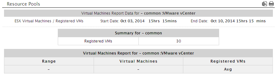
Figure 9 : The physical servers that fall within the usage range clicked on
-
Adjacent to the pie chart, you will find a bar chart that indicates the physical servers that have topped/failed in a selected performance realm (i.e., the Measure) during the specified Timeline. For example, for the Registered guests measure, this bar chart reveals the physical servers in the cluster with which the maximum number of guests have registered. Like the pie chart, the values for the bar chart are also calculated by applying the first of the configured functions on the chosen Measure.
Note:
You can configure the colors to be used in the distribution chart and the Top <N> Components bar chart in the zone report, by editing the eg_report.ini file in the <eg_install_dir>\manager\config directory. The [VIRTUAL_cluster] section of the file defines the 20 default colors of the distribution and bar charts:
[VIRTUAL_CLUSTER]
ChartColor=#8399b0,#ffd95a,#a4ac91,#98d980,#d5b996,#f48848,#8b8cc2,
#eb4052,#c4b3d0,#b18651,#ebb7ce,#028768,#f5c372,#887c65,#e4c536,
#b5582c,#f94989,#770d72,#97a067,#89aeb7distColor=#115fa6,#f25454,#60bd68,#b276b2,#81bef7,#a61120,#ffd13e,
#770d72,#887c65,#a4ac91
You override the default color settings of the distribution chart by modifying the color-codes specifying against distColor. For changing the colors used by the Top <N> Components chart, alter the codes listed against the ChartColor parameter.
Note:
The number of components to be displayed in the Top <N> Components bar chart is configurable. To specify the number, select Top-N from the Filter by list in , and pick an option from the adjacent drop-down list.
-
-
Likewise, if the Report Type is Graph, the View by selection is Distribution, and the Report for option is Virtual Machines, then picking the Foreground Generation - HTML option from the Report Generation list and clicking the Run Report button will invoke Figure 10.
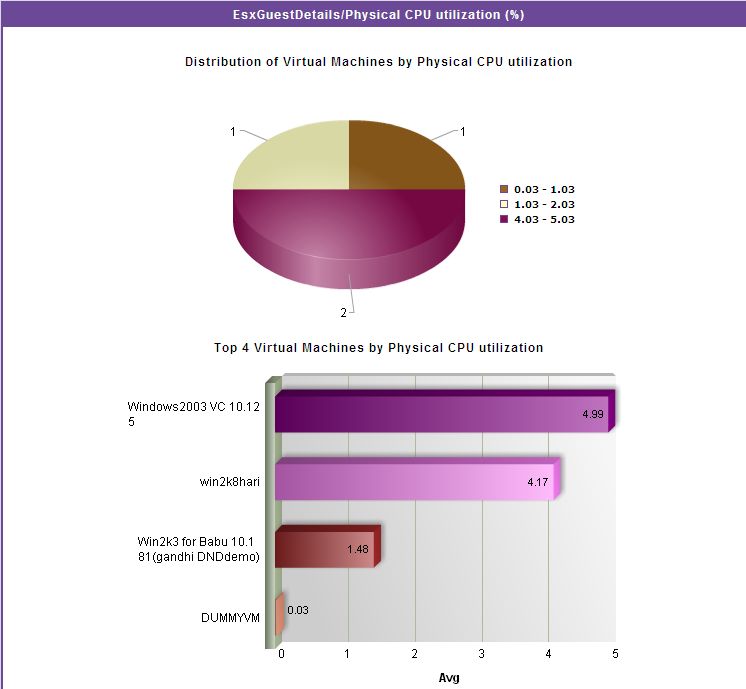
Figure 10 : A Cluster - Resource pools report that appears when the 'View by' option is 'Distribution' and 'Report by' option is 'Virtual Machines'
-
Figure 10 reveals the following:
-
A distribution pie chart that depicts the number of virtual machines that are in different distribution ranges. The distribution ranges are obtained by applying the first of the configured functions on the chosen Measure. For instance, assume that Physical CPU utilization is the chosen Measure. Say that you have configured to display the Avg and Max of this measure in a Data report. Typically, both these configured values will appear only in the Data report. In the case of a Graph report however, the first of the two functions - i.e., Avg of Physical CPU utilization - alone is calculated for every virtual machine configured on each physical server in the chosen Cluster. The resulting pie chart enables administrators to deduce, at a glance, the number of virtual machines where the chosen performance metric has fared well and/or badly. Clicking on a particular slice in the pie chart lists the VMs that fall within the value range represented by that slice (see Figure 11). Against every server, the actual values for each of the configured functions (both Avg and Max, in our example) will be displayed. A cluster-level Summary of the chosen Measure will also be available.
Note:
By default, the chart type for distribution is a pie chart. However, you can have a bar graph depict the same data instead of a pie chart, by following the steps given below:
- Edit the eg_report.ini file in the <EG_INSTALL_DIR>\manager\config directory.
- Change the value of the chartTypeForDist parameter in the [virtual_CENTER] section of this file from the default Pie, to Bar.
- Save the eg_report.ini file.
By default, the number of value ranges that need to be configured for the distribution chart is 10. To override this default setting, do the following:
- Edit the eg_report.ini file in the <EG_INSTALL_DIR>\manager\config directory.
- Specify a number of your choice against the nofRangeForDist parameter in the [virtual_cluster] section of this file. By default, this parameter will hold the value 10.
-
Save the eg_report.ini file.
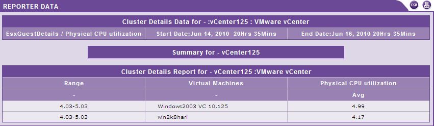
Figure 11 : The virtual machines that fall within the usage range clicked on
-
Adjacent to the pie chart, you will find a bar chart that indicates the VMs that have topped/failed in a selected performance realm (i.e., the Measure) during the specified Timeline. For example, for the Physical CPU utilization measure, this bar chart reveals the VMs in the cluster that are using CPU excessively. Like the pie chart, the values for the bar chart are also calculated by applying the first of the configured functions on the chosen Measure.
Note:
You can configure the colors to be used in the distribution chart and the Top <N> Components bar chart in the zone report, by editing the eg_report.ini file in the <EG_INSTALL_DIR>\manager\config directory. The [VIRTUAL_cluster] section of the file defines the 20 default colors of the distribution and bar charts:
[VIRTUAL_CLUSTER]
ChartColor=#8399b0,#ffd95a,#a4ac91,#98d980,#d5b996,#f48848,#8b8cc2,
#eb4052,#c4b3d0,#b18651,#ebb7ce,#028768,#f5c372,#887c65,#e4c536,
#b5582c,#f94989,#770d72,#97a067,#89aeb7distColor=#115fa6,#f25454,#60bd68,#b276b2,#81bef7,#a61120,#ffd13e,
#770d72,#887c65,#a4ac91
You override the default color settings of the distribution chart by modifying the color-codes specifying against distColor. For changing the colors used by the Top <N> Components chart, alter the codes listed against the ChartColor parameter.
Note:
The number of components to be displayed in the Top <N> Components bar chart is configurable. To specify the number, select Top-N from the Filter by list in , and pick an option from the adjacent drop-down list.
-
- If the Report Type is Data, then the View by list will no longer appear. Also, the Report by section will now allow you to choose between the Physical Servers and the Virtual Machines options. Moreover, besides enabling you to view the data pertaining to all/specific clusters managed by a chosen vCenter server, the Data report will also enable you to view the data pertaining to all/specific Resource Pools.
-
If the Report Type is Data and neither the Physical Servers nor the Virtual Machines check box is selected from Report by, then, clicking the Run Report button will reveal Figure 12.
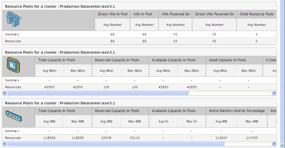
- For a particular cluster, Figure 12 provides separate sections displaying the user-configured metrics related to the CPU and memory usage of the chosen/all resource pools (depending upon the option chosen from the Resource pool list) in that cluster. This way, you can analyze cluster performance over time, and identify the resource-intensive pools in the cluster that are adversely impacting the overall cluster health.
- Besides metrics, users can also configure the functions that they want applied on the metrics, so that they receive the true picture of the performance of the cluster. The number of values displayed per measure in the report will depend upon the number of functions that the user has configured for the measure.
-
If the Physical Servers check box alone is selected from Report by, then, Figure 13 will appear upon clicking the Run Report button. As you can see, in addition to the default sections focusing on CPU and memory usage, Figure 13 provides a Physical Server Report Details section that provides an overview of the performance of all ESX servers that are part of the chosen cluster. Using this information, you can figure out whether any of the ESX servers have contributed to any deterioration in the performance of the cluster.
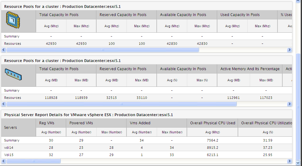
Figure 13 : A Cluster Details Report providing Physical Server information additionally
- Clicking on a Physical Server link in this section will lead you to a Server Report that zooms into the performance of the physical server that was clicked.
- This Physical Server Report section of Figure 13 will also provide you with a quick Summary of the performance of the cluster across its physical servers.
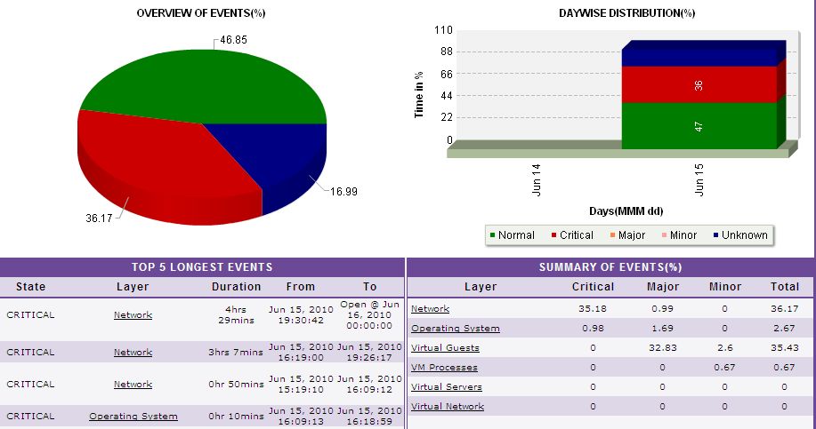
- The Health % that corresponds to every physical server included in a cluster is a good indicator of how problem-prone that physical server was during the given period. Clicking on this percentage leads you to an Executive Report of that physical server, using which you can determine the type of problems that were encountered by that server during the said period, which layers were frequently affected and on what days (see Figure 14).
-
The Heath % for the Summary row on the other hand signifies the overall health of the cluster.
-
If the Virtual Machines check box alone is selected from Report by, then, Figure 15 will appear upon clicking the Run Report button. As you can see, in addition to the default sections focusing on CPU and memory usage, Figure 15 provides a Virtual Machines section that indicates how resource-intensive each VM in the cluster is. Using this information, you can figure out whether any of the VMs have contributed to any deterioration in the performance of the cluster.
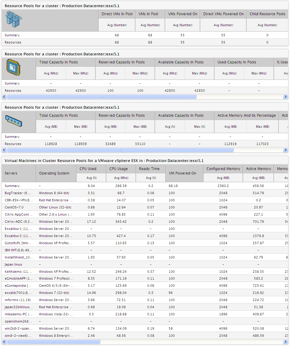
Figure 15 : A Cluster Details Report additionally providing virtual machine information
- Clicking on a VM in this section will lead you to the Virtual Machine Details report of that VM.
-
If the All option had been chosen from the Cluster list in Figure 16, the resulting report will display CPU and memory usage metrics related to every cluster configured on the chosen vCenter Server (see Figure 16). If both the Physical Servers and Virtual Machines check boxes are selected, then the report will also explore the resource usage of the ESX servers and VMs in all the clusters managed by the chosen vCenter Server (see Figure 16).
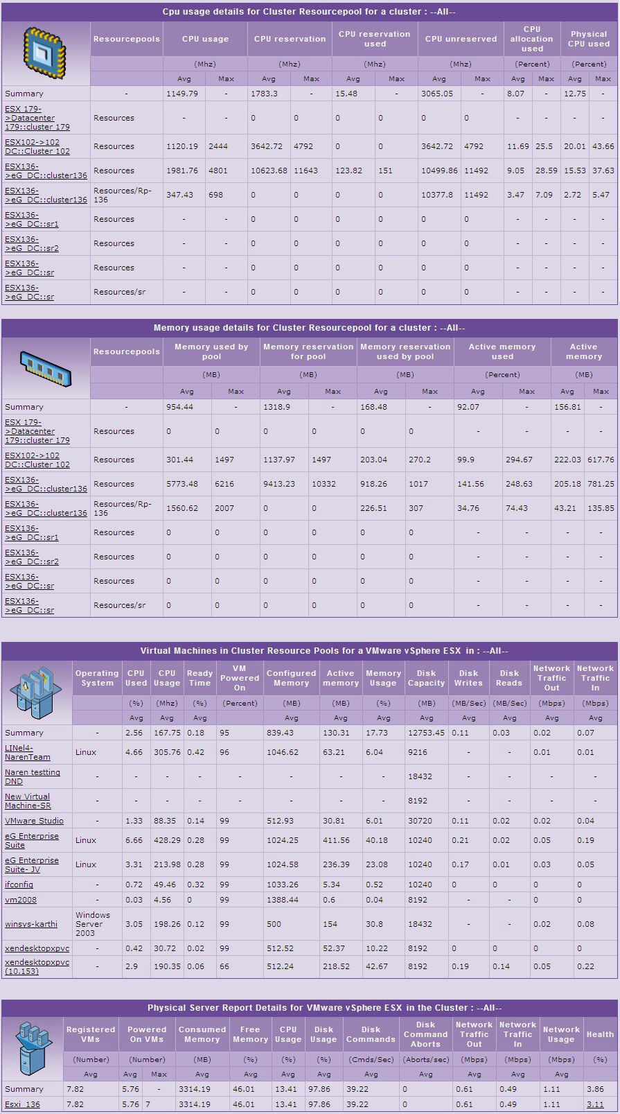
Figure 16 : The Cluster Details report revealing the CPU and memory usage of every cluster on a vCenter
-
To zoom into the performance of a particular cluster, just click on it. Figure 17 will then appear.
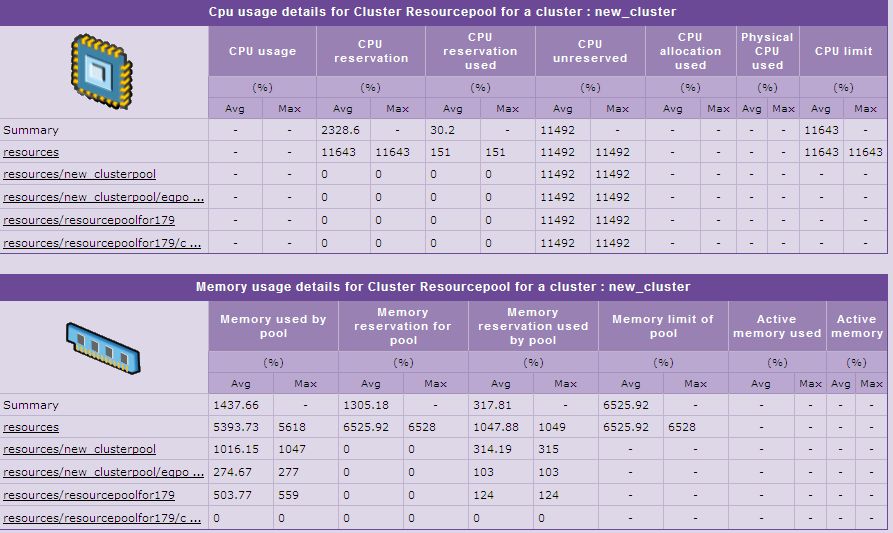
Figure 17 : A report displaying the details of a particular cluster
- On the other hand, if the Background Save - PDF option is chosen from the Report Generation list, then clicking on the Run Report button will not generate the report and display it in this page for your benefit. Instead, a message indicating that the report is being processed in the background will appear. This will be accompanied by a link that will lead you to the page that lists all the reports that are being processed in the background, and their current status. If background report generation fails for a report, you can regenerate that report using this page, or can even delete that report if need be. On the other hand, if background processing successfully completes for your report, then, you can view a PDF of the report by clicking on the
 icon in that page.