The System Dashboard
Clicking on the System tab page in will take you to Figure 1, which reveals a System Dashboard.
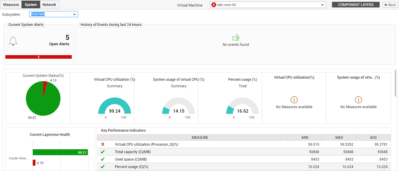
Figure 1 : The System Dashboard
The System Dashboard, using raw and graphically represented data, helps you understand how the critical resources of the guest operating system are being currently utilized, and how usage has changed over time. Besides enabling you to promptly detect over-utilization of resources, this dashboard also helps you accurately determine when such an unhealthy usage trend began and what caused it - is it owing to the improper allocation of virtual resources or the execution of one/more resource-intensive processes on the VM?
The contents of the dashboard typically vary based on the Subsystem chosen. By default, the System Dashboard provides an overview of VM performance. Accordingly, the Overview option is chosen from the Subsystem list by default. To zoom into the usage of a particular resource allocated to the VM, you can pick the corresponding option from the Subsystem list (i.e., CPU/Disk/Memory). On the other hand, if you want to analyze the uptime of the VM, choose Uptime as the Subsystem.
Each of these subsystems have been dealt with in detail in the sections that will follow.
-
Overview
To receive a macro view of the health of a VM, select Overview from the Subsystem list. Figure 2 then appears.
Figure 2 : The System Overview Dashboard
The contents of the Overview dashboard are as follows:
-
The Current System Alerts section indicates the number and type of issues currently encountered by the guest operating system.
-
While the Current System Alerts focuses on current problems, the History of Events section provides a snapshot of problem situations in the past. By default, the bar chart in this section indicates the number and type (i.e., priority) of problems that affected VM operations during the last 24 hours. To know what these issues were, click on a particular bar in the bar chart. The page that appears next provides elaborate details of the problems of that priority.
- Click on the Back to Dashboard link at the right, top corner of that page to return to the dashboard.
- Once back in the dashboard, shift your focus to Current System Status section within. The pie chart in this section helps you quickly determine how healthy the guest operating system currently is. The slices in this pie chart typically indicate the percentage of measures that are currently in various states (normal/unknown/major/minor/critical).
- Next to the pie chart, you will find a series of dial charts indicating how well the VM is currently utilizing the CPU and disk space resources allocated to it. Abnormal resource usage by a VM can be instantly detected using these dial charts.
- To know the current configuration of the VM, refer to the System Configuration section (not shown in Figure 2). This section will appear only if the eG license enables the Configuration Management module. If not, then a Current Layerwise Health section (shown in Figure 2) will appear instead. This section displays a bar chart that indicates the percentage of system-related measures mapped to the Inside View of VMs layer that are in various states currently; this indicates how problem-prone the VM currently is.
-
To be promptly alerted to any change in the state of critical system-related parameters, refer to the Key Performance Indicators section. This section displays a pre-configured list of key resource usage metrics that govern the overall health of the VM. For every measure, the current value reported by that measure and the measure state will be available. Clicking on a measure name here will take you to Figure 3 that reveals the problem layer and test that reports the measure.
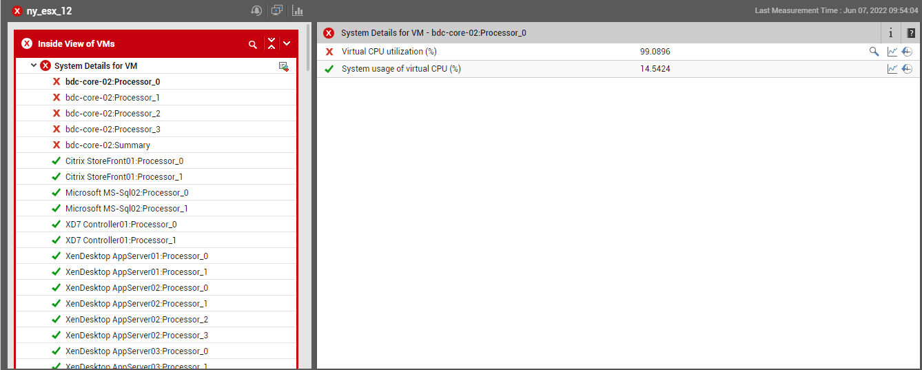
Figure 3 : The layer model page that appears upon clicking on a key performance indicator
-
Below the Key Performance Indicators section, the dashboard provides a variety of measure graphs and top-n bar charts that facilitate effective analysis of both past and current performance (see Figure 4).
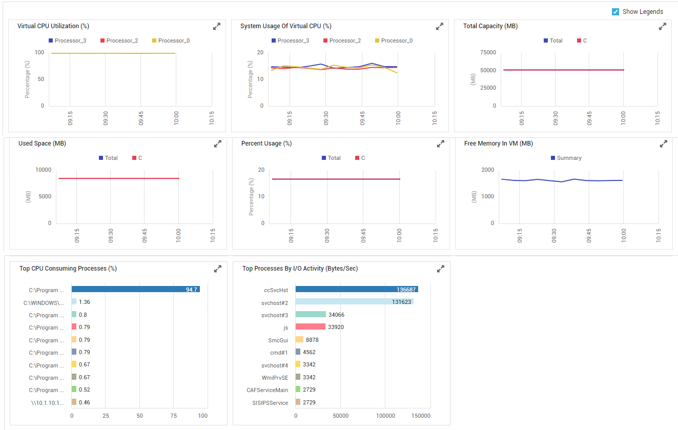
Figure 4 : Measure graphs and Top-N bar charts in the Overview dashboard
-
The graphs section begins with a series of measure graphs that reveal the time-of-day variations in the virtual resource usage during the last 1 hour (by default). In the event of excessive resource usage by the VM, these graphs will help you determine whether the increase in resource consumption happened suddenly or over time. This way, you can accurately figure out when a resource contention actually originated, and then investigate further as to what caused it. Some of these measure graphs may be plotted for multiple descriptors, and may hence appear cluttered. To view these graphs clearly and to analyze their performance implications better, click on the
 icon in the corresponding graph and enlarge it. In the enlarged mode (see Figure 5), you can even change the Timeline of the graph, so as understand how performance has varied over a longer period of time.
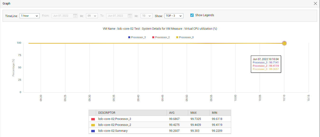
Figure 5 : An enlarged measure graph in the Overview Dashboard
-
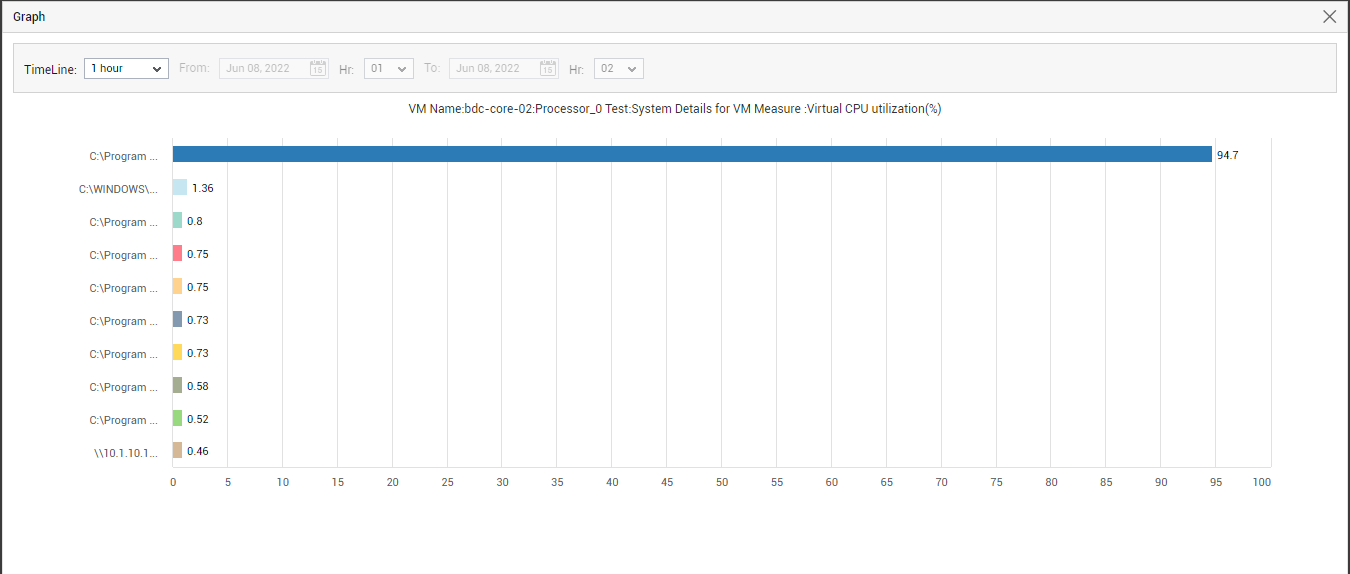
After the measure graphs, top-n bar charts are available in the dashboard (see Figure 4). Each of these bar charts reveal the most CPU-intensive, memory-intensive, and I/O-intensive processes that are currently executing on the VM, thus taking you a step closer to the root-cause of any resource contention that might have occurred currently on the VM. Sometimes, you might want to investigate issues with resource usage that might have occurred in the past, in an effort to zero-in on the process(es) that caused the issue. To achieve this, you need to alter the timeline of the bar charts. For this purpose, click on the required bar chart to enlarge it. Figure 6 will then appear. The enlarged bar chart allows you to change the Timeline, so that you can easily view the top resource-intensive processes that executed on the VM during the specified time period, and instantly detect root-cause.
-
-
CPU
While the Overview subsystem provides you with quick insights into the overall resource usage situation on the VM, to know how the individual resources are utilized, you would have to select the corresponding option from the Subsystem list. Select CPU as the Subsystem if you want to focus only on the current and historical CPU usage of the VM, and promptly detect potential CPU bottlenecks. Upon selecting this option, Figure 7 will appear.
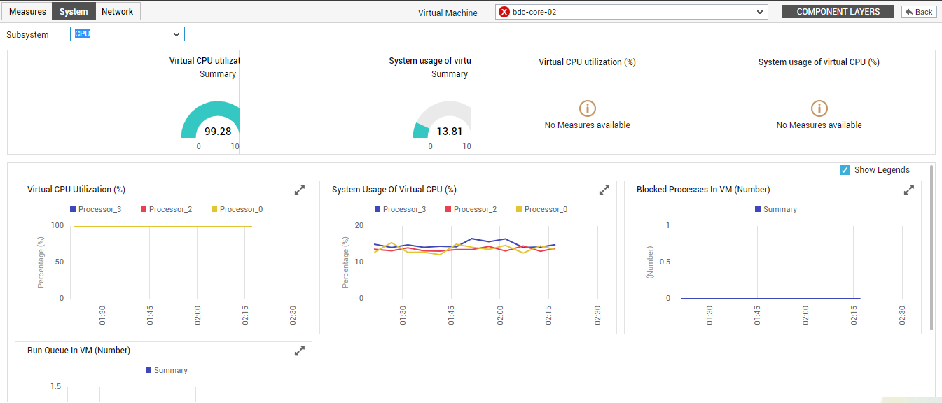
Figure 7 : The Dashboard of the CPU Subsystem
- Using dial charts and displays, Figure 8 provides a quick summary of virtual CPU usage of the chosen VM, across all its processors. In the event of excessive CPU usage by the VM, you can use this section to quickly identify the processor that is contributing to this problem condition.
- Below this section, a collection of measure graphs are available that facilitate effective analysis of CPU usage over time. Using tthese graphs, you can figure out how CPU was utilized by the VM during the last 1 hour (by default). In the event of unusually high CPU consumption by the VM, these measure graphs will help you understand whether this increase in CPU usage is just a sudden, one-off incident, a phenomenon that occurred frequently during the last hour (by default), or an anomaly that aggravated over time.
-
To change the timeline of the measure graphs, so that usage analysis can be performed over longer time periods, click on the
icon in the measure graph of interest to you. This will enlarge the measure graph (see Figure 8). In the magnified mode, you can modify the Timeline of the graph. Also, by default, the measure graph is plotted only for the top-3 processors, in terms of CPU usage. In the enlarged mode, you can configure the graph to plot usage metrics related to more or less number of processors. For this, select a different option from the Show drop-down (see Figure 8). 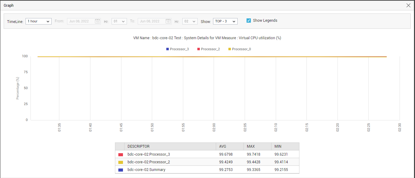
Figure 8 : Enlarged bar chart in the CPU subsystem dashboard
-
Memory
Be proactively alerted to current and probable memory contentions with the help of the Memory Dashboard that appears when the Memory option is chosen as the Subsystem (see Figure 9).
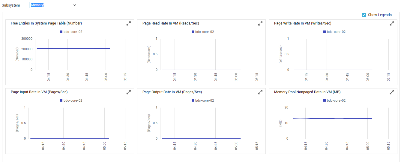
Figure 9 : The Dashboard of the Memory Subsystem
If a memory contention is noticed, then the graphs provided in the dashboard will enable you to figure out when the memory drain began, and what caused it. The graphs section typically begins with measure graphs which indicate how the VM has been using its allocated memory resources over the past 1 hour (by default). In the event of excessive memory usage by the VM, you can use these graphs to figure out whether the VM suddenly became memory-hungry, or has been consuming memory excessively for a while. If the memory usage has been consistently high, then you might want to go further back in time - i.e., beyond the default 1 hour period - to determine when exactly the memory depletion began. For this, you will have to change the timeline of that measure graph that will aid your investigation. To alter the timeline of a graph, click on the
icon in that graph to enlarge it, and then modify its Timeline. -
Disk
To closely observe disk usage and disk activity on a VM and to proactively identify partitions that are running out of space, select Disk from the Subsystem list. The Disk Dashboard of ‘ appears.
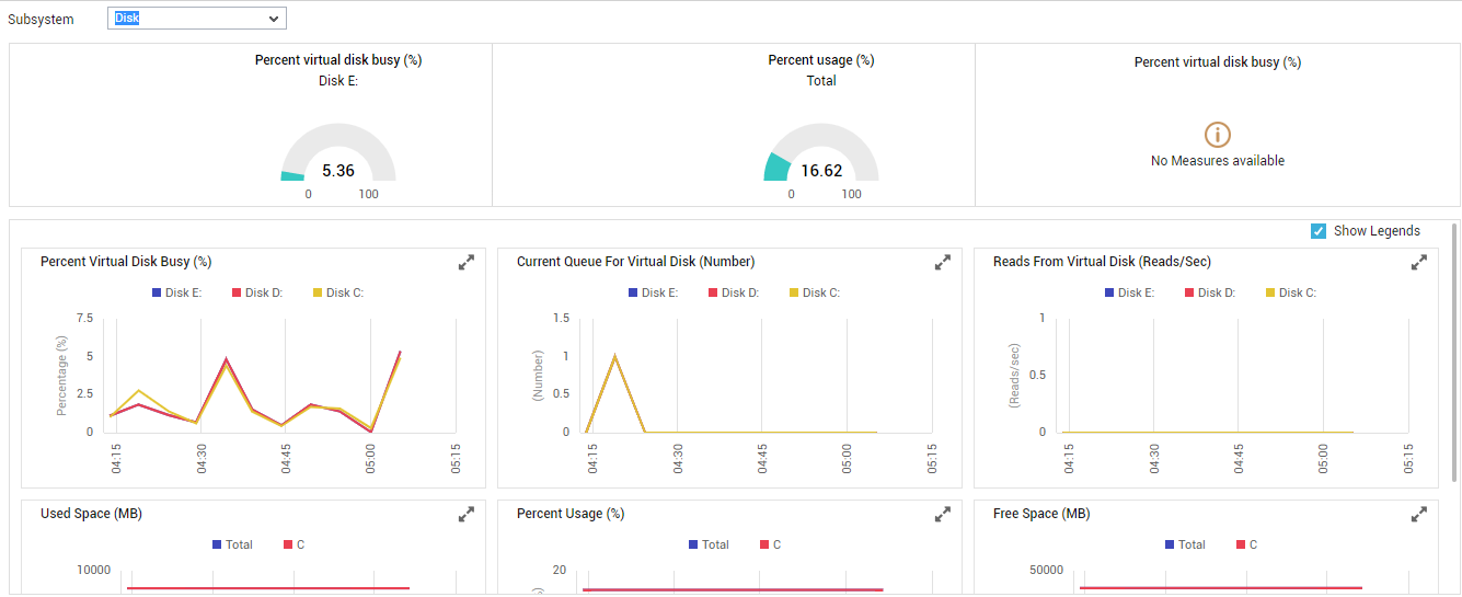
Figure 10 : The Dashboard of the Disk Subsystem
The contents of this dashboard are as follows:
- For real-time updates on disk activity levels and disk space usage of the chosen VM, use the dial charts provided at the top of this dashboard. These dial charts provide you with a quick summary of disk space usage across all disk partions of the VMs. From these dial charts, you can be promptly alerted to abnormal I/O activity or excessive disk space consumption on the target VM.
-
To know which disk partition on the VM is experiencing performance issues, take a look at the measure graphs that follow the dial charts. The measure graphs in Figure 10 depict the time-of-day variations in disk usage and disk activity for the top-3 (by default) disk partitions of the VM over a default period of 1 hour. Using these graphs, the following can be ascertained:
-
How has disk space been utilized across the virtual disks over the last 1 hour? Is any disk exhibiting excessive usage trends? If so, which disk partition is it, and when during the last hour did this trend begin?
-
How busy were the virtual disks during the last hour? Which disk was the busiest?
-
Are all virtual disks able to process requests quickly, or are too many I/O requests currently enqueued for a disk? If so, which disk is it?
-
Was any sudden/steady increase noticed in the length of the I/O request queue of a disk during the past hour?
-
- However, analysis of an hour’s data might not be enough at all times. For instance, the free space on a virtual disk might have decreased gradually, but steadily over a time span of say 1 week. This anomaly might not be evident in a 1-hour graph. You need to plot a graph for a week to figure this out. Therefore, to facilitate usage analysis over longer time windows, eG Enterprise allows you to change the timeline of the measure graphs. For this, simply click on the icon in the measure graph of interest to you to enlarge it. In the magnified mode, you not only get to alter the graph Timeline, but can also study the graph more clearly.
- Also, by default, the measure graph is plotted only for the top-3 partitions, in terms of activity/space usage (as the case may be). In the enlarged mode, you can configure the graph to plot usage metrics related to more or less number of partitions. For this, select a different option from the Show drop-down.
-
Uptime
If Uptime is chosen as the Subsystem, the resulting dashboard enables you to promptly detect unscheduled reboots and determine how long the VM has been down (see Figure 10.
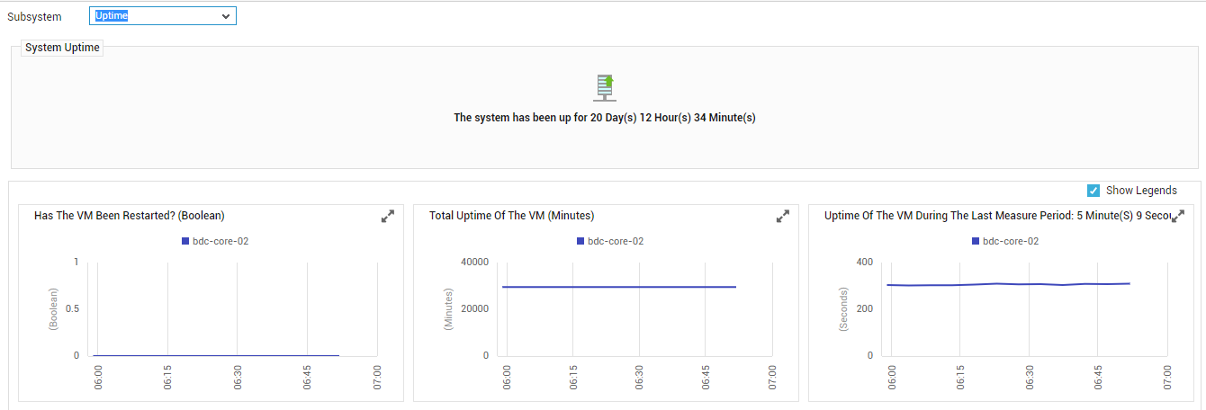
Figure 11 : The Uptime Dashboard
The contents of this dashboard are as follows:
- The System Uptime section indicates the total time for which the VM has been up since its last reboot.
- The measure graphs that appear below indicate how long during the last hour (by default) the system has been up, whether the reboots scheduled for the system have occurred during the last hour or not, and how long during the last measurement period was the system up. Using these measure graphs, you can accurately determine reboot failures/prolonged VM downtime.
- To alter the timeline of a graph, click on the icon in to enlarge it, and then change the Timeline in the enlarged mode.