Monitoring Components using eG Monitor App
To zoom into the status of a component, first click a particular component-type in the Home tab screen. Upon clicking the component type, the list of managed components of that particular type will be displayed as shown in Figure 1.
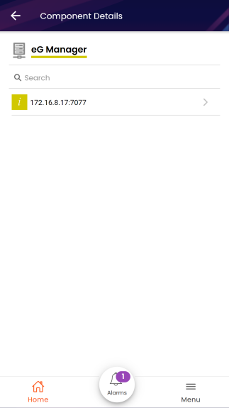
Figure 1 : All managed components of a particular type
Clicking on a specific component of a type will lead you to a Layers screen that displays the layer model pertaining to the eG Manager component as shown in the Figure 2. eG represents every component it monitors as a set of hierarchical layer. Each layer of the layer model is mapped to tests that measure the health of that layer. Figure 2 reveals the layer model of a eG Manager component.
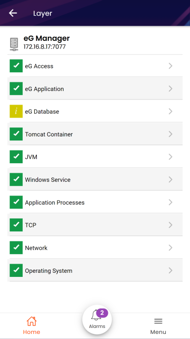
Figure 2 : Layer model of the eG Manager component
The state of each layer is determined by the state of the tests that are associated with it and the state of the measures that the tests report. Here, you will have to click on each layer to view the tests associated with it.
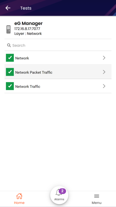
Figure 3 : Tests pertaining to the Network layer
Next, clicking on the test name or descriptor of the test (if any) will list the measures reported by that test as shown in the Figure 4.
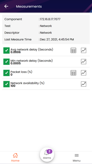
Figure 4 : Measures reported by the Network test
While the Measurements screen reports the current state of each measure, you can also quickly analyze the historical performance of a measure by invoking a time-of-day graph of that measure. The graph can be launched by clicking on  icon provided alongside the measure name (see Figure 4). By default, the graph plots the values registered by that measure during the last hour as shown in Figure 5. You can also change the time duration for plotting the graph by choosing options from the drop-down provided at the left corner of the graph window. The Graph window also contains with the icons for sharing the graph and downloading the graph as an image.
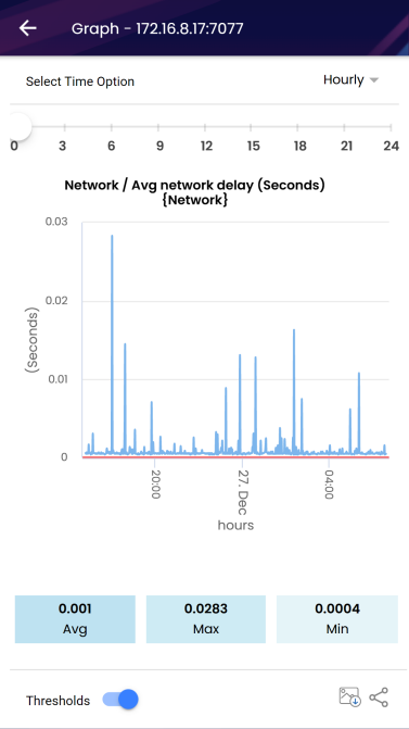
Figure 5 : A graph indicating the variations that occurred in the Average network delay (Seconds)) measure
If you wish to share the graph with others, you can do so by clicking the  icon in the Graph window. When this icon is clicked, the list of sharing applications such as Facebook, WhatsApp, etc., on your mobile device will be displayed. From the list, you can select anyone of the applications of your choice and can share the graph. You can also download and can save the graph as an image using the
  icon.
icon.
Using the Thresholds on/off slider in the bottom-right corner of the Graph window, you can view the preset threshold levels on the graph, if any (see Figure 5) . Likewise, you can disable it using the on/off slider when you don't want to see the threshold lines on the graph.
If the detailed diagnosis capability has been enabled for a test, you can also instantly access the detailed metrics reported by that test and thus identify the root cause of a problem reported by that test. You can view the detailed diagnosis of a measure (see Figure 6) by clicking the  icon. For instance, Figure 6 reveals the detailed diagnosis of the Average network delay (Seconds) measure for the eG Manager.
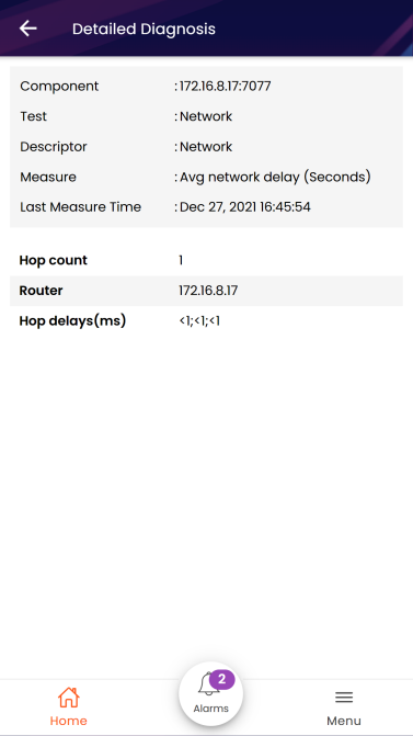
Figure 6 : The detailed diagnosis of a measure
The eG Mobile App not only sends the performance issues as push notifications but also sends the alerts as In-App messages instantly when the mobile app is in use. The In-App messages notify you the problem issues within minutes of their occurrence. For instance, Figure 7 shows the In-App message received for the alert generated due to the more number of application errors found in the event log of the Windows component.
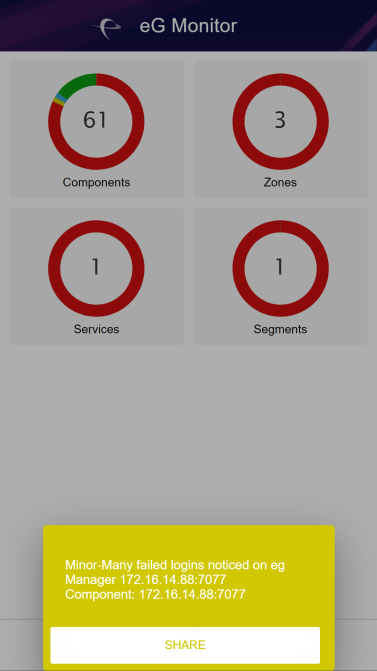
Figure 7 : In-App message showing an alert generated due to failed logins
The In-App message displays the alert message, the component name, the component type, and the time stamp at which the alert was generated. The In-App message prompt contains the icons for sharing the alert information with others and for viewing the graph instantly. You can also view the detailed diagnosis of the measure by clicking on the magnifying glass icon.