SQLDatabases
Select the SQLDatabases option from the Subsystem list to know how efficiently the databases are used by the MS SQL application and how well the database has been responding to the queries from other applications. Upon selection, Figure 1 will appear.
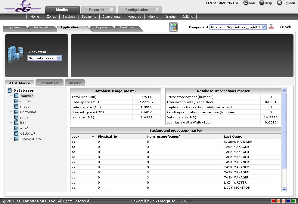
Figure 1 : The At-A-Glance tab page of the SQLDatabases Dashboard
The contents of this dashboard are as follows:
- The At-A-Glance tab page lists the databases that are available at present in the MS SQL application, in the Databases section. Upon selecting a database, the detailed measures corresponding to that particular database is available in a context-sensitive right panel. For instance, if master database is selected, then in the right panel, the Database Usage section will provide the usage details like Total size, etc. Also the Database Transactions section provides the relevant transaction measures The Background processes section will list out all the background process available for the users who are accessing that particular database. By default, the background process list provided by this section is sorted in the alphabetical order of the User. If need be, you can change the sort order so that the processes are arranged in, say, the descending order of values displayed in the Physical_io column - this column displays the physical io location of each user connected to the database. To achieve this, simply click on the column heading – Physical_io. Doing so tags the Physical_io label with a down arrow icon - this icon indicates that the background process list is currently sorted in the descending order of physical io location. To change the sort order to ‘ascending’, all you need to do is just click again on the Physical_io label or the down arrow icon. Similarly, you can sort the process list based on any column available in the Background processes section. Likewise the right panel may consist of Running processes and Sleeping processes sections, if those particular processes are available for execution in the selected database. Similarly CPU cycles rate section may also be available for the databases. This section reveals the number of CPU cycles taken by the server for each host available in the target MS SQL application. The columns available in this section can also be sorted in the same manner as that of the Background processes section.
-
The Comparison tab page that follows the At-A-Glance tab page provides a series of top-10 charts, using which you can isolate the databases that are leading the lot in the following fields: Size, Log Size and Active transactions. This default list of fields (i.e., measures) for top-n chart generation can be overridden by following the steps discussed below:
- Click on the
 icon at the top of the Application Dashboard. In the Dashboard Settings window that appears, select Application from the Module list, and SQLDatabases from the Sub-System list.
 - To add new measures for which top-n graphs are to be displayed in the Comparison tab page, first, pick the Comparison Graph option from the Add/Delete Measures for list. Upon selection of this option, the pre-configured measures for comparison graphs will appear in the Existing Value(s) list.
- Next, select the Test that reports the said measure, pick the measure of interest from the Measures list, provide a Display name for the measure, and click the Add button to add the chosen measure to the Existing Value(s) list.
- If you want to delete one/more measures for which comparison graphs pre-exist in the Comparison tab page, then, as soon as you choose the Comparison Graph option from the Add/Delete Measures for list, pick any of the displayed measures from the Existing Value(s) list, and click the Delete button.
- Finally, click the Update button to register the changes.
Note:
Only users with Admin or Supermonitor privileges can enable/disable the system, network, and application dashboards, or can customize the contents of such dashboards using the Dashboard Settings window. Therefore, whenever a user without Admin or Supermonitor privileges logs into the monitoring console, the
button will not appear. 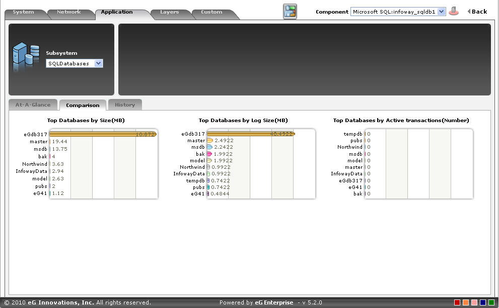
Figure 2 : The Comparison tab page of the SQLDatabases dashboard
- Click on the
-
To view the complete list of databases, simply click on the corresponding graph in Figure 2. This enlarges the graph as depicted by Figure 3.
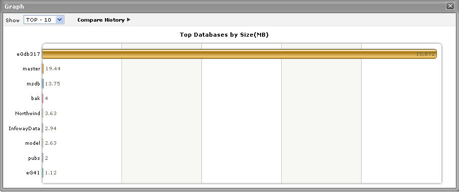
Figure 3 : The expanded top-n graph in the Comparison tab page of the SQLDatabases Dashboard
- Though the enlarged graph lists all the databases by default, you can customize the enlarged graph to display the details of only a few of the best/worst-performing databases by picking a top-n or last-n option from the Show list in Figure 3.
- Another default aspect of the enlarged graph is that it pertains to the current period only. Sometimes however, you might want to know what occurred during a point of time in the past; for instance, while trying to understand the reason behind a sudden increase in the Size of the databases on a particular day last week, you might want to first determine which database has behaved abnormally on the same day. To figure this out, the enlarged graph allows you to compare the historical performance of databases. For this purpose, click on the Compare History link in Figure 3 and select the TimeLine of your choice.
- The History tab page below, by default, provides a series of measure graphs that reveal how well the databases have been performing over the default duration of the last 24 hours. If the performance of the databases dramatically decreases, it could indicate that the databases are experiencing performance issues. In such a case, a look at these measure graphs will help you figure out when exactly the bottleneck surfaced - did it happen suddenly or is it a condition that has become worse with time?
-
The default duration of 24 hours can be overridden using the procedure discussed below:
- Click on the icon at the top of the Application Dashboard.
- In the Dashboard Settings window that appears, select History Graph from the Default Timeline for list.
- Then, choose a Timeline for the graph.
- Finally, click the Update button.
Note:
Only users with Admin or Supermonitor privileges can enable/disable the system, network, and application dashboards, or can customize the contents of such dashboards using the Dashboard Settings window. Therefore, whenever a user without Admin or Supermonitor privileges logs into the
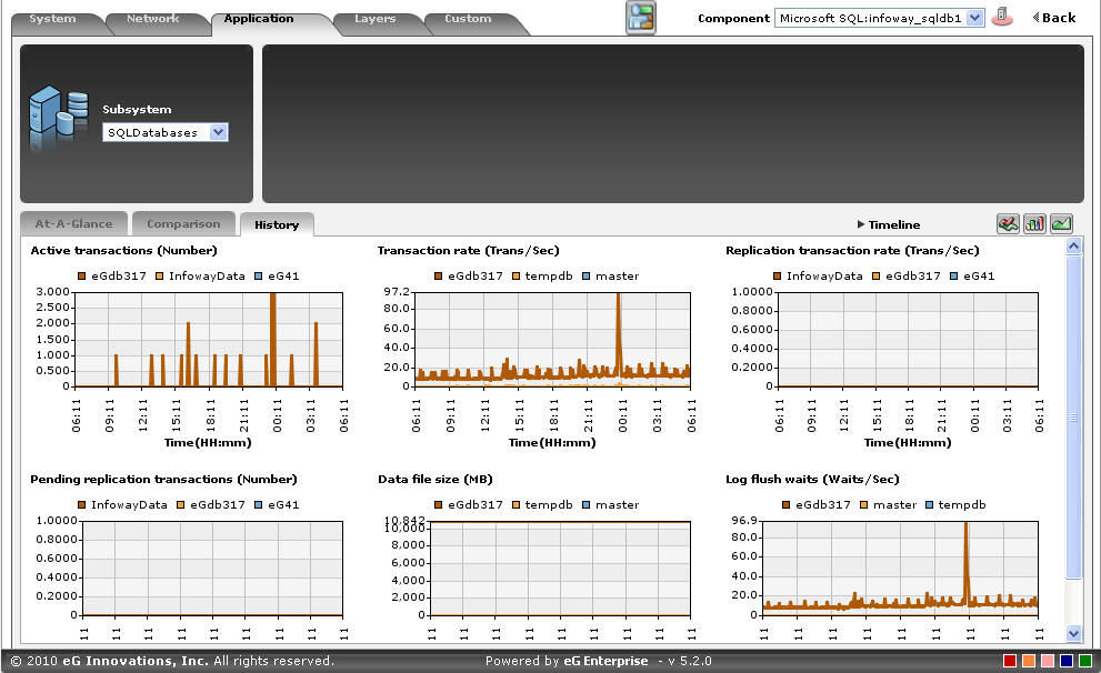
Figure 4 : The History tab page of the SQLDatabases dashboard
- Click on the
-
If need be, you can even alter the timeline of all these measure graphs so that you can analyze performance across days and weeks; for this, simply click the Timeline link at the right, top corner of the History tab page and change the timeline for the graphs using the calendar that pops out. To change the timeline of a single graph alone, simply click on that graph to enlarge it, and then modify the Timeline of the graph in the enlarged mode. Though the enlarged graph lists all the databases by default, you can customize the enlarged graph to display the details of only a few of the best/worst-performing databases by picking a top-n or last-n option from the Show list. In the enlarged mode, you can even change the dimension of the measure graph (3d / 2d).
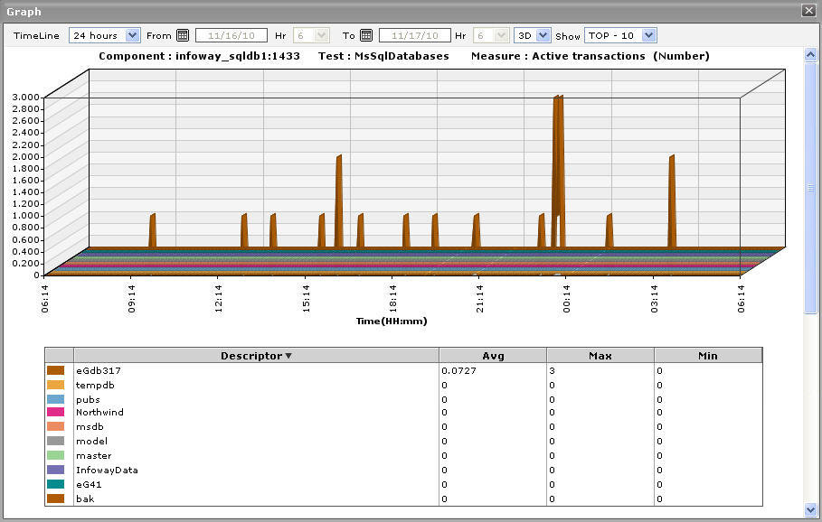
Figure 5 : An enlarged measure graph in the History tab page of the SQLDatabases dashboard
-
To determine the service level achievements of the databases, you need to view summary graphs of the measures and not the default measure graphs. For this, just click on the
 icon at the right, top corner of the History tab page. Figure 6 then appears.
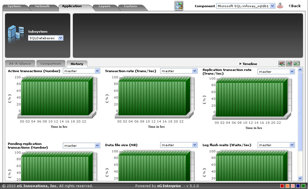
Figure 6 : Summary graphs displayed in the SQLDatabases Dashboard
- The summary graphs displayed in Figure 6 reveal the percentage of time the MS SQL application experienced problems in one of its databases. Besides revealing the efficiency of your administrative staff in recognizing bottlenecks and mitigating them, these summary graphs also indicate whether the databases has been able to maintain the assured performance levels during the default duration of 24 hours.
-
To override this default duration, follow the steps below:
- Click on the icon at the top of the Application Dashboard.
- In the Dashboard Settings window that appears, select Summary Graph from the Default Timeline for list.
- Then, choose a Timeline for the graph.
- Finally, click the Update button.
- Click on the
- In case of the summary graphs too, you can change the Timeline of all graphs by clicking on the Timeline link at the right, top corner of the History tab page. To alter the timeline of a single graph, here again, you will have to click on that graph, enlarge it, and modify the timeline. Also, by default, hourly summaries are plotted in the summary graph; you can configure these graphs to plot daily/monthly summaries instead by picking the relevant option from the Duration list in the enlarged mode.
-
To analyze past trends in the performance of the databases, click on the
 icon at the right, top corner of the History tab page. Figure 7 will then appear.
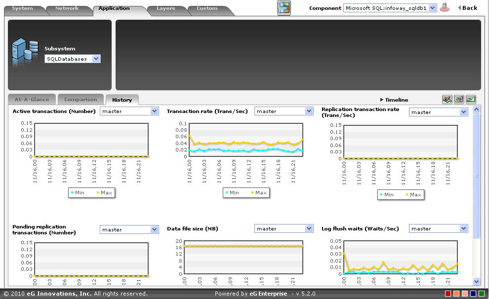
Figure 7 : Trend graphs displayed in the SQLDatabases Dashboard
- These trend graphs, by default, plot the minimum and maximum values that every measure registered during each hour of the last 24 hours (by default). Using such graphs, you can accurately point to the time windows during which there was a lull in the transaction of the selected database. Here again, you can change the timeline of all graphs using the Timeline link in Figure 7, or just a particular graph by clicking on it and enlarging it.
-
For changing the default duration (of 24 hours) of the trend graphs, do the following:
- Click on the icon at the top of the Application Dashboard.
- In the Dashboard Settings window that appears, select Trend Graph from the Default Timeline for list.
- Then, choose a Timeline for the graph.
- Finally, click the Update button.
- Click on the
-
In addition, when a trend graph is enlarged, it is not just the Timeline that you can modify. The Duration of the graph can also be altered. By default, trend graphs reveal only the hourly trends in performance. By picking the relevant option from the Duration list, you can ensure that the trend graph in question plots daily/monthly trend values instead. Also, in the enlarged mode, the Graph type can also be modified. Since the default Graph type is Min/Max, the trend graph, by default, reveals the minimum and maximum values registered by a measure. If need be, you can select the Avg or Sum option from the Graph type list to plot average trend values of a measure or sum of trends (as the case may be) in the graph.
Note:
In case of descriptor-based tests, the Summary and Trend graphs displayed in the History tab page typically plot the values for a single descriptor alone. To view the graph for another descriptor, pick a descriptor from the drop-down list made available above the corresponding summary/trend graph.
- At any point in time, you can switch to the measure graphs by clicking on the
 button.
 -
Typically, the History tab page displays measure, summary, and trend graphs for a default set of measures. If you want to add graphs for more measures to this tab page or remove one/more measures for which graphs pre-exist in this tab page, then, do the following:
- Click the button at the top of the dashboard.
- The Dashboard Settings window then appears. From the Module list of Figure 20, pick Application, choose SQLDatabases as the Sub-System, and then, select History Graph from the Add/Delete Measures for list.
- The measures for which graphs pre-exist in the History tab page will be automatically displayed in the Existing Value(s) list. To delete a measure, and in effect, its corresponding graph as well, select the measure from the Existing Value(s) list, click the Delete button, and then click the Update button.
- To add a new graph, first, pick the Test that reports the measure for which a graph is to be generated.
- Next, select the Measure of interest.
- Provide a Display name for the measure. Then, click the Add button to add the measure to the Existing Values(s) list. Finally, click the Update button.
- This will add a new measure, summary, and trend graph for the chosen measure to the History tab page.
Note:
Only users with Admin or Supermonitor privileges can enable/disable the system, network, and application dashboards, or can customize the contents of such dashboards using the Dashboard Settings window. Therefore, whenever a user without Admin or Supermonitor privileges logs into the monitoring console, the
button will not appear. - Click the