SQLMemory
If you want to assess how efficiently the Microsoft SQL application uses the memory resources available to it, and thus promptly detect issues related to the memory-intensive measures, select the SQLMemory option from the Subsystem list.
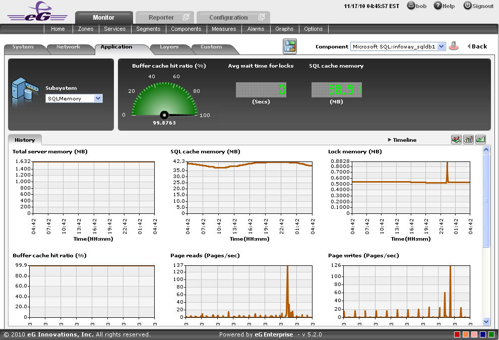
Figure 1 : Figure 3.49: The SQLMemory Dashboard
The contents of this dashboard are discussed hereunder:
- The dashboard begins with a dial and digital graphs section, which enables you to visually track the changes that are happening in the measures related to the memory related measures that are available in the Microsoft SQL application. For instance, the Buffer cache hit ratio pertaining to the SQL Memory can be viewed at a single glance. Clicking on a dial/digital graph will lead you to the layer model page of the Microsoft SQL Application; this page will display the exact layer-test combination that reports the measure represented by the dial/digital graph.
-
The History tab page displays time-of-day graphs for all the memory-related measures for a default time duration of 24 hours. You can override this default timeline (of 24 hours) by following the steps below:
- Click on the
 icon at the top of the Application Dashboard.
 - In the Dashboard Settings window that appears, select History Graph from the Default Timeline for list.
- Then, choose a Timeline for the graph.
- Finally, click the Update button.
Figure 2 : The History tab page of the SQLMemory Dashboard
- Click on the
-
Say, you suddenly notice that the Page reads measure has increased; in such a case, you can use these measure graphs to figure out when during the last 24 hours there was an increase in the number of pages that was read per second. If required, you can even look beyond the last 24 hours - i.e., you can find out whether the anomaly originated much earlier. For this, you just need to click on the graph of interest to you. This will enlarge the graph; in the enlarged mode, you can alter the graph Timeline, so that the performance of that measure can be analyzed over a broader time window. In this mode, you can even change the graph dimension from 3d to 2d, or vice-versa.
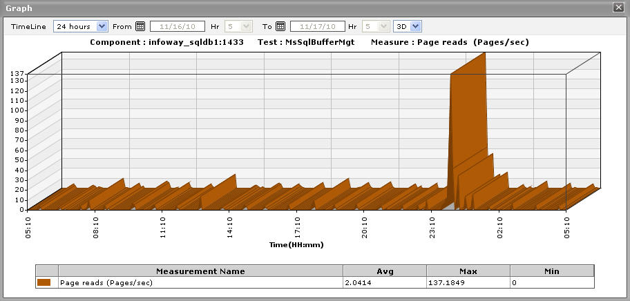
Figure 3 : An enlarged measure graph in the History tab page of the SQLMemory dashboard
- To view summary graphs of these memory-related measures instead of the default measure graphs, just click on the
 icon at the right, top corner of the History tab page. Figure 4 will then appear. The summary graphs of Figure 4 reveal the percentage of time during the last 24 hours (by default) the Microsoft SQL application has been affected by memory-related issues, and the type of issues (whether critical/major/minor) the application was experiencing. These graphs help determine whether the assured service levels were delivered or not.
 -
The default duration (of 24 hours) of the summary graphs can be overridden by following the procedure discussed below:
- Click on the icon at the top of the Application Dashboard.
- In the Dashboard Settings window that appears, select Summary Graph from the Default Timeline for list.
- Then, choose a Timeline for the graph.
- Finally, click the Update button.
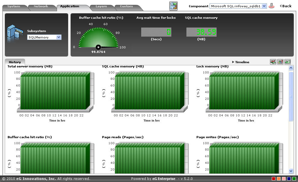
Figure 4 : Summary graphs displayed in the History tab page of the SQLMemory Dashboard
- Click on the
- Use the Timeline link at the right, top corner of the tab page to change the timeline of all the summary graphs at one shot. For altering the timeline of a single graph, click on it; this will enlarge the graph. In the enlarged mode, you can change the Timeline of the summary graph and modify the dimension (3D/2D) of the graph. Also, by default, hourly summaries are plotted in the summary graph; you can configure these graphs to plot daily/monthly summaries instead by picking the relevant option from the Duration list in the enlarged mode.
- If you want to view the past trends in the memory performance, click on the
 icon at the right, top corner of the History tab page. Figure 5 will then appear. Using the trend graphs displayed in Figure 5, you can better assess the current capacity of your application and can accordingly plan its future capacity. By default, these trend graphs plot the maximum and minimum values registered by every memory-related measure during every hour of the last 24 hours. From this data, you can clearly figure out when during the last 24 hours the application performance has peaked and when it has been below-normal.
 -
The default duration (of 24 hours) of the trend graphs can be overridden by following the procedure discussed below:
- Click on the icon at the top of the Application Dashboard.
- In the Dashboard Settings window that appears, select Trend Graph from the Default Timeline for list.
- Then, choose a Timeline for the graph.
- Finally, click the Update button.
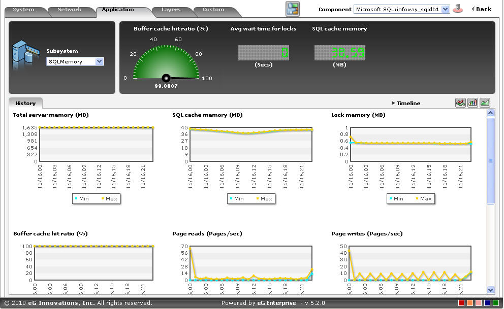
Figure 5 : Trend graphs displayed in the History tab page of the SQLMemory Dashboard
- Click on the
-
Use the Timeline link at the right, top corner of the tab page to change the timeline of all the trend graphs at one shot. For altering the timeline of a single graph, click on it; this will enlarge the graph. In the enlarged mode, you can change the Timeline of the trend graph and modify the dimension (3D/2D) of the graph. Also, by default, hourly trends are plotted in the trend graph; you can configure these graphs to plot daily/monthly trend values instead by picking the relevant option from the Duration list in the enlarged mode. Moreover, by default, the trend graphs plot only the minimum and maximum values registered by a measure during the specified timeline - this graph will enable you to isolate those times at which performance of that measure had peaked and the times it had fared poorly. If need be, you can select the Avg option from the Graph type list in the enlarged mode to make sure that the trend graph plots the average trend values for the specified timeline. Alternatively, you can select the Sum option from the Graph type list to have the trend graph plot the sum of trends for the specified timeline.
Note:
In case of descriptor-based tests, the Summary and Trend graphs displayed in the History tab page typically plot the values for a single descriptor alone. To view the graph for another descriptor, pick a descriptor from the drop-down list made available above the corresponding summary/trend graph.
- At any point in time, you can switch to the measure graphs by clicking on the
 button.
 -
Typically, the History tab page displays measure, summary, and trend graphs for a default set of measures. If you want to add graphs for more measures to this tab page or remove one/more measures for which graphs pre-exist in this tab page, then, do the following:
- Click the button at the top of the dashboard.
- The Dashboard Settings window then appears. From the Module list of Figure 20, pick Application, choose SQLMemory as the Sub-System, and then, select History Graph from the Add/Delete Measures for list.
- The measures for which graphs pre-exist in the History tab page will be automatically displayed in the Existing Value(s) list. To delete a measure, and in effect, its corresponding graph as well, select the measure from the Existing Value(s) list, click the Delete button, and then click the Update button.
- To add a new graph, first, pick the Test that reports the measure for which a graph is to be generated.
- Next, select the Measure of interest.
- Provide a Display name for the measure. Then, click the Add button to add the measure to the Existing Values(s) list. Finally, click the Update button.
- This will add a new measure, summary, and trend graph for the chosen measure to the History tab page.
Note:
Only users with Admin or Supermonitor privileges can enable/disable the system, network, and application dashboards, or can customize the contents of such dashboards using the Dashboard Settings window. Therefore, whenever a user without Admin or Supermonitor privileges logs into the monitoring console, the
button will not appear. - Click the