SQLService
The SQLService option is picked from the Subsystem list to know about the overall performance of the Microsoft SQL application such as server health, session activity, access capacity of the server etc, in detail. Upon selecting this Subsystem, Figure 1 will appear.
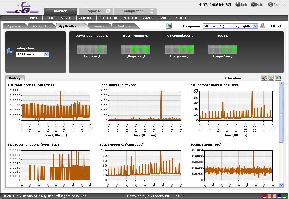
Figure 1 : The SQLService Dashboard
The contents of the SQLService dashboard are as follows:
- A digital display section for some critical session activity and access capability measures is included for an easy and single glance view. When a digital display is clicked, the corresponding layer-test combination which reports that particular measure will be displayed from the layer model page of the Microsoft SQL application.
-
The History tab page as shown in Figure 1, by default, displays time-of-day graphs revealing how well the application has been performing over a default period of 24 hours. If the eG agent reports any abnormal behavior of the Microsoft SQL application, these graphs will help determine when exactly in the last 24 hours the abnormality occurred. This default duration of 24 hours can be overridden using the following steps:
- Click on the
 icon at the top of the Application Dashboard.
 - In the Dashboard Settings window that appears, select History Graph from the Default Timeline for list.
- Then, choose a Timeline for the graph.
- Finally, click the Update button.
Note:
Only users with Admin or Supermonitor privileges can enable/disable the system, network, and application dashboards, or can customize the contents of such dashboards using the Dashboard Settings window. Therefore, whenever a user without Admin or Supermonitor privileges logs into the monitoring console, the
button will not appear. - Click on the
-
A careful study of this graph over time periods longer than 24 hours, can reveal intermittent breaks (if any) in the session activity and access capability measures of this Microsoft SQL application. To ensure that all graphs plot values for longer time periods, click on the Timeline link at the right, top corner of the History tab page, and then change the timeline using the calendar that pops out. To modify the timeline for a particular graph alone, click on the graph to enlarge it (see Figure 2), and alter the timeline in the enlarged mode. Besides the timeline, you can even change the graph dimension (3d / 2d) in the enlarged mode.
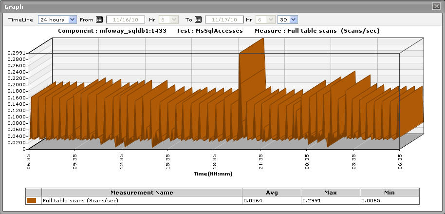
Figure 2 : The enlarged history graph of the SQLService dashboard
- Sometimes, you might have to periodically determine the percentage of time for which the Microsoft SQL application experienced problems relating to the databases. To determine such problems, summary graphs are useful. To view summary graphs in the History tab page, click on the
 icon at the right, top corner of the History tab page. These summary graphs reveal the percentage of time during the last 24 hours (by default) the Microsoft SQL application has experienced issues related to the SQL service. To override this default timeline, do the following:
- Click on the icon at the top of the Application Dashboard.
- In the Dashboard Settings window that appears, select Summary Graph from the Default Timeline for list.
- Then, choose a Timeline for the graph.
- Finally, click the Update button.
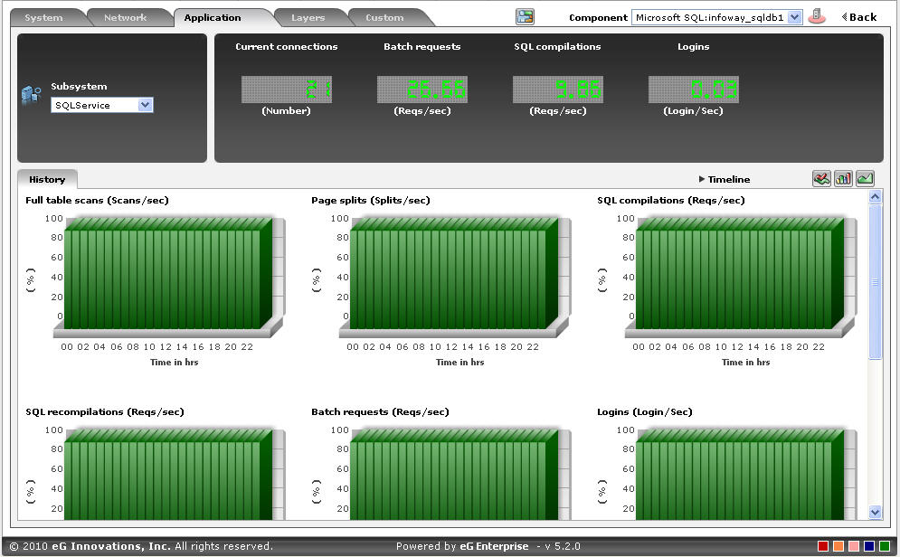
Figure 3 : The summay graphs for the SQLService dashboard
- Click on the
- To perform the summary analysis over a broader time window, click on the Timeline link at the right, top corner of the History tab page and change the timeline;this will alter the timeline for all the graphs. To change the timeline of a particular graph alone, click on the graph to enlarge it, and then alter its timeline. Also, by default, hourly summaries are plotted in the summary graph;you can configure these graphs to plot daily/monthly summaries instead by picking the relevant option from the Duration list in the enlarged mode. Here again, the graph dimension (3d / 2d) can be altered.
- Similarly, you can analyze uptime trends by viewing trend graphs in the History tab page. For this, click on the
 icon at the right, top corner of the tab page. These trend graphs, by default, plot the minimum and maximum values registered by every SQL application-related measure during every hour for the last 24 hours. The default duration of 24 hours can be overridden using the procedure discussed below:
- Click on the icon at the top of the Application Dashboard.
- In the Dashboard Settings window that appears, select Summary Graph from the Default Timeline for list.
- Then, choose a Timeline for the graph.
- Finally, click the Update button.
- Click on the
-
To perform trend analysis over a longer time span, click on the Timeline link at the right, top corner of the History tab page and change the timeline; this will alter the timeline for all the graphs. To change the timeline of a particular graph alone, click on the graph to enlarge it, and then alter its timeline. In addition to the timeline, the graph dimension (3d / 2d), the graph Duration, and the Graph type can also be changed in the enlarged mode. By default, the graph Duration is Hourly, indicating that trend graphs plot hourly trend values by default. To ensure that these graphs plot the daily/monthly trend values instead, select the relevant option from the Duration list. Similarly, as already mentioned, trend graphs plot only the minimum and maximum values registered by a measure during the specified timeline. Accordingly, the Graph type is set to Min/Max by default in the enlarged mode. If you want the trend graph to plot the average trend values instead, set the Graph type to Avg. On the other hand, to configure the trend graph to plot the sum of trends set the Graph type to Sum.
Note:
In case of descriptor-based tests, the Summary and Trend graphs displayed in the History tab page typically plot the values for a single descriptor alone. To view the graph for another descriptor, pick a descriptor from the drop-down list made available above the corresponding summary/trend graph.
- At any point in time, you can switch to the measure graphs by clicking on the
 button.
 -
Typically, the History tab page displays measure, summary, and trend graphs for a default set of measures. If you want to add graphs for more measures to this tab page or remove one/more measures for which graphs pre-exist in this tab page, then, do the following:
- Click the button at the top of the dashboard.
- The Dashboard Settings window then appears. From the Module list of , pick Application, choose SQLService as the Sub-System, and then, select History Graph from the Add/Delete Measures for list.
- The measures for which graphs pre-exist in the History tab page will be automatically displayed in the Existing Value(s) list. To delete a measure, and in effect, its corresponding graph as well, select the measure from the Existing Value(s) list, click the Delete button, and then click the Update button.
- To add a new graph, first, pick the Test that reports the measure for which a graph is to be generated.
- Next, select the Measure of interest.
- Provide a Display name for the measure. Then, click the Add button to add the measure to the Existing Values(s) list. Finally, click the Update button.
- This will add a new measure, summary, and trend graph for the chosen measure to the History tab page.
Note:
Only users with Admin or Supermonitor privileges can enable/disable the system, network, and application dashboards, or can customize the contents of such dashboards using the Dashboard Settings window. Therefore, whenever a user without Admin or Supermonitor privileges logs into the monitoring console, the
button will not appear. - Click the