Hyper-V Switches
-
Selecting the Hyper-v switches option from the Subsystem list will invoke a Hyper-v switches dashboard that serves as a single console from which you can observe the network traffic flowing into and out of the virtual switches associated with a Hyper-V server, identify abnormalities in traffic patterns, isolate virtual switches that are experiencing heavy network traffic, and review historical performance of the switches to ascertain whether such traffic-related anomalies occurred sporadically or regularly.
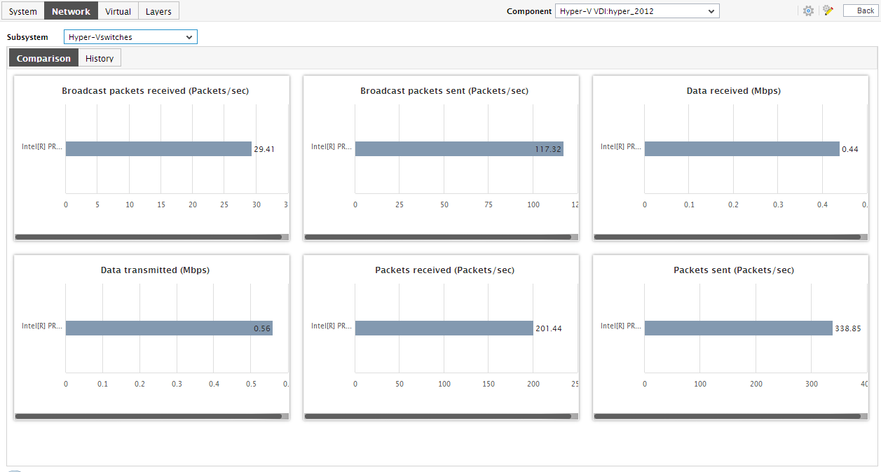
- The Comparison tab page, as the name suggests, displays comparison bar charts for pre-configured measures. With the help of these bar charts, you can effortlessly point to the virtual switch that is experiencing heavy traffic. To view a graph clearly, click on it. This will enlarge the graph. In the enlarged mode too, by default, the graph will only reveal the top-10 virtual switches in that performing sphere. You can choose a different top-n or last-n option from the Show list in the enlarged graph for viewing a few other best/worst performers.
-
For receiving greater visibility into the historical performance of the virtual switches, use the History tab page. Clicking on this tab page will reveal measure graphs for a default set of traffic-related metrics, each of which will indicate how well the corresponding measure has performed across switches during the last 24 hours (by default).
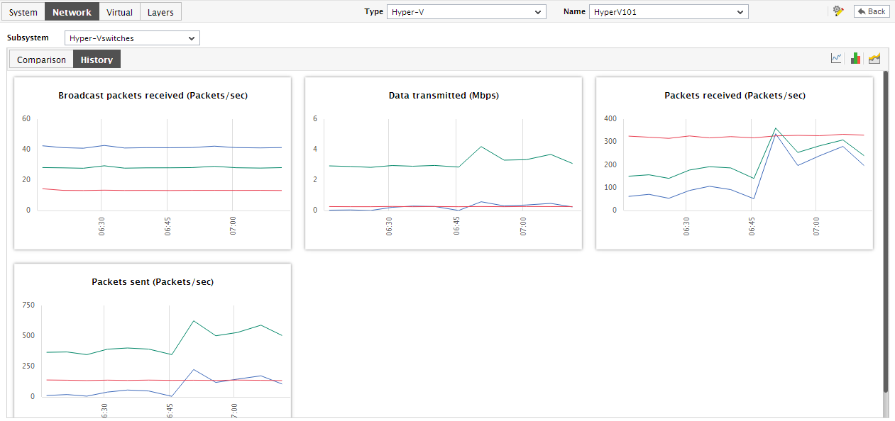
Figure 2 : The History tab page of the Hyper-V Switches dashboard
- In the event of an abnormality, you can use these historical measure graphs to ascertain whether the issue occurred suddenly or is only the climax of a consistent performance deterioration over time.
-
To view a measure graph clearly, click on it. The graph will then enlarge as depicted by Figure 3.
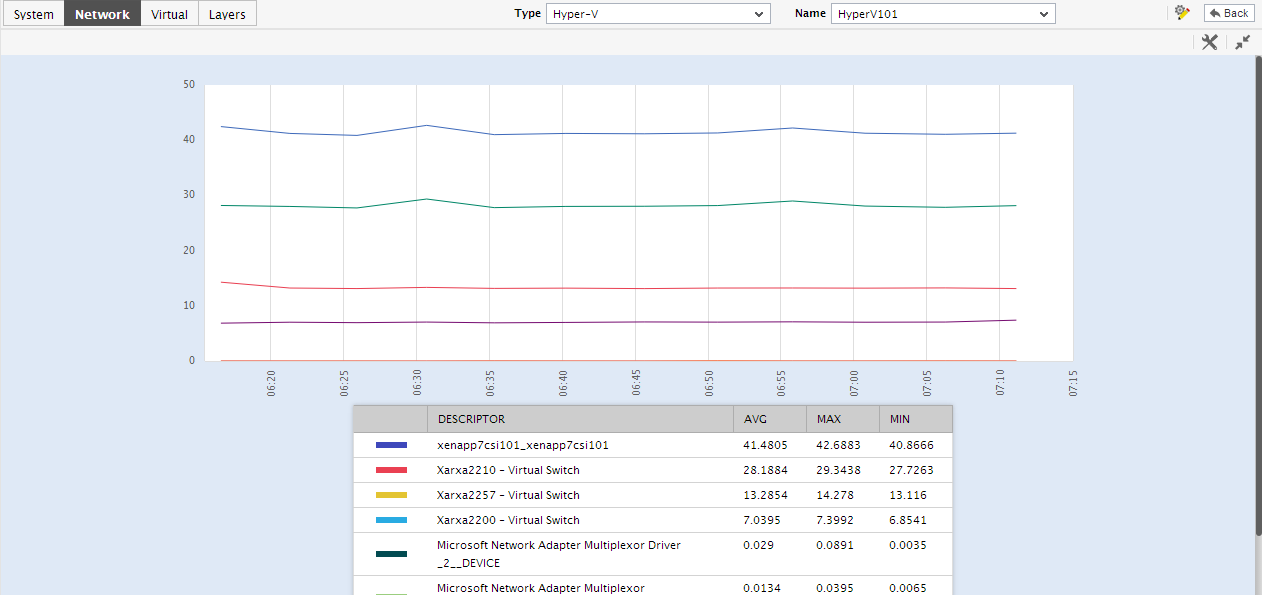
Figure 3 : An enlarged measure graph in the History tab page of the Hyper-V Network Adapters dashboard
- You can change the Timeline of the graph in the enlarged mode, or pick a different top-n or last-n option from the Show list to view the historical performance of a few other best/worst virtual switches.
-
To view the percentage of time during the last 24 hours for which a virtual switch was affected by issues, click on the
 icon at the right, top corner of Figure 4.
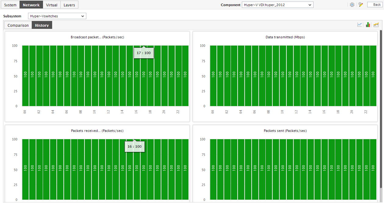
Figure 4 : Summary graphs in the History tab page of the Hyper-V Switches dashboard
- Using the graphs in Figure 1, you can effectively perform service level audits and detect when and what type of network issues caused the agreed-upon service levels to be compromised.
-
Similarly, click on the
 icon at the right, top corner of the History tab page in Figure 2 to view and analyze the past trends in virtual switch performance. By default, the trend graphs will pertain to the last 24 hours.
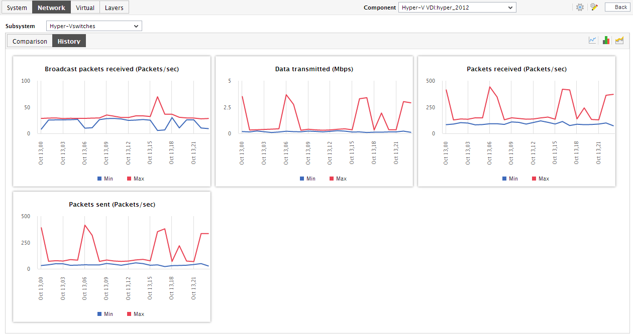
Figure 5 : The Trend graphs in the Hyper-V Switches dashboard
- Using these trend graphs, you can determine when the performance of a virtual switch peaked and when it hit rock bottom - this way, you can easily infer how a virtual switch's load patterns have varied during the last 24 hours, and thus receive a heads-up on potential switch-related anomalies.
- You can click on a trend graph to enlarge it. An enlarged summary/trend graph allows you to alter the graph Duration - i.e., view the daily or monthly summary/trend information, instead of the default hourly data in the graphs.
-
Moreover, by default, the trend graphs in the History tab page plot the minimum and maximum values of a measure during the given timeline. In enlarged trend graphs, you can view the Graph type, the average values or sum of trend values are plotted below the graphs.
Note:
In case of descriptor-based tests, the Summary and Trend graphs displayed in the History tab page typically plot the values for a single descriptor alone. To view the graph for another descriptor, pick a descriptor from the drop-down list made available above the corresponding summary/trend graph.
- At any point in time, you can switch to the measure graphs by clicking on the
 button.
 - If need be, you can instantly change the timeline of the measure/summary/trend graphs in the History tab page by clicking on the Timeline link at the right, top corner of the tab page.
- Typically, the History tab page displays measure graphs for a default set of measures.