Hyper-V Network Adapters
While monitoring Hyper-V and Hyper-V VDI environments, the Network Dashboard comes embedded with two additional sub-systems, namely - Hyper-V Network Adapters and Hyper-V Switches.
The Hyper-V Network Adapters dashboard provides you with a quick look at the current and historical performance of the network adapters used by a Hyper-V host. Using this dashboard, you can be proactively alerted to real and potential irregularities in load-balancing across the adapters, and identify those adapters that may be experiencing unusually heavy load.

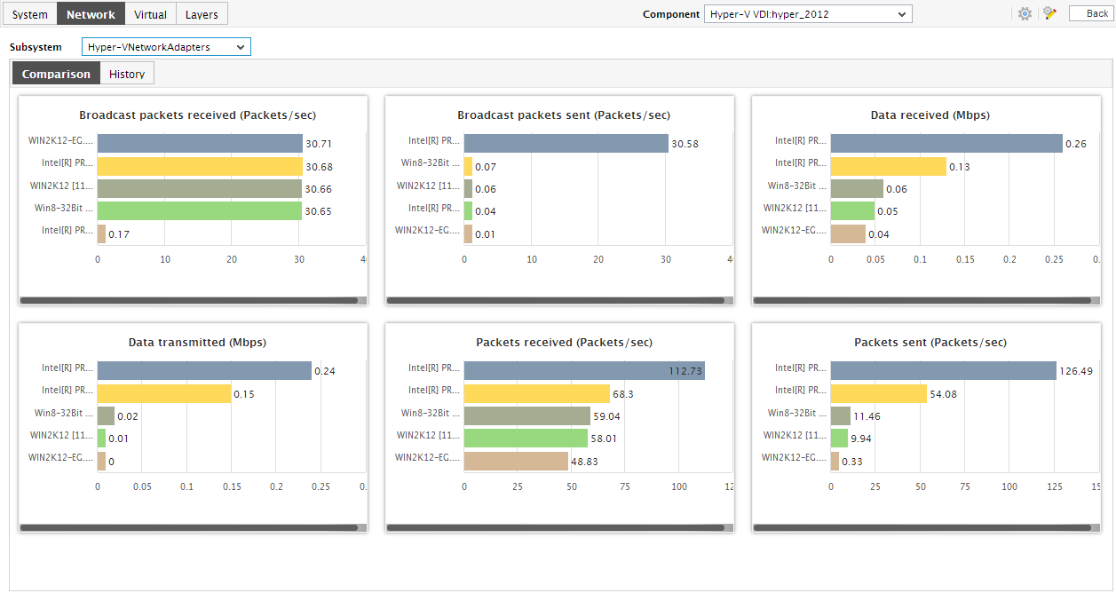
Figure 1 : The Hyper-V Network Adapters Dashboard
- The dashboard begins with digital graphs for a default set of metrics, which indicate the data/packet load currently handled by the network adapters. The eG Enterprise system automatically compares the current value of a pre-configured metric across all adapters, picks the maximum value, and displays this high watermark in the digital format in the dashboard. A look at these digital graphs will hence instantly reveal whether any adapter is currently experiencing unhealthy load patterns. In the event of an abnormality, you can simply move your mouse pointer over the problem digital graph to know which network adapter is responsible for the anomaly. Alternatively, click on the digital graph, so that you can view the layer, test, descriptor (i.e., network adapter), and measure that has deviated from the norm.
-
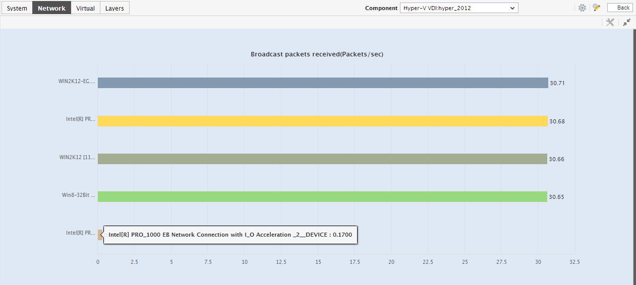
The Comparison tab page, as the name suggests, displays comparison bar charts for pre-configured measures. With the help of these bar charts, you can effortlessly determine on which network adapter load is abnormally high. To view a graph clearly, click on it. Figure 2 will then appear.

Figure 2 : An enlarged comparison graph in the Hyper-V Network Adapters dashboard
- In the enlarged mode too, by default, the graph will only reveal the top-10 network adapters in that performing sphere. You can choose a different top-n or last-n option from the Show list in Figure 2 for viewing a few other best/worst performers.
- For receiving greater visibility into the historical performance of the network adapters, use the History tab page. Clicking on this tab page will reveal measure graphs for a default set of load-related metrics, each of which will indicate how well the corresponding measure has performed across adapters during the last 24 hours (by default).
- In the event of an abnormality, you can use these historical measure graphs to ascertain whether the issue occurred suddenly or is only the climax of a consistent performance deterioration over time.
- To view a measure graph clearly, click on it.
- You can change the Timeline of the graph in the enlarged mode, or pick a different top-n or last-n option from the Show list to view the historical performance of a few other best/worst network adapters.
-
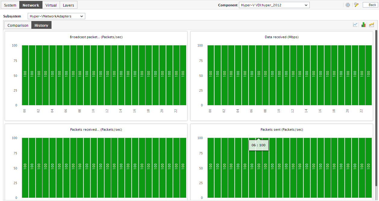
To view the percentage of time during the last 24 hours for which a network adapter was affected by issues, click on the
 icon at the right, top corner.
Figure 3 : Summary graphs in the History tab page of the Hyper-V Network Adapters dashboard
- Using the graphs in Figure 4, you can effectively perform service level audits and detect when and what type of network issues caused the agreed-upon service levels to be compromised.
-
Similarly, click on the
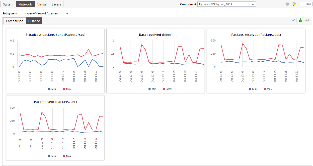
 icon at the right, top corner of the History tab page in Figure 4 to view and analyze the past trends in network adapter performance. By default, the trend graphs will pertain to the last 24 hours.
 You can click on a summary graph to enlarge it.

Figure 4 : The Trend graphs in the Hyper-V Network Adapters dashboard
- Using these trend graphs, you can determine when the performance of a network adapter peaked and when it hit rock bottom - this way, you can easily infer how a network adapters load patterns have varied during the last 24 hours, and thus receive a heads-up on potential adapter-related anomalies.
- You can click on a trend graph to enlarge it. An enlarged summary/trend graph allows you to alter the graph Duration - i.e., view the daily or monthly summary/trend information, instead of the default hourly data in the graphs.
-
Moreover, by default, the trend graphs in the History tab page plot the minimum and maximum values of a measure during the given timeline. In enlarged trend graphs, you can change the Graph type so that the average values or sum of trend values are plotted in the trend graphs instead.
Note:
In case of descriptor-based tests, the Summary and Trend graphs displayed in the History tab page typically plot the values for a single descriptor alone. To view the graph for another descriptor, pick a descriptor from the drop-down list made available above the corresponding summary/trend graph.
- At any point in time, you can switch to the measure graphs by clicking on the
 button.
 - If need be, you can instantly change the timeline of the measure/summary/trend graphs in the History tab page by clicking on the Timeline link at the right, top corner of the tab page.