Virtual Network
In order to provide in-depth insights into the network traffic handled by the virtual networks on a vSphere/ESX server, the Network Dashboard of such a server supports a specialized Virtual Network sub-system. Figure 1 depicts the Virtual Network dashboard that appears when the Virtual Network option is chosen from the Subsystem list.
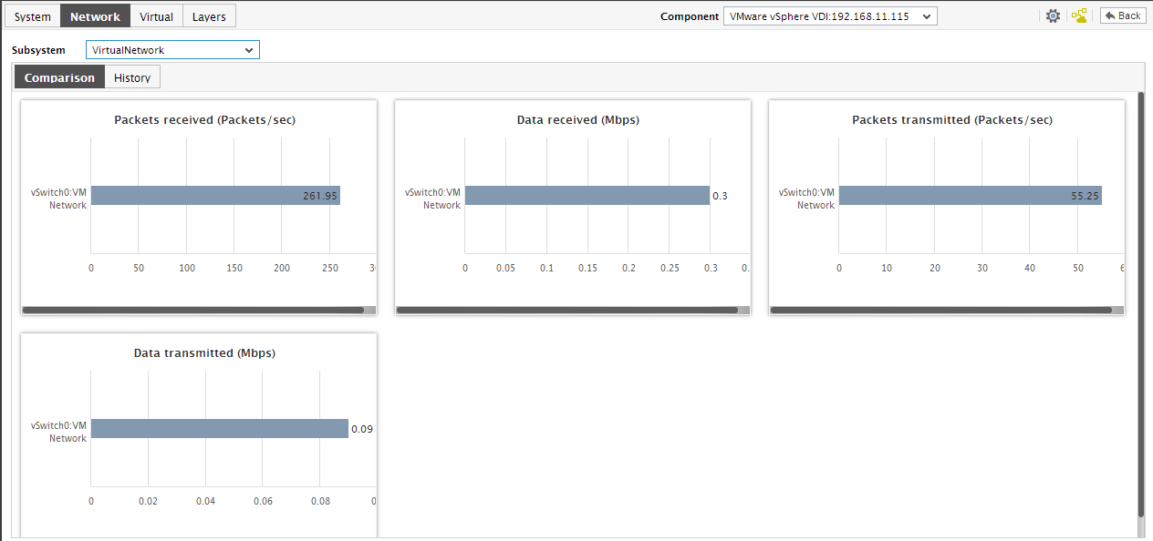
Figure 1 : The Virtual Network Dashboard
- To the right of the Subsystem list in the Virtual Network dashboard, you will find a series of digital graphs displaying the current values for a pre-configured set of measures related to the traffic handled by the virtual networks. Network traffic congestions and the number of VMs affected by such a congestion can be instantly detected with the help of these default digital displays
- Below the digital graphs, you will find the Comparison tab page. This tab page provides comparison bar graphs, which, by default, graphically compare the data and packet traffic handled by the vSwitches servicing the virtual networks. Using these default comparison graphs, you can accurately identify which vSwitches are experiencing heavy traffic.
- If a comparison graph appears to be very cluttered, then, you can view the graph clearly by clicking on it - this will enlarge the graph. In the enlarged mode, you can clearly view the top-10 (by default) virtual switches in a specific performance area, and thus identify that switch that has performed well/badly in that area. If need be, you can pick a different top-n or last-n option from the Show list in the enlarged mode so that, you can focus on the performance of more or a less number of vSwitches.
-
However, to perform a more elaborate historical analysis of the performance of virtual networks, you need to switch to the History tab page. This tab page displays a default set of measure graphs that track the variations in the traffic to/from each of the vSwitches during the last 24 hours (by default).
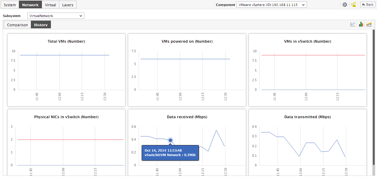
Figure 2 : The History tab page in the VirtualNetwork Dashboard
-
To instantly change the timeline of the measure graphs, click on the graph; this will enlarge the graph. Click on the Settings option and change the Timeline for the graph.
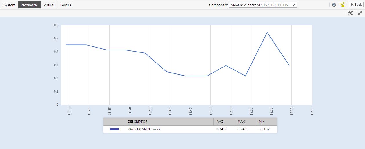
Figure 3 : The enlarged history graph in the History tab page of the VirtualNetwork dashboard
- Besides the timeline, by default every measure graph will plot the values for the top-10 vSwitches on a vSphere/ESX server. If required, you can choose to view the historical performance of a more or a less number of vSwitches in the graph, by picking a different top-n or last-n option from the Show list in the enlarged mode.
-
Instead of the time-of-day variations, if you prefer to view a quick summary of virtual network performance across vSwitches so that, service level slippages are brought to light, click on the
 icon at the right, top corner of the History tab page. Summary graphs revealing the service level achievements of the pre-configured measures during the last 24 hours (by default), will then appear.
Figure 4 : Summary graphs displayed in the History tab page of the VirtualNetwork dashboard
- If you want to alter the timeline of a single graph alone, click on the graph; this will enlarge the graph.
- Besides the timeline, an enlarged summary graph allows you to alter the graph Duration - i.e., view the daily or monthly summary information, instead of the default hourly data.
-
For analyzing past trends in virtual network performance, understanding traffic patterns, and isolating bottlenecks to smooth transmission, click on the
 icon at the right, top corner of the tab page. Doing so will invoke a series of trend graphs for pre-configured measures, which are plotted for a default duration of 24 hours.
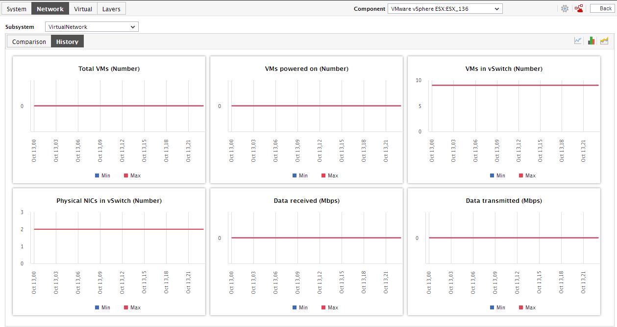
Figure 5 : Trend graphs displayed in the History tab page of the VirtualNetwork dashboard
- If you want to alter the timeline of a single graph alone, click on the graph; this will enlarge the graph. Click on the Settings option and change the Timeline.
- Besides the timeline, an enlarged trend graph allows you to alter the graph Duration - i.e., view the daily or monthly trend information, instead of the default hourly data.
-
Moreover, by default, the trend graphs in the History tab page plot the minimum and maximum values of a measure during the given timeline. In enlarged trend graphs, you can view the Graph type so that the average values or sum of trend values are plotted in the trend graphs instead.
Note:
In case of descriptor-based tests, the Summary and Trend graphs displayed in the History tab page typically plot the values for a single descriptor alone. To view the graph for another descriptor, pick a descriptor from the drop-down list made available above the corresponding summary/trend graph.
- At any point in time, you can switch to the measure graphs by clicking on the button.