Overview
As its name suggests, the Overview dashboard of a Java application provides an all-round view of the health of the Java application being monitored, and helps administrators pinpoint the problem areas. Using this dashboard therefore, you can determine the following quickly and easily:
- Has the application encountered any issue currently? If so, what is the issue and how critical is it?
- How problem-prone has the application been during the last 24 hours? Which application layer has been badly hit?
- Has the administrative staff been able to resolve all past issues? On an average, how long do the administrative personnel take to resolve an issue?
- Are all the key performance parameters of the application operating normally?
- Is the JVM (of the application) utilizing CPU optimally or is the current CPU usage of the JVM very high? Did the CPU usage increase suddenly or gradually - i.e., over a period of time?
- How many threads are currently live on the JVM? Which of these threads is currently consuming high CPU?
- Have any JVM threads been blocked? Which thread is it?
- Are any threads deadlocked?
- Which is the busiest garbage collector on the JVM?
- Which garbage collector is taking too long to collect garbage?
- Which JVM process is currently consuming CPU and memory excessively?
- Which memory pool on the JVM is utilizing too much memory?
The contents of the Overview Dashboard have been elaborated on hereunder:
- The Current Application Alerts section of Figure 1 reveals the number and type of issues currently affecting the performance of the Java application being monitored.
-
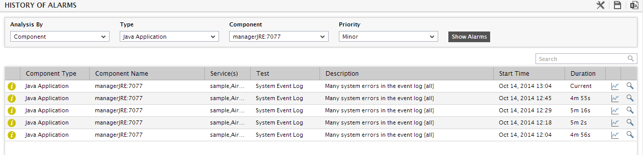
While the list of current issues faced by the application serves as a good indicator of the current state of the application, to know how healthy/otherwise the application has been over time, a look at the problem history of the application is essential. Therefore, the dashboard provides the History of Events section; this section presents a bar chart, where every bar indicates the number of problems of a particular severity, which was experienced by the Java application during the last 1 hour (by default). Clicking on a bar here will lead you to Figure 1, which provides a detailed history of problems of that priority. Alongside the bar chart, you will also find a table displaying the average and maximum duration for problem resolution; this table helps you determine the efficiency of your administrative staff.
- Back in the dashboard, you will find that the History of Events section is followed by an At-A-Glance section; this section, using pie charts, digital displays and gauge charts, reveals, at a single glance, the current status of some of the critical metrics and key components of the Java application. For instance, the Current Application Health pie chart indicates the current health of the application by representing the number of application-related metrics that are in various states.
-
The dial and digital graphs that follow provide you with quick updates on the status of a pre-configured set of resource usage-related metrics pertaining to the JVM. If required, you can configure the dial graphs to display the threshold values of the corresponding measures along with their actual values, so that deviations can be easily detected.
Note:
If you have configured one/more measures of a descriptor-based test to be displayed as a dial chart, then, in real-time, the descriptor that is in an abnormal state or is currently reporting the maximum value for that measure will be represented in the dial chart. You can view the dial charts pertaining to the other descriptors, by clicking on the More button that appears alongside a dial chart in the dashboard.
-
Clicking on a dial/digital graph will lead you to the layer model page of the Java Application; this page will display the exact layer-test combination that reports the measure represented by the dial/digitial graph.
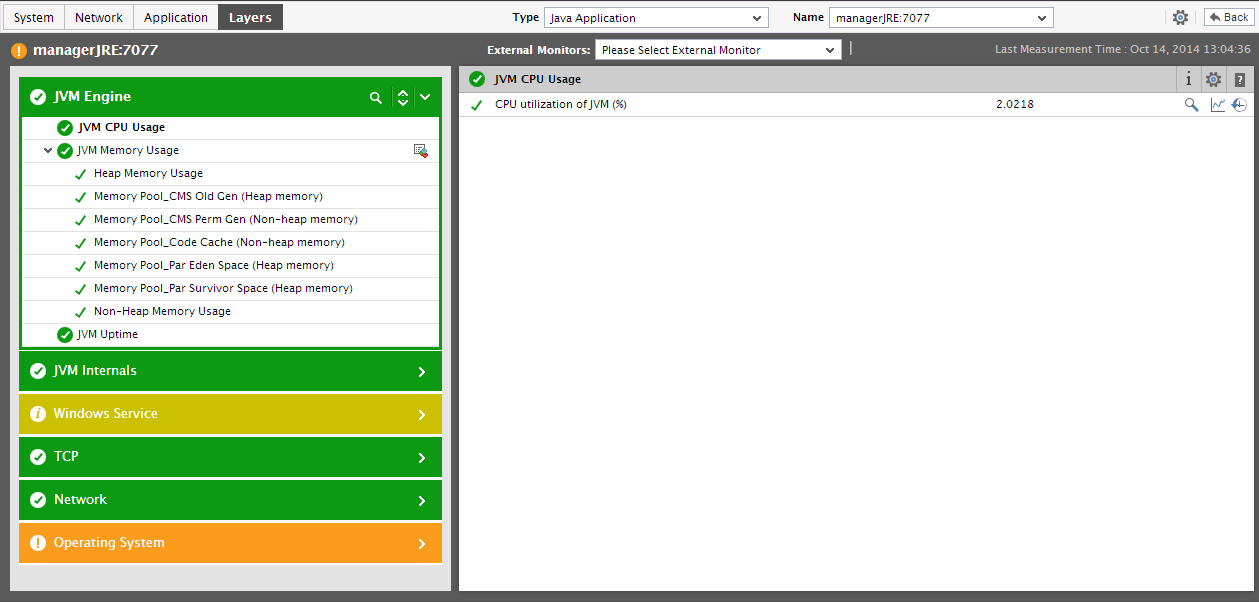
Figure 2 : The page that appears when the dial/digital graph in the Overview dashboard of the Java Application is clicked
- If your eG license enables the Configuration Management capability, then, an Application Configuration section will appear here providing the basic configuration of the application
-
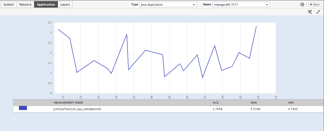
Next to this section, you will find a pre-configured list of Key Performance Indicators of the Java application. Besides indicating the current state of and current value reported by a default collection of critical metrics, this section also reveals ‘miniature’ graphs of each metric, so that you can instantly study how that measure has behaved during the last 1 hour (by default) and thus determine whether the change in state of the measure was triggered by a sudden dip in performance or a consistent one. Clicking on a measure here will lead you to Figure 4, which displays the layer and test that reports the measure.
You can, if required, override the default measure list in the Key Performance Indicators section by adding more critical measures to the list or by removing one/more existing ones from the list. Clicking on a ‘miniature’ graph that corresponds to a key performance indicator will enlarge the graph, so that you can view and analyze the measure behavior more clearly, and can also alter the Timeline and, if need be.
-
This way, the first few sections of the At-A-Glance tab page help understand what issues are currently affecting application health, and when they actually originated. To diagnose the root-cause of these issues however, you would have to take help from the remaining sections of the At-A-Glance tab page. For instance, the Key Performance Indicators section may indicate a sudden/steady increase in the CPU usage by a JVM. However, to determine whether the rise in CPU usage was a result of one/more high CPU threads executing on the JVM or a couple of resource-intensive Java processes, you need to focus on the jvm Thread Details section, JVM Memory Management - Summary section, and the Application Process - Summary section in the dashboard. The jvm Thread Details section for starters reveals the number of JVM threads that are in varying states of activity. With the help of this section therefore, you can quickly figure out whether there are currently any:
- Threads that are blocking each other (deadlocked threads);
- Threads that are being blocked by other threads;
- Threads that are waiting for other threads to release a block;
- Threads that are consuming high CPU resources, etc.
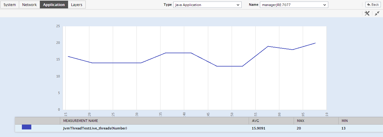
Say, you notice that too many threads are currently in a BLOCKED state. Immediately, you might want to know whether this is a sudden occurrence, or a situation that has become worse over time. To enable you to determine this, every thread count displayed in the jvm Thread Details section is accompanied by a ‘miniature’ graph, which tracks the changes in the corresponding thread count during the last 1 hour (by default). To enlarge the graph, click on it; this will invoke Figure 3. The enlarged graph allows you to change the Timeline for analysis, and also the graph dimension.
- To zoom into a particular thread-type and analyze its resource usage, click on the thread type in the JVM Thread Details section. For instance, to gain deeper insights into the performance and resource usage of the runnable threads, click on Runnable Threads in the jvm Thread Details section. Figure 4 will then appear, where a list of threads of the chosen type will be displayed, starting with the most CPU-intensive thread. To enable in-depth analysis of the resource usage of a thread, a pie chart depicting the percentage of time the thread used CPU and the percentage of time it was idle, is provided. If a thread is observed to have used CPU excessively, then, you can study the stack trace information available alongside the pie chart to zero-in on the exact line of code that the thread was executing when its CPU usage spiked.
- The JVM Memory Management - Summary section reveals how well the JVM manages its memory resources by measuring and reporting the effectiveness of its garbage collection activity. For every garbage collector, this section reveals the number of garbage collections initiated by the collector, the time taken for the garbage collection, and the percentage of time spent on garbage collection. From this information, you can infer which garbage collector is spending too much time and resources on garbage collection. By default, the garbage collector list provided by this section is sorted in the alphabetical order of the names of the collectors. If need be, you can change the sort order so that the garbage collectors are arranged in, say, the descending order of values displayed in the Time taken for garbage collection column - this column displays the time taken by each collector to perform garbage collection. To achieve this, simply click on the column heading Time taken for garbage collection. Doing so tags the Time taken for garbage collection label with a down arrow icon - this icon indicates that the JVM Memory Management table is currently sorted in the descending order of the time taken by each garbage collector for collecting garbage. To change the sort order to ‘ascending’, all you need to do is just click again on the Time taken for garbage collection label or the down arrow icon. Similarly, you can sort the table based on any column available in it.
- The Application Process - Summary section, on the other hand, traces the CPU and memory usage of each of the Java processes currently executing on the JVM of the target application, and thus leads you to the resource-intensive processes. By default, the process list provided by this section is sorted in the alphabetical order of the process names. If need be, you can change the sort order so that the processes are arranged in, say, the descending order of values displayed in the Instances column - this column displays the number of instances of each process that is in execution currently. To achieve this, simply click on the column heading - Instances. Doing so tags the Instances label with a down arrow icon - this icon indicates that the process list is currently sorted in the descending order of the instance count. To change the sort order to ‘ascending’, all you need to do is just click again on the Instances label or the down arrow icon. Similarly, you can sort the process list based on any column available in the Application Process - Summary section.
-
While the At-A-Glance tab page reveals the current state of the JVM threads and the overall resource usage of the JVM, to perform additional diagnosis on problem conditions highlighted by the At-A-Glance tab page and to accurately pinpoint their root-cause, you need to switch to the Details tab page by clicking on it. For instance, the At-A-Glance tab page may indicate the number of threads that are currently blocked, but to know which thread has been blocked for the longest time, you will have to use the Details tab page.
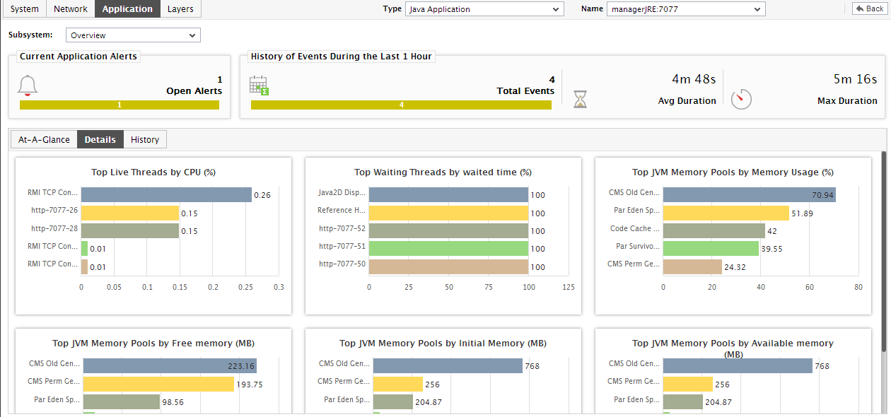
Figure 5 : The Details tab page of the Application Overview Dashboard
-
The Details tab page comprises of a default set of comparison bar graphs using which you can accurately determine the following:
- How many threads are currently executing on the JVM? Which is the most CPU-intensive thread?
- Have any threads been blocked? If so, which thread has been blocked for the maximum duration?
- Are any threads in the WAITING state? If so, which thread has been waiting for the longest time?
- Which memory pool on the JVM is consuming memory excessively?
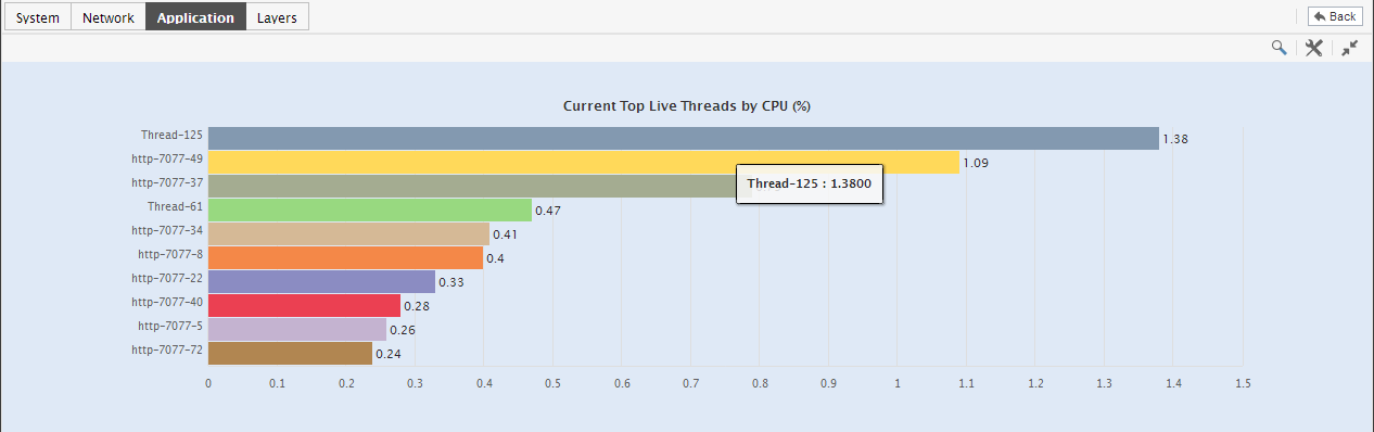
Figure 6 : The expanded top-n graph in the Details tab page of the Application Overview Dashboard
- Though the enlarged graph lists all the memory pools or threads (as the case may be) by default, you can customize the enlarged graph to display the details of only a few of the best/worst-performing threads/memory pools by picking a top-n or last-n option from the Show list in Figure 5.
- Another default aspect of the enlarged graph is that it pertains to the current period only. Sometimes however, you might want to know what occurred during a point of time in the past; for instance, while trying to understand the reason behind a sudden spike in memory usage on a particular day last week, you might want to first determine which memory pool is guilty of abnormal memory consumption on the same day.
-
Where detailed diagnosis is applicable, you can quickly view the detailed measures that correspond to a comparison graph by clicking on the
 icon at the right, top corner of the enlarged graph. This will invoke Figure 7, using which you can arrive at the root-cause of a problem.
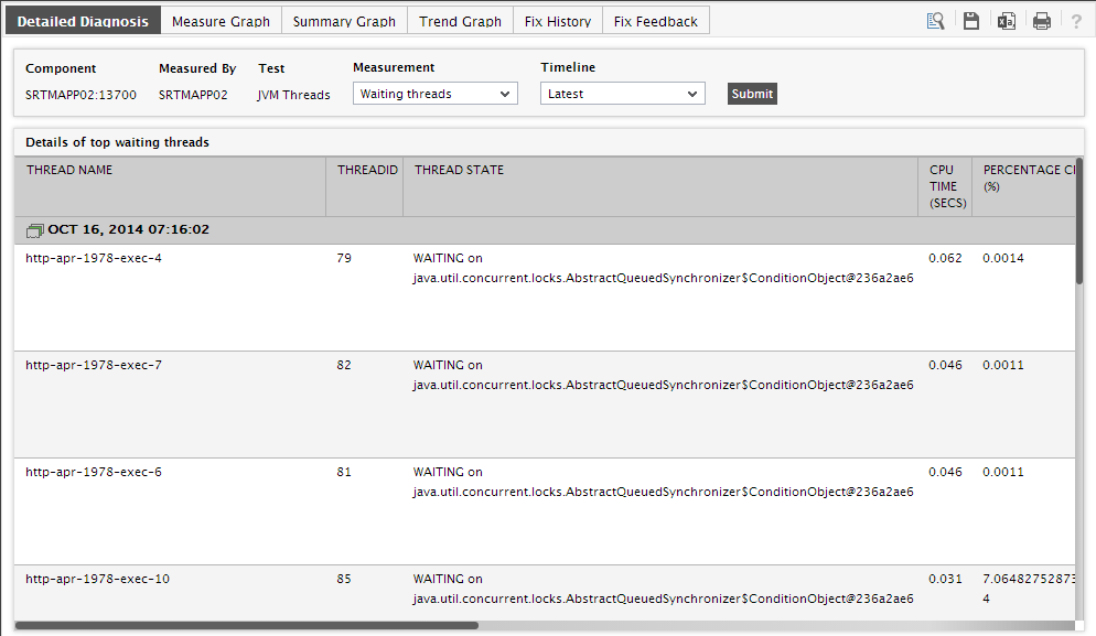
Figure 7 : The detailed diagnosis that appears when the DD icon in the enlarged comparison bar graph is clicked
-
For detailed time-of-day / trend analysis of the historical performance of a Java application, use the History tab page. By default, this tab page (see Figure 7) provides time-of-day graphs of critical measures extracted from the target Java application, using which you can understand how performance has varied during the default period of 24 hours. In the event of a problem, these graphs will help you determine whether the problem occurred suddenly or grew with time.
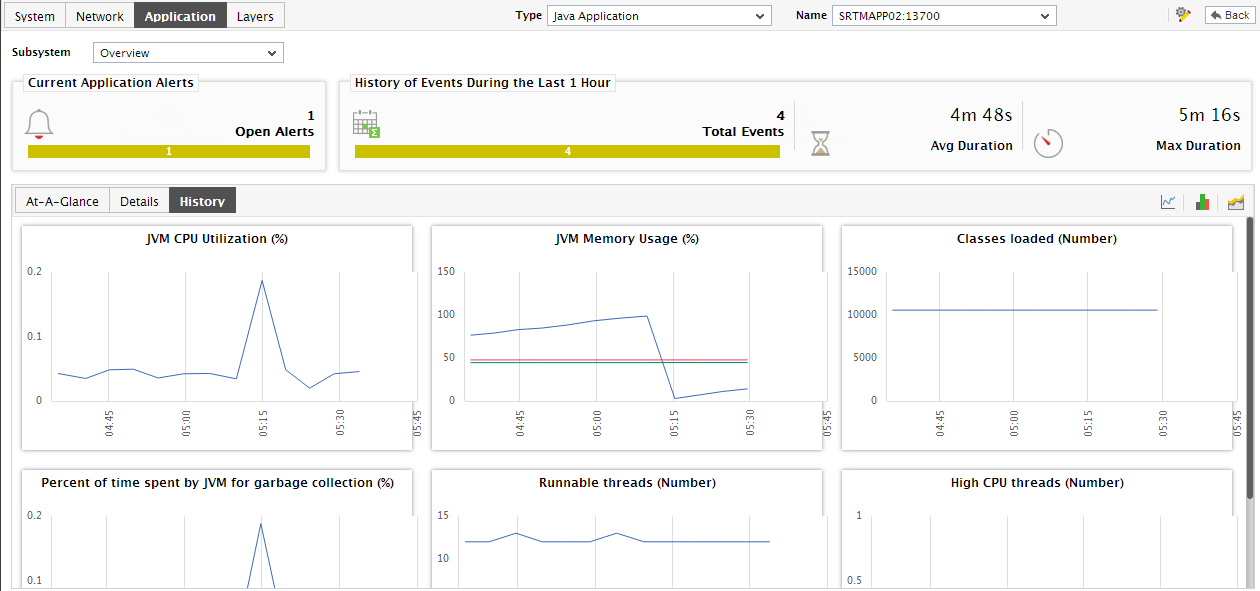
Figure 8 : Time-of-day measure graphs displayed in the History tab page of the Application Overview Dashboard
-
You can click on any of the graphs to enlarge it, and can change the Timeline of that graph in the enlarged mode.
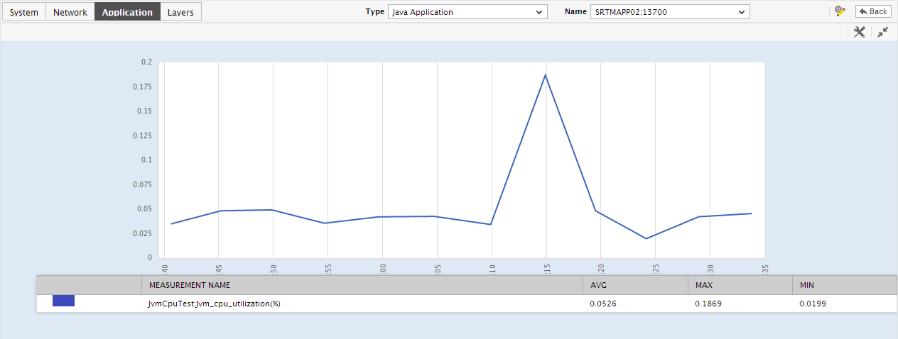
Figure 9 : An enlarged measure graph of a Java Application
- In case of tests that support descriptors, the enlarged graph will, by default, plot the values for the top-10 descriptors alone. To configure the graph to plot the values of more or less number of descriptors, select a different top-n / last-n option from the Show list in Figure 7.
-
If you want to quickly perform service level audits on the Java application, then summary graphs may be more appropriate than the default measure graphs. For instance, a summary graph might come in handy if you want to determine the percentage of time during the last 24 hours the Java application consumed excessive CPU. Using such a graph, you can determine whether the CPU usage levels guaranteed by the Java application were met or not, and if not, how frequently did the application falter in this regard. To invoke such summary graphs, click on the
 icon at the right, top corner of the History tab page. Figure 10 will then appear.
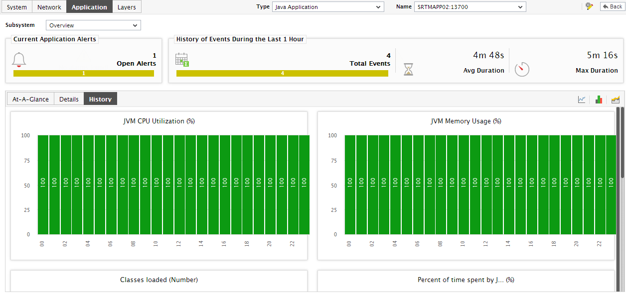
Figure 10 : Summary graphs displayed in the History tab page of the Application Overview Dashboard
- You can alter the timeline of all the summary graphs at one shot by clicking the Timeline link at the right, top corner of the History tab page of Figure 11.
-
To change the timeline of a particular graph, click on it; this will enlarge the graph as depicted by Figure 12. In the enlarged mode, you can alter the Timeline of the graph. Also, though the graph plots hourly summary values by default, you can pick a different Duration for the graph in the enlarged mode, so that daily/monthly performance summaries can be analyzed.
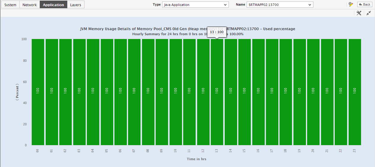
Figure 11 : An enlarged summary graph of the Java Application
-
To perform effective analysis of the past trends in performance, and to accurately predict future measure behavior, click on the
 icon at the right, top corner of the History tab page. These trend graphs typically show how well and how badly a measure has performed every hour during the last 24 hours (by default). For instance, the CPU usage trend graph of a Java application will help you figure out the maximum and minimum percentage of CPU that was consumed by the application every hour during the last 24 hours. If the gap between the minimum and maximum values is marginal, you can conclude that CPU usage has been more or less constant during the designated period;this implies that CPU usage has neither increased nor decreased steeply during the said timeline. On the other hand, a wide gap between the maximum and minimum values is indicative of erratic usage of CPU, and may necessitate further investigation. By carefully studying the trend graph, you can even determine the points of time at which CPU usage had been abnormally high during the stated timeline, and this knowledge can greatly aid further diagnosis.
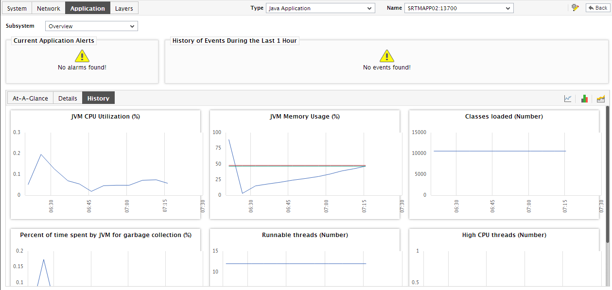
Figure 12 : Trend graphs displayed in the History tab page of the Application Overview Dashboard
- To analyze trends over a broader time scale, click on the Timeline link at the right, top corner of the History tab page, and edit the Timeline of the trend graphs. Clicking on any of the miniature graphs in this tab page will enlarge that graph, so that you can view the plotted data more clearly and even change its Timeline.
- Besides the timeline, you can even change the Duration of the trend graph in the enlarged mode. By default, Hourly trends are plotted in the trend graph. By picking a different option from the Duration list, you can ensure that Daily or Monthly trends are plotted in the graph instead.
-
Also, by default, the trend graph only plots the minimum and maximum values registered by a measure. Accordingly, the Graph type is set to Min/Max in the enlarged mode. If need be, you can change the Graph type to Avg, so that the average trend values of a measure are plotted for the given Timeline. For instance, if an average trend graph is plotted for the Live threads measure, then the resulting graph will enable administrators to ascertain how many threads, on an average, were executing in the JVM during a specified timeline; such a graph serves as a good indicator of the growth in the workload of the JVM over time.
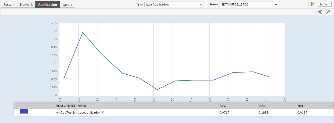
Figure 13 : Viewing a trend graph that plots average values of a measure for a Java application
-
Likewise, you can also choose Sum as the Graph type to view a trend graph that plots the sum of the values of a chosen measure for a specified timeline. For instance, if you plot a 'sum of trends' graph for the measure that reports the CPU usage of the JVM, then, the resulting graph will enable you to analyze, on an hourly/daily/monthly basis (depending upon the Duration chosen), how CPU usage of the JVM has varied.
Note:
In case of descriptor-based tests, the Summary and Trend graphs displayed in the History tab page typically plot the values for a single descriptor alone. To view the graph for another descriptor, pick a descriptor from the drop-down list made available above the corresponding summary/trend graph.
- At any point in time, you can switch to the measure graphs by clicking on the
 button.