Overview
In the Overview mode, the System Dashboard reveals the following:
-
The Current System Alerts section indicates the number of unresolved issues at the host-level, and also reveals how these issues have been distributed based on priority - i.e., the number of current issues of each priority. By clicking on an alarm priority, you can view the details of current alarms of that priority (see ). This way, you not only determine how problem-prone your operating system is, but also figure out the number and type of current problems at the system-level.
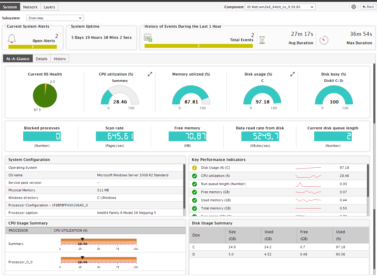
Figure 1 : The details of current alarms raised at the system-level
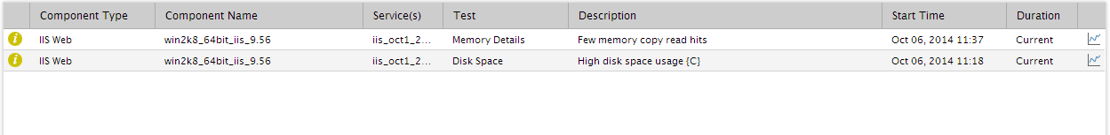
- If too many alarms are displayed in , you can use the Search text boxes placed at the end of this alarm window to perform quick searches based on the Description, Layer, and StartTime columns to locate the specific alarm(s) of interest to you. For instance, to look for an alarm with a specific description, specify the whole/part of this description in the text box below the Description column in Figure 2. Doing so will automatically display the details of only that alarm containing the specified description.
-
If you click on any alarm in Figure 2, an Alarm Details section will be introduced in the Alarms window itself, providing additional details of the alarm clicked on. These details include the Site affected by the problem for which the alarm was raised, the test that reported the problem, and the Last Measure value of the problem measure.
-
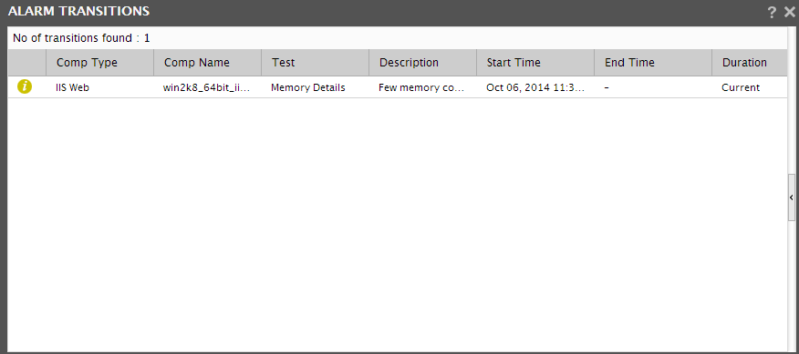
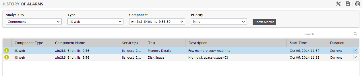
To figure out the type of problems that occurred the maximum on the system during the last 1 hour, refer to the History of Events section in Figure 3. This section provides a bar graph that reveals the number of problems of each priority that the application host experienced during the last 1 hour. Clicking on a bar will lead you to the history of alarms page (see Figure 3) that displays the complete list of problem events that occurred at the system-level in the last 1 hour. This information provides administrators with quick and effective insights into recurring problems, and enables them to deduce problem patterns.
-
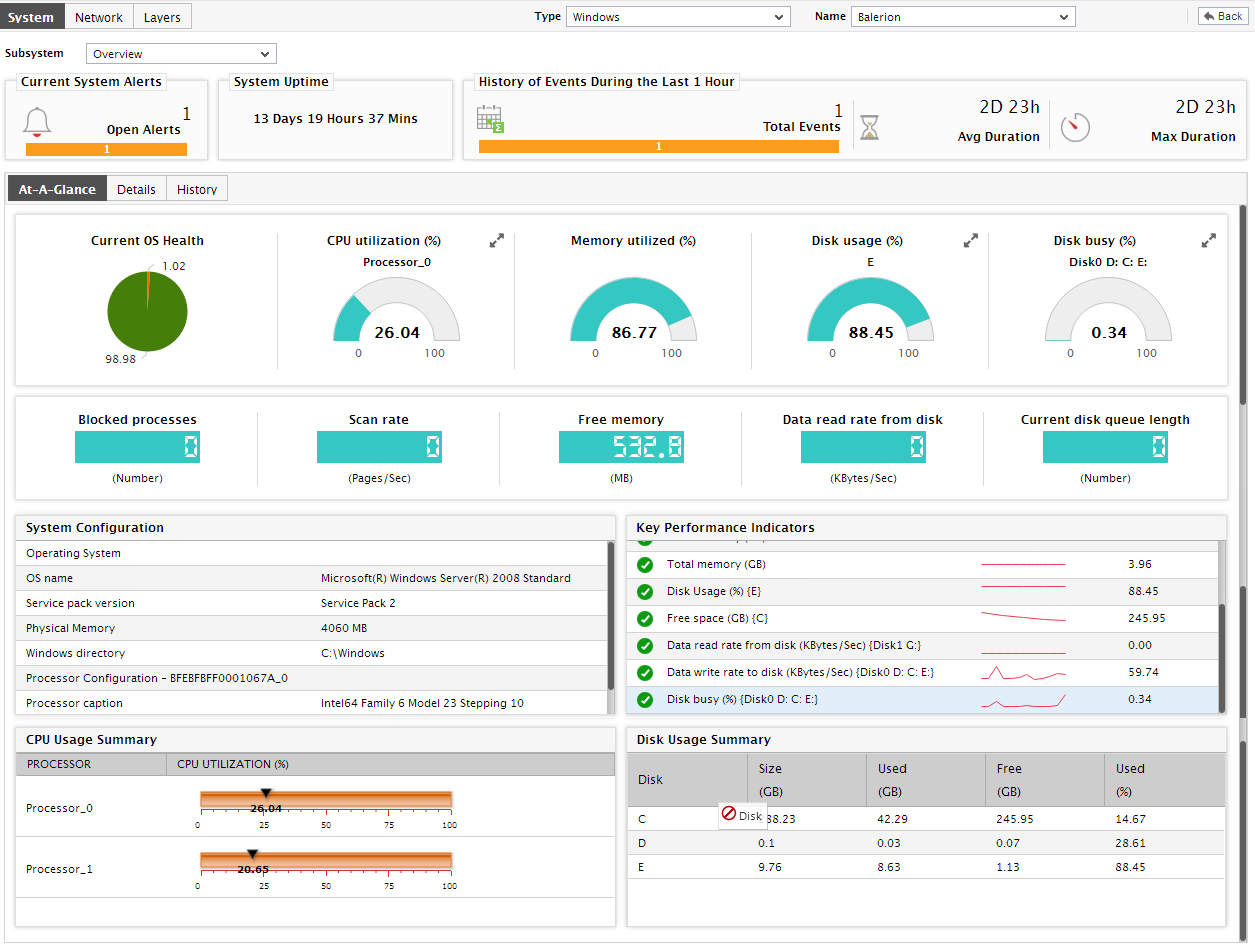
Once back in the dashboard, you will find an At-A-Glance tab page that enables you to determine, at a glance, the current state of the system. This tab page begins with a Current OS Health section, which provides a pie chart revealing how problem-prone the system currently is - in other words, it indicates the service level that has been achieved by the system currently. Clicking on a slice will lead you to the event history page again (see Figure 3).
-
This pie chart will be followed by a series of pre-configured host-level measures and their current values, with the help of which unhealthy metrics can be instantly detected and impact analysis easily performed. While measures that report percentage values are typically represented using a dial chart, other measures are reported using digital displays. Since all these values are rounded-off to two decimal places (by default), you are advised to move your mouse pointer over these “approximations”, so that the “actuals” can be viewed as a tool tip.
Note:
If you have configured one/more measures of a descriptor-based test to be displayed as a dial chart, then, in real-time, the descriptor that is in an abnormal state or is currently reporting the maximum value for that measure will be represented in the dial chart. You can view the dial charts pertaining to the other descriptors, by clicking on the More button that appears alongside a dial chart in the dashboard.
- Also, to enable administrators to instantly and accurately detect deviations from the norm, the dial charts, by default, indicate the threshold settings of a measure along with the real-time values reported by that measure. If multi-level thresholds are set for a measure, then each such threshold will be indicated using the conventional color-codes (Red for Critical, Orange for Major, and yellow for Minor) used across the eG monitoring and reporting consoles. By default, the dial charts display the Maximum thresholds alone. If a measure is associated with Minimum thresholds only, then the dial chart will display the minimum thresholds settings instead. Thanks to the threshold representations in the dial charts, administrators can easily identify when and what type of thresholds were violated.
-
Let us now return to the dashboard. If you click on any dial/digital graph in the dashboard, you will be directly lead to the layer model page, where the exact layer-test-measure combination that corresponds to the dial/digital graph will be displayed.
Figure 6 : The layer model, test, and measure that appear when a dial graph is clicked on
- Now that we are done exploring the dial and digital graphs, let us proceed to focus on the other sections of the dashboard. A quick look at the current System Configuration in Figure 4 helps determine whether a change in system configuration can make the host less vulnerable to performance issues. Note that the System Configuration will appear only if your eG license allows Configuration Management; if not, then this section will display a bar chart indicating the current status of the Operating System layer of the host, in terms of the percentage of time the host has been in normal/critical/major/minor/unknown states.
-
Let us now focus on the dashboard again. A list of critical system-related measures and their current state is provided under the head Key Performance Indicators in the dashboard, so that administrators can swiftly determine if the eG agent has detected any abnormalities with any of the factors that significantly influence system performance. This way, remedial measures can be immediately initiated. Clicking on a measure here will lead you the Layer Model tab page displaying the monitoring model of the target application, and the value reported by the measure that was clicked on (see Figure 5).
Figure 7 : The layer model tab page that appears when a key performance indicator is clicked
-
Moreover, corresponding to each of the core measures displayed in the Key Performance Indicators section, a miniature graph will be available, which provides a quick look at the variations in that measure during the last 1 hour (by default). By observing these variations more closely and clearly - say, for even longer time periods - you can rapidly detect disturbing performance trends and proactively isolate potential problems. To achieve this, click on the miniature graph to expand it. Figure 6 then appears, displaying a zoomed out graph. Using Figure 9, you can alter the Timeline of the graph, and also change the default dimension of the graph from 3d to 2d. In addition, if the time-of-day values reported by multiple descriptors are plotted in the graph, you can choose to focus on the historical performance of the best/worst descriptors alone by picking a top-n or last-n option from the Show list that appears in the expanded graph (not shown in Figure 6). For instance, if the graph tracks the usage of all the disk partitions on the host over time, then, you can pick the top-3 option from the Show list to make sure that the graph plots the historical values of only those 3 disk partitions, which are being used the maximum.
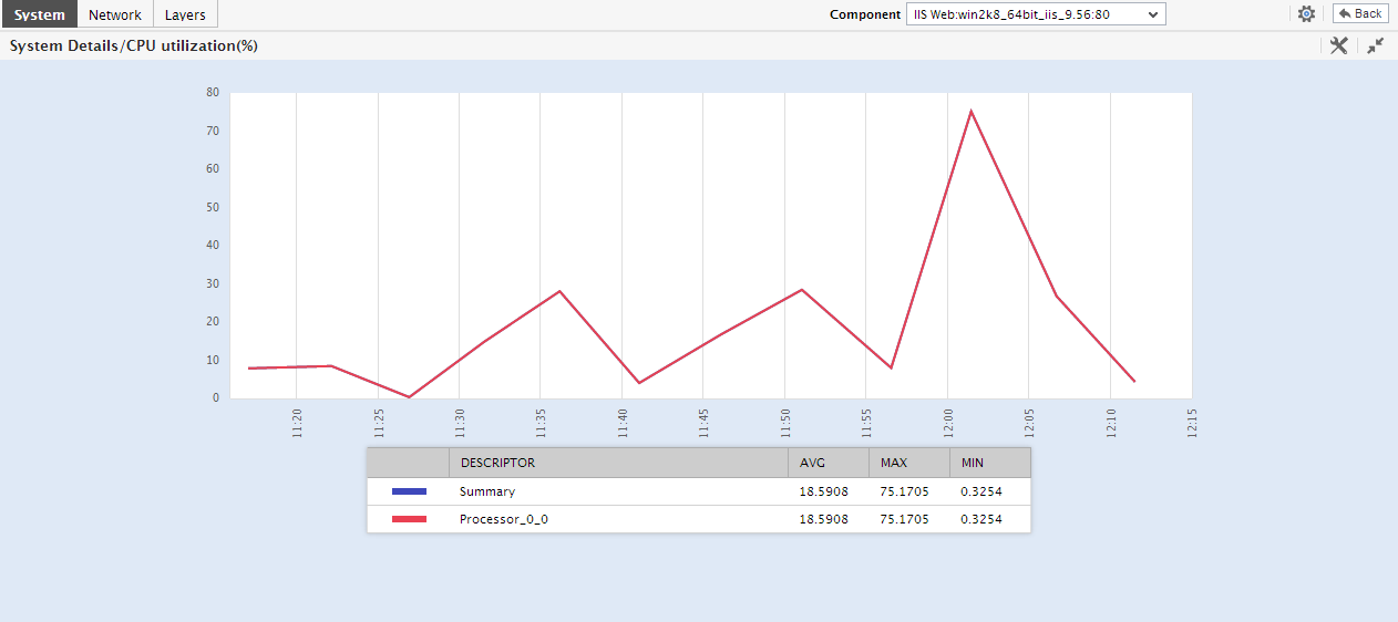
Figure 8 : The expanded graph that appears upon clicking the miniature graph in the Key Performance Indicators section
- Beneath the Key Performance Indicators section, you will find a CPU Usage Summary; from this summary, you can quickly understand how well all the processors supported by the system are currently utilizing the host’s CPU resources, and also accurately identify those processors that are eroding these critical resources.
- Similarly, the Disk Usage Summary will reveal the current capacity and usage of each of the disk partitions on the host, so that you can swiftly isolate disk partitions that are running out of space.
-
Thus, with the help of tabulated usage statistics, the At-A-Glance tab page turns the spot light on resource-intensive processors and disk partitions on the host. Alternatively, if you prefer an interface that provides a graphical comparison of resource usage across processors and disk partitions (as the case may be), combined with quick insights into the root-cause of usage excesses (if any), then, you can switch to the Details tab page instead. For this purpose, click on the Details tab page in Figure 8. Figure 9 will then appear.
-
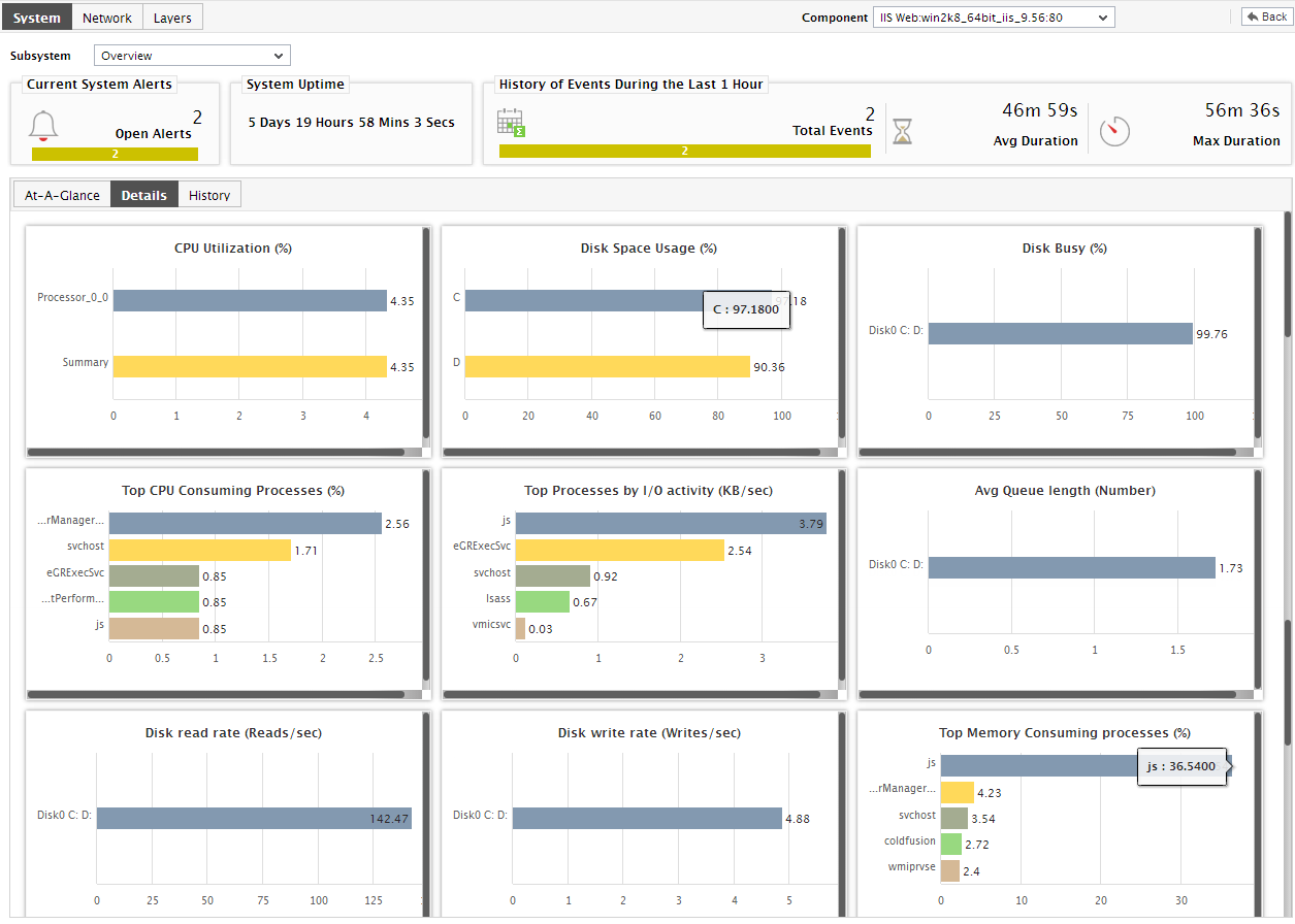
As you can see, Figure 9 provides a set of pre-defined bar charts, each of which focuses on the current usage of a key resource (disk/CPU/memory). Using these default graphs, you can easily and accurately determine the following:
- Which processor is currently utilizing the maximum CPU resources? Which process currently executing on the host is causing this resource-drain?
- Which disk partitions are left with limited free space?
- Which disk partitions are the busiest in terms of the rate of I/O requests they handle? Which processes currently executing on the host are causing high disk I/O?
- Which processes on the host are consuming memory excessively?
-
These bar charts, in fact, can also be configured to aid effective postmortem analysis of resource usage. For instance, you can use one of these bar charts to find out which process caused the memory usage on the host to increase during a time period in the past. For this purpose, click on the corresponding bar chart in Figure 10. The graph will then zoom out as depicted by Figure 10.
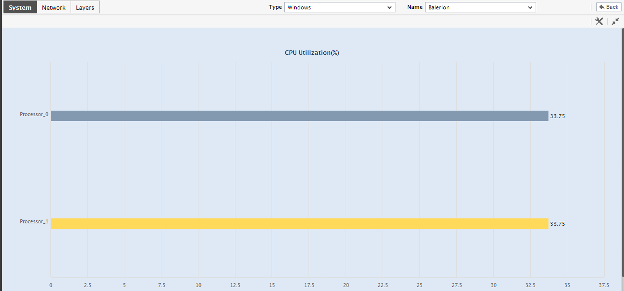
Figure 10 : An enlarged bar chart in the Details tab page
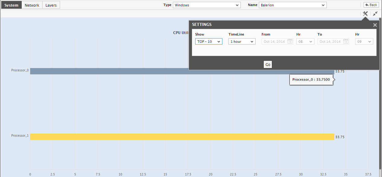
Figure 11 : The Top-N graph for a past period
- By default, the resulting graph will display the top-10 processes that executed on the host during the specified Timeline, in the descending order of memory usage. Accordingly, the top-10 option is chosen by default from the Show list. To view only a limited number of processes in the graph, pick a different top-n or last-n option from the Show list.
-
This way, with the help of the bar charts, you can quickly get to the source of any resource contention at the host. However, to engage in an elaborate historical analysis of the behavior of the host-level measures and isolate probable problems, the measure/summary/trend graphs offered by the History tab page will be more useful. To switch to this tab page, click on History in Figure 12. will then appear.
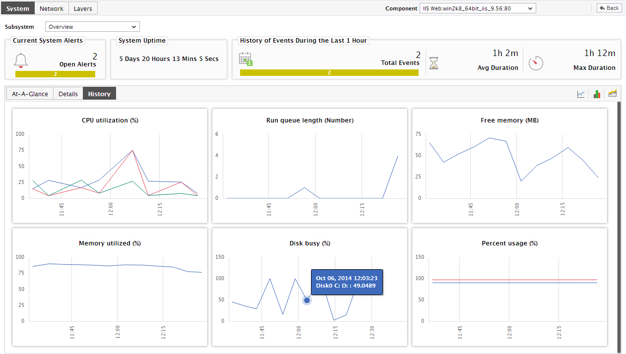
- By default, the History tab page provides measure graphs for each of the key host-level measures, using which you can efficiently track the changes in the performance of the measures during the last 24 hours (by default). These graphs help determine when a measure, which is currently in an abnormal state, began exhibiting performance inconsistencies.
-
Some measure graphs in the History tab page may plot values for multiple descriptors; such graphs will appear very cluttered, making analysis a nightmare! To view such measure graphs clearly, you will have to first enlarge the graph by clicking on it. The graph will then zoom out as depicted by .
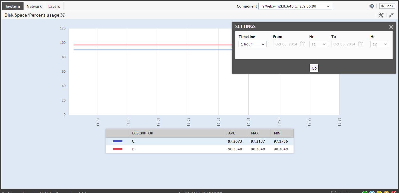
Figure 13 : Expanding a measure graph in the History tab page
- If need be, you can change the Timeline of the enlarged graph, choose to view only a few of the descriptors in the graph by picking a top-n or last-n option from the Show list.
- You can change the graph timeline by clicking on the Timeline link in Figure 14. You can even expand the graph by clicking on it, and then alter its Timeline.
- In addition to the timeline and dimension, the enlarged summary graph also allows you to change its Duration. By default, the Duration is set to Hourly, indicating that the summary graphs plot only the hourly summaries by default. If required, you can change the Duration of the summary graph in the enlarged mode so that, you can perform daily or monthly summary analysis.
-
Similarly, to observe and understand the past trends in the performance of the host and to predict future measure behavior, click on the
 icon at the right, top corner of the History tab page. will appear revealing trend graphs for the host-level metrics. By default, these graphs plot the maximum and minimum values registered by a measure during the default period of 1 day.
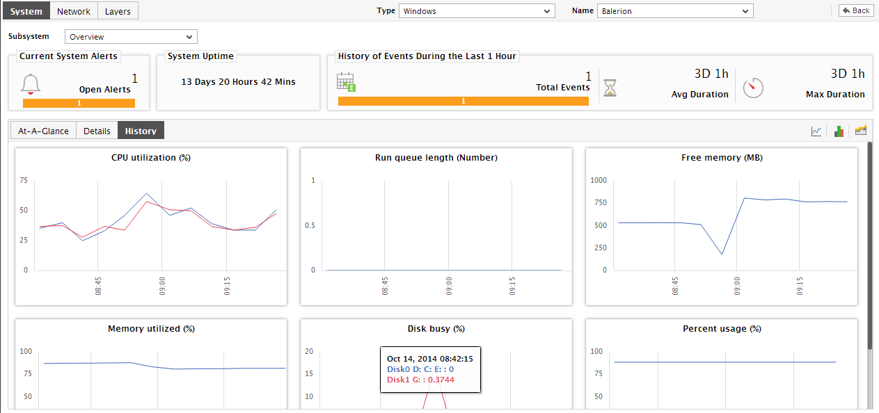
- If need be, you can change the graph timeline by clicking on the Timeline link in Figure 14. You can even expand the graph by clicking on it.
-
Doing so will invoke , where you can view the enlarged graph. By default, only hourly trend values are plotted in a trend graph. If need be, you can change the Duration of the trend graph in the enlarged mode, so that you can perform daily or monthly trend analysis. Likewise, you can change the graph Timeline using .
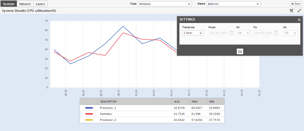
Figure 15 : Changing the Duration of the trend graph
-
Also, by default, the trend graph displays the AVG, MAX and MIN value below the graph.
Note:
In case of descriptor-based tests, the Summary and Trend graphs displayed in the History tab page typically plot the values for a single descriptor alone. To view the graph for another descriptor, pick a descriptor from the drop-down list made available above the corresponding summary/trend graph. For instance, in Figure 2 above, note that the trend graph for CPU utilization plots the CPU usage trends of Processor_1 only. If you want to view the CPU usage trend graph for Processor_0 instead, pick the Processor_0 option from the drop-down list adjacent to the graph title, CPU utilization (%).
- At any point in time, you can switch to the measure graphs by clicking on the
 button.
 - Typically, the History tab page displays measure, summary, and trend graphs for a default set of measures.