The RUM Dashboard
A picture speaks louder than a thousand words! Messages conveyed using a visual medium are always more impactful and reaches the audience more quickly. This is the philosophy that drives eG’s Real User Monitor Dashboard (see Figure 1).
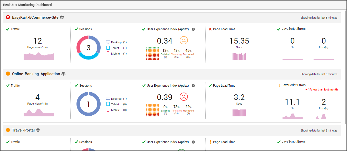
Figure 1 : The Real User Monitor Dashboard
To access this dashboard, click on the Real User Monitoring option in the Dashboards tile of the Monitor menu.
With the help of a bevy of visual tools – eg., intuitive icons, color-coded values, miniature graphs, geo maps, etc. - this real-time dashboard helps administrators understand, from just a glance, the following:
- How is the traffic to the managed web sites/web applications in your environment? Is the traffic to any web site/web application suspiciously high or low?
- From which devices is this traffic coming from – desktops? Mobile phones? Or tablets? Which is the most popular device
- Is the user experience with any managed web service poor presently? If so, what is causing service quality to degrade – delay in page loading? Or JavaScript errors?
-
How many distinct users are currently connected to each web site / web application being monitored? - this is a good indicator of the number of users who are truly contributing to the traffic on the web site.
Note:
HttpOnly is a flag that can be set on cookies to prevent their contents from being accessed by JavaScript. This is often done for session cookies to hide the session identifier, as a security measure.
If the HttpOnly flag is set for the session cookies of the monitored web site, then the eG RUM JavaScript will not be able to read the session identifier from the cookies. In such cases therefore, the eG agent will not be able to report the count of unique sessions - i.e., the count of distinct users currently connected to the web site. The Unique Sessions count will hence not be displayed in the RUM dashboard for of such web sites.
This way, the dashboard facilitates the rapid identification of web sites/web applications in your environment that do not enjoy user confidence and the probable reasons for this unfavorable user perception.
Moreover, the exact pages in the target application that are slow, the reason for the slowness of those pages, and the JavaScript errors that are wrecking user experience, can all be identified with a quick click from this dashboard. For instance, you can click on the Page Load Time measure representation in the dashboard to know which page views are experiencing slowness and why – is it because of the front end? network? or backend? (see Figure 2)
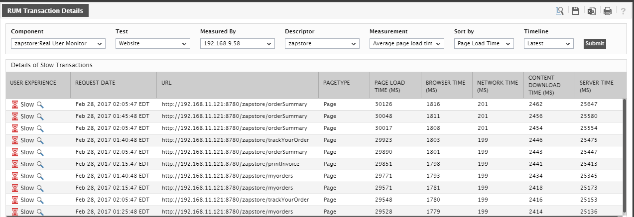
Figure 2 : Details of slow page views where the URLs of the pages are provided along with the breakup of each page
This way, the Real User Monitor Dashboard takes you from the problem symptoms to the problem source in no time!
To zoom into a particular web site/application in the dashboard, simply click on its name in the dashboard of Figure 1. Figure 3 will then appear.
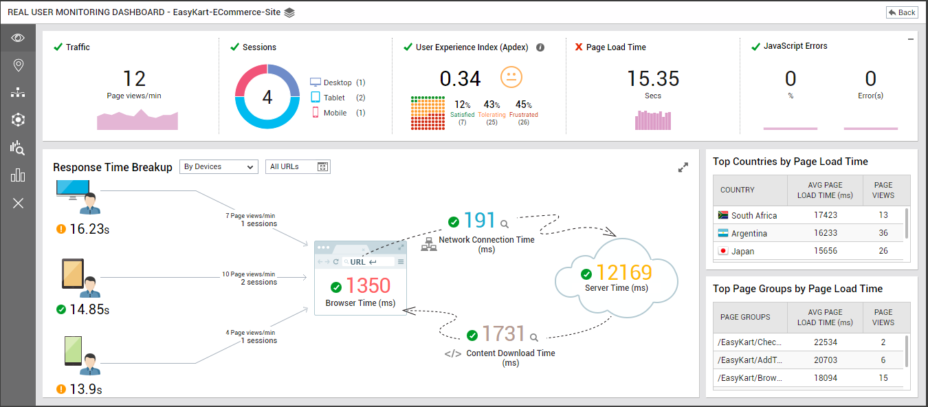
Figure 3 : The RUM dashboard of a chosen web site/application
The dashboard of Figure 3 supports an array of icons (see Figure 4) in its left panel, which when clicked enables you to review and analyze different facets of real user experience with the chosen web site/application.
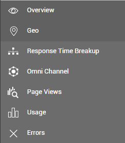
Figure 4 : The array of icons available in the left panel of the application-specific RUM dashboard
By default, the Overview option is selected. As a result, Figure 3 appears by default, which provides an overview of the user experience with the target application.
Overview of User Experience
The traffic to, the Apdex score of, the responsiveness of, and the number of JavaScript errors (if any) encountered by the target can be quickly ascertained using the Overview page (see Figure 3). Using the Response TIme Breakup section in Figure 3, you can see, at-a-glance, how many requests are from different devices (desktop, mobile, etc.) and the response time per device type. This application-level response time analysis provides insights across all pages in the application.
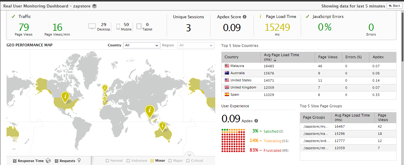
Figure 5 : The RUM dashboard revealing the user experience per country
The Overview also points you to the countries and page groups in which high page load time has been observed.
User Experience Analysis Across Geographies
To analyze user experience geographically, click on the Geo icon in the array of icons (see Figure 4) in the left panel of the dashboard. Figure 6 will then appear.
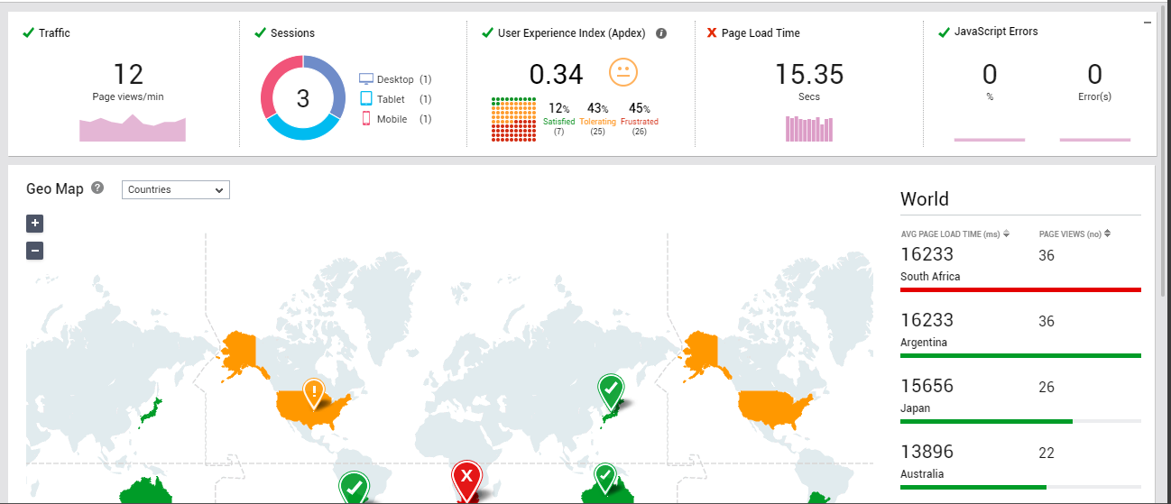
Figure 6 : User experience analysis across geographies
Without requiring you to pour over tens of metrics, the Geo Map in Figure 6 quickly tells you where your users are. Location markers accurately pinpoint the countries from which the requests are flowing into the web site / web application. The size of the location marker varies according to the number of requests from each country- i.e., larger the marker, higher will be the number of page view requests from that country. Also, to indicate the experience of users from a country, both that country and its corresponding marker are colored using conventional color-codes. This way, the map intelligently differentiates between the “happy” countries and the “unhappy” ones.
Note:
At any given point in time, you can choose to view only the request indicators - i.e., the markers - or the response time indicators - i.e., the countries colored using conventional color-codes - in the map. For instance, to hide the markers, click on the  button below the map, and uncheck the Requests check box. To hide the colored countries, uncheck the Response time check box (see Figure 7).
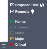
Figure 7 : Customizing the Geo map
You can also choose to view in the map, only those countries with a poor user experience. For this, you may want to uncheck the Normal check box in Figure 7, and check the Major, Minor, Critical, and/or Unknown check boxes therein.
To know why users from certain countries are 'unhappy' with the web site / web application, click on the problem country in the map. A box depicted by Figure 8 will appear revealing what the users from that country experience when interacting with the target web site/web application. The page views from the country, the average page load time, and the error percentage are displayed in the box. From this, you can easily infer what is ailing the experience of users from that country – slow page loading? or JavaScript errors?
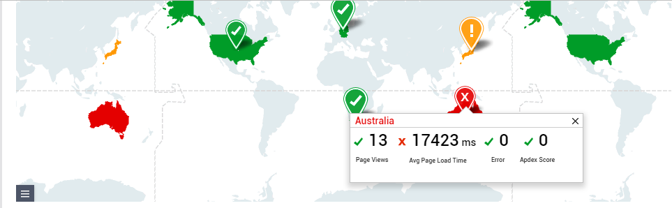
Figure 8 : Viewing the user experience statistics of a particular country in the geo map
If users from a country are experiencing slowness, it is only natural that you want to figure out whether the problem is widespread or is confined to a specific region within that country. This can be easily determined by zooming into a problem country in the map! For this, just select the country you want to focus on from the Country drop-down list in the Geo Map. Figure 9 will then appear revealing the exact regions (in that country) from which requests are received and the overall experience of the users from each region.
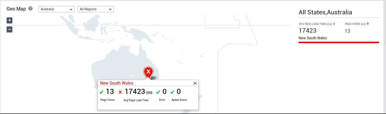
Figure 9 : Zooming into the regions within a country
Likewise, you can quickly drill-down from a region to view the cities in that region and the quality of their experience with the web site / web application. For this city-level view, select a Country and then a Region from the Geo Map. Figure 10 will then appear. Using Figure 10, you can precisely pinpoint the city that is experiencing slowness.
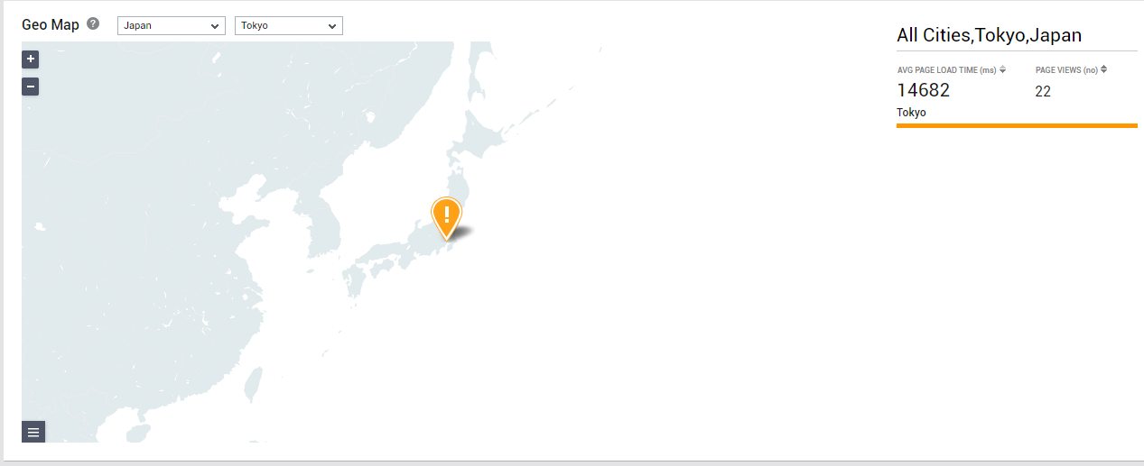
Figure 10 : Zooming into the cities within a region
If the Geo Map reveals that users coming from a particular country/city/region are experiencing slowness, then you may want where such users are seeing the maximum slowness - is it at the browser level? during content download? in the network? or during backend server processing? At the same time, you may want to verify whether the type of device used by the users from a specific country/city/region are impacting their experience with the application, and if so, in what way. The Response Time Breakup section in this geographical view enables this dual analysis (see Figure 11). The contents of this section will vary depending upon the option you choose from the Geo Map drop-down. For instance, if the Countries option is chosen from the Geo Map drop-down, then the Response Time Breakup section will display distribution pie charts revealing where application users from across all the countries in the world are spending their time. Likewise, if you choose a specific Country from that drop-down, then the Response Time Breakup will provide the breakup of response time for all users from that country alone.
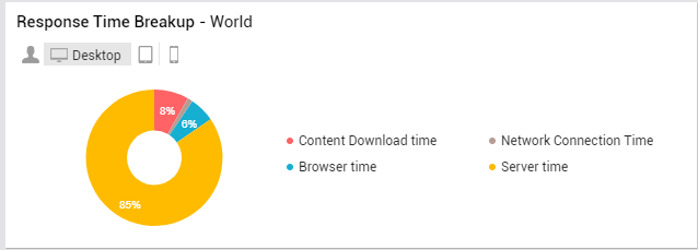
Figure 11 : Response Time Breakup of users from a chosen geography using a chosen device type
Also, by default, the Response Time Breakup section presents the breakup of the response time of all application users, regardless of what type of device they are using. This is why, the End-user icon in this section is selected by default. If required, you can use this section to analyze the experience of users depending upon the device type they use. For instance, click on Desktop icon in this section to know where desktop users are experiencing a bottleneck (Figure 11).
If the Geo Map reveals that users coming from a particular country/city/region are experiencing slowness, then you may want to figure out which page groups accessed by the users from that country/city/region are the slowest. This is where the Top-5 Slow Page Groups <Countries/Regions/Cities> list helps. Depending upon the geography you zoom into in your Geo Map - whether it is for the world over, a particular country, or a specific region - this list will display the top-5 page groups in that geography in terms of responsiveness. For example, if Countries is chosen from the drop-down in your Geo Map, then the top-5 list will display the top-5 'least responsive' page groups accessed by application users across the world (see Figure 12).
.png)
Figure 12 : Slowest page groups in a chosen geography
Response Time Analysis
For a more detailed analysis of response time, click on the Response Time Breakup icon in the array of icons (see Figure 4) in the left panel of the dashboard. Figure 13 will then appear.
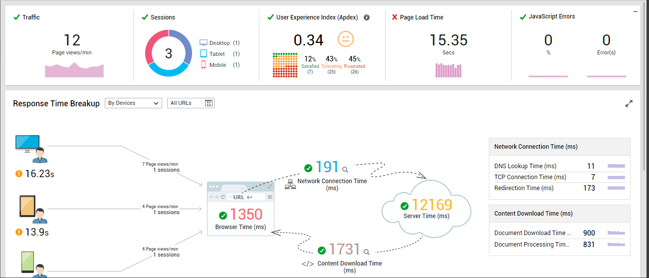
Figure 13 : Response time analysis
Using the Response Time Breakup section in Figure 13, you can easily and effectively analyze the response time per device type - i.e., desktops, mobiles, and tablets. A quick look at this visual representation will tell you if users using a specific type of device are seeing more slowness than the others.
You can also compare the responsiveness of a specific URL across device types by selecting the URL of interest to you from the All URLs drop-down. This will reveal the devices from which the URL has been accessed and the response time of the URL as seen as by the users of each device (see Figure 14). You will thus be able to tell whether the URL was slow across the board, or was slow for the users of certain device types only. This way, you can figure out if the poor application performance that the users of certain device types are experiencing is because the application is not optimized to handle requests for certain URLs from certain device types.
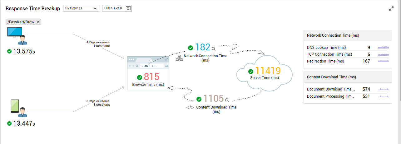
Figure 14 : Response time breakup for a chosen URL across device types
The Response Time Breakup section also reveals the probable cause for poor UX with the application - is it owing to a slowness at the browser end? a latent network? delay in content loading? or a processing bottleneck on the backend server? Note that this insight is provided at the application-level and not at the device type/URL level. If the section reveals that high network connection time is the reason for the poor responsiveness of the application, you can click on the 'magnifying glass' icon alongside Network Connection Time to view a break-up of that metric. This way, you can accurately diagnose the reason why network connections to the application took too long. Additionally, you can also identify those URLs that were badly hit by high network connection time (see Figure 15).
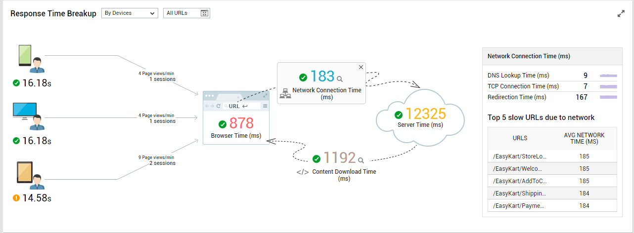
Figure 15 : Break-up of Network Connection Time and the top-5 URLs impacted by high network connection time
On the other hand, if the section reveals that high content downloading time is the reason for the poor responsiveness of the application, you can click on the 'magnifying glass' icon alongside Content DownloadTime to view a break-up of that metric. This way, you can accurately diagnose the reason why content downloading took too long. Additionally, you can also identify those URLs that were badly hit by high content download time (see Figure 16).
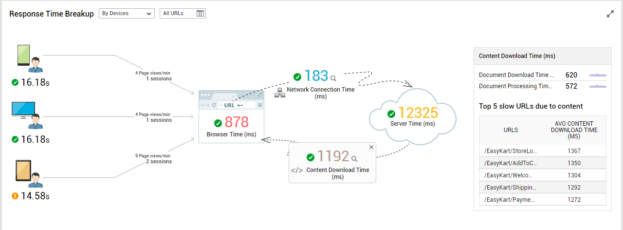
Figure 16 : Break-up of Content Download Time and the top-5 URLs impacted by high content download time
When viewed together with the per-device response time, this application-level response time breakup also reveals if the slowness at the browser, network, server, and/or content download areas has impacted all users or only users of a few specific device types. Typically, if an application is not optimized to handle requests from certain device types, then such requests may end up spending more time on the browser, network, server, and/or content downloading. Using Figure 16 therefore, you can identify those device types that the application is not optimized to support and where such optimizations should be performed.
Similarly, you can analyze responsiveness at the page group-level by selecting the Page Groups option from the Response Time Breakup drop-down (see Figure 17).
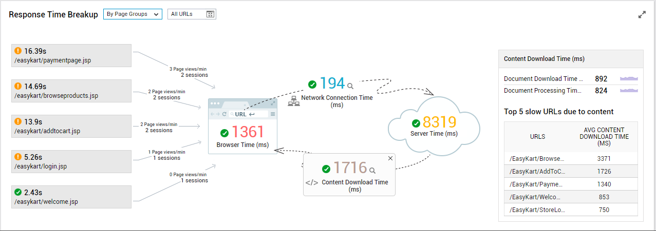
Figure 17 : Response time breakup analysis by page group
Using Figure 17, you can analyze the performance of the top-5 'least responsive' page groups in the target application. The response time of and the load imposed by (page views/minute and current sessions) each page group is displayed therein. This way, you can identify the page groups with which application users are having the maximum trouble! Here again, the response time break-up (browser time, network time, server time, and content download time) is presented at the application-level (and not at the page group-level). Using the break-up, you can determine why user experience with the application is poor. When correlating the application-level response time breakup with the page group-level analytics, you can figure out if the slowness that users are seeing on the browser, network, content processing, and/or are impacting all application users or only those accessing specific page groups. Sometimes, certain page groups in the application may not be engineered right to handle user requests. This inefficiency may manifest as high browser time, network time, server time, or even content download time. Figure 17 will point you to those page groups that may need fine-tuning.
User Experience Analysis Across Devices
For detailed analysis of response times across devices, click on the Omni Channel icon in the array of icons (see Figure 4) in the left panel of the dashboard. Figure 18 will then appear.
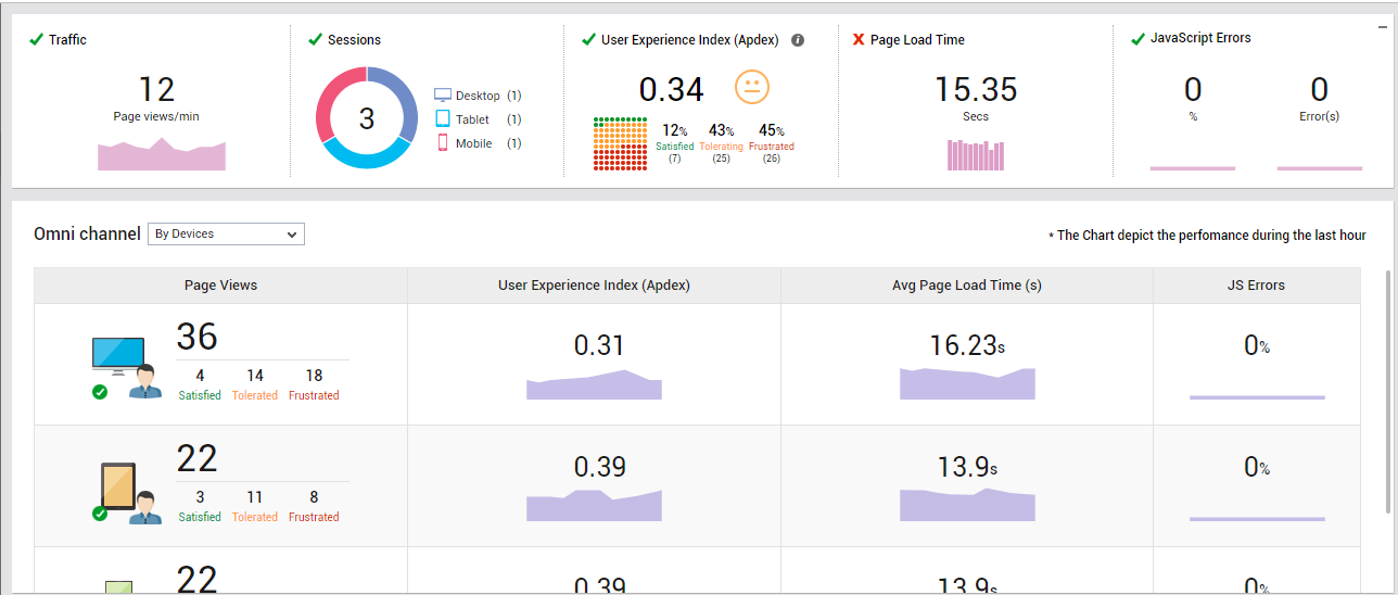
Figure 18 : User experience analysis by channel
For each type of device that is accessing the target application, the Omni Channel section in Figure 18 reveals the total count of page view requests that came from that device during the last hour, the Apdex score representing the experience of users using that device, the average page load time as seen by the users of that device during the last hour, and the count of JavaScript errors that were encountered by the users of that device in the last hour. This comprehensive comparison quickly and accurately points you to those types of devices that are experiencing maximum slowness when accessing the application.
User Experience Analysis by URL
If you want a quick summary of user experience across URLs or for a specific URL, click on the Page Views icon in the array of icons (see Figure 4) in the left panel. Figure 19 will then appear.
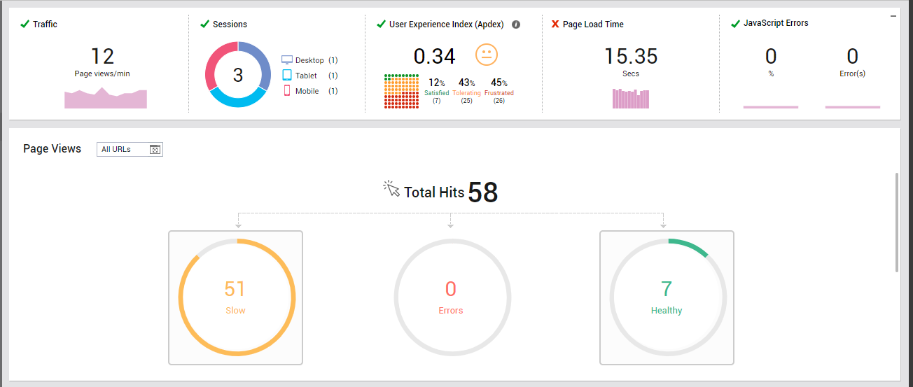
Figure 19 : Analysis across URLs
By default, the Page Views drop-down in Figure 19 is set to All URLs. Accordingly, this section reveals the total page view requests to the target application and the count of slow, healthy, and error page views. This will reveal if there are any URLs in the target that are loading slowly. If this representation reveals slow page views, then you can scroll down to view a summary of the slow page views, as depicted by Figure 20.
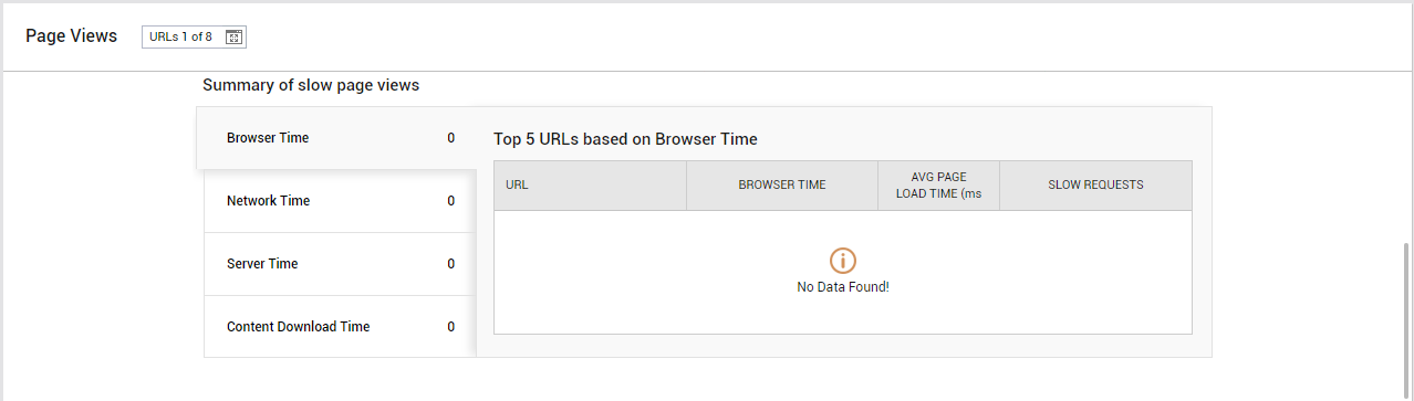
Figure 20 : Summary of slow page views
In this summary, you will be able to view the break-up of page load time on one side - i.e., browser time, network time, server time, and content download time. Clicking on any component of page load time will list the top-5 URLs that registered the maximum value for that component. In other words, if say Browser Time is chosen, then the top-5 URLs with the highest browser time will be displayed. In the process, you can figure out where your bottlenecks lie, and which URLs are impacted by these bottlenecks.
If you want to focus on the responsiveness of a particular URL, then select that URL from the Page Views drop-down in Figure 19. The Page Views section will then graphically represent the experience of users hitting that URL alone (see Figure 21).
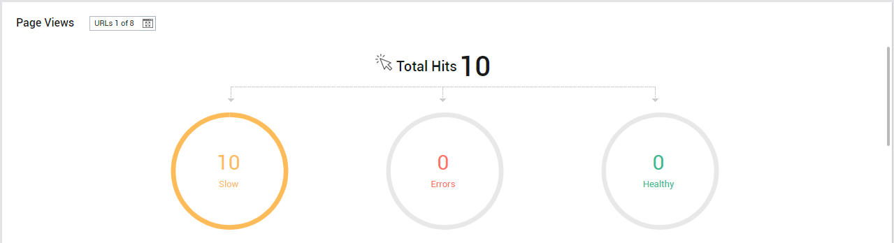
Figure 21 : Analysis of a chosen URL
Analysis by Usage
To cross-correlate across usage analytics related to the target application and to study usage trends, click on the Usage icon in the array of icons (see Figure 4) in the left panel of the dashboard. Figure 22 will then appear.
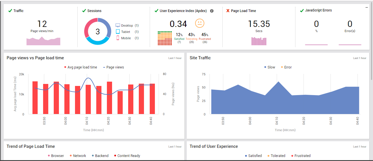
Using the Page views vs Page load time graph in Figure 22, you can easily time-correlate page view requests with page load time for the last one hour. In the process, you can figure out if page load time increased consistently, or only when page views increased. If the page load time keeps increasing regardless of the count of page views, you may need to investigate the reasons for the same. On the other hand, if application responsiveness deteriorates only when the traffic to the application increases, it could only mean that the application is not optimized to handle heavy loads.
You can use the Site Traffic graph in Figure 22 to closely analyze the traffic to the target site/application during the last hour. At the end of this analysis, you will be able to tell how healthy the page views were in the last hour - were they slow most of the time? did they experience too many JavaScript errors? or were they healthy most of the time?
You can then scroll down Figure 22 to analyze past trends in page load time and user experience, and to view the distribution of page views by device and browser (see Figure 23).
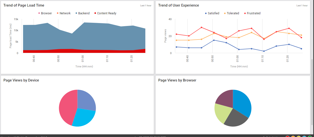
Figure 23 : Trend and distribution analysis
Using the Trend of Page Load Time graph in Figure 23, you can understand where your page view requests have spent most of their time in the last one hour - at the browser? on the network? in the backend server? or in content downloading? This will accurately reveal where your bottlenecks lie and where you need to focus your engineering efforts.
You can then analyze user experience trends using the Trend of User Experience graph in Figure 23. With the help of this graph, you can figure out whether the user experience with your application has been satisfactory or not during the last hour. Disturbing trends in user experience come to light in the process, so you can initiate measures to negate this trend before it becomes worse!
To view the most popular browsers and devices, in terms of the page view requests coming from them, use the Page Views by Device and Page Views by Browser distribution pie charts in Figure 23. To make sure that your application delivers an above-par experience to a majority of your users, optimize your application to offer the best support to these popular browsers and devices.
Error Analysis
For insights into JavaScript errors encountered by the target applications, click on the Errors icon in the array of icons (see Figure 4) in the left panel. Figure 24 will then appear.
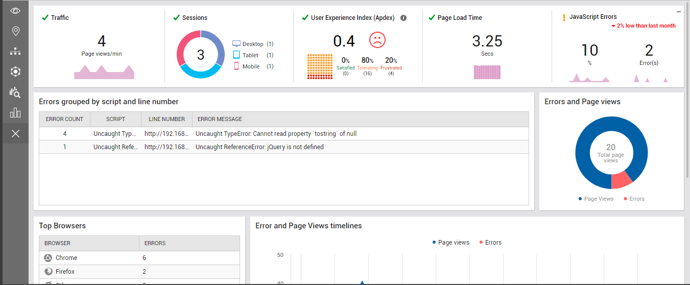
To know what JavaScript errors occurred on the target application, take a look at the Errors grouped by script and line number section. From this tabulation, you can quickly identify what errors occurred, where (on which line), and in which script.
To determine how many of the pages currently viewed have errors in them, use the Errors and Page Views distribution chart. This is also a good indicator of how badly page views are impacted by JavaScript errors.
Scroll down the Error analysis view to identify the top browsers and top URLs, in terms of the JavaScript error count (see Figure 25).
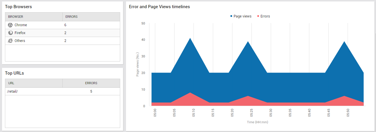
Figure 25 : Identifying error-prone browsers and URLs, and correlating error views with total page views
Use the Error and Page Views timelines chart in Figure 25 to study variations in the count of error views and total page views during the last hour. This will give you a fair idea of how frequently JavaScript errors occurred in the target application, and how many page views were impacted by these errors.