The Datastores Tab Page
The Datastores tab page reports the availability and usage of datastores, so that unavailable datastores and those that are currently running out of space can be accurately identified, and the hosts affected by this anomaly can be easily isolated.
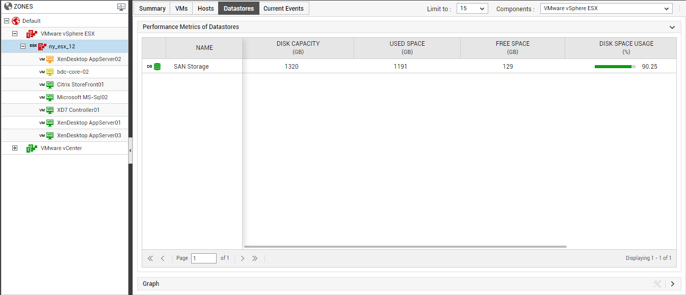
Figure 1 : The Datastores tab page
The datastores listed in this tab page will change according to the node you choose from the tree-structure in the left panel of Figure 1.
|
Node chosen |
Datastores displayed in the tab page |
|
Node representing a specific folder |
Datastores used by the vSphere hosts managed by that folder |
|
Node representing a specfic datacenter |
Datastores used by the vSphere hosts managed by that datacenter |
|
A specific vSphere host |
Datastores used by that host |
Regardless of the node chosen, the Datastores tab page will list only the top-15 (default) datastores in terms of their current state. Against every datastore displayed here, the availability and space usage metrics pertaining to that datastore will be provided, along with the number of VMs and ESX servers that have been using the datastore. Using this information, you can swiftly isolate unavailable or over-utilized datastores, and the number of ESX servers and VMs that have been impacted by the anomaly (see Figure 1). The default measure list that accompanies every datastore listed in the Datastorestab page can be modified. For this purpose, follow the steps detailed in The VMs Tab Page topic.
If you click on a datastore in the Datastores tab of , Figure 2 will appear leading you straight to the layer model of the VMware vSphere ESX server, which manages that datastore. In the event of the non-availability or excessive usage of a datastore, you can use this model to instantly identify the layer that has been affected by the problem with the datastore. Click on the problem layer to view the problem test, and then, click on the problem test to view the problem measure(s). This way, you can easily understand the nature of the problem with the datastore, and how it has impacted the state of the vSphere server.
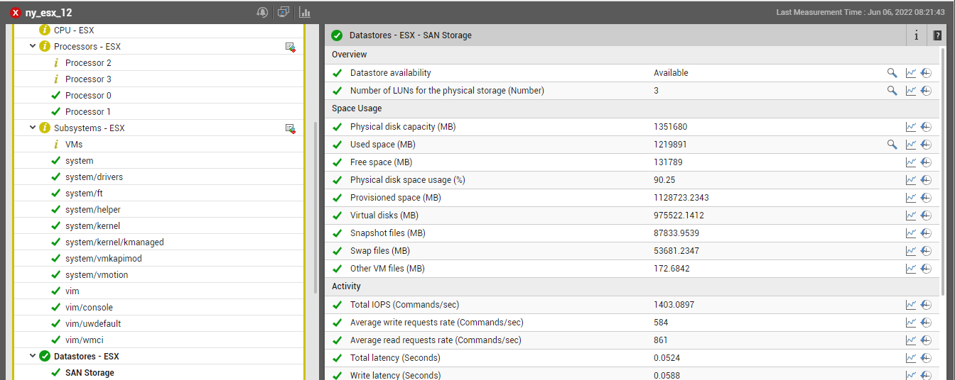
Figure 2 : The layer model of the vSphere server that appears when a datastore is clicked on in the Datastores tab page
In addition to listing datastores, the Datastores tab page provides a time-of-day graph. To view this graph, click on the right arrow icon in the Graph section of Figure 1. The Test drop-down in the Graph section is automatically sorted in the alphabetical order of the names of the tests related to datastores. The options in the Measures drop-down are also similarly sorted. The first test and first measure of the sorted lists will be the default selection in the Test and Measures drop-down lists, respectively. The default graph will be plotted for this Test-Measure combination only, for the last 1 hour (by default) (see Figure 3). You can select a different Test and Measure combination for the graph, if you so need.
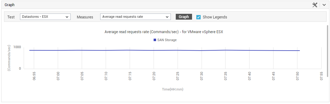
Figure 3 : The graph displayed in the Graph section of the Datastores tab page
Using this graph, you can efficiently analyze performance trends and proactively detect performance issues.
You can also override the default 1-hour graph timeline by defining a different Timeline for the graph. For this, click on the  icon in the Graph section, and specify a different timeline using the window that pops out.
Scrolling down the Graph section will reveal the legend of the graph (see Figure 4). This legend clearly indicates which datastore is represented using which color in the graph. This is accompanied by the Avg, Max, and Min values that the chosen Measure has recorded for every datastore during the chosen Timeline.
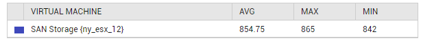
Figure 4 : The legend in the Graph section of the Datastores tab page