The Hosts Tab Page
The Hosts tab, as mentioned already, provides insights into the current state and the extent to which resources are currently used by the managed virtual hosts in the environment. This tab page sheds light on resource-intensive hosts, and embeds efficient drill downs to discover the underlying cause for the high resource consumption of a host.
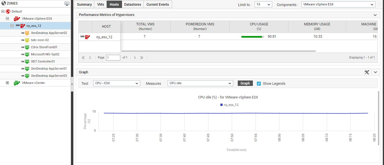
Figure 1 : The Hosts tab page of the VM Dashboard
|
Node chosen |
VMs displayed in the VMs tab page |
|
The global ZONES node |
All managed virtual hosts of the chosen type, across the environment |
|
A specific zone |
All managed virtual hosts of the chosen type in the selected zone |
|
Default zone |
All managed virtual hosts of the chosen type, which are not part of any zone |
|
Node representing a specific hypervisor type |
All virtual hosts of that type in the chosen zone |
|
Node representing a specific virtual host |
The chosen virtual host |
|
Node representing a management server type (e.g., VMware vCenter) |
Virtual hosts of the chosen type that are managed by all management servers of that type |
|
Node representing a management server of a specific type |
Virtual hosts of the chosen type that are managed by that management server |
|
Node representing a virtual cluster |
Managed virtual hosts in that cluster |
As stated earlier, this tab page, by default, provides the details of those managed virtual hosts that are of the type VMware vSphere ESX. Similarly, the details of the top-10 virtual hosts alone will be displayed in this tab page, by default. These default settings can however be overridden using the procedure discussed in The VMs Tab Page
The list of hosts displayed in the tab page is typically sorted by the current state of the hosts. If state is the same across hosts, then the hosts are arranged in the order of their host names. Against every virtual host, the state of the host, the total number of VMs configured on the host, the number of VMs powered-on, and a default set of metrics indicating the extent to which resources are currently utilized by the host, will be displayed. This default measure list can be modified by adding new measures to be displayed in the Hosts tab page or by removing one/more existing measures from the tab page. To achieve this, follow the steps detailed in The VMs Tab Page.
Besides revealing the VM load on each virtual host, this tab page also enables administrators to instantly figure out the following:
- Is any host experiencing performance issues currently?
- Is any VM on this host currently powered off?
- Are there any resource-hungry virtual hosts in the environment? If so, which ones are they?
If you click on a virtual host in this tab page, Figure 2 will appear revealing the layer model of that host. A quick look at the layer model will point you to the precise layer that is the root of all the performance problems that the virtual host is currently experiencing. You can drill-down from that problematic layer to diagnose the exact source of that virtual host's troubles.
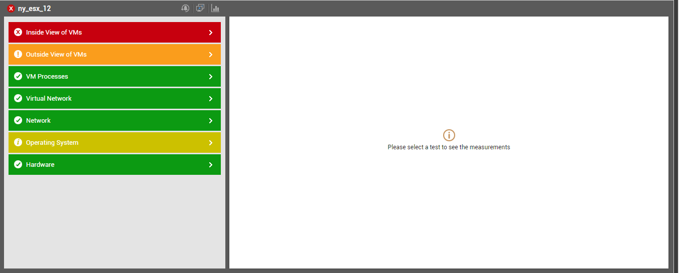
Figure 2 : Layer model of the virtual host that is clicked on in the Hosts tab page
Below the hosts list, you will find a Graph section (see Figure 3). To invoke this section, you need to click on the right-arrow icon at the end of it.
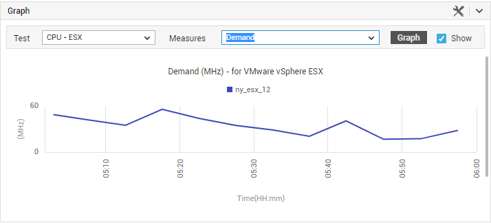
Figure 3 : The Graph section of the Hosts tab page
The Test list in this section will be populated with all the tests related to the virtual hosts of the chosen type. Note that VM-related tests will not be available for selection in this list. These tests will be sorted in the order of the test names, and the top test in the sorted test list will be selected by default in the Test list box. The Measures list naturally, will be populated with those metrics that the default Test reports. Since this list too is sorted in the order of the measure names, the top measure in the sorted list will be chosen by default in the Measures list. Using this graph, administrators can compare the performance of a particular measure across virtual hosts, and accurately identify those virtual hosts that are poor performers. If need be, you can plot a comparison graph for a different Test-Measure pair, for a different timeline. To change the timeline, click on the  icon in the Graph section; the window depicted by Figure 4 will then pop out, allowing you to change the date and time.
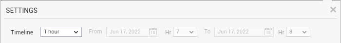
Figure 4 : The Timeline window
A legend is provided at the end of every graph clearly indicating which virtual host is represented using which color in the graph. This is accompanied by the Avg, Max, and Min values that the chosen Measure has recorded for every virtual host during the chosen Timeline. To view the legend, you can scroll down the Graph section.

Figure 5 : The legend in the Graph section
Note:
By default, while plotting a graph for a descriptor-based test across virtual hosts, eG Enterprise aggregates the measure values across all descriptors for a host, and plots only a single value for each virtual host. Accordingly, the AggregateGraphs flag in the Configuration Settings window that appears when the  button is clicked is set to Yes by default. Sometimes, administrators might want the graph to plots values per descriptor. In such a case, set the AggregateGraphs flag to No.