The VC Tab Page
Promptly detect issues with vCenter and swiftly diagnose the root-cause of these issues, using the VC tab page offered by the VM dashboard. This tab page appears only when you click on the VMware vCenter node, or the node representing a VMware vCenter node, in the tree-structure in the left panel of the dashboard. This tab page will list one/all vCenter servers in the environment (depending upon the node chosen from the tree). For each vCenter server, the tab page will report a default set of metrics revealing the availability and resource usage of that server. Resource-intensive/unavailable vCenter servers in the target environment can thus be instantly identified.
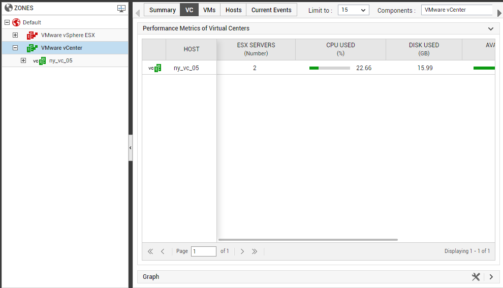
Figure 1 : The VC tab page
The default measure list that accompanies every vCenter listed in the vc tab page can be modified. For this purpose, follow the steps detailed in The VMs Tab Page topic.
In the event of a slowdown in the performance of a vCenter server, you can click on the name of that server in the vc tab page; this will lead you straight to the layer model of the vCenter server, which reveals the exact layer where the problem has originated. Click on the problem layer to view the problem test, and click on the problem test to view the measures (see Figure 2).
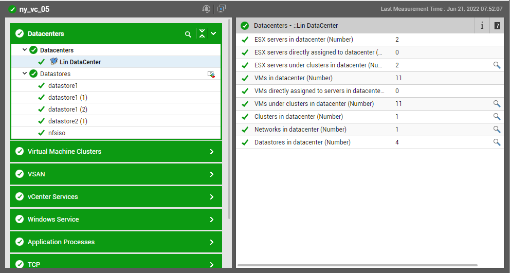
Figure 2 : The layer model, tests, and measures pertaining to the vCenter server
The vc tab page also embeds a time-of-day graph. To view this graph, click on the right arrow icon in the Graph section. The Test drop-down in the Graph section is automatically sorted in the alphabetical order of the names of the vCenter tests. The options in the Measures drop-down are also similarly sorted. The first test and first measure of the sorted lists will be the default selection in the Test and Measures drop-down lists, respectively. The default graph will be plotted for this Test-Measure combination only, for the last 1 hour (by default). You can select a different Test and Measure combination for the graph, if you so need (see Figure 3).
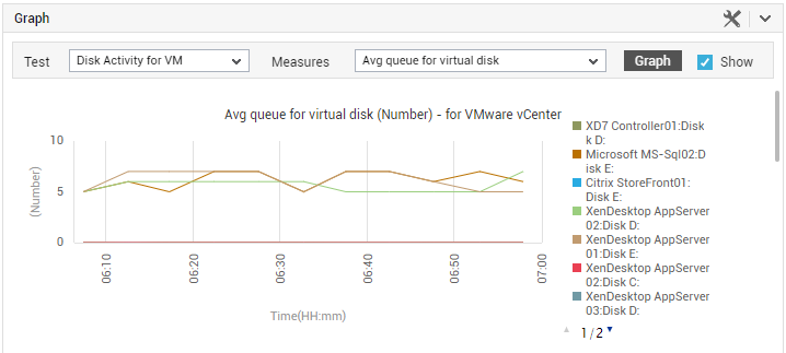
Figure 3 : The graph displayed in the Graph section of the VC tab page
Using this graph, you can efficiently analyze performance trends and proactively detect performance issues.
You can also override the default 1-hour graph timeline by defining a different Timeline for the graph. For this, click on the  icon in the Graph section, and specify a different timeline using the window that pops out.
If a graph is plotted for multiple descriptors, then a legend is provided at the end of that graph clearly indicating which descriptor is represented using which color in the graph. This is accompanied by the Avg, Max, and Min values that the chosen Measure has recorded for every descriptor during the chosen Timeline. To view the legend, you can scroll down the Graph section (see Figure 4):
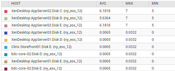
Figure 4 : The legend in the Graph section of the VC tab page