Learn how unified observability helps identify hidden cloud performance bottlenecks, TCP retransmissions, and application latency issues faster. Discover how cloud application slowness occurs despite healthy metrics and how unified observability helps identify hidden bottlenecks and resolve issues faster.
Why Cloud Applications Slow Down Even When Dashboards Look Healthy

A retail ERP system underwent a vertical scaling operation to support growth from 3,000 to 10,000 stores on AWS. Immediately following the cutover, users experienced widespread HTTP 503 (“Service Unavailable”) errors and checkout failures. Yet, standard performance dashboards indicated a healthy environment.
During the incident response, each team reviewed their respective telemetry, which indicated normal operation:
- Database Team: “Query latency is flat at sub-millisecond levels. The database is executing requests instantly.”
- Application Team: “JVM threads are in a WAIT state on
sun.nio.ch.SocketDispatcher.read. The code is blocked, waiting for database responses.” - Infrastructure Team: “CPU is at 9%, storage IOPS is at 8%, and bandwidth is within SLA. We have substantial headroom.”
While component-level metrics appeared healthy, system-wide transactions were failing.
Case Study: Hidden Bottlenecks in Cloud Application Scaling
To understand why this happens, we have to look outside standard telemetry. This article breaks down a real production incident where the root cause was an invisible bottleneck: the EC2 instance had hit a hard packets-per-second (PPS) ceiling, not a bandwidth limit.
The system looked perfectly healthy at 9% CPU and under 10% storage IOPS. It wasn’t; it was silently discarding traffic. TCP retransmissions had climbed past 20% at peak (with spikes to 50%), database insert latency jumped from 1ms to 150ms, and connection time to the SQL service ballooned to 3 seconds.
The standard monitoring stack saw none of it.
This postmortem documents how cross-layer correlation—specifically overlaying synthetic connection probes, network stack metrics, and application thread states on a single timeline—exposed what siloed monitoring missed, and exactly what SRE teams must instrument to catch it early.
(Note: This article summarizes a 15-page forensic postmortem. Download the full technical case study (PDF) for the complete timeline, configuration diffs, and TCP tuning parameters.)
Common Observability Blind Spots in Cloud Environments
Troubleshooting an outage where component metrics are green but users are seeing 503s creates an operational blind spot. Standard monitoring tools are built to answer ‘Is it up?’ and ‘Is it busy?’—they aren’t built to answer ‘Is the packet flow healthy?’
This postmortem breaks down four specific blind spots that hid the root cause from the operations team:
-
Utilization vs. Saturation: The infrastructure team saw 9% CPU utilization, yet the system was silently dropping >20% of packets. The CPU wasn’t busy, but the kernel queue was full. Standard tools missed this because they don’t correlate transport-layer metrics with resource utilization.
-
PPS Limits vs. Bandwidth Limits: An instance can hit a packet processing limit while overall bandwidth remains well within SLA. Cloud provider health checks reported “Healthy” because the bandwidth pipe wasn’t full, even though the underlying network interface couldn’t serialize the TCP handshakes fast enough.
-
Breaking the “Green Dashboard” Deadlock: When every siloed team has a clean dashboard, you need a unified timeline. Proving this was a transport issue (and not a slow database) required overlaying application thread states with network counters.
-
The Managed-Cloud Responsibility Myth: The cloud provider guarantees infrastructure availability, but the configuration of the data plane (connection lifecycles, packet-flow behavior, and OS-level networking) remains entirely the domain of the operations team.
Challenges in Scaling Cloud Applications
This outage occurred after a strategic acquisition required the ERP system to scale up. To support the load, Engineering executed a standard vertical scale-up: EC2 instances were upgraded to 32 vCPU general-purpose families (m5.8xlarge), and RDS was migrated to SQL Server Standard Edition.
Immediately post-cutover, inventory updates began failing with timeouts. Yet, as the war room participants insisted, the standard telemetry backed up their claims of a healthy environment:
- Database CPU: 9% average (Peak 17%)
- IOPS: 8% average
- Query Execution: <400ms.
- JVM Threads: Saturated at 1,500 (Max Pool). Dominant thread state: WAIT.
- Infrastructure: Memory allocations normal, Bandwidth within SLA.
Cloud Infrastructure Limitations That Impact Performance
In a traditional data center, ownership is clear. If a switch port is saturated, the Network team logs into the device and fixes it. In the cloud, the network is an opaque abstraction where the provider owns the physical wire, while the operations team owns only the logical configuration and data plane.
When latency spikes without explicit errors, no one sees a red light on “the network.” Each team falls back to the boundaries of its own dashboards. The application server, OS/kernel, and database all looked healthy in isolation—even as packets were being dropped in the middle.

In this incident, every team reported healthy metrics (ALB, App/EC2, RDS) while packets were dropped in the invisible layer between them. At the risk of repeating the core concepts, it is critical to examine exactly how these specific blind spots manifested for each team to understand why the root cause remained invisible for so long.
The Database Administrator’s Perspective: “My Engine is Fast”
The DBA focused on the golden metric of their domain: Query Execution Time. This measures the milliseconds between the database receiving a query and finishing it.
As the performance data showed, this metric remained flat at a steady baseline (just 31 ms) throughout the outage. The DBA’s conclusion was logical: “The database is processing requests instantly. The problem is upstream.”
Why the Discrepancy?
Standard database performance tools only measure the “tip” of the transaction. As illustrated in the iceberg analogy below, the bulk of the latency (~3,000ms) was hidden beneath the surface in the transport layer—consumed by SYN/ACK retries, packet drops, and kernel queue waits—entirely invisible to standard SQL monitoring.

- The Flaw: Their dashboard was scientifically accurate but practically blind. It measured processing time (just 31 ms) but missed the 3-second delay requests spent in TCP connection establishment.
Application-Level Visibility Gaps in Cloud Monitoring
The Application Developers analyzed JVM thread dumps. They found hundreds of threads in a WAIT state (specifically blocked on sun.nio.ch.SocketDispatcher.read).
-
The Developer’s Conclusion: “The app is blocked waiting on the database. The code isn’t churning CPU or looping; it’s waiting for a socket response.”

The application thread reports it is waiting, which developers often mistake for a slow database. In reality, that time is being consumed by the OS Kernel retrying dropped packets. The actual database query is a tiny fraction of the total delay.
- The Flaw: To a Java developer, a WAIT state is an exoneration. It proves the code isn’t the bottleneck. However, without visibility into the TCP stack, they couldn’t distinguish between a slow database (processing delay) and a slow network (travel delay). They assumed the former because that is the standard interpretation of WAIT.
Infrastructure Monitoring Blind Spots in Cloud Systems
The System Administrator monitored the EC2 fleet. The signals were overwhelmingly positive: the m5 instances had massive vCPU headroom, storage IOPS averaged just 8%, and there were zero OS-level alarms.
- The SysAdmin’s Conclusion: “Infrastructure health is green. We have plenty of capacity.”
- The Flaw: They tracked Utilization (busy time) but missed Saturation (queue depth). The NIC was silently dropping packets due to the instance hitting its Packets-Per-Second (PPS) ceiling, not bandwidth.
The Fallacy of the Idle CPU
We are trained to equate CPU % with Work. If the CPU is 90%, the server is busy; if it’s 10%, it’s available.
But in distributed systems, “Idle” is ambiguous. It can mean:
- True Idleness: The system has zero pending tasks.
- Starvation: The system has pending tasks but is blocked on I/O.
In this incident, the CPU was starved. The packet processing queue was saturated, preventing requests from crossing the user/kernel boundary to reach the application. This demonstrates why CPU utilization is a flawed proxy for availability: A low-utilization CPU is often a symptom of high-saturation I/O.
Transport-Layer Bottlenecks in Cloud Architectures
In this incident, the bottleneck lived in the transport layer, not the application logic. The application server was attempting to serialize thousands of concurrent TCP handshakes on a single network interface, overwhelming the instance’s packets-per-second (PPS) limit. It was a packet-rate bottleneck, not a bandwidth bottleneck.
The graphic above illustrates this: a wide road (10Gbps bandwidth available) with a narrow gate (PPS limit). The server could handle the total volume, but not the rate of small packets.
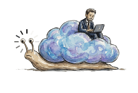
How Non-Linear Failures Impact Cloud Performance
This created a classic non-linear failure mode.
- Linear Phase (0–3k Stores): Performance was flat and stable.
- The Saturation Point: As soon as the load crossed the concurrency threshold, we hit the “knee” of the curve. Latency didn’t just drift; it went vertical.
Standard metrics (CPU/IOPS, basic health) stayed deceptively normal. The failure only became obvious once the team correlated synthetic connection time with TCP retransmissions and JVM thread states across the same time window.
Cloud Shared Responsibility & Performance Monitoring
There is a pervasive myth that running on managed infrastructure outsources performance risk. This incident demonstrated the risk of that assumption.
When the team escalated the issue with time-correlated graphs, synthetic test results, and tcping data, the cloud provider’s official response was: “Everything is fine from our end.”
Cloud providers ensure the health of their underlying infrastructure. However, application performance and connection-layer behavior remain the customer’s responsibility. Under the shared responsibility model, ensuring that the underlying TCP stack and network parameters are tuned to handle the required transactional load falls entirely on the operations team.
The compute and storage resources were functioning normally. The bottleneck was network packet processing within the EC2 instance itself. It was simply mismatched to the packet rate being pushed through it. This mismatch stayed invisible without transport-layer visibility.
Why Traditional Monitoring Fails in Cloud Environments
Standard CloudWatch is strong on instance health and resource metrics, but it’s weak on the transport-level symptoms that explain connection quality and packet flow. In this incident, the decisive signals lived at a layer you typically don’t get from basic instance dashboards:
- TCP retransmission rates: A strong indicator of packet loss and congestion.
- TCP handshake latency: Time to establish a new connection (SYN → ACK).
- Network Adapter Buffer Exhaustion: Drops occurring when instances hit packet-per-second (PPS) limits or exhaust transmit/receive buffers.
Even when upgrading to enhanced networking like AWS ENA Express, critical visibility gaps remain in standard cloud dashboards. TCP handshake latency is simply not exposed as a native instance metric. Low-level counters for packet drops or OS-level socket exhaustion are often cumulative or buried in driver-level tools, making them reactive rather than easily alertable.
These transport-level metrics—not CPU or bandwidth—are what reveal network processing bottlenecks. (Recommended Alert: TCP Retransmits rising above a near-zero baseline, or anomalous spikes in database connection time).
Why Conventional Performance Tuning Failed
Before the team proved the issue was transport-layer latency, they worked through the standard optimizations—driver tuning, connection pooling changes, and database-side adjustments—because early symptoms looked like a classic app/DB bottleneck. They toggled driver behaviors (including TcpNoDelay and packet sizing), tried different JDBC drivers (jTDS vs Microsoft), increased the initial connection pool to reduce handshake frequency, and even reduced SQL Server’s memory allocation to free resources for the OS/TCP stack.
None of these moved the needle on the key symptom: connection establishment time remained erratic and high. That “failure to improve” became a critical data point—it narrowed the root cause away from application/database configuration and toward the network transport path and packet processing behavior between the tiers.
How Unified Observability Enables Faster Root Cause Analysis
To bypass the siloed views, the team used eG Enterprise for unified observability. Instead of relying on passive infrastructure metrics, it executed an active validation and correlation strategy:
-
Synthetic Validation: Periodically initiated real database connections from the EC2 tier to measure round-trip time. This revealed a critical discrepancy:
- Connection Time: Spiked to over 3 seconds during peak periods.
- Query Execution Time: Remained flat at a baseline of 0.4 seconds.
- Conclusion: This mathematically isolated the latency to the pre-execution phase: the delay was occurring in the network handshake.
-
Cross-Layer Correlation: By overlaying metrics from the application, network, and database on a single timeline, the pattern became undeniable:
- TCP Retransmits: Spiked from near zero to over 20% at peak load, climbing as high as 50% of total packets sent in some intervals
- Database Connection Time: Jumped to 3 seconds while Query Execution stayed flat.
- JVM Threads: Hit 1,500 (saturated) while SQL CPU remained at 9% (idle).
The root cause was not visible in any single metric; it emerged only through correlation. The database was performant. The network was dropping packets. The system was throttled by TCP handshake serialization, not compute capacity.
Best Practices to Optimize Cloud Application Performance
Once the transport layer was identified as the bottleneck, the solution was architectural, requiring zero changes to the application logic:
- Enabled HTTP Keep-Alives: Reduced TCP handshake volume by allowing persistent connections between the Application Load Balancer (ALB) and the Tomcat tier.
- Upgraded Instance Class: Migrated from m5.8xlarge to m6in.8xlarge. This retained identical CPU and memory capacity, but unlocked AWS ENA Express (SRD technology) for accelerated packet processing and reduced jitter.
- Tuned the OS/Network Stack: Disabled RSC and ECN; expanded the ephemeral port range; increased free TCBs (Transmission Control Blocks); and heavily enlarged the receive/transmit buffers on the EC2 adapter. This allowed the system to absorb high-concurrency bursts without dropping frames.
The full configuration parameters, registry keys, and Tomcat connector settings for each of these changes are documented in the complete case study PDF.
Why Flow-Based Monitoring Matters in Cloud Observability
Scaling goes beyond vertical provisioning. It requires understanding how architectural limits manifest under increased load. A system that works at 3,000 users can fail non-linearly at 10,000. This happens not because of compute exhaustion, but because of transport saturation.
To detect these failures, move from measuring resource consumption (CPU, Memory) to measuring flow quality (Connection Time, Retransmission Rate, Buffer Exhaustion). In cloud environments, the transport layer is often the first place scale breaks, yet it is the last place teams instrument.
Download the Full Case Study
We have documented the complete forensic analysis of this incident in our technical white paper, including:
- The exact correlation that isolated the root cause.
- Step-by-step configuration changes for TCP tuning, Keep-Alives, and ENA Express.
- Eight architectural principles for scaling cloud applications without hitting non-linear failure curves.

Why Unified Observability is Essential for Modern Cloud Operations
A “Healthy” status from your cloud provider means the infrastructure is running as designed. It does not mean your transactions are completing on time.
This incident proved that a system can be simultaneously healthy by every dashboard metric and broken from the user’s perspective. The gap lives in the transport layer—a layer no single team owns, and the last layer anyone instruments.
Conventional monitoring answers ‘Is it up?’ whereas Unified monitoring answers, ‘Why is it slow?’. eG Enterprise correlates infrastructure signals (TCP retransmits), application context (thread states), and database behavior (connection time vs. query time) on a single timeline — so the next time every dashboard is green and users are seeing 503s, you have a path to root cause in minutes, not days.
Break the ‘Not My Problem’ loop.
Key Learnings for Cloud Application Performance Optimization
The key takeaway from this case study is that cloud slowness often stems from hidden cross-layer bottlenecks rather than isolated components. Teams must move beyond siloed dashboards and correlate application, network, and infrastructure metrics. True optimisation requires unified observability, transport-level visibility, and focusing on end-to-end transaction flow instead of CPU or resource utilisation alone.
How eG Enterprise Improves Cloud Observability & Troubleshooting
eG Enterprise enables end-to-end observability by breaking down monitoring silos and correlating signals across all infrastructure layers—application, database, virtualisation, and network—on a single timeline. As shown in the case study, it links symptoms like latency and errors to hidden issues such as TCP retransmissions or packet loss. This removes “not my problem” gaps and quickly identifies the true root cause across teams.
eG Enterprise is an Observability solution for Modern IT. Monitor digital workspaces,
web applications, SaaS services, cloud and containers from a single pane of glass.
Benefits of Unified Observability in Cloud Environments
- End-to-end visibility: Correlates application, infrastructure, database, and network telemetry with a single pane of glass, helping teams see the full transaction path.
- Detects hidden bottlenecks: Identifies issues like dependency latency, packet drops, and connection delays that isolated metrics miss.
- Faster root-cause analysis: Enables teams to pinpoint whether slowness originates from transport, services, or infrastructure layers.
- Breaks down silos: Provides a shared view across teams, reducing blame-shifting and improving collaboration.
- Optimizes user experience: Keeps focus on transaction flow and performance consistency in hybrid cloud environments.
eG Enterprise is an Observability solution for Modern IT. Monitor digital workspaces,
web applications, SaaS services, cloud and containers from a single pane of glass.
Frequently Asked Questions
Traditional monitoring tools are built to answer ‘Is it up?’ and ‘Is it busy?’—they aren’t built to answer questions such as ‘Is the packet flow healthy?’. Failure to capture the relevant metrics can lead to scenarios where those metrics captured look normal and healthy because the metrics needed are missing leading to visibility gaps.
What the infrastructure team observed is a classic example of the difference between resource utilization and resource saturation. Utilization asks: “How busy is the CPU?” Saturation asks: “Is demand exceeding the system’s ability to process work?” The bottleneck was not compute capacity but was packet processing latency and queue depth inside the networking stack.
Packets-Per-Second (PPS) limits are the maximum number of network packets that a component (for example cloud instance, virtual NIC, firewall or load balancer) can handle. In cloud infrastructure, systems may hit PPS limits before bandwidth or CPU limits, especially with many small packets. Exceeding PPS capacity causes packet drops, retransmissions, increased latency, and degraded application performance despite low overall resource utilization.
TCP retransmissions occur when packets are lost or delayed, forcing the sender to resend data. They increase latency, reduce throughput, and consume additional bandwidth and CPU resources. High retransmission rates usually indicate congestion, overloaded queues, or network instability, causing slower application responses and degraded user experience even when system utilization appears low.
Traditional monitoring fails in cloud environments because it focuses on isolated metrics (CPU, memory, uptime) rather than end-to-end service behavior. It lacks correlation across application, network, and infrastructure layers, missing transient issues like latency spikes, packet loss, or dependency failures. Cloud systems are dynamic, distributed, and ephemeral, making static thresholds and siloed tools insufficient for root-cause analysis and real user experience visibility.
Unified observability in cloud monitoring is the practice of correlating metrics, logs, traces, and events across all layers—applications, infrastructure, network, and user experience—into a single, contextual view. It enables teams to understand end-to-end system behavior, quickly identify root causes, and detect performance issues in distributed, dynamic cloud environments.
Organizations can prevent cloud performance bottlenecks by combining proactive monitoring, capacity planning, and end-to-end observability. Key practices include tracking latency, throughput, and saturation across compute, storage, and network layers; using autoscaling effectively; testing dependencies like databases and APIs; and identifying early signals such as queue buildup, packet loss, or CPU contention before they impact users.
There can be multiple reasons for cloud application slowness. Bottlenecks often exist in transport layers, service dependencies, or network flows – areas that are not visible through basic CPU or memory monitoring. Sometimes, “green dashboards” can also mislead teams into believing that everything across the IT stack is functioning normally. While, latency may be accumulating across multiple tiers, including APIs, databases, and underlying infrastructure. To diagnose such issues effectively, organizations must move beyond surface-level metrics and correlate telemetry across layers to understand the true source of performance degradation.
TCP retransmissions occur when network packets are lost or delayed and must be resent. In cloud environments, this is typically a sign of congestion or transport-layer inefficiencies. While retransmissions are a low-level network metric, their impact is felt at the application level.
Green dashboards often focus on individual component health. Such as CPU, memory, or uptime, rather than end-to-end transaction behavior. As a result, systems can appear healthy even when users are experiencing slow or failed requests. The limitation lies in siloed monitoring. When metrics are not correlated across application, infrastructure, database, and network layers, it is impossible to understand causal relationships. Bottlenecks in dependencies, packet flow, or queueing delays may go unnoticed. Unified observability addresses this gap by correlating telemetry across layers and mapping it to user transactions, ensuring that performance issues are detected based on real experience rather than isolated metrics.
Packets per second (PPS) limits define the maximum rate at which an EC2 instance can process network packets. These limits can become a bottleneck well before CPU, memory, or bandwidth are fully utilized.
When PPS limits are reached, packets may be dropped or delayed, leading to increased latency and degraded application performance. This can happen even when infrastructure dashboards appear green. This makes PPS a critical but often overlooked constraint in cloud environments.
By tying PPS monitoring to transaction performance and network health, organizations can identify situations where packet-processing capacity is the real limiting factor.
 Arun is Head of Products, Container & Cloud Performance Monitoring at eG Innovations. Over a 20+ year career, Arun has worked in roles including development, architecture and ops across multiple verticals such as banking, e-commerce and telco. An early adopter of APM products since the mid 2000s, his focus has predominantly been on performance tuning and monitoring of large-scale distributed applications.