Microsoft 365 User Dashboard
The Microsoft 365 User Dashboard provides administrators with a centralized view of detailed statistics for every user in the organization. It tracks and displays key metrics such as mailbox usage, OneDrive storage consumption, mail and communication activities, and license assignments. The dashboard also issues warnings when a user is approaching mailbox and reveals if OneDrive storage is utilized excessively, enabling administrators to take proactive action before these limits disrupt work. By regularly reviewing this dashboard, administrators can identify inactive or underutilized accounts, reassign licenses to optimize costs, monitor collaboration patterns, and detect unusual activity that may require investigation. This comprehensive view not only streamlines user management but also supports compliance, resource planning, and the smooth functioning of Microsoft 365 services across the organization.
To access the Microsoft 365 User Dashboard, click on the  icon available in the Monitor tab. Then, select the Users option under the MS Office 365 node in the Dashboards tile. then appears:
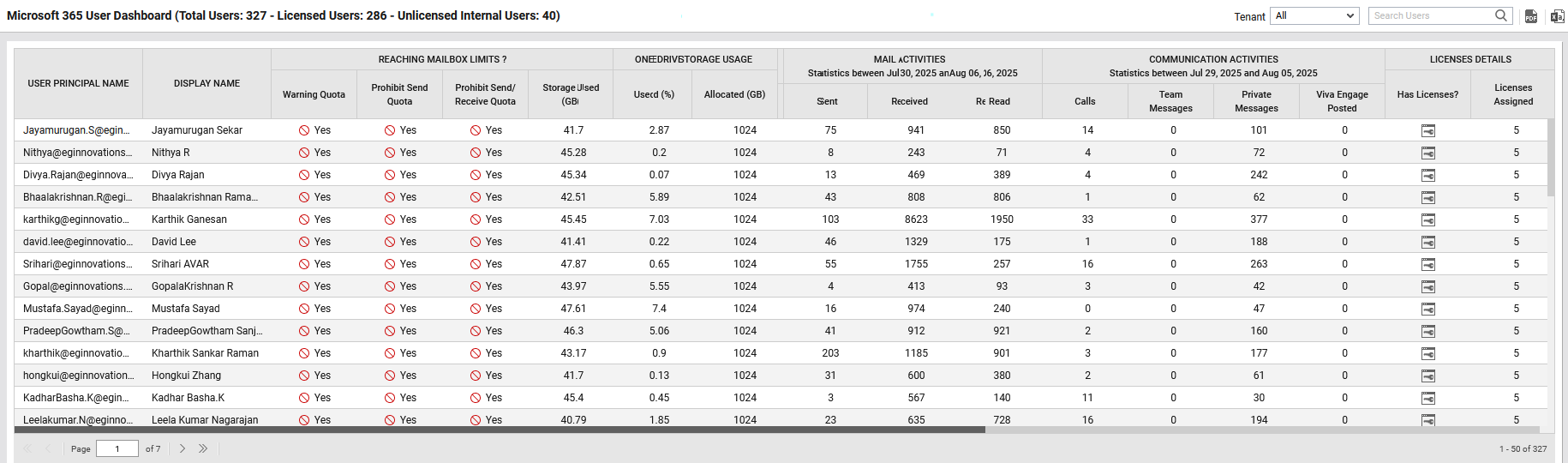
Figure 1 : The Microsoft 365 User Dashboard
By default, All option is chosen from the Tenant list box indicating that this dashboard is generated for all tenants in the environment. The dashboard reveals the following:
-
Lists principal name and display name of each user for quick reference.
-
Shows whether users are nearing their warning, send quota, or send/receive quota limits, along with the actual mailbox size in GB.
-
Displays OneDrive storage utilization by each user, helping administrators to track cloud storage consumption by each user.
-
Summarizes email usage within a specified date range, including messages sent, received, and read.
-
Tracks collaboration metrics such as Teams calls, team messages, private messages, and Viva Engage posts.
-
Indicates whether a user has a license assigned and specifies the number of licenses allocated.
However, if you wish to generate this dashboard for a specific tenant, then select that tenant from the Tenant list box. For example, refer Figure 2.
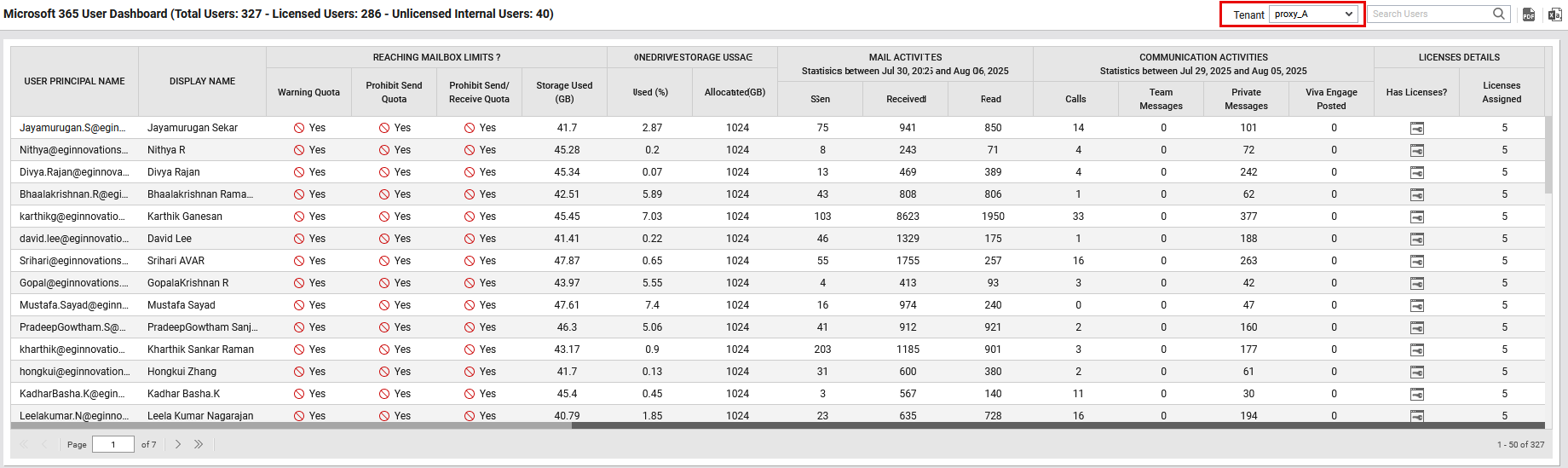
Figure 2 : The Microsoft 365 User Dashboard for a specific tenant
You can view a PDF of the dashboard by clicking on the  icon in the top-right corner page. You can also export the dashboard as an excel file using the Excel icon provided in the right-corner of the dashboard. Specify a part or whole name of a user in the Search text box to view the details of that particular user.
For deeper analysis of user experience with Microsoft 365 services, you can click on the user's name in the user principal name column Figure 1. This will invoke the Microsoft 365 User Dashboard for the chosen user (see ).
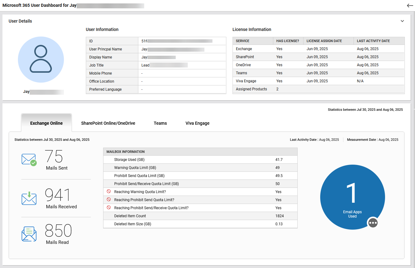
Figure 3 : The Microsoft 365 User Dashboard for a specific user
This dashboard presents a consolidated view of a specific user’s activity across Microsoft 365 services, license status, and resource usage. The User Details section comprises of User Information and License Information tables. The User Information displays details such as the user’s ID, name, job title, contact information, and preferred communication language. The License Information table lists the services assigned to the user, indicates whether the user has valid licenses, and provides timestamps for when these licenses were activated, along with the last date the user accessed each service. The tabs in this dashboard provide service-specific insights, as outlined below.
The Exchange Online tab (see Figure 3) displays the user’s email activity for a chosen date range, including the number of mails sent, received, and read. The Mailbox Information table provides details such as storage space used (in GB) by the chosen user, defined quota thresholds (Warning, Prohibit Send, Prohibit Send/Receive), indicators showing whether the user is approaching or has reached these limits, the number and size of items deleted from mailbox. Additionally, a visual indicator shows the number of email applications used by the user. To know what are all the applications are being used by the user, click on the three-dotted icon attached to the visual indicator.
The SharePoint Online / OneDrive tab provides a detailed breakdown of the user’s activity within SharePoint Online and OneDrive during the selected date range.
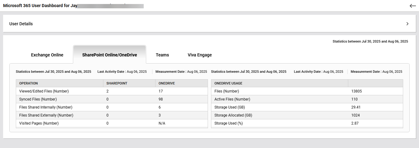
Figure 4 : The SharePoint Online / OneDrive tab
This tab displays the count of files viewed or edited, synced, and shared (both internally and externally), along with the number of SharePoint pages visited. Additionally, the OneDrive Usage tabular section offers storage insights such as total number of files and active files, storage space used, allocated storage capacity (in GB) and percentage of storage utilized. These metrics help administrators assess the file utilization level, storage consumption patterns, and sharing behavior.
The Teams tab provides a detailed breakdown of the user’s call quality, network performance, and overall communication experience within Microsoft Teams. The Teams Dashboard will appear upon clicking this tab as shown in Figure 5. This dashboard displays the key metrics to help administrators to identify whether issues are user-specific, network-specific, or device-specific, pinpoint problem patterns over time, compare internal and external network call quality and monitor the balance between audio, video, and screen-sharing performance.
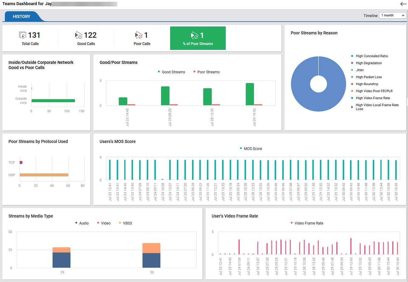
Figure 5 : The Teams Dashboard
The Teams Dashboard displays the following:
-
The top row of the dashboard displays the total number of Teams calls made by the user within the selected timeline, the count of good calls i.e. calls with better audio and video quality, and the number of poor calls i.e. calls that did not meet quality standards. The percentage of calls with poor streaming quality is also displayed. Clicking the Total calls/Good calls/poor calls will show a table listing the details of chosen call. For example, if you click on the Total calls in Figure 5, then it will display the Total Calls section as shown in Figure 6. The table in this section displays a unique identifier for each call or meeting session, User Principal Names (UPNs) of the two main participants in the call, UPN of the person who scheduled or organized the meeting or call, the exact timestamps indicating when the call began and ended, the total length of the call in minutes, the call type (whether the call was a P2P (peer-to-peer) interaction or a Conf (conference call)) and icons showing whether audio, video, and VBSS (Video-based Screen Sharing) streams were used during the call.
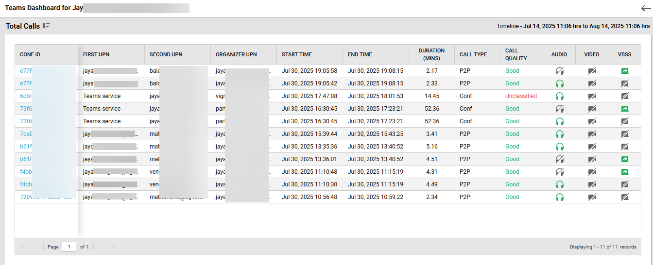
Figure 6 : The Total Calls table of the Teams Dashboard
To get a deep insight into a particular call, click any ID provided in the conf id column of Figure 6. This will display the following call session flow that visually shows participants, session type, start/end times, and call duration for the selected interaction as shown in Figure 7.
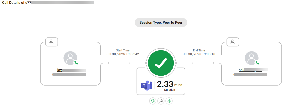
Figure 7 : The details of the selected call
Clicking a participant name in Figure 7 will open the call id page (Figure 8) for the chosen participant.
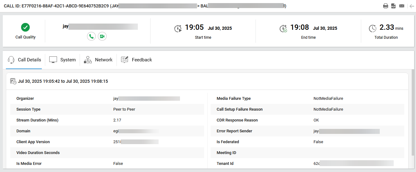
Figure 8 : The details of a call participant
This page provides a summary of an individual Microsoft Teams peer-to-peer call, call quality status, start and end times, total and stream duration, and other details such as domain, client version, and tenant ID. This page also reveals whether there were media or setup failures and if the call was not federated. Likewise, Network, System and Feedback tabs display the device-level details about the participant’s hardware and software, network-related statistics for the call and user-submitted ratings and comments (if any), respectively.
-
The bar chart in the Inside/Outside Corporate Network – Good vs. Poor Calls widget helps administrators to compare the quality of calls based on whether they are established via the internal corporate network or external network. This helps them to assess whether network location impacts call quality.
-
The Good/Poor Streams widget graphically displays the number of good and poor media streams across different timestamps. This view helps administrators to track if poor stream incidents are isolated or recurring.
-
The Poor Streams by Reason widget breaks down the root causes of poor-quality streams and visually distributes the possible reasons in the doughnut chart based on their occurrences.
-
The bar chart in the Poor Streams by Protocol Used widget graphically displays the count of poor-quality streams transferred through TCP and UDP transport protocols. This helps administrators identifying if poor quality correlates with a specific protocol (e.g., UDP over unreliable networks).
-
The User’s MOS Score widget graphically presents the MOS (Mean Opinion Score) for the calls made by the chosen user over time. The high bars in the bar chart indicate stable audio quality whereas the low bars indicate potential audio quality problems.
-
The Streams by Media Type widget displays the distribution of streams based on the type of media used during calls. The media types are categorized as Audio, Video, and VBSS (Video-based Screen Sharing). The bar chart shows how many streams of each type occurred over the selected period, helping administrators understand the nature of call usage.
-
The User’s Video Frame Rate widget represents the frame rate of the user's video streams over time. A consistent frame rate indicates stable video quality, whereas fluctuations or drops may suggest network congestion, performance issues, or device limitations. This helps administrators analyze the smoothness of video playback and identify possible causes of degraded video quality.
The Viva Engage tab highlights the user’s social engagement and participation in organizational communities through Microsoft Viva Engage.
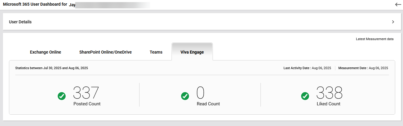
Figure 9 : The Viva Engage tab
The tab reports the number of posts the user has created in Viva Engage communities, reflecting their contribution to discussions and knowledge sharing, the number of posts the user has read, indicating their level of content consumption within the platform and the number of likes or reactions the user has given to others’ posts, showing their engagement with peer contributions. These insights help administrators assess how actively the user participates in collaborative communities, both as a contributor and as a consumer of shared content.