Designing a Report Template
To design a report template of interest to you, you need to configure the widgets using the Config Report Template pop up window that appears soon after you click the CREATE button to create a template. The widgets that can be added to the report template are listed as horizontal stacked tabs (see Figure 1). By default, the Horizontal Bar Chart tab is chosen for configuration. This section explains in detail on how to configure each type of widget.
Use the Horizontal Bar Chart widget to compare the values of the chosen measures-descriptors combination during the last measurement period. A bar graph can be generated for closely related measures so that you can accurately diagnose the root-cause of performance problems in an infrastructure. For instance, a bar graph comparing the CPU usage of a virtual host, the relative CPU usage of the VMs, and the actual CPU usage of the VMs, will lead you to the root-cause of a CPU contention experienced by a VM.
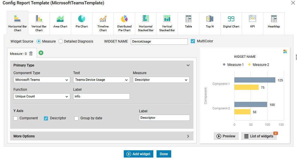
Figure 1 : Configuring the Horizontal Bar Chart Widget
To configure this widget do the following:
-
Specify the name of the widget in the WIDGET NAME text box.
-
By default, the Widget Source is set to Measure indicating that the widget will display the graph/chart with respect to the reported measures. To generate a graph/chart based on the values retrieved as part of the detailed diagnosis, you can choose the Detailed Diagnosis radio button.
-
The Multicolor check box is checked by default. This indicates that each bar of the graph/chart will be plotted using a different color chosen from the color palette. Unchecking the check box will plot the entire graph/chart using a single random color.
-
The Measure - 0 tab consists of two sections - Primary Type and More Options. In the Primary Type section, specify the following:
-
Select a Component Type, Test and Measure for which you wish to generate the graph/chart.
-
Specify the Label that you wish to see when you hover over the graph/chart.
-
From the Function list, specify the function that you wish to apply for the chosen measure in the graph that is to be generated.
Function
Description Average Average value of the measure Count Denotes the value of the measure, expressed in terms of Number Latest Data The last measurement value of the measure Maximum The maximum value of the measure in the chosen time period Minimum The minimum value of the measure in the chosen time period Sum The sum total of the measure during the chosen time period Unique Count Unique value of the measure during the chosen time period -
If you have chosen the Detailed Diagnosis radio button against the Widget Source, then, an additional DD Columns drop-down list will appear. Here, choose the column based on which you wish to generate the graph.
-
Then, choose an option from the Summarize DD Data By list. This list will be populated with the columns that are provided as part of the detailed diagnosis for the chosen measure.
-
By default, the Component check box will be checked in the Y Axis section. This indicates that the components of the chosen Component Type will be the Y-Axis of the graph. You can check the Descriptor check box if you wish to generate a graph for the descriptors of a chosen test. To view the day-wise/month-wise/week-wise distribution of the measures in the generated graph, first, you need to select the Group by Date check box and select the appropriate Day or Week or Month radio button.
-
Specify the Label that should be displayed for the Y-Axis in the generated graph.
-
-
In the More Options section (see Figure 2), specify the following:
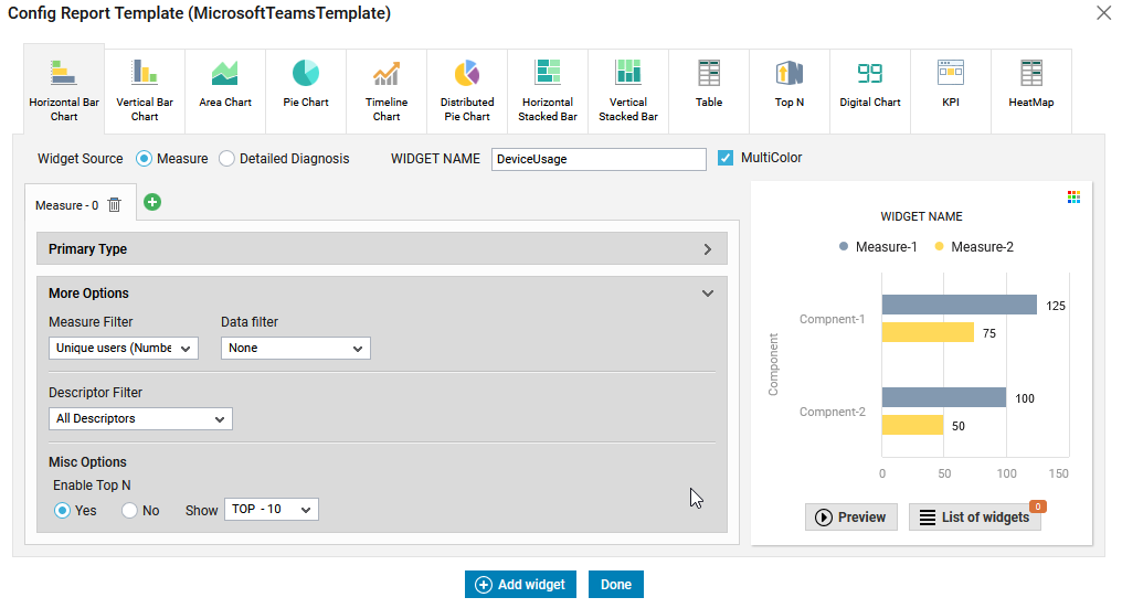
Figure 2 : Configuring the More Options section for the Horizontal Bar Chart widget
-
By default, the measure chosen from the Measure list box will be chosen by default from the Measure Filter list box.
-
If you wish to plot the graph/chart for the chosen measure based on a mathematical condition such as greater than, lesser than, equals etc, then, you can choose such condition from the Data Filter list. By default, None will be chosen from this list.
-
The Default Value text box will appear as soon as you choose an option from the Data Filter. By default, a value of 0 is specified in this text box. If you wish to provide a number of your choice, then you can do so using this text box. For example, if you wish to plot a graph/chart for unique users with count greater than 100, then, you can set the Data Filter to Greater than and specify 100 in the Default Value text box.
-
By default, the graph/chart will be plotted considering all the descriptors of the chosen test. To this effect, All Descriptors option will be chosen from the Descriptor Filter list. If you wish to plot the graph/chart for a specific set of descriptors alone, then, choose Specific Descriptors option from the Descriptor Filter list. The Include and Exclude options will then appear. By default, the Include option will be chosen. The all option will be chosen from the text box adjacent to the Include/Exclude options indicating that all the descriptors will be chosen for plotting the graph/chart. If you wish to choose to plot the graph only for a select few descriptors alone, then, click the
 icon adjacent to the text box. This will lead you to Figure 3 using which you can choose the descriptors of your choice.
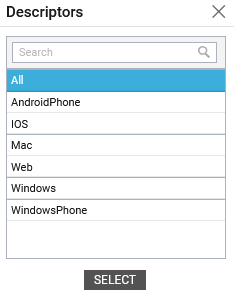
Figure 3 : Choosing to include/exclude a few descriptors
Similarly, you can exclude a few descriptors by choosing the radio button preceding the Exclude option.
-
By default, the Enable Top -N option in the Misc Options section is set to No indicating that the graph/chart will be plotted using the values retrieved for the chosen measure. If you wish to restrict the graph to a fewer values, then, you can set the Enable Top-N option to Yes and choose an appropriate value from the Show list. By default, Top-10 will be chosen from the Show list indicating that the graph/chart will be plotted for the top 10 measure/descriptor combination.
-
-
To add another measure, click the
 icon (see Figure 4). A new stacked tab named Measure - 1 (see Figure 4) will then appear where you can choose to configure another measure for the graph.
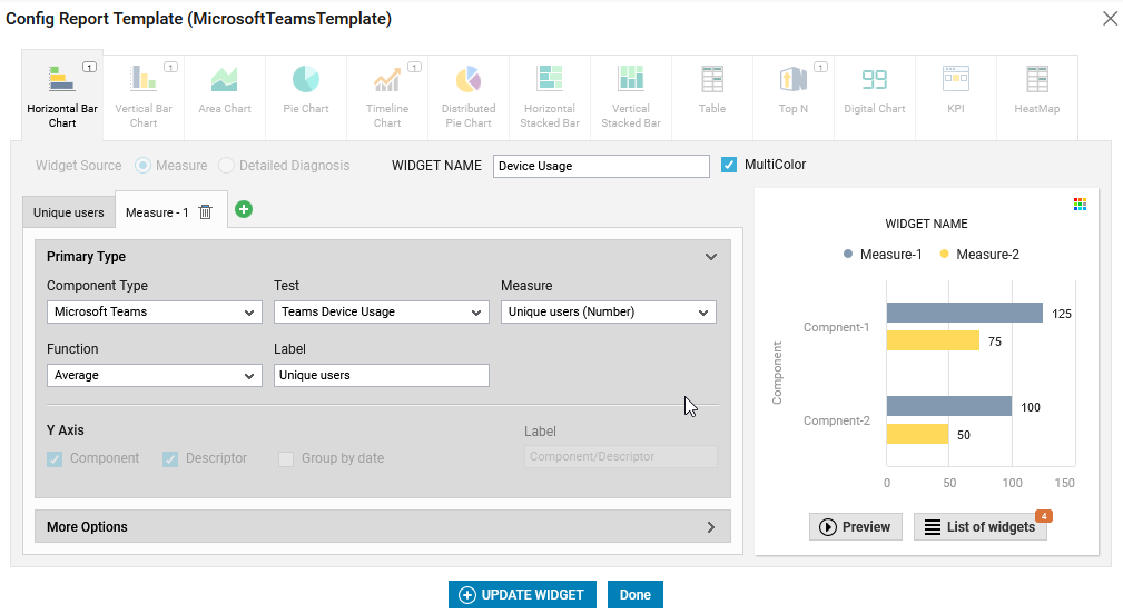
-
Clicking the Preview button will display the generated graph in the section available just above that button.
-
Figure 5 shows a sample graph generated by configuring the Horizontal Bar Chart widget.
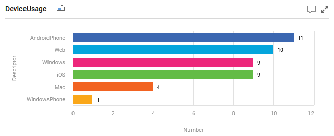
Figure 5 : A graph generated using Horizontal Bar Chart widget
Vertical Bar Chart
Use the Vertical Bar Chart widget to generate a vertical bar graph using which you can compare the values of the chosen measures-descriptors combination during the last measurement period. Clicking the Vertical Bar Chart tab in Figure 1 will lead you to Figure 6.
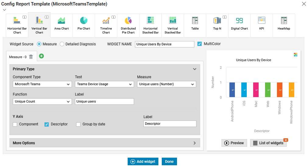
Figure 6 : Configuring the Vertical Bar Chart widget
To configure the Vertical Bar Chart widget follow the steps 1 - 7 mentioned in Horizontal Bar Chart. Figure 7 shows a sample graph generated by configuring the Vertical Bar Chart widget.

Figure 7 : A graph generated using Vertical Bar Chart widget
Area Chart
To view the area-wise distribution of metrics in a single graph, you can use the Area Chart. For example, if you wish to plot a chart for the Incoming traffic and Outgoing traffic of the Network Traffic test and identify how well the network traffic is utilized over a time period, then you can plot an Area Chart. Clicking the Area Chart tab in Figure 1 will lead you to Figure 8.
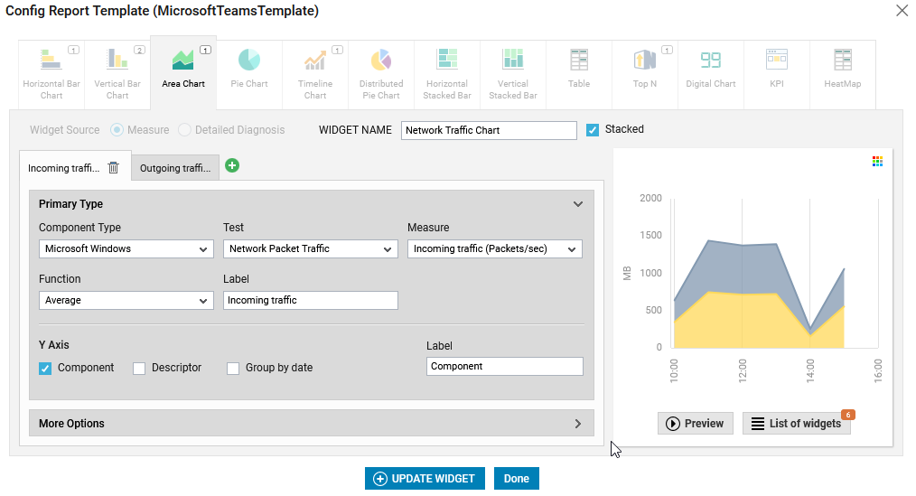
Figure 8 : Configuring the Area Chart Widget
To configure the Area Chart widget follow the steps 1 - 7 mentioned in Horizontal Bar Chart. Note that you will not be allowed to choose the Widget Source while configuring this widget.
By default, the check box preceding Stacked option will be checked as shown in Figure 8. This implies that you can view the exact area distribution of measures without overlap when the graph is generated. For example, if you wish to view the area-wise distribution of the Incoming Traffic and Outgoing Traffic metrics of the Windows Network Traffic test using the Area Chart, then upon adding those metrics, the Area Chart will appear as shown in Figure 9 with the minimum value being plotted in the graph first and the value higher than the minimum value plotted over the minimum value. Note that only the metrics with the same measurement unit should be added if the check box preceding Stacked option is checked.
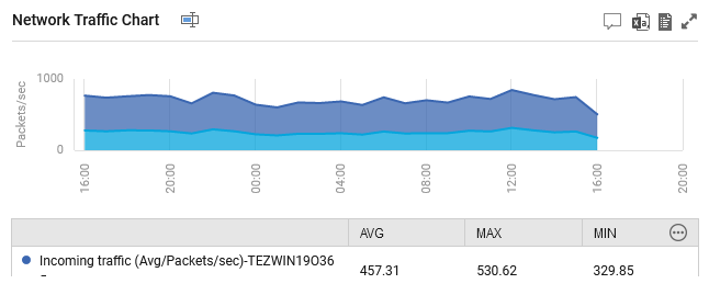
Figure 9 : A graph generated using Area Chart widget
If you have unchecked the check box preceding Stacked option, then, the Area Chart will be generated as shown in Figure 10.
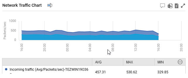
Figure 10 : A graph generated using Area Chart widget by unchecking the Stacked check box
Pie Chart
To view the distribution of metrics for a chosen component, you can use the Pie chart widget to plot a pie chart. Clicking the Pie Chart tab in Figure 1 will lead you to Figure 11.
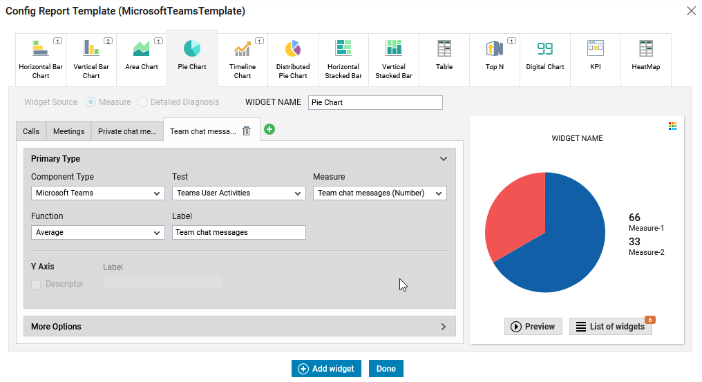
Figure 11 : Configuring the Pie Chart widget
To configure the Pie Chart widget follow the steps 1 - 7 mentioned in Horizontal Bar Chart. For a pie chart to be plotted effectively, the measurement units of all the configured measures should be the same.
Figure 12 shows a sample Pie chart generated using the Pie Chart widget.

Figure 12 : A pie chart generated using the Pie Chart widget
Timeline Chart
To historically analyze the performance of the chosen measure, you can include a Timeline Graph in your dashboard. For this, you need to choose the Timeline Chart tab from Figure 1. Figure 13 will then appear.
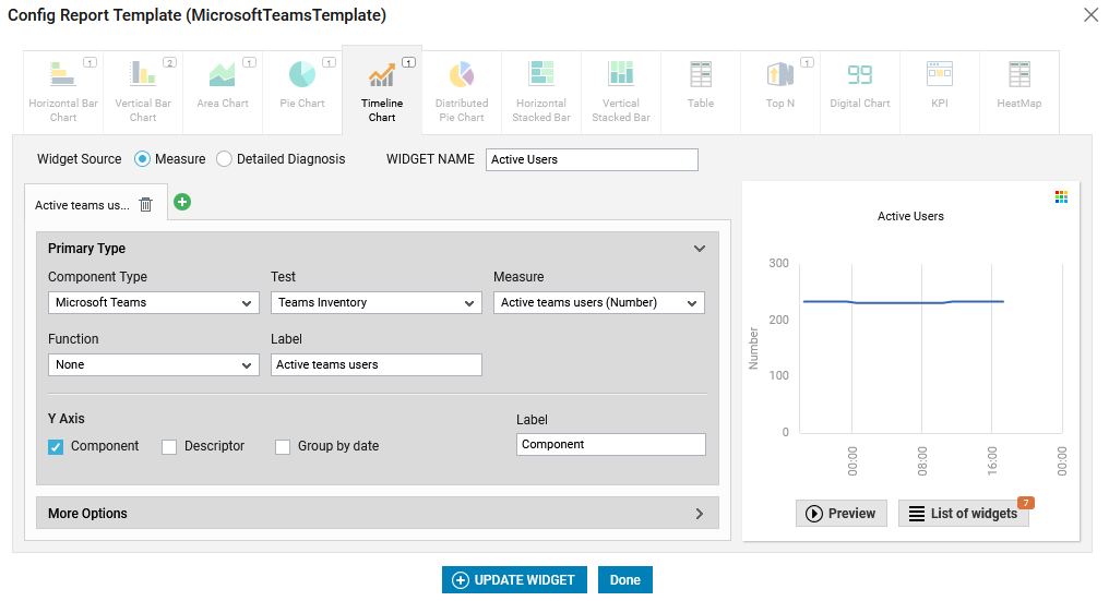
Figure 13 : Configuring the Timeline Chart widget
To configure the Timeline Chart widget follow the steps 1 - 7 mentioned in Horizontal Bar Chart. Figure 14 shows a sample Timeline Chart generated using the Timeline Chart widget.
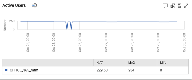
Figure 14 : A timeline chart generated using Timeline Chart widget
Distributed Pie Chart
To view the distribution of a measure for a chosen component across different distribution ranges, you can plot a pie chart using the Distributed Pie Chart widget. For this, you need to choose the Distributed Pie Chart tab from Figure 1. Figure 15 will then appear.
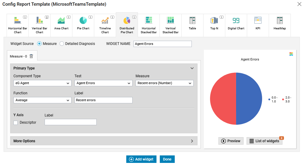
Figure 15 : Configuring the Distribution Pie Chart widget
To configure the Distributed Pie Chart widget follow the steps 1 - 7 mentioned in Horizontal Bar Chart. Figure 16 shows a sample Distributed Pie Chart generated using the Distributed Pie Chart widget.

Figure 16 : A pie chart generated using Distribution Pie Chart widget
Horizontal Stacked Bar
Use this widget to generate a stacked horizontal bar graph for closely related measures for e.g., you can generate a graph to view the free space and used space of each disk in a server. Using this bar graph, you can accurately diagnose the root-cause of performance problems in your infrastructure. To configure this widget, choose the Horizontal Stacked Bar tab in Figure 1. Figure 17 will then appear.
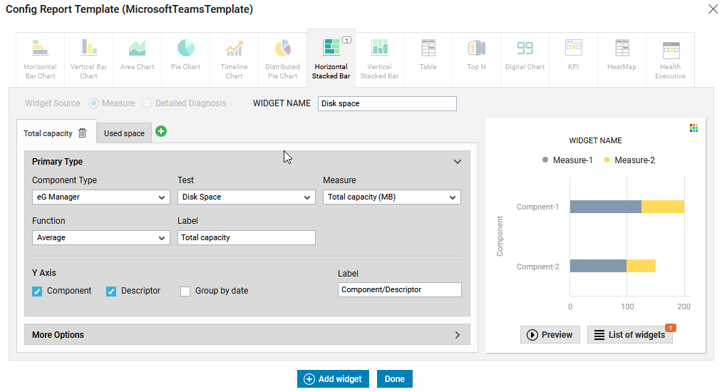
Figure 17 : Configuring a Horizontal Stacked Bar widget
To configure the Horizontal Stacked Bar widget follow the steps 1 - 7 mentioned in Horizontal Bar Chart. Note that you will not be allowed to choose the Widget Source while configuring this widget. Figure 18 shows a sample Horizontal Stacked Bar chart generated using the Horizontal Stacked Bar widget.
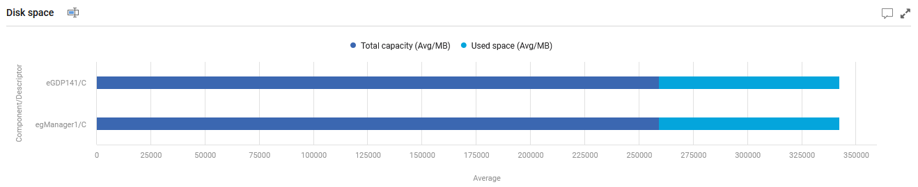
Figure 18 : A horizontal stacked bar chart generated using the Horizontal Stacked Bar widget
Vertical Stacked Bar
Use this widget to generate a stacked vertical bar graph for closely related measures for e.g., you can generate a graph to view the free space and used space of each disk in a server. Using this bar graph, you can accurately diagnose the root-cause of performance problems in your infrastructure. To configure this widget, choose the Vertical Stacked Bar tab in Figure 1. Figure 19 will then appear.
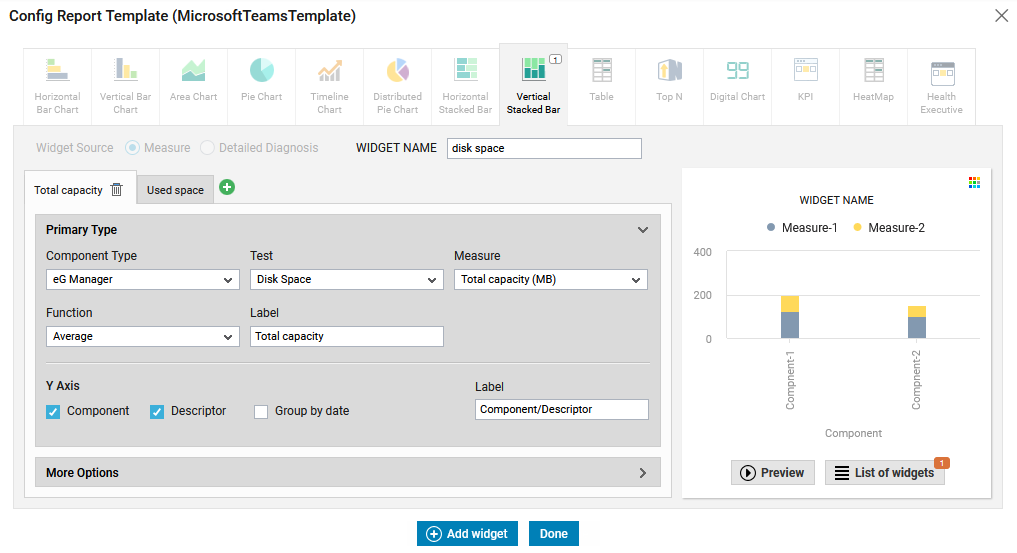
Figure 19 : Configuring a Vertical Stacked Bar widget
To configure the Vertical Stacked Bar widget follow the steps 1 - 7 mentioned in Horizontal Bar Chart. Note that you will not be allowed to choose the Widget Source while configuring this widget. Figure 20 shows a sample Vertical Stacked Bar chart generated using the Vertical Stacked Bar widget.

Figure 20 : A vertical stacked bar chart generated using the Vertical Stacked Bar widget
Table
If you want to compare the values of metrics collected from a wide array of components in a tabular column, then, you can use the Table widget. To configure this widget, choose the Table tab in Figure 1. Figure 21 will then appear.
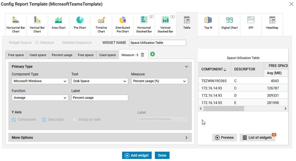
Figure 21 : Configuring a Table widget
To configure the Table widget follow the steps 1 - 7 mentioned in Horizontal Bar ChartFigure 22 shows a sample Vertical Stacked Bar chart generated using the Vertical Stacked Bar widget.
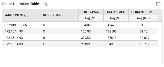
Figure 22 : A table chart generated using the table widget
Top N
To analyze the top values of measures over a period of time, you can use the Top N widget. To configure the Top N widget, click the Top N tab in Figure 1. Figure 23 then appears.

Figure 23 : Configuring a Top N widget
To configure the Top N widget follow the steps 1 - 7 mentioned in Horizontal Bar Chart. Figure 24 shows a sample Top N chart generated using the Top N widget.
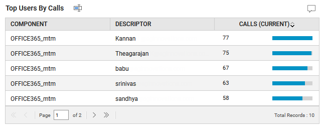
Figure 24 : A Top N Analysis chart generated using Top N widget
Digital Chart
To track the fluctuations of a chosen measure over a period of time, you can use the Digital Chart widget. To configure the Digital Chart widget, click the Digital Chart tab in Figure 1. Figure 25 then appears.
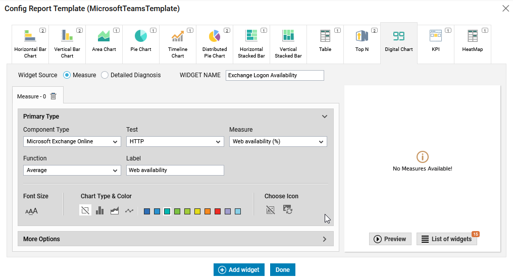
Figure 25 : Configuring the Digital Chart
To configure the Digital Chart widget follow the steps 1 - 7 mentioned in Horizontal Bar Chart. Figure 26 shows a sample Digital Chart generated using the Digital Chart widget.
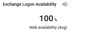
Figure 26 : The Digital Chart widget
In addition, for a better look and feel of the digital chart, you can customize the font of the chart, analyze the historical trend of the configured measure using bar chart, line chart or area chart and also choose an appropriate icon for display in the digital chart. For this, do the following:
-
By default, a medium font size is used to display the content of the digital chart. To alter the size of the font for the content displayed in the digital chart, click on the appropriate font in the Font section (see Figure 25).
-
To view the historical trend of the measure using a bar chart, click the
 icon available in the Chart Type & Color section (see Figure 25). Similarly, you can use an area chart in the digital chart by clicking the
  icon. To view the historical trend of the measure using a line chart, then, click the
  icon.
icon. -
To plot the graph with the color of your choice, choose a color from the color palette displayed in the Chart Type & Color section (see Figure 25).
-
You can even choose a relevant icon of your choice for display in the digital chart using the Choose Icon section. For this, click the
 icon in Figure 25. Figure 27 will then appear.
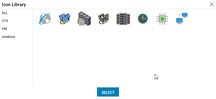
Figure 27 : Choosing an appropriate icon for the digital chart
-
Pick the icon of your choice from Figure 27 and click the SELECT button. Figure 28 shows a sample Digital Chart generated using the Digital Chart widget.
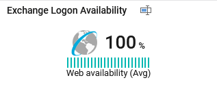
Figure 28 : The Digital Chart widget configured with all selection
KPI
To view the performance of metrics of a chosen component over a period of time, you can use the KPI widget. To configure the KPI widget, click the KPI tab in Figure 1. Figure 29 then appears.
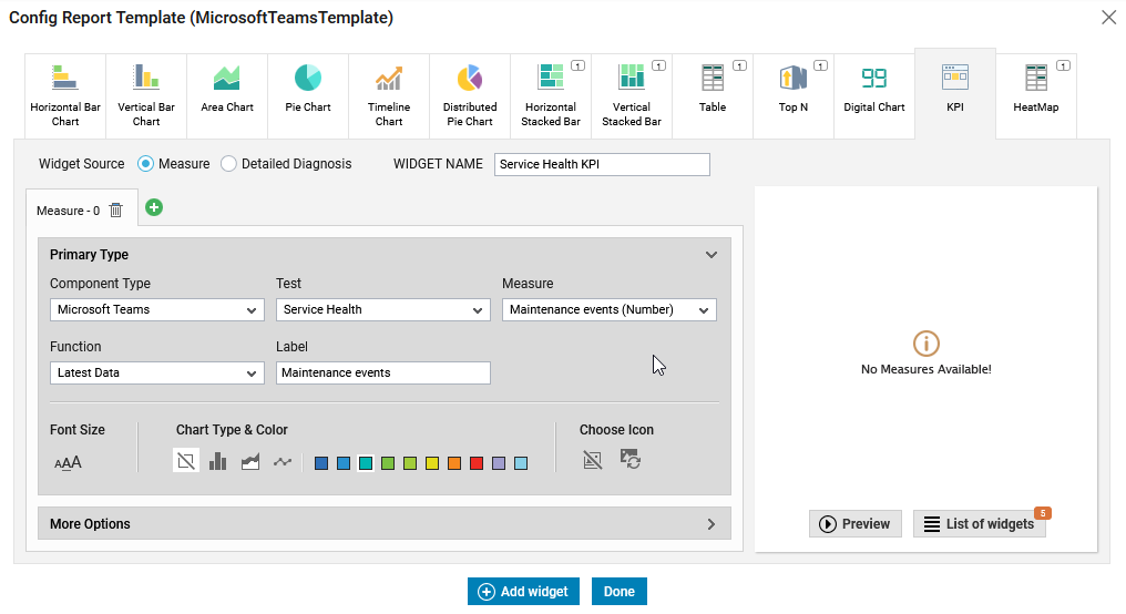
Figure 29 : Configuring the KPI widget
To configure the KPI widget follow the steps 1 - 7 mentioned in Horizontal Bar Chart. Figure 30 shows a sample KPI graph generated using the KPI widget.

Figure 30 : A KPI report generated using KPI widget
In addition, for a better look and feel of the digital chart, you can customize the font of the chart, analyze the historical trend of the configured measure using bar chart, line chart or area chart and also choose an appropriate icon for display in the digital chart. For this, do the following:
-
By default, a medium font size is used to display the content of the KPI chart. To alter the size of the font for the content displayed in the KPI chart, click on the appropriate font in the Font section (see Figure 29).
-
To view the historical trend of the measure using a bar chart, click the
icon available in the Chart Type & Color section (see Figure 29). Similarly, you can use an area chart in the digital chart by clicking the icon. To view the historical trend of the measure using a line chart, then, click the icon. -
To plot the graph with the color of your choice, choose a color from the color palette displayed in the Chart Type & Color section (see Figure 29).
-
You can even choose a relevant icon of your choice for display in the digital chart using the Choose Icon section. For this, click the
icon in Figure 29. Figure 31 will then appear.
-
Pick the icon of your choice from Figure 31 and click the SELECT button. Figure 32 shows a sample KPI chart generated using the KPI widget with all selections.

HeatMap
If you wish to view how well the measures are performing over a chosen time period and to monitor their threshold violations from time to time, you can use the HeatMap chart. To configure the HeatMap widget, click the HeatMap tab in Figure 1. Figure 33 then appears.
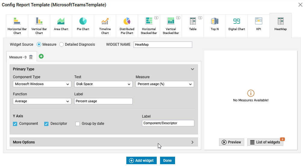
Figure 33 : Configuring the HeatMap widget
To configure the HeatMap widget follow the steps 1 - 7 mentioned in Horizontal Bar Chart.
eG Enterprise offers the flexibility of allowing the administrators to view the measures that violate a certain threshold from the generated graph at a single glance. This can be achieved by choosing a Measure Condition (Greater than or Lesser than) and by providing the lower/higher threshold limits of your choice i.e., providing the Minor/Major/Critical values in the appropriate colored text boxes against the Measure Condition Range option (see Figure 34). Doing so, whenever the configured measures violate the specified threshold values, the value of that measure will be highlighted with the corresponding color of the specified text box in the generated table chart.

Figure 34 : Specifying the threshold values
Figure 35 shows a sample generated HeatMap chart.
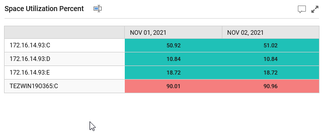
Figure 35 : A generated HeatMap chart using the HeatMap widget